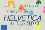
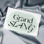
We spoke to Graphic Designer Lisa Reckeweg (@lmrgraphic) whose bold typographic work found its way through the endless sea of design on social media to our feed. Below we find out about her journey as a designer and some of the cool projects she’s got going on right now.

Amber: Hi Lisa, to kick off this discussion, can you tell us a bit about yourself?
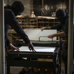
Lisa: Sure! So I grew up in a small city in Germany and moved to Aachen — another small city in Germany — for my bachelor studies in communication design. I studied in the classes of Eva Kubinyi from Integral Rudi Baur Paris for several years who taught me a lot about typography, editorial design and the process of designing. I love experimenting with new printing methods and exploring new potentialities that evolve from different procedures.
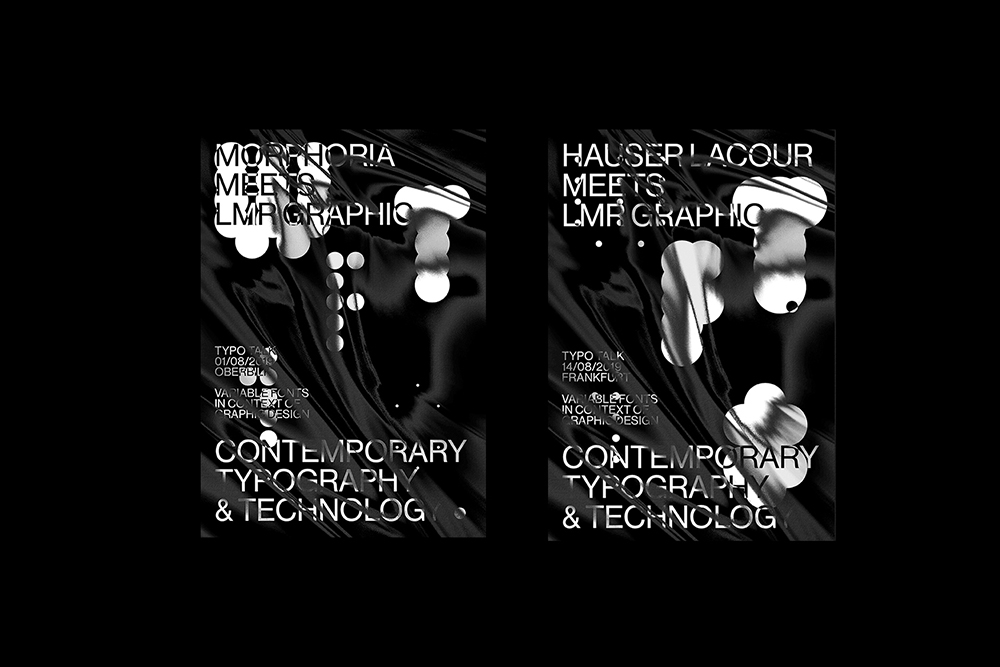
For my internship semester, I went to Frankfurt and worked for Hauser Lacour — that was where I had the first opportunity to manage and design my own client projects. I returned to Aachen for my bachelor thesis and started working as a freelancer. After graduation, I moved to Düsseldorf to do an internship at Morphoria Design Collective. I learned a lot about motion design and animation in those months and worked on some really interesting projects.

A: Exciting stuff. How did you get into design? Was it something you were always interested in or did something inspire you to go into that area of design?
L: I am lucky enough to be one of those people that have always known what they want to do professionally. As a kid, I was always really into art and handcrafts but I had no idea what to do with that later on. When I was in the ninth grade, my best friend’s uncle worked in a small graphic design studio in my hometown. One day we were walking down the road and we saw a poster that he did. I was thinking: I really want that, too. I want to do something that is for the public, that anyone can see. I want to inspire people and bring a little joy to their day. That was when I decided to do something with design.
Throughout the years, there were many other factors and people that influenced my way and conception of design and helped me shape my graphic identity but that definitely was the starting point.

A: What about who influences your work? Do you have particular references that you look to?
L: There are a lot of great designers that have had an influence on my way of working and my visual language. I also have my personal contemporary idols in the area of typography and graphic languages like Studio Feixen, Joseph Lebus and Kasper-Florio. But as a designer, I try to draw my inspiration from other things when developing a concept. The historic, spatial and social classification of a topic is always really important to me. In addition to that, I love to visit a lot of exhibitions, watch movies and take inspiration from everyday life objects and moments.

A: Some beautiful typographic references you have there! What is your favourite project you’ve done so far?
L: That is a difficult question. Any project I work on is based on extensive research on the subject and its historic background. I believe that only by understanding the topic, you can evolve a striking design concept. So, to me, it is really about the topic you are dealing with. I collaborated on several projects with great a graphic designer and close friend of mine: Charly Bönner. We worked on an exhibition design about the artistic movement of the Neue Wilde that took place in Germany in the eighties. The subcultural background and energy of these artists are really engaging so it was a lot of fun to work on that.
Another project that was really important to me was the editorial design for a bookazine about the freedom of speech and censorship. In each issue of Geschwärzt, the focus lies on two countries that are examined and compared with each other — in this issue, we dealt with China and Germany. The bookazine provides an objective view of the situation of censorship in those countries. For me, this project was intense as I learned a lot while researching on the topic (https://www.designmadeingermany.de/2018/143935/ )
For my bachelor thesis, I finally started diving deeper into the topics of animation and coding — I try to keep practising these disciplines to continue learning as much as I can. What changes when you add the level of motion to a (traditionally) printed matter, for instance, a poster? That question is the basis for my exploration of moving posters which I really enjoy and that is an ongoing project of mine. Here I am free to experiment and do not have to stick to any regulations or restrictions.

A: Your Bachelor Thesis sounds interesting, can you tell us a little more about it?
L: We live in times of digitalization and constant progress. New media are constantly changing the way we communicate with each other and with society. With technical progress, our most important means of communication — the written word — is also evolving. My bachelor project Variable Fonts — Reactive Typography deals with new developments in the field of digital typography: Variable Fonts are font files that can be interpolated linearly. The typeface itself can now be dynamically shaped.
But to what extent are Variable Fonts relevant for us as graphic designers? I researched the format of Variable Fonts in the context of the profession of a graphic designer. The publication explains historical and technical backgrounds. But what will the future of typography look like? Through active discourse with experts — typographers, graphic designers and developers — I discussed relevant questions. Design experiments serve to explore the future perspectives of the font format. The focus lies on the automated adaptation of typography to its environment. Which factors can influence the appearance of a typeface? How can we collect the data needed for this kind of live interpolation? Reactive typographic posters explore these adaptations in detail.

The project operates at the interface between graphic design and programming — which caused me a lot of distress and sleepless nights. But that is also one key point that I learned from the project: to realize concepts like this on a wider scale, we need to collaborate interdisciplinarily and form new teams, not only amongst designers but also with type designers and developers. No single person can combine all those disciplines alone. I am excited about working together with new people and learn things I would not know about as a traditional graphic designer. It is about moving out of your comfort zone and find people that share your visions.

A: Finally, what are your plans for the future?
L: I recently moved to Antwerp to do my master studies at the Royal Academy of Fine Arts and to continue my researches on Variable Fonts in this environment. The city has a vibrant art and design scene, which is influenced, among other things, by the various departments of the Academy such as Fashion and Painting. I think we live in the times of radical upheaval in design, comparable to those triggered by the invention of movable lead type or desktop publishing. Technology forces us to rethink design tools, file formats and opens up inconceivable possibilities.

