
Emerging from a previous branding brief, Bairne was created by Thom of Fettle Foundry (@fettlefoundry) as a direct response to issues he observed with existing functional sans serif typefaces. “The idea for [the typeface] came from a branding brief in which the client wanted a brand that embodied their industrial product, but made it seem friendly and approachable,” says Thom.
“However,” he continues, “they wanted to use a well known typeface that I’ve always found to have horrible spacing issues, particularly when used for websites. It was disappointing that I couldn’t convince them to explore alternatives, and I’d done a lot of research into other typefaces which didn’t quite hit the mark for me, so I took that research and decided to create something that did.”
Thom is no stranger to locating problems in the design industry and tackling them with type. When he first started learning about typefaces, he says “it was to learn more about the tools that help form the backbone of all of the work that designers do,” adding that this understanding of the fundamental importance of type improved his practice “immensely.”
Knowing this as a young designer from a low-income background, he says of his decision to create Fettle Foundry, “I felt it was an opportunity to make a difference and provide tools to new designers that may be in the same position that I was, as well as freelancers and independent designers that may not be working with the budgets of larger agencies – without a sacrifice in the quality of the tools.”
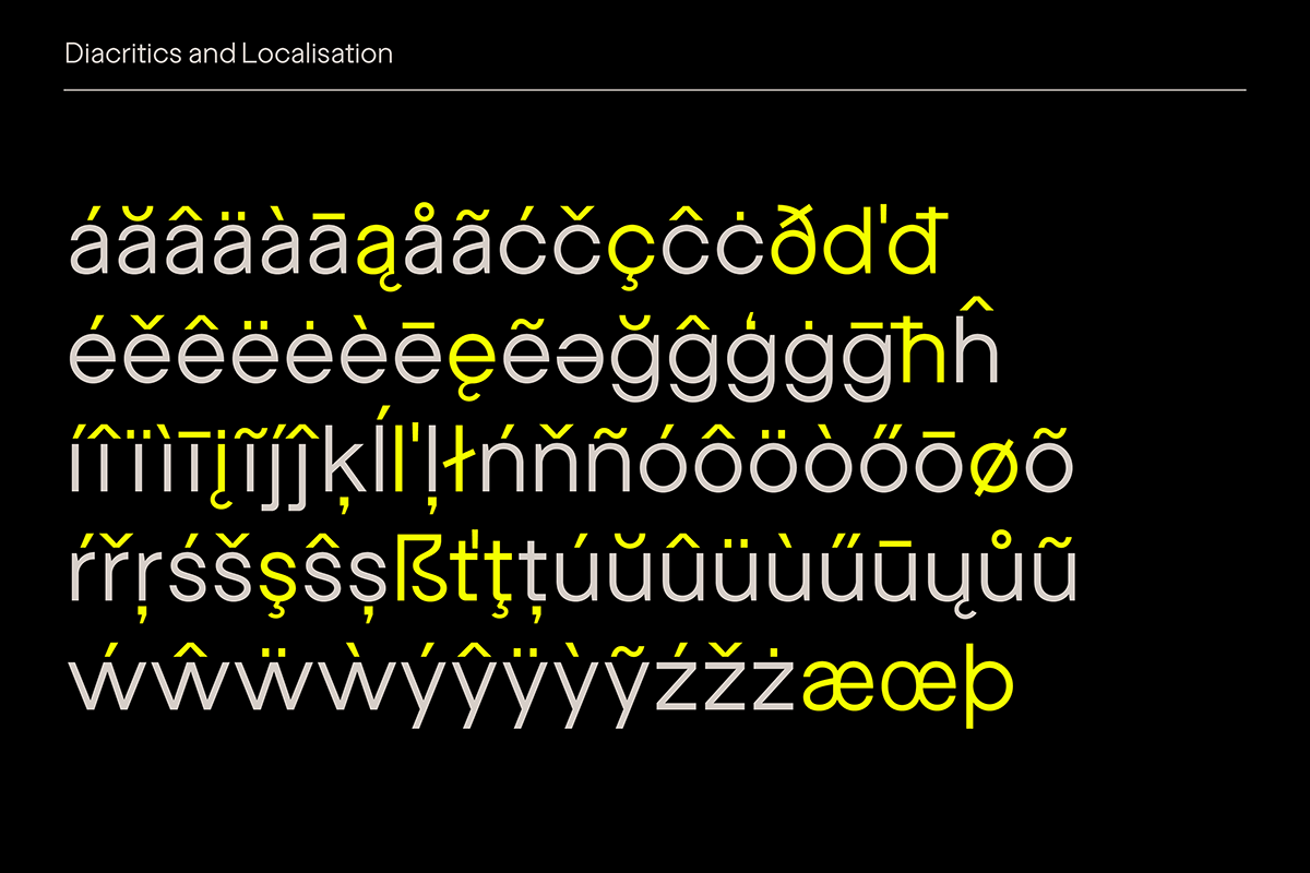
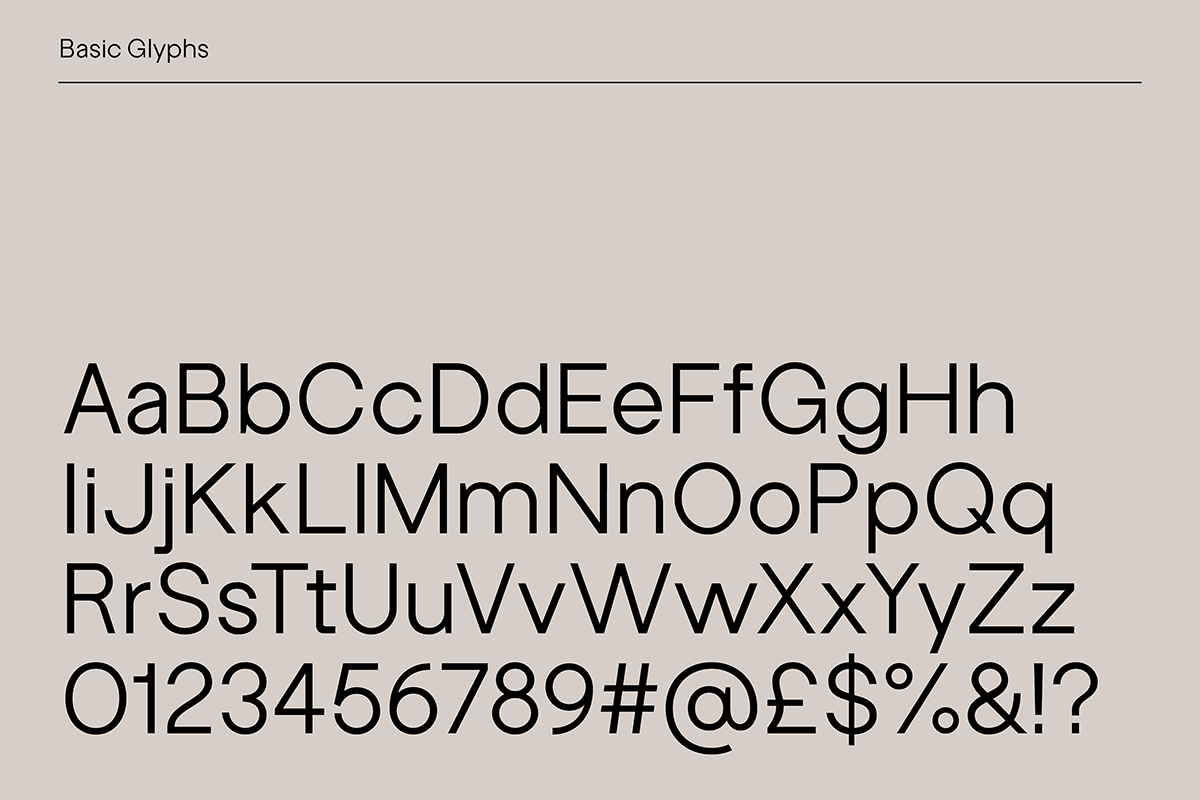
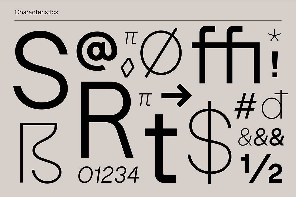
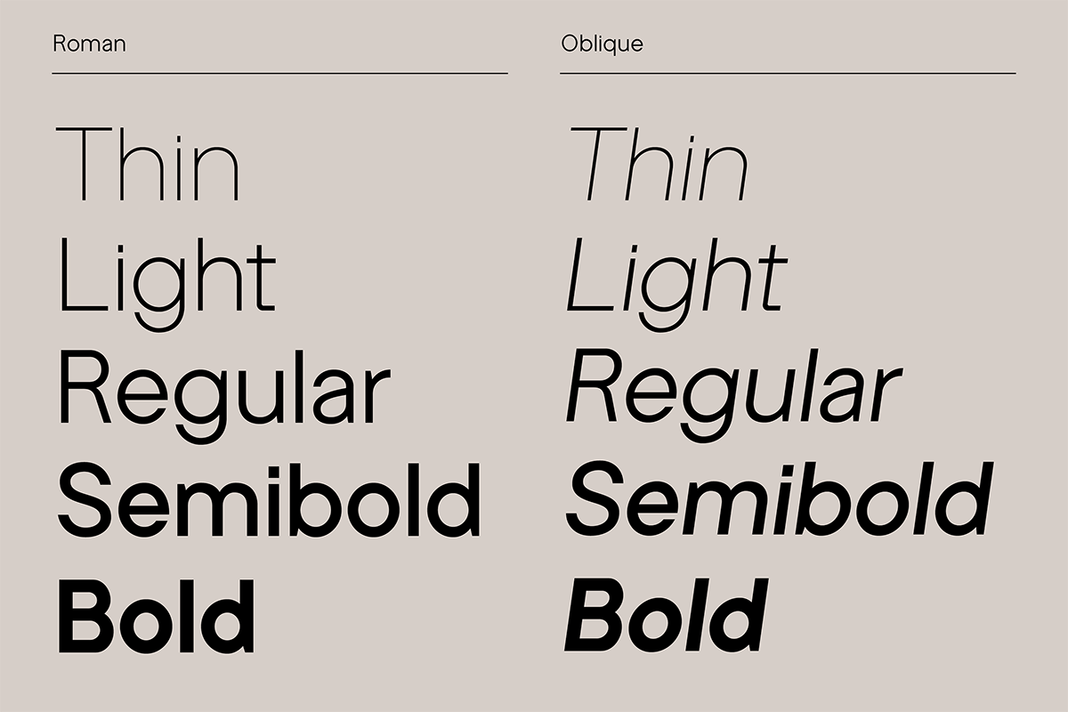
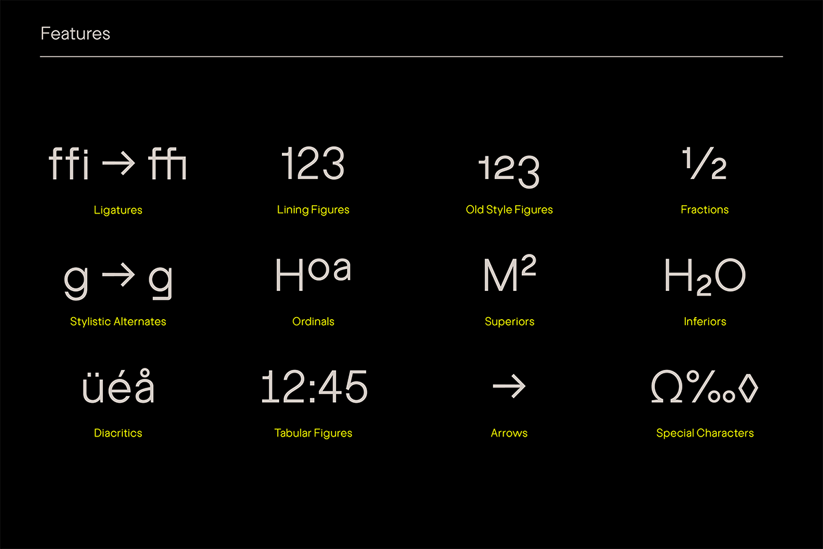
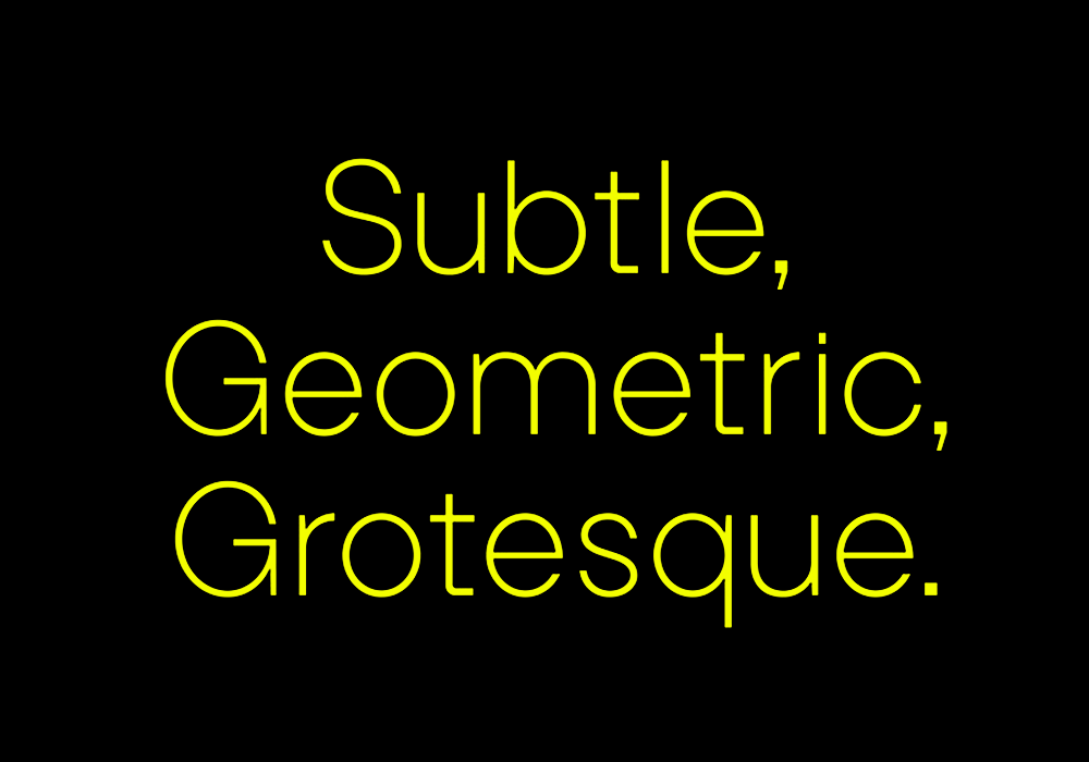
Bairne’s design is sneaky and effective in terms of working in unique quirks while remaining functional above all. “The main features of Bairne were designed to be quite subtle, but with just enough edge to feel modern,” he explains. “The core of these features are asymmetrical curves – which are most apparent on glyphs like the capital S – and tight geometric curves on letters like the lowercase t and f. Similarly, there are contextual options for the descenders on letters like the lowercase y and g that lend the typeface a certain dynamism. Beyond those features I have included a wide range of diacritics which have all been contextually kerned.”
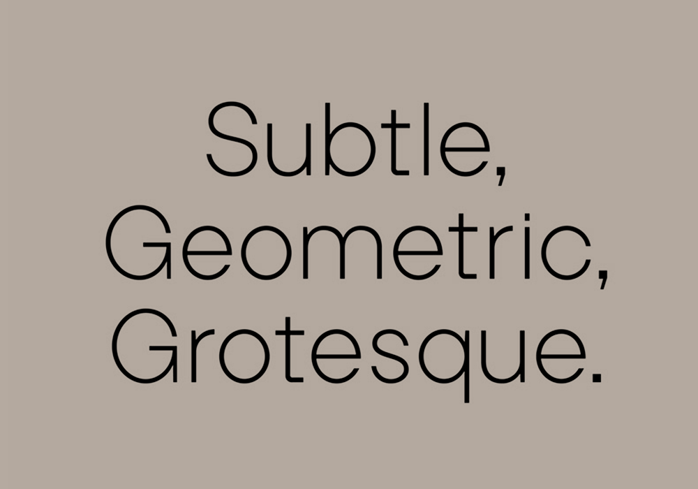
The attention to detail in Bairne is exceptional—and in typefaces as ubiquitous as functional sans serifs, this is, at times, overlooked. However Bairne is uniquely successful in carving out its own identity in this realm; it is recognisable in its subtleties while remaining minimal and on-task.
“There are obvious influences of modernist design,” Thom notes, “and the typeface has been designed with a wide range of European languages in mind. In my head I envisioned institutions such as art galleries that may need to display artist names that include characters that don’t appear in English.”
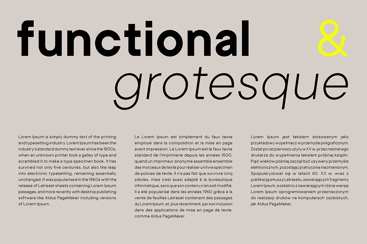
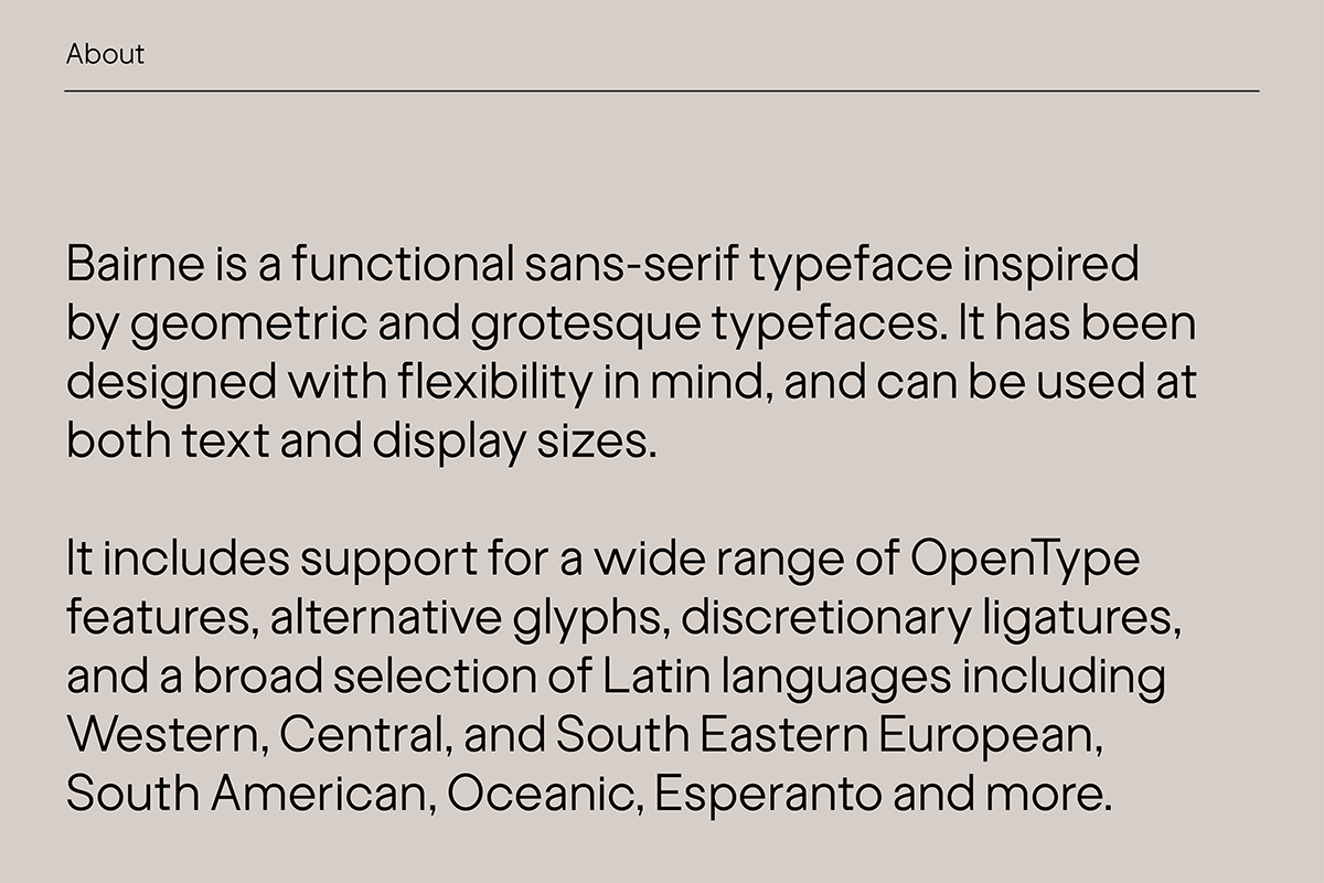
With its wide range of subtle features, Bairne excels in both display sixes, where its unusual quirks are exaggerated, while the apparent simplicity of its design means it is perfect in text settings too. The typeface works well across a range from media – from printed leaflets to websites, poster designs and more, while its aesthetic feels particularly suited to creating identities or promotional materials for cultural institutions.
To discover how Bairne can elevate your next project, head over to Type Department now. Thank you, Thom!


