Independent type foundry, Blaze Type, is delighted to unveil three of their latest typeface releases, adding to their extensive and high-quality font catalogue. The trio – Nuances, Spinner Gothic, and Surt Rounded – each stands out due to their unique character and adaptability across various weights. From the elegant contrast of Nuances to the modern fusion of Spinner Gothic, like the rest of the typefaces that Blaze Type designs and distributes, they all draw strong influences from a broad spectrum of fonts, spanning multiple categories and eras. To provide an in-depth look into their distinct traits and idiosyncrasies, we spoke to founder Matthieu Salvaggio, who shares the stories behind them.


Blaze Type: Nuances
Nuances is a serif typeface that sings with a modern, expressive design. It’s a font of contrasts – rich and detailed, yet sharp and confident in its elegance. Born from type designer Ethan Nakache’s personal research into typographic design and aesthetic detail, each glyph in the Nuances Serif family is carefully crafted, with a strong focus on design intricacies. The curves and contrasts maintain consistent unity throughout the width design space, becoming more generous as the font gets thicker.
“In lighter weights,” explains Salvaggio, “the serifs are designed to be subtle yet distinct, ensuring readability and elegance without overwhelming the letterforms.” To achieve this, he explains that he drew upon modern serif typefaces such as Baskerville (1757), which is known for its high contrast and sharp, yet elegant serifs, and Didot (1784) by Firmin Didot, which showcases dramatic contrasts and fine serifs.
Then as the font goes blacker, uniformity takes centre stage. “As the weights increase,” he continues, “the serifs become more pronounced, contributing to a strong typographic voice while maintaining tight letter spacing.” Achieving this balance – serif prominence with spatial economy – required a meticulous design process, achieved “through careful adjustments in the stroke contrast and the fine-tuning of kerning pairs,” similar to the practices seen in typefaces like Clarendon (1845), which are known for their sturdy and bracketed serifs.

This ultimately results in a typeface that offers a very different visual experience depending on the style used, from sharp and precise when used in Thin to a much richer and denser look when used in Black. From Condensed Thin to Extended Black, its three widths and eight weights maintain the typeface’s legibility and aesthetic harmony, making it a versatile choice for diverse design contexts — from body text to headlines. Thanks to the careful attention to detail in each glyph, Nuances shines in large sizes, where every curve and serif can be fully appreciated.


Blaze Type: Spinner Gothic Typeface
Guillaume Sbalchiero’s sans-serif Spinner Gothic seamlessly combines the traits of American Gothic fonts with the strong features of German Grotesk lettering. Initially a revival of the lettering on a 5 Swiss Franc coin, the typeface evolved into a broader interpretation, progressively incorporating these American and German influences. Meanwhile, the name itself, Spinner, pays tribute to the designer’s mother’s maiden name.
“This typeface draws from the American Gothic tradition with its clean, utilitarian forms that emphasise clarity and straightforwardness, reminiscent of early 20th-century signage and newspaper headlines,” Salvaggio reveals, pointing to the likes of Franklin Gothic (1902) and News Gothic (1908) as sources of inspiration, for their simple, highly legible and functional traits. The boldness and dark tonality of Spinner Gothic arrive from German type foundries of the same era. Berthold Type Foundry’s Akzidenz-Grotesk, for example, was one of the seminal sans-serif typefaces that defined the category in the 20th Century.

“Spinner Gothic incorporates these elements by combining the geometric precision and utilitarian nature of American Gothic with the weighty, assertive presence typical of German Grotesk,” Salvaggio explains, “creating a versatile typeface that excels in both display and text settings.” A highly adaptable typeface, Spinner Gothic boasts nine weights and corresponding italics. With an impressive 800+ glyphs per font and an array of OpenType features, it is well-suited to an extensive variety of design applications. Likewise, its robust structure, coupled with an elegant charm, makes it a fitting choice for both print and digital.
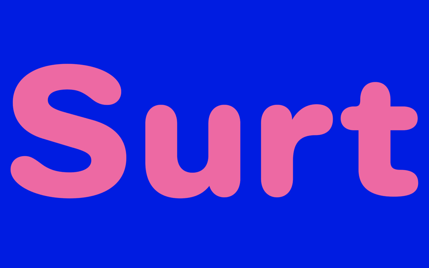


Blaze Type: Surt Rounded Typeface
Surt Rounded, the playful sibling of the Norse-inspired Surt, links geometric sans-serif typography with humanistic design elements. Designed by Matthieu Salvaggio, Tim Vanhille and Hugo Jourdan, it draws its primary inspiration from the lore of Norse mythology and the crisp, minimalist lines of Scandinavian architecture, offering a quirky yet comfortable reading experience. The rounded terminals of Surt Rounded are a key feature, which helps to soften the traditional geometric rigidity commonly associated with sans-serif typefaces.
While not a rounded typeface itself, Gill Sans (1928) had a notable impact on the development of Surt Rounded, thanks to its modern and approachable aesthetics, alongside its humanist characteristics. Likewise, VAG Rounded (1979) — a typeface designed for Volkswagen AG — played a role in Surt Rounded’s development, featuring rounded terminals that imbue the font with a friendly and endearing character.
Culminating in a clean, highly versatile, yet wholly inviting typeface, Surt Rounded enhances any project across print or digital media. It is “particularly effective in projects aiming to convey a sense of friendliness, modernity, and approachability,” Salvaggio notes, reflecting on the potential uses for the typeface. It can be effectively used in a wide variety of applications, particularly excelling in branding projects where a contemporary and welcoming look is required.

These three typefaces underline the versatility and mastery of Blaze Type in catering to a variety of contexts and need via their astute attention to detail, historical influences and clear understanding of typographic principles. Each typeface carries its own personality, steeped in typographic tradition yet pushing the envelope in terms of modern design. It’s important to note that these three typefaces only represent a small fraction of the vast array of options available in Blaze Type’s catalogue too.
For those interested in exploring more, Blaze Type’s website is a treasure trove of typographic excellence. Their full offerings include an impressive range of over 30 typefaces. These designs are available for trial or purchase, with prices beginning at a reasonable €40.


