Ajax Piper, creator of the new typeface Nubya, is a graphic designer based in Hastings. Since childhood, he’s been fascinated by the world of graffiti, where he discovered his love for letterforms. Later attending London College of Communication, Ajax broadened his horizons in graphic and type design by learning about more traditional forms of type design, mingling with experts in the field, and experimenting more deeply with the discipline. “I also got the chance to work alongside some truly amazing typographers,” he says, “In viewing their work and designing alongside them, I was greatly influenced by their creativity and knowledge, which in turn inspired me to pursue my own type design practice.”
We speak with Ajax to hear about the influences behind his new typeface, Nubya, which has just landed in Type Department’s collection.
Where did the idea for this typeface come from?
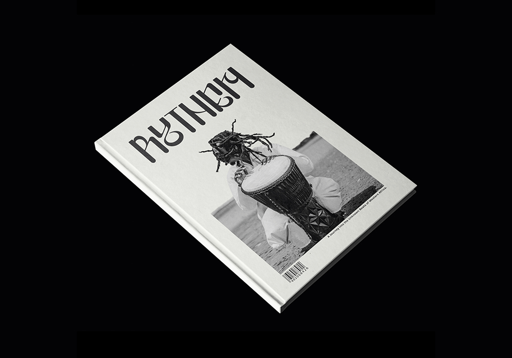
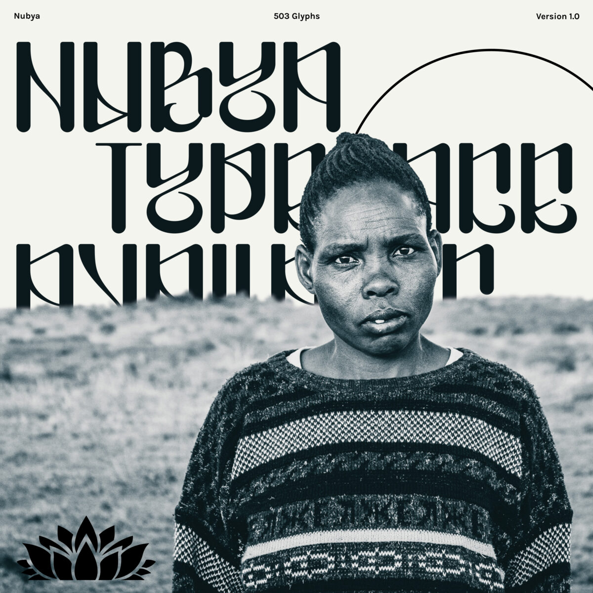
The idea behind Nubya came from a wide array of places. First and foremost I wanted to produce something unique, original and somewhat unusual, to stand out amongst the many of typefaces already available. Also, when completing freelance design work I often found that the ideal typeface that I wanted to use for a specific project did not exist, and therefore Nubya was spawned partially in order to fill that void. The actual inspiration behind the visual aspects came from my various personal interests in graffiti, calligraphy and Arabic letter forms. The typeface was also in part influenced by the unusual and expressive sounds of Jazz, with its name paying homage to the British Jazz Saxophonist Nubya Garcia.
What are the main design features and how do these work in-use? What qualities do they bring?
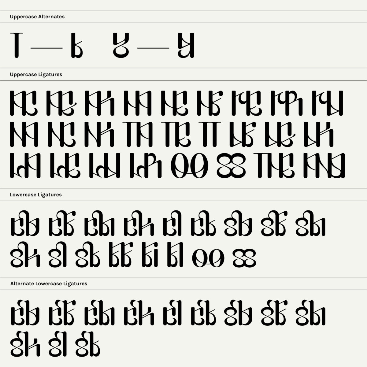
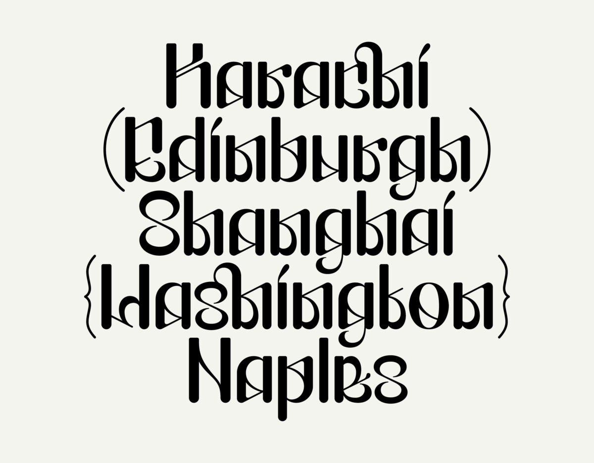
Nubya uses unusual and heavily contrasting strokes to create dynamic, eye catching and visually expressive marks. This results in characters far removed from their everyday form meaning each glyph can hold it’s own as a single entity, without the visual security that a word, phrase or sentence provides. On the other hand consistencies within each letter provide flow and rhythm to the typeface. Diagonal strokes, closed apertures and repeating forms invoke a coherent visual language. The vertical strokes terminate at both flat and rounded points. This is to relinquish explicit connotations to calligraphic marks, whilst still retaining some of the charismatic more nuance attributes of this style of typography. These visual characteristics result in complex and sometimes illegible letter forms that require concentration in order to be fully appreciated and understood.
What kind of projects is this typeface best suited to and why?
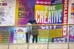
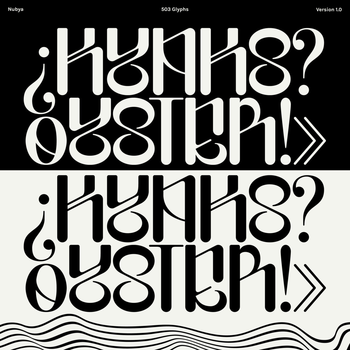
Nubya is designed to be used as a display typeface and is therefore suited for use at large sizes for small strings of text. This includes headings, Posters, Flyers etc. However, although I designed it for this purpose it is up to the individual to find a use that best fits their vision. As the typeface is aiming to push the boundaries of letterforms it seems fitting for people to use the typeface in unconventional ways that push the boundaries of typography. In whatever way Nubya is used I shall be happy!
Thank you, Ajax!
Head over to Type Department for more on Nubya, and keep up with Ajax on socials to stay updated.

