
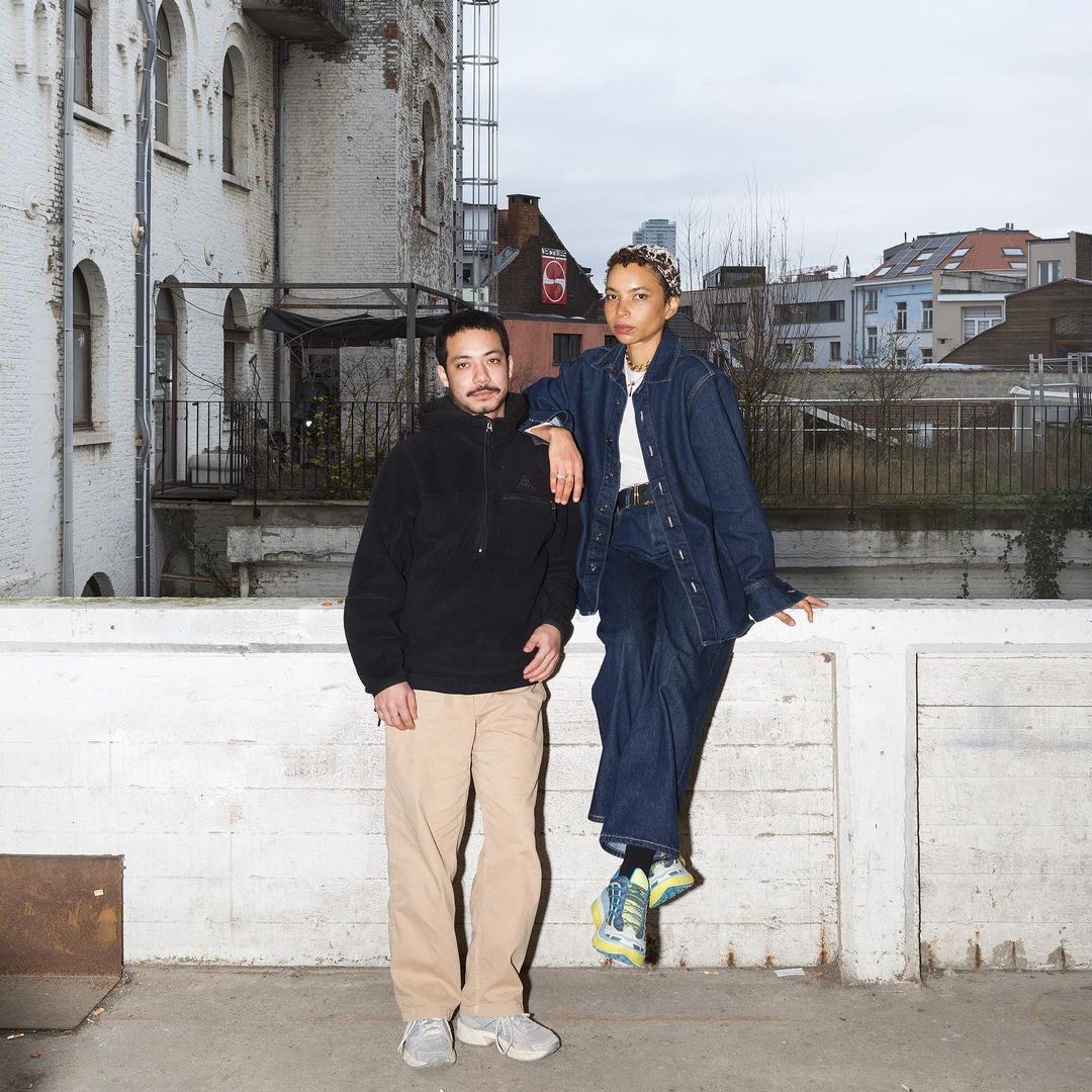
In this interview, Lucile Martin, co-founder of alliage, shares their creative methodology and how to speak to a large audience while maintaining an experimental edge.
Established in 2017 by Lucile Martin and Julien Pik, Brussels-based studio alliage blends Martin’s dreamy creativity with Pik’s technical precision to craft bespoke designs for each client, emphasising its distinct identity. Interestingly enough, the studio’s name reflects the creative symbiosis that the duo share – alliage is the French word for “alloy,” a metal created by combining two or more metallic elements to make it stronger or more corrosion-resistant.
The duo gravitates towards projects reflecting their inclusive and social change values, which are evident in their diverse portfolio encompassing art, design, fashion, and contemporary culture. From feminist initiatives to projects shedding light on colonial history, alliage’s clients and body of work reflect the studio’s commitment to impactful storytelling and design.
TYPE01 spoke to Lucile Martin, one of the alliage duo, to delve into their creative approach, experimental work, and studio ethos.
Rand Al-Hadethi: Could you share Alliage’s philosophy and approach to graphic design with us?
Lucile Martin: Our philosophy is based on the subtle fusion of aesthetics and conceptualisation. Each design project is an opportunity to create something genuinely unique whilst our approach is characterised by a blend of creativity and precision, where each element is carefully chosen to bring forth every project’s own identity. It’s worth noting that our duo operates in harmony: Julien brings a technical and functional approach, while my perspective is more dreamy and artistic.
RAH: Are there any specific types of projects you gravitate most towards as a design studio?
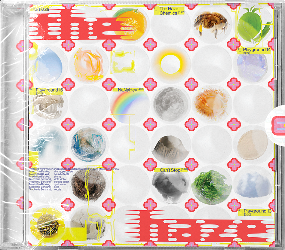
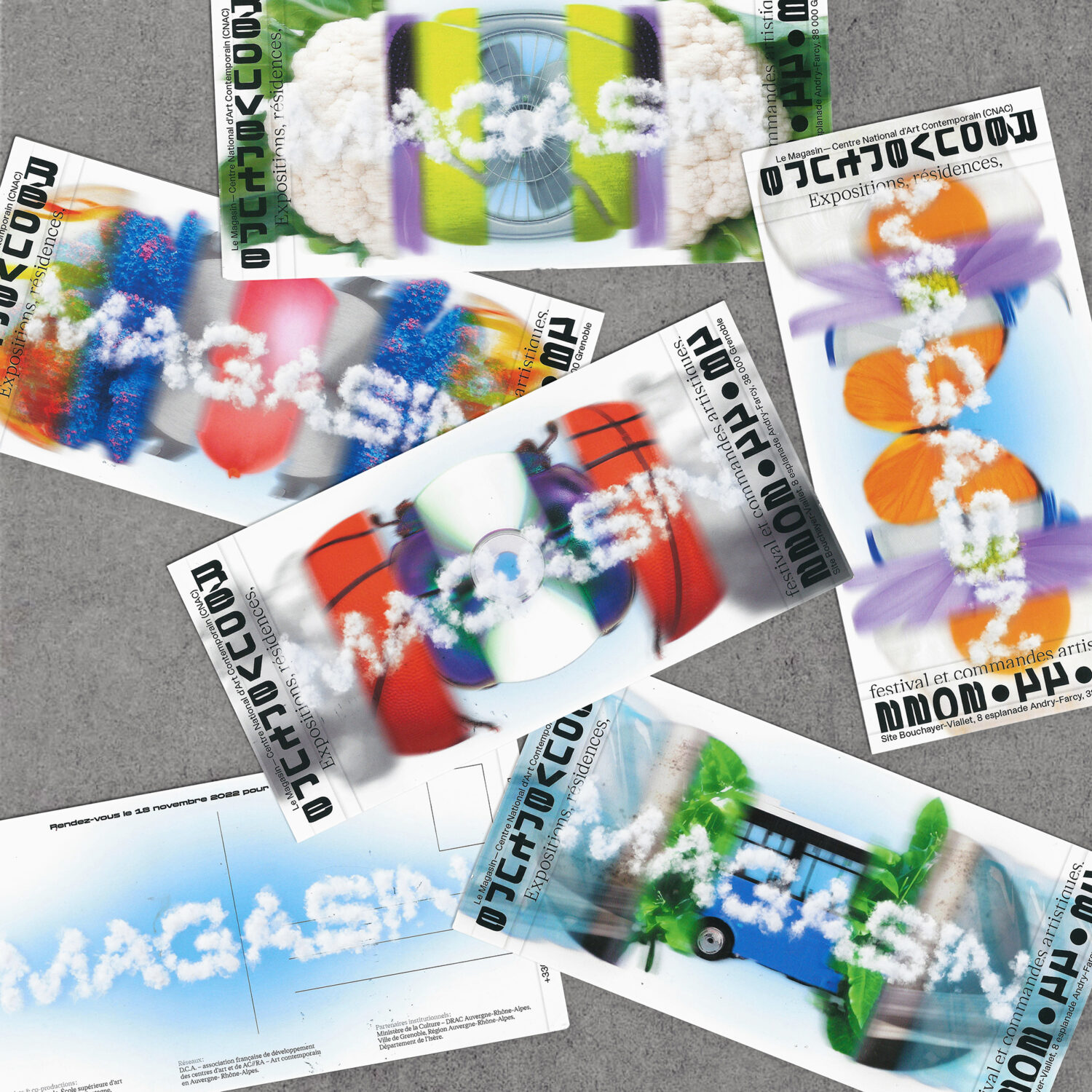
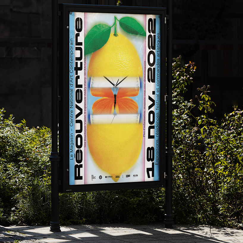
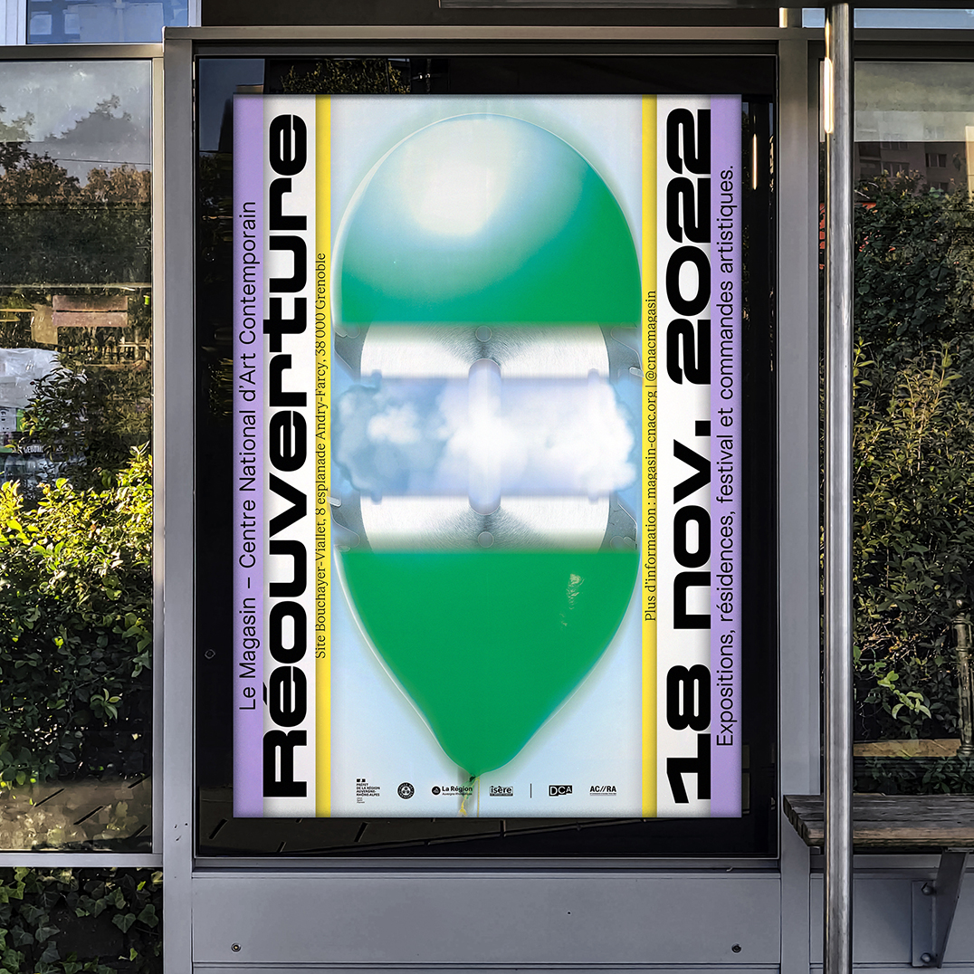
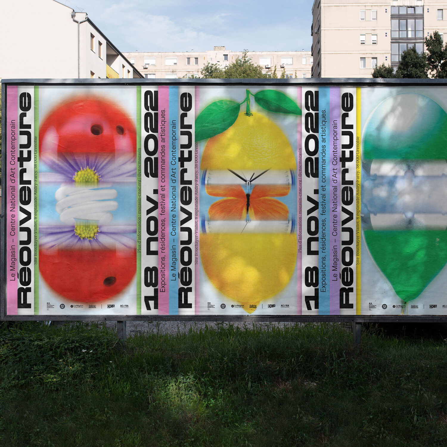
LM: We are drawn to projects that reflect our values of inclusion, representation, and social change. Working with partners such as Psst Mlle, an intersectional feminist platform, and events like the Schiev Festival that promotes experimental music allows us to express our commitment to diversity and non-conformity. We have also participated in projects that address the history of the Belgian empire, exposing decades of colonial deceit and denial. In addition to supporting initiatives that give a voice to the marginalised, we have had the privilege of collaborating with institutions like Magasin-CNAC, led by Céline Kopp, who challenges norms and supports young artists.
This year, we also had the opportunity to accompany artist Julien Creuzet, whose body of work evokes social realities with a lot of poetry, as he exhibits in the Pavilion of France of the Venice Art Biennale. So far, we have been fortunate to participate in projects that reflect our values, and we look forward to continuing to be part of this engaged and inspiring community.
RAH: With your involvement with cultural projects, have you noticed a pattern of embracing more experimental design approaches within art centres and similar institutions?RAH:
LM: Absolutely, we have noticed a growing trend towards the adoption of more experimental design approaches in the cultural field. These institutions are increasingly open to exploring new forms of visual expression, seeking to create unique and immersive experiences that engage their audience and provoke interpretation. It’s a fertile ground for creativity and innovation.
RAH: How do you balance experimental design and typography while aiming to resonate with a diverse audience?
LM: Our approach is to combine experimentation with clarity of communication. We believe in the importance of accessibility while exploring new creative avenues and pushing the boundaries of readability. We often face the need to create designs that can be appreciated by a wide range of audiences. It’s this blend of innovation and inclusivity that allows us to create quirky designs with a pop touch.
RAH: Do you have any key typography/design principles that you consistently maintain regardless of different briefs and clients?
LM: We don’t really have design principles rigidly and consistently maintained. Instead, our approach is rooted in storytelling, seeking first to capture the narrative essence of each project. This orientation leads us to constantly adapt to the specific needs of each story we tell, exploring a variety of principles and techniques such as modular typography, typographic morphing, serial work, collage, etc. This process constitutes a continuous and boundaryless exploration.
RAH: How do you build fluid systems that take on new forms while remaining consistent with your overall visual language?
LM: It is an exciting challenge in our field of work to create identity design systems for others while remaining faithful to your own identity and background. This requires a delicate balance between coherence and adaptability. Generally speaking, we don’t rely on rigid and immutable principles – our approach is the result of close collaboration between Julien and I, in which our sensitivities and universes come together to create our studio identity. Without really forcing it, we have a graphic approach that allows our two visions to intertwine. It’s this dynamic meetup that produces results we couldn’t achieve individually.
RAH: Does alliage have a preferred typeface? If so, what is it, and what makes it a favourite?
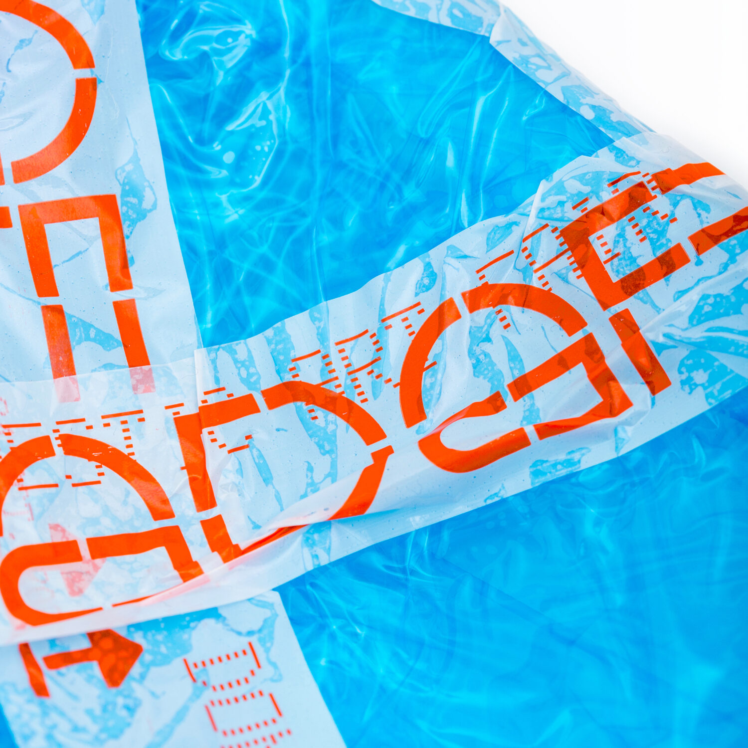
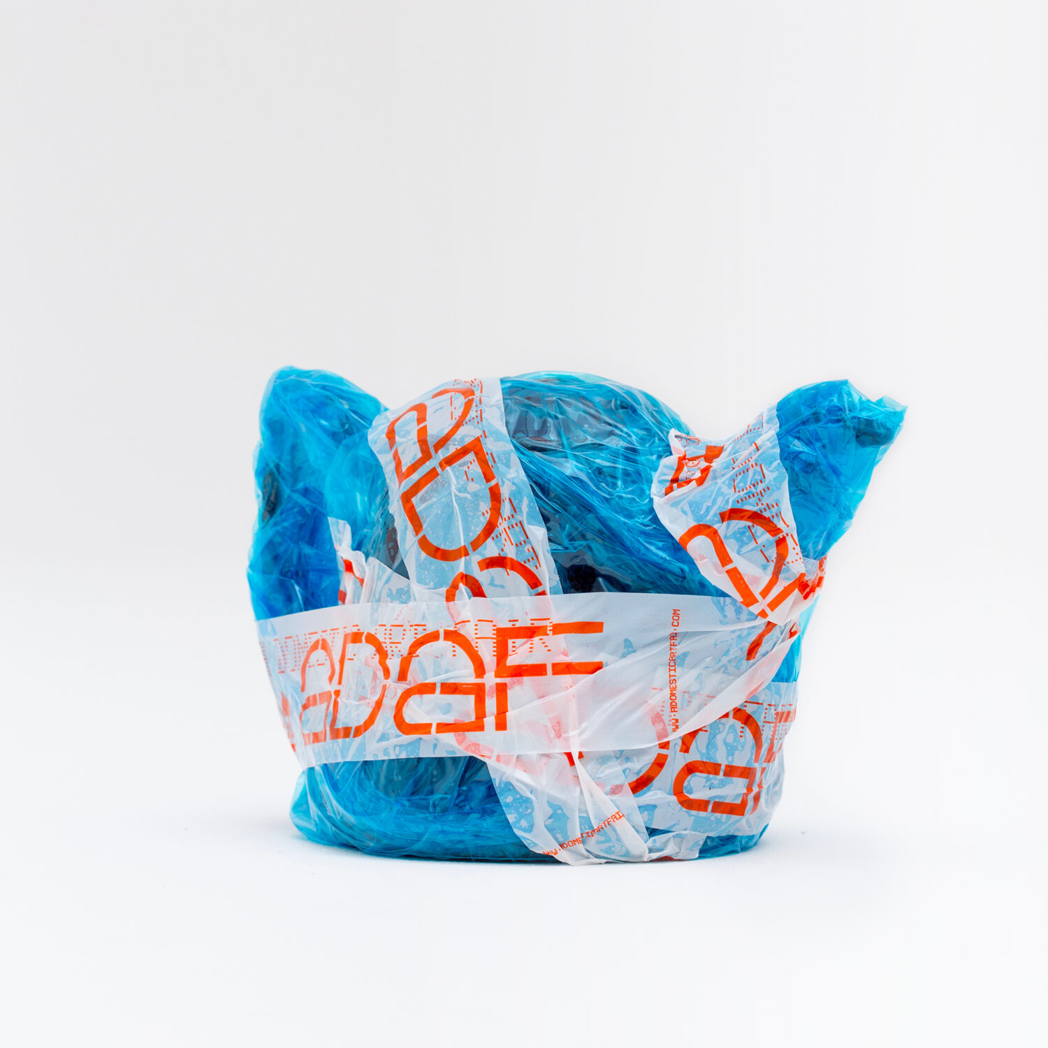
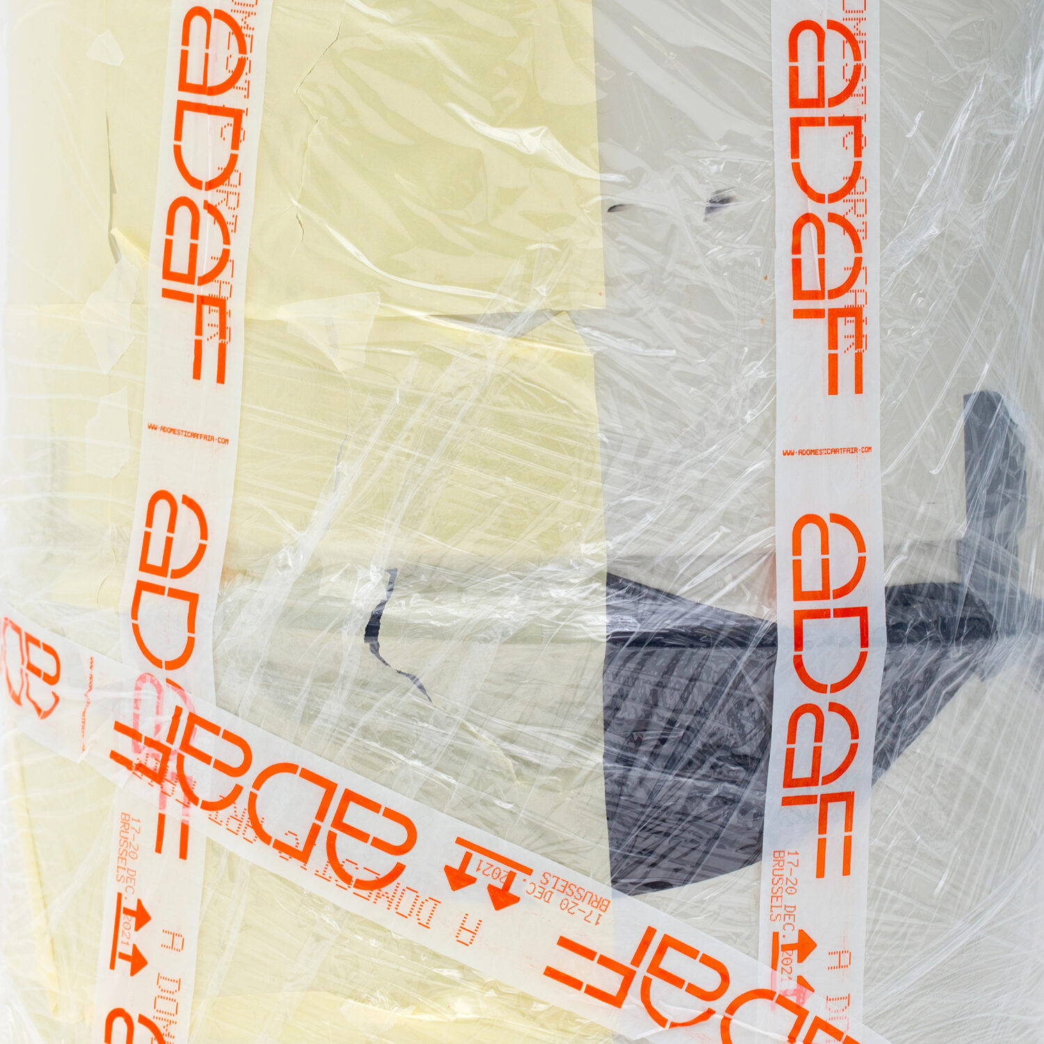
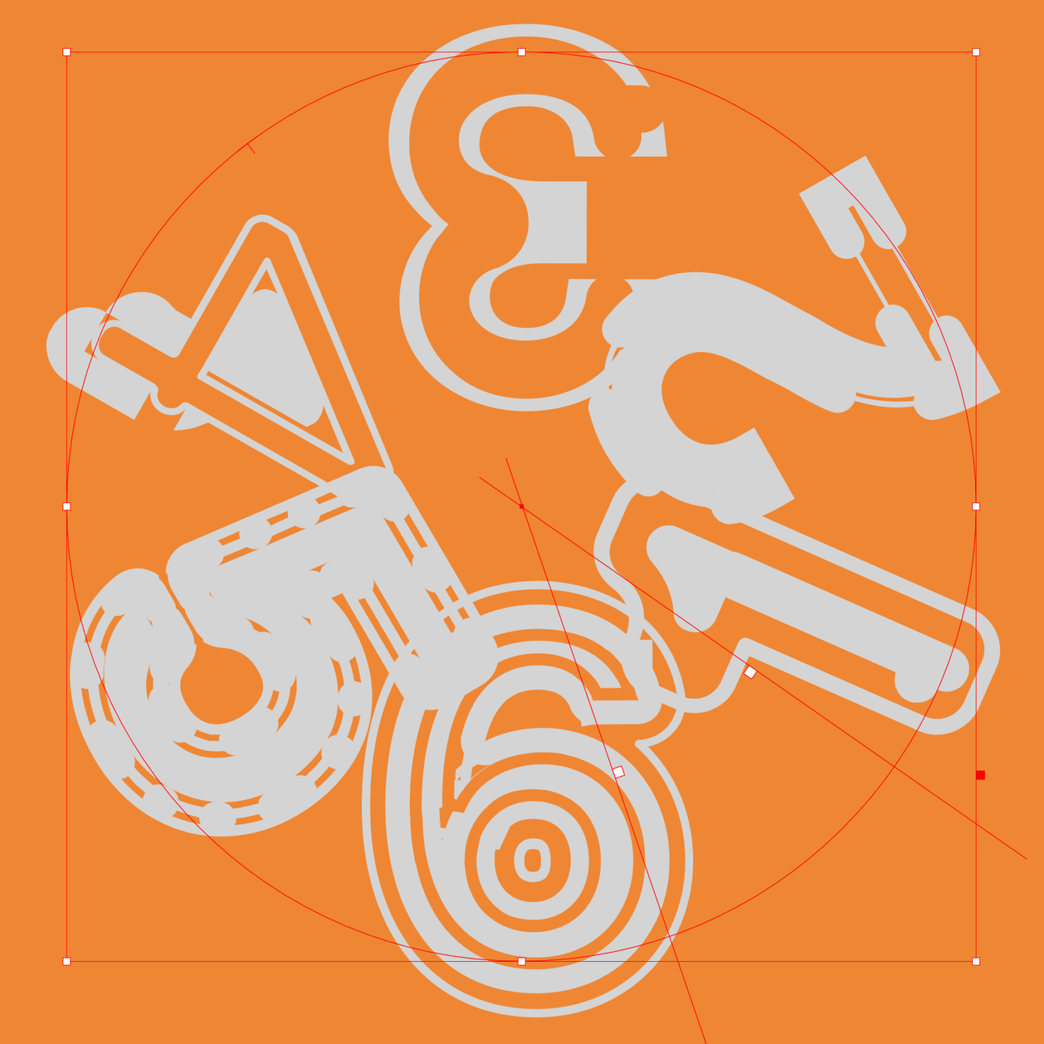
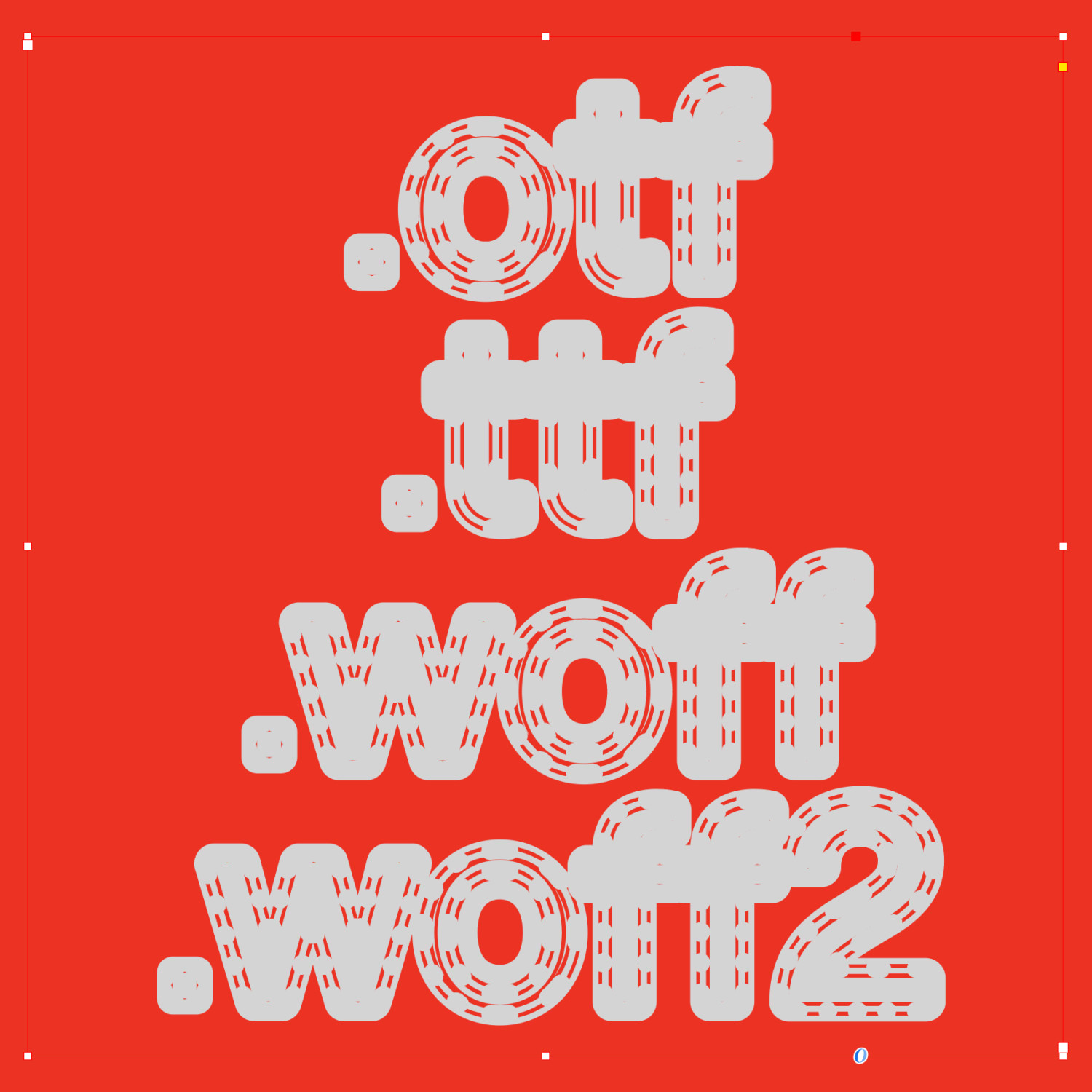
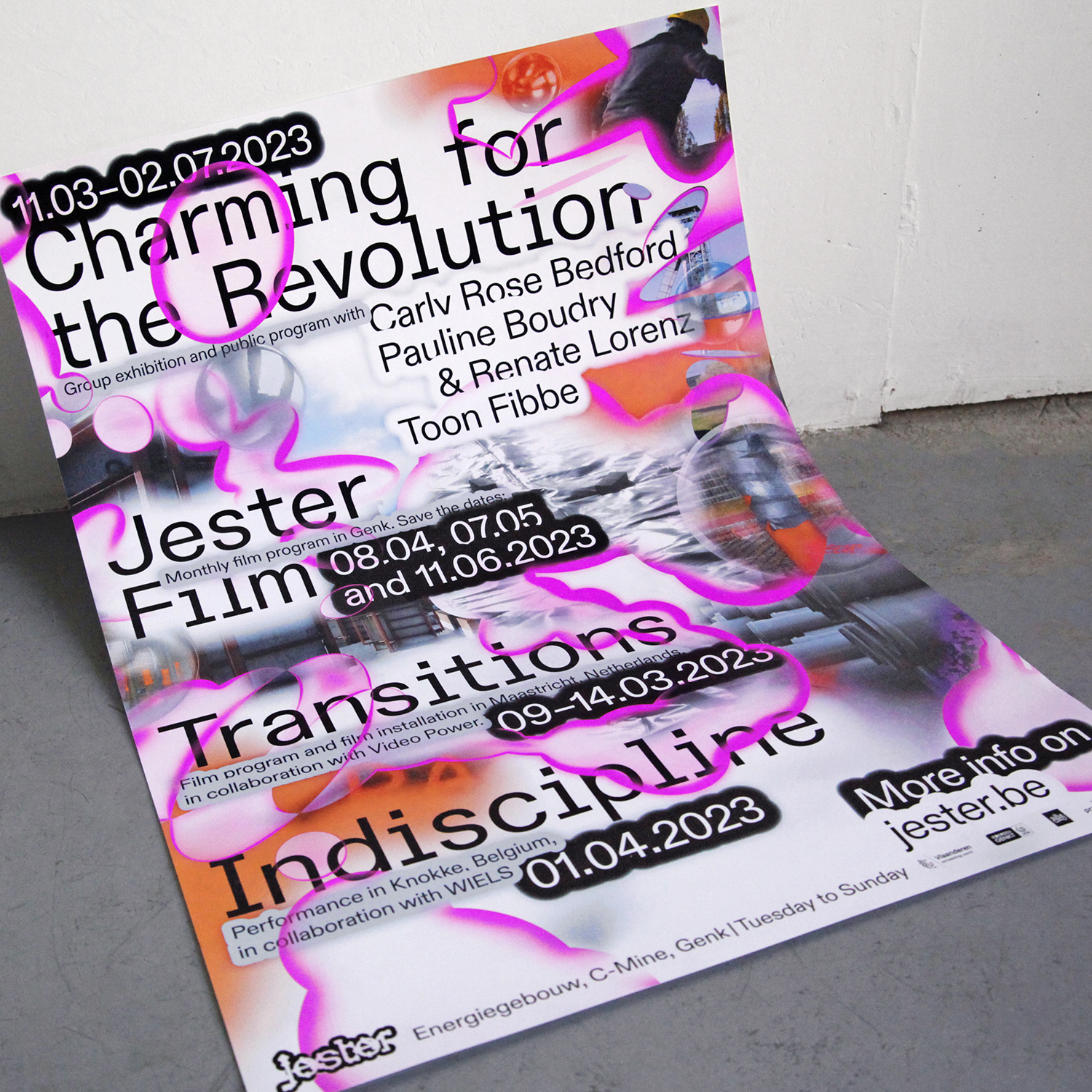
LM: While we don’t have a specific favourite typeface, we have a particular inclination for the Dinamo foundry. Known for its timeless elegance, Dinamo also brings a touch of freshness and modernity to its creations, which aligns perfectly with our aesthetic. By exploring their wide range of fonts, we find an abundant source of inspiration for our projects, allowing us to create both subtle and intense typographic compositions. For example, when we experimented with the Diatype typeface, playing with the thickness of the outline to create a series of varied shapes, telling the story of a material in constant evolution for the identity of the Belgian art centre Jester.
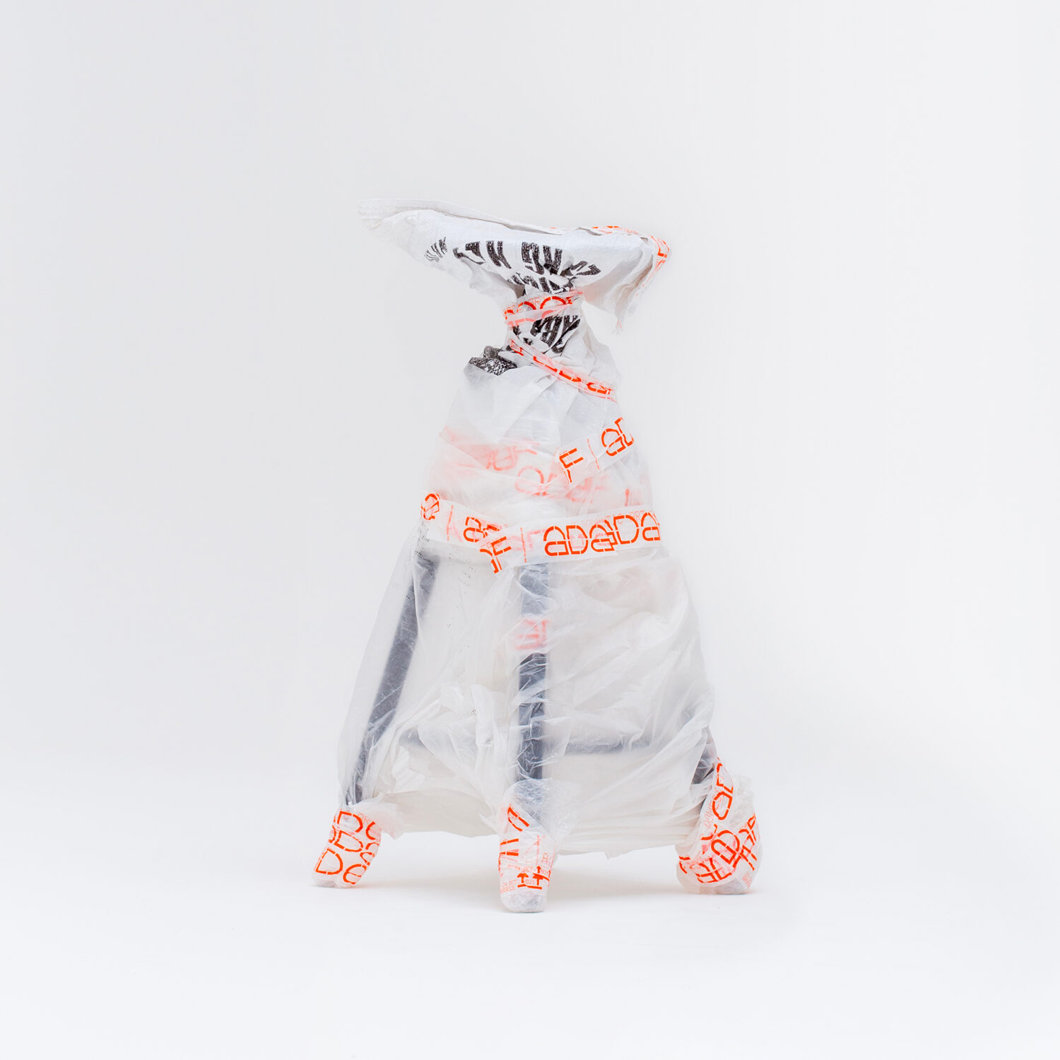
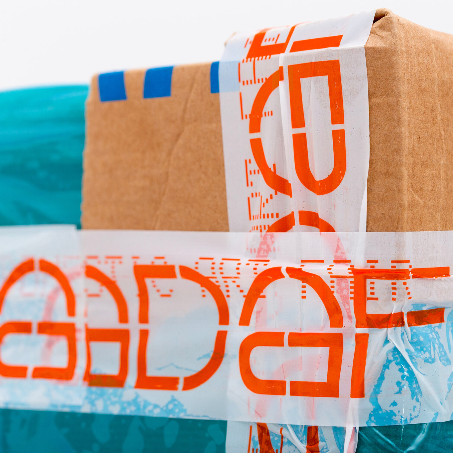
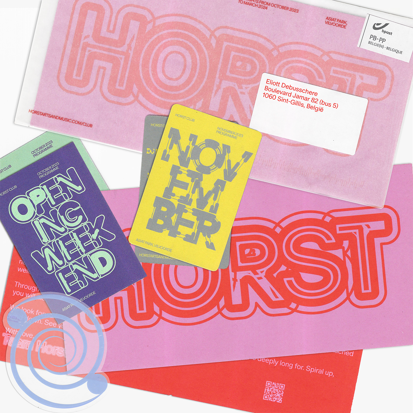
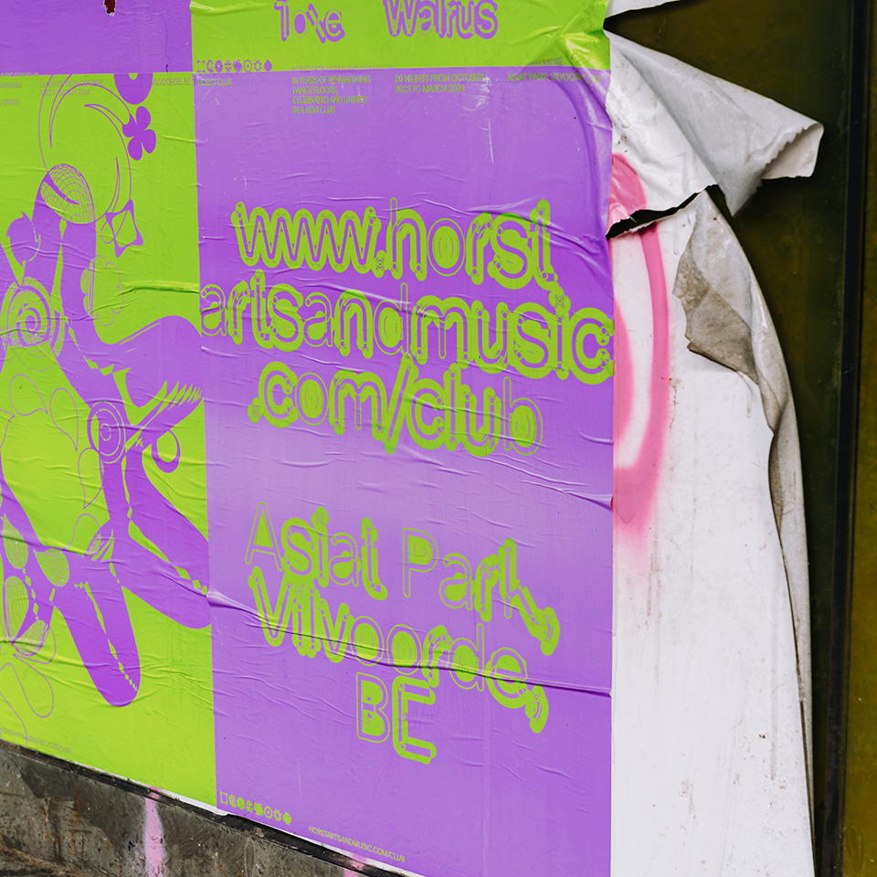
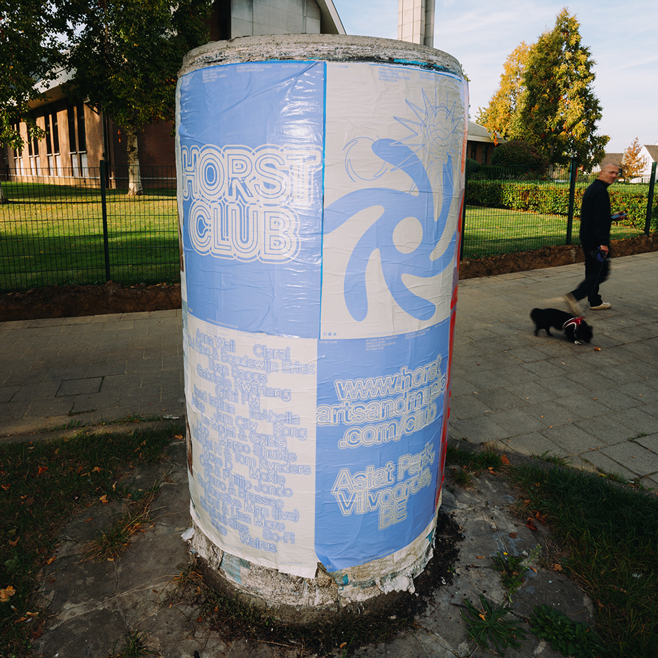
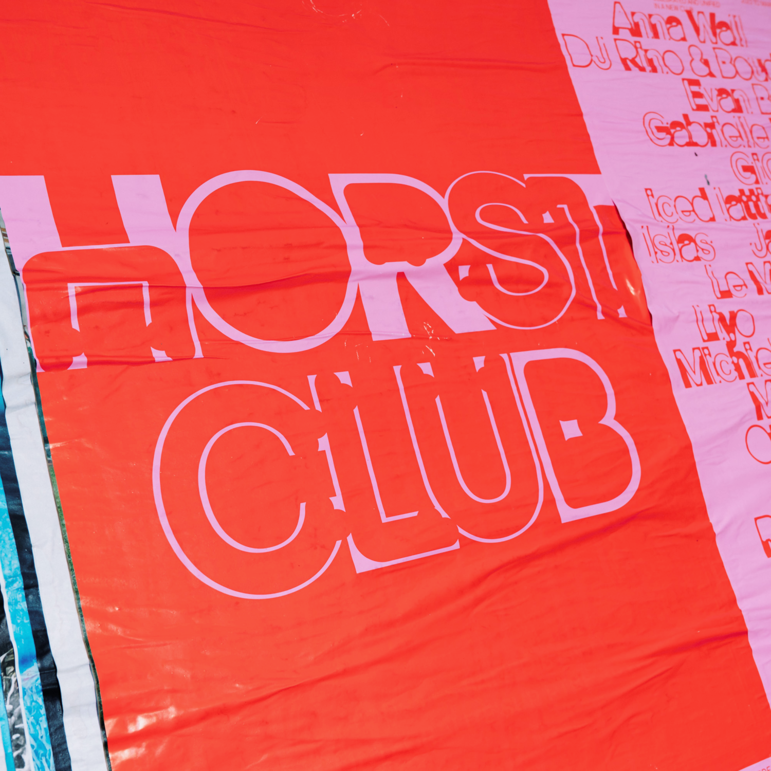
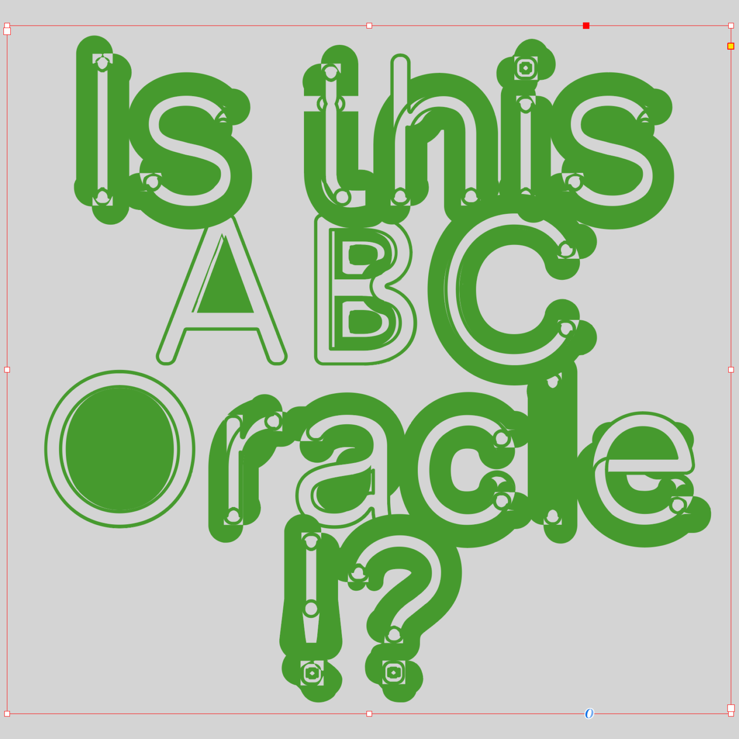
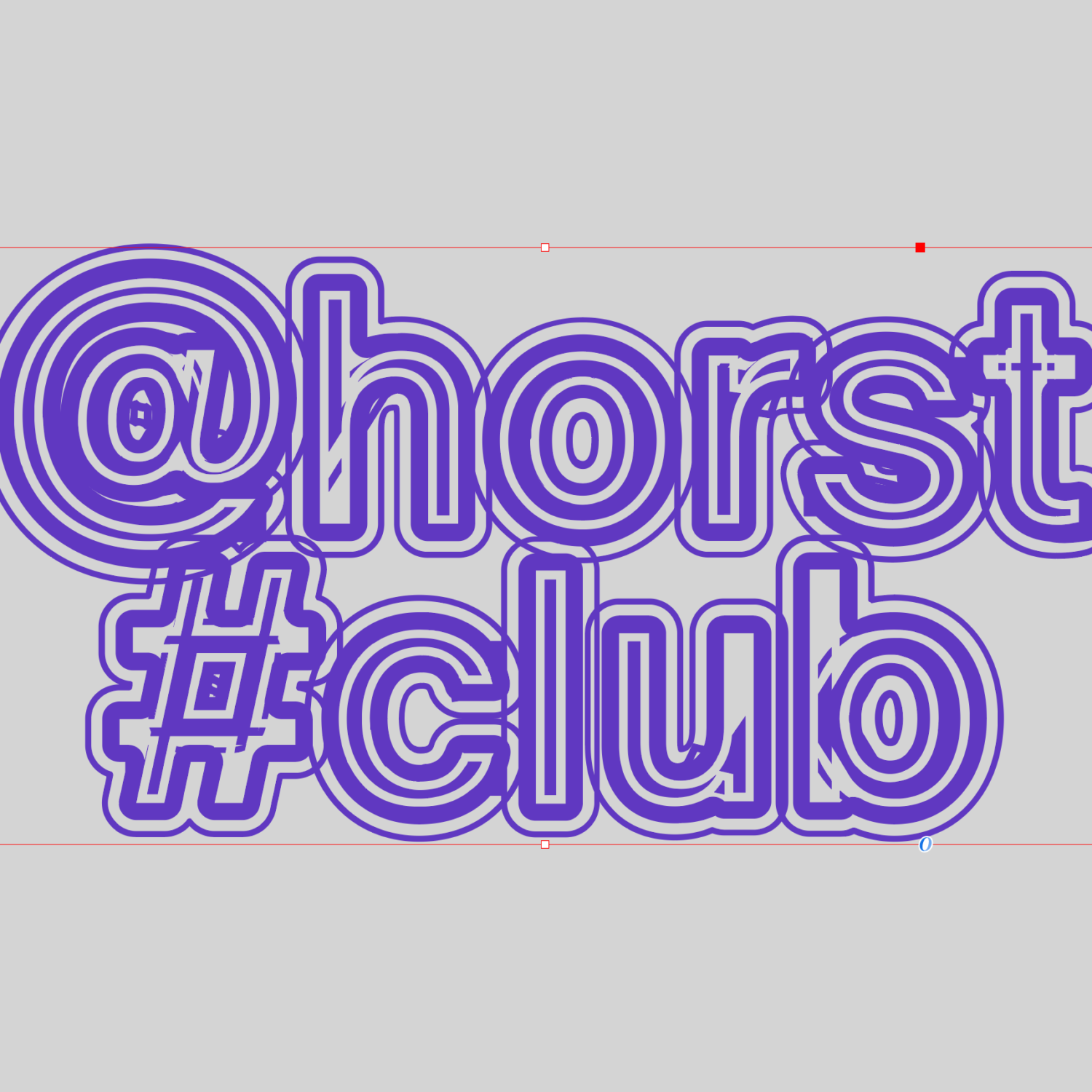
More recently, we disrupted their Oracle typeface for the visual identity of the Horst club. We are grateful to the Dinamo foundry for allowing us to work and experiment with their creations.
RAH: I can tell that the base of a lot of your typography work is Sans Serif fonts. In what ways does Alliage like to experiment with type?
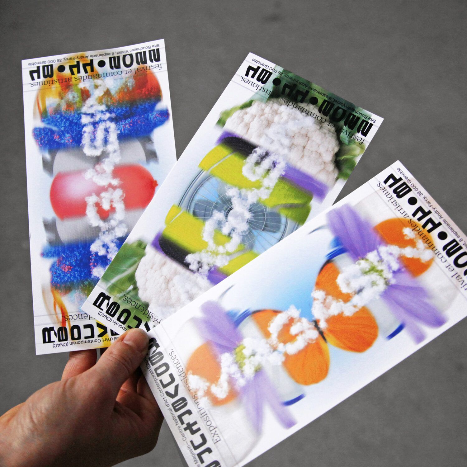
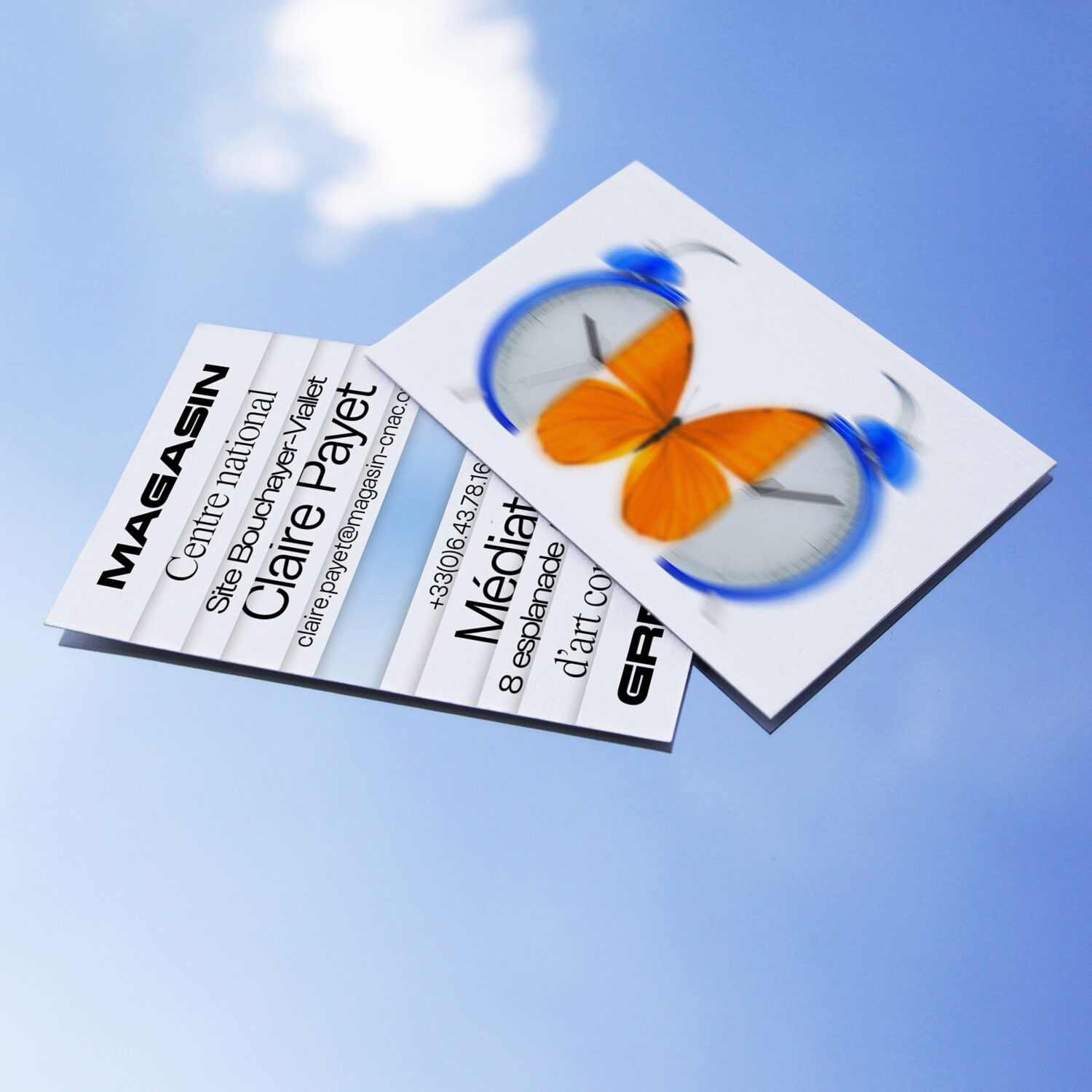
LM: Indeed, Sans Serif fonts are often foundational in our typographic work, likely because of their more ‘neutral’ stance, which consequently allows for ample extravagance. We don’t define ourselves as type designers by any means, but we indeed enjoy experimenting with typefaces – we enjoy playing with fonts to add depth and character to our designs. For example, we explore unconventional font pairings to create visual contrasts and harmonies, as seen in the visual identity of the National Art Center of Grenoble (Magasin – CNAC), where we combined Pizza Typefaces‘ Kern with Florian Karsten’s FK Roman serif and Laurenz Brunner’s Rapid display.
Additionally, we experiment with typography manipulation techniques such as morphing, layering, and distortion to push the boundaries of traditional typographic design. These experiments ensure that each project has its own typographic identity.
RAH: How do you maintain a flow of inspiration? Are there any particular sources or practices that help you and Julien nurture your creative minds?
LM: Whether through walks in nature, exploring city streets, or listening to music, we find moments of inspiration in the rhythms and patterns that surround us. This connection with the environment allows us to approach our projects with a vision anchored in our time and space. Of course, there are other sources of inspiration, ranging from art and culture to design and technology. We believe in the importance of remaining open and curious. Sometimes this happens through collaborations with other designers/artists or even during moments of solitary reflection.
RAH: Are there any design/typography techniques or concepts that Alliage is enthusiastic about exploring in future projects?
LM: We are particularly excited about exploring concepts that push the boundaries of traditional design and typography. This includes exploring new technologies such as kinetic typography, as well as more experimental approaches such as using unconventional materials in our designs. Our goal is to create visual experiences that resonate as they evoke a story and emotions. For example, one time we used video game technology to tell a story about an apocalyptic drowned world, and who knows, perhaps one day we will need to express something through augmented reality.
RAH: What can we expect from alliage in the future?
LM: At alliage, we’re incredibly excited about the future. We envision expanding our team to include talented individuals with diverse skills, allowing us to further elevate our capabilities and offer a wider range of creative solutions. Our focus will remain on pushing the boundaries of creativity and innovation, particularly in the realms of digital design, motion graphics, typography, book design, and print. We’re passionate about continuing to explore new frontiers in these areas, experimenting with emerging technologies and techniques to deliver results that truly resonate with audiences. By fostering a culture of collaboration and exploration, we’re confident that we’ll continue to grow and evolve.
Thank you, Lucile Martin, for the wonderful conversation and insight into alliage’s work. To keep up with her and Julien Pik’s latest creative endeavours, follow @alliage.work on Instagram.
Read more industry interviews here.


