
A look inside Mucho‘s bold new typography-led identity for Big C Charters.
Offering hands-on fishing trips and excursions, Big C Charters is the premier charters service in the San Francisco Bay Area. Founded by 6’8″ former professional basketball player Christian Cavanaugh, Big C gets its name from the big man himself and his local reputation for the biggest catches. With a growing fanbase and fleet, Mucho was called in to rebrand the charters for its expanding business and audiences—the resulting visual identity consisting of a new logo, colour palette, typeface, photography and brand collateral.
“The name Big C Charters presented an opportunity to create an iconic logo,” the folks at Mucho write, referring to the an unforgettably tall, hooked ‘C’ that forms, if you will, the hook of the brand’s identity.
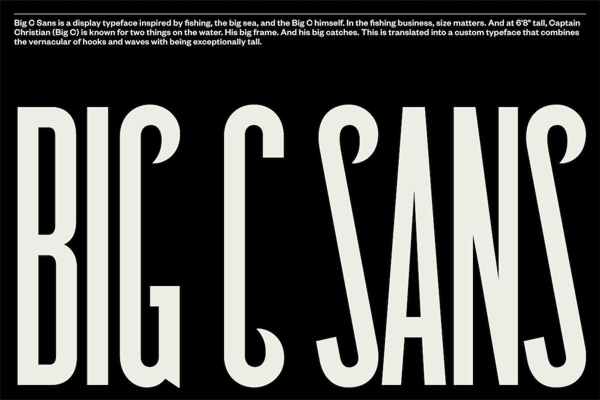
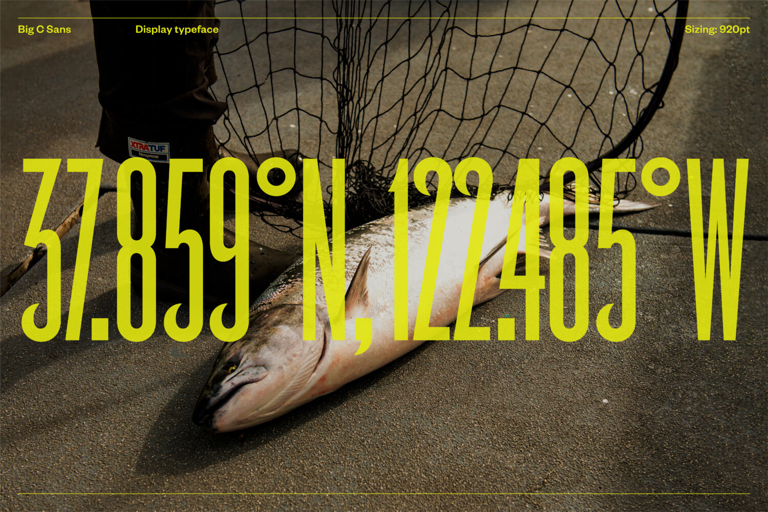
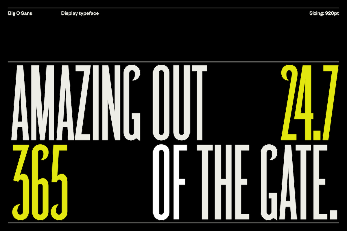
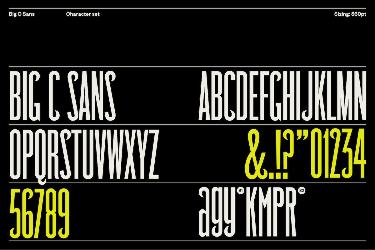
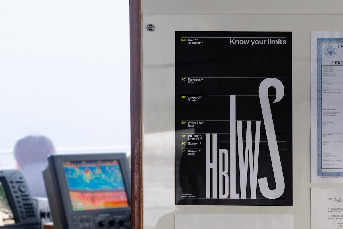
Alongside the Big C symbol, a display typeface, Big C Sans, was developed for the brand. “Inspired by the vernacular of charters,” Mucho explains, “the custom typeface extends the language of symbol. It features elongated letterforms with characteristic fishing hook/wave-like terminals that fuse antiquities of early san-serif lettering with a contemporary typeface. Its usage makes for a high impact, boutique look that is recognisably ‘Big C’.”
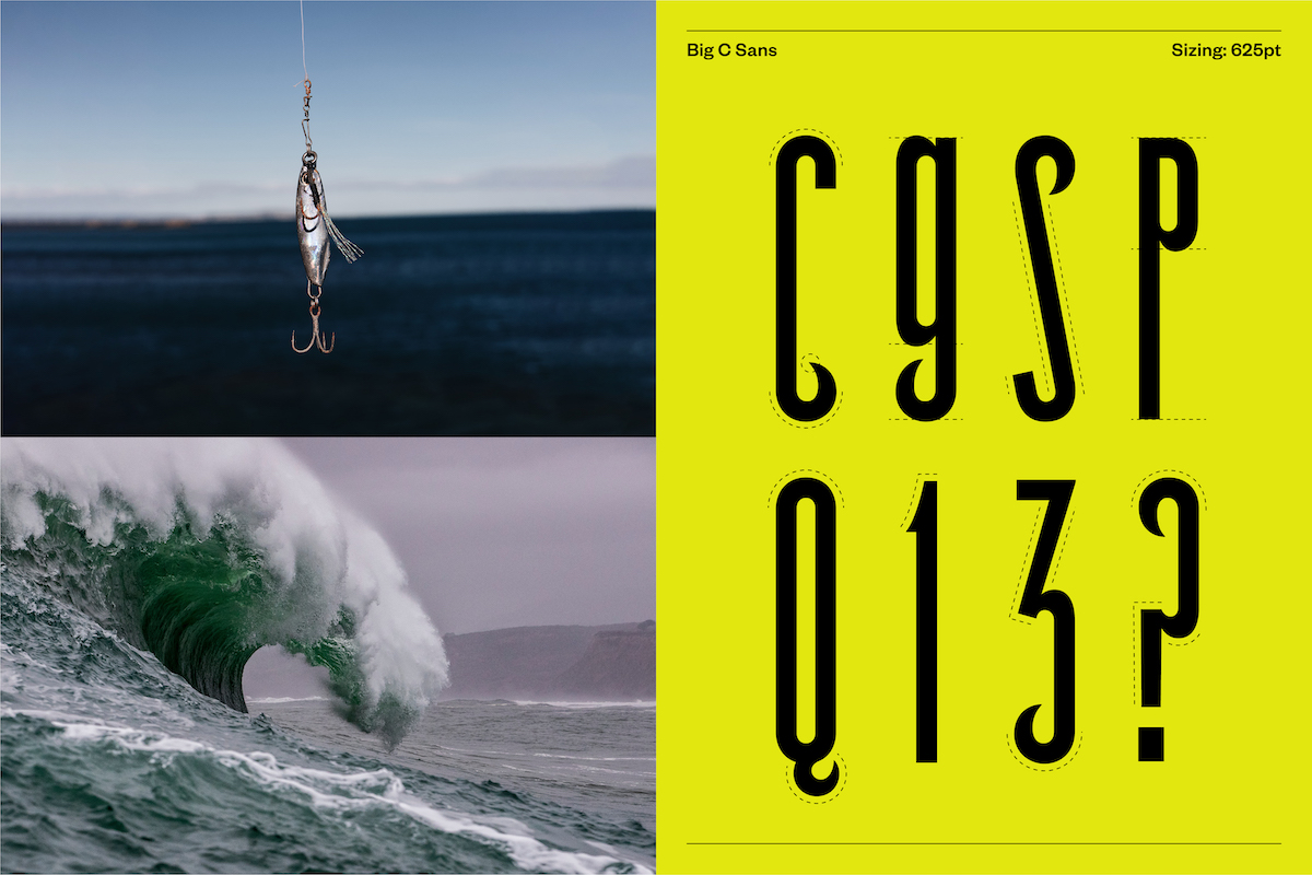
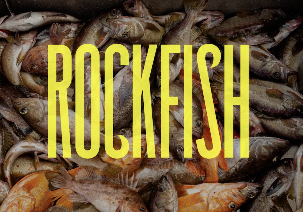
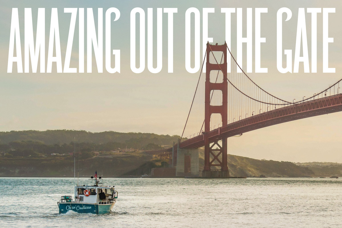
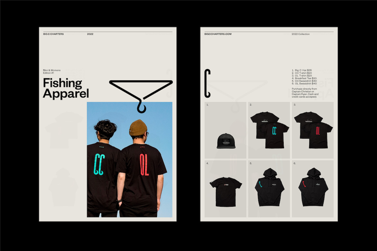
The visual language uses a vibrant palette inspired by the pop of colours found onboard their boats (hi-vis clothing, bait flashers and hooks), resisting the cliché of ‘ocean blues’ to help challenge old-fashioned perspectives around fishing. “Accompanied by reportage style photography capturing real moments on the sea,” Mucho add, “the elements come to together to form a compelling visual identity made to appeal to wider ages and experience levels and sets Big C Charters apart from others.”
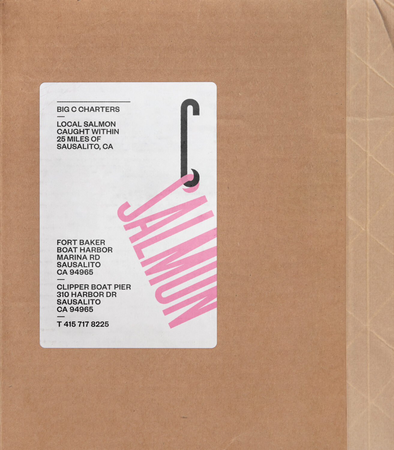

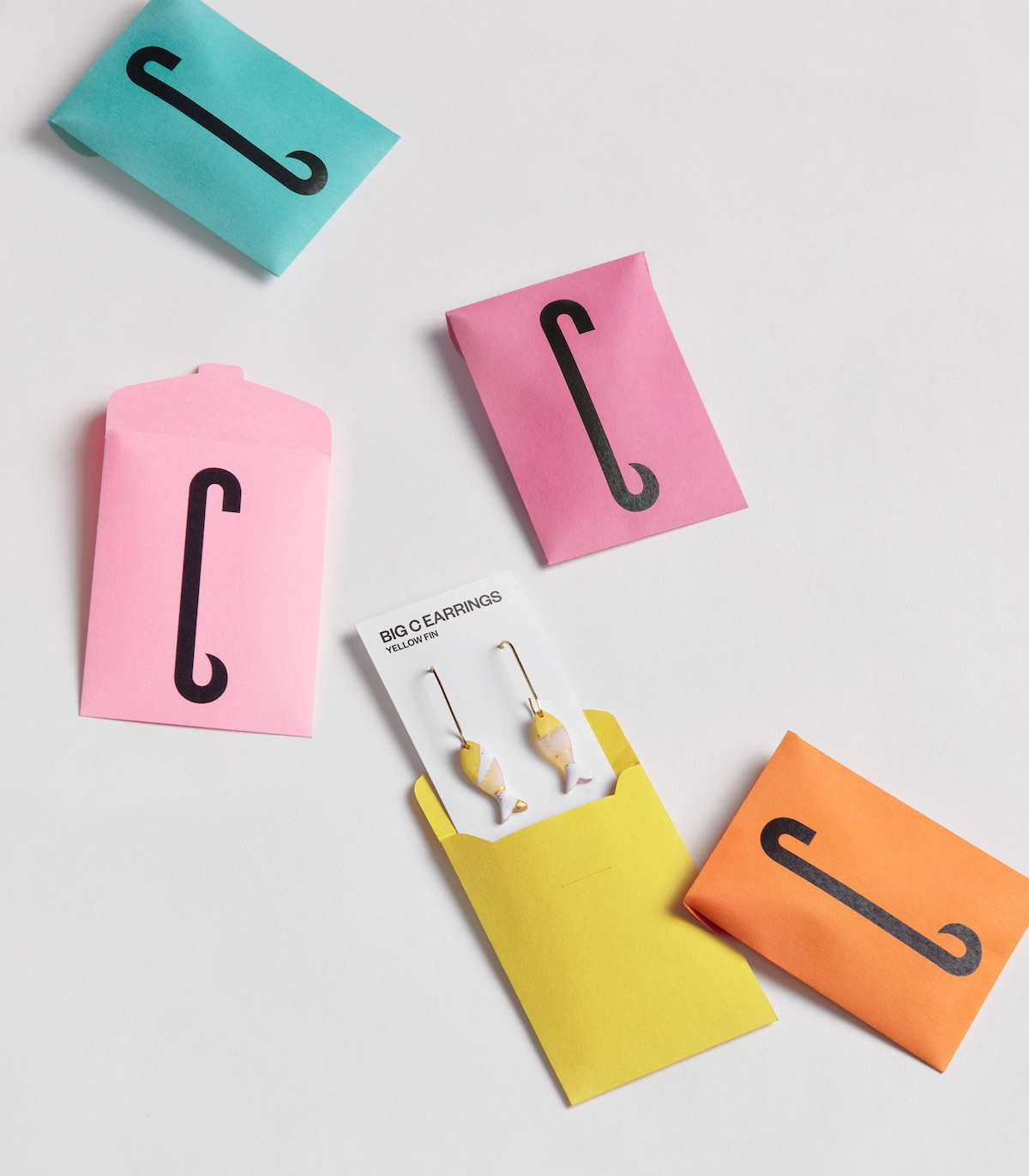
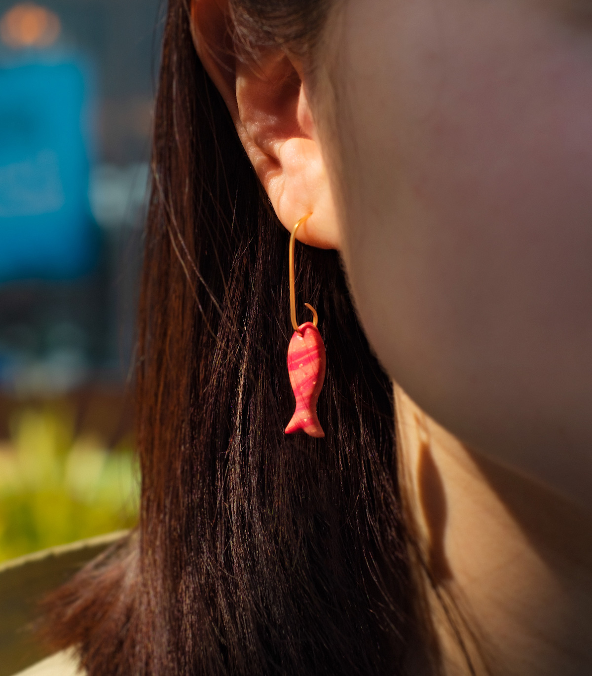
Alongside the thoughtful visuals and custom typeface, Mucho partnered up with a local handmade jewellery maker, Cali Clay, to create a limited edition collection of Big C earrings, further playing on the hook of the C and adding a unique, memorable, personal dimension to the identity. “The visual identity champions the individual crew members and boats that make Big C Charters’ service beloved,” Mucho write, “Crew are given custom jackets with their initials, reinforcing their value to the team and helping passengers identify and put names to faces. Their fleet are also differentiated since passengers often have an attachment to a particular boat and the unique experience on the water it offers.”
Featuring the typefaces Big C Sans by Lyam Bewry and Founders Grotesk by Klim, this identity is an incredible example of the power of type used thoughtfully and concisely—it’s safe to say we’re fans. To discover more from Mucho, follow them on Instagram, Twitter, and LinkedIn.


