
In conversation with Co-Founders Alessio Pompadura and Massimiliano Vitti, we take a look at Due Studio’s new sans serif fonts, Autaut & Lay Grotesk.
Founded in Perugia, Italy, Due Studio is the independent type practice of Alessio Pompadura and Massimiliano Vitti. Specialising in identity systems for corporate and cultural institutions, art direction, print, editorial and web design, they favour a “non-dogmatic” approach to design—experimentation is not only key to their daily method of running a studio, but a cornerstone in the creative process of each of their projects. “Our design is solid and clear, sometimes minimal, others bolder and more irreverent,” the pair says, “we prefer irony over taking ourselves too seriously.”
In Due Studio’s characteristic experimental spirit, Lay Grotesk and Autaut Grotesk were born from a desire to combine a taste of the Swiss typographic tradition with a more contemporary vision of the type design. Both of these new sans serif fonts are reflective of Due Studio’s typographic voice, managing to be extremely versatile whilst also personal.
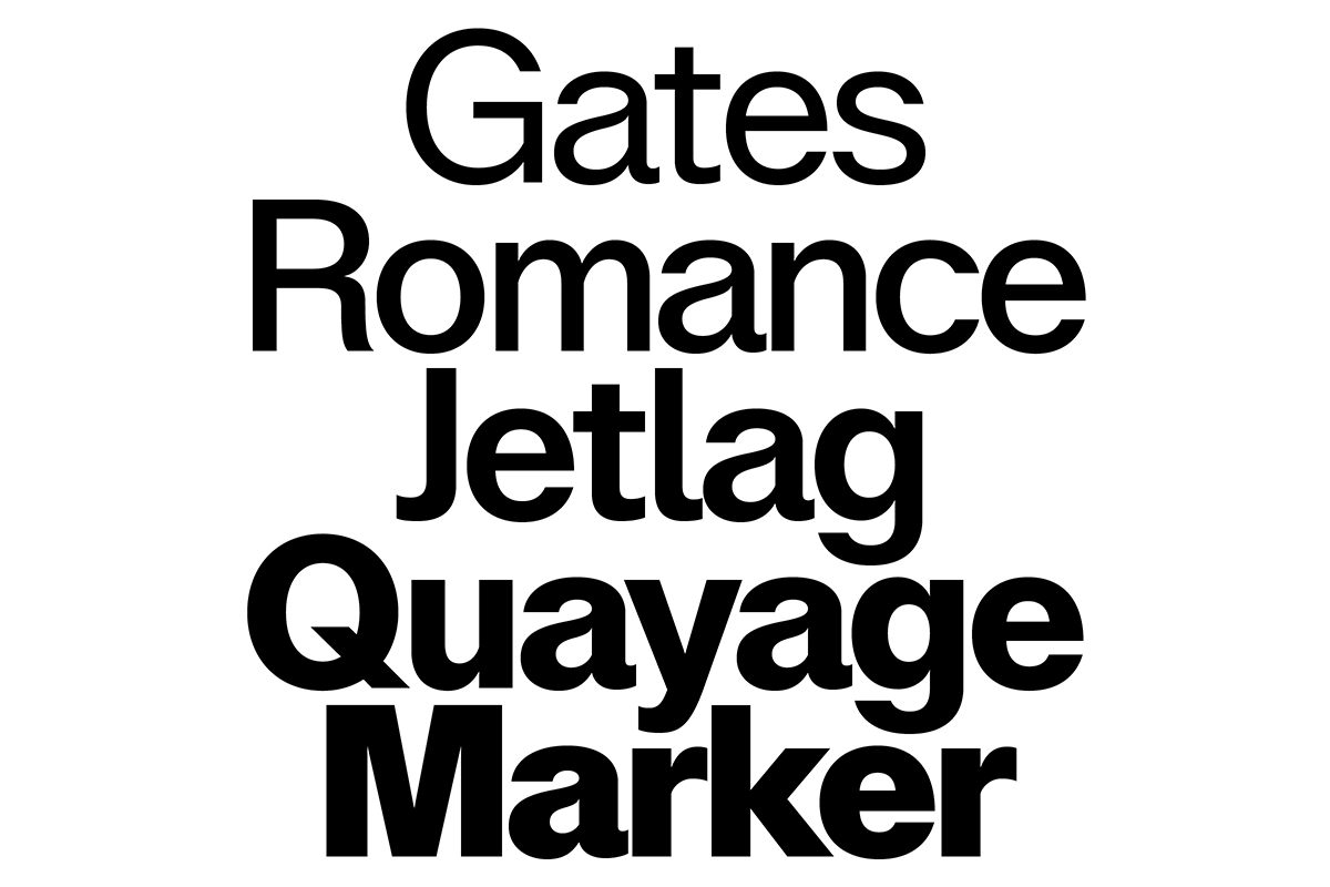
“Lay Grotesk reinterprets the style of grotesks like Helvetica, Neue Haas Grotesk and Folio, and carries on the idea of neutrality while smoothing out their rigidity,” says Massimiliano. “Similarly, Autaut Grotesk draws on the aesthetics and typographic standards of 1960s Swiss modernism, reworking them with a contemporary perspective. Both the typefaces make neutrality the key to their strength whilst also trying to overturn the same concept through their stylistic alternates.”
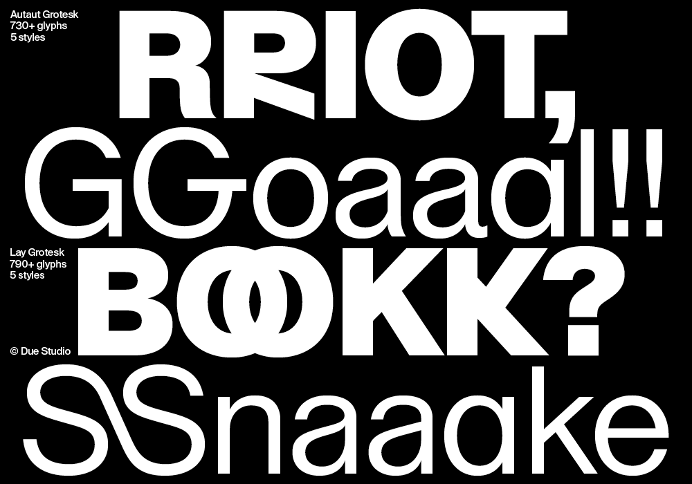
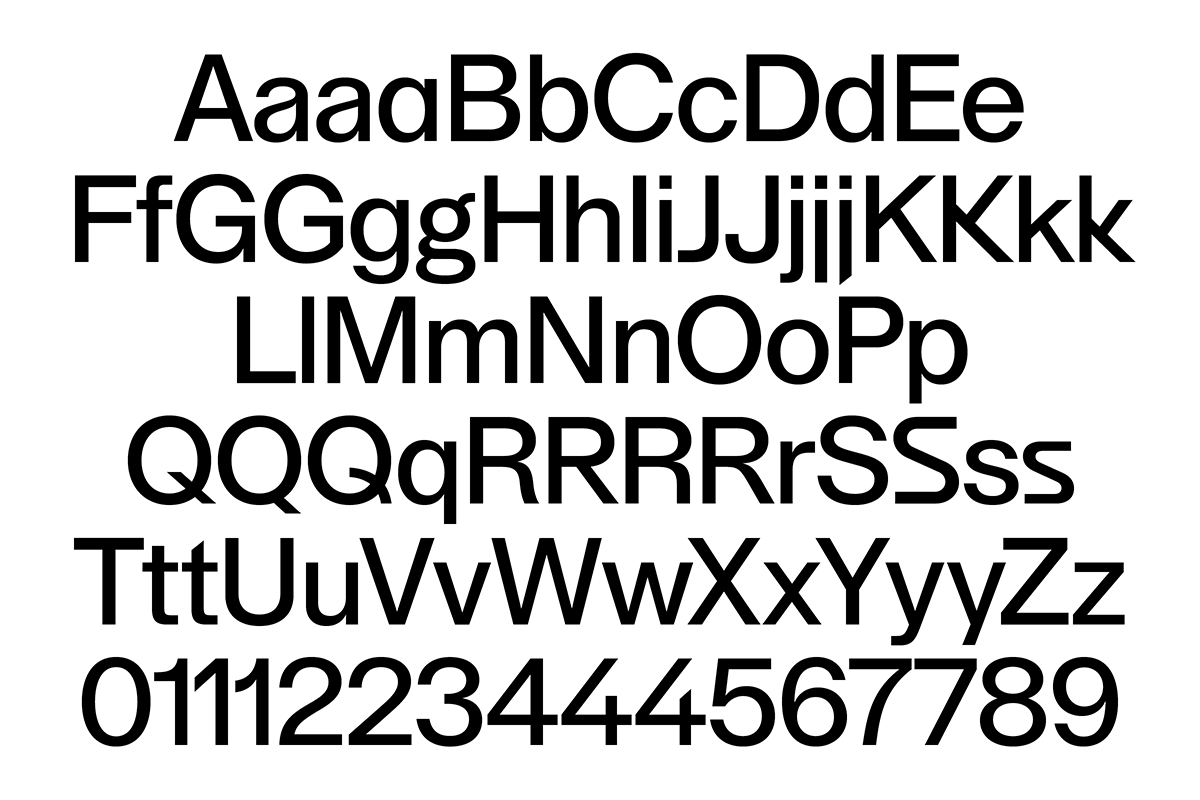
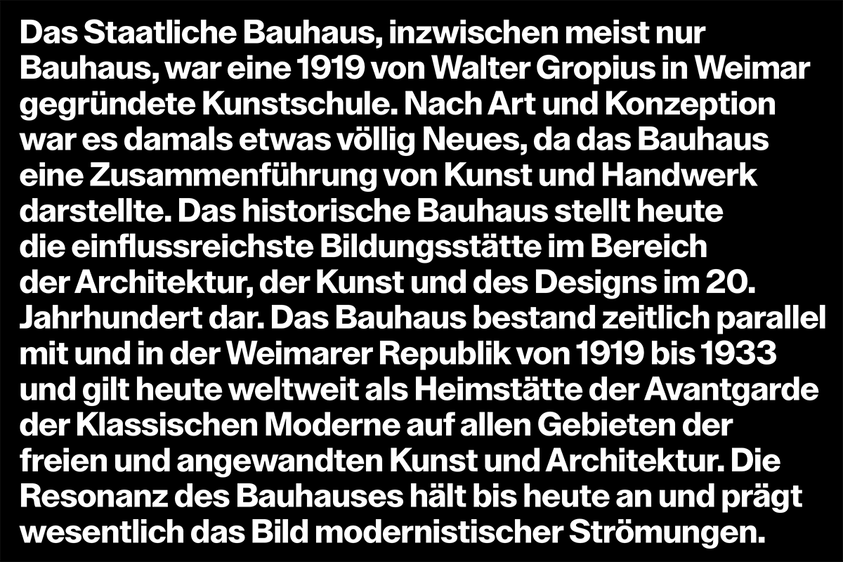
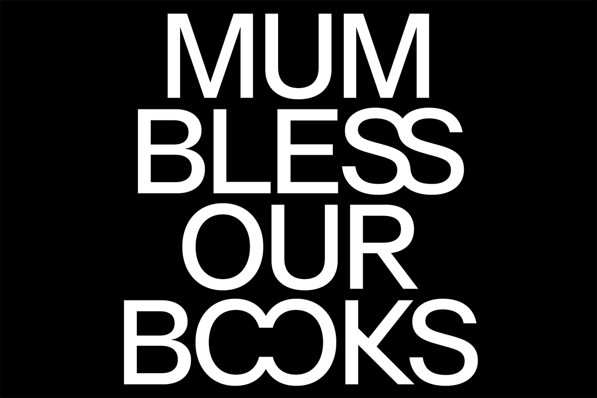
In Lay Grotesk, the evident contrast softens the shapes making the font elegant yet straightforward: no frills or hidden meanings. Thanks to the slightly reduced width of the letters, which allows for denser text lines, Lay works incredibly well at small sizes—however, it’s at larger sizes that its geometric nature gets to shine through. “The name clarifies its intentions: ‘Lay’, a timeless typeface for everyone,” Massimiliano adds. Lay Grotesk comes with 791 glyphs, various stylistic sets, OpenType features and case-sensitive forms, as well as many discretionary ligatures for both uppercase and lowercase.
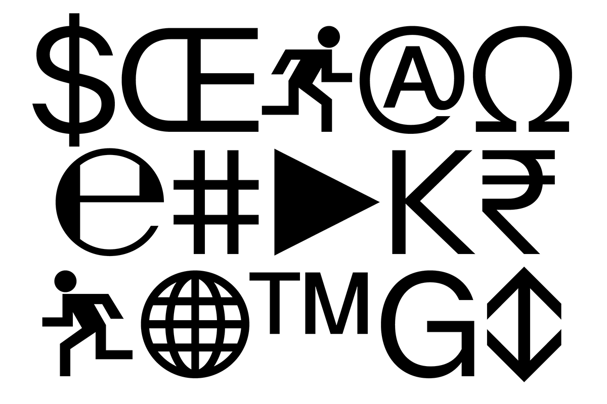

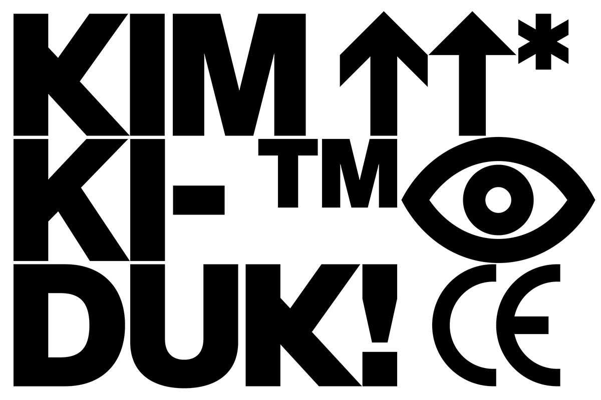
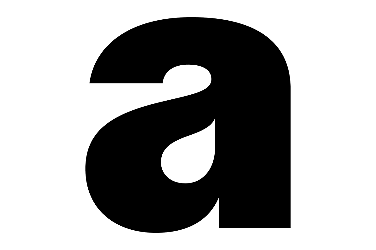
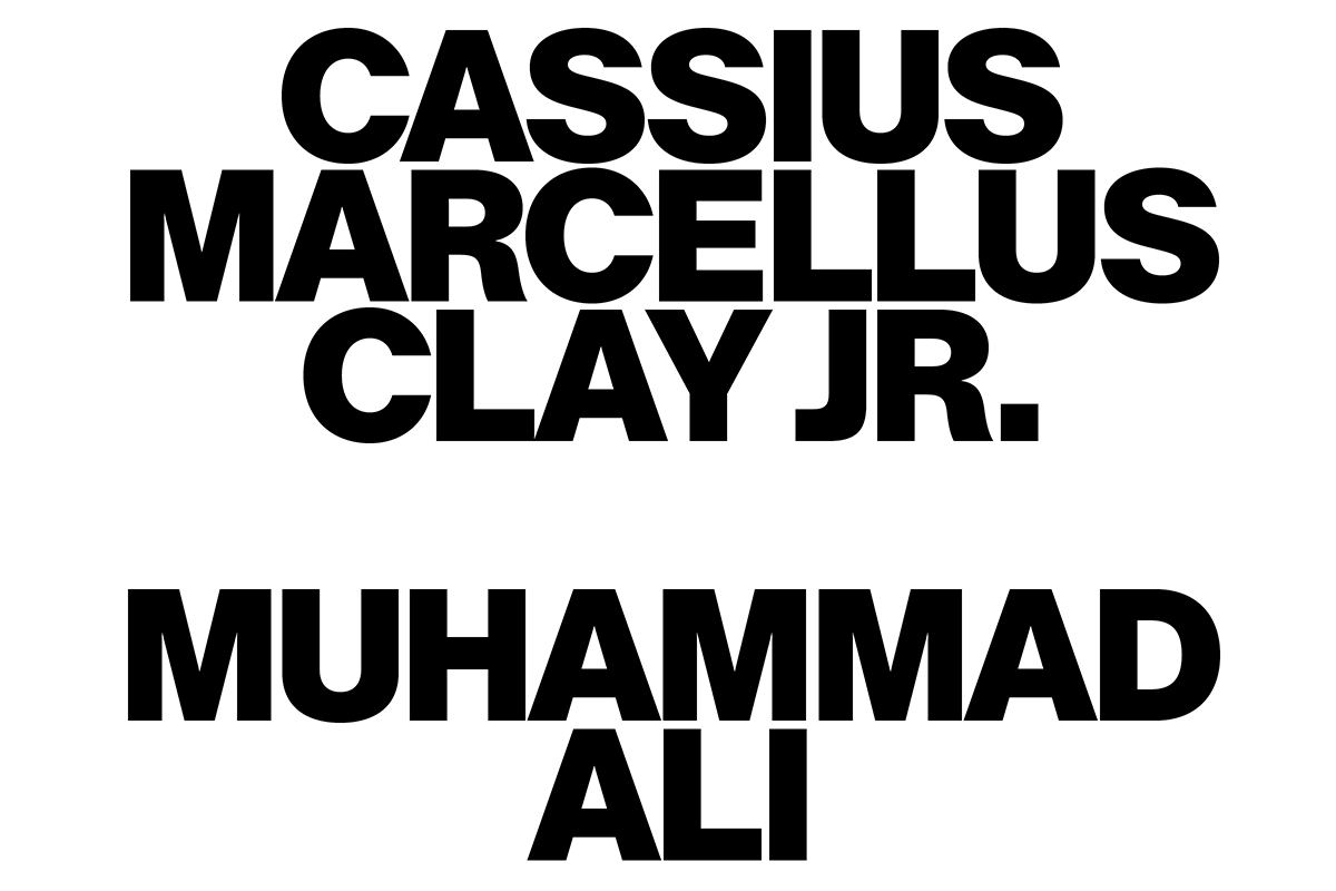
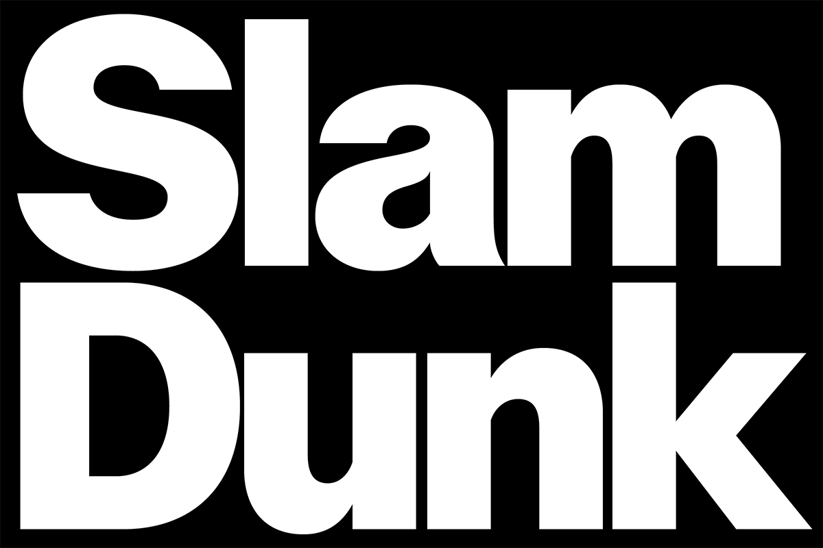
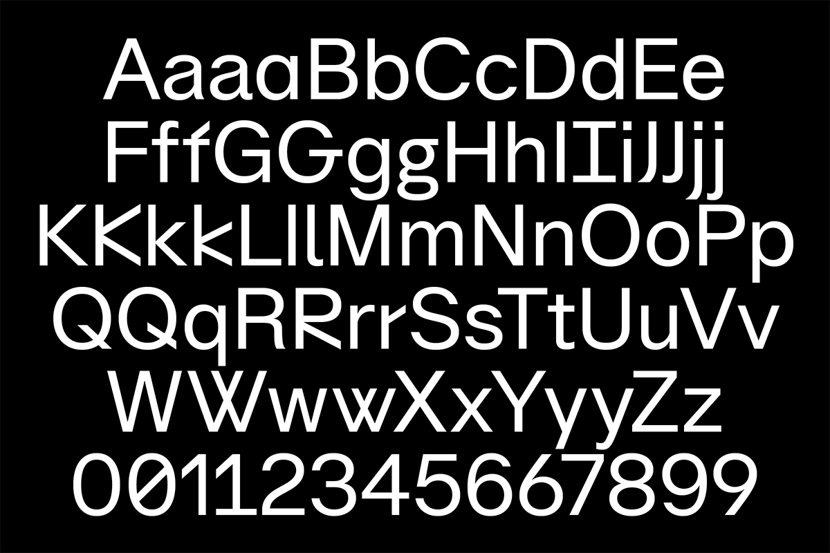
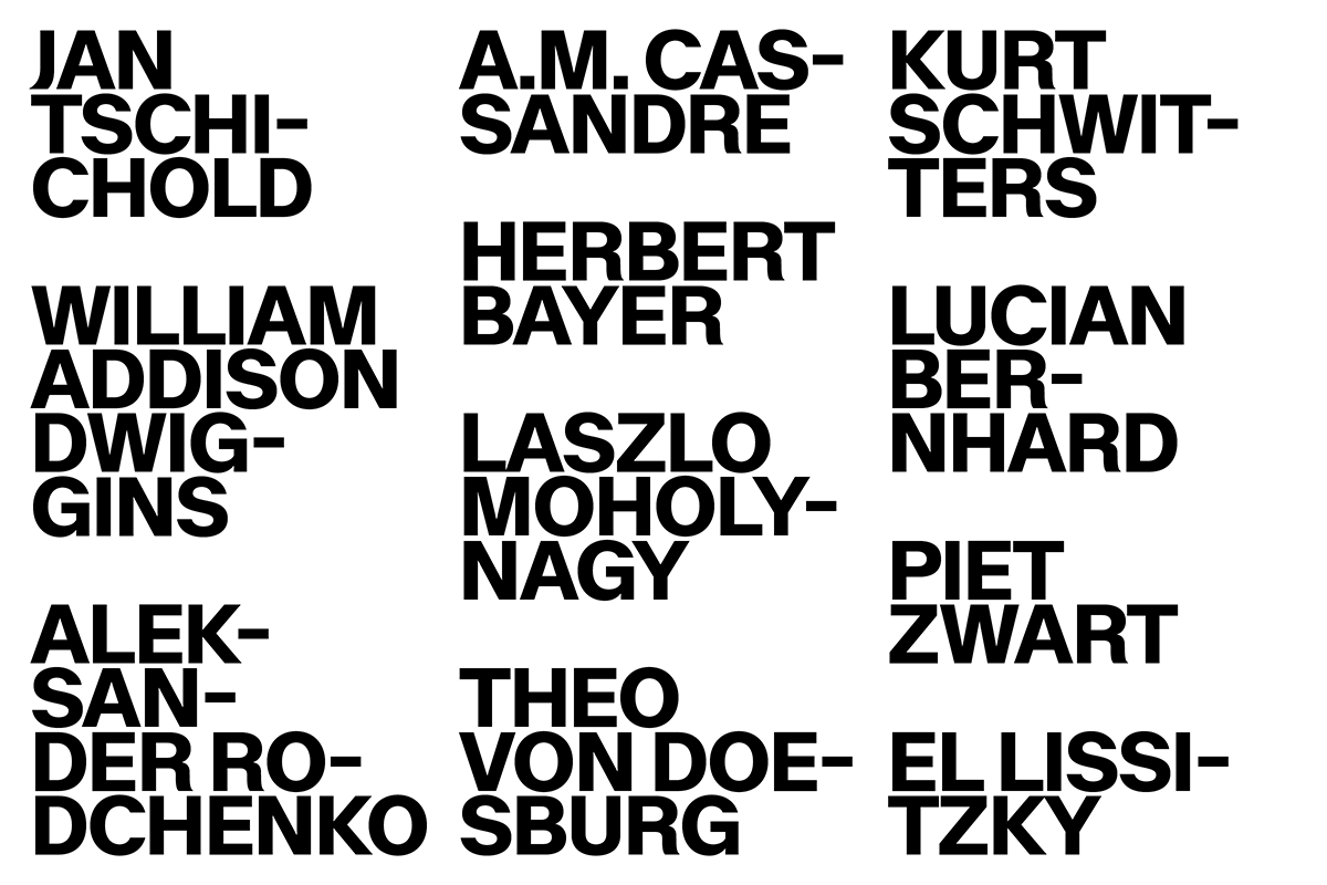
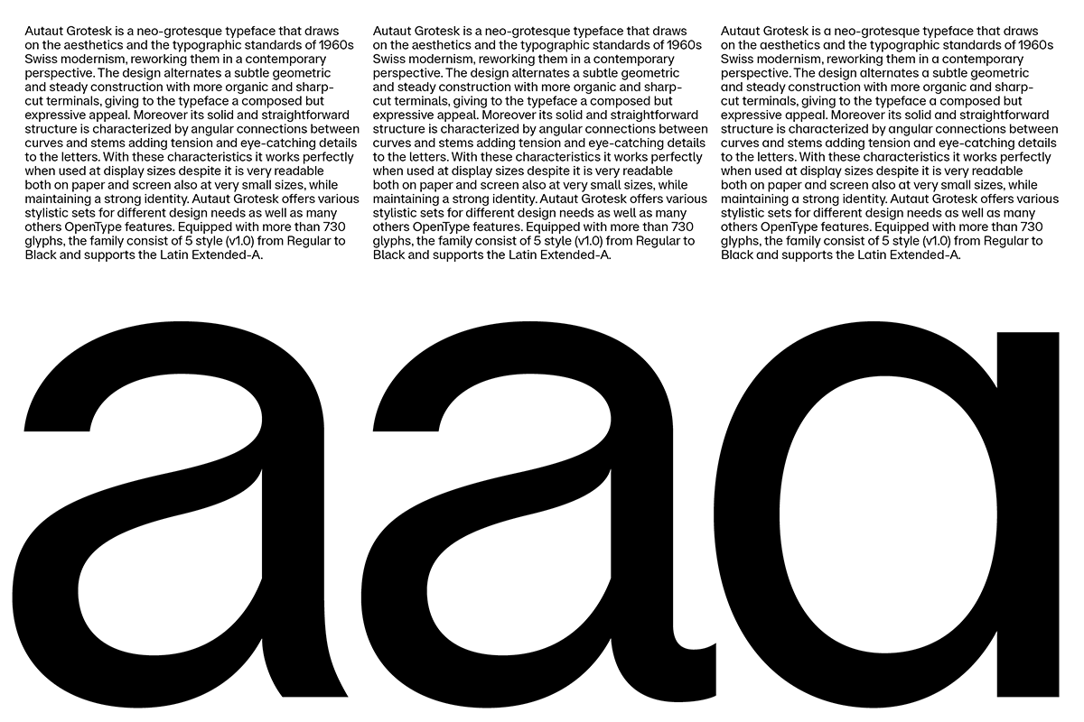
Similarly, Autaut Grotesk’s design is that of a subtle geometric with steady construction, however in this case it’s combined with organic and sharp-cut terminals. Its solid and straightforward structure is characterised by angular connections between curves and stems, adding tension and eye-catching details to the letters. “With these characteristics, it works perfectly when used at display sizes, but it’s also very readable on paper and screen at very small sizes whilst maintaining its strong identity,” Alessio explains. Autaut Grotesk offers various stylistic sets for different design needs as well as many other OpenType features. Equipped with more than 730 glyphs, the family consists of 5 styles (v1.0) from Regular to Black.
You can access both Lay and Autaut Grotesk along with the rest of Due Studio’s font collection on Type Department now. Thank you, Alessio & Massimiliano.


