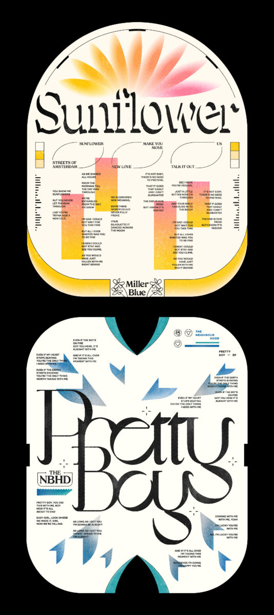
Jasmin Chavez’s portfolio is an energetic kaleidoscope of bright compositions, gritty colour palettes and addictively clever typography. The Singapore-based Graphic Designer uses her Instagram presence @kool.type as an outlet for her gorgeous typographic art, and it’s safe to say we’ve been hooked for a while now.
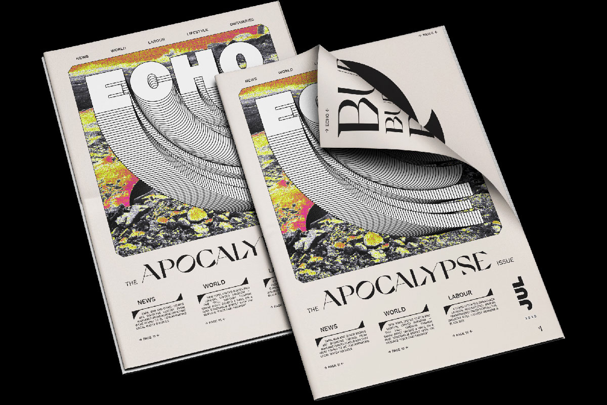
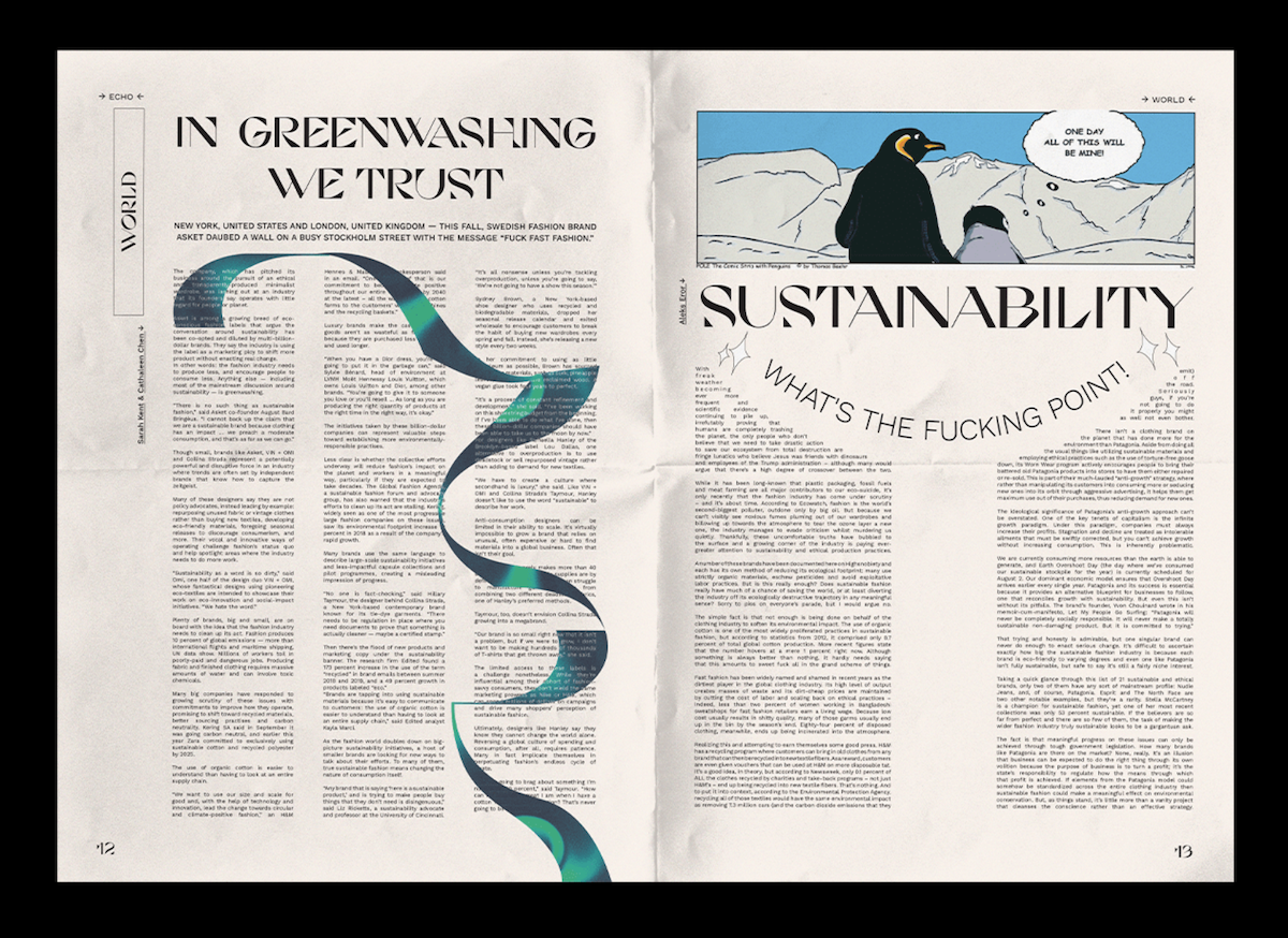
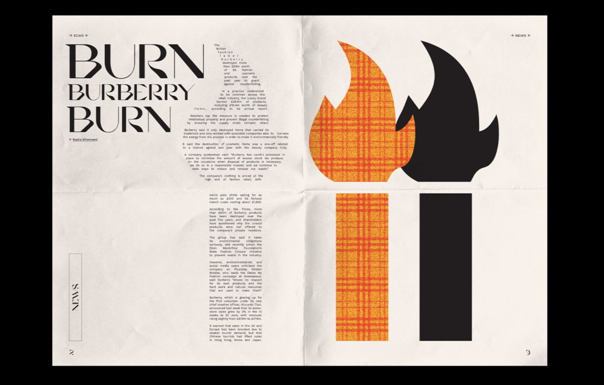
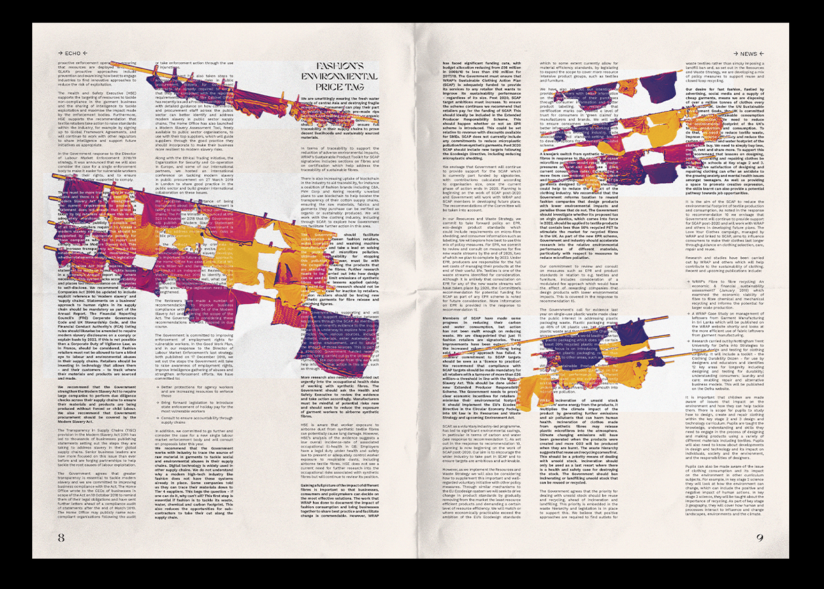
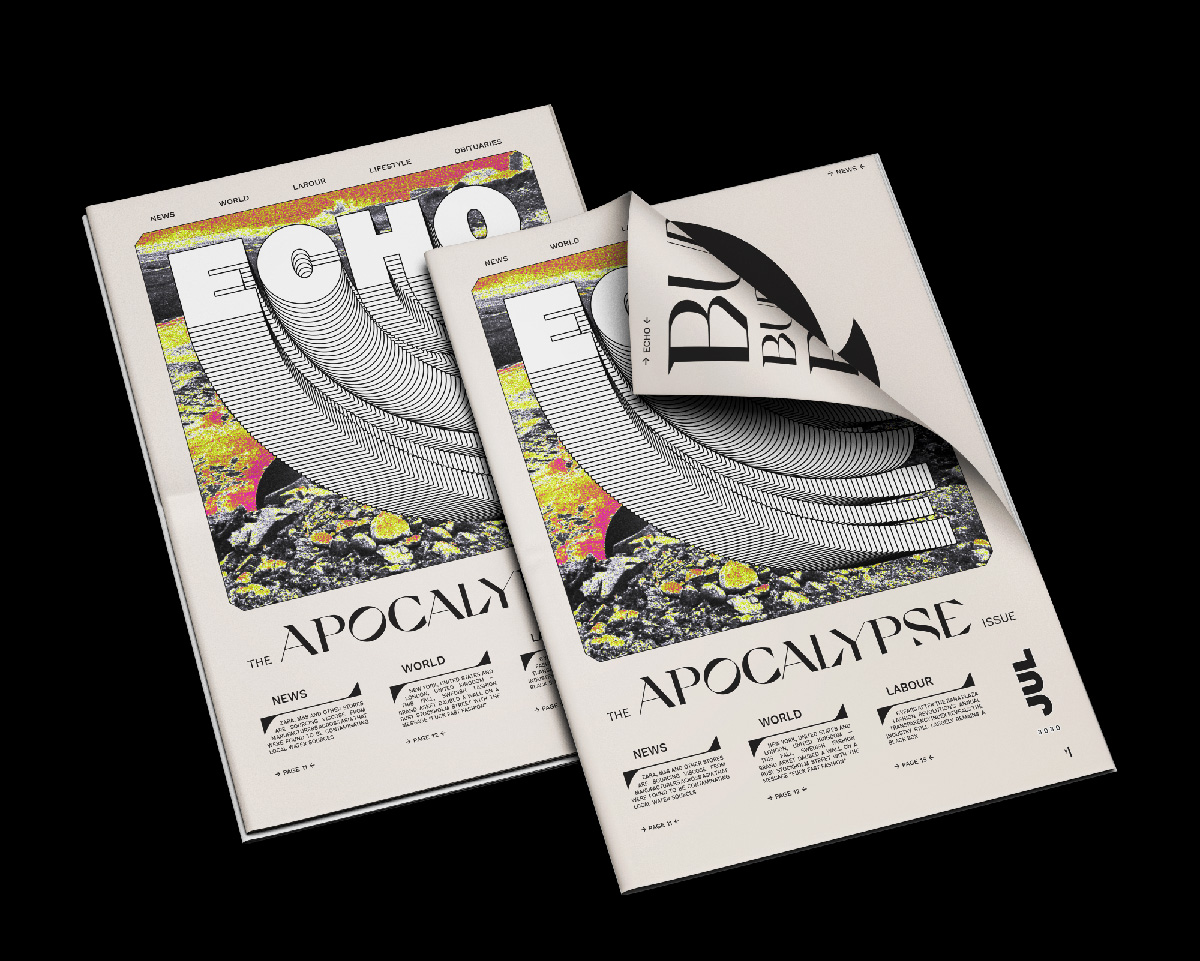
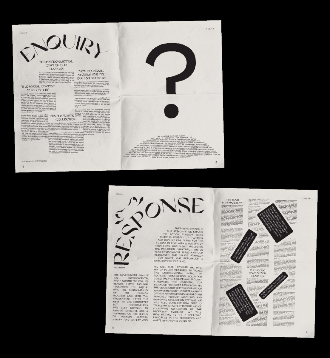
So naturally, when we saw Jasmin’s project ECHO Paper, we wanted to hear more about it. ECHO Paper is a newspaper set in the future which stands as an ominous warning about the current fate of the Earth; presenting a dystopian future which calls viewers into action on climate change, ethical consumption and sustainability. With body copy set like natural formations and buildings crumbling into ruin alongside a disjointed sense of urgency throughout the headlines, ECHO Paper takes an intelligent, engaging look at issues of fast fashion, the environment and sustainability. We’ve been chatting with Jasmin to find out more about ECHO Paper, her opinion on the future of design for print and to learn more about her practice.
Can you tell us a bit about your ECHO Paper project and the messages involved with the visuals/typography?
The ECHO Paper has been one of my favourite and most memorable school projects because it was the final year project completed amidst the first few weeks of the pandemic. The brief was to present the truths and myths on sustainable fashion and publish it in a more compelling and creative manner. We were tasked to develop and curate content that’s designed to inspire and engage the reader to ask ethically conscious questions on their next fashion purchase, in the form of an A3 sized publication.
I approached the brief by creating the sustainable fashion newspaper titling it “ECHO Paper”, giving the newspaper’s issue the theme “Apocalypse”, which essentially highlights the key failures humans have contributed to the environment through the fashion industry. Opposed to the conventional way newspapers deliver their news, I wanted this issue to not only inform but also frighten the reader as the fictional paper is set in the distant future – where the Earth has possibly experienced countless environmental crises to cause enough alarm.
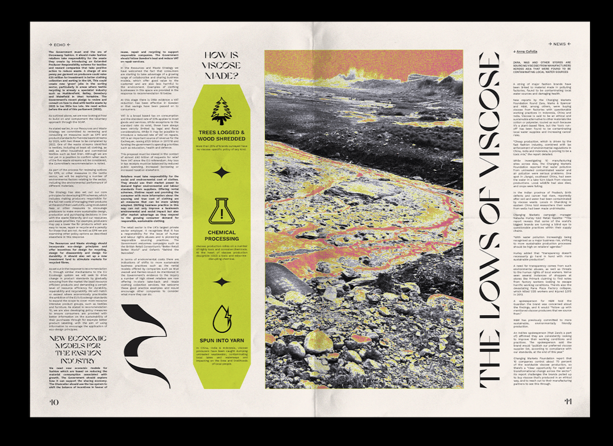
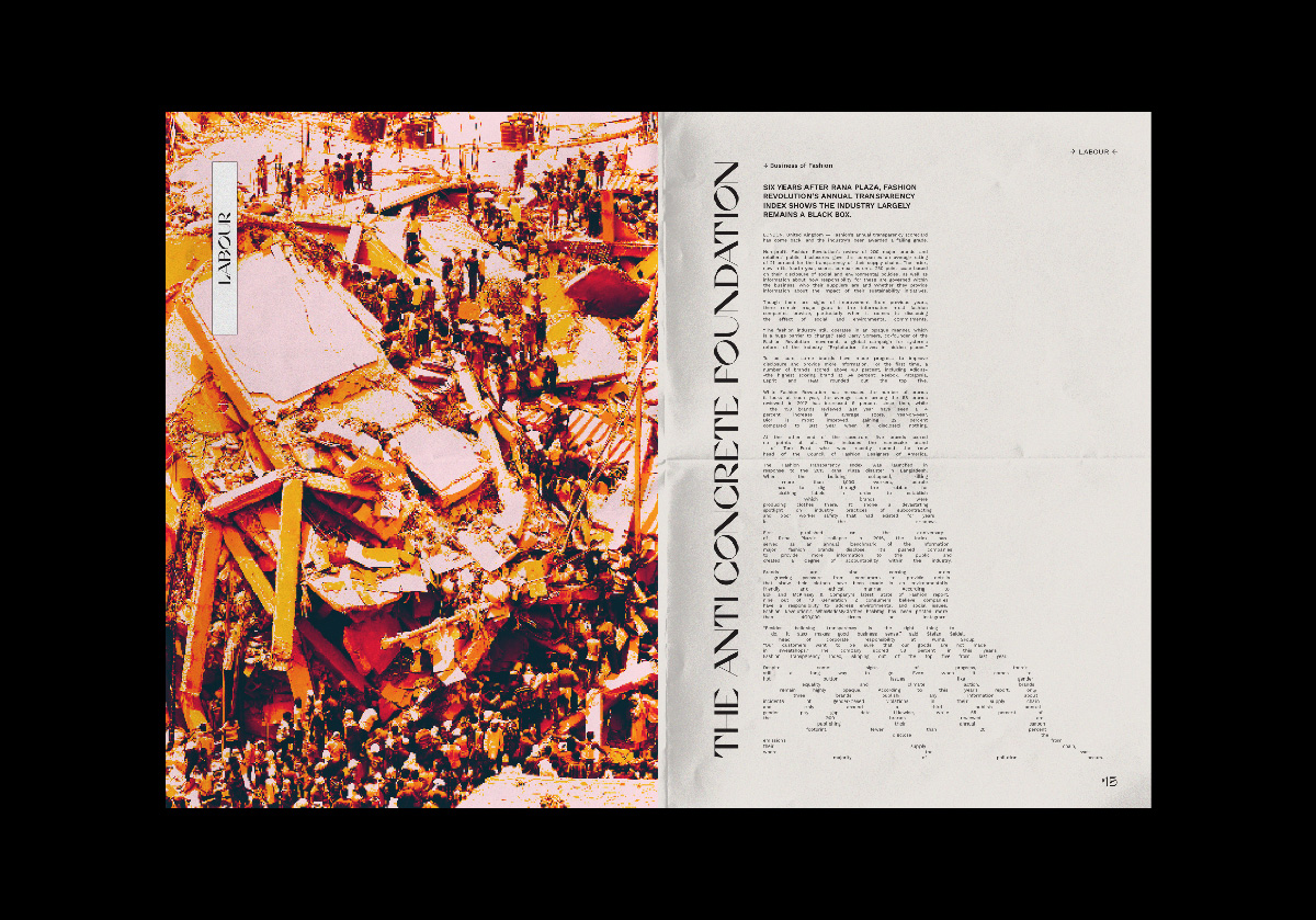
One of my favourite spreads from the paper features an article titled “The Anti Concrete Foundation” which discusses the Rana Plaza garment factory collapse in 2013, and how the fashion supply chain negatively impacted their workers. To visually communicate the situation’s distress through type, I manipulated the article’s body copy to represent the collapsed building, where the last few paragraphs were spaced out and broken up to illustrate the remnants and debris from the accident.
Overall, I was really satisfied with the outcome of this project as this was where my love for type actually began – discovering unique type forms and experimental layouts which I had not delved into enough in previous school projects.
Print is such a beautiful thing when it comes to graphic design and type – do you think print is a sustainable art form looking forward?
I for one am a firm believer that print is not dead. Of course, print’s sustainability in the future lies in the hands of the designers and the businesses producing it. As far as I’ve observed, the graphic design community has been doing an excellent job keeping the print flame alive. I feel it’s a vital part of being an artist and designer: consuming, collecting and producing print. So yes, I think it will continue to stay socially relevant for a long time to come.
I will admit I do understand the rising concerns that websites like Twitter and blogs would eventually replace magazines and newspapers, Instagram and Facebook ads with posters and flyers. However, I still think that as long as print and its material continue to be designed well, they will never lose its touch. If all else fails, I’m certain the challenges that might come from the decline of print will only leave the current and future designers with more room for creativity to better print as an art form.
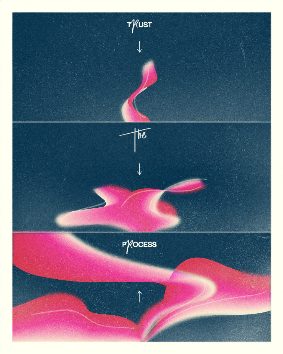
What are your favourite design tools/mediums to use?
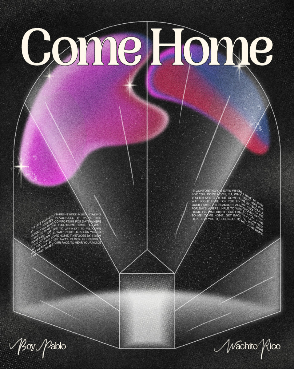
Illustrator and Photoshop for sure! I used to be comfortable with using only Illustrator and was extremely intimidated by Photoshop but as my work on Instagram progressed and I explored more Photoshop tools, I soon discovered they work best for me when used hand in hand. I don’t think one is better than the other, in fact they compliment each other really well.
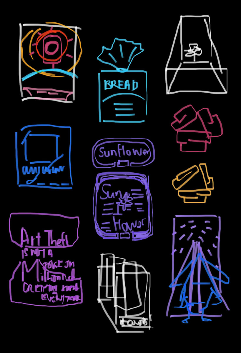
Another essential and underrated design tool is my Notes app – but not for writing though! 9 out of 10 times I like to sketch out my designs before vectorising them in Illustrator, and the notes app makes things waaay easier as I get the best ideas oddly right before I’m about to fall asleep or when I’m out on public transport. I’ve got a neat little gallery of zero effort sketches I’ve collected over the last 4 months since I started @kool.type!
Thanks, Jasmin!
We couldn’t agree more that print is an incredibly powerful tool for galvanising the power of people and inspiring designers alike. ECHO Paper’s play in a fictionalised setting makes its exploration of real life implications even more hard-hitting. The printed newspaper format being one we associate with both grassroots social and political movements as well as larger, mass media formats creates an uneasy, yet very effective, tension. This is a story set in a space which as a history of both garnering the power of the people, and mirroring the disenfranchisement of the masses.
We’ve loved hearing from Jasmin and exploring her work on ECHO Paper more. It’s so inspiring to see projects which explore the power of design in creating a sustainable world – and we can’t wait to see what she comes out with next.

