
Dana Chan (@canofdanchan) is a queer non-binary disabled East Asian femme. Their creative work is delivered through bright colours and vibrant shapes which collect to create, as they say, “artistic commentary on being anxious, disabled and constantly filled with existential dread.” As a designer, they specialise in branding and marketing – consistently creating work through the lens of accessibly, they say they’re less drawn to design trends driven purely by aesthetics, and lean more towards work that does what it needs to do throughly, accessibly, and beautifully. We spoke to Dana about the role typography can play in designing more accessible tools and interfaces, the problem with purely ‘aesthetic’ design trends, and what they think designers need to consider in order to create a more accessible world; all while taking a look at the their own work, and exploring the balance of functionality and beauty in type.
Hi, Dana. Firstly, could you explain a bit about the stories behind your Enable project & your ‘How Do You Want to Heal?’ tool?
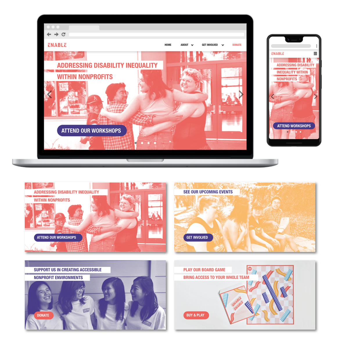
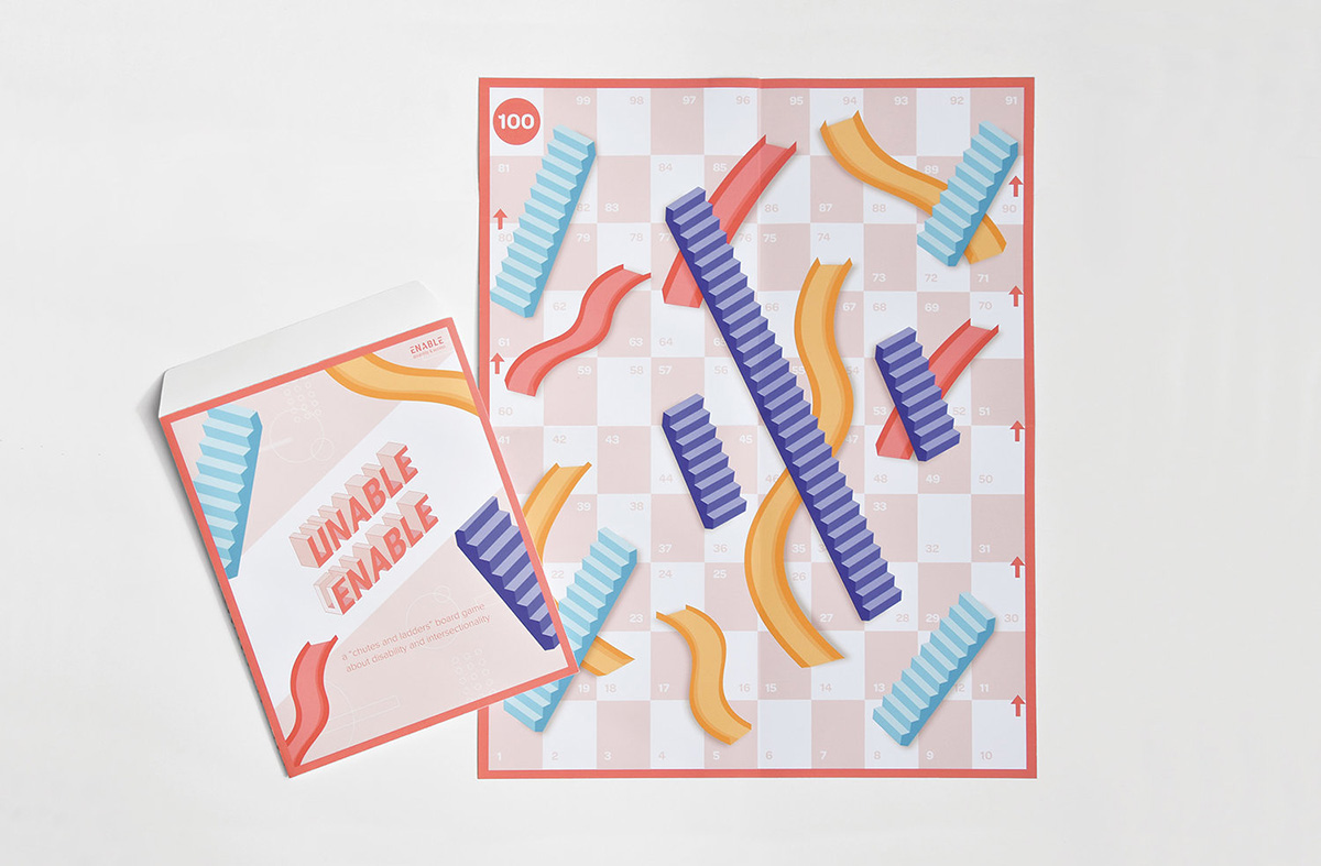
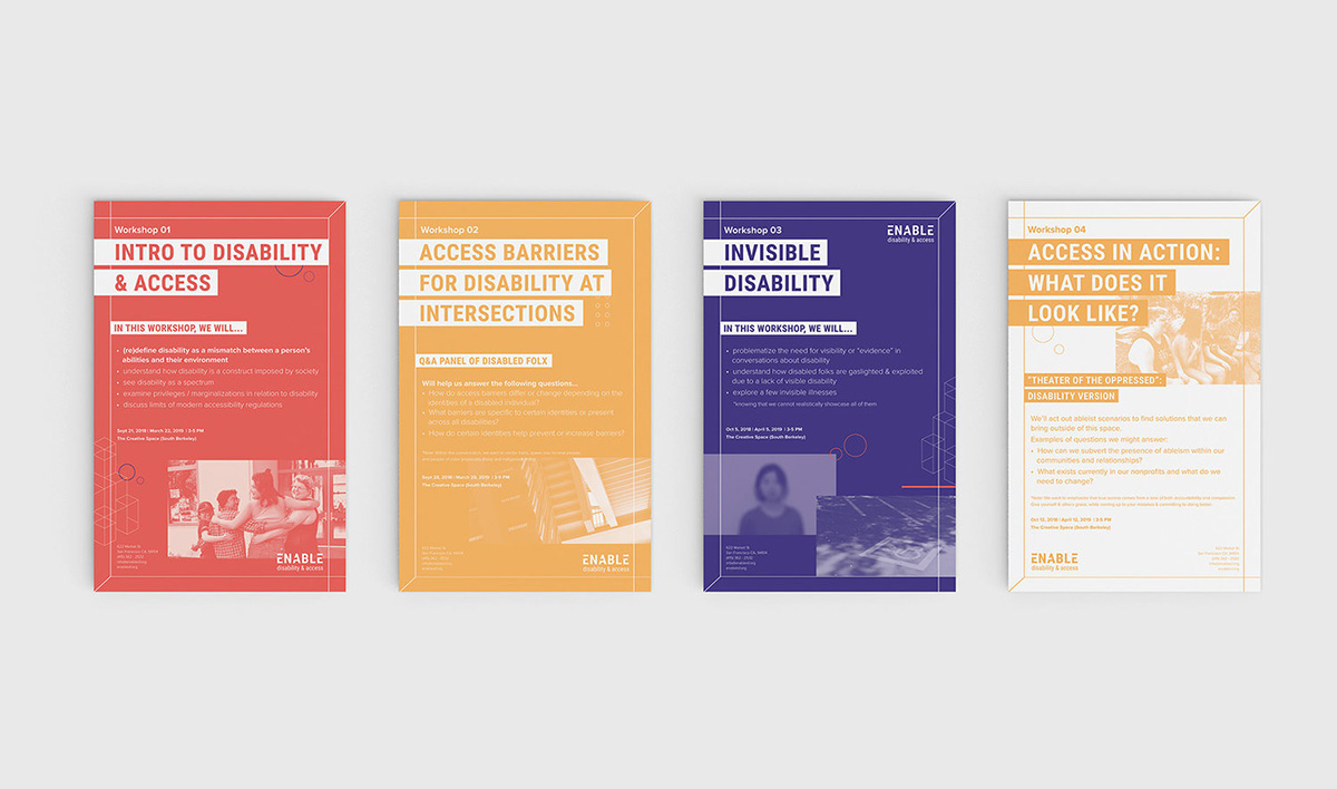
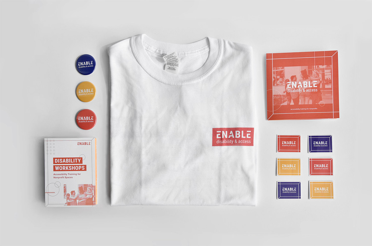
Enable is a campaign concept for a nonprofit organisation that aims to address issues of disability inequality by providing workshops and accessibility training to nonprofit organisations that serve marginalised communities. This project was created alongside three other amazing designers, Timothea Wang, Emily Luong, and Cherilyn Seetho. I worked on Enable during a time when I was really struggling with disability and accessibility, so all the work I did on it felt personally significant to me. I was hesitant at first about working in depth on a disability-led project, but Enable ultimately gave me the empowering opportunity to bridge my two passions: design and community engagement. Being able to create design solutions that could tangibly impact my community allowed me to feel the importance of creating meaningful work that aligned with my values.
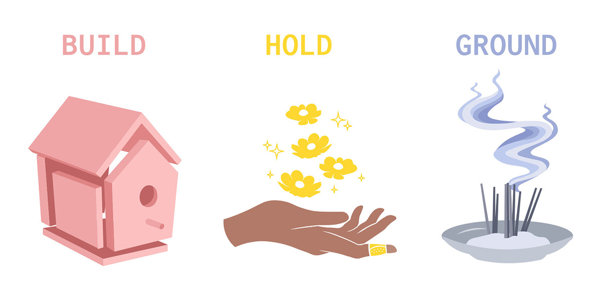
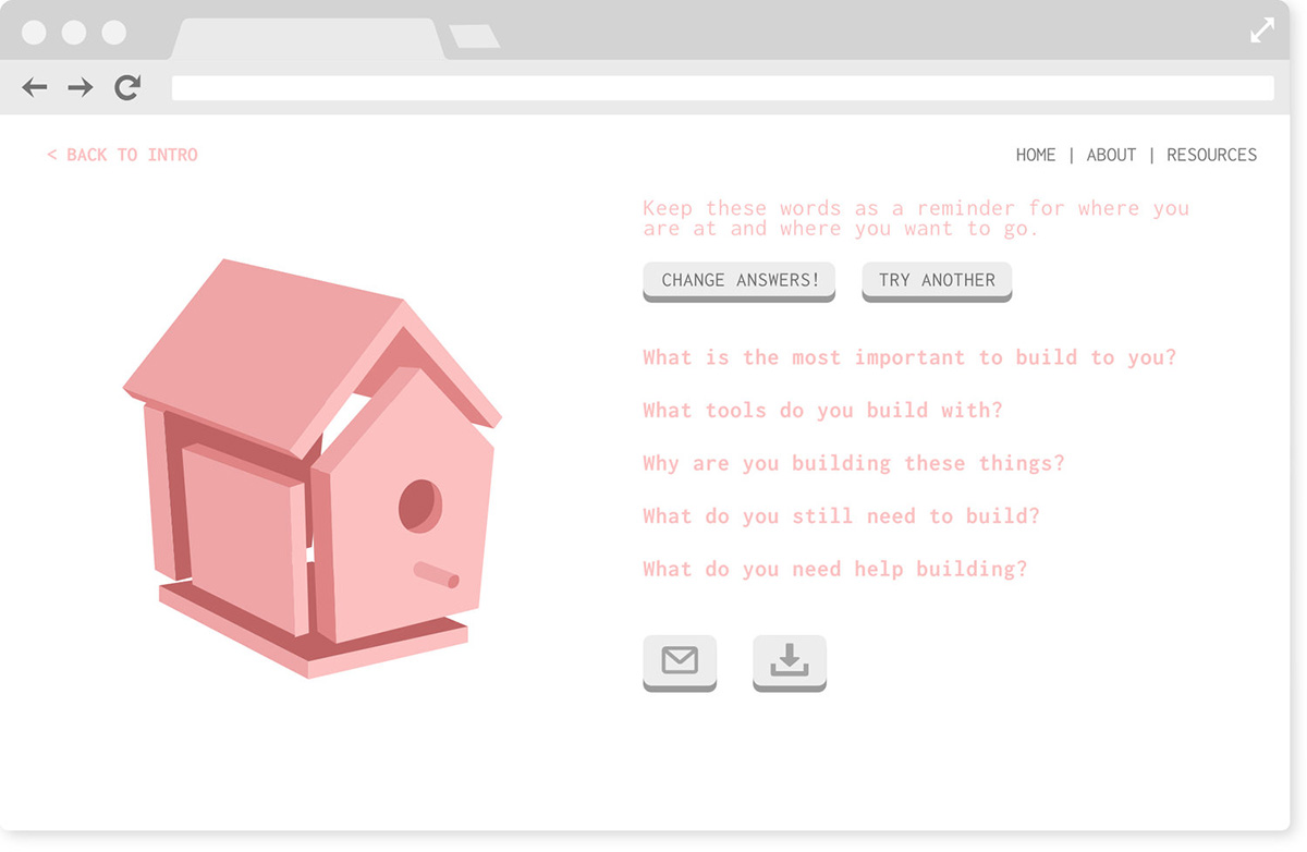
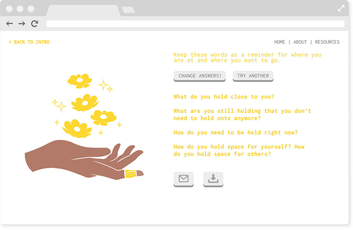
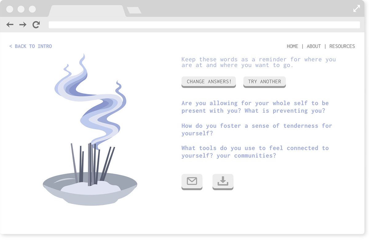
‘How Do You Want to Heal?’ is an interactive web tool for community organisers and activists to self and community care. This project aims to redefine “self care” to centre on a more holistic, interdependent form of healing. This project was created during a time where I felt really isolated from a strong sense of community. I wanted to create a tool where I felt closer to (a) community, despite how alone I felt.
How does the typographic approach in your work relate to your activism around accessibility?
For me, when I want to create accessible design (which applies to all forms, not just typography), I try to prioritise function over form. If something isn’t easily recognisable or understandable by my audience, it doesn’t matter how pretty it is because it isn’t serving its purpose. The Enable logo illustrates this point by being first and foremost, simple, clean, and readable. The typographic treatment my team and I used doesn’t take away from the legibility of the type but is still effective in communicating something about disability.
I’m always thinking about functionality in the back of my mind. If something isn’t legible/functional I don’t even consider it as an option. I think it also helps that my style is very clean and simple, which makes my work inherently accessible. Design in general also tends to be more minimal than not, which helps. So overall there aren’t a lot of big things that I need to balance, it’s just the little details like upping font sizes for legibility or pairing colours in a way that offers enough contrast.
Do you think the culture of typography design (as part of graphic design, UX design etc.) needs to evolve or improve to work towards a stronger focus on accessibility?
I think a lot of designers tend to prefer aesthetics over functionality, which is something that can be seen a lot on sites like Dribbble. The UX design displayed there often looks beautiful on the surface but when you try to imagine those designs on real life products, they begin to fall apart. For example, take trends like neumorphism. The lack of colors and subtle shadows may look edgy / modern / cool, but there’s not nearly enough contrast for it to be accessible at all.
At the end of the day, I think creatives just need to care more. Care about the people experiencing their work and care about the impact their work is making; not just how good their work can make them look. It’s about wanting to be effective more than wanting to be aesthetic.
And how does type fit into your design & activism more broadly?
I think behind every powerful movement there has to be a message that makes people strongly resonate with the cause. And I think designers have the potential to communicate those messages in a way that’s effective and attention-catching.
There’s also such a large creative community around type/lettering which I think can be really useful in terms of activism (more people, more power!).
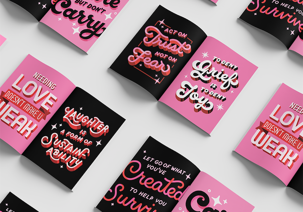
I do think though, that much of the “activism” happening in these creative type/lettering spaces is largely neoliberal. By that I mean this community falls into the same functionality vs aesthetics pitfall discussed earlier, where the type and message is pretty and marketable, but functionally their “message” means next to nothing. For example, “love not hate” type quotes that completely ignore the systems of oppression that generate hate, and place the responsibility to “love” on the oppressed. Or misquoted MLK sayings that make him seem much less progressive than he actually was, instead of the radical leader that was assassinated by the US government for his activism.
I personally try to stay as far away as I can from pretty, generic messages in my type/design. For me, I want my design to be BOTH pretty and impactful, not either/or. If I’m trying to spread any kind of message, I try to be really thoughtful on how I’m communicating it, making sure to do it in a way where people understand what I mean and resonate with what I’m saying.
Thank you, Dana!


