Brian Jackson is a freelance brand designer living in Los Angeles. With 34 years of professional experience, he has recently undertaken the challenge of creating a brand refinement for Universal Pictures, and throughout his years on the scene, he’s gathered a wealth of experience dealing with high end clients and established brands.
Taking an approach that centres the “fundamental business strategy behind any creative work and its relationship to a business problem,” Brian delivers his services with a strong problem solving ethic. “If needed,” he adds, “I assist in outlining these as a clear, actionable vision, and then manage its creative evolution to final execution in all media.” Today, Brian breaks down how to effectively locate problems and solutions in a branding context, the refinements he created for Universal’s identity and logotype, and his top tips for guiding clients through their brand refinement journeys – helping you to build the networks and relationships that will benefit your career and keep your clients happy.

Hi Brian. Firstly, what are established brands usually looking for when they want a brand refinement?
Some brands I’ve worked with are unfamiliar with what they need, but do have a keen sense that there is various forms of inconsistency and confusion. So, a brand audit is usually required. In other cases, I’ll be provided a third-party’s brand audit already completed. This is typically a presentation deck that outlines observations and challenges related to a company’s brand, and most times this provides clear strategies for better communication. This puts me ahead of the curve and allows me to jump into creative exploration, since there is an already established barometer for gauging success of future creative.

What is the process usually like when dealing with a big brand refinement? What is the process of dealing with clients like, and what steps do you take from concept to final product?
First a brand audit is needed and is a separate billable effort. An audit assesses all of a brands touch points, and their effectiveness and consistency. I look at online and off-line marketing and corporate materials, their social presence, ad campaigns, established brand guidelines, and even the style and tone of their copy writing. It is important that when presenting all of these findings that you leverage them against the vision and mission statement of the company. The point is that if the mission and vision of a company is not effectively or consistently represented in how they are currently portrayed, then an effort has to be made to correct it. The degree of change required is the difference between ‘refinement’ versus ‘redesign’: one is an effort that has subtleties, whereas the other is more aggressive.
After an audit is complete, a plan and vision presentation may be required, with goals of projecting impromptu ‘what if’ scenarios for the brand. These can take the form of various types of mood boards that try to create what the adjusted or radical change to the brand can be. It’s perfectly fine to borrow and showcase other successful brands as a point of discussion. But I try to end these types of presentations with some actionable guiding principles for gauging future creative, something like 3-5 adjectives.
After the above, the stage is set for developing creative. And having a mutually agreed upon set of guiding principles to critique, the future work is invaluable.
What steps do you think are important to follow in order to preserve the integrity of a well known brand when creating a rebrand or brand refinement?
Understanding the history and future vision for any company will guide everything. Many times for instance a brand may be stagnant, without connection to its audience any longer, or lacking a sense of innovation. And while it’s always tempting to advise on a radical change, they may have a legacy decades old with loyal followers that could make this a dangerous strategy.
What trends are you noticing at the moment in terms of typography in rebrands/brand & identity refinements?
Type is fashion. Like any trend, its styles evolve over time, but it’s still a mystery to me exactly who or what brands or institutions influence its evolution. It’s an exciting endeavor as a designer to keep a pulse on type trends, with so many fabulous resources online to draw inspiration from. Every project requires its own unique channel to draw inspiration from. Whether it’s a youth market, tech or household consumer goods, the trend quality of each changes at different paces.
Can you run us through the process of your brand refinement for Universal. How did the typography in particular need to be altered and how/why did you do this?
With Universal I had a tremendously rare privilege of working directly with leadership. This provided a much nimbler working relationship, so I could cut to the heart of matters and be honest about the brand.
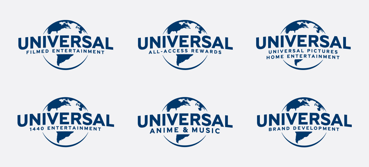
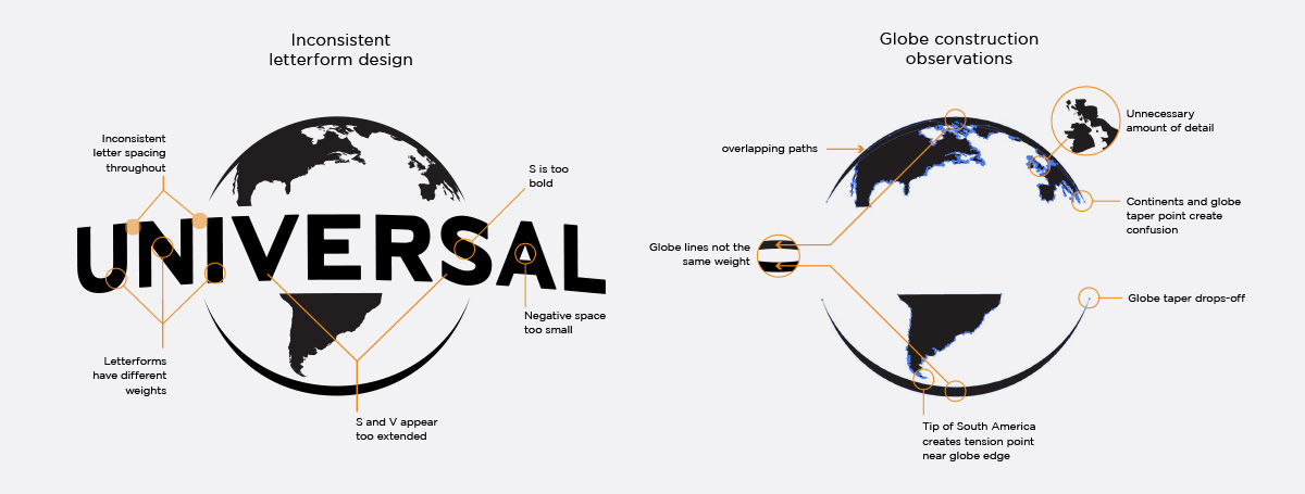
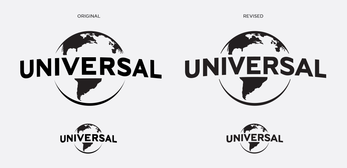
The initial request was to refresh the logo. And after some discussion about the legendary status of the brand recognition, I advised on an evolutionary adjustment to the mark rather than a drastic one. So, first I presented them with a forensic breakdown of some of the problems in the construction and visual qualities of the existing corporate mark. This was met with great enthusiasm and confidence, and I established important details that needed to be reengineered.
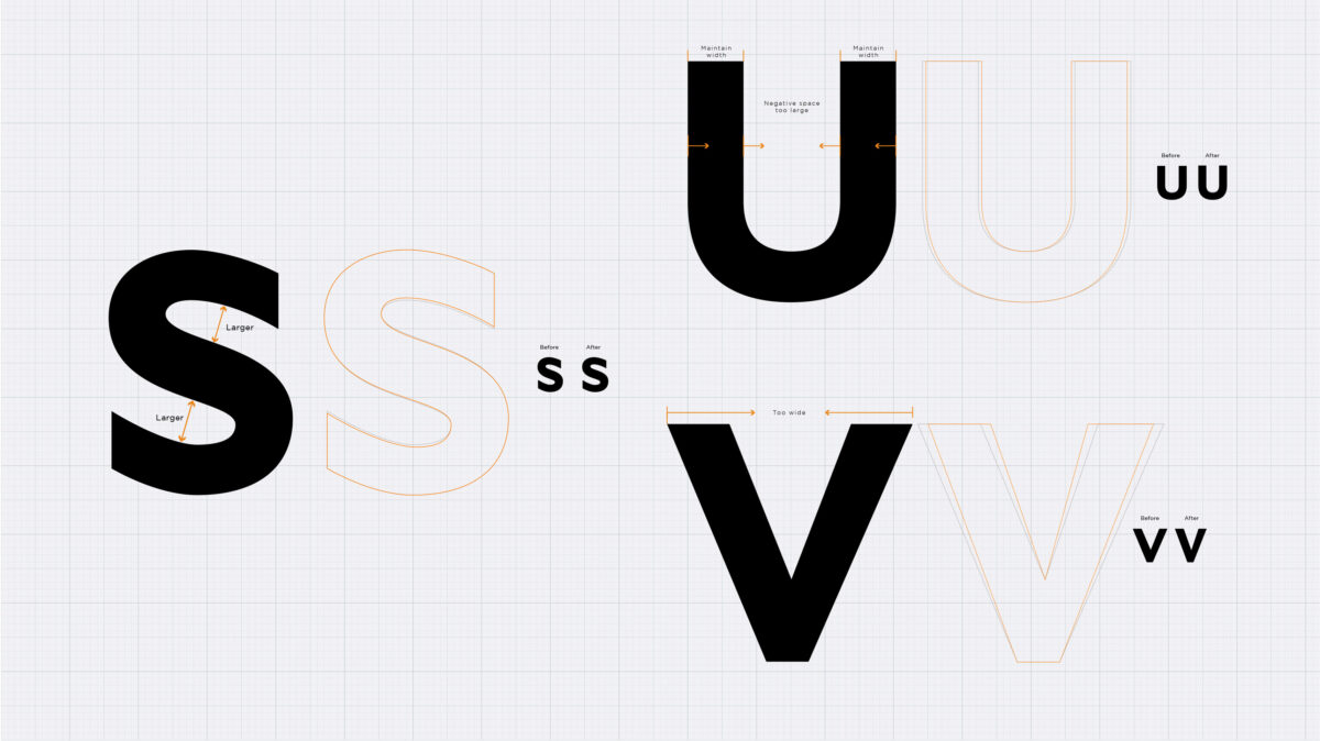
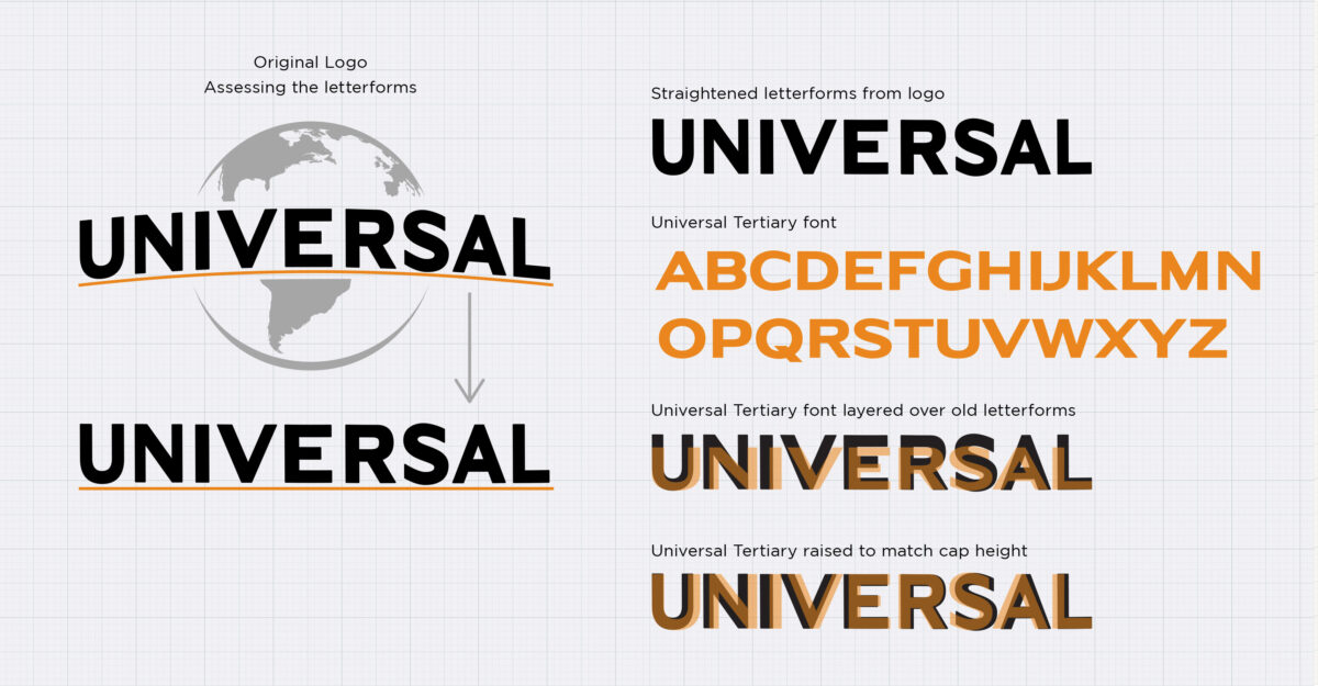
The biggest issues were found within the typography. The corporate logo type was trying to mimic some of the dimensional qualities of the legendary theatric animation, which benefits from its realistic rendering and motion to achieve its drama – something where the two-dimensional graphic version falls flat. For instance, the first letter (U) and the last letter (L) were foreshortened to appear in perspective, which ends up looking like a poorly drawn letterform with stems too thin. Also evident was that the “S” appeared too heavy architecturally, losing its unity with the other letters. The trailing leg of the “L”, being the last character of the name, was too long and needed shortening. I also recommended a cleaner consistent weight design rather than the slightly contrasted previous effort. This gave the logo more clarity and a contemporary quality. Finally, knowing the logo is often re-produced very small, the negative space inside of the “A” needed to be larger, so it wouldn’t ‘close up’ in traditional printing.

And lastly, do you have any do’s and don’ts when it comes to dealing with clients & creating work for big brands?
My advice doesn’t distinguish between large or small brands; first and foremost is a great client/designer relationship. Great creative work comes from earning the trust of your client. And I find the most valuable means of achieving this is by striving to connect your creative to positive business outcomes. This demonstrates that you have your client’s business interests first. Don’t fall in the trap of persuading your client to trust you because your invaluable, innate instinct as an artist. This will encourage divisiveness between you both by suggesting that only you know what’s right and they do not.
Another piece of advice is never to second-guess a client who feels you haven’t solved the problem and that more work is required. No matter how much you love a design solution, be open to the idea that there could be another approach not considered. I have countless examples that I can reflect on where I was proud of the work because they pushed me further! My tenth grade design teacher put it best: Just know that in the grand expanse of your mind’s creative capabilities, that for any given design problem there are five great design solutions. You may have just presented one!
Thank you, Brian!

