
Jan Fromm, designer of Fontwerk’s latest type system, Nice, on designing vast, varied type systems and complex superfamilies.
ZLM: Hi, Jan. What was your personal motivation for creating Nice?
JF: I wanted to make a text family that was infused with positive values such as friendliness, clarity, and liveliness. It should contain some subtle historical references to create a certain degree of familiarity—which is also a positive aspect. Still, I had something contemporary in mind: modern, versatile, flexible. On the other hand, the idea of a complex superfamily did not stand at the beginning; rather, it grew during the design process, and the family grew with it.
ZLM: How did you begin to distil your research and ideas into letterforms?
JF: Before I started making the first sketches, I looked at many typefaces from the Baroque period. Nice is not a revival in the usual sense, nevertheless, many mannerisms of the typefaces of Johann Fleischmann or William Baskerville have been incorporated into the initial ideas. I do not sketch complete alphabets in advance—for that, I am too impatient. A handful of letters with important details is enough for me to start working in the font editor. Usually, I arrive at the final shape during the digitizing process.
ZLM: So, can you break down the process of creating such a vast, complex type system? What are the steps?
JF:
- As usual, I started by drawing the basic characters: lowercase, uppercase, numerals, and a handful of punctuation marks. I then modified the characters in several cycles, tested them, modified and tested them again, and so on. Piece by piece, I worked out the shape and feel of the typeface.
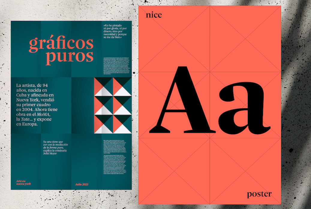
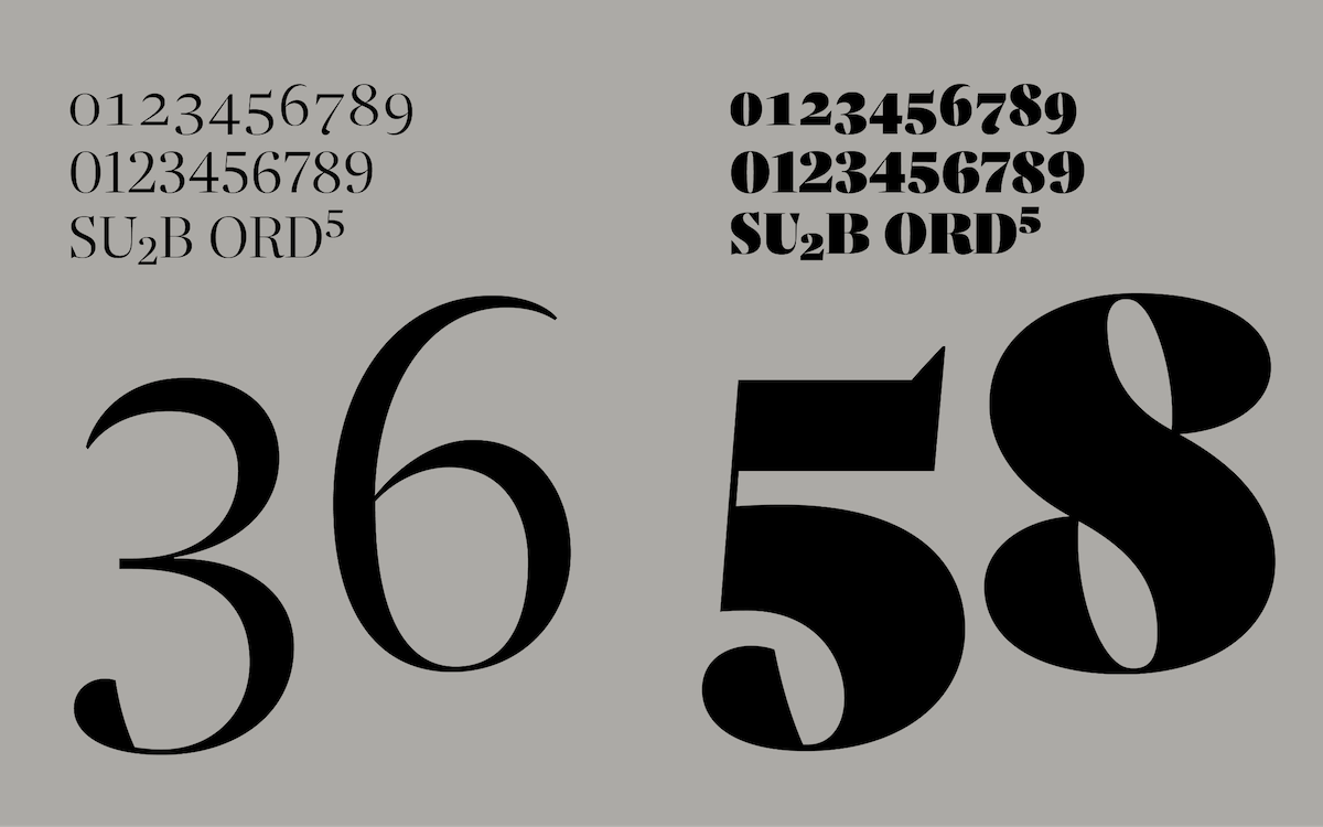
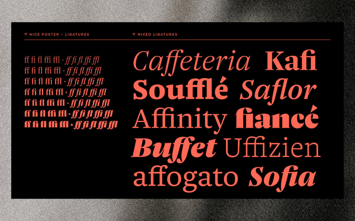
- I got to a point where I was happy with the basic design, but felt that the skeleton of the type had much more potential than just some common text styles. I then drew the Poster variants by increasing the stroke contrast, making the characters less airy and much more compact and closed. The high contrast allowed the Poster weights to become much bolder and heavier. During the development of the Poster version, new design ideas came in, such as new shapes of serifs and drops, alternate forms of shoulders, bows, and so on. I then had to incorporate these new ideas into the already existing Text version.
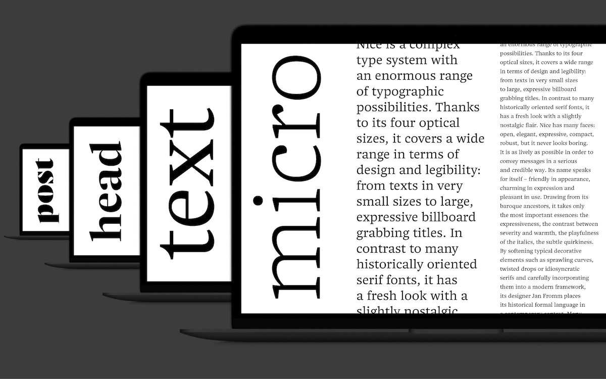
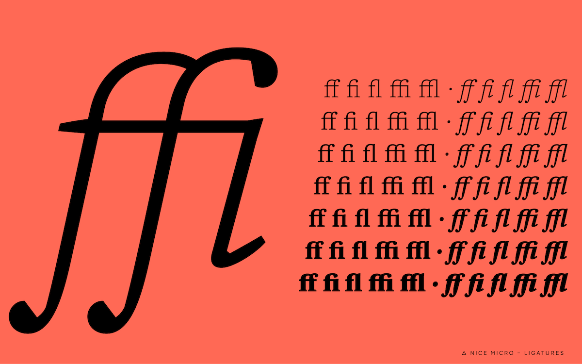
- At this stage, the Text version worked well for sizes 9pt and up. For smaller sizes I found them a bit too tight and dark. Since I was meanwhile taken by the idea of comprehensive support for optical sizes, I decided to develop a Micro version for very small texts from 6pt. Based on the Text version, I gave the characters a more airy and open feel, added distinct inktraps, and reduced the stroke contrast. Again, this resulted in lots of design changes that I had to apply to the existing Poster styles.
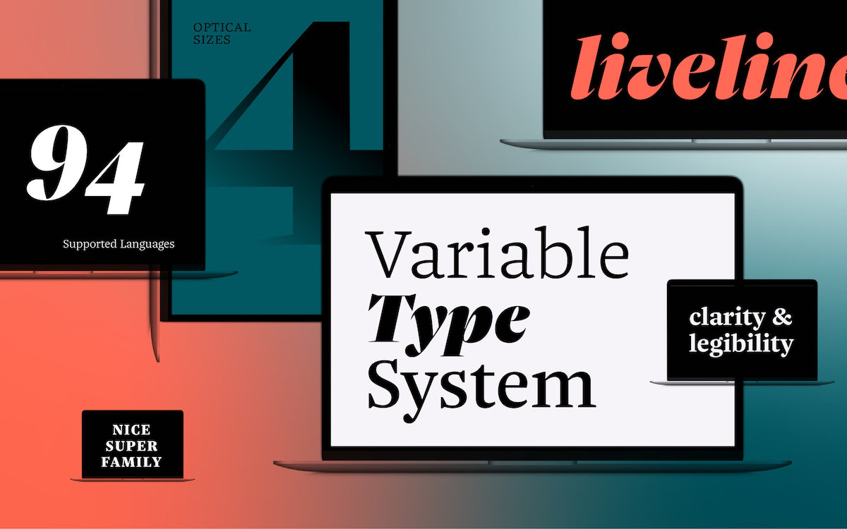
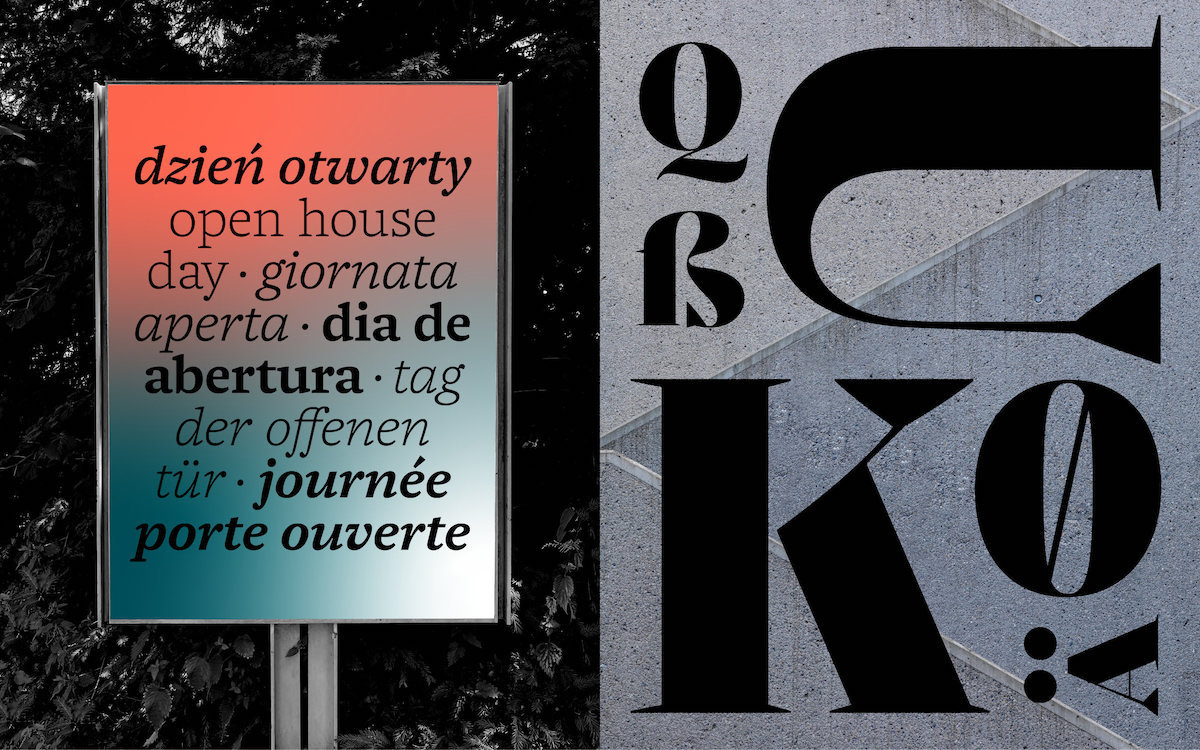
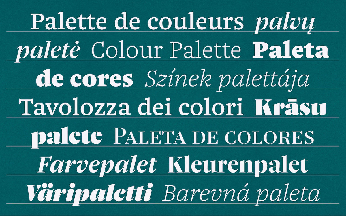
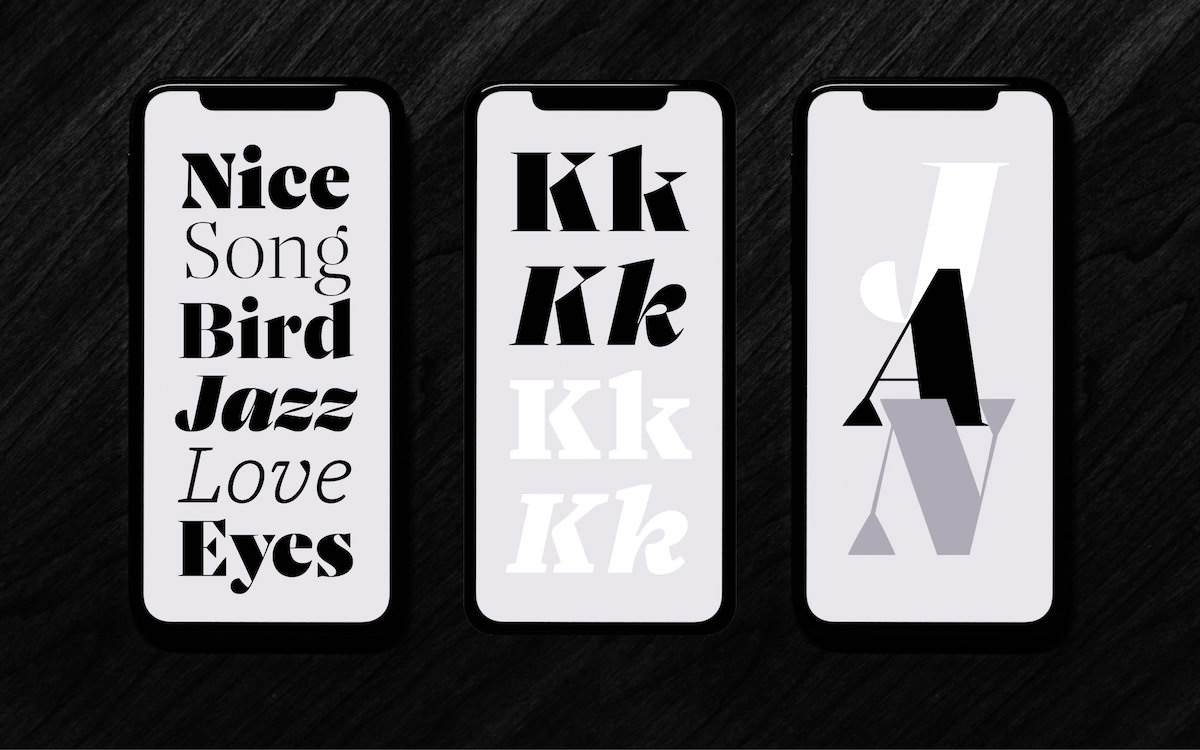
- Now that the shape and scope of the typeface were (somewhat) satisfactory, the character set had to be expanded – up to this point I had been working on a basic set of only about 100 characters. I extended the typeface with letters for many Latin-based languages, punctuation marks, small caps, different figure sets, symbols, mathematical characters. We are talking about about 750 characters that have been added.
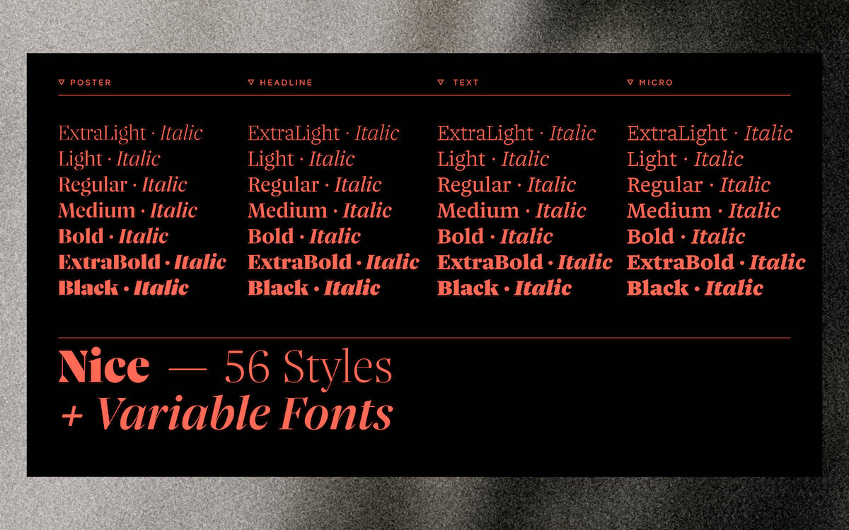
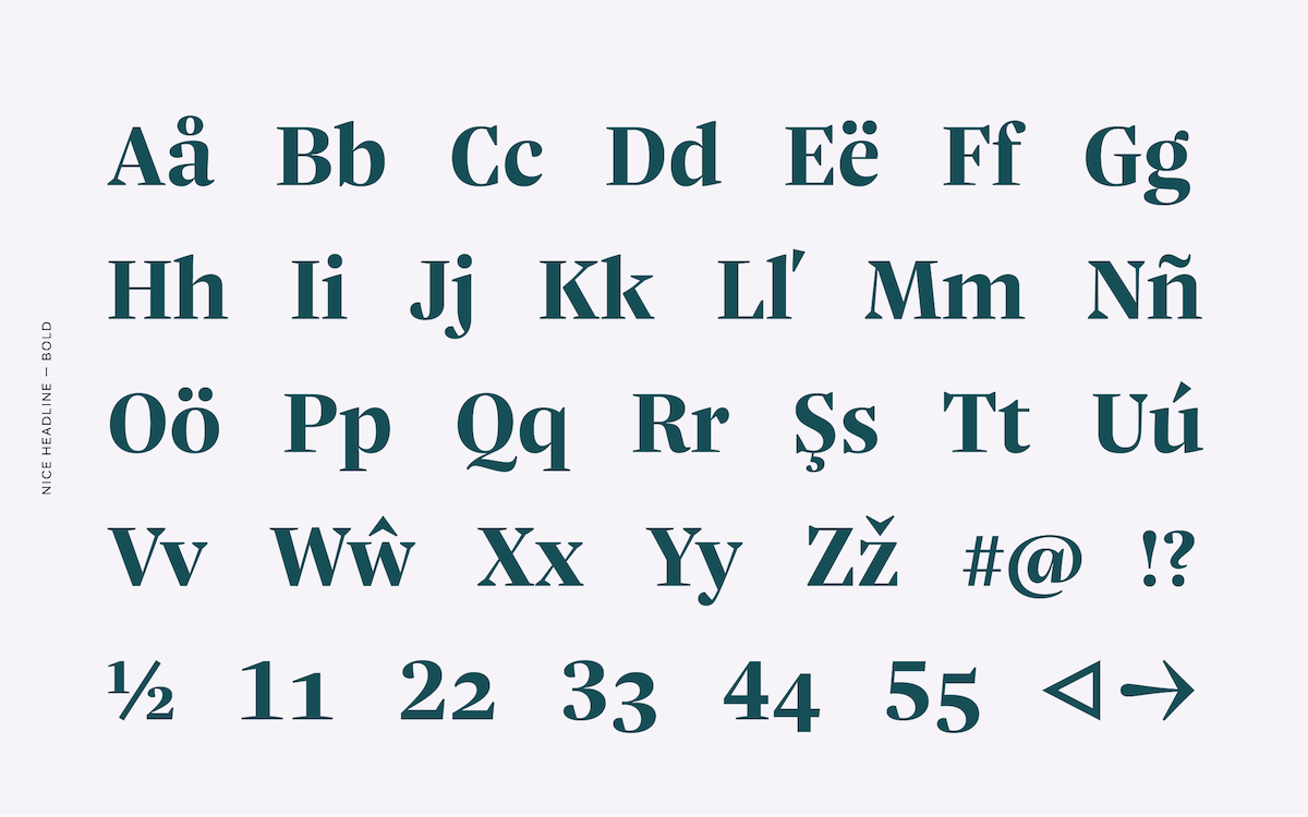
- Now it came to family planning – how many styles should the typeface consist of? The styles should result in a reasonable gradation, they should be well distinguished from each other, but not too far apart, so that they do not lose the reference to each other. To figure this out, I did countless tests, tried many weight increments, combined and compared them. To the existing optical sizes (Micro, Text and Poster) I added a Headline size, usable for medium sized headlines from 16pt to 48pt. Regarding weights, I came up with seven (ExtraLight, Light, Regular, Medium, Bold, ExtraBold, Black), so the typeface consists of 28 upright weights.
- From this point I started to develop the Italic. Since the italic characters (at least the lowercase) are very different from the upright ones – in terms of width, slant, shape of leading and trailing strokes, etc. – it took me a few attempts to find the right recipe for a fluid appearance. Once that was worked out, I was able to cursify the rest of the character set.
- Now it was time to take care of the spacing – the relation of the white space between the characters. I already roughly determine this during the drawing process. But as soon as the design is finished, the white space has to be thoroughly checked and balanced again. In addition, kerning has to be made, meaning the balancing of certain problematic letter combinations. This is a time-consuming process that actually involves looking at all the combinations of all existing characters. Although one can automate kerning nowadays, I prefer to do it manually to have full control over the result. Kerning the whole family (Upright and Italic) took me two weeks, and resulted in about 20,000 kerning pairs.
- In the end, the font still had to be technically prepared for production. This included programming the OpenType features, optimizing the screen display performance (hinting), and adjusting the settings for it to work smoothly as a variable font. This part was done by the folks at Fontwerk, who put the finishing touches on the font with their extensive technical expertise.
ZLM: What did you want to achieve with each face and how did you go about this? How do design details etc. differ to suit different needs and create different looks?
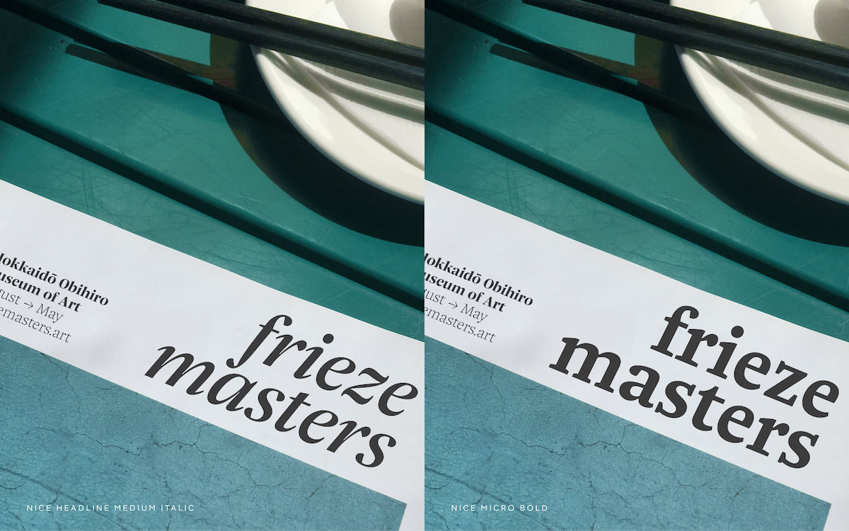
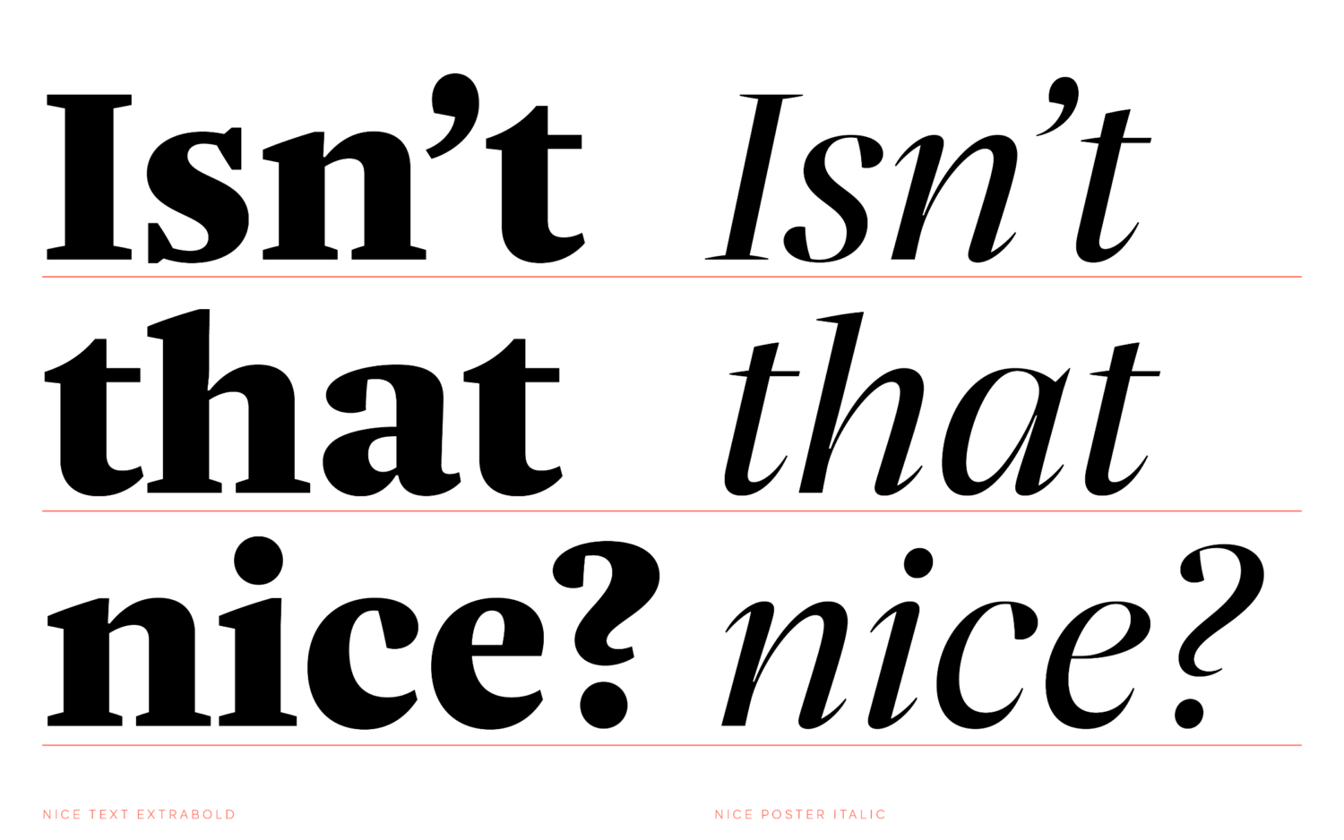
JF: The faces of Nice are designed for different purposes in certain font sizes. The Micro variants (intended for 6pt to 9pt) have a low stroke contrast. They are very open, generously spaced, less playful and thoroughly robust. The Poster variants, on the other hand, have a very high contrast between Thick and Thin. Their closedness gives them a highly elegant look, and many small details make them very lively. Completely unsuited for small texts, they develop their expressive qualities in font sizes from 48pt. In between, there are variants for normal reading sizes (Text) and smaller headlines (Headline). I have extensively tested and optimized these variants in their intended sizes, emphasizing the differences without neglecting the similarities that distinguish them as a family.
ZLM: What tips do you have for designers to keep themselves going when working on a project as vast as this? How do you keep yourself motivated on a project like this and persevere through the years?
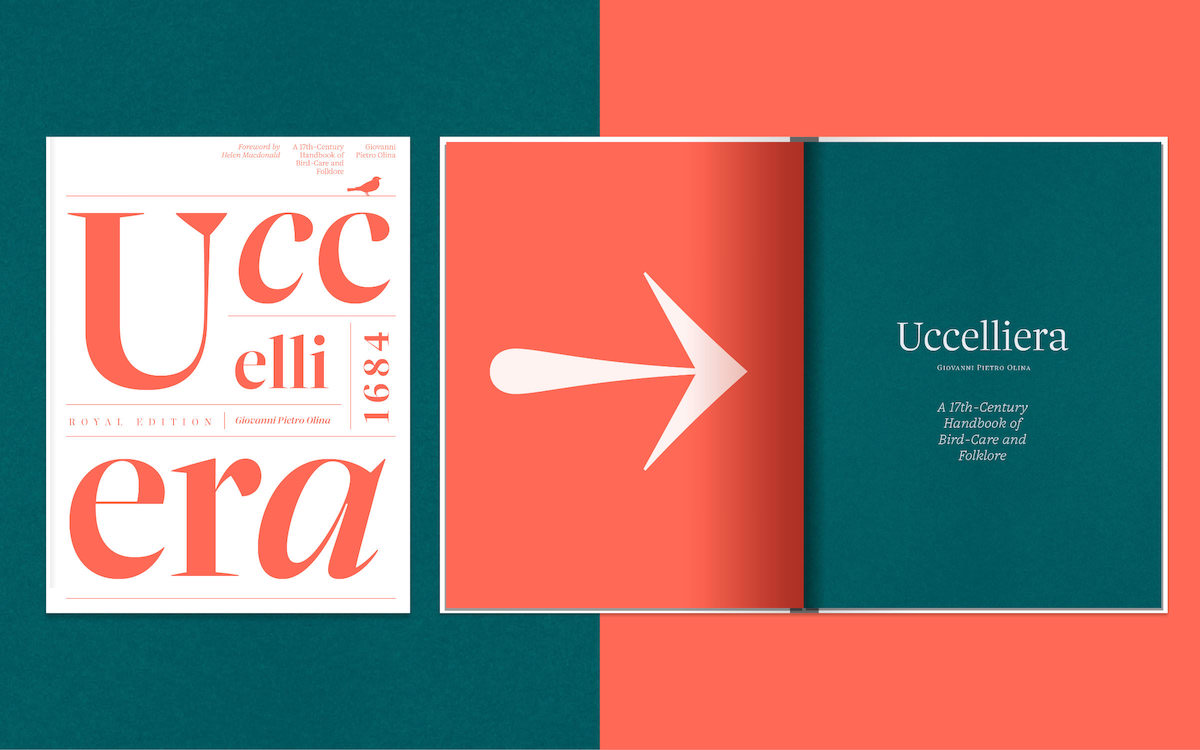
JF: I think it’s wise to take breaks in between and put the typeface aside for a while. This grounds your own perception and ensures a clear view when you return to the typeface a few weeks or months later. You should design something with the typeface in between that reflects the intended context, for example, a magazine page, a poster, a book cover, a few book pages, whatever. Something like that breaks up the often monotonous type design process in a creative way. It also shows the strengths and weaknesses of the typeface – much more clearly than in the font editor. Most importantly, if you’re working alone on a comprehensive typeface, get feedback often. Not just from type designers, but from designers who could potentially use the typeface. Give them the fonts to test and try out. That will motivate you and help you keep going.
ZLM: What have you learnt over the creation of Nice that you will take with you going forward?
JF: While developing Nice, I decided that my next typeface will be a very small family – no serifs, no optical sizes, just a couple of weights – something very un-complex. At least that’s the plan at the moment 😉
ZLM: Thank you, Jan!
You can discover Nice now over at Fontwerk, or read more about other projects from Fontwerk here and here.


