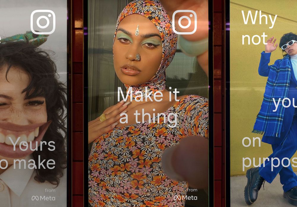
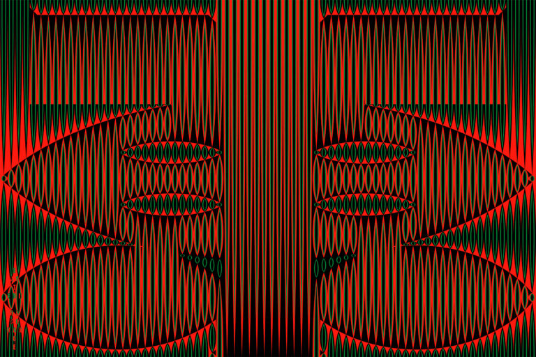
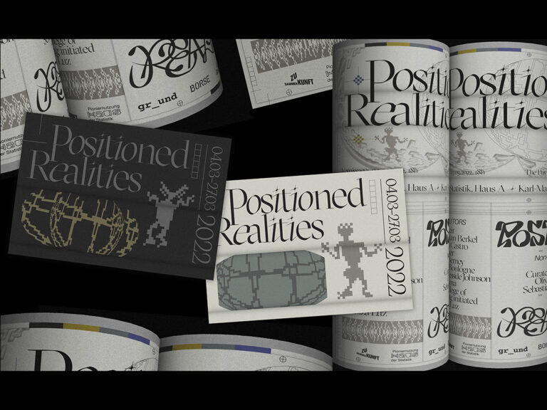
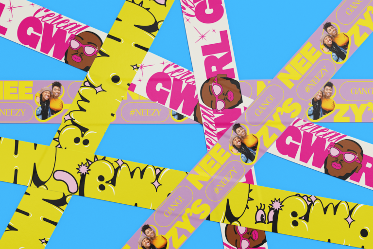
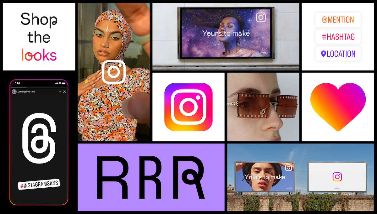
Complete with Instagram Sans, a custom typeface by Colophon Foundry, the new brand identity aligns with Instagram’s future—giving movement, inclusivity and a new purpose.

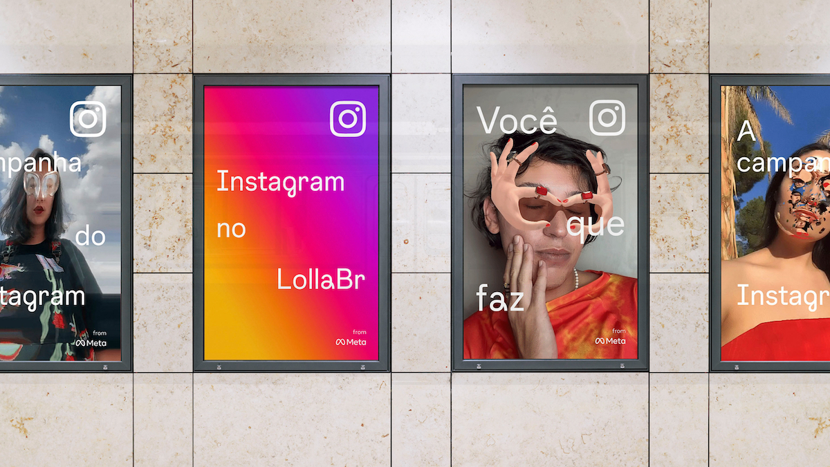
Inspired by their global community, Instagram from Meta’s brand, product and creative teams set out to reflect the platform’s role as a place for people to express themselves. The redesign nods to Instagram’s heritage, putting expression first and paving the way for their continuous evolution. “From the start,” they write, “our objective was to provide our global community with an immersive and inclusive experience by focusing on accessibility and legibility throughout the design process.”
“We approached the design evolution from a spirit of innovation and exploration by assembling a braintrust of global typographers, artists and creative technologists who’d push our boundaries. Together, we kept the best of the brand, while infusing it with new energy and powers of expression.”
— Cynthia P., Creative Director, Instagram from Meta
In collaboration with Colophon Foundry, the new brand identity is complete with a fresh custom typeface—Instagram Sans.
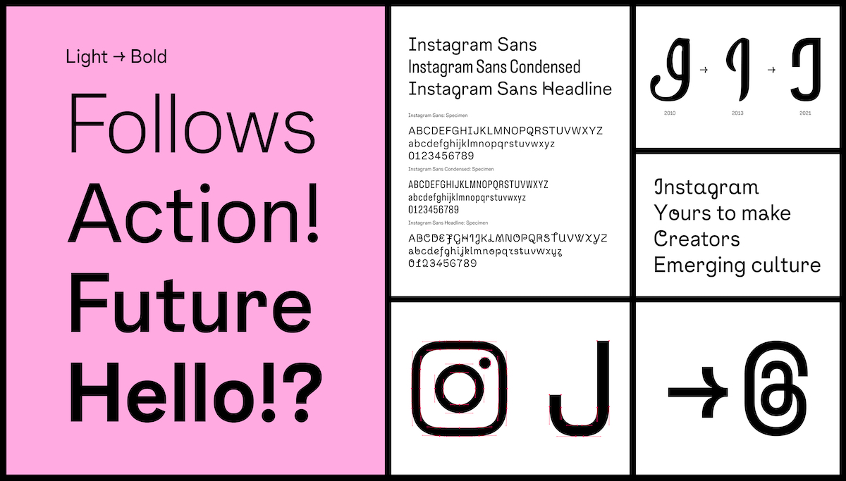
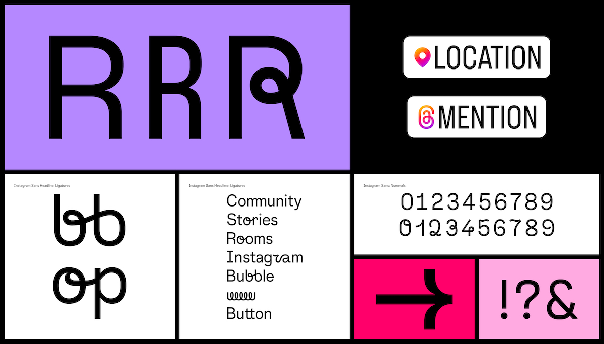
Instagram Sans is rooted in Instagram’s design foundation, representing their identity both in app and in marketing. They wanted the type to be distinct, legible and versatile, keeping the platform’s heritage at heart. The custom typeface draws on distinctive qualities plucked from Instagram’s wordmark and logo, which has softly rounded corners that place it somewhere between a circle and a square—a form they call the “squircle.” The typeface also incorporates unexpected quirks that give it a human touch, like the design of the “Q,” “@” and use of sheared terminals.
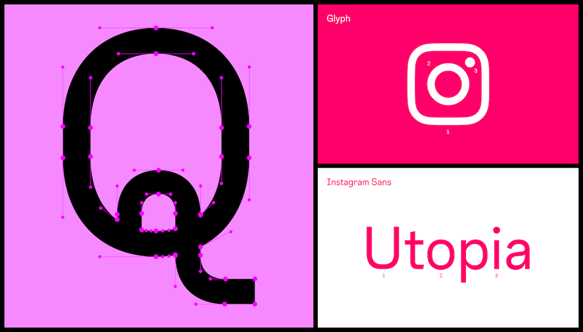
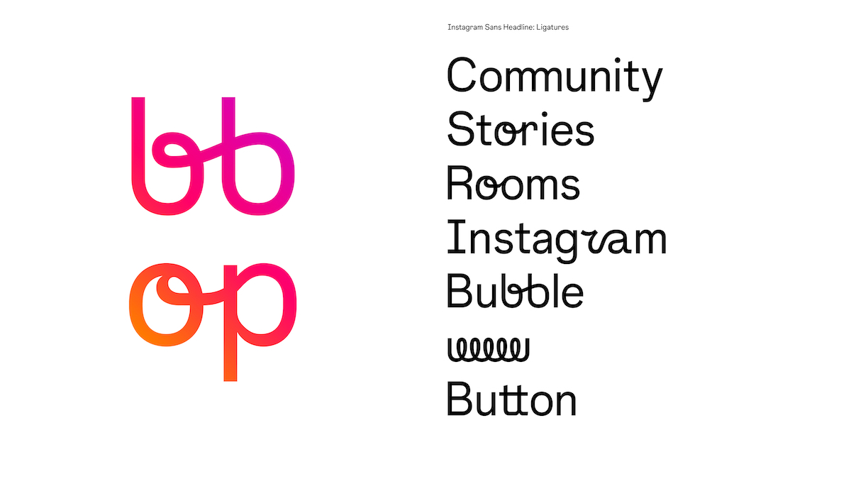
“We explored how typography can be a tool for expression and how our new typeface can go beyond letters on a screen. Instagram Sans is inspired by the design of our logo and the script letterforms from our wordmark. The letterforms in Instagram Sans Headline add a human touch, as well as a moment of ownership, joy and surprise.”
— Daniel S., Creative Director, Instagram from Meta
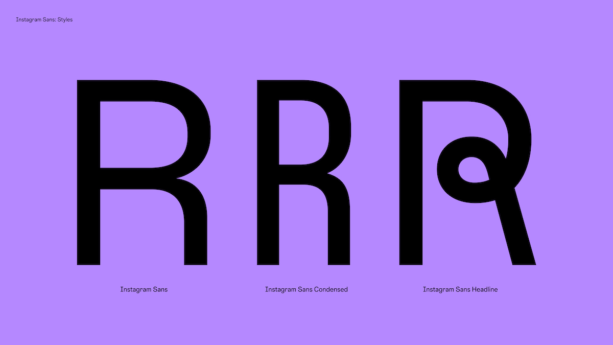
Created in collaboration with Colophon Foundry and several global type foundries, Instagram Sans is available in three styles: Regular, Headline and Condensed which users in the online community can use to create in Instagram Stories. “Giving this tool to millions—if not billions—of people and seeing what they create with it is so amazing. Being able to create a typeface that can represent all of those different people in different ways is such a challenge, but a really rewarding one,” says Edd Harrington of Colophon.
From the outset, global accessibility was at the heart of the typeface development process. Beginning with an in-depth audit of the Instagram community’s needs to ensure the traditions and cultures behind each script system were respected, the team collaborated with over 40 typographers and language experts to produce multiple global scripts.
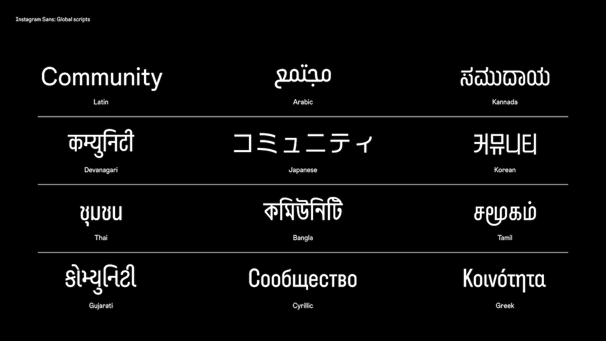
Among them, Creative Directors Daniel, S. and Cynthia P. write, are:
Korean: Uses proportional styles instead of condensed, keeping local customs and legibility in mind. The script also incorporates strongly defined curves creating geometric design elements.
Thai: Optimized for short-form copy, and uses a contemporary loopless style. Vowel marks save space, allowing for tighter, more recognizable spacing.
Arabic: This hybrid Kufic-Naskh script activates the best qualities of both, and maintains optical balance by using a lower body height than Latin script.
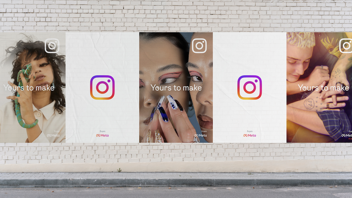
Designed with the diverse individuals, creatives, groups and business all around the world that make up the Instagram community, the platform is continuing to evolve alongside its people. “Our refreshed visual system puts expression, inclusion and creativity first,” Daniel, S. and Cynthia P. conclude, “affirming Instagram’s mission to support the creators and communities who are pushing culture forward. We’re inspired by our community’s sense of exploration—and we can’t wait to see what’s next.”

