Not all type foundries are born from a brand and business model. Some, like Alex Chavot’s Apex Type Foundry, arise from a simple desire to share well-crafted and proficient fonts. The Paris-based type and graphic designer kick-started his own foundry in 2020 – armed with his full hard drive of type families that he was keen to introduce to the design world.
The foundry’s name, much like Chavot’s own creative practice, was a natural progression from his childhood and passion for outdoor pursuits. “Being born and raised in the heart of the French Alps,” he tells us, “I have always been surrounded by mountains and spent the better part of my teenage years rock-climbing and hiking up and snowboarding or skiing down.” Having lived in the French capital for nearly a decade now, he adds, “I guess I sometimes miss the perspective!” Choosing the name ‘Apex’ was, therefore, a pleasing way to unify both the ‘typographic’ and ‘topographic’ aspects of his life.

Finding Type
His current position may be a surprise for his younger self, who strived to be either “a professional skateboarder or comic strip artist,” completely unaware that graphic design was an existing vocation.
However, hindsight is 20/20, and looking back at his childhood, Chavot understands that his knack for design arrived early. “Long before I even knew about typography,” he reveals, “I was re-designing logos of my favourite brands and drawing letters all over my school notebooks.” His enthusiasm for both skateboarding and snowboarding – alongside their respective subcultures – were huge influential factors too, sparking ideas for board motifs and graffiti. “And I reckon it ultimately leads to the same goal: having control over the last piece of what you’re doing,” he adds. “And what is the ultimate element of a piece of printed design if not type?”
It was during his studies in Graphic Design at Ecole Nationale Supérieure des Beaux-Arts de Lyon that Chavot found his way into the field of typography. And he never looked back. “That’s where I learned everything I could and specialised more in the field — for the most part on my own,” he admits, “as there weren’t actual courses in type design outside one or two introductory courses and workshops.” In spite of this, he remained dedicated, completing internships as an undergraduate with Eline Mul, Manuela Dechamps Otamendi, and Production Type.
Going Solo
Upon graduating in 2014, Chavot pursued a solo practice and now works as an independent designer as well as a frequent collaborator of studio deValence; designing typefaces and brand identities for the award-winning French studio. “I never “decided” to be an independent creator,” he reflects. “I guess it just happened that way, because of the job and how it usually works in France. I was lucky enough that my parents always encouraged me to do what I like and to make sure ‘to be happy to wake up in the morning’. And it’s fortunate because I’m not so good at taking orders.”
With type design as his side gig, this individualist approach serves him and his practice well. As the sole founder of Apex, “I’m the only one behind everything,” Chavot says. Whilst some of the custom fonts were designed under the art direction of deValence, the rest are created entirely solo; “from concept, to design, metrics, kerning, engineering, specimens, communication.”
As most creatives will know, balancing personal work alongside a day job is a test in time management like no other. Often working four days a week for the French studio, Chavot explains that type design is usually relegated to the spare hours he has available in the evening or weekend. Sometimes a typeface project will even be shelved for a few months in order to focus on bespoke client work. Because of this, he adds, “It’s sometimes hard to keep the focus —especially on big families— when you’re jumping on and off a project constantly.” Considering the amount of time and work involved in the process, it can be difficult to maintain motivation throughout a typeface’s development, too. “I consider it a win if I don’t hate it by the time I get to the finish line!” he jokes. “Type design is such a long-time practice that it can be challenging sometimes to keep the fire alive and not be bummed out by all the amazing work people are releasing before you do.”
When asked about the work of other foundries, Chavot likens his admiration of other typefaces to his own love of music: “There are hits, guilty pleasures, and secret hidden nuggets,” he says. “There is this album you keep coming back to, the one you listen to on a loop for three months and then forget forever… There is so much good work being released now on a daily basis that it can be quite overwhelming.” Saying that he keeps his tastes open, and doesn’t fixate on choosing favourites, neither by other designers nor within his own portfolio.
The Type Foundry
Today, Apex’ website – developed by Flavien Loche – hosts a healthy selection of typefaces all presented against a range of fittingly mountainous backdrops. (“I thought it was fun to muddy the waters on the meaning and story behind that name with my website font tester which displays another definition of “Apex” every time you refresh the page,” he recalls)
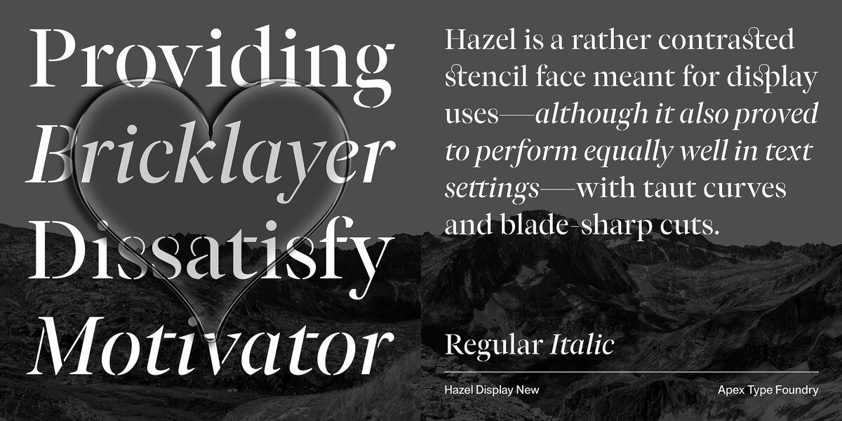
Influenced by typographic trends throughout history – from Gortex’ geometric roots in European 20th-century sans serifs, to Kellar’s conceptual and visual links to Thomas MacKellar and magician Harry Kellar – the typefaces themselves are a reflection of Chavot’s conceptual and research-driven attitude to design, informed by history but rigorously crafted for contemporary needs.
“I look at type design from a graphic designer point of view which puts emphasis on the form,” he tells us, detailing his ethos in further depth. “It probably gives me a little more liberty to think outside of the box sometimes or try different approaches. I try —and probably fail— not to be too bound by the rules and habits of typography’s history. You must learn your trade and know the rules in order to be able to tweak them and make up your own.”
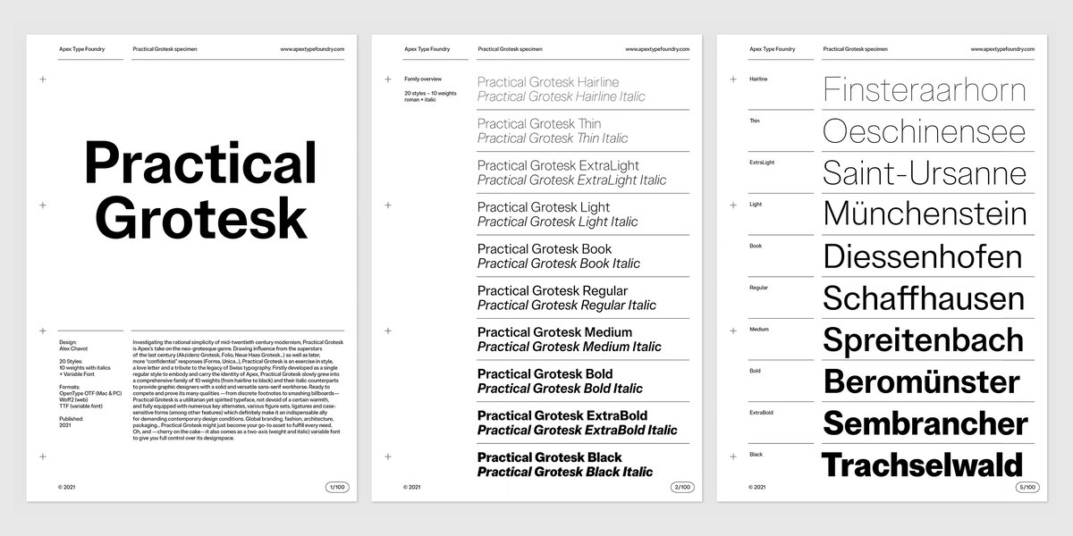
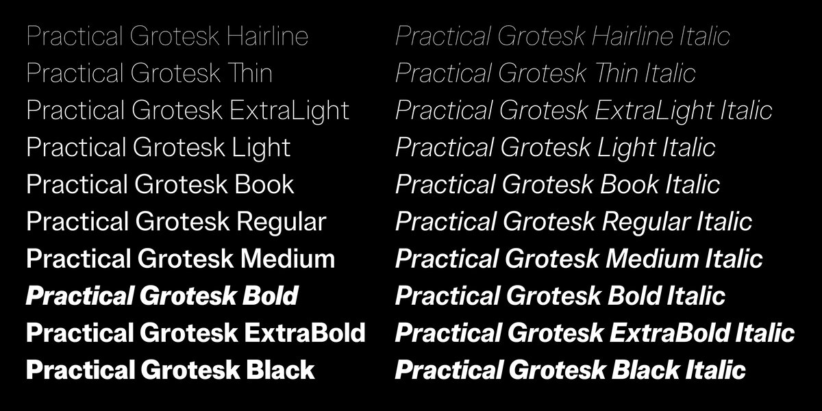
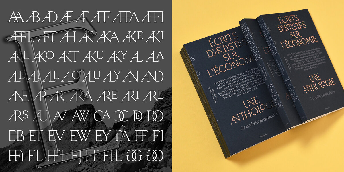
This belief is evidenced across all typefaces in Chavot’s roster, showcasing an appreciation of type history across France and Europe. For one, Practical Grotesk is not only Apex’s take on the neo-grotesque genre, but it also serves as an exercise in style and a “love letter” to the legacy of Swiss typography. Utilitarian yet spirited, the comprehensive and highly versatile family draws inspiration from the “superstars” of mid-twentieth-century modernism.
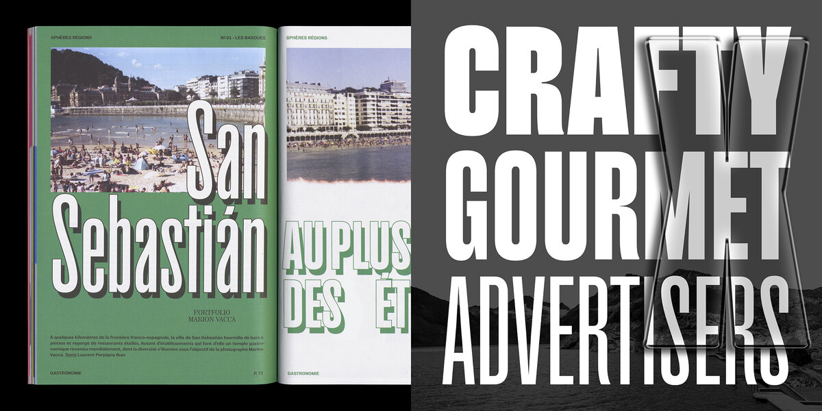
Lesser-known artifacts from type heritage take precedence, too. The charming and classic serif Peckham shares characteristics with Scotch Roman typefaces (from the 19th century and beyond), yet primarily takes its roots in a “surprising” French Canon specimen from Vincent Figgins.
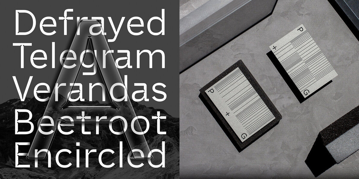
Searching through the archives of the Musée de l’Imprimerie et de la Communication Graphique (Lyon) led to the bold and industrial Smithee. Found in an old and unnamed French foundry’s wood type specimen, the mechanical shapes and organic twists were a captivating combination – leading to a straight-sided and condensed sans serif.
Based on his own experiences in the industry, Chavot ensures that his platform allows users to browse, test and purchase his fonts more easily. In the same way, the licenses for each release are straightforward, easy to understand, and inexpensive. “From a graphic designer’s perspective, I frequently struggle to make my clients understand the price and value of typefaces,” he tells us, explaining the thinking behind this. “More and more, they will turn to free alternatives, Google fonts and alike and slowly kill all the independents.” With clients reluctant to pay for a single font, “how are they supposed to pay 6 times the price just to communicate on their brand or exhibition?” he asks. “That’s why I wanted to keep things the clearest and the simplest possible, fair for everyone from the solo independent to the big company. The bigger you are, the more you pay. And when you do, you get everything, forever: no surprise cost, no recurring fees, no reduced glyph-set…”
Following the recent release of the Nicéphore family – a striking display typeface with high-contrast joins – we were eager to hear what the designer has next in store. “I have absolutely no schedule regarding type releases,” he responds. With his day job consuming a large chunk of his time, it’s difficult to commit the time needed for several releases, “so I’m probably down to one or two releases a year, depending on the size of the project.” However, as the saying goes, ‘good things come to those who wait’. The next release, when it does arrive, will certainly be one to look forward to.
Lastly, a beautiful quote shared by Chavot embodies the spirit of the foundry beautifully. “We choose to believe that the granite is alive. If life is movement, then rock – with its atoms flying around like stars in cosmos – is alive.” – Yvon Chouinard.
Visit Apex Type Foundry on their website or keep up with what’s new on their Instagram page.
Read more of our type foundry spotlights here.
Thank you Clarissa for interviewing Apex.