Growing up in the city of Nantes, France Jules Tirilly (@jules_tirilly) is a Paris-based graphic designer whose recent bold typographic works have been grabbing our attention. After moving to Paris in 2011 to study graphic design at the Dupperré School of Applied Arts, the designer joined l’École National des Arts Décoratifs de Paris, eventually completing his Master’s degree. Since, he’s been sharing a workspace with his designer friends where his practice is split between freelance projects and personal research.
‘I’ve always liked to do things from start to finish’, Jules tells us. ‘In the graphic design field it quickly became necessary for me to master typography as an essential material that needs to be modulated, customised, shaped or even created to adapt to a project best… My interest in typography particularly started during my ERASMUS exchange in Netherlands at KABK in 2016, thanks to the calligraphy classes taught by Franck E.Blokland. Through this experience I liberated myself from the insecurities I had concerning this practice, which I thought was reserved for top-flight designers.’

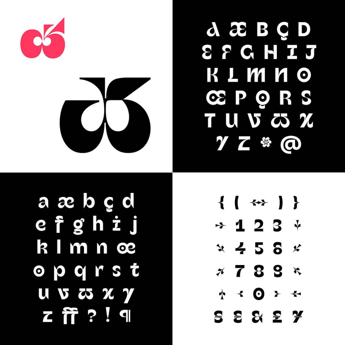
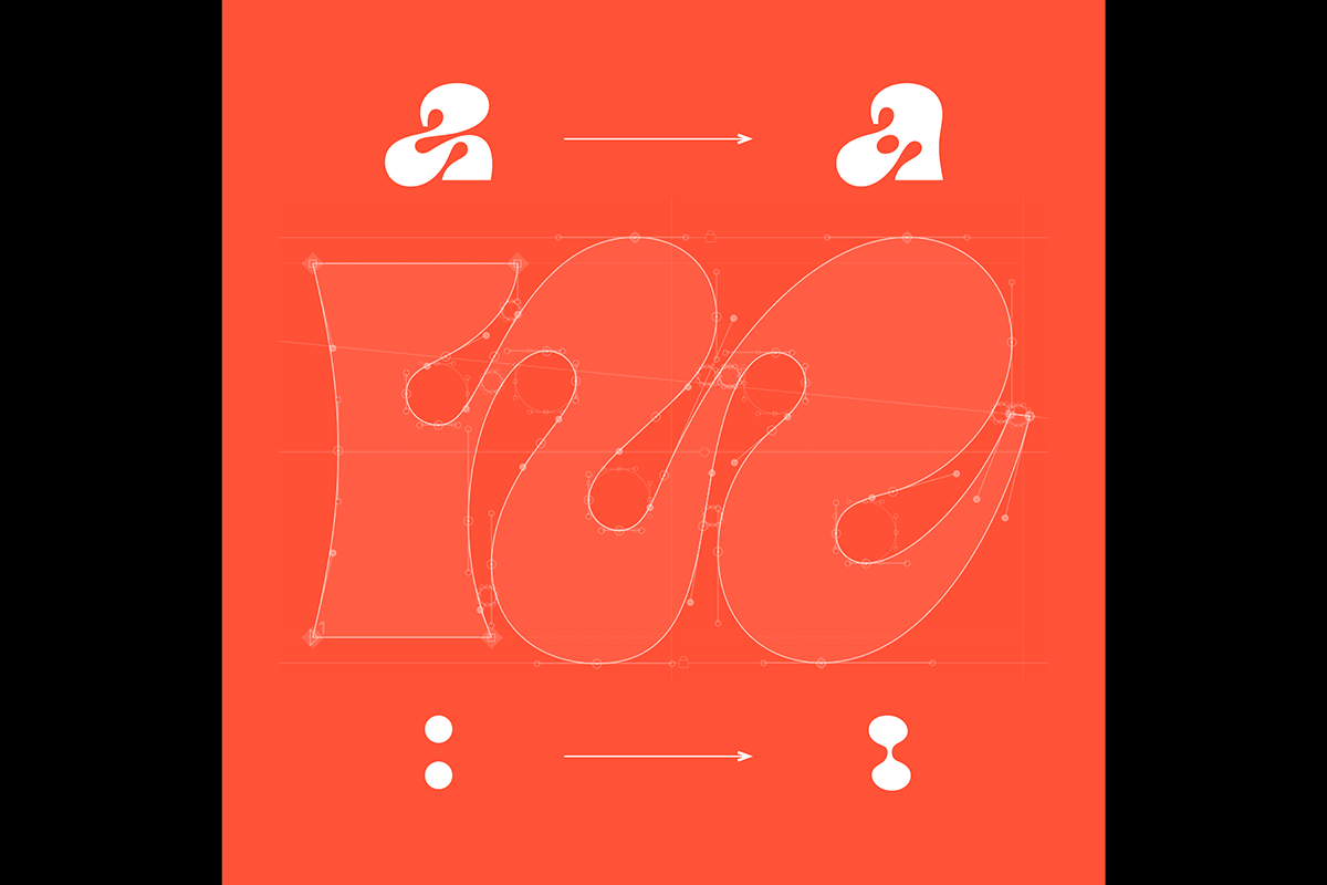
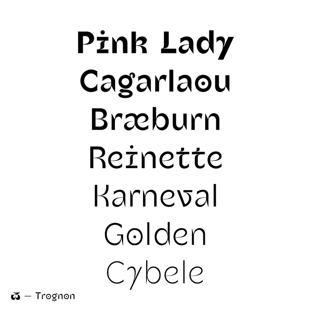
Considering Jules seemed to find type kind of intimidating at first, we were interested to hear more about how he began to break down this barrier; which he explains came down to an explorative open call from Velvetyne Type Foundry in 2017, who were looking for designs on the theme of ampersands. This call provided the opportunity which pushed Jules into drawing his first glyph. ‘From this point, the adventure began’, the designer tells us. ‘Not long after, I started to draw my first typeface Trognon, based on this first drawing… Its origin comes from the similarities between the appearance of an ampersand and an apple cut in half. This typeface is almost finished now, though I am still looking into the typographic licenses and the distribution options.’ We love Trognon’s fluid, humanist influences and particularly its treatment of negative space, which you can see in the stunning renderings of the sharp terminals in characters such as ‘a’ and ‘r’.
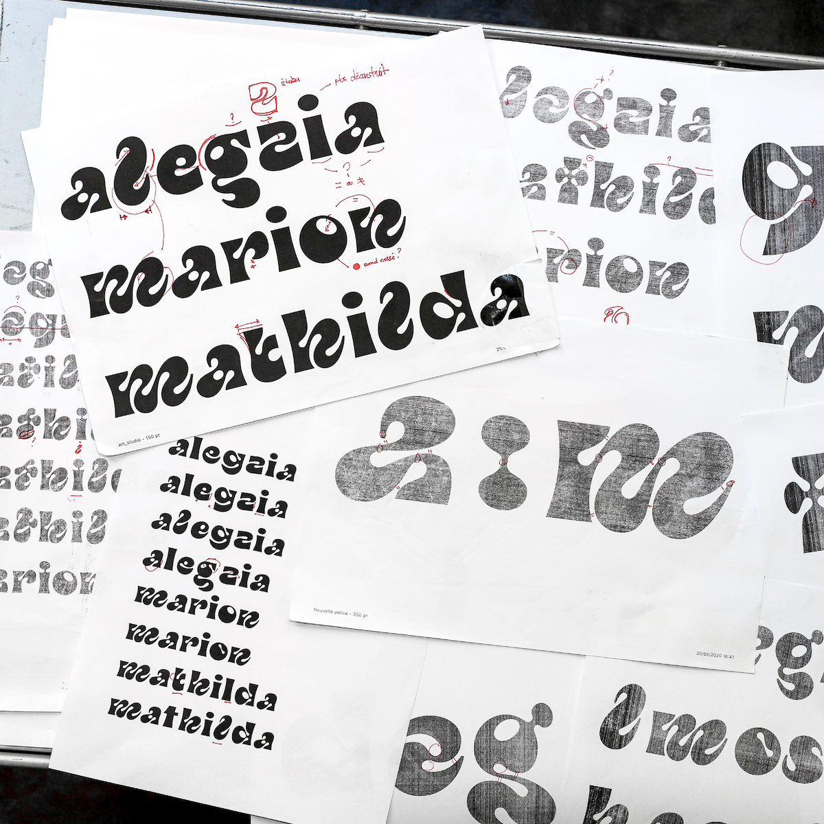
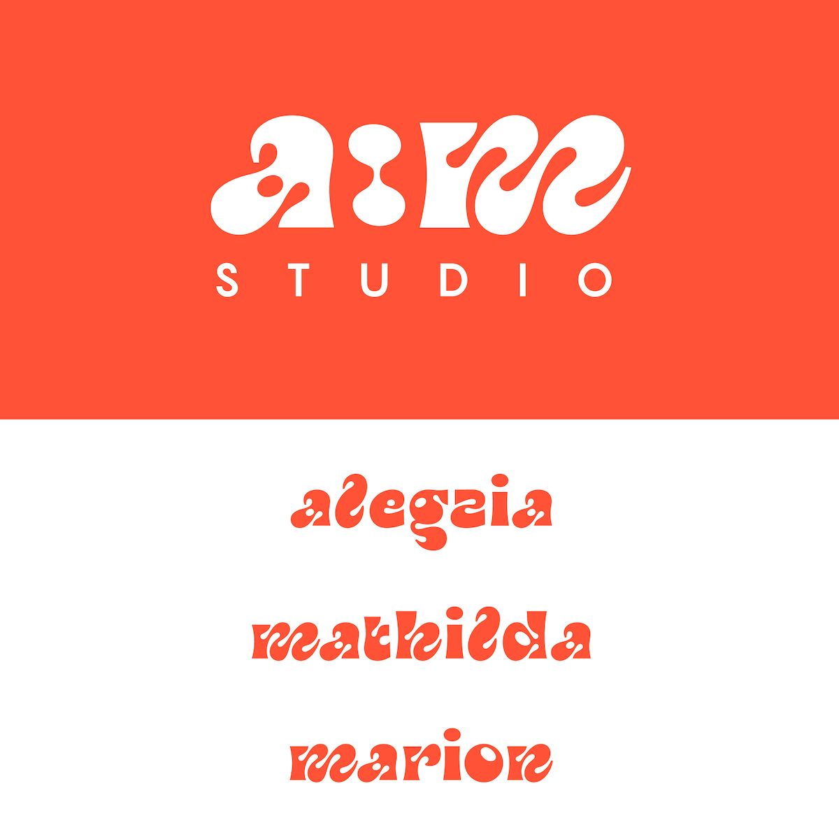
Last Summer, Jules also got his first graphic design commission from a:m Studio, a design studio based in Paris. The studio were in need of a new custom logo and distinct lettering pieces for each of their three members. The logo’s bold, fluid shapes make it so, so addictive. Jules tells us he loved the freedom he had in this project – and we think that really comes through in the final result. ‘The studio – being very keen on fashion and especially big fancy shoes – quickly agreed on the shapes, especially those of the letter ‘a’, which evoked a splendid pair of shoes. It was super nice to work on such generous & organic shapes’, Jules recalls.
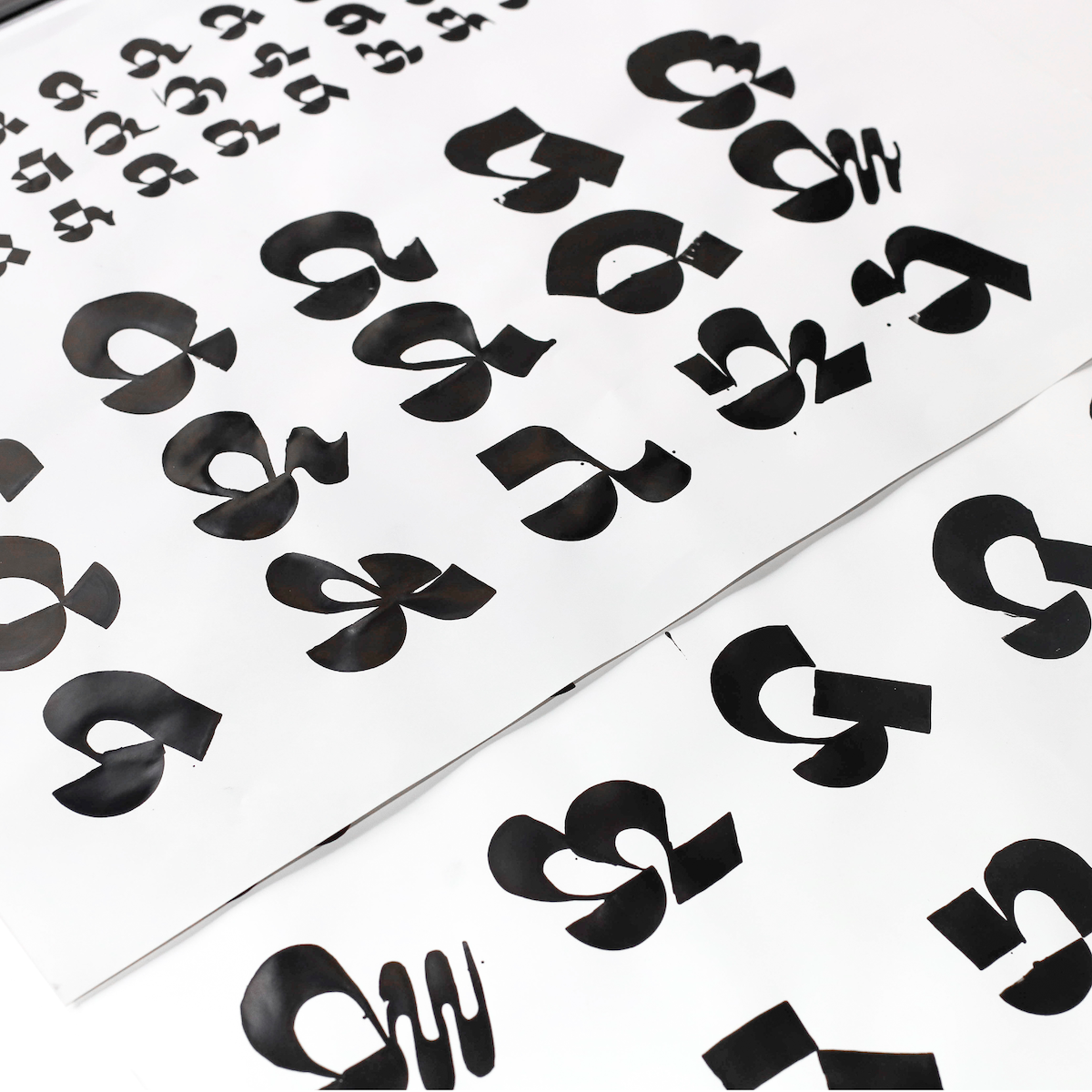
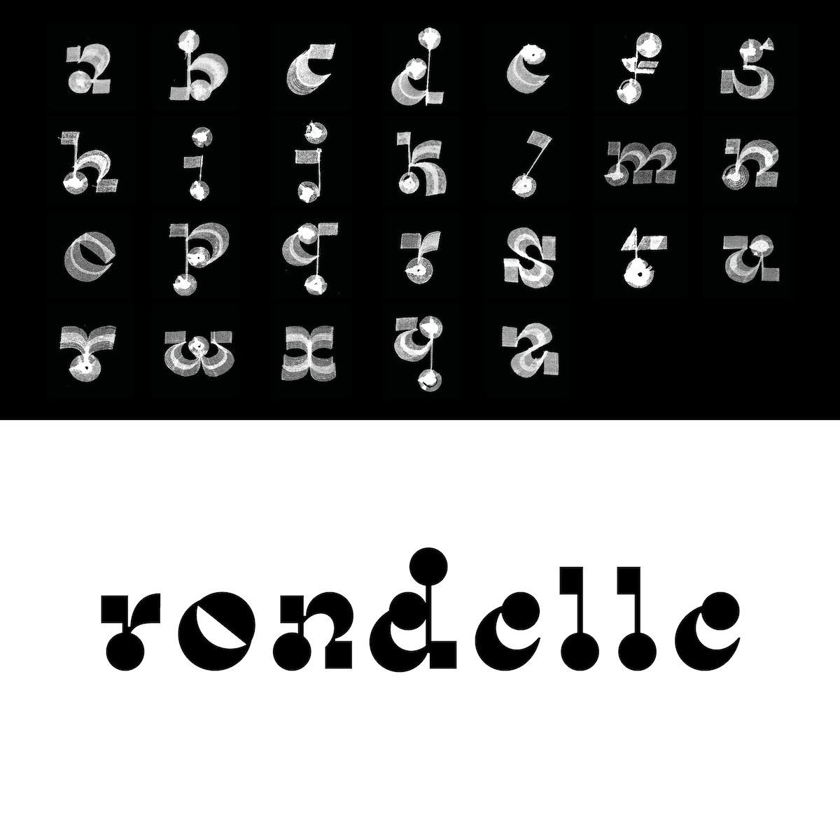
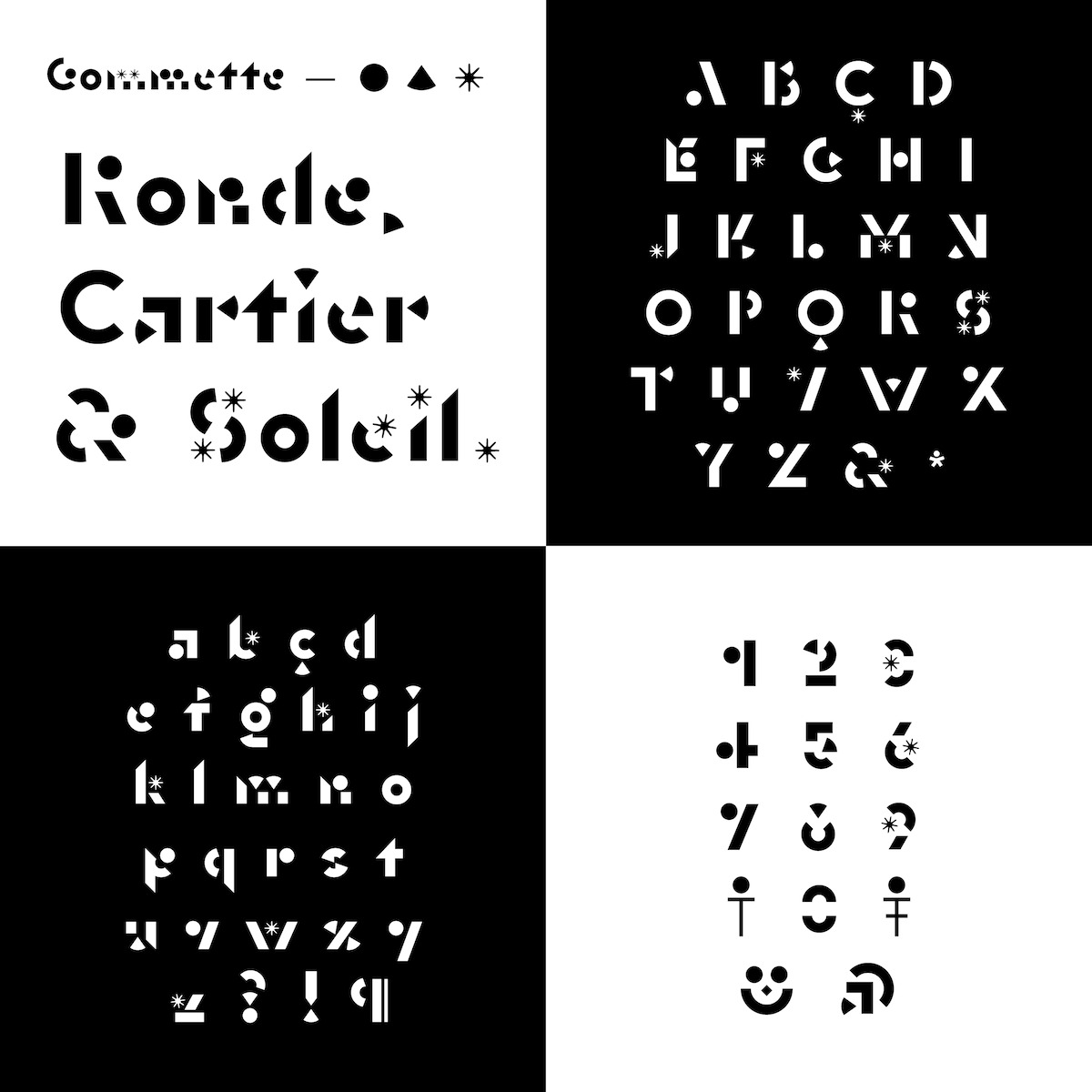
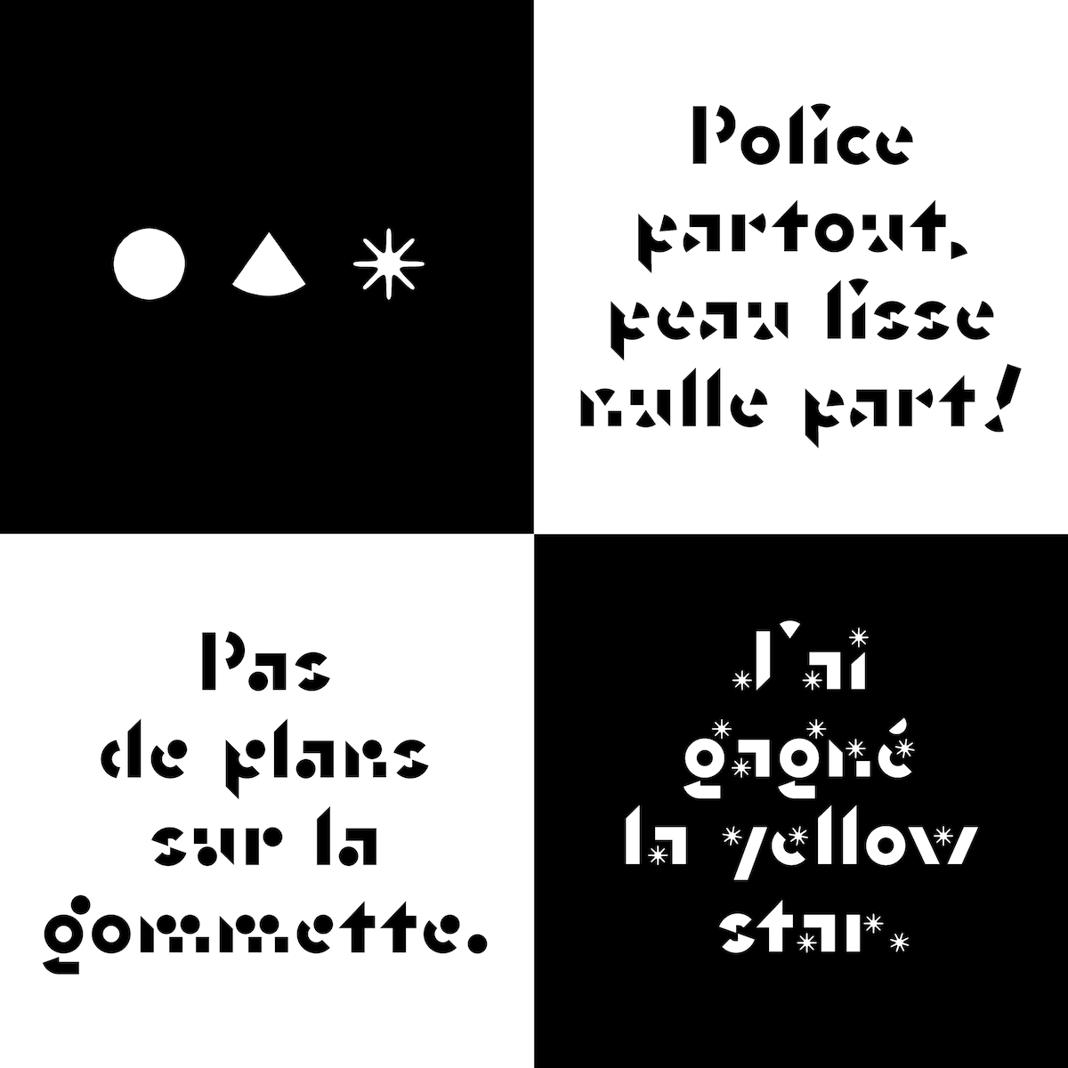
Jules’ knack for negative space also shows up in his typeface Gommette, which developed from a previous typeface endeavour named Rondelle. Finding its origins in calligraphic shapes, handwriting and using a quill, Rondelle is much more fluid and rounded than Gommette, which feels much sharper and more angular is form.
‘What interested me in Gommette’s conception was to draw a complete alphabet using a module as simple as a circle on every letter… It amused me a lot to be able to interchange this module by others, like a quarter or a sun’, Jules explains. ‘This creative process combined with the interpolation tools we get to use nowadays makes it really fun to create small animations on an alphabet, with simple shapes… Those ingredients all put together are offering a lot of possibilities which I can not wait to continue to develop.’
To see more from Jules, check out his website and Instagram.

