Invited to participate in the 10th edition of the Algarve Design Meeting, an annual event that promotes arts and design in the Algarve, Portugal, KOBU™ Foundry (the type foundry of KOBU™ Agency) have put together an immersive exhibition that poses new, explorative ways to interact with their type. “We immediately understood that it made sense to explore the work we’ve been doing with KOBU™ Foundry,” says KOBU’s Graphic & Type Designer, Brígida Guerreiro, adding that they wanted the exhibition not only to to showcase their work to the community, but to “engage young creative talents with the fascinating world of typeface design.”
Through a limited colour palette, sweeping murals and large sculptural interpretations, KOBU have achieved just that. Their immersive exhibition allows viewers to wander through a world of letters to viewed from different angels, all dropped into alternative, exciting contexts. Today, we speak with Brígida Guerreiro to dive deep into the the process of devising the exhibition, the nuances of viewing type in different contexts, and more.
What typefaces did you showcase and how?
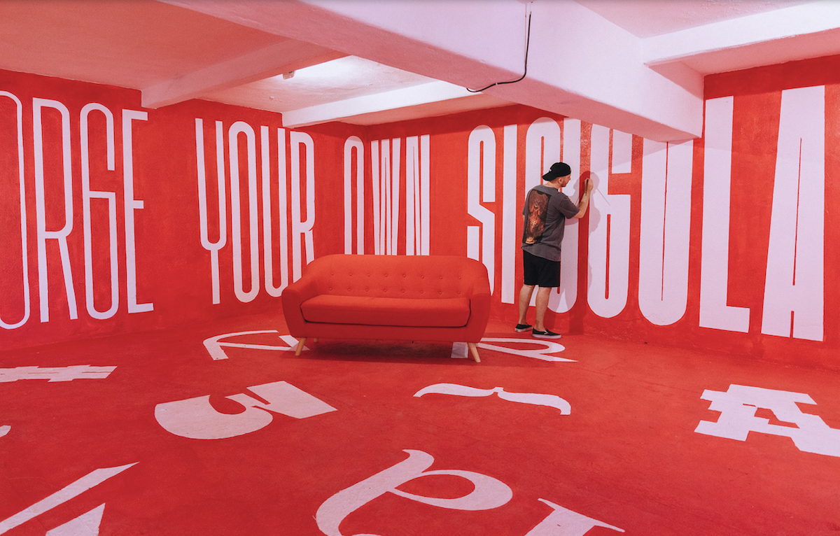
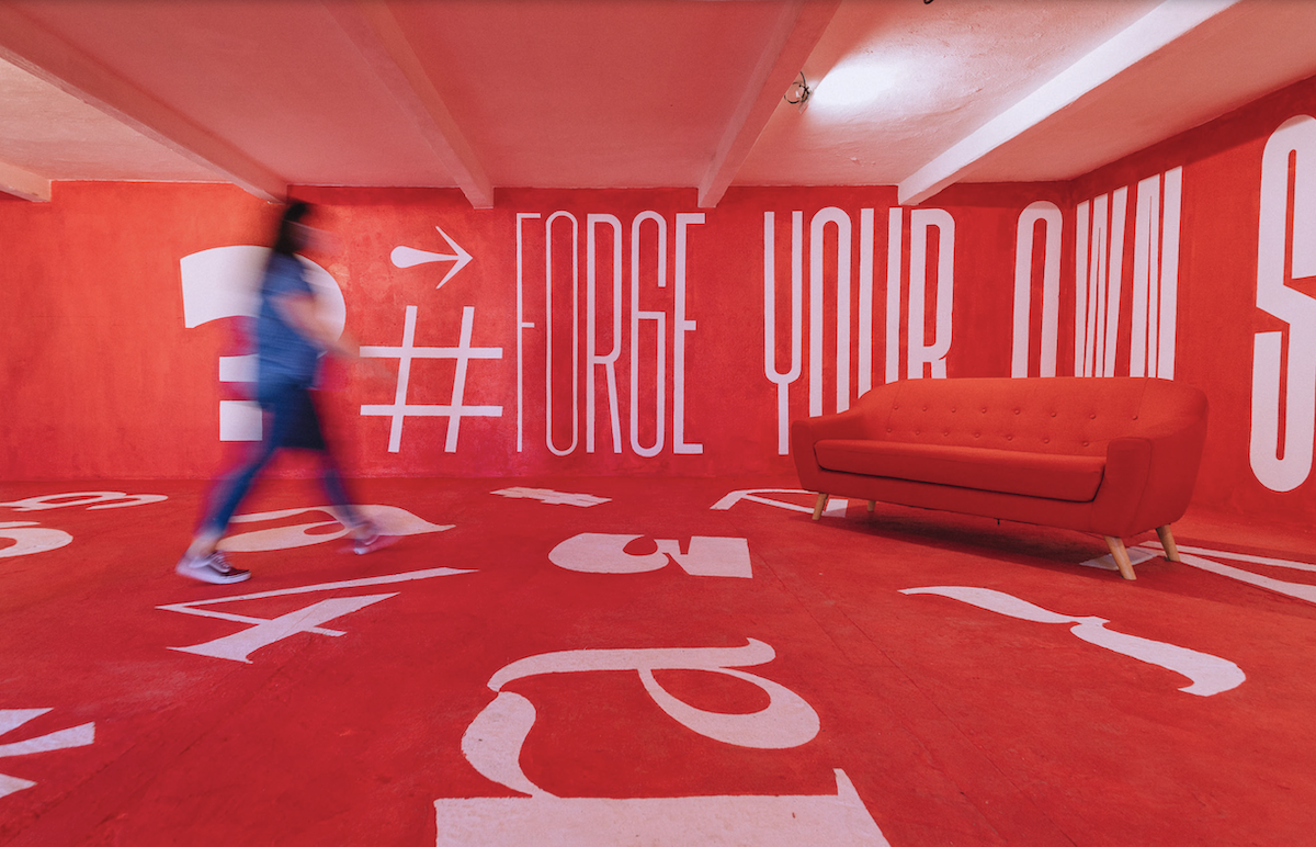
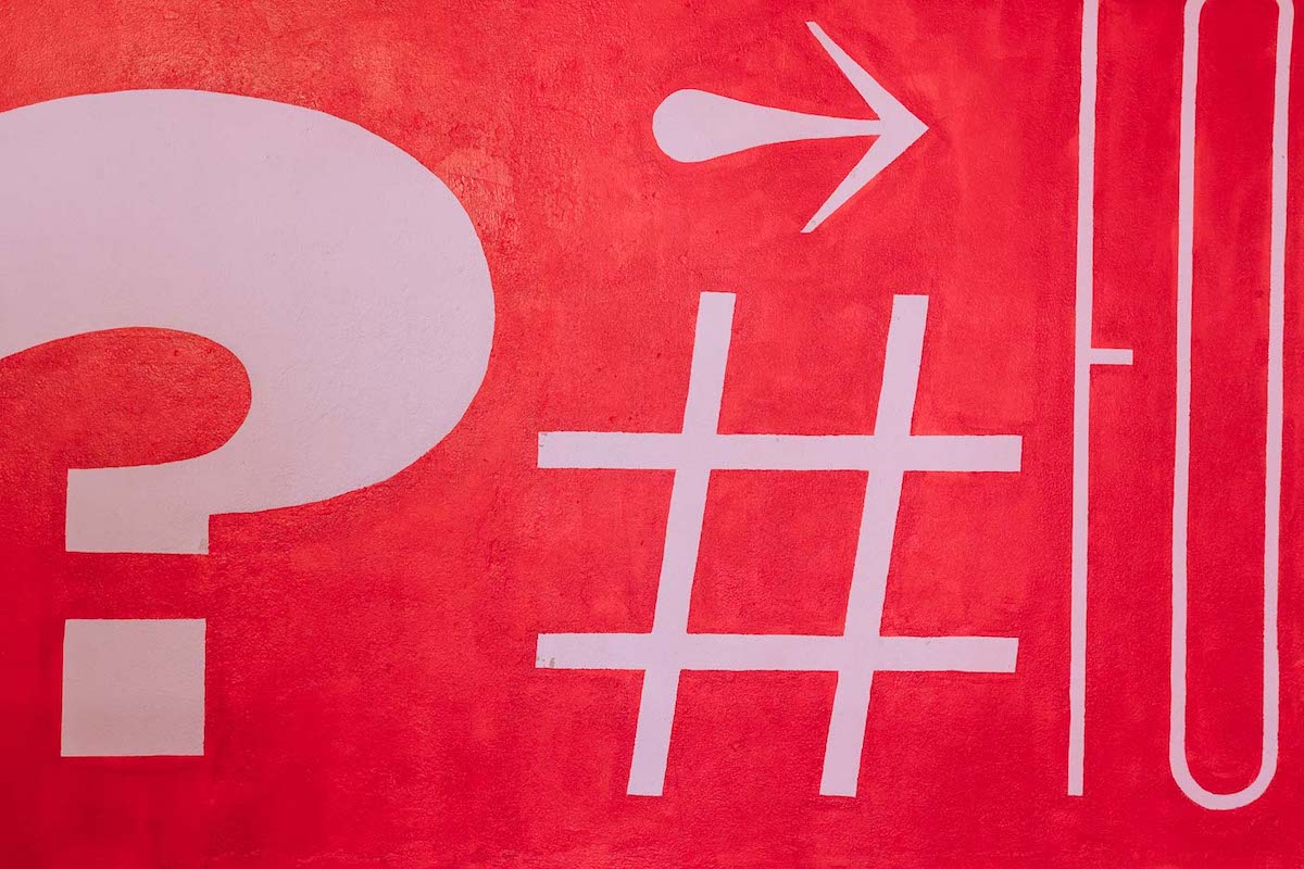
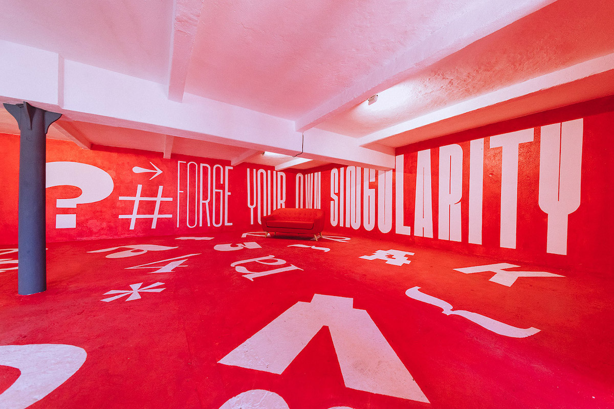
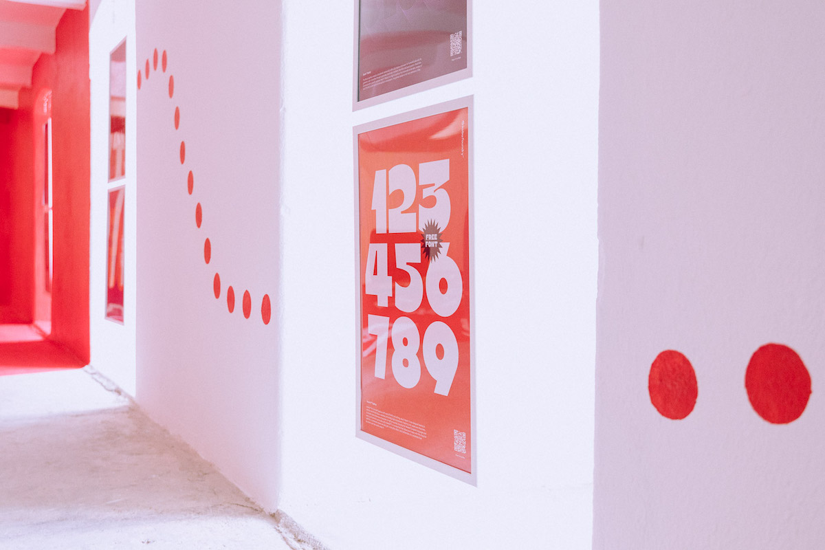
Throughout our exhibition we showcased type specimens of all the 9 typefaces that we have created over the last two years, and which are available for sale in our shop. To highlight details of each typeface we created a red section of the exhibition where these were featured through the floor and walls, creating a quite “instagrammable” spot. “Forge your own singularity” is the sentence that marks our typographic exhibition, and we decided to display it through a variable font that grows stronger, Kotei™ Condensed, to instantiate young designers to find their own voice. As a small note, Kotei is the Japanese word for affirmation, so it made total sense to use it.
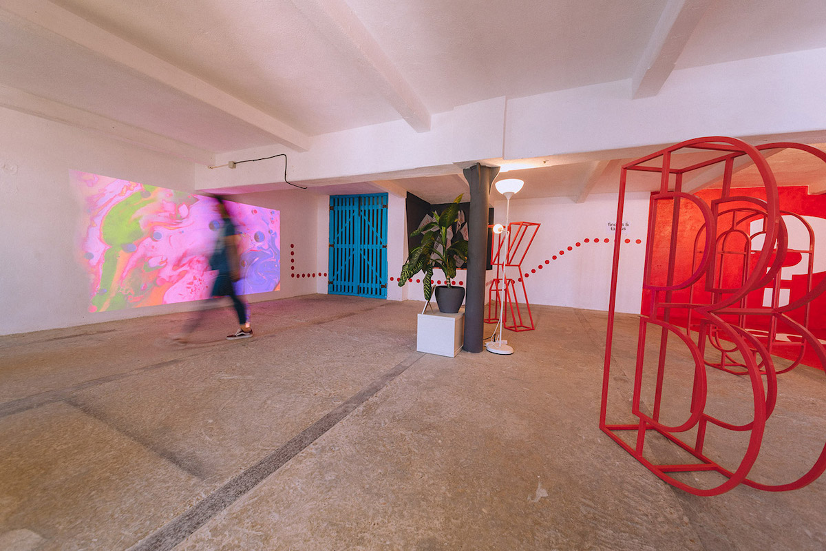
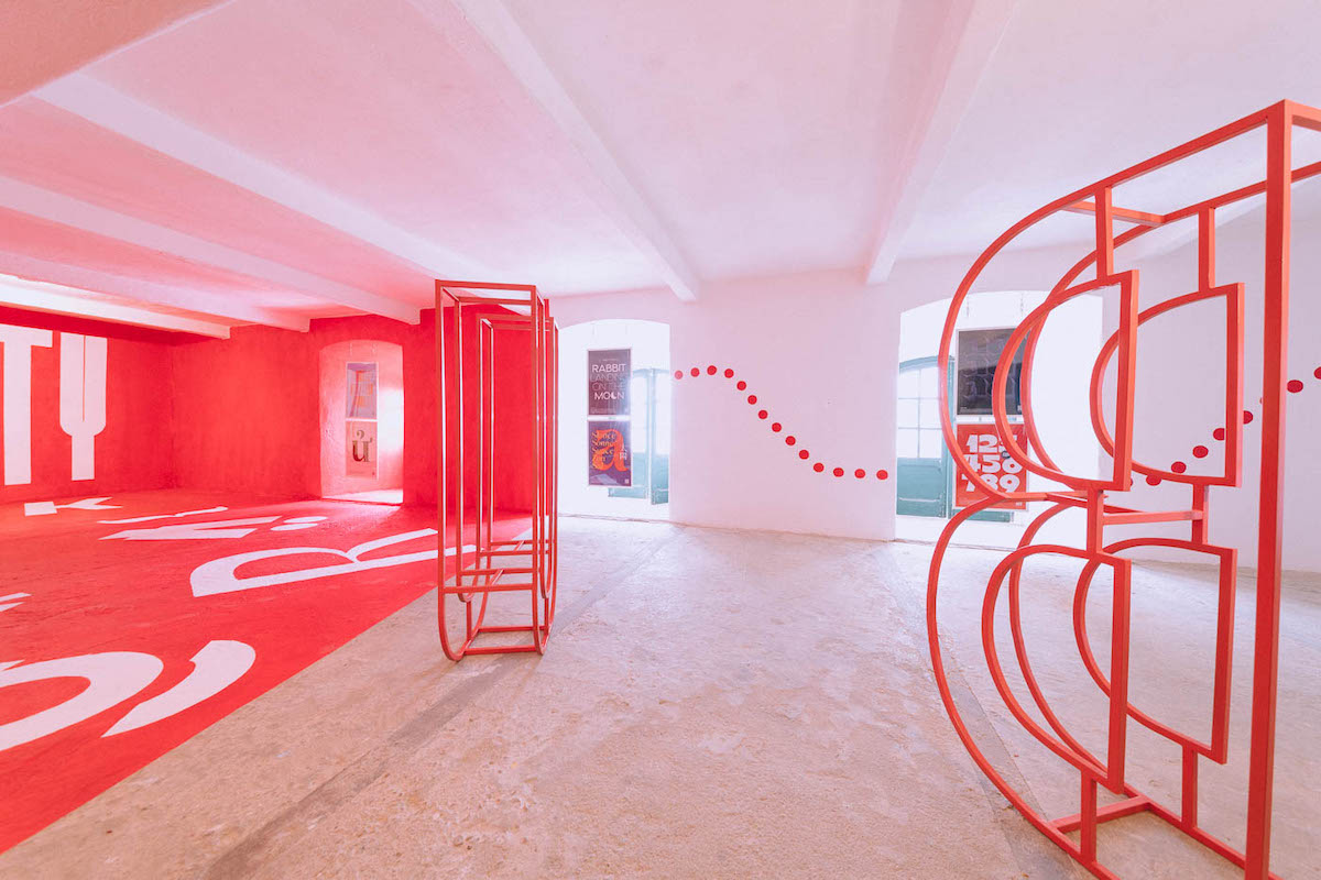
We also decided to shed light into the typefaces of own own brand identity, KOBU™ Headline and KOBU™ Text. We used KOBU™ Headline in the four-letters of the brand’s name, materialising them into human-sized iron shapes, mimicking some visual elements that you can also find on our website. As for KOBU™ Text we decided to hang the type specimen, printed in translucent tracing paper, from the ceiling to demonstrate the charisma of this typeface derived from the agency’s own personality.

What did you want viewers to get out of the exhibition?
The exhibition was conceived with a visitor journey in mind: we wanted every person to feel immersed in the typographic universe developed over these two years of KOBU™ Foundry. We designed a path where the visitor could appreciate visual compositions with all the typefaces applied, and, through QR codes, learn more about the different fonts in our digital channels. Visitors were then guided to a red area with our “psychologists red chair,” where they could appreciate the intricate details of each character. It should be noted that the use of the red color derives not only from the main KOBU™ Agency brand, but it was also meant as an element that gives voice to the way we think when developing a typeface – value, charisma, personality and purpose.
What was it like translating your typefaces into different mediums, like sculptures and murals? How does this change the way they’re viewed?
The perception we have of a given typeface varies greatly depending on how the designer determines its application. The typeface may even have a lot of charisma, but if we use it out of context, its elegance may be lost. With this idea of perception in mind, we chose each medium meticulously. KOBU™ Headline is a condensed font with a striking visual impact so we wanted it to featured as the welcome element in the room, thus creating it in painted iron shapes. As for KOBU™ Text, ceiling hanging tracing paper reflects the transparency that we as an agency envision as a core value, and also the shape shifting nature that we all assume as designers that want to bring diversity into our work. In the case of the phrase “Forge your own singularity,” we decided to present it through a variable font, not only to raise awareness to the utility of this fonts, but mainly to express, almost as a metaphor, that as the weight changes across the wall the message gains more relevance. And people could see the characters evolve, gaining new shapes while remaining part of the same family. Additionally, we wanted this to have a major impact on people’s minds whenever they entered the exhibition and so we knew from the start that it had to be big and covering most of the walls.
Do you think there should be more exhibitions that celebrate typeface design and what kind of shows do you think would benefit people in learning more about typefaces?
As a graphic designer, I believe that in some places we may still need to do more ground level work, where we need to assign the correct value to design and demonstrate that the role of a designer, in a given context, is necessary – and that we are not just tools. We think and solve problems at the level of communication, in this case, visual. In this context, it is also necessary not only to do this for the general public, but also to reinforce it in our community and adjacent communities – such as marketing, digital media, etc. – to bring the value of typography into projects. After all, a wrong typography choice can fully undermine the tone of voice of a project as well as its personality. With this being said, I believe that there should be more exhibitions that explore how typefaces bring perspective into communication, and how that has an impact into how we perceive and relate to messages.
Did you have a favourite element of the exhibition?
In this exhibition of ours I don’t really have a favourite element. But I have a moment that I consider the most immersive, which is when we walk through the exhibition room and we have a chance to sit on the sofa – there is a feeling of comfort, affirmation.
What part did you play in how the exhibition went and what was the process like?
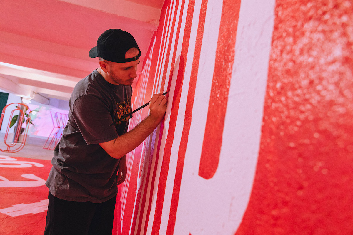
It is sometimes difficult to explain my role in this project, because I was present at all stages of the process, from conception to final implementation. The typefaces have been exclusively developed by me, over these last two years, but I also worked with the remaining team in the concept and its implementation, as well as all the assembly work needed to make it happen. I must mention that all of this would not have been possible without the involvement of Nuno Tenazinha (KOBU’s Founder), Miguel Spínola (Graphic Designer), Ramiro Mendes (Photographer) and Pedro Santos (Graphic Designer). They all played key roles in making this exhibition happen and without them it would not have had the charisma and dimension it had – thank you guys!

Thank you, Brígida!