

Originally from Spain, Carmen Nácher (@carmen.nacher) made the move from Valencia to Germany after completing her studies in Graphic Design. Firstly living in Cologne for three years, Carmen used her time to gather graphic design work experience within branding and packaging, before moving on to Berlin where she began to expand her practice.


Continuing to work as a graphic designer, Carmen began to explore areas such as illustration, experimental type, motion design and UX/UI, and after three yeas of honing her digital design skills, UX/UI has become her main profession… In turn, Carmen’s been experimenting more deeply with typography and illustration in her free time; meaning she’s been working way more freely and trying lots of different techniques.
‘One of the reasons I love design is because of typography… Luckily it has always been very present during my whole career’, Carmen tells us. ‘On the other hand, I am very happy that I discovered lettering/experimental type. It’s become my ultimate hobby and has given me the opportunity to occasionally work on commissioned projects as well’.

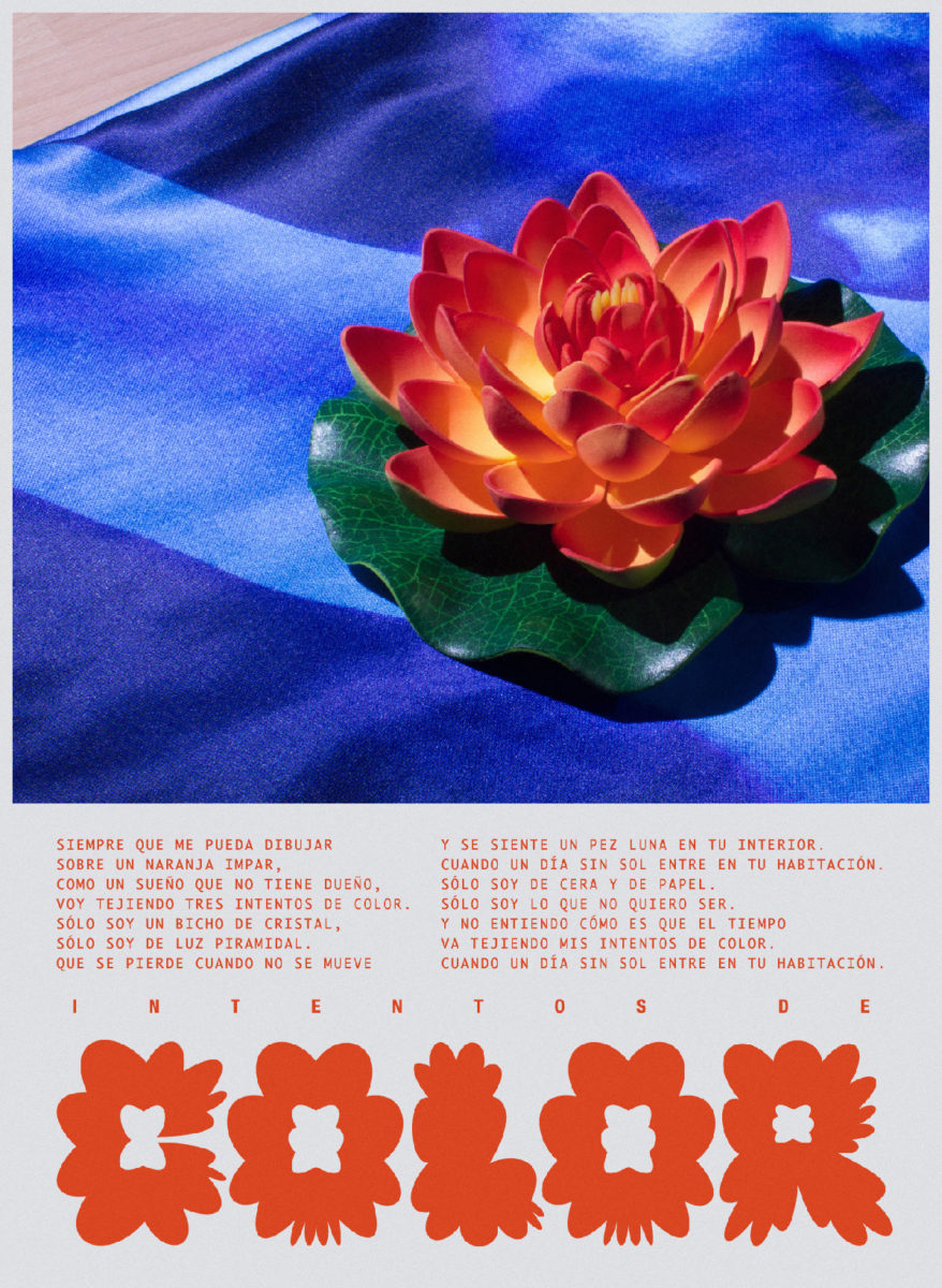
Born from bringing to life old, unused photographs, we love Carmen’s Flower series and wanted to know more about how it came into being. A small series of three posters, the type’s graphic shapes mirror the petals of different flowers are are assembled with words, almost like nature slides. Constructed with a grainy tonal quality and muted colours with the odd burst of brightness, these explorative pieces leave a lot of space for the expression of the letterforms.
‘I have a lot of unedited pictures and looking at a folder from last year, I found the “bird of paradise” flower picture and really liked it’, Carmen tells us. ‘After moving things around in illustrator for a while, I came to the idea of doing the letters with the shape of the flower and this kind of sparked the poster series’.
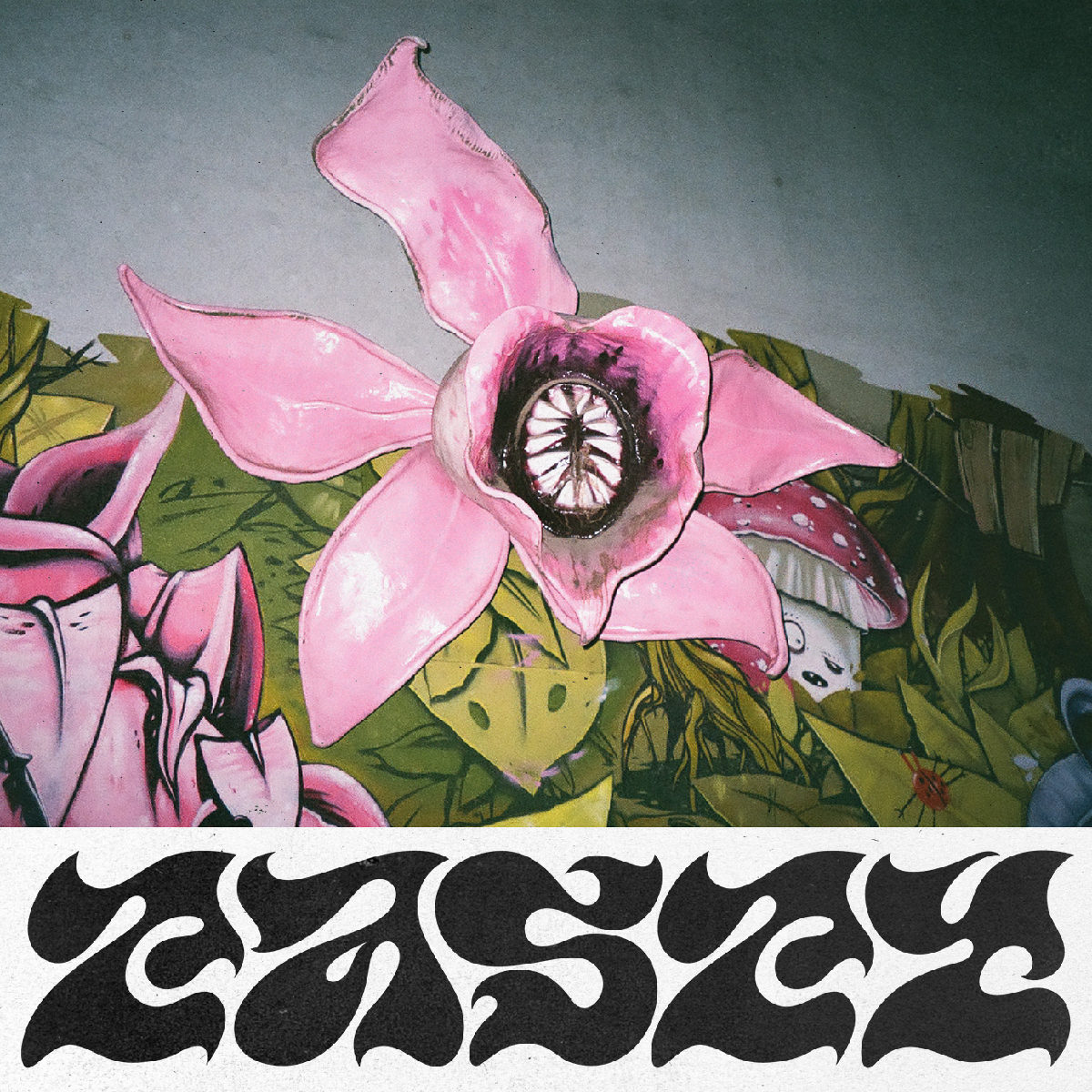
‘I started looking for more photos on my computer and I found the pink one for “Tasty”, which is a flower sculpture located in a children’s playground here in Berlin, and began to work with that. After this, I also photographed this plastic water lily on blue fabric I have in my flat to create a third design… I wanted to add some more text this time, so I started browsing into my 18 year old emo playlists from Spotify, where I found this moody song called “Intentos de color” from a Spanish band called maga (magician in Spanish)… I didn’t actually make any sketches for these posters, I just placed the images in an A3 Artboard in Illustrator and tried different shapes’.
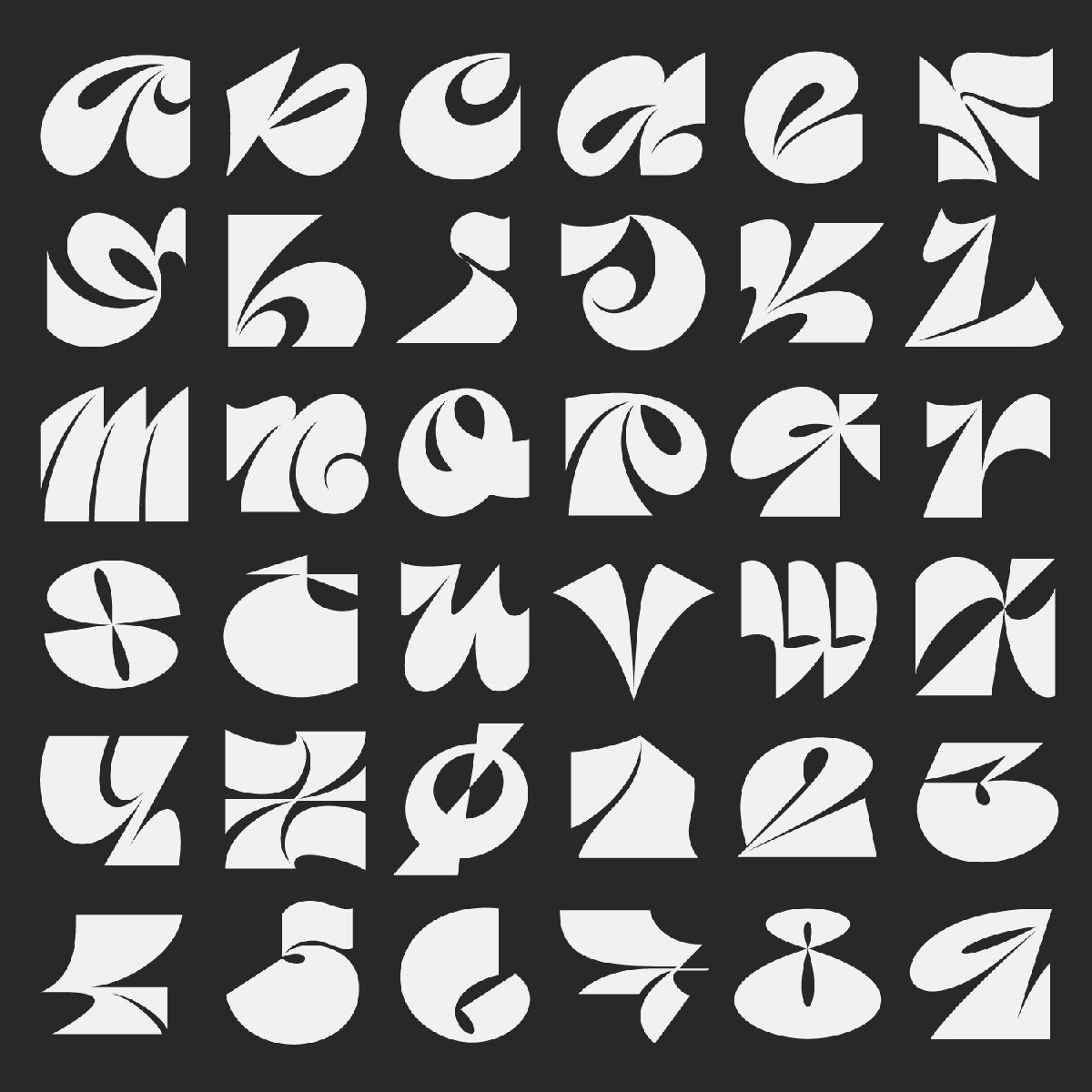
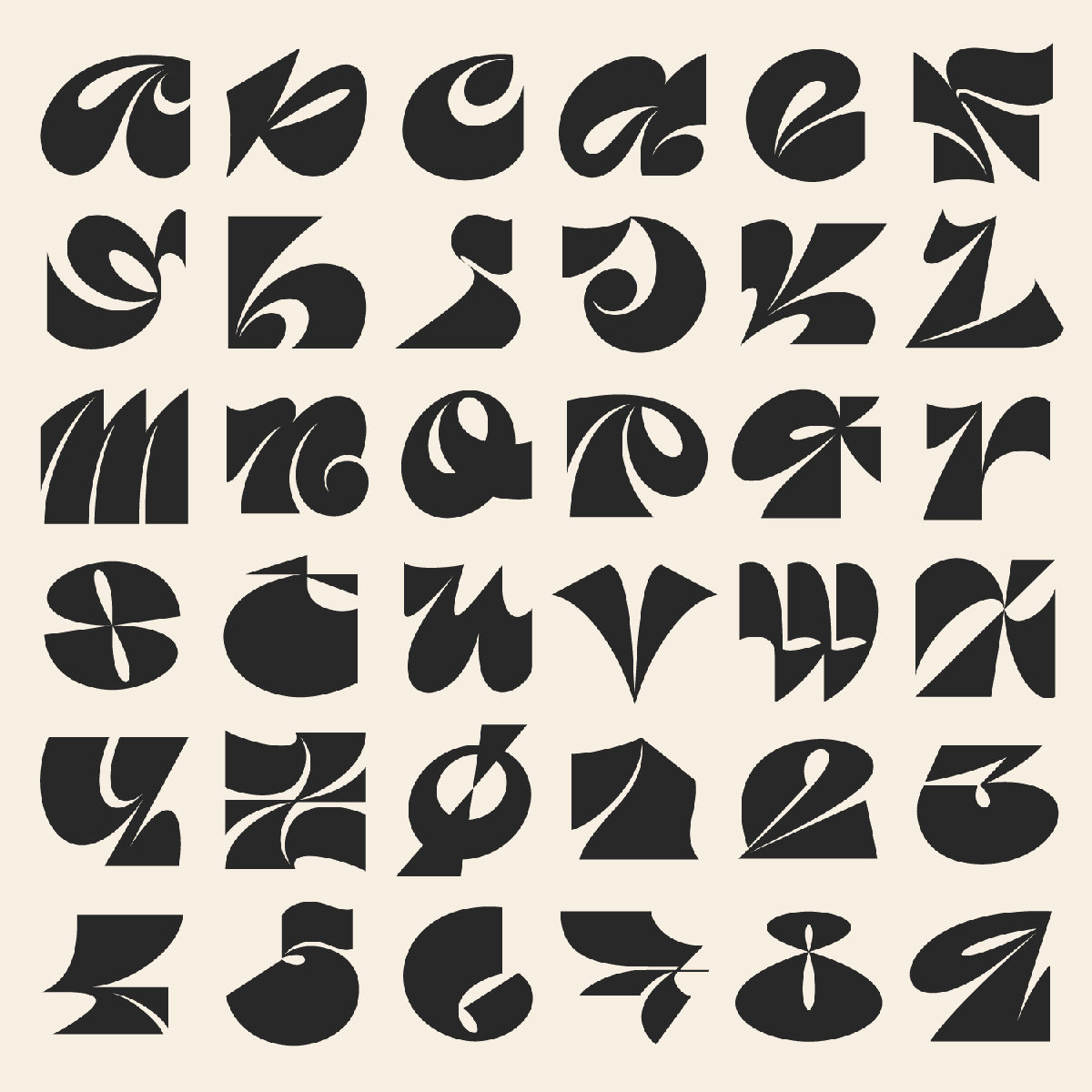
We also think Carmen’s 36 Days of Type series is worth checking out, too. Te see more from Carmen in the future, be sure to follow her Instagram and check out her website.


