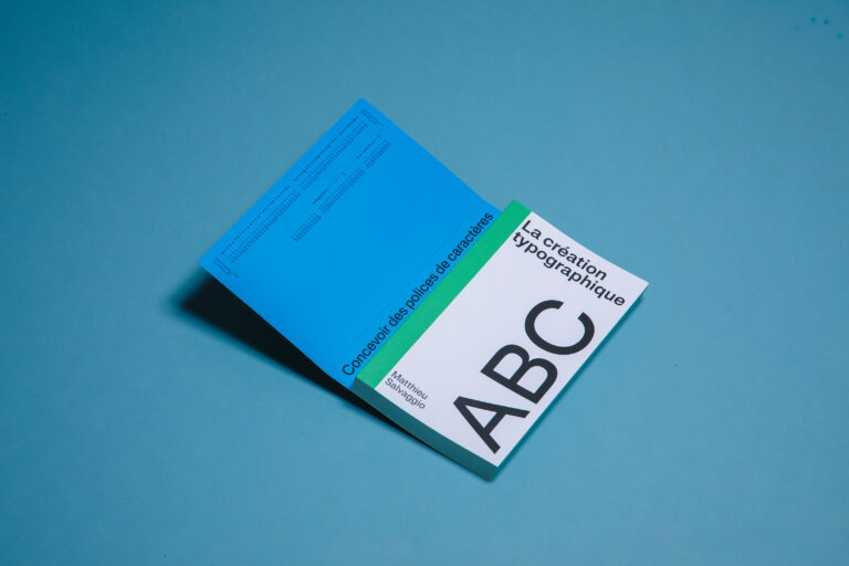
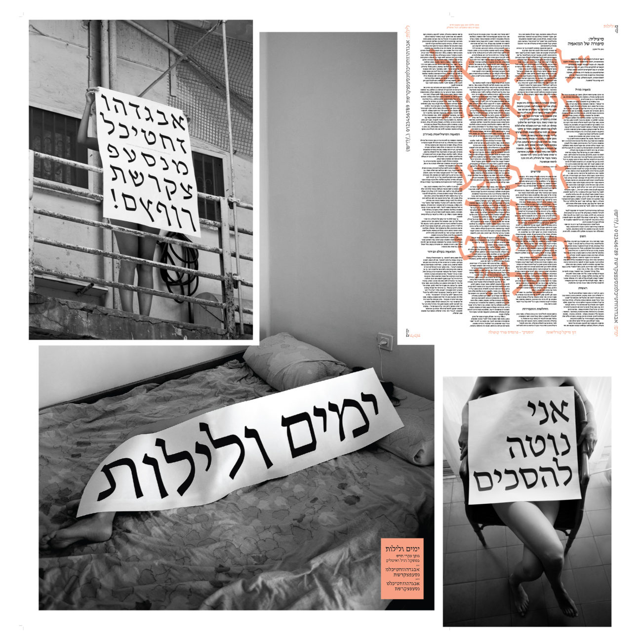
Ben Nathan is the founder of type foundry, Hafontia (@hafontia). Based in Tel Aviv, he lives with is fiancee and three cats and through Hafontia, he designs Hebrew fonts for Israeli brands and designers.
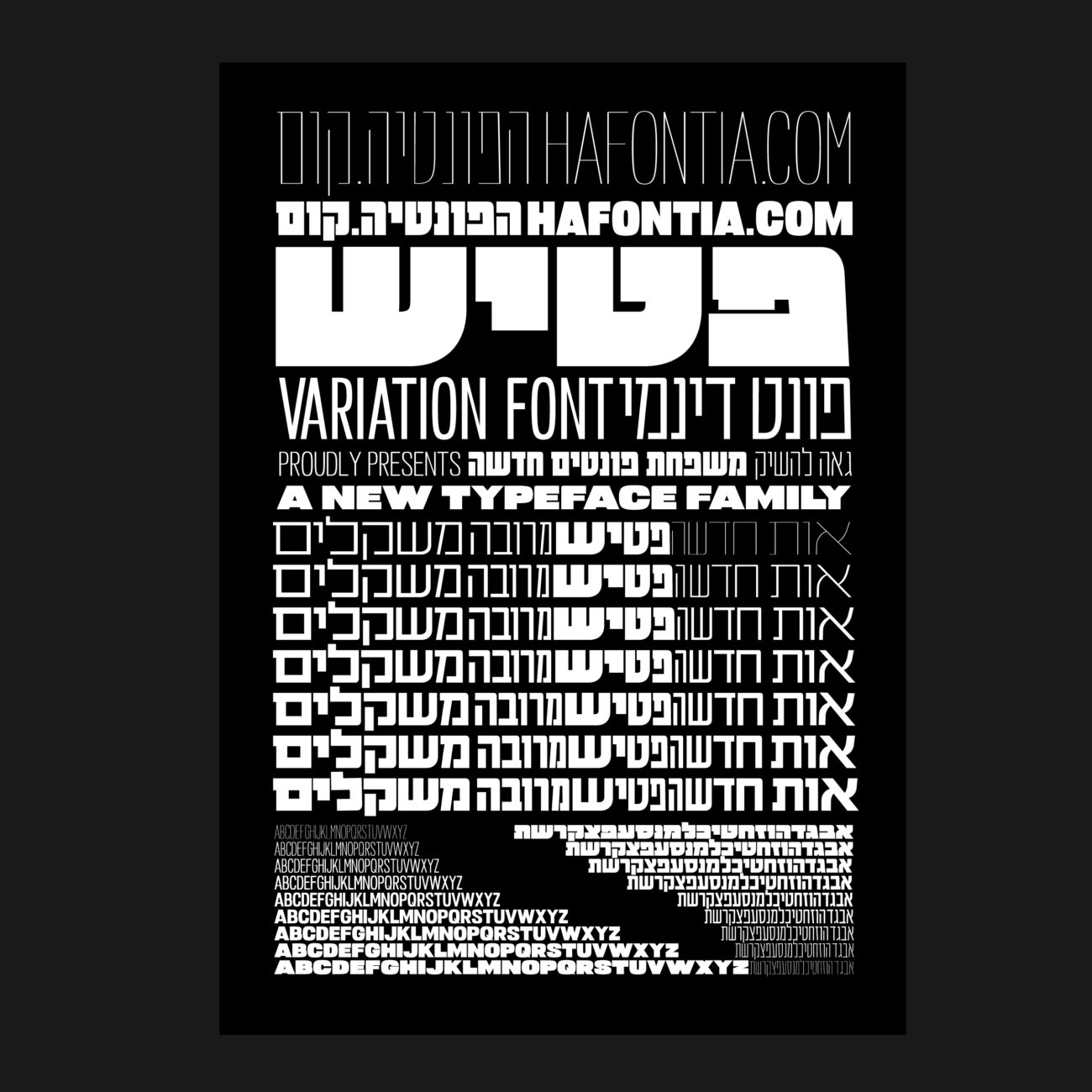
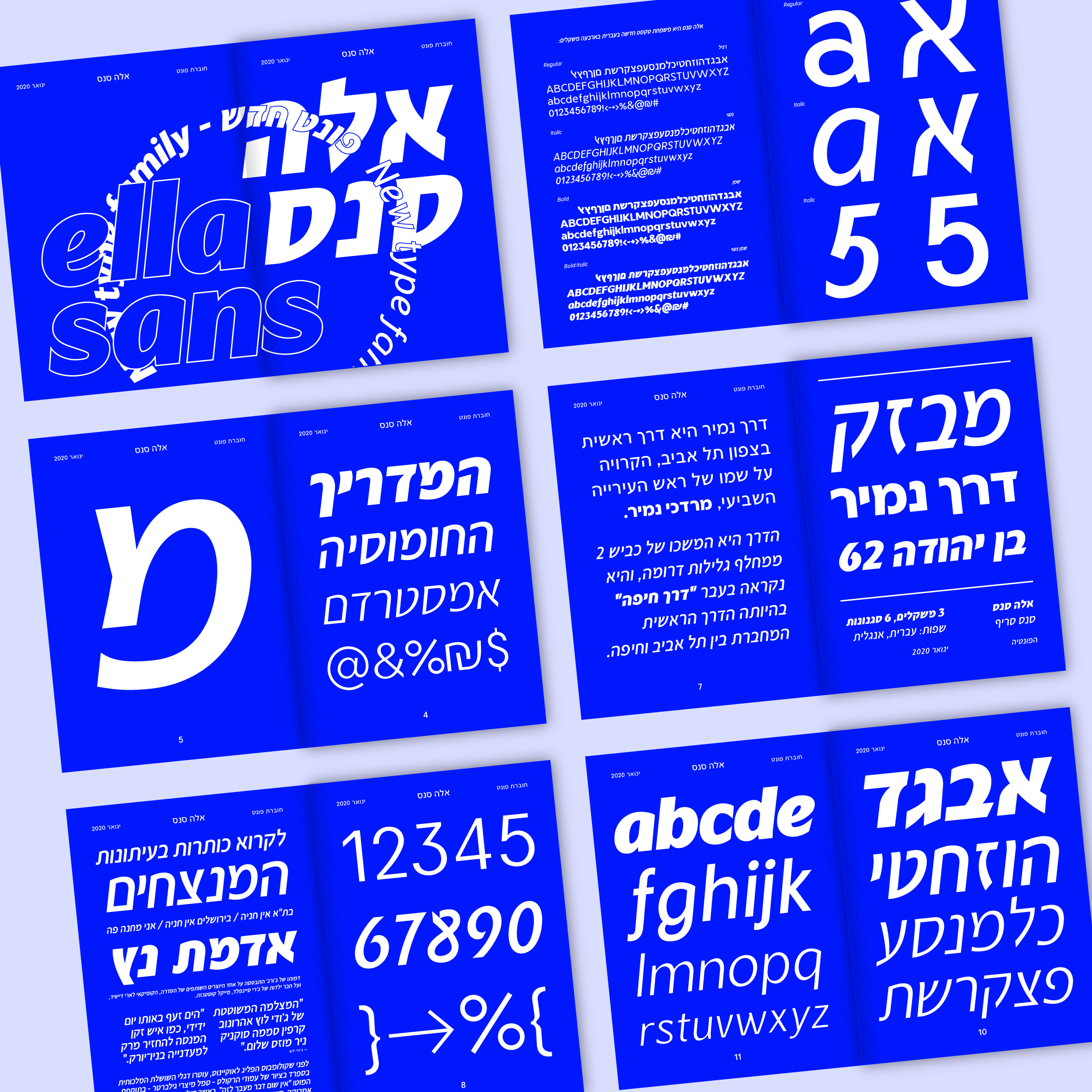
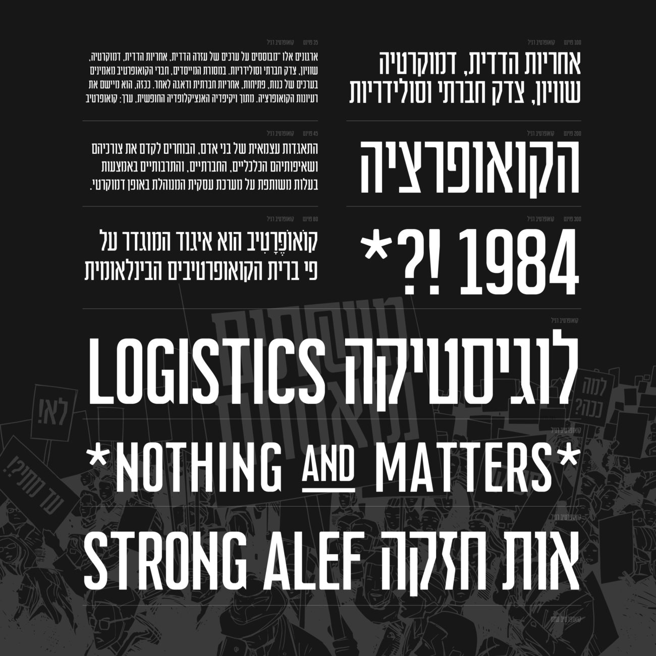
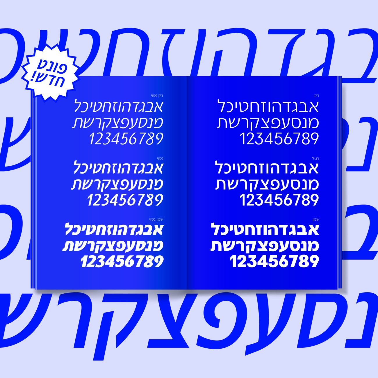
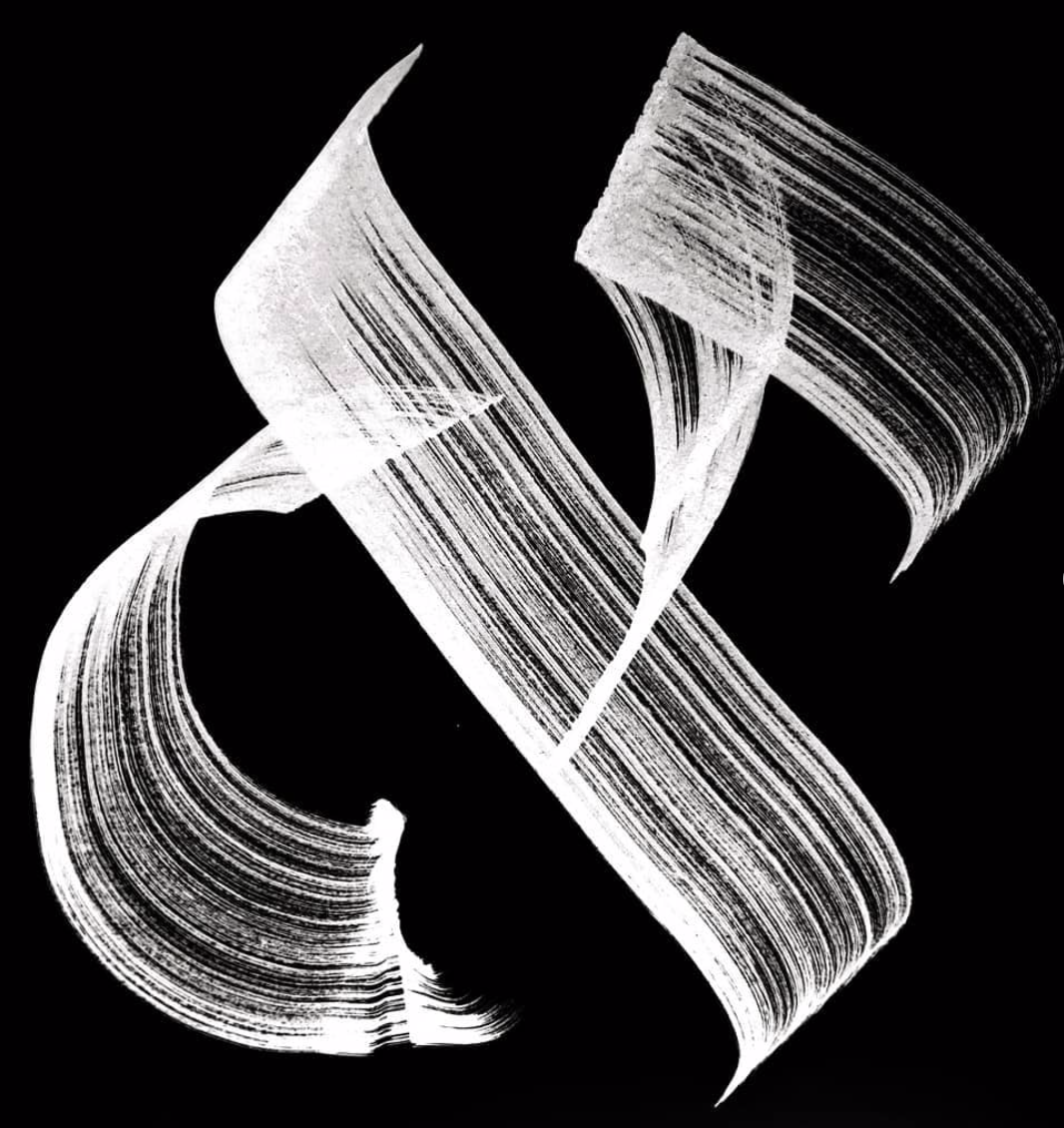
Hafontia’s visual presence feels routed in deeply honed craft and close attention to detail. Much of the foundry’s output features high-contrast fonts with a tactile, rhythmic finish — at once deeply connected to script, ink and the hand of the designer, whilst offering contemporary and unexpected quirks which feel more closely related to the digital rendering aspects of type.
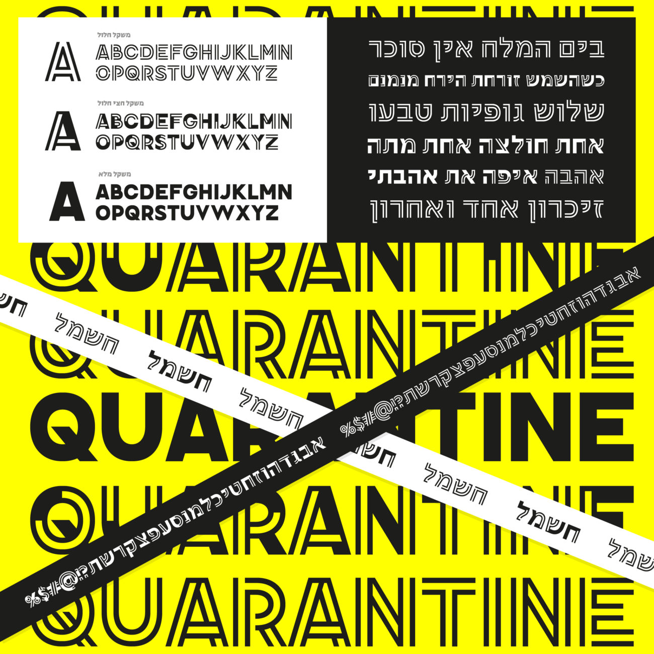
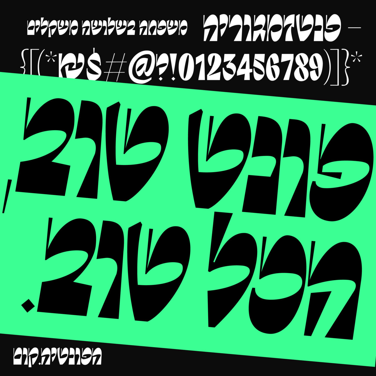
One characteristic which feels super compelling is the drastic contrast achieved throughout Hanfontia’s portfolio, which often features wafer-fine strokes alongside super heavy counterparts; creating a high level of dynamic interplay and contrast within and between glyphs.
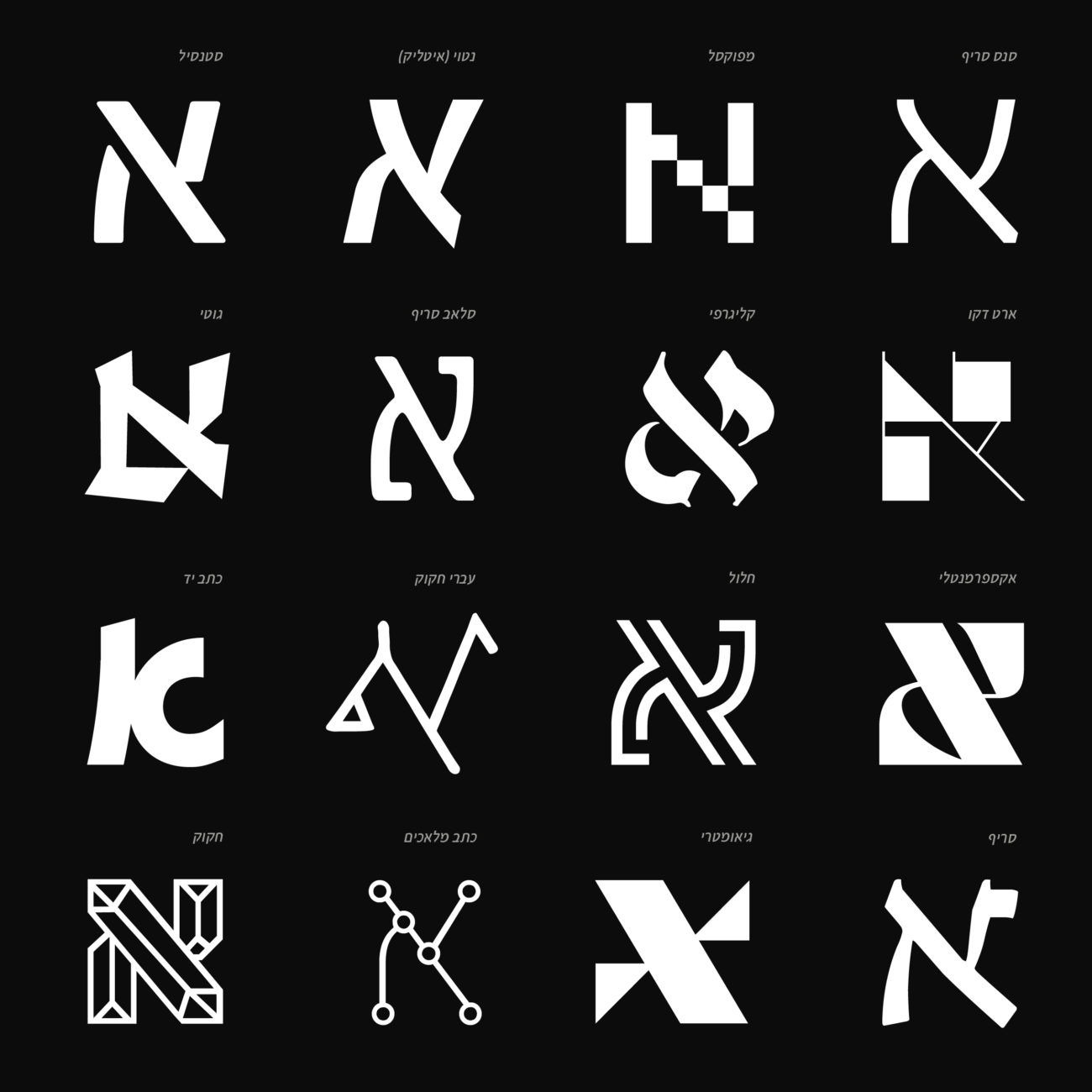
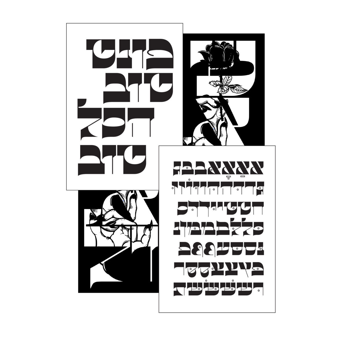
Hafontia’s portfolio is also full of fascinating experimentation with glyphs and possibilities of composition. We particularly love the foundry’s moving image explorations, such as this, which feature glyphs embodying a fabric and life of their own; knitting together, weaving and unfolding in dimensional, fluid and sculptural form.

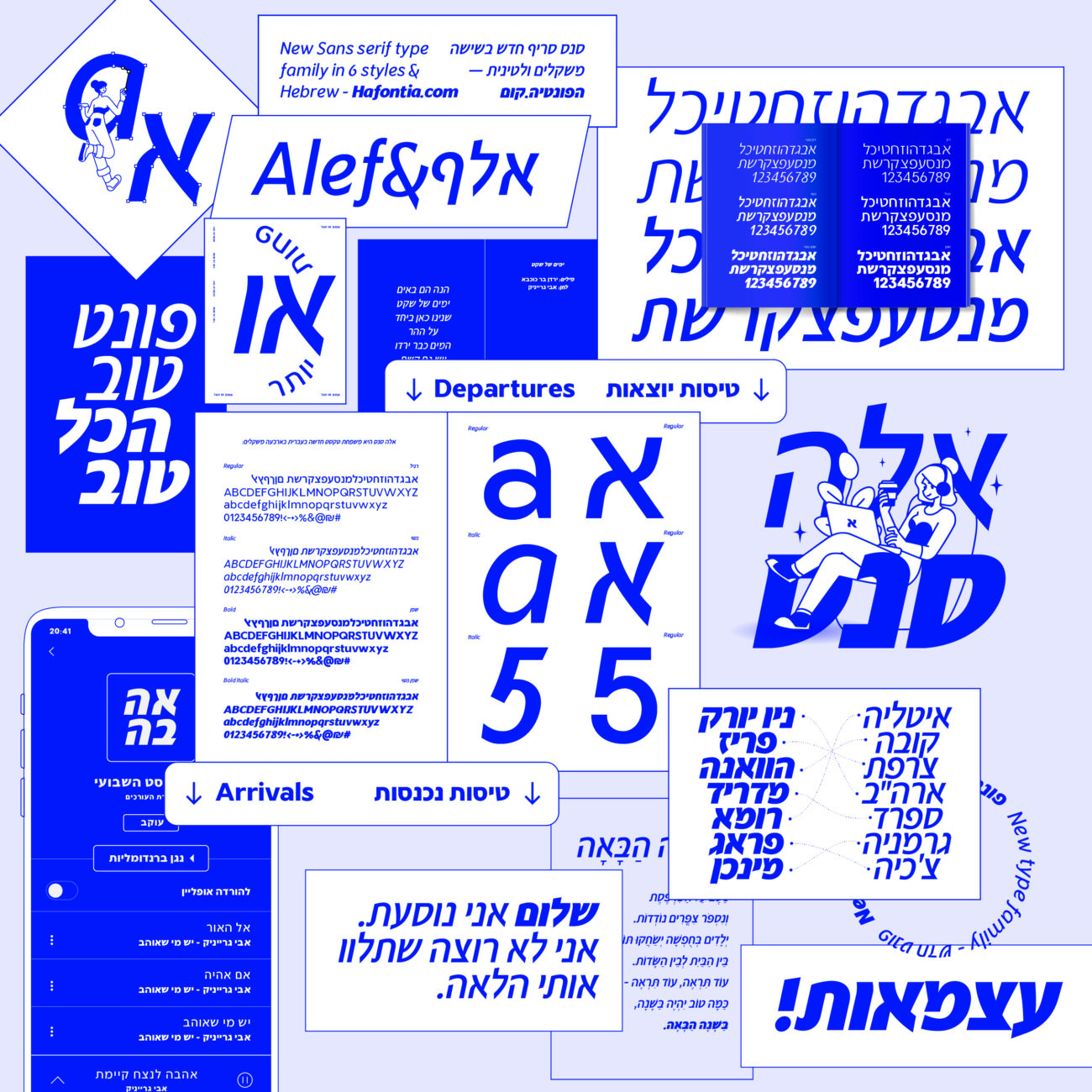
Ben also shared his love of collaboration, and highlights some of his favourite collaborating projects, commenting ‘I’m always looking to collaborate with Latin type designers. Some of my best work is a result of creating a Hebrew versions for a Latin font, like Assistant for Google, or Discórdia by naipe.xyz — which is still in design process and will be released later this year.’
Thank you so much for chatting with us, Ben! To see more from Hafontia, check out their website and Instagram.