

Hello, and welcome to The Palace of Typographic Masonry. Please keep your eyes, ears and mind open as you wander these corridors, chambers, pavilions, labyrinths, galleries and rooms. Don’t get lost now. Its architect and proprietor, Dutch graphic designer, Richard Niessen (1972), has filled this Palace with a collection of visual communication/graphic design examples. Sorry to spoil it so soon though, this is not a real Palace. There is no Library of Inextricable Books and you can’t actually walk through The Annex of Universal Language.
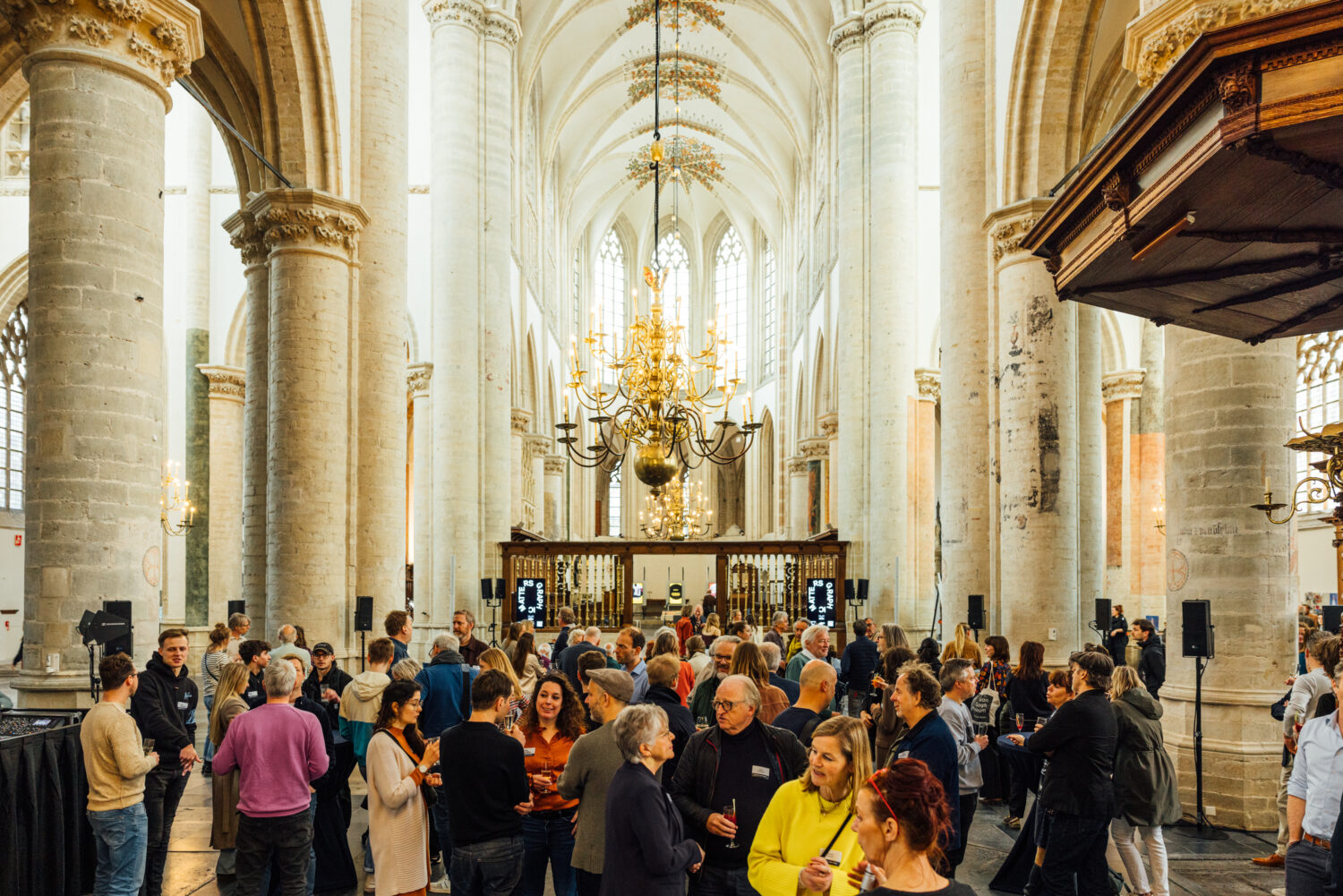
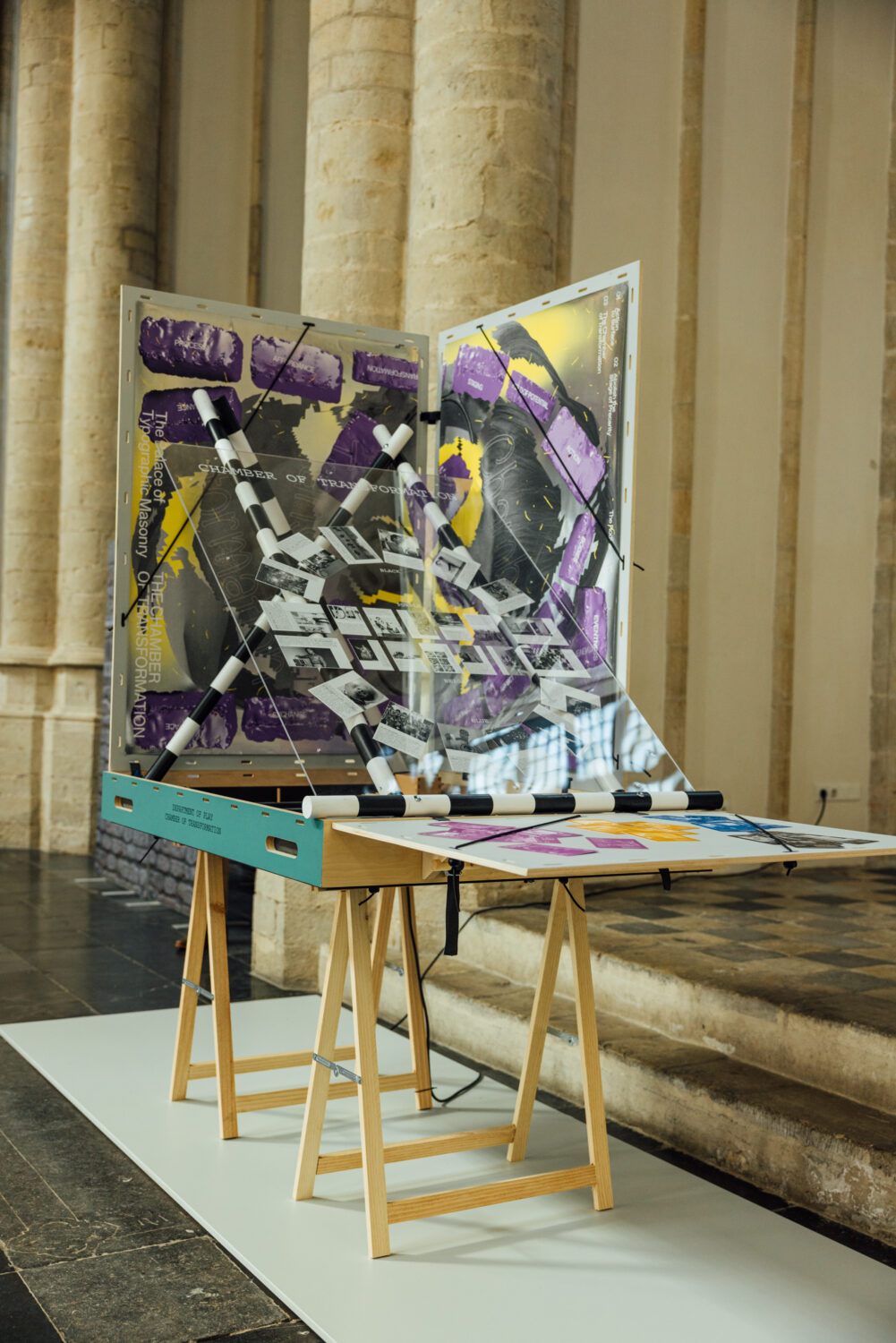
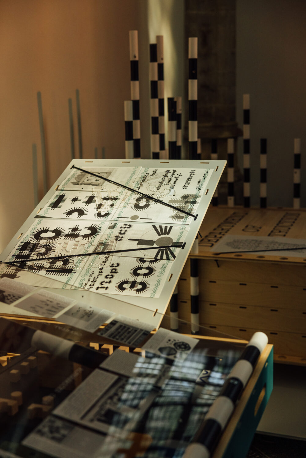
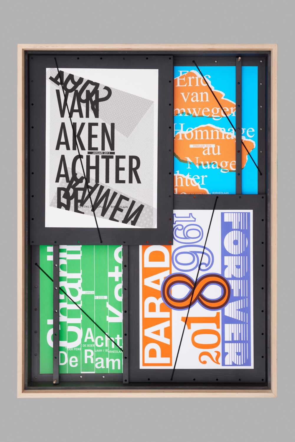
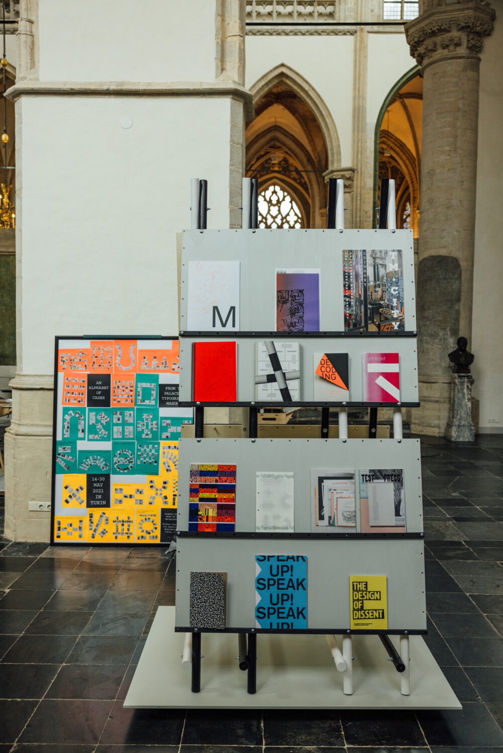
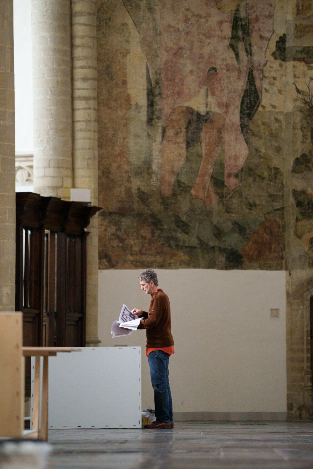
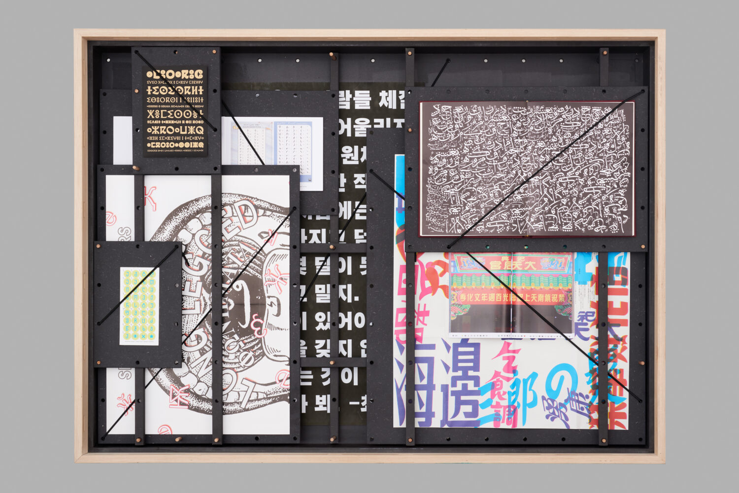
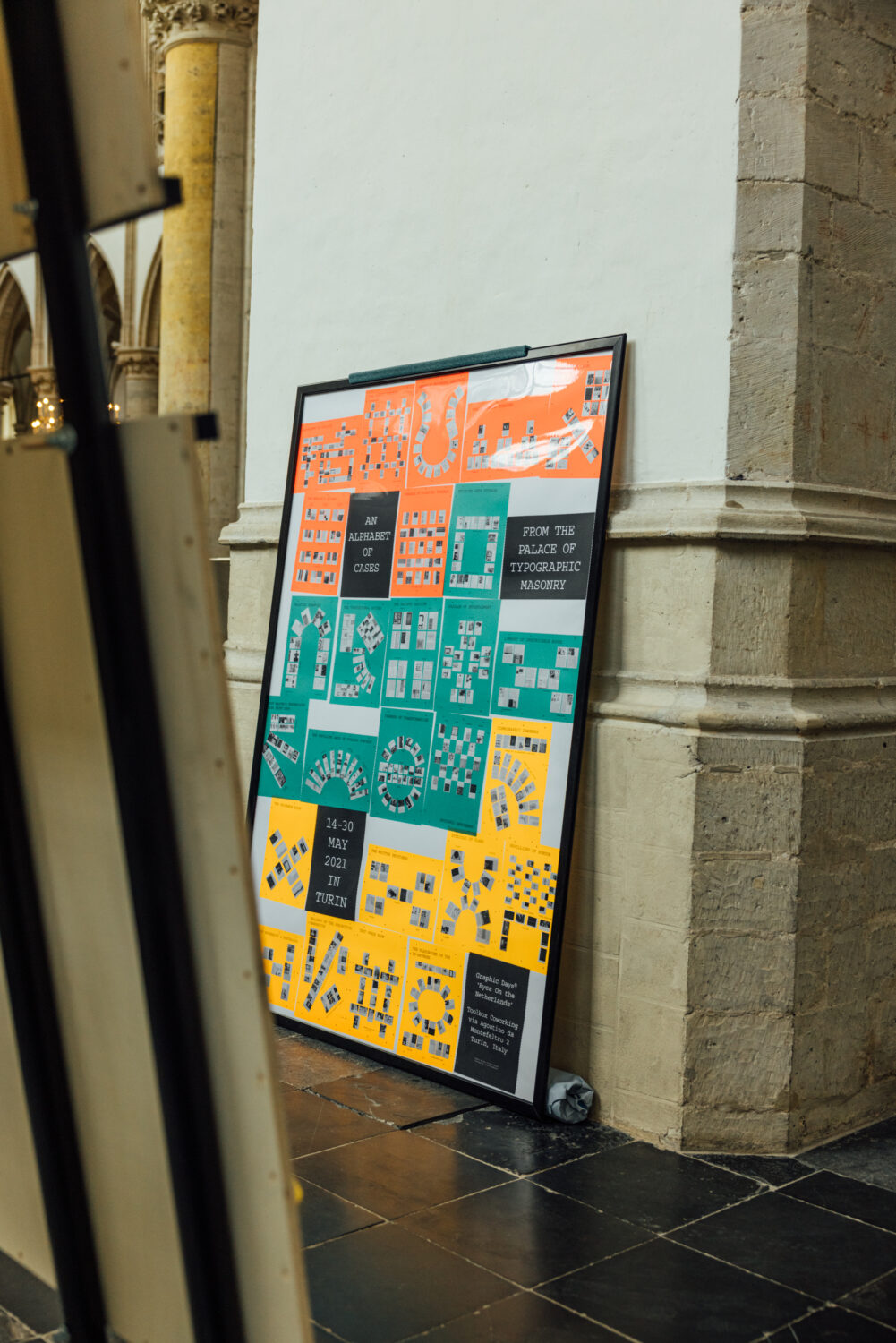
Niessen’s imaginary Palace has to exist in your mind. The collection, however, is real and together with Graphic Matters*, it’s been brought to life through a physical exhibition. Displayed over 26 unfolding drawers, aka An Alphabet of Cases, which are split across three (imaginary) floors and sorted under nine overarching Departments of Sign, Symbol, Ornament, Construction, Poetics, Play, Order, Craft and Practice. To understand how the exhibition works, you have to understand that each room in the Palace is one of these 26 drawers – as you physically move from one drawer to the next, imagine you are traveling from one room to the next.
The initial idea was inspired by the Svalbard Global Seed Vault, a facility where over 1 million different seed samples are stored to preserve crop diversity for the future. Here, the Palace exists as its own ‘seed vault’ by preserving the diversity of visual communication. It stores all the elements, aspects, approaches and outcomes through its collection, in an infinite pick-and-mix sweet shop for future designers. The desire for this preservation of diversity comes from Niessen’s thought that, because nowadays clients strive for efficiency and predictability, the freedom designers once had is restricted, something that could eventually result in a monoculture.
Visual communication exhibitions come around rarely as it’s an often overlooked and unloved discipline in the wider creative profession, but The Palace shows how rich and diverse it can be. These drawers, floors, departments and overall collection questions the profession of visual communication itself and asks what its role is in society and also what its role is for the designer themselves. In short, Niessen’s Palace of Typographic Masonry puts visual communication and graphic design into the context of itself.
Naturally, for a country with a strong opinion on design, it has a distinctly Dutch flavour, although each department, case and point Niessen makes is global and relevant to everyone. Visual communication is not limited to one country and the building blocks and tools we have are universal. Signs and symbols can be understood regardless of language, on the most basic level, consider how we’re (mostly) able to read street signs when abroad. It’s how we as designers choose to use these building blocks that varies, often influenced by each designer’s situation, interests and concurrent context.
This personal context is something I’ve not considered before and it brought me to reflect on my own subconscious, decisions, holding a mirror up and questioning how my interests and my career have been shaped to date. Stepping into The Gallery of Modernity vs Nostalgia made me consider where I’ve positioned myself on the timeline of visual communication as when working, we as designers can choose to make something new every time, reacting to our environment in a contemporary manner.
We can also look to the people who have come before us, and follow a more traditional path, aiming to nestle closely beside them by using the same principles. In The Gallery, the two studios, Metahaven and Experimental Jetset are on respective, opposite ends.
Of course, it’s not binary and there are infinite places in-between these two. Personally, I’d put myself in the middle leaning towards Nostalgia, in my work I strive to create something unique but my taste is inspired by Modern design. This wasn’t a conscious decision but has happened through what I’ve experienced in my career (and life) to date and something I’ve never thought about until confronted in this way. I could change my perspective on this, but right now, I’m happy here.
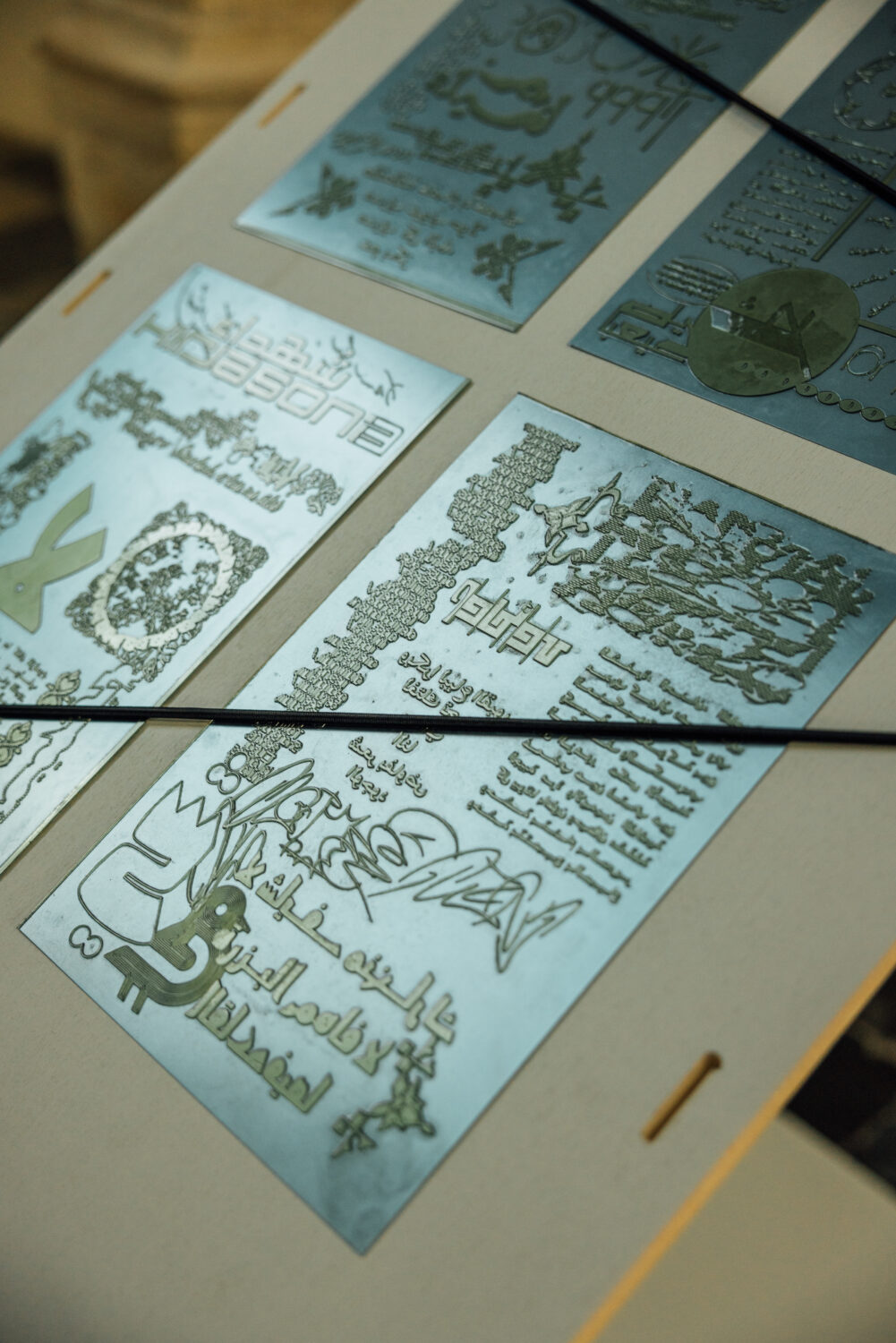
A trip into The Exchange Room made me consider how where I live has impacted what I do. Being born, raised, educated, and institutionalised in the Western world, my inspirations, references, and interests are Western, and thus the work I make looks inherently Western. It’s not necessarily a bad thing, but if everyone kept themselves so local and closed off, we’d soon be hitting that monoculture I mentioned earlier. The result of opening one’s eyes to alternative culture is shown in a piece of work (and its production tool) by Estonian designer Ott Metusala and Farah Fayyed from Lebanon; where their local texts are combined in a visual conversation; a whole greater than the sum of its parts.
My own situation, personal context and education have (so far) led me to become a graphic designer, which might sound obvious but this isn’t necessarily the only route or practice one can take. A brief stroll from The Test Pressing Room to The Playground of the In-Between highlights something else I’ve never considered before: what other path(s) could I have taken? Understanding what and how visual communication works are skills that can lead someone to be an artist, educator, author, editor, producer or all of these at once (or more); these are all essential roles in the upkeep of, and diversity in what we all do.
Almost all of The Palace rooms confronted me with even more questions and thoughts: Jurriaan Schrofer and Hansje van Halem’s exploration of pattern made me consider what is the role of ornamentation in visual communication. Edgar Walthert’s publication on ‘The Evolution of Emoji as Visual Language’ made me wonder if we have successfully cracked a global universal language. And a simple card game from The Rodina highlighted to me how play and performance combined with order are an integral aspect of visual communication and perhaps I should explore this in my own work more.
These questions and thoughts (and many more) from the exhibition are still sitting with me; I’ve constantly been trying to answer them in my mind but in doing so, only more questions appear. It makes my work even more fascinating. I’ve never witnessed an exhibition put what I do daily under the microscope yet blow it out so wide.
Despite showing archival pieces, it’s not a retrospective exhibition but that doesn’t mean it’s a prospective, future-facing exhibition either. And although there are around 150 items on display, it’s not about these individual items, but how they are composed together.
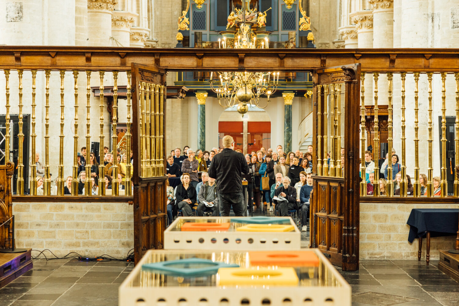
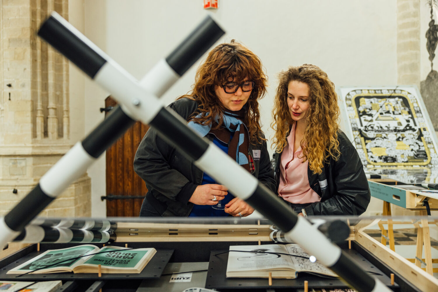
As I mentioned at the start; you need to keep your eyes, ears and mind open. Your eyes because it’s a visually striking exhibition with the design of the 26 drawers, your ears because it relies on an audioguide to introduce each section and your mind because this is an incredibly conceptual exhibition. But what else do you expect when you put someone’s imagination into a physical space?
It’s difficult, confronting and at times even confusing. But through this, it’s open to interpretation and allows you to create your own unique experience based on your current situation. It feels deeply personal, something that most exhibitions could only dream of achieving. If you’re looking for an exhibition that spoon-feeds you information or answers, then this isn’t the one for you, a visit to The Palace truly rewards the inquisitive.
—
The Palace of Typographic Masonry
Grote Kerk Breda
On display till June 18, 2023 – open daily – pay-what-you-like
www.graphicmatters.nl
Browse more graphic design editorials here.


