
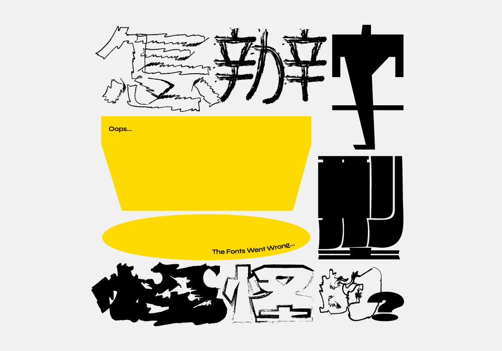
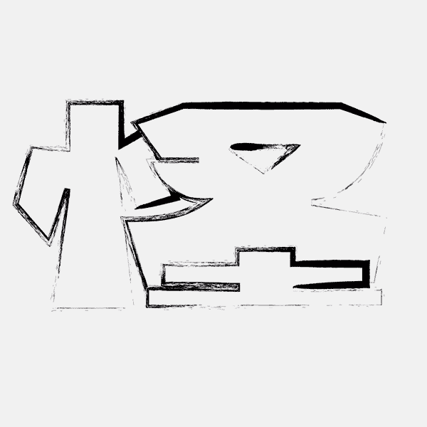
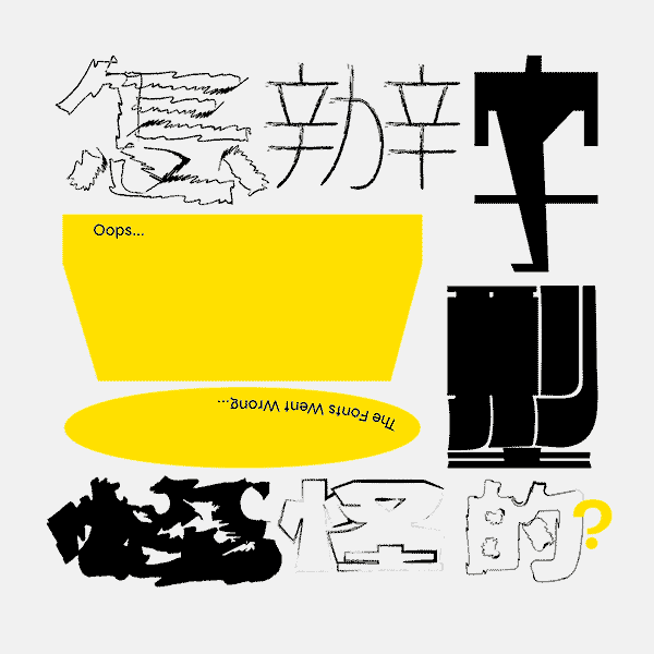
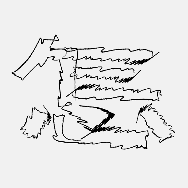
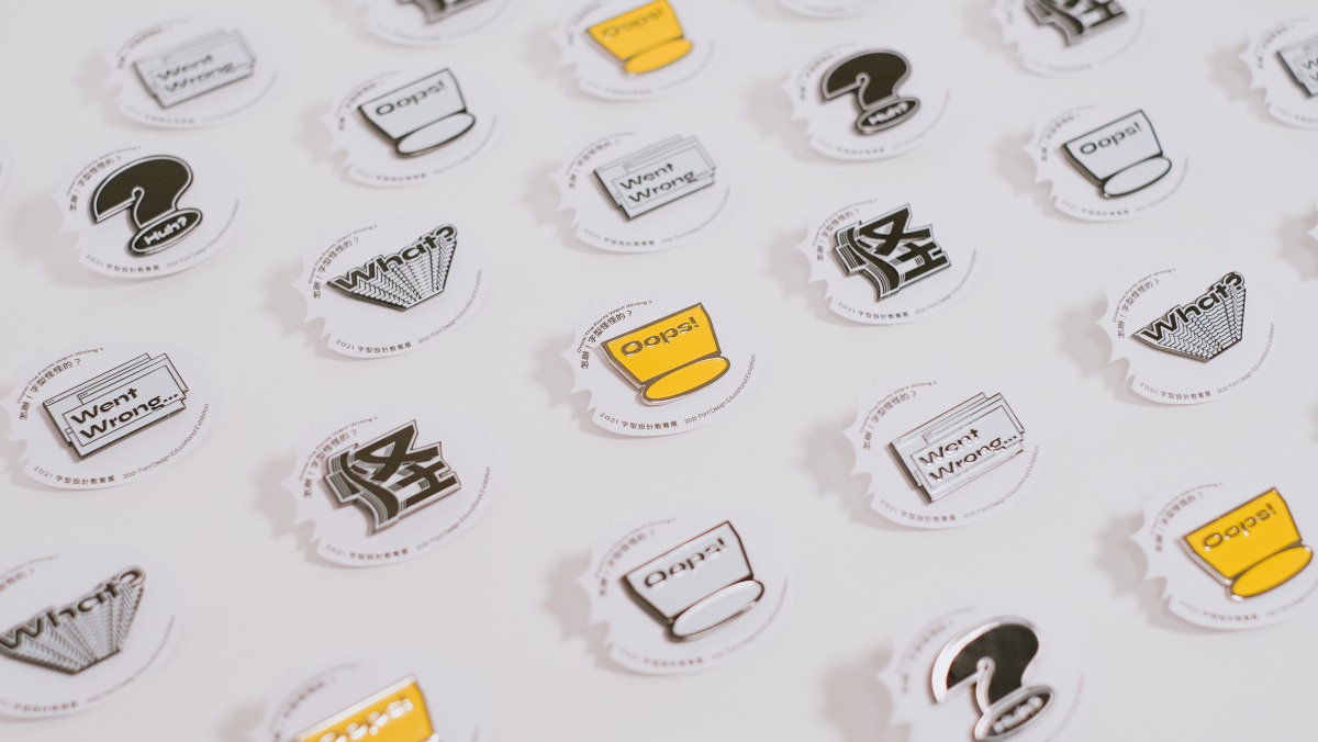
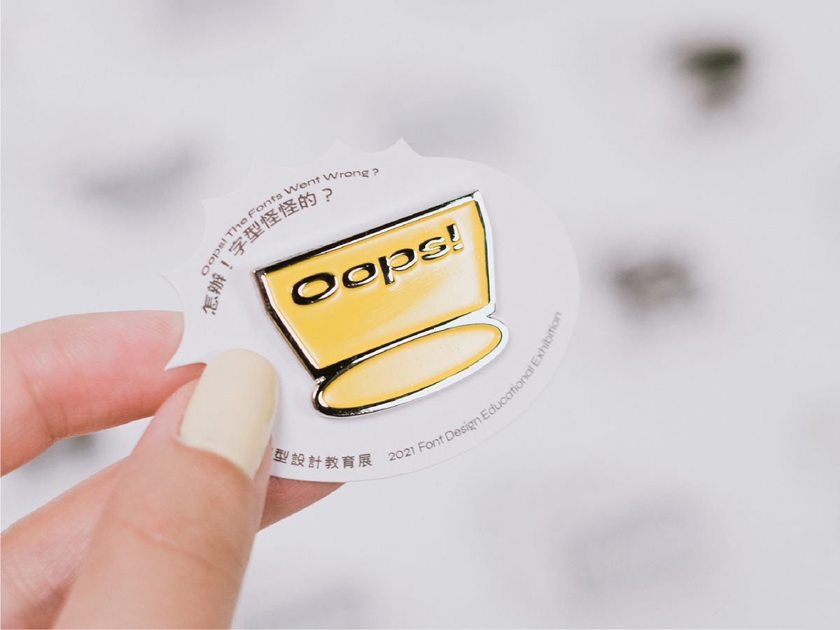
The dancing glyphs and glitchy atmospheres of Ting-An Ho’s identity for ‘Oops! the fonts went wrong’, a typeface exhibition held at Taiwan Design Museum in Taipei earlier this year, are decidedly jarring. As the exhibition itself demands, the identity confronts viewers with what happens when a font goes ‘wrong,’ as well as how much we can take fonts for granted day-to-day. Going to the extent of developing an entire back story for the identity, Ting-An’s design creates a world where viewers can encounter the messiness of language gone mad; shaped from a mishmash of millennial early internet age nostalgia, and a fictional world of fonts.
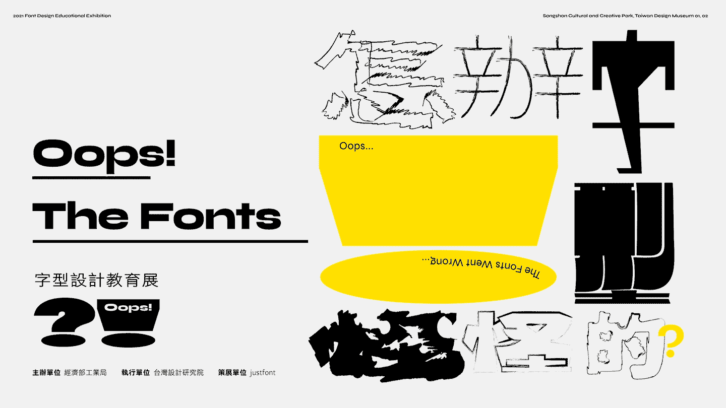
“The exhibition uses unusual logic to introduce typefaces,” says Ting-An. “Through the absence, variation, and misplacement of the fonts, everyone can feel the problems they will cause when they’re used abnormally. It is because the fonts look ‘wrong’ that we can realise how important they are.” Based in Taiwan, Ting-An broadly identifies as a graphic designer, but he’s hasty to add that his work tends to bleed across practices. When formulating the basis for what would become the final exhibition identity, he decided a back-story was needed to make sense of his ‘wrong’ fonts – leading him to imagine a type-filled world he would later call ‘Font Country.’
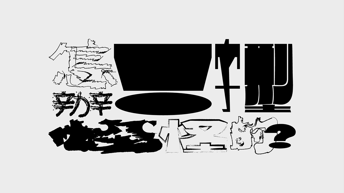
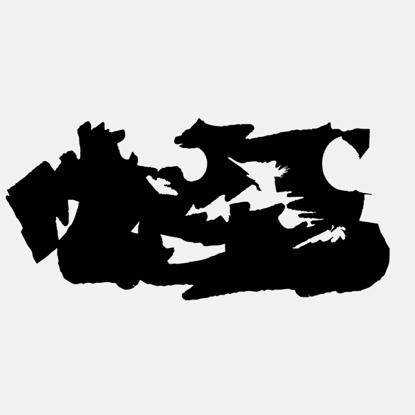

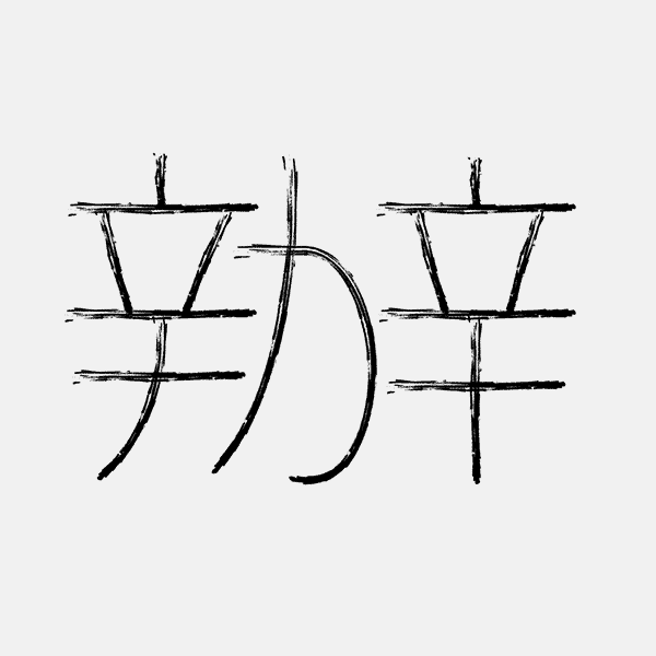
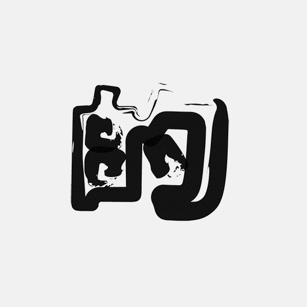
“In the Font Country,” Ting-An tells us, “the typefaces suddenly have their own consciousness and voice, and they quarrel together and make living there unbearable. Some typefaces are out of fashion, some are incoherent, some are weird, and some like to interrupt others…Through the visual identity, we formulated the setting of this country, made up of various Chinese typefaces which are full of information and motion, but still consistent.”
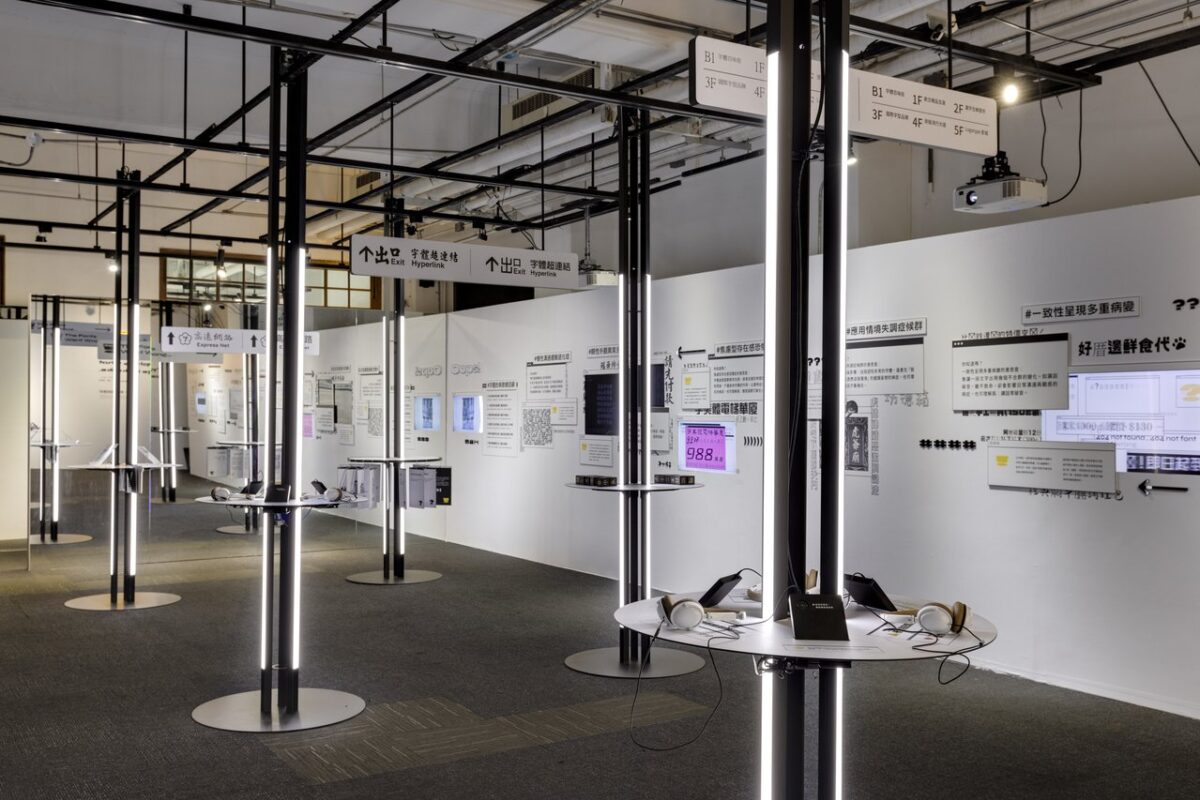
Integrating motion through the identity, Ting-An notes he wanted to play around with the capabilities of Chinese characters in motion. “Motion graphics play an important role in the dissemination of information,” he says, “however the major motion graphics are products of the Roman alphabet, and there’re relatively few examples of Chinese. In order to offer insights into Chinese motion design, I tried to explore the balance between legibility and animation performance of Chinese characters.”
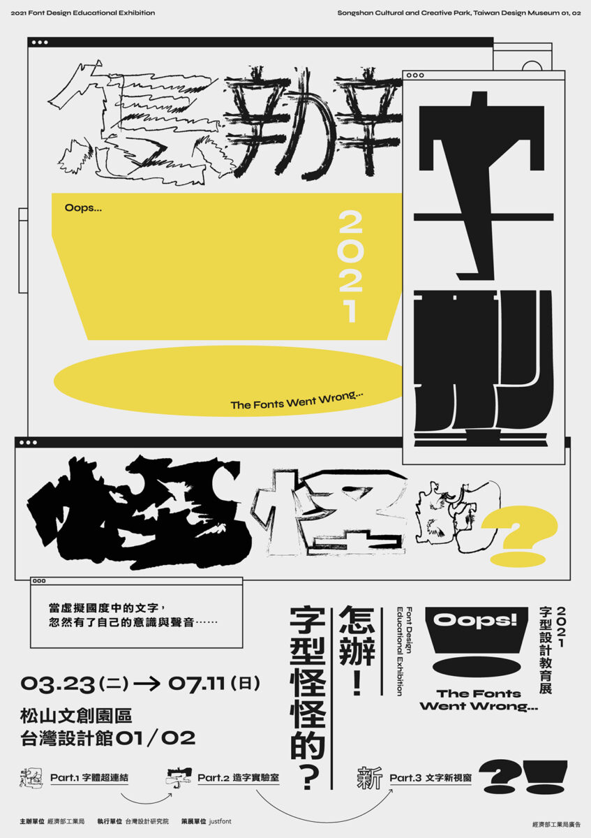

Exploring motion through a nostalgic, glitchy rhythm, the identity gives space for the fonts of Font Country to express themselves and clash; reflecting the story behind the exhibition and highlighting the weight that fonts quietly carry in society. “The visual style is based on my experience of surfing the Internet when I was young,” Ting-An tell us. “That was the pioneering era of the online world. The number of websites was still explosively growing. Special effects, text animation gifs, word arts, java scripts and web page grammar were all poured into the page. The browser was filled with numerous advertisements, and the pop-up windows flooded the entire screen like a wave. Those crowded, noisy, and vibrant images have almost disappeared after contemporary ad-blocking techniques. For our generation, this has become a kind of ‘digital homesickness.’”
“In the online world I imagined,” he continues, “that country is still growing somewhere in the online world. And the exhibition allowed me continue creating that noisy, vibrant, and a bit ‘wrong’ digital world.”
Thank you so much to Ting-An for sharing more with us on this project!


