
It goes without saying that good web design is central to brand communications, and in a sporadically locked-down world, it’s become even more essential. So today, we’re speaking to Helsinki-based Designer and Art Director Marina Veziko – the creative behind the web design for online journal Edit – about what it means to utilise typography’s powers in web design, the ‘make or break’ factors of generating top-class web design, and the possibility of a precarious future for motion and interactivity in our industry.
Having worked with clients across a vast array of sectors, Marina says, ‘Projects that are in some way boundary-pushing and societally meaningful – ethical, sustainable, promoting equality – are especially close to my heart.’ Welcome, Marina…
Hi Marina! Firstly, could you outline the brief and ideas behind the Edit project?
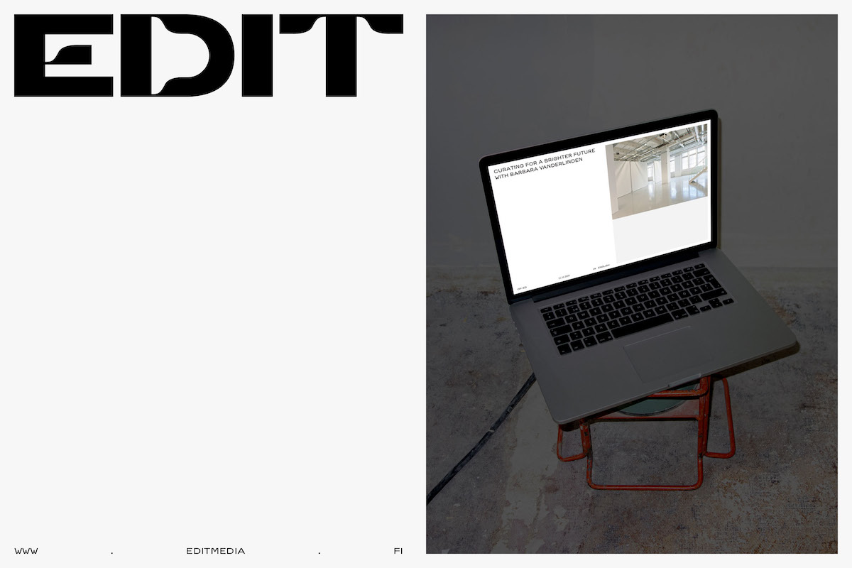
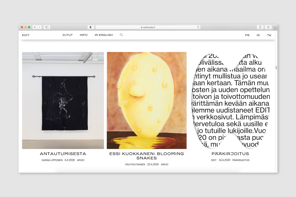
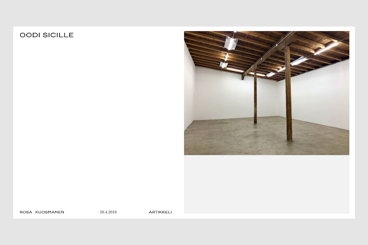
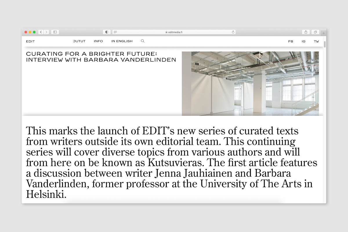
Edit is an online journal founded in 2014, focusing on contemporary art, artists, exhibitions and current cultural phenomena. The previous identity and website had been made by the Edit team themselves back in 2014, and the amount of content on the site had outgrown the existing platform. The founding team was hoping that the new identity would be eye-catching yet timeless. It was also important that while the site visuals should be distinctive, the identity shouldn’t overshadow the content. The site structure should tempt you to read more articles and be easy to navigate between the different categories.
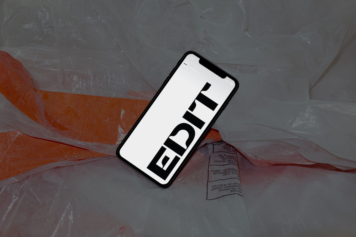
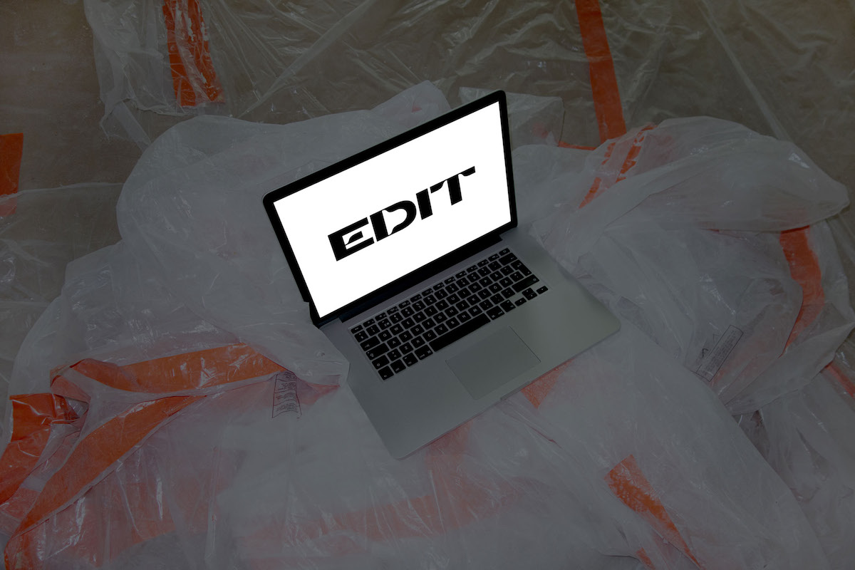
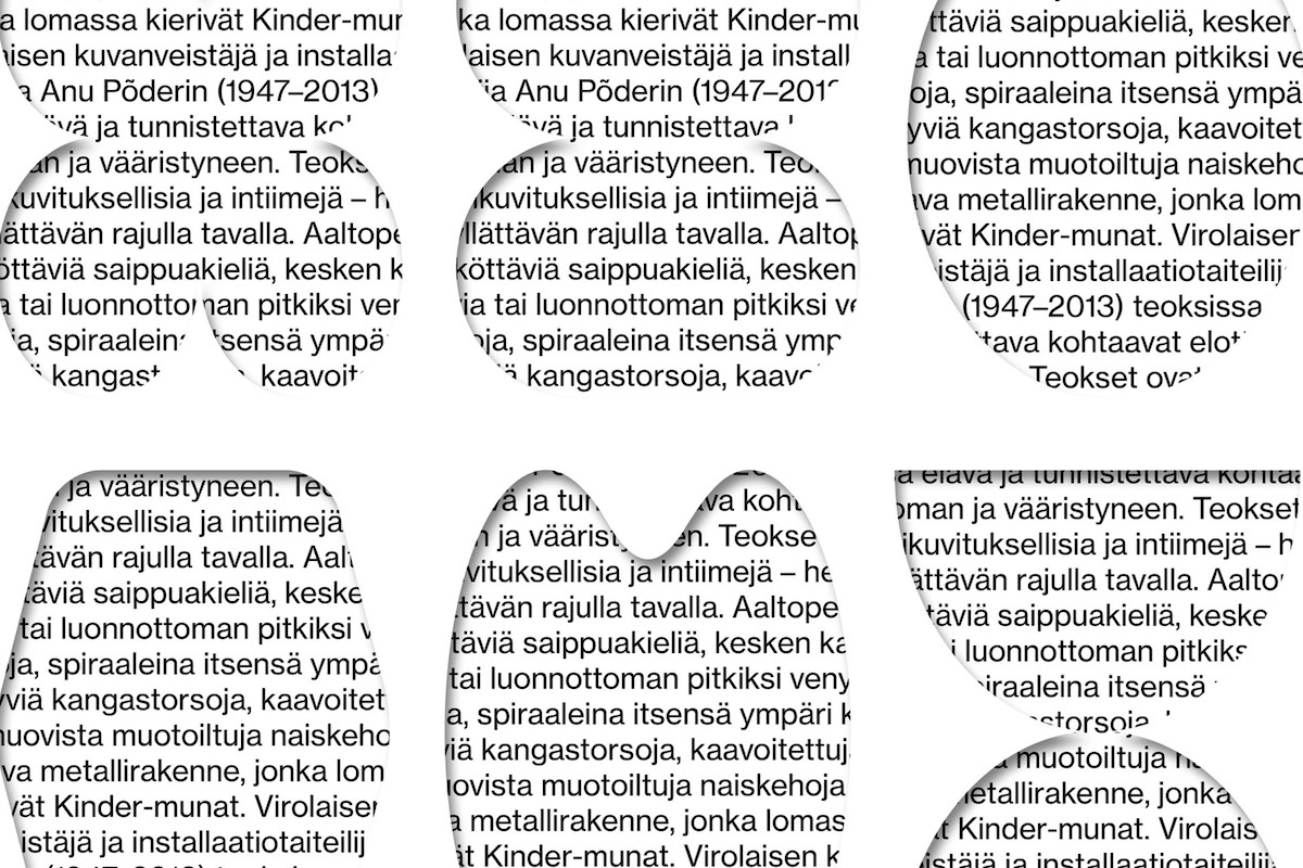
It was quite clear from the beginning that the identity would be otherwise very simple, but the typography would pay a large role in making the identity distinctive. In addition to that, a visual navigation system for exploring the site was created. The platform consists of different article categories, which are each marked with an abstract symbol.
We love the end result – the typography is so impactful. What do you think is most important when selecting fonts or creating custom type for web design? Why did you choose the fonts you did for this project?
First, I typically try to crystallise the brief to 3–5 keywords. I actually have a bookmark list of like 80 foundries, so I open all of them in tabs and then start systematically screening the sites and fonts one by one to find the fonts that resonate with the keywords. I usually have some sort of intuitive feeling on how the typeface should look based on these keywords and the overall brand tonality, so most of the times this process is quite fast, even though it may sound time-consuming.
If I’m designing a poster for an exhibition, a trendy typeface might be just the thing. If it’s for a branding project, usually a typeface that withstands time is a better choice. For Edit I felt that a mix of traditional and contemporary would work the best. For headings I chose HTS One by Helsinki Type Studio. They really have a gift for creating fonts that are modern, cool and interesting, but don’t seem to get outdated, which often happens with “cool” fonts. HTS One was paired with neutral and legible Neue Haas for article body texts, and “traditional” Century Old Style for lead paragraphs.
Do you have any predictions on what the future role of fonts will be in visual identities and web design, as they are increasingly incorporating motion and interactivity?
It’s an interesting topic and I actually have mixed feelings about this. On the one hand it does seem that motion and interactivity are increasing in typography and web design. On the other hand I’m wondering if this is just a phase? What if after reaching a saturation point, the novelty of all the AR/VR/kinetic type etc. will wear out? What if motion typography will start to feel gimmicky and outdated and we’ll eventually go back to “less is more” mentality, as trends tend to go in cycles…I realise this is probably a very ‘boomer’ thing to say, haha.
Can you tell us a bit about the design and creative process of this project? Any challenges or breakthrough moments?
When creating an identity, I often design the logo at the very last minute, as I feel that typography and photography play a far more important role in branding. For this project the process was a bit different, as the logo had a very prominent role. While everything else went very smoothly – typography, color scheme, shapes, web design – the logo was the trickiest element and there were multiple versions before settling on the final version.
I felt that the logo should be as timeless as possible, and very plain and minimalistic, to give room to the art displayed on the site. I suggested a logo that was simply typed in big letters in a neutral font. However, the client wanted something more recognisable, so after a lot of revisions we finally agreed on the final one – a logo that draws its design from the category shapes, allowing the logo to be modular and ever-changing while also visually communicating the notion of the word “edit”.
What do you think identity and web design need to aim for to stand out from the crowd?
Trying too hard to be unique just for the sake of doing something differently usually shows. You can also tell if something is just following trends or if not a lot of time and thought has been invested in the project.
If the ground work and overall process behind a project have been thorough and thoughtful, that often results in a case that really stands out. If the visual identity actually reflects the brand’s values, all the elements effortlessly click. That kind of honesty usually comes through and resonates with people. Same with web design – if the design and functionality are purposeful, a very simple and minimalistic site might be just as impressive and satisfying as a more flashy one.
Thanks, Marina!


