
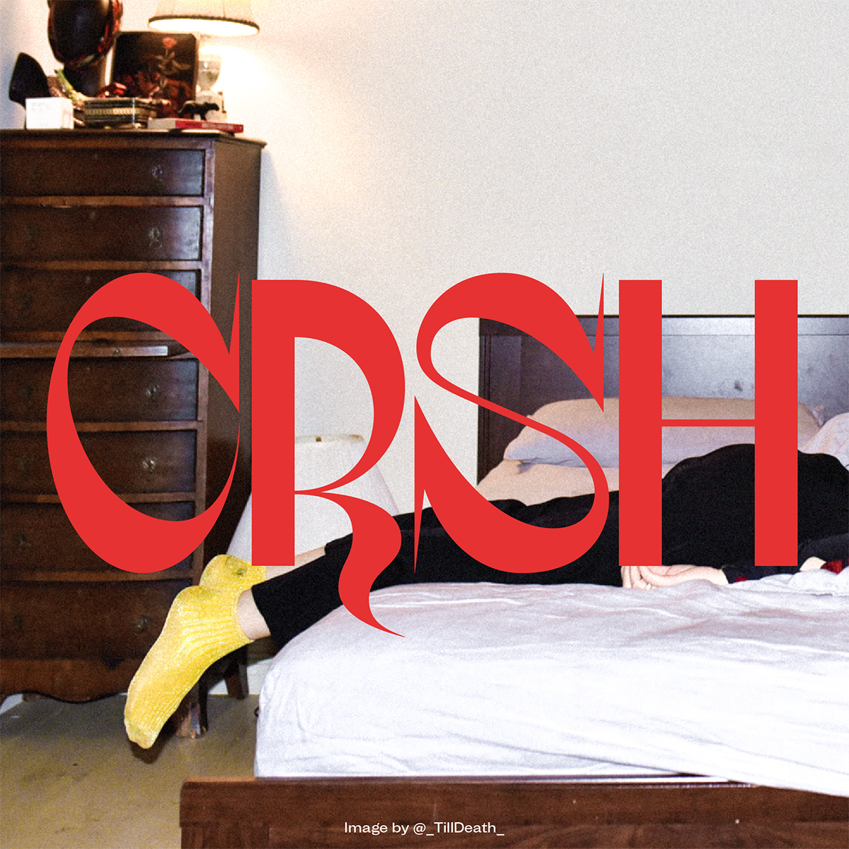
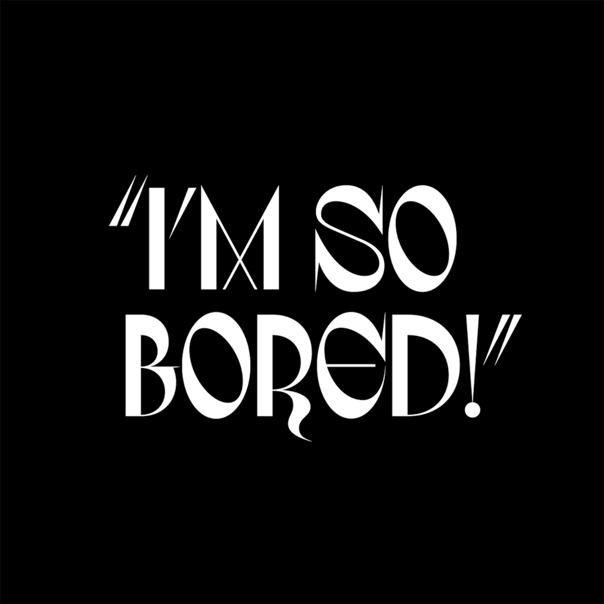
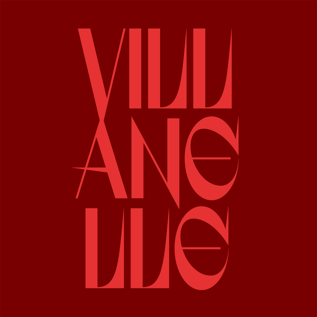
Designed to emulate a formidable, cut-throat and deliciously enticing psychopathic-killer of the same name, experimental display typeface, Villanelle, is as aggressive, unpredictable and charismatic as its sister namesake – which, of course, is taken from BBC America’s overwhelmingly successful, Killing Eve. Mysterious, sharp and undeniably sexy (and, not to mention, utterly self-obsessed) this stunning exploration of personified type – the brainchild of the incredible Joseph Dennis (@josephdennis_) – is imbued with intense and unavoidable presence.
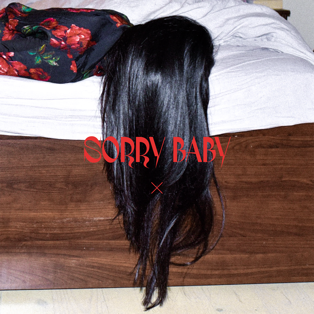

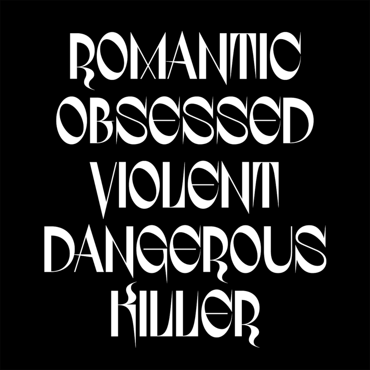
Sparingly adorned with rare, deadly serifs and deep-diving descenders, the typeface is a myriad of complex contradictions; full of unexpected twists and turns. There is tangible tension laced throughout the characters, which interact with another in an aggressive tug of war. The kerning renders a tight feeling of density whilst angular and variable flourishes aggravate the spaces between. These details ground the typeface deeply within the character of its unattainable muse and her unravelling story, reflecting the narrative and obsessive, toxic gravity between herself and the show’s protagonist; British intelligence agent, Eve Polastri.
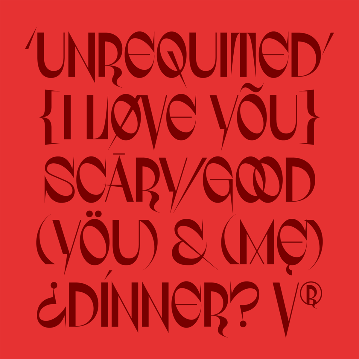
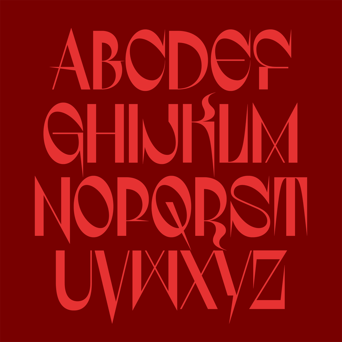
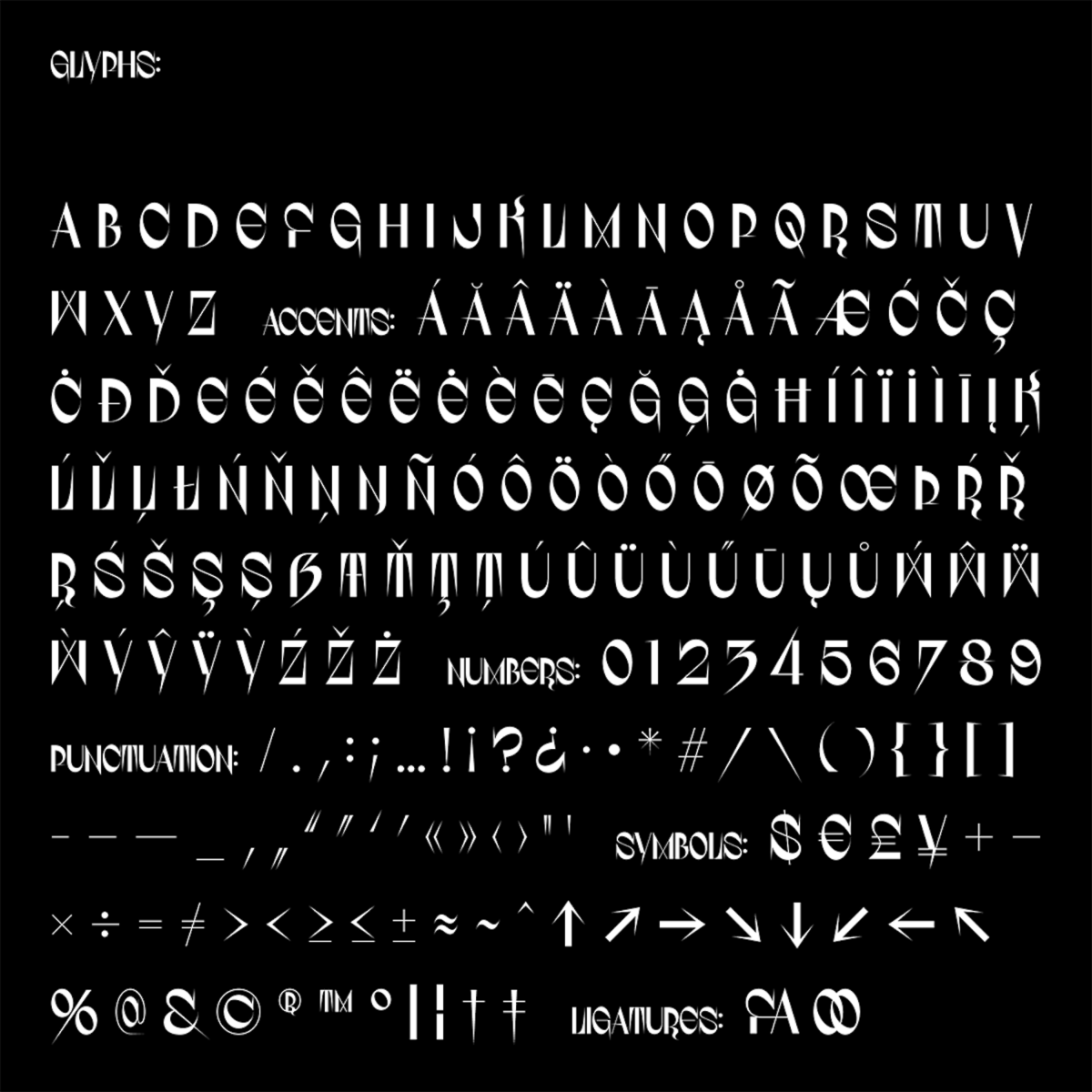
Likewise, the masterfully changeable accents of Russian-born Villanelle’s speech are elucidated to in the typeface’s quiet mirroring of the Cyrillic alphabet; behind its Latin exterior. It’s unusual curvatures, such as in the ‘J’ or the sharply angular ‘F,’ create unexpected contractions to deliberately throw you off guard; picking forked flourishes from Cyrillic characters and blending them masterfully with Latin shapes.
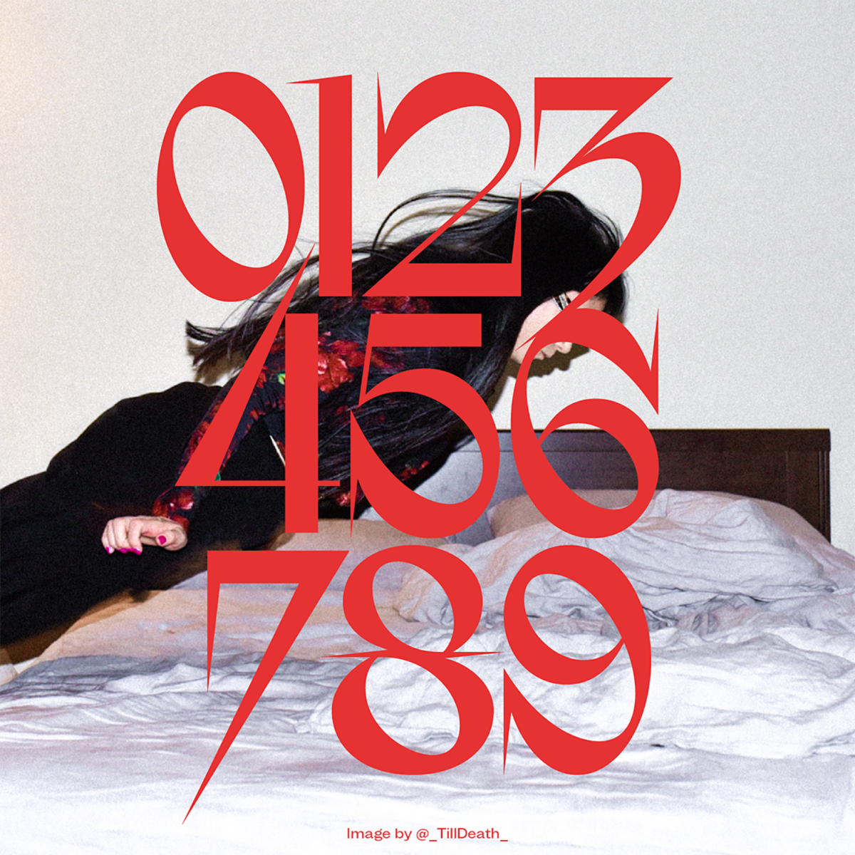
The exact visual mirroring between the ‘M’ and the upturned ‘W,’ in turn, create an uncertain sense of security and continuity whilst the sensual flourishes spun off the ‘K’ and ‘R’ drench the overall effect with a successful and elegant finesse. The deeply plunging, sharp descenders behave differently for each character; pulling the gaze along an ever-changing terrain of false starts, harsh edges and – albeit short-lived – smooth and harmonious curves.
The characterisation of this daring typeface is trapping and entrancing, its compelling presence as addictive as it is challenging. It demands your attention and love. With its armoury of deadly spikes and tricking, elegant sensuality, it is masterfully manipulative to the eye. As irresistible as it is lethal, this display type venture – available for purchase on Type Department – is nothing other than captivating.


