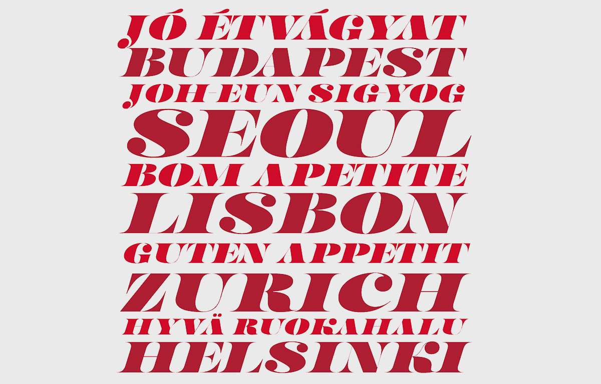
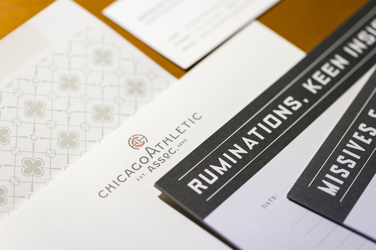
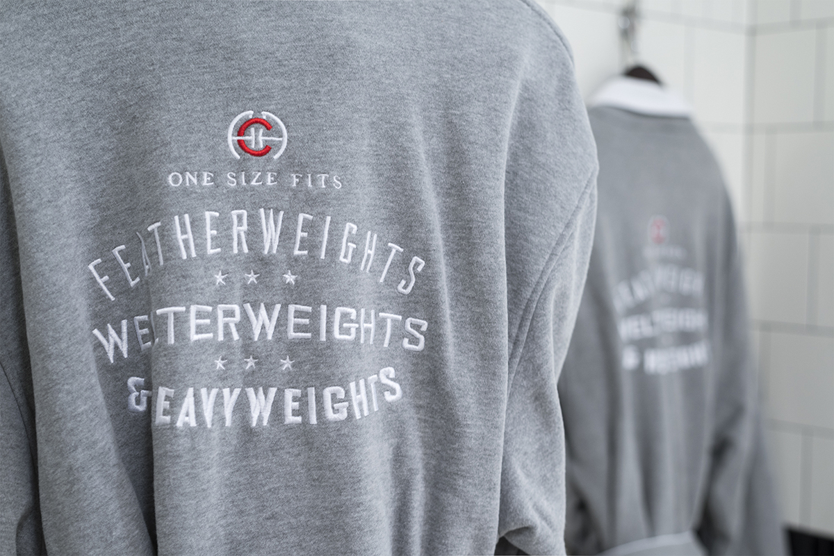
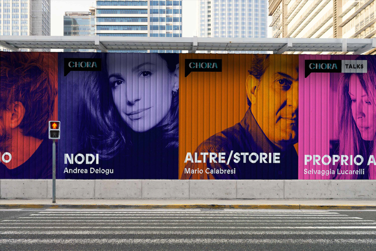
Matteo Bologna has some bold ideas on branding and fonts today. Not only does he believe that custom fonts are a super-tool for brands right now, but that they are essential for any brand to build their story effectively in today’s climate.
Having built his branding studio, Mucca, from the ground up, Matteo’s insights are invaluable to both brands and type designers today. You only need to look over Mucca‘s impressive client list (we’re talking Sephora, Barnes & Noble, Target, WeWork, Whole Foods, Adobe Systems, the legendary Balthazar in NY, and many others) to see why. We speak with Matteo to find out everything you need to know about brands and custom fonts right now.

Firstly, you’ve said that you believe all brands should have a custom font. Why is this?
If a brand is a person, its custom font is like the sound of their voice. Any thought expressed by that person will be reinforced by the sound of their voice.
We want the brands we create to be recognised through every aspect of their communication. And what is the most commonly used element of a brand for copylines, newsletters and interface buttons? Their text. And what is the text made of? Letters (or “glyphs” for type nerds) which, when they are collected with other letters with similar characteristics, we call font or typeface.
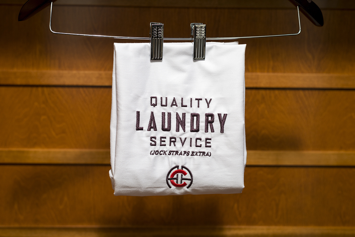
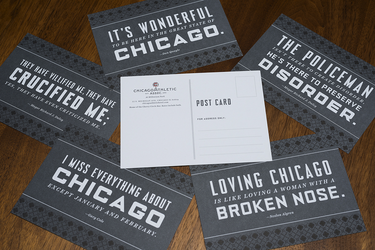
In our mind a successful scenario is when an audience recognises a brand just by looking at their typeface, before reading any copy. Jackpot! Anything else that the brand wants to communicate will be sustained by the font itself. Their campaigns will change every season, but the connective tissue across all their marketing and advertising activities will always be that custom font that will stay the same no matter what that campaign is promoting. The font will also function as the connective tissue across the different aspects of the brand expression: from newsletters and websites to campaigns and apps, their audience will hear the reassuring sound of the brand’s voice and feel comforted by its constant presence through their font. If well managed, the font may become the main brand asset.
What do you think type designers need to consider when approached by a brand to create a custom font? What kind of considerations need to go into factors like the design or pricing?
The first question to ask is if the clients really believe that having a custom font will make a difference for their brand. If that belief is strong then everything else is just a matter of accounting.
Different factors may determine the cost of a font: character set, languages, number of users, platforms, number of styles and importantly, its destination of use. A font whose main function is for print will have a different design from a font that is designed for LCD screens on a microwave – resolution and display restrictions will determine the outcome of the design.
Licensing will also need to be taken into consideration. Will the font be fully owned by the client or will the client have a limited license of use? In the first case the font will be substantially more expensive because the type foundry will not be able to license it for commercial use after the client’s exclusivity use period has expired.
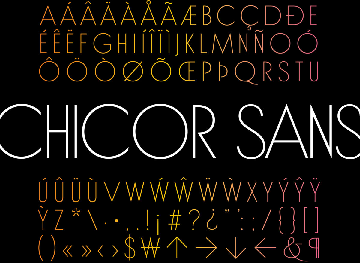
Do you think brands generally understand how to utilise the power of type?
There are a modest number of business people and designers that really understand the power of type. And that knowledge becomes their advantage, because they can out-pace those companies that are still unaware of the power of type, instead choosing to communicate using Helvetica or some other overused fonts.
What current trends in custom fonts have you seen crop up a lot?
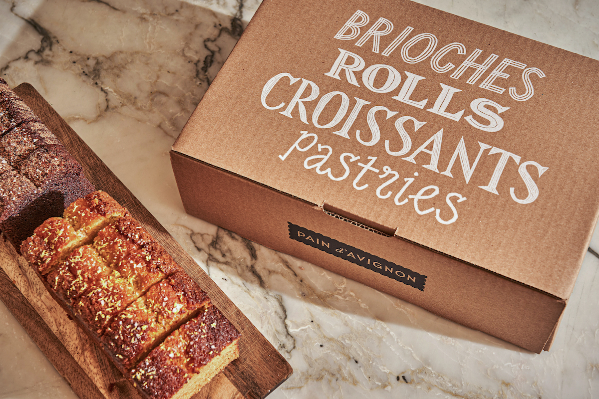
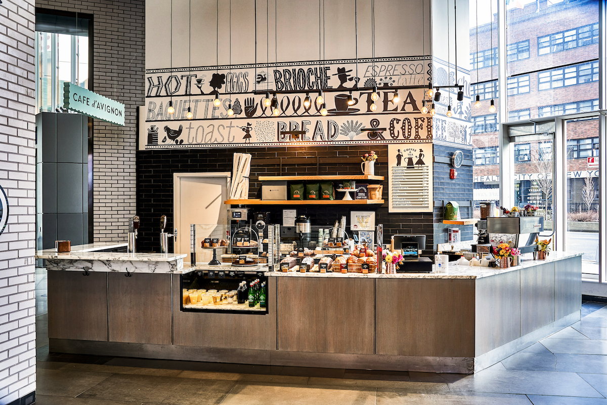
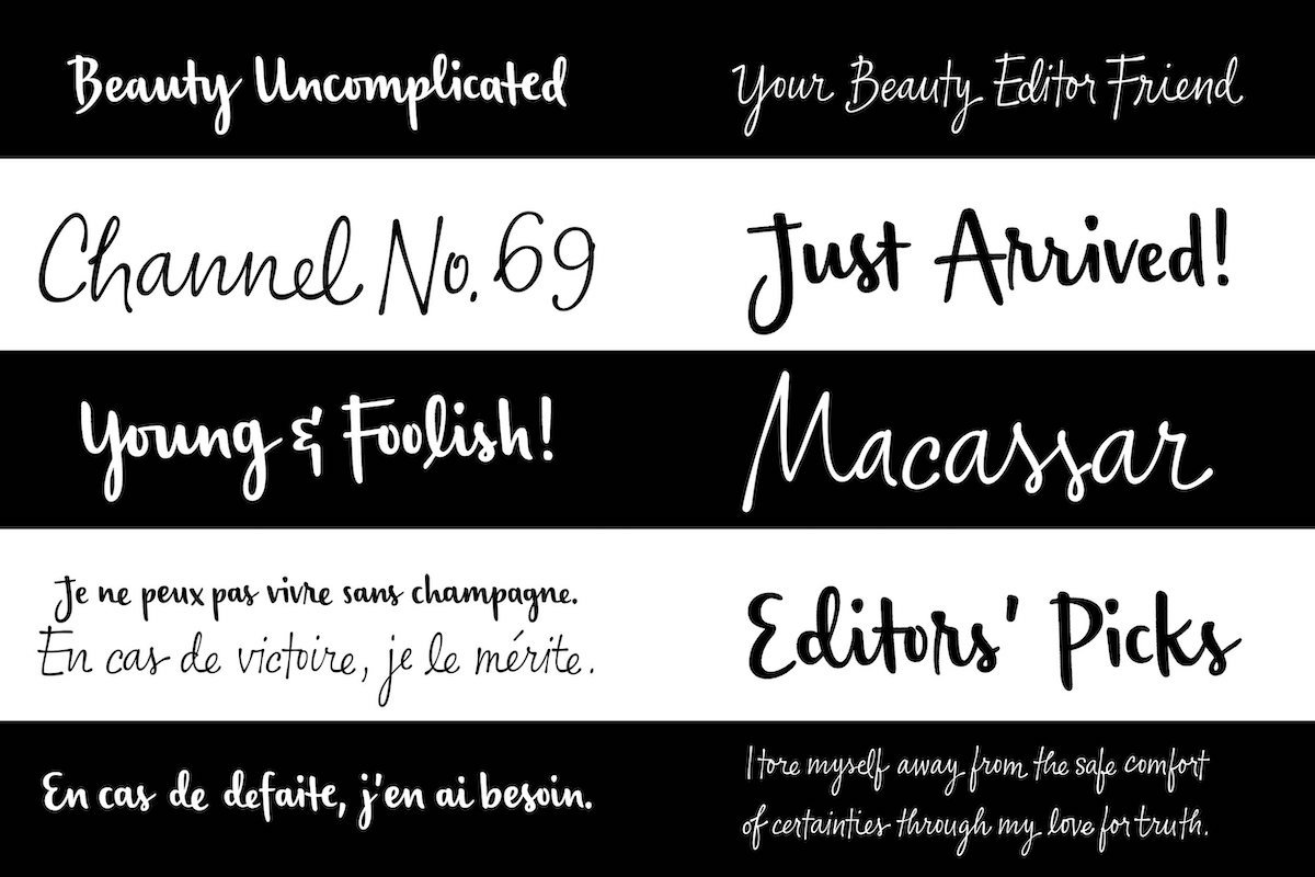
I have been mostly disappointed by current trends in custom typography, especially by companies choosing to design custom fonts that look like other fonts. Besides Spotify’s boring typeface, Apple takes the prize with their font called San Francisco, which is the impeccably executed child of the most boring and uninspiring typefaces in design history. Someone could use it for an ad to sell Bavarian sausages and nobody would recognize that the font comes from the biggest brand in the world. Apple’s products are sophisticated and ground breaking while their font is as vanilla as, well, vanilla. The total disconnect between the core beliefs of the brand and their custom typeface still keeps me awake at night.
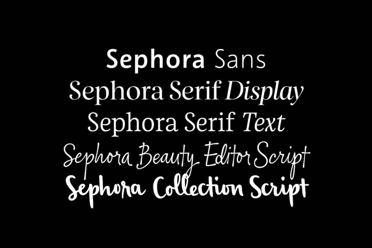
Can you tell us about the “Building Brands with Type” programme?
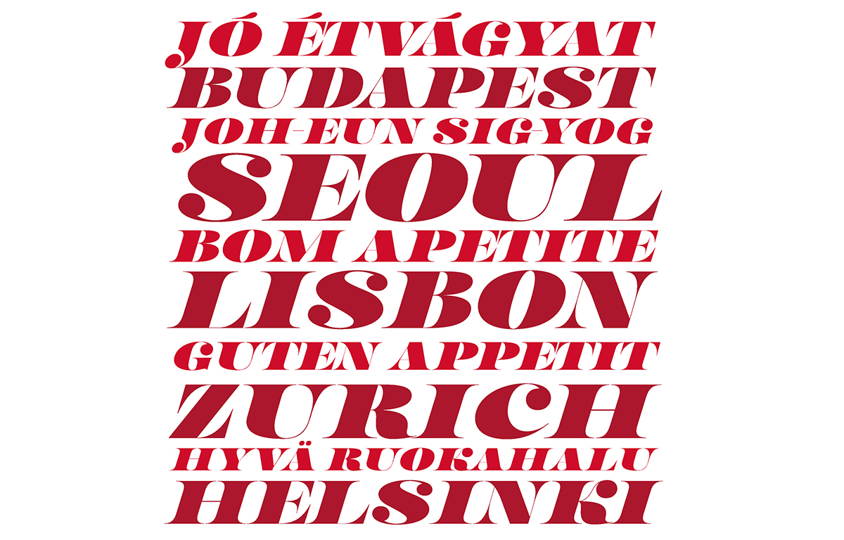
“BUILDING BRAND WITH TYPE” is a programme designed to investigate the power of typography for the expression of a brand.
The School of Visual Art course coordinated by Joe Newton started by introducing the students to brand strategy and then having them develop a brand using type as the main conduit of its expression. The students were taught type history by Paul Shaw, sketching techniques by Cyrus Highsmith, while I taught the basics of type design and Dan Rathigan helped the students to finish their typefaces during some “type therapy” sessions. The class concluded with the help of Ksenya Samarskaya guiding the students to finalize their branding project using the typefaces they designed during the class.
Because we wanted to add some fun to the class, the students were required to design the brand for an interstellar travel agency under the assumption that space travel had been invented in past centuries. Some students developed the branding for a company in the Copernican era using typeface design inspired from that historical period, while others worked on projects set in the Victorian or Art Nouveau periods. While doing this project, they were able to place their newly acquired type design skills in a “real world” context, while understanding the historical context of typography and the importance of brand strategy.
What do you think the future relationship between brands and type will look like? How do you think brands could benefit by using its powers combined with developing technologies?
Letters have been part of our communication for millenia with a slow-moving evolution from graffiti to pixels. The fastest changes, though, have happened in the past 80 years with the advent of all the post-lead and wood technologies.
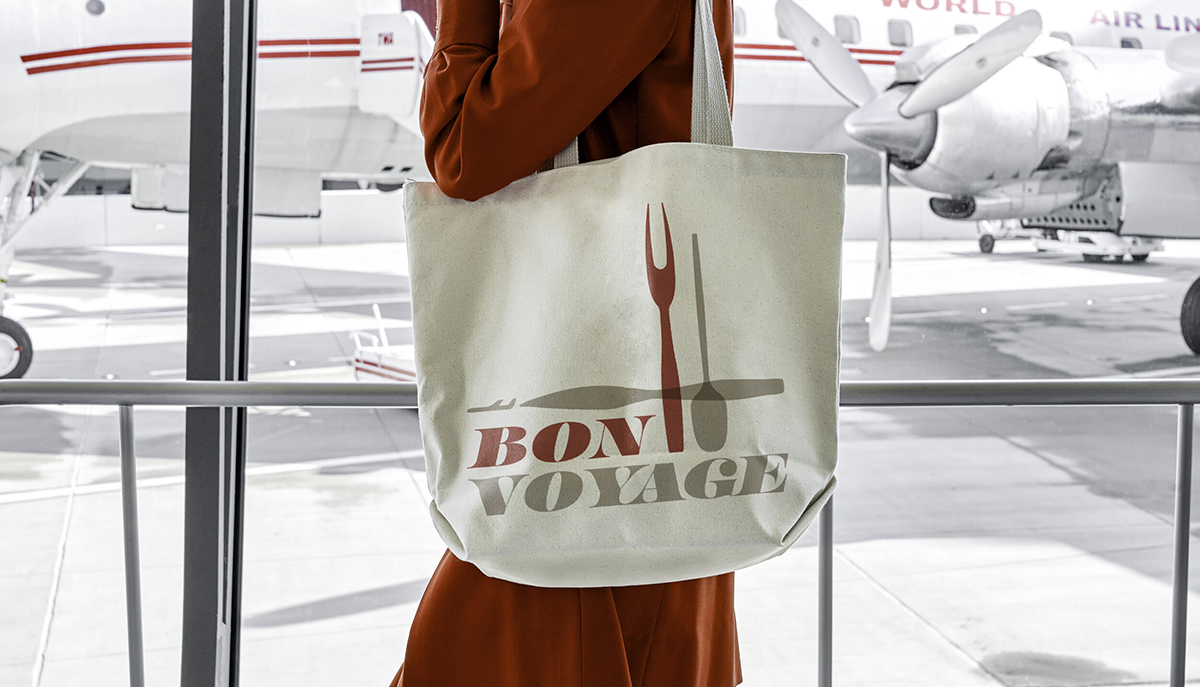
In the immediate future, our world made of atoms will be invaded by AR artifacts that will need words and messaging to help us interface with them. It’s going to be an exciting moment to see this virtual typography surrounding us in this super high-tech reality next to our dirty dishes and screaming children, with brands experimenting, trying, failing and succeeding in this post-paper/screen frontier. I really can’t wait for that and especially for the tools that will make anyone be able to produce and use type in this new context.
Thank you, Matteo.

