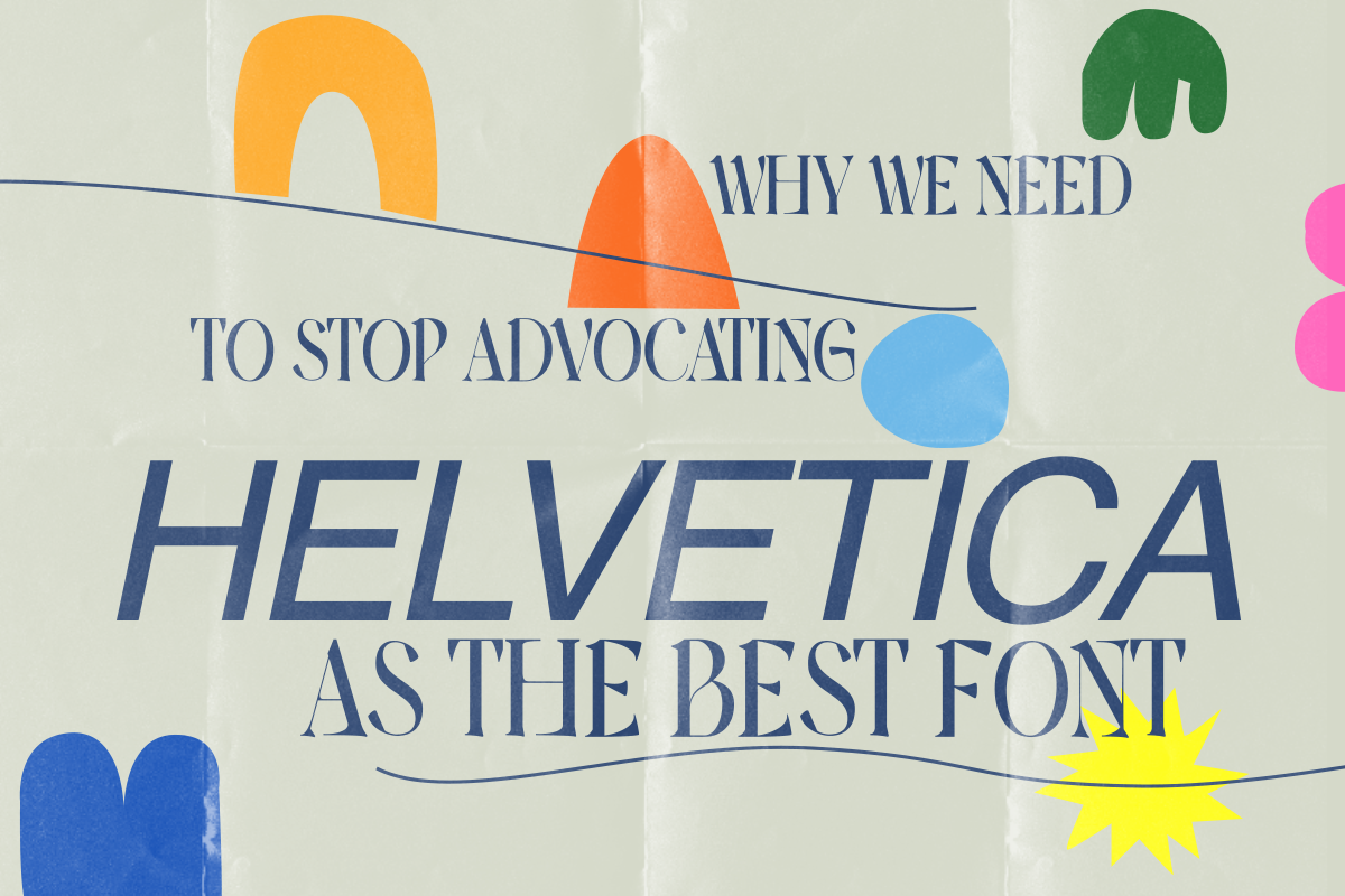
Every good typeface— in my opinion— has been designed with the intent, to be used to fulfill a certain purpose. That might be one of the answers to the question “why do we need more typefaces”, (if not the ultimate answer to the question). Living amidst a thousand fonts then, why do we still keep spotting and using just a few ‘normal’ ones time and time again? Why do we keep falling on Helvetica’s (and its counterparts’) back for safety, like going back to an ex merely for the sake of familiarity and comfort? We put hours into making full proof concepts and sketches for our designs, spend waking nights selecting the perfect color pallets, making original forms. And yet when it comes to tying it all together, we simply select a beautiful, no-nonsense, Swiss typeface from our back pocket of the many Helvetica-like typefaces. There is no way we can go wrong with that.
But must ‘not going wrong’ be the only ultimate aim for a designer?
We’ve been taught to keep things simple, to use proportions that work, and use forms that are comfortable, agreeable to all. And using Helvetica-like typefaces reinstates this need to be conventionally correct. It also helps that these fonts complement the rest of our careful considerations. As Jen Wang says in Helvetica, Modernism and the Status Quo of Design, “Although design contributes to the culture it perpetuates and reflects upon, it is seen as the stage for the message, not as part of the message itself.” Even today, many Neue fonts masquerading as rebrands and brand refreshes are plastering on to thick layers of, excessively prim, Swiss, barren walls of redundant, monotonous design. To me, this looks like a missed opportunity, to not let type do the talking, beyond just the words it has been set in; to not let your type choices truly elevate your design on top of that indistinguishable wall. Why would you paint the town all in yellow when there are in fact a thousand different colours that could be more appropriate for different parts of the town?
The beauty of design is in its potent ability to exceed even being boundless of rules. Helvetica in all its glory has more than served its life’s purpose and even if we in a combined capacity don’t use it for years to come, will not be lost or diminished. Then why not take a chance by making way for a little more expression where necessary. Peter Bilak says in his essay ‘why we need new fonts’, that “there are typefaces which haven’t been made yet and which we need. Type that reacts to our present reality rather than being constrained by past conventions.” Identifying and valuing such typefaces that have more personality gives our design more of a presence. A union of literal meaning and visual perception through an intentionally defined identity. It is an opportunity to make more space for typefaces that aren’t considered ‘normal’ enough for Helvetica’s world. These typefaces have dared to break away from Swiss ideals of letter design, they’ve dared to be something else—something more, and their otherness stands in the way of their favourable use. They are viewed from a critical standpoint, as opposed to being viewed as more contemporary, more timely solutions to the normalcy, the lazy comfort that grotesque type shadows our world with.
There’s also the question of who you’re inviting on to your design discourse. Using typefaces translates to supporting, promoting, and reverberating the Type Designers whose work you’re using. It has to be our ethical responsibility to be mindful of whose work are we advocating. Using the same old fonts over and over again for the sake of safety is like encouraging the same old designers and the same old rigid grid of design that keeps out anyone who isn’t a conventional ally. We’re serving as gatekeepers to custom by being incapable of broadening our type pallet. We need to understand that the impetus of Helvetica-like typefaces was meant to be limited. But in our desire to propagate acceptable information, we’ve exhausted, stretched those limits. It’s a burden too strong on these fonts to relay more than just objective information. So it doesn’t have to be an obligation to use more diverse fonts, because bringing those in to your design also means bringing in the voices and expression of these diverse designers in. Making your work more deliberate in meaning, form, and design decisions. Matchmaking, utilising fonts for what they are meant to be used for—attributing the author’s original purpose.
FURTHER READING
Amid the Extremes: Aasawari Kulkarni On Pioneering Feminist Typefaces
Biľak, Peter, “We don’t need new fonts…”, 8 Faces Magazine, issue 3