Across the last ten issues of TYPEONE Magazine, we have dug into many corners of the creative landscape, understanding and unpacking what type is today. Intersections — of identity, innovation, and culture — shape the way we perceive and utilise typography in contemporary society, and we have embraced this head-on, from the feminist focus of issue four, the branding focus of issue five, and the coding-centred approach to issue seven.
As we enter the second half of the year, we’re asking, where are we now? The history of typeface design has culminated in a landscape where, as communication and expression evolve, language remains a powerful force, continuing to galvanise, divide, inform, and transform. Taking this into account, what is shaping the type scene in 2025? Here, we’re taking a snapshot of font trends and themes that define how we convey meaning and identity in this era.


Sans and Serifs
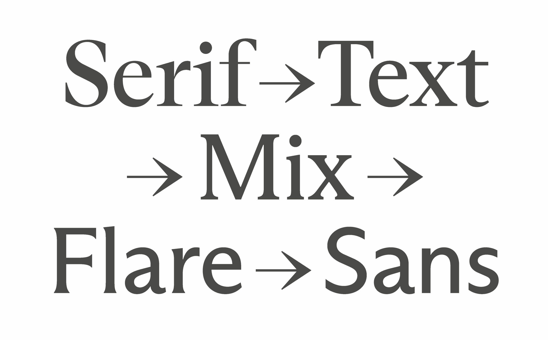
A sans is not just a sans, and a serif is not just a serif; today, it can be both. Flexing, fluid, free. Thanks to Variable Font technology and the technical expertise of foundries like Dinamo and Displaay, which have carefully developed their own variable fonts, designers can switch between styles with sliding-scale smoothness. ABC Arizona contains five distinct styles – Serif, Text, Mix, Flare, and Sans – each with five weights, three widths and corresponding italics, all within a unified file.
Season, by Displaay is all about transformation — from sans to serif (or serif to sans) and the stages in between. After extensive experimentation, the designers achieved a high-quality, versatile set that captures the essence of both typeface worlds, including an additional blend variant.
With client brands existing across print, digital, and many other touchpoints, superfamilies are becoming increasingly important because, thanks to the vast possibilities of a flexing font, they meet design needs effectively. As it continues to evolve, we’re excited to see how foundries adopt variable technology and what this could mean for the superfamilies and brand identities of the future.


Small and Mighty
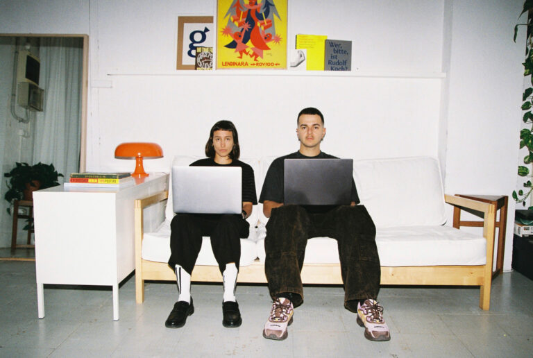
To create a truly personal visual impact, brands are more often turning to bespoke fonts crafted by independent designers instead of big foundries. These creatives provide a more personalised and thoughtful service, along with greater flexibility and room for experimentation, resulting in typography that can stand toe-to-toe with larger organisations.
For instance, silver jewellery brand Trucos, founded by Diego Torres Cano, showcases a custom wordmark crafted by Andres Higueros. Inspired by rave culture and brutalism, the typography mirrors the sleek forms of the jewellery, reinforcing the brand’s unique character.


Similarly, under the direction of Christopher Doyle & Co., Dave Foster created the custom typeface HOTSPUR for Bell Shakespeare.
Meanwhile, the Spanish brand Donuts® has revitalised its nostalgic identity by returning to the essence of its iconic ’80s and ’90s logo. The new design, developed by the duo of Bogidar Mascareñas and Carlos Martos, features a refined serif, moving towards a more mature aesthetic while preserving its heritage.
Design in flux: exploring motion and creative coding
In a world that is always moving, typography also refuses to stand still. Dancing across brand identities (NN North Sea Jazz Festival; Solfeggio Obscuro), kinetic type will continue to form a point of play for creatives. This is further bolstered with the ever-expanding capabilities of creative code, which designers are experimenting with in numerous ways – from moving in time with music and sound to adding a tactile layer of interactivity through human gestures.
For example, created within his creative coding workspace, The Lab, Nahuel Gerth’s long-term passion project ‘Body as Interface’ invites us to explore the future potential of integrating real-time human gestures into the design process.


Balancing creative coding with graphic design, Gun-Hyuk Choi’s (@ch_gnhk) practice investigates type through code-based creation, conducting ongoing experiments using machine learning models, culminating in visuals defined by grids, early computing, and glitch aesthetics – where contemporary programming meets lo-fi tech. While this field has proved exciting so far – weaving its way into the practices of many designers – it still has a way to go until it’s established within the commercial landscape.
All about AI
We couldn’t reflect on 2025 in type without bringing up AI, now could we? Creatives are already questioning how generative tools can be integrated into – and facilitate – the type design process.
But as many creatives know, the topic of generative AI in type design is a sensitive issue, with a range of opinions within the community. Similar to the current debate about generative design among artists, illustrators, and graphic designers, there’s an argument that adopting these tools diminishes the artistry and complexity involved in traditional type design. When trained only on a limited selection of in-house fonts, this results in a lack of depth and originality in the outputs. With the added layer of concerns about plagiarism, it’s fair to say a tension exists between innovation and maintaining creative integrity in our field.

A craving for craft
With all that said, despite the rapid advancement of generative design, there’s an inevitable pendulum swing back toward handcrafted work, driven by the need for something real and something human. In a world saturated with AI-generated content and digital illusions, it’s no wonder that both creative professionals and audiences are yearning for authenticity. The enduring appeal of handmade fonts serves as a testament to this desire.
After all, every typeface – often designed over several years – tells a story; it carries the DNA of the artisans who poured their skill, passion, and soul into its creation.
Sharp Type’s Rosalie, shaped over the course of six years by My-Lan Thuong, encompasses this hard work and desire for perfection. Characterised by its calligraphic forms, unusual proportions and exuberant swashes, high contrast, and innovative shapes, it’s the story of a journey between the typeface and the designer, and the relationship between them.

History makers VS Experimental
When faced with the infinite possibilities of the present, we must never forget the past. Engaging with design in all its forms, past and present, encourages a broader perspective beyond the transient, deepening our appreciation of all that has shaped the history of type.
Among the many revivals we’ve come across, Out of the Dark’s Handwerk is a poignant example. Initially designed by Berthold Wolpe in 1932 as Wolpe Kursiv, its development was interrupted by Nazi persecution, resulting in changes and delays. Recently, thanks to Hammer (David Schatz & Sereina Rothenberger) and Philipp Herrmann, Handwerk has been reconstructed, reflecting its various past styles and original hand-lettered qualities.


A joyful counterbalance to this is the rise in experimental, joyful typefaces that, unburdened with razor-sharp rules, are making fonts for fun. Works like those of – to name a few – Not Your Type Foundry, PFA-Typefaces and BB-bureau, which flex, squish, bleed, pushing the limits of legibility, remind us that type doesn’t always have to be a pursuit of perfection.
From the fluidity of variable fonts to the tactile charm of handcrafted type, the design scene – where typography is more versatile, expressive, and intertwined with technology than ever before – reflects a tension, not unlike the wider cultural landscape, between digital innovation and human craftsmanship. As we move forward, one thing is clear: typography’s power to shape identity and emotion remains timeless and vital. And human ingenuity isn’t going anywhere.
Enjoyed this piece? Explore more featured editorials here.