
A Short History of Aeonik
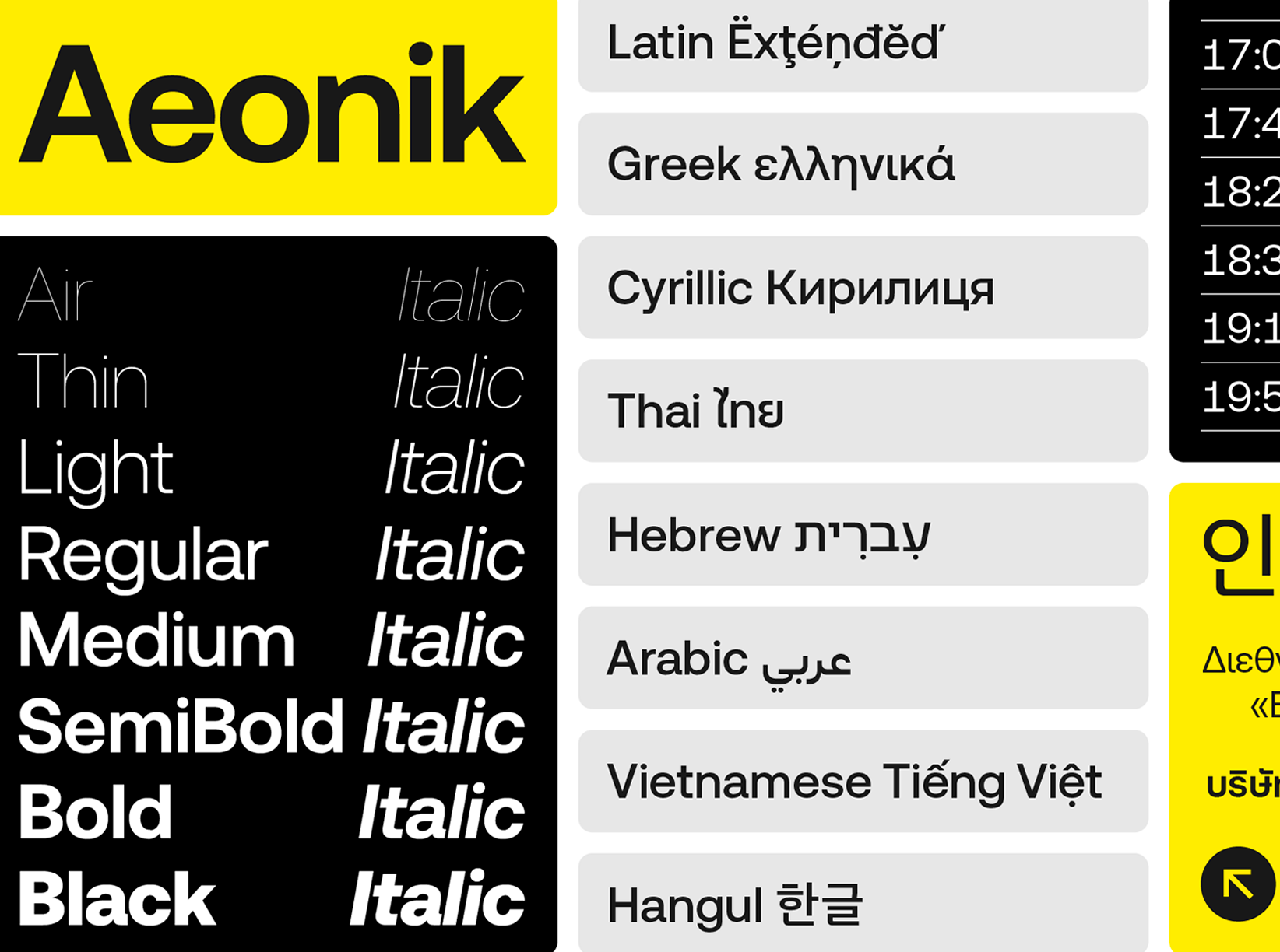
Since its launch in 2018, CoType’s Aeonik has established itself as a staple in the design and branding sphere. A workhorse type family designed by Mark Bloom and Joe Leadbeater, characterised as a neo-grotesque with a geometric skeleton, it boasts a balance of mechanical precision and timeless aesthetics, evident in its strict terminals and rounded letters. And it has been recognised as such, not only capturing the attention of the design community but also demonstrating its versatility and technical excellence across high-profile projects for brands like Revolut, Eurosport, Alipay, and Virgin Hyperloop.
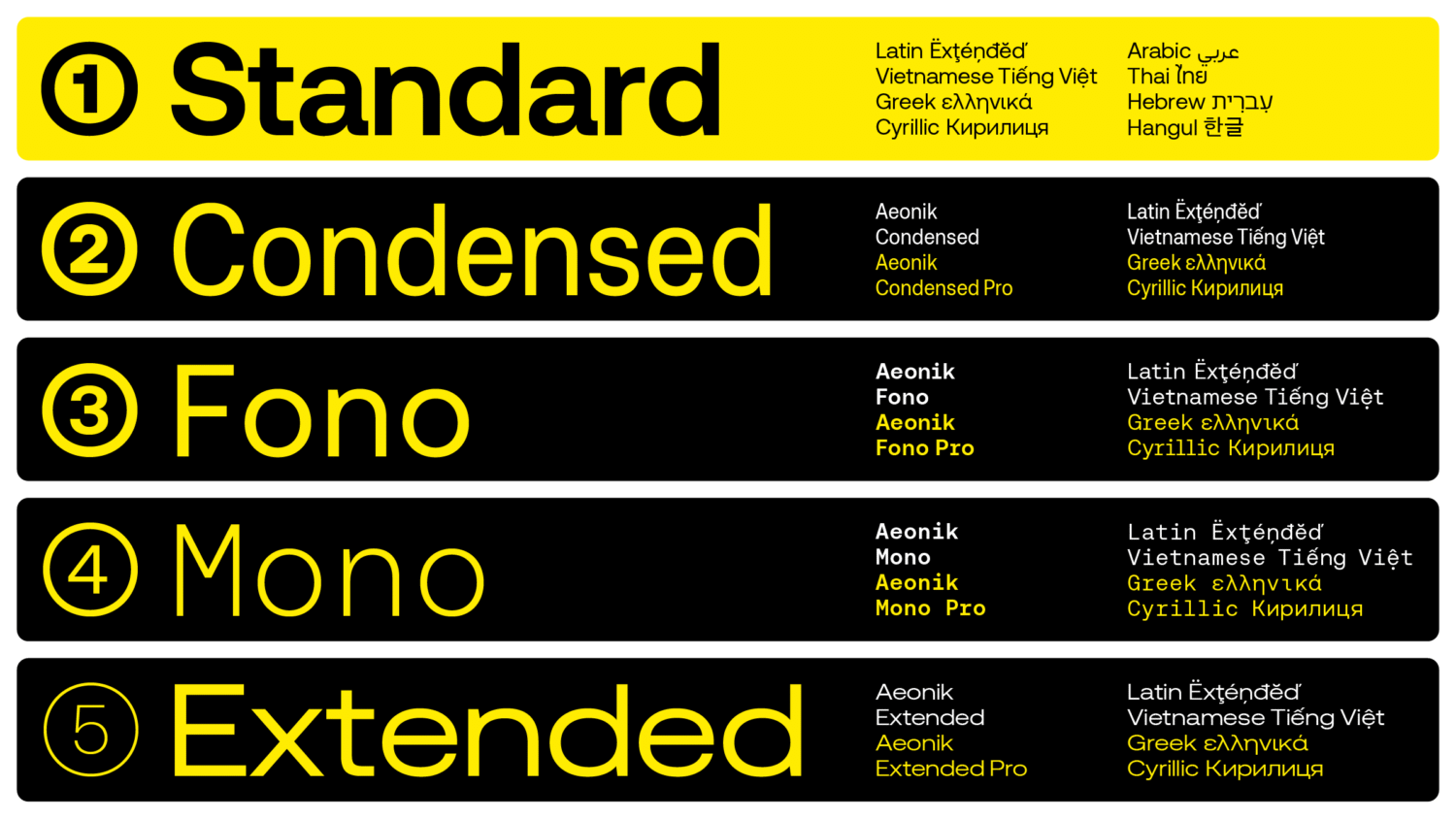
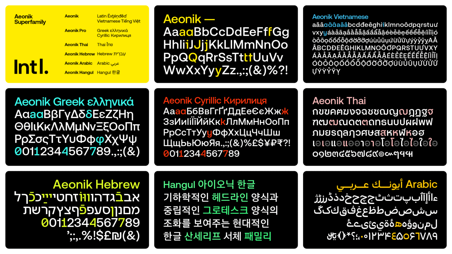
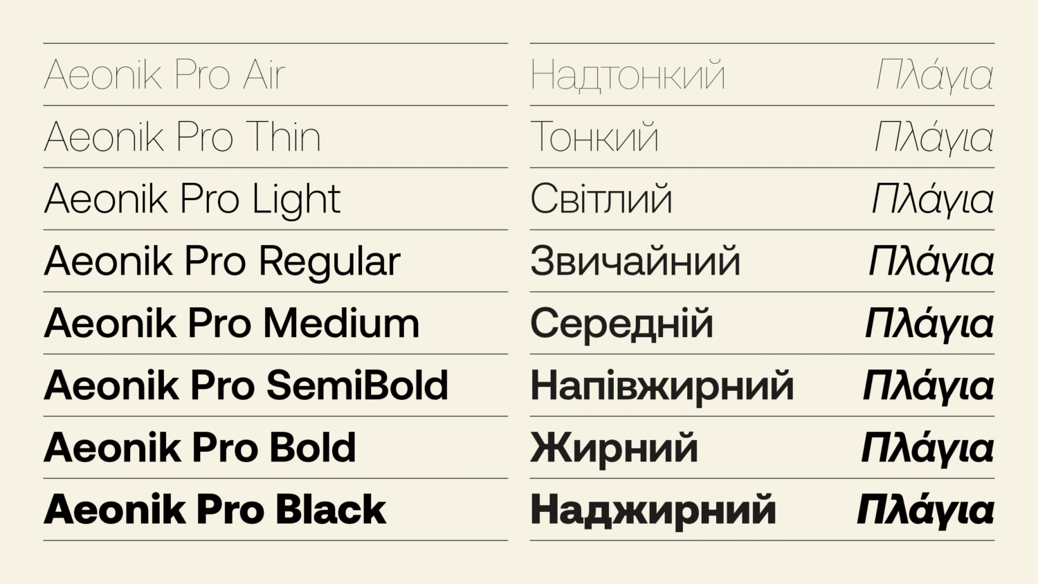
Initially offering only Latin Extended language support, CoType later released Aeonik Pro, which included support for Greek and Cyrillic languages. Aeonik’s crowd-pleaser status led Bloom and Type Designer Diana Ovezea to develop Condensed and Extended versions of the sans-serif. Likewise, on a global scale, the workhorse’s demand hasn’t slowed.
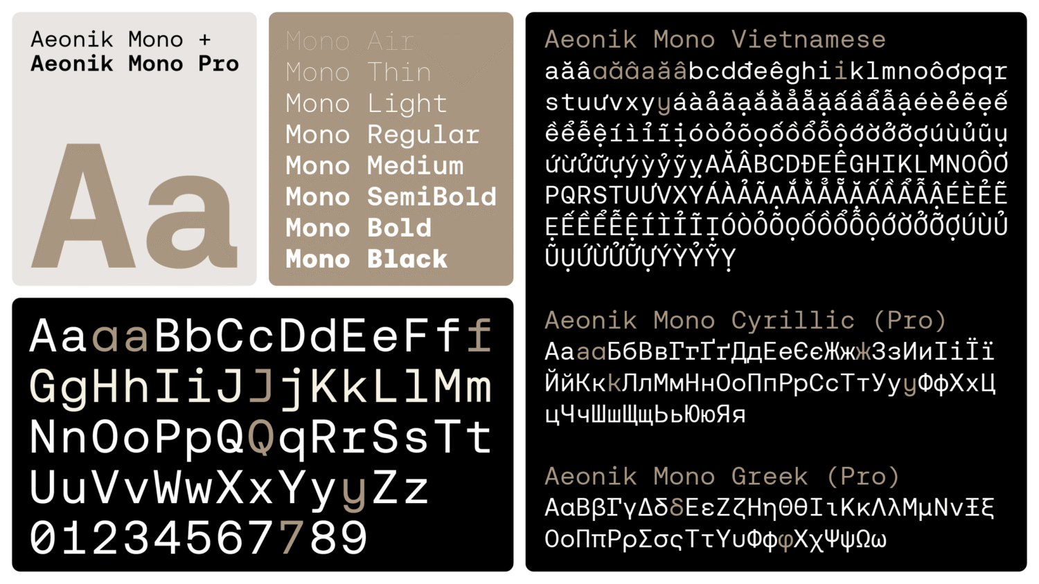
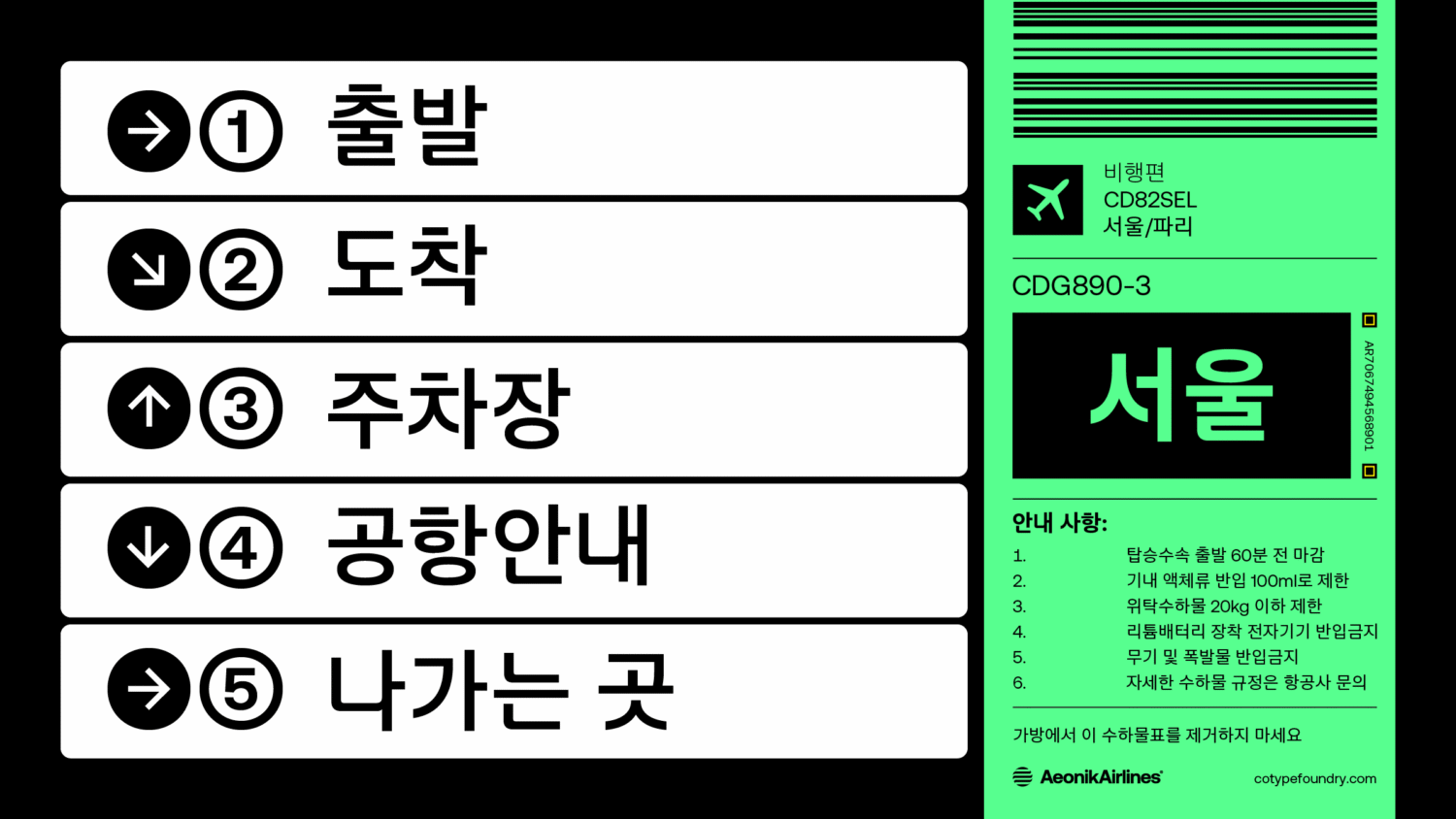
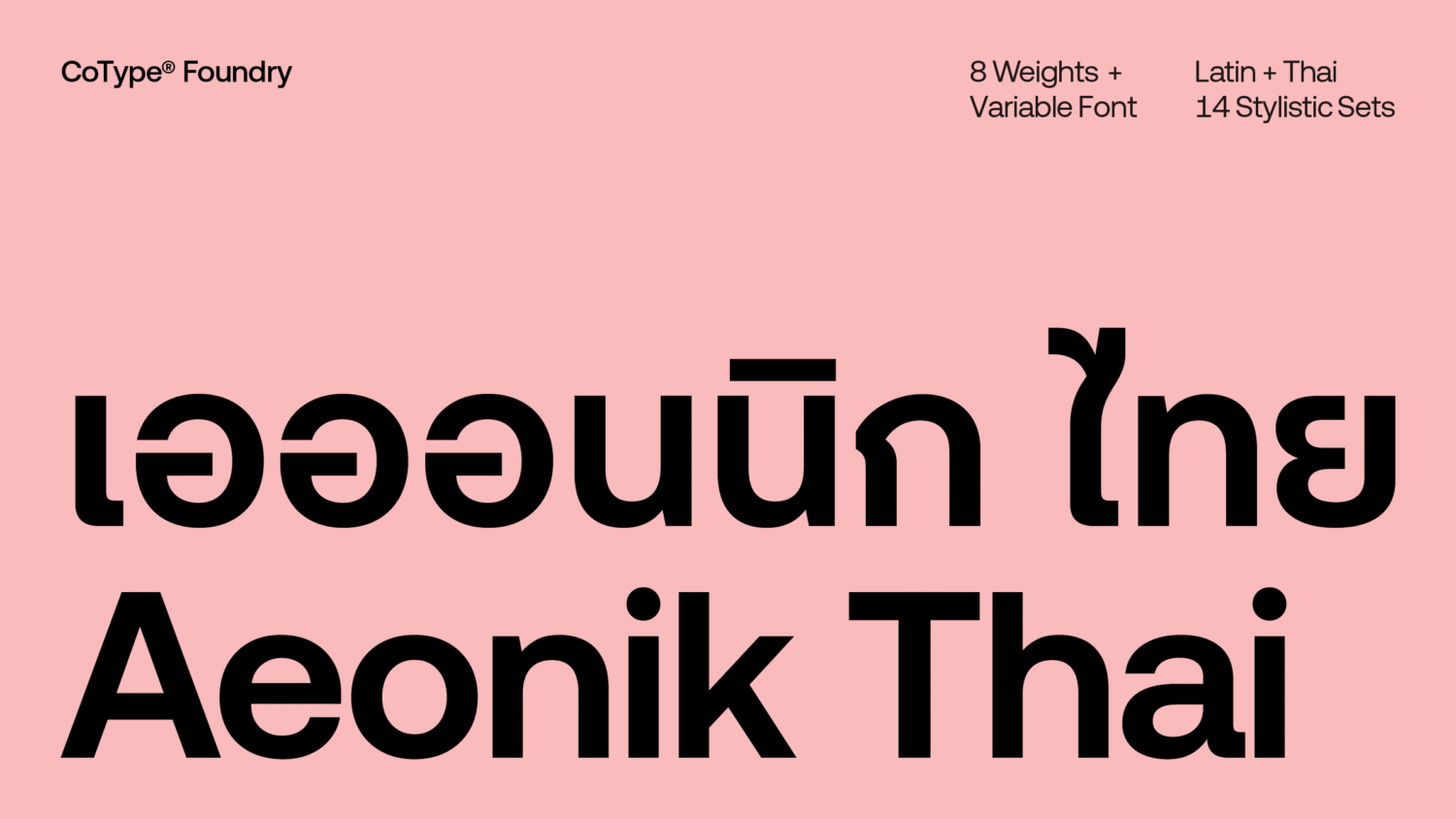
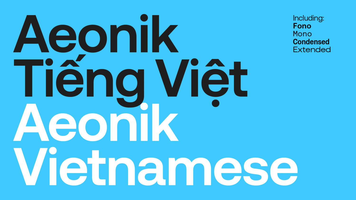
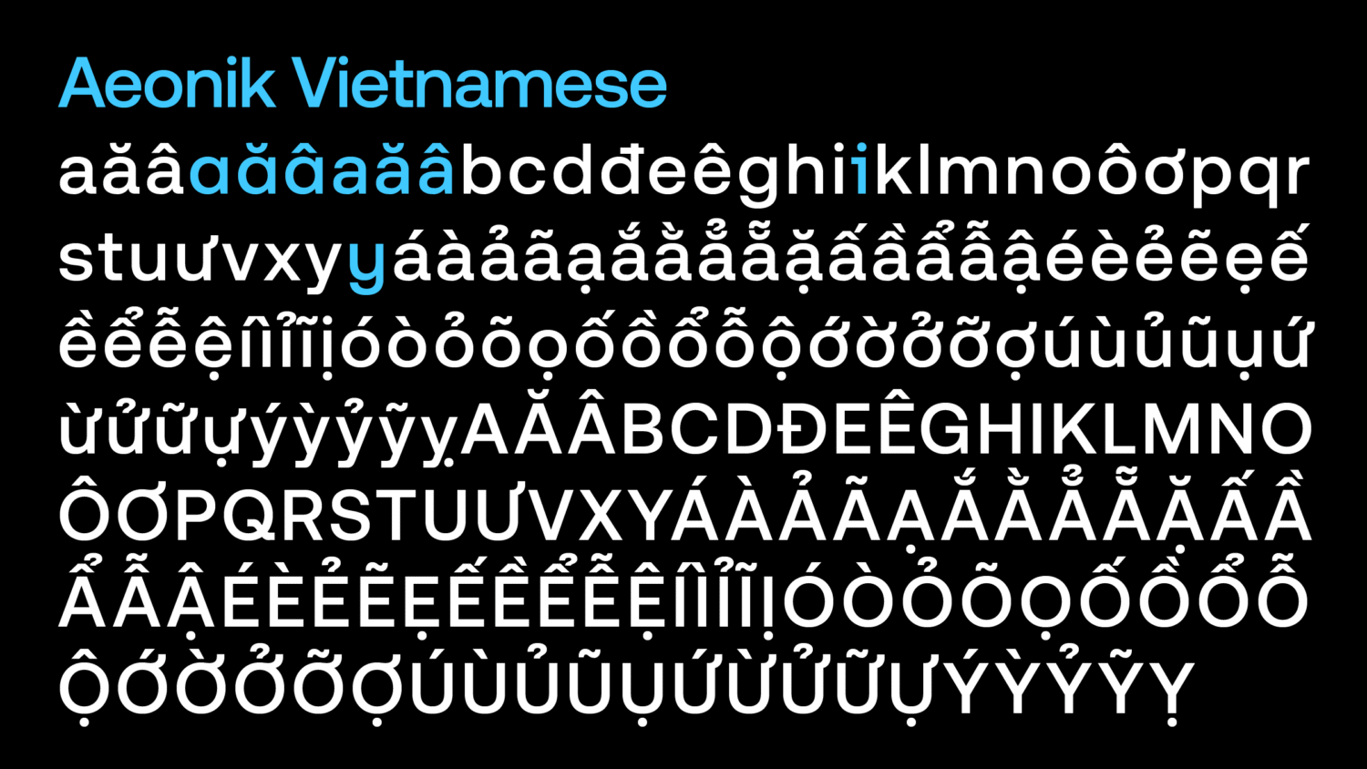
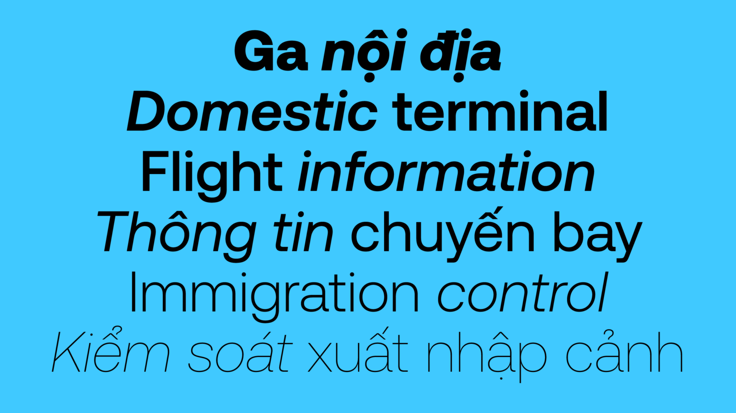
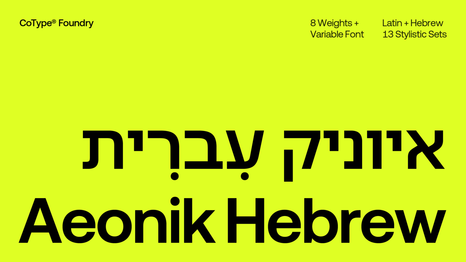
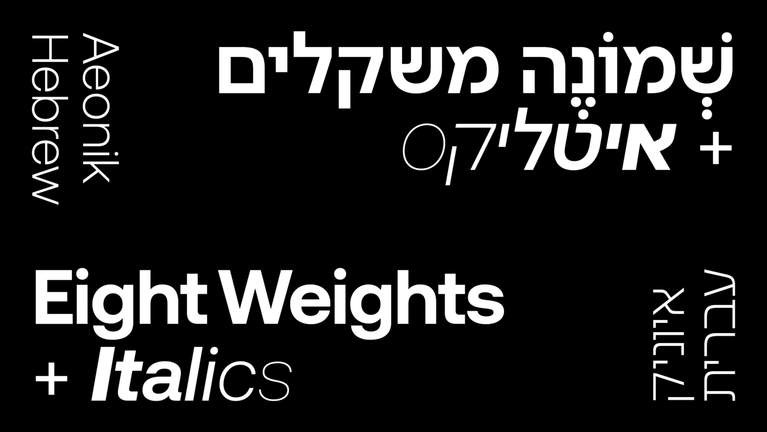
In 2025, CoType expanded Aeonik by adding support for Thai, Hebrew, Vietnamese, and Hangul, along with Pro language options for all variants, including Mono and Fono.
We caught up with Bloom and Ovezea, who provide an in-depth overview of the development process behind these new script releases.
Development: Creating something undeniably ‘Aeonik‘
In 2024, with strong momentum behind them, Ovezea took the reins to steer Aeonik’s evolution further than ever. Under her guidance, independent designers were commissioned for each new script: Black Foundry tackled Hangul, Bahman Eslami embraced Arabic, Cadson Demak ventured into Thai, and Fontef Foundry explored Hebrew. Each designer was carefully briefed to capture the unmistakable essence of Aeonik while still respecting the “structure, rhythm, and traditions” of their respective languages.
“With the Latin, Cyrillic, and Greek versions in place,” Ovezea adds, “Aeonik’s core design features were clear enough for each designer to interpret them in a way that felt cohesive.” Before the work began, they exchanged ideas and drafts, often sharing PDFs to align their efforts, and soon, the distinctive essence of Aeonik began to emerge across various scripts.
The project initially focused on Arabic, Thai, and Hebrew, as these languages could be developed in roughly the same timeframe. Hangul, meanwhile, was more complex and required a longer development cycle.
Project Highlights: Super Scripts and Dancing Glyphs
As versions of Aeonik took shape, what surprised Diana the most was the potential for clean, low-contrast Arabic typefaces that remain faithful to the script. “Historically, Arabic type has been shaped by calligraphy and broad-edge tools,” she explains. “For a long time, many new Arabic fonts were either overly Latinised or limited by the constraints of early font technology.” The tools have since advanced, allowing for a thoughtful approach that was once limited by the constraints of older technology. “I’m proud Aeonik can be part of that shift.”

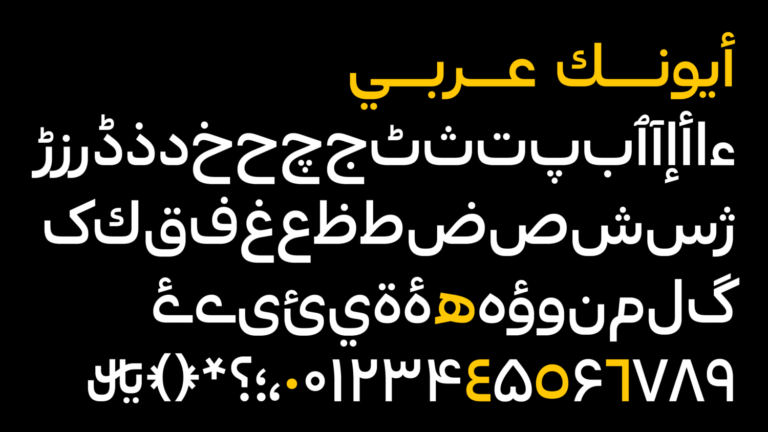
“One principle I always return to is that Arabic type should preserve the illusion of continuous movement. Because the script connects contextually, each letter must feel like part of a ribbon flowing through the line. It feels unusual to apply that idea to a geometric grotesque typeface, yet Bahman Eslami has managed to design Aeonik Arabic in a way that respects both what makes Aeonik appealing to graphic designers in the Latin world and what makes Arabic structurally and culturally unique.”
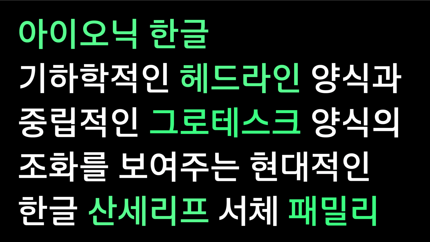
When Black Foundry presented the Hangul version, Mark was impressed beyond measure. “The structure of the script is completely different from Latin, yet the Hangul version still feels unmistakably Aeonik,” he remarked, admiring the balance of visual complexity with the clean, modular feel that defines the family. “It’s a great example of how a typeface can adapt across writing systems without losing its identity.”
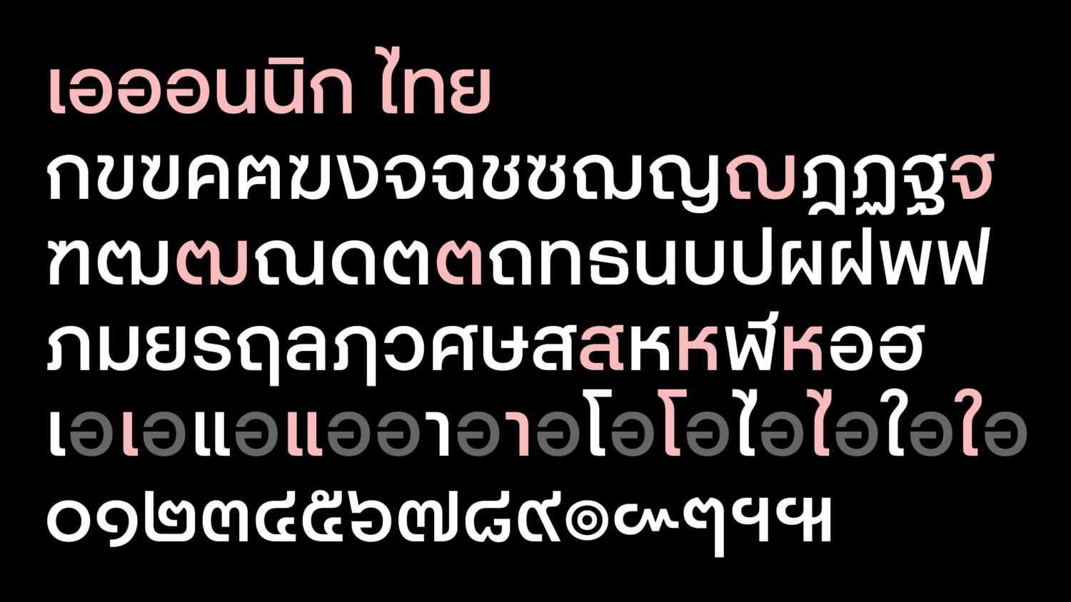
Meanwhile, Diana marvelled at the ‘Air’ version of the Thai glyphs, expressing joy over the playful forms — “especially characters like the Thai number ‘5,’ which almost feels like it’s dancing” – that breathed life and energy into the script. “Cadson Demak managed to bring so much personality into those lighter weights while still staying true to Aeonik’s tone. Seeing those shapes actually made me wonder what Aeonik might look like as a handwritten script.”
Lessons and Learning Curves
“Expanding Aeonik into multiple scripts was a rewarding process,” Ovezea reflects, grateful for the chance to lead it. While the design phase was carried out smoothly – thanks to both Aeonik’s clear personality and the teams’ respective expertise – there were definitely a few things she hadn’t fully anticipated at the start. “As we moved into engineering and started making decisions about how to deliver the fonts to customers,” she recalls, “things naturally became a bit more complex.”
For anyone thinking about a multi-script expansion, Ovezea shares a few nuggets of advice that she learned along the way:
- Wait on setting a timeline until each script team has shared theirs. Each team you’ll interview will have wildly different timelines based on their available resources and approaches to manpower.
- Be clear early on about who will handle final exports and testing. Even deciding whether to bundle all scripts into a single font or keep them separate can lead to interesting discussions — so it’s worth thinking through upfront.
- If you’re merging all scripts into one family, bring in a font engineer early. Different scripts can introduce unexpected feature conflicts, and it’s good to have someone who can advise on those issues early on.
Since she wasn’t an expert in the scripts CoType was expanding into, Ovezea knew it was essential to start early and be transparent about what she didn’t know. “Rather than writing a rigid brief, I worked closely with each team to shape it together, making space for their input from the start,” she says. “That helped build trust and kept the process flexible, while still giving everyone a clear sense of direction. When every team works a little differently, that kind of clarity and openness really pays off.”
What’s next for Aeonik?
The reception to these new scripts has been overwhelmingly positive, reports Bloom, “with consistent growth in the adoption of non-Latin scripts each month, highlighting strong interest and demand across diverse markets.” Brands that had already licensed Aeonik began upgrading their packages to include additional language support; meanwhile, creative studios and international companies are integrating the typeface into broader, multilingual branding and design initiatives.
With this in mind, Bloom envisions expanding Aeonik to support additional languages, such as Devanagari, and eventually even Chinese and Japanese. “These expansions are time-consuming and costly, but they’re exciting opportunities to make Aeonik truly global. We’re also planning to introduce a new ‘Soft’ variant, a semi-rounded version of Aeonik. Like the other variants, it will include optional Pro support for Greek and Cyrillic, adding even more versatility while staying true to the typeface’s distinctive character.”
Enjoyed this article? Read some of our other typeface design features here.


