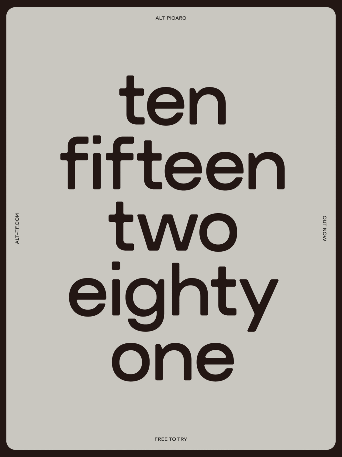
With its bold proportions, rogue charm, and softened geometry, this new sans serif from ALT.tf, crafted by independent designer Ellen Jonsson is equal parts structured and rebellious. Born from sketchbook doodles and shaped by influences ranging from ghost signs to early grotesques, ALT Picaro is a bold sans serif with a geometric backbone and a roguish edge—living up to its name, which is drawn from the Spanish word for ‘rogue.’
What began as a couple of uppercase sketches in Ellen’s sketchbook quickly evolved into something much bigger. “It was a really intuitive process,” she says. “I’d been looking at a lot of old signage and type specimens—those clunky, charming letterforms that feel functional but still full of character. I wanted to channel that into something contemporary and usable.”
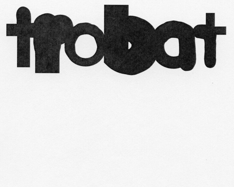
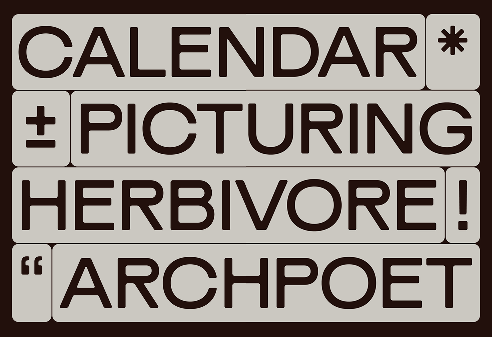
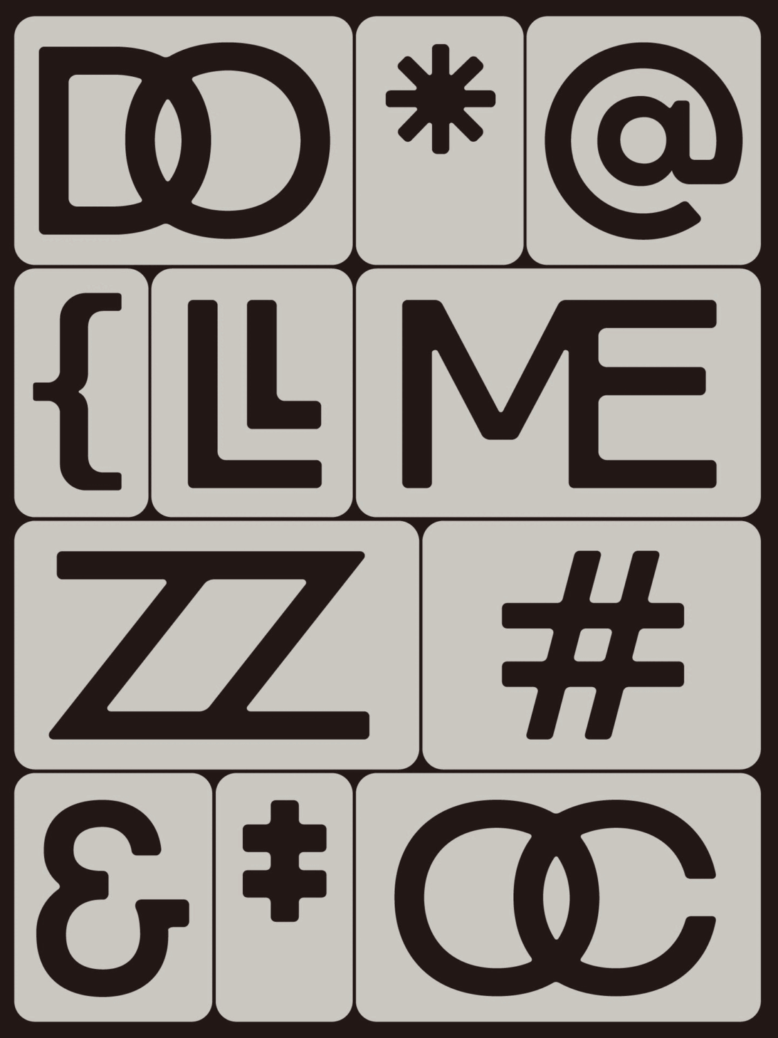
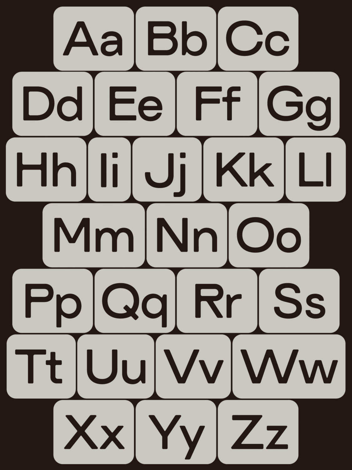
ALT Picaro certainly delivers on that sentiment. Its most distinctive traits—a wide stance, raised crossbar, and rounded terminals—make for a typeface that balances precision and softness. There’s a clear sense of structure in its geometry, yet it avoids sterility thanks to generous curves and subtle quirks. Though initially intended purely for display, ALT Picaro grew into something more expansive during development. “Once I added the lowercase and extended language support, it started to sit in that sweet spot between being a headline font and a more versatile sans,” Ellen explains.
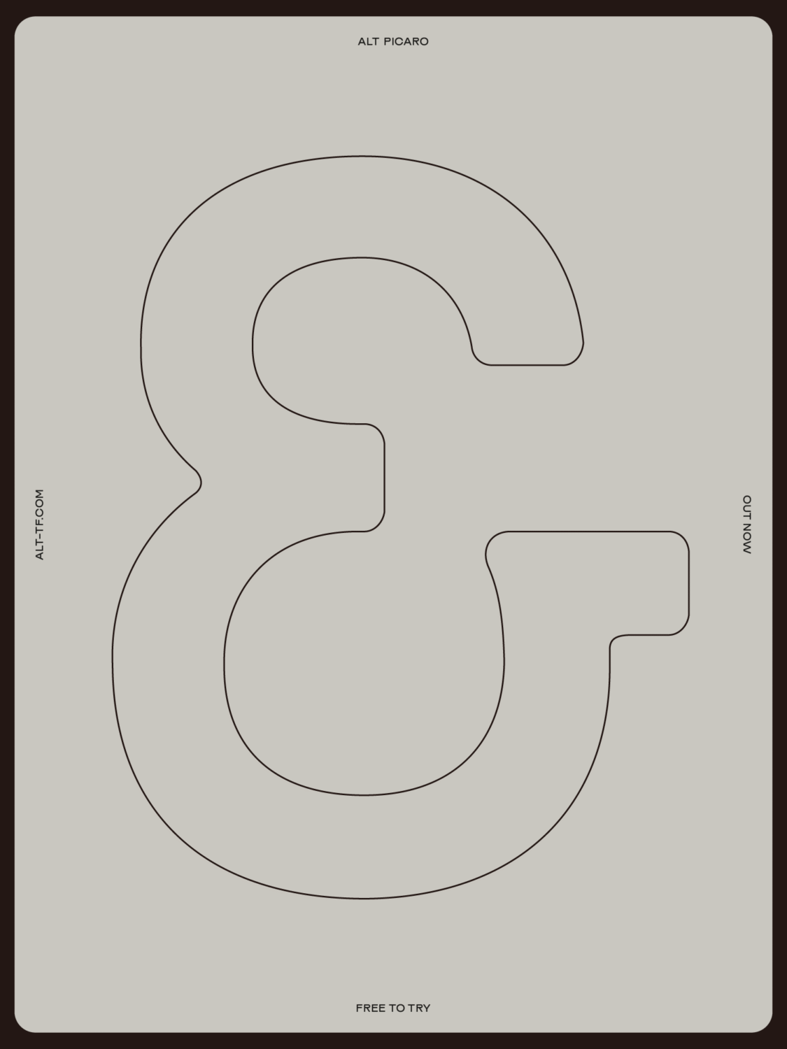
The letterforms themselves were shaped through a mix of intuition, feedback, and deep attention to detail. The lowercase ‘a’ was reworked five times before Ellen landed on the final form. “Balancing the geometric and grotesque influences was tricky,” she admits. “The roundness of the counters made optical balancing a challenge—especially for letters like ‘a’, ‘b’, and ‘n’. In the end, cutting a subtle notch where the stems meet the bowls helped lighten those areas.”
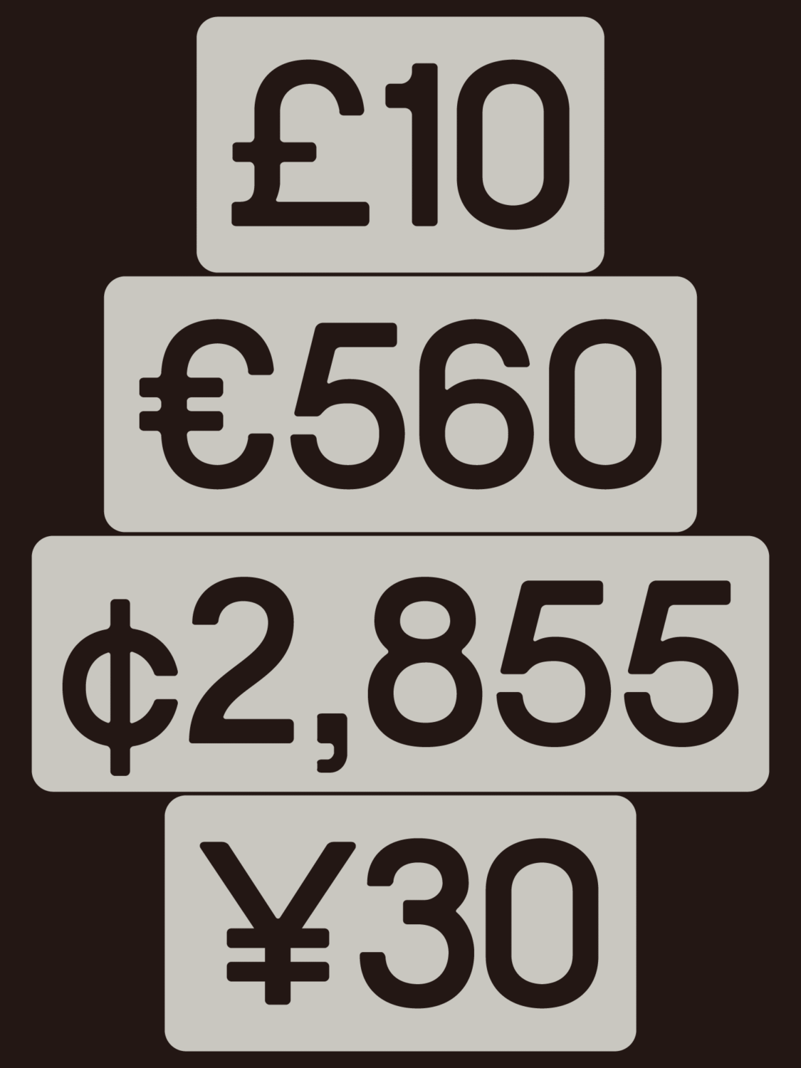
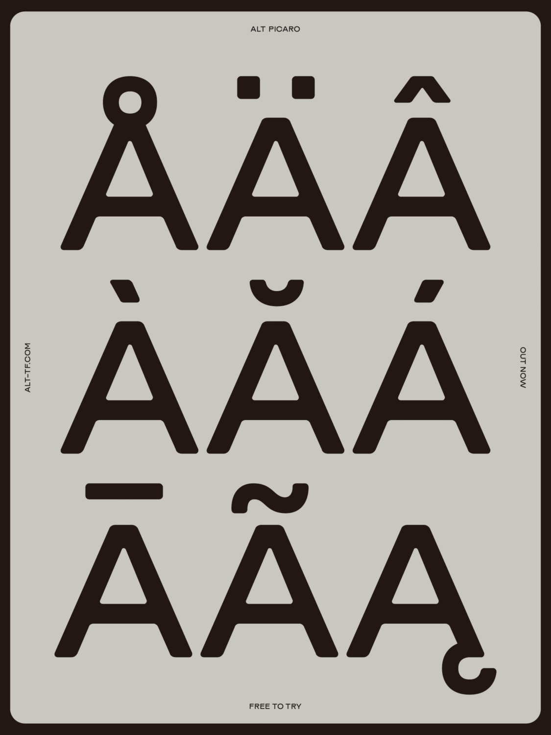
The technical underpinnings of the typeface reflect Ellen’s commitment to accessibility and functionality. ALT Picaro supports 219 Latin languages, including full Latin Extended-A coverage. For Ellen, who is Swedish, designing with multilingual users in mind was second nature. “I often start with characters like Å, Ä and Ö and build from there. I know how frustrating it is when those are missing.”
Despite being a single-weight font, ALT Picaro is anything but limited. Its distinctive voice makes it a strong anchor in a typographic system and an ideal companion for other styles. Ellen envisions it used in bold branding, logo design, and expressive editorial layouts—projects where personality matters.
As a self-taught type designer with a background in graphic design, Ellen’s journey into font creation has been marked by curiosity and a collaborative spirit. She credits designer and ALT.tf Creative Director Giulia Boggio for key feedback during the process and reflects on the solitary—but—rewarding—nature of type design. “This was my first time creating a full font in Glyphs. It was incredibly informative, and I definitely approach things differently than someone with formal type training.”
ALT Picaro also marks a milestone: Ellen’s first commercially distributed typeface, and the latest addition to ALT.tf’s growing catalogue of work from underrepresented voices in type. “It’s amazing to be part of a platform that champions new designers,” she says. “The tools for making and distributing type are more accessible than ever, and that’s opening the door for some really exciting, experimental work.”
So, what’s next for Picaro? A full family expansion is on the horizon, with Ellen hinting at bolder weights—and maybe even a square-terminal variant. But for now, ALT Picaro stands on its own: bold, confident, a little mischievous, and ready to make its mark.
Explore ALT Picaro
→ alt.tf/picaro
Designer: Ellen Jonsson
Instagram: @alt__tf
Browse more font release articles here.