Can you believe we’re already a quarter into the 21st century? This year’s been packed with milestones, and we’re stoked to drop Issue 10 of TYPEONE Magazine along with them. Now an annual publication, this issue is brimming with more features than ever, with plenty to sink your teeth into.
Marking five years since the magazine first appeared and making a statement on magazine racks worldwide, issue 10 explores “The Type Industry of the 21st (and a Quarter) Century,” answering the questions: where are we today? What does the type industry look like? What does it stand for? And how has it changed?
As one of this issue’s contributors, I had the pleasure of discussing some of these questions with this issue’s Editors and TYPEONE’s long-running designers Studio Ground Floor (Alice Sherwin and Harry Bennett), whom I interviewed after the magazine’s completion.
For them, this manifests in in-depth, exploratory pieces on today’s type industry, focusing on adaptability and forward-thinking in a rapidly changing environment, where contemporary type design reflects broader cultural shifts and technological advancements. “It’s really cool,” they tell us. “And as its editors and designers, we’re super proud of it.”
Over 182 pages, we sink into these discoveries, cycles, and changes shaping the typographic landscape, through essays, interviews, and design spotlights.
Issue 10: Culture and Innovation
Ellis Tree begins the issue in the tangible world of typographic merchandise, where foundries shift from digital to physical products, creating items to promote their fonts – making typefaces more relatable and strengthening connections with fans and designers. Is this a move into lifestyle branding? From typography as a niche industry to a wider audience, studios like Dinamo and Blaze Type are exploring this new space, including clothing, ceramics, and home goods.
And from physical to philosophical, Michaela Zoppi’s exploration into the complex relationship between language and reality invites us to question whether language – a human invention – limits our perception and understanding.
With a global perspective, Dalia Al-Dujaili examines the evolution of typography, focusing on multiscript engineering – the integration of multiple scripts within a single framework. She highlights the challenges of maintaining cultural integrity in type design and stresses the importance of collaboration among designers from diverse backgrounds to create authentic and contextually aware typefaces that reflect the richness of various scripts.
Issue 10: Studio Interviews
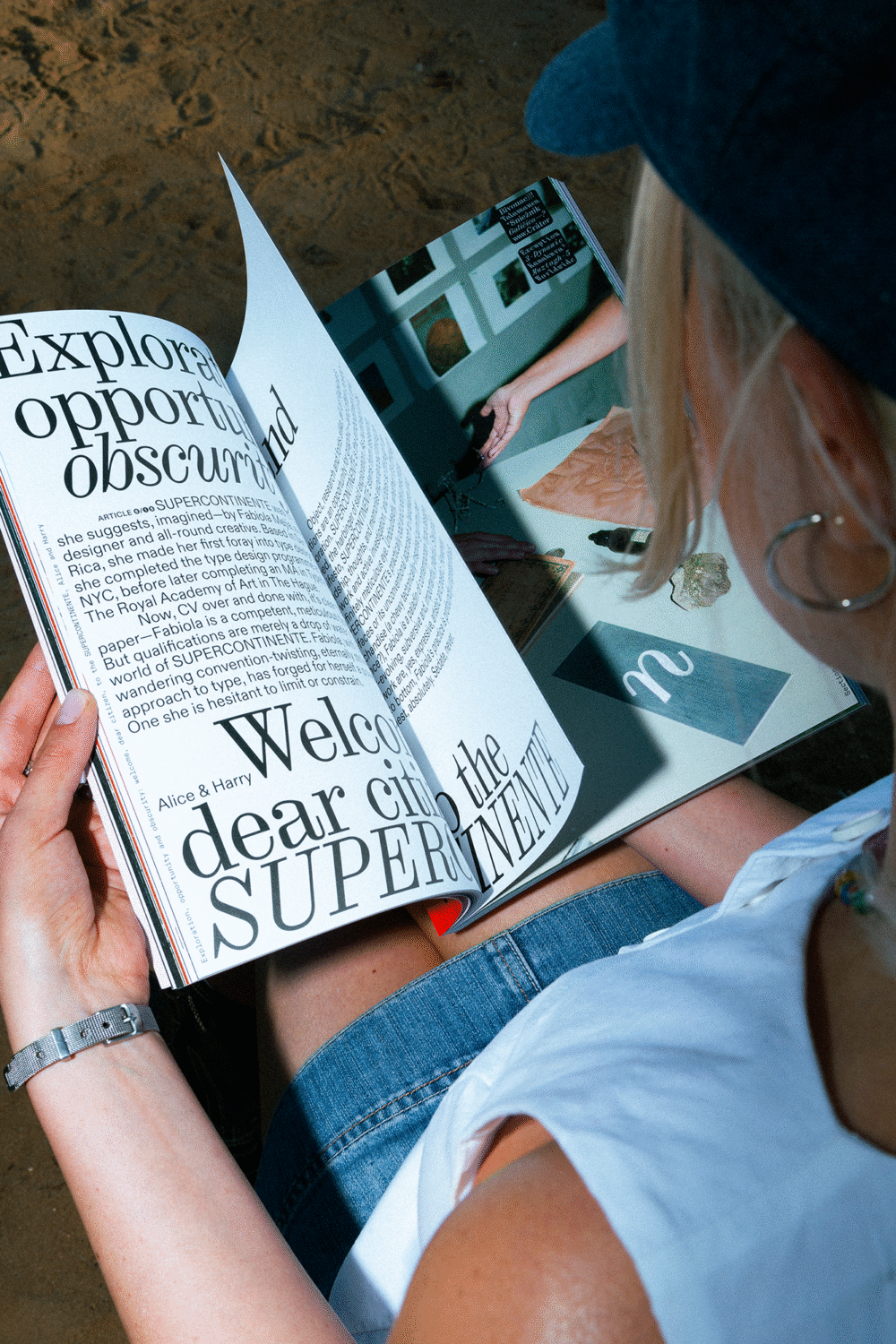
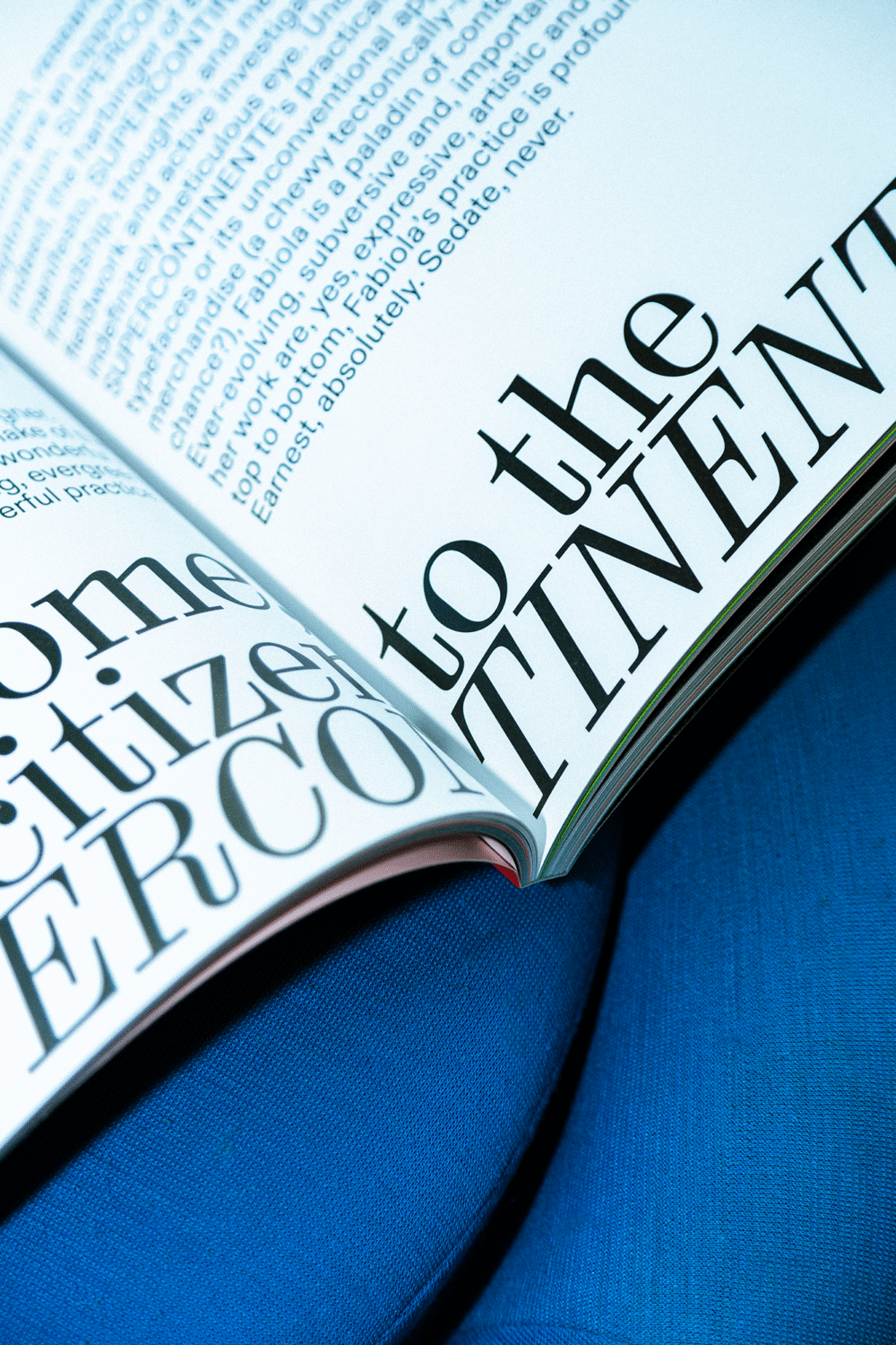
Our interview section is full of questions not only about current creative practices and making typefaces, but also about creative evolution, their observations of the industry’s changes, storytelling, and knowledge sharing. The answers from Benoit Bodhuin of BB Bureau, Vocal Type’s Tré Seals, and Fabiola Mejía of SUPERCONTINENTE all present a rich portrait of their creative journeys.
Issue 10: Opinion
We provided three creatives with a platform to explore their perspectives on the industry today, where they stand, and what needs to change, with each piece printed on a beautiful Fedrigoni stock – Sirio Celeste, Sirio Lime, and Sirio Nude. Chantra Malee discusses Sharp Type’s decision to sell its legacy font library and how this move reflects its dedication to innovation and craftsmanship. Elizabeth Goodspeed examines the growing trend of studios designing custom typefaces, highlighting the shift from traditional and generic fonts to bespoke typeface designs that embody brand identities and create emotional resonance. Velvetyne’s co-founder Jérémy Landes, meanwhile, prompts us to consider the evolution and challenges of developing open-source fonts within a capitalist economic framework.
Issue 10: Insights
Ideas of accessibility lead us to the Insights section, where Olivia King – creator of Inclusive Sans – provides a guide on creating accessible typefaces. Xiaoyuan Gao shares a fun and accessible approach to creating a basic Latin-based typeface using free online tools.
Issue 10: Spotlights
Type within mountain trails, building your own food brand, and designing for film. Our spotlight profiles of Ishar Hawkins, Moritz Appich, and Eastern rodeo share an emphasis on the interplay between creativity and context – how their work responds to and reflects the world today. Whether it’s aluminium signage plates, a typeface inspired by spotting a “poor bootleg metal version of Caslon”, and an embroidered wordmark made with the assistance of a mother-in-law’s careful stitching, type is a central means to engage in unexpected ways. These designers – whom I had the pleasure of interviewing myself – are doing some seriously cool work, with each reminding us that careers in design rarely follow the same path.
Looking back at the issue’s development, Sherwin and Bennett couldn’t pick a single favourite piece – “we think all of the articles bolster each other to create a picture of, and reflect on, the type industry of the 21st+¼ century,” they explain. From important discourse about accessibility and globalisation to great chats with people doing cool stuff, we’re super proud of it, and super grateful to all of the brilliant writers and contributors who have brought their brilliant perspectives to the magazine.”
The Design of TYPEONE Issue 10
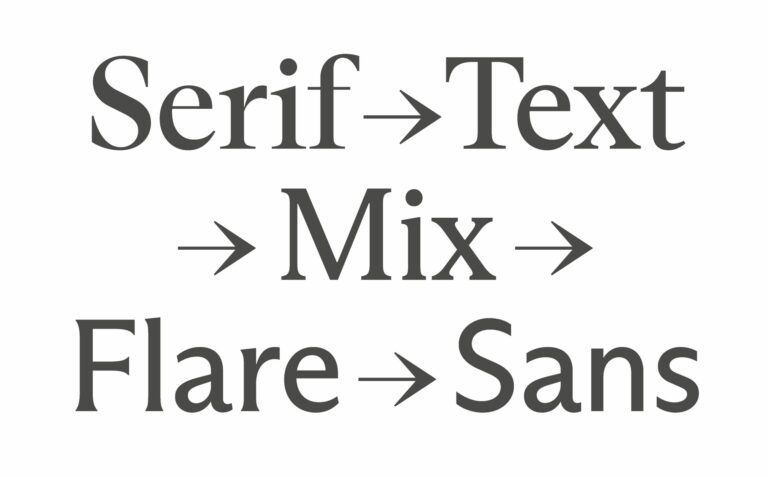
And as always, the magazine’s design itself is a treasure trove of inspiration, with details and discoveries for readers to savour. “Not only do we feature lots of amazing designers (as always),” says Sherwin and Bennet, “this time we are also using their typefaces to set each of their respective articles. It only felt appropriate to the theme!”
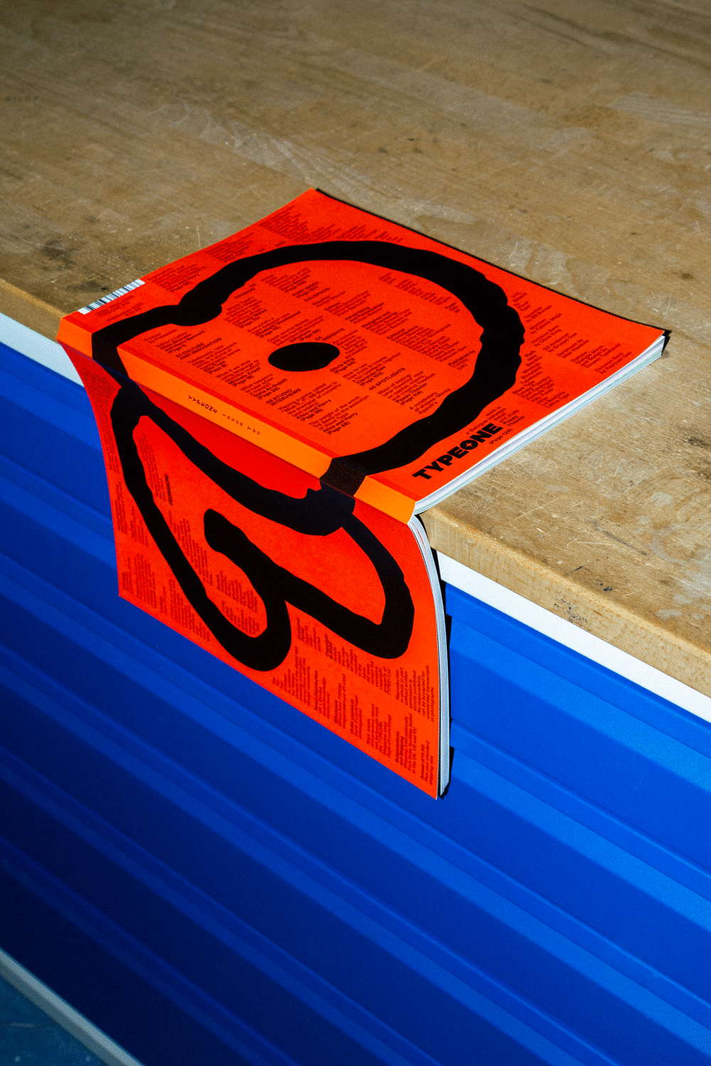
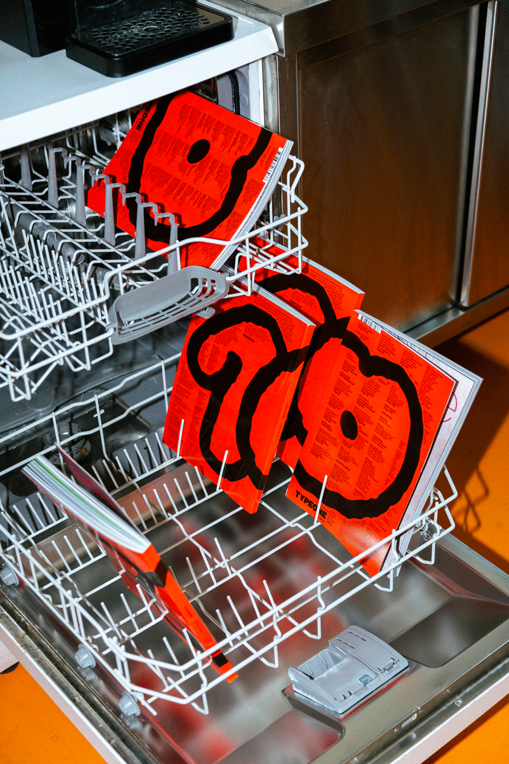
Describing this issue’s Idol, Berlin-based type design studio Dinamo, “they’re amazing folk and it’s always exciting to get their perspective and see what they’re up to,” note both Bennett and Sherwin. “Similarly, being able to use their typefaces across this issue (and many previously) is always a treat. Harry particularly liked using the library of insane/bewildering/playful glyphs from ABC Stefan.” The cover, which also doubles as the colophon (a ‘coverphon’?), sets this typeface (aka, Stephan Marx’s handwriting) as a mighty number ‘10’, set against a deep red Pantone.
Having created the magazine’s design system – a flexible and evolving foundation that responds to the magazine’s theme while keeping essential elements like the cover number and a focus on typography, Studio Ground Floor has designed every issue, ensuring each one feels connected through the identity and system they’ve developed from the very beginning.
With more issues on the horizon, we are excited to dive deeper into the world of typography and design – platforming fresh perspectives, featuring talented designers, and exploring innovative techniques. Your unwavering support and passion for TYPEONE Magazine have been instrumental in our journey, and we couldn’t have reached this point without you. Thank you for being with us at every stage, for sharing your love for typography, and for inspiring us to keep pushing.
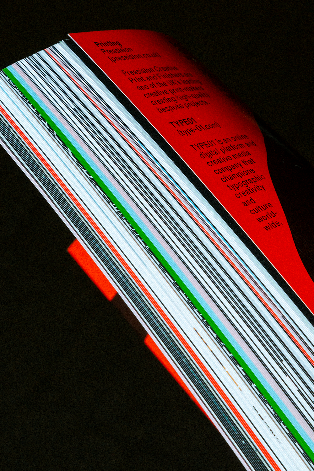
Thank you to our wonderful partners at Pressision, who have been responsible for the print production of all ten issues—paper sponsors Fedrigoni (07, 10), GF Smith (issues 06, 08, 09), and Foilco for their kind contribution of stunning foils. Lastly, our foundational foundry sponsors and partners, without whom we would not be here.
Browse more TYPEONE Magazine editorials to check out all of our back issues.
Thank you to the incredible Jojo Scheutze for the shots of issue 10.