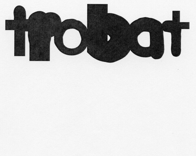
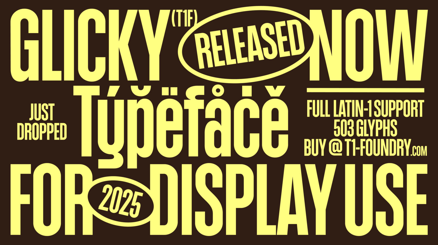
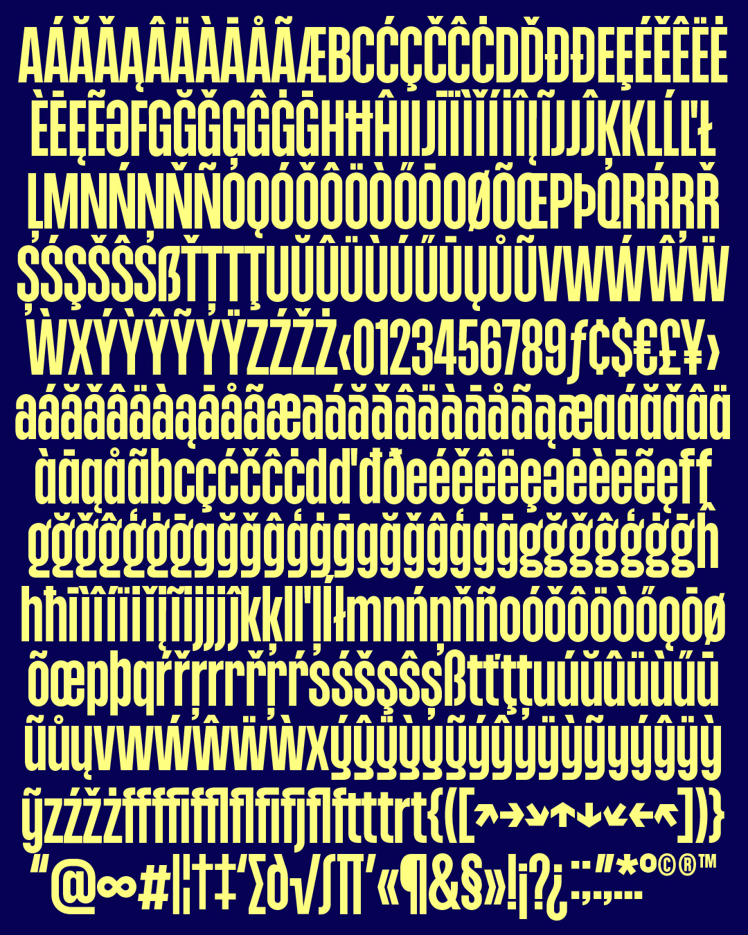
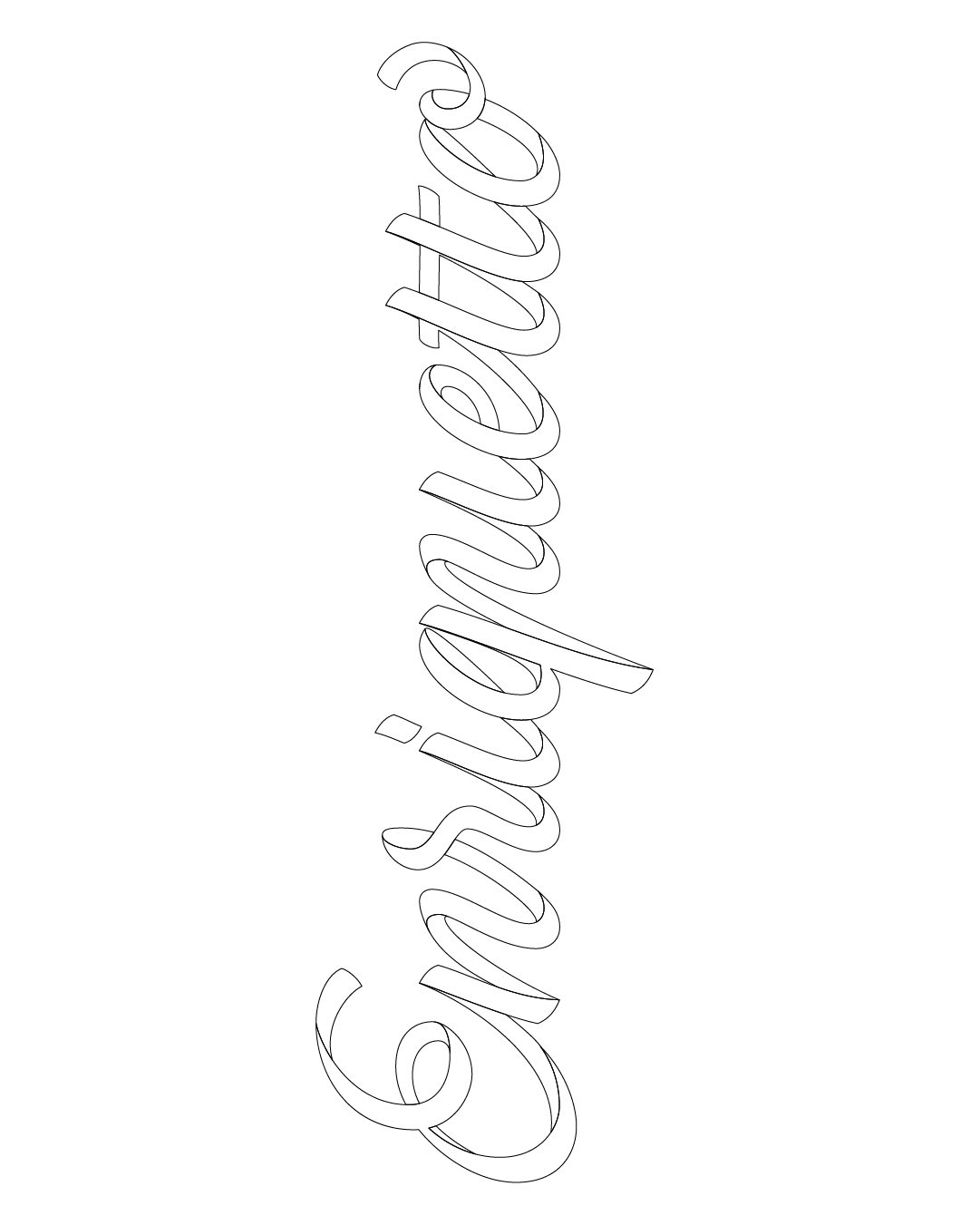
Designed by Marco Rollo, this debut T1 Glicky font released by T1 Foundry bridges the worlds of graphic and type design, translating a deep sensitivity to lettering into a bold, expressive display family.
Born from the spontaneity of hand sketches and honed through technical refinement, T1 Glicky carries the energy of its creator’s early experiences with graffiti, street lettering, and analogue forms. Its large-scale personality and dynamic forms invite experimentation, challenging designers to harness type not just as a tool, but as a medium capable of storytelling, emotion, and visual impact.
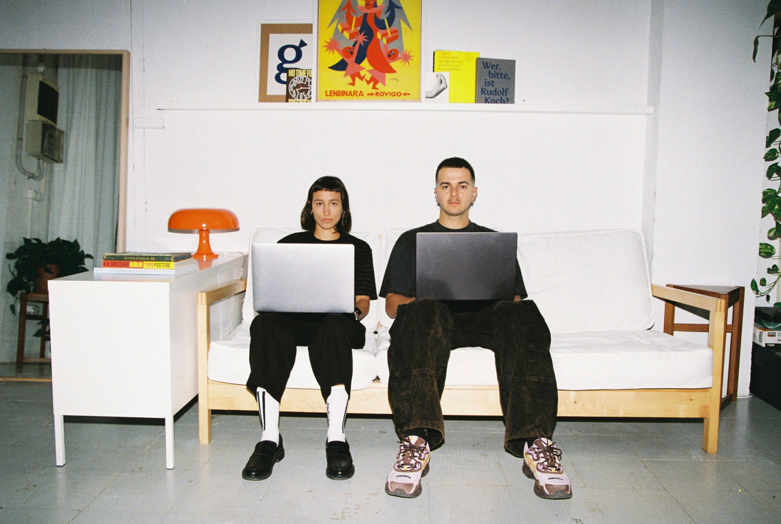
In this Q&A, T1 Glicky’s type designer Marco and type specimen designer Martina Troya discuss the journey behind Glicky—from inspiration and hand-drawn origins to the deliberate, playful approach to composition—revealing how a typeface can both express character and spark creativity in the hands of others.
Amber Weaver: Before we get started Marco, could you tell me a bit more about your design background and journey into type design?
Marco Rollo: As a teenager, I used to organise events with a group of graffiti writers: hip-hop concerts and graffiti jams. I was fascinated by their ability to draw and interlock letters. I handled the organisational side, and since we couldn’t afford to hire a graphic designer for the posters, I started making them myself by vectorising their lettering.
This experience led me to study Graphic Design. During my academic path, I lived between Milan, Buenos Aires, and Barcelona, but it was in Buenos Aires, where sensitivity to analogue things has a completely different weight than in Europe, that my passion for letters truly arose. It’s a city where lettering on buses and shop windows is more often hand-painted than printed. In the city where Fileteado Porteño was developed, a professor put a nib in my hand for the first time; that’s when the short circuit happened, and I began to obsess over letters.
Over time, my path as a Graphic Designer increasingly shifted toward a specific field: Type Design. Today I combine both disciplines in my practice, which is why I define myself as a hybrid between Graphic and Type Designer. I love drawing letters, but I also love composing with them and even bringing them into motion, as I also work with Motion Graphics.
AW: What is it about type design that you love the most?
MR: I believe that, within the graphic arts, type is the element with the greatest impact: it brings together the primary function of communication, conveying text, with aesthetics. A letter doesn’t simply form words; with its shapes, it can communicate values, concepts, and a strong emotional meaning.
That’s why I started drawing letters: to solve branding projects, and because it’s the language through which I feel most inspired. What I enjoy most is thinking about letters, defining the concept that gives life to a typeface, a lettering, or a logotype, a solution that always originates from a problem, from a question, and is never an end in itself.
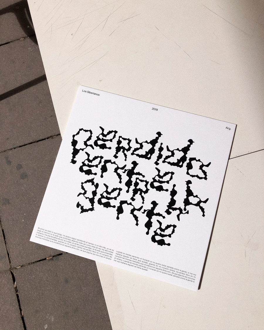
AW: So Glicky, what a release. Could you tell me a bit more about it and what inspired the design?
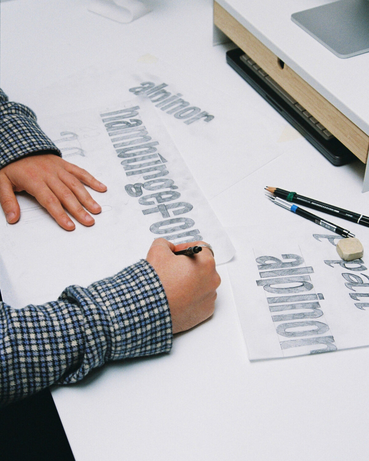
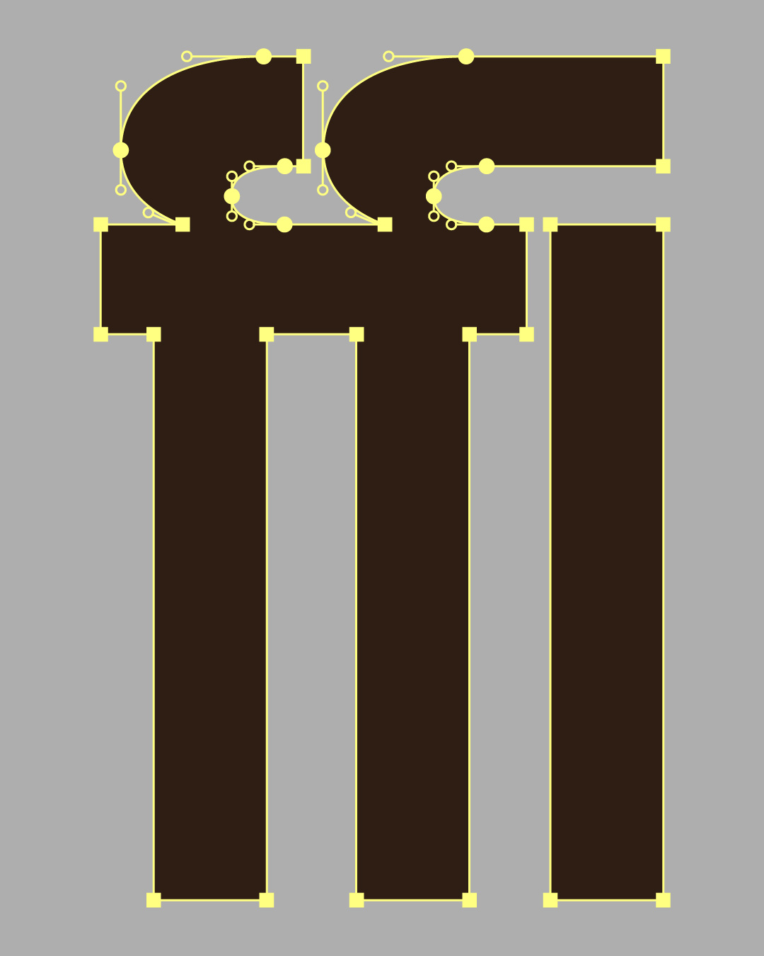
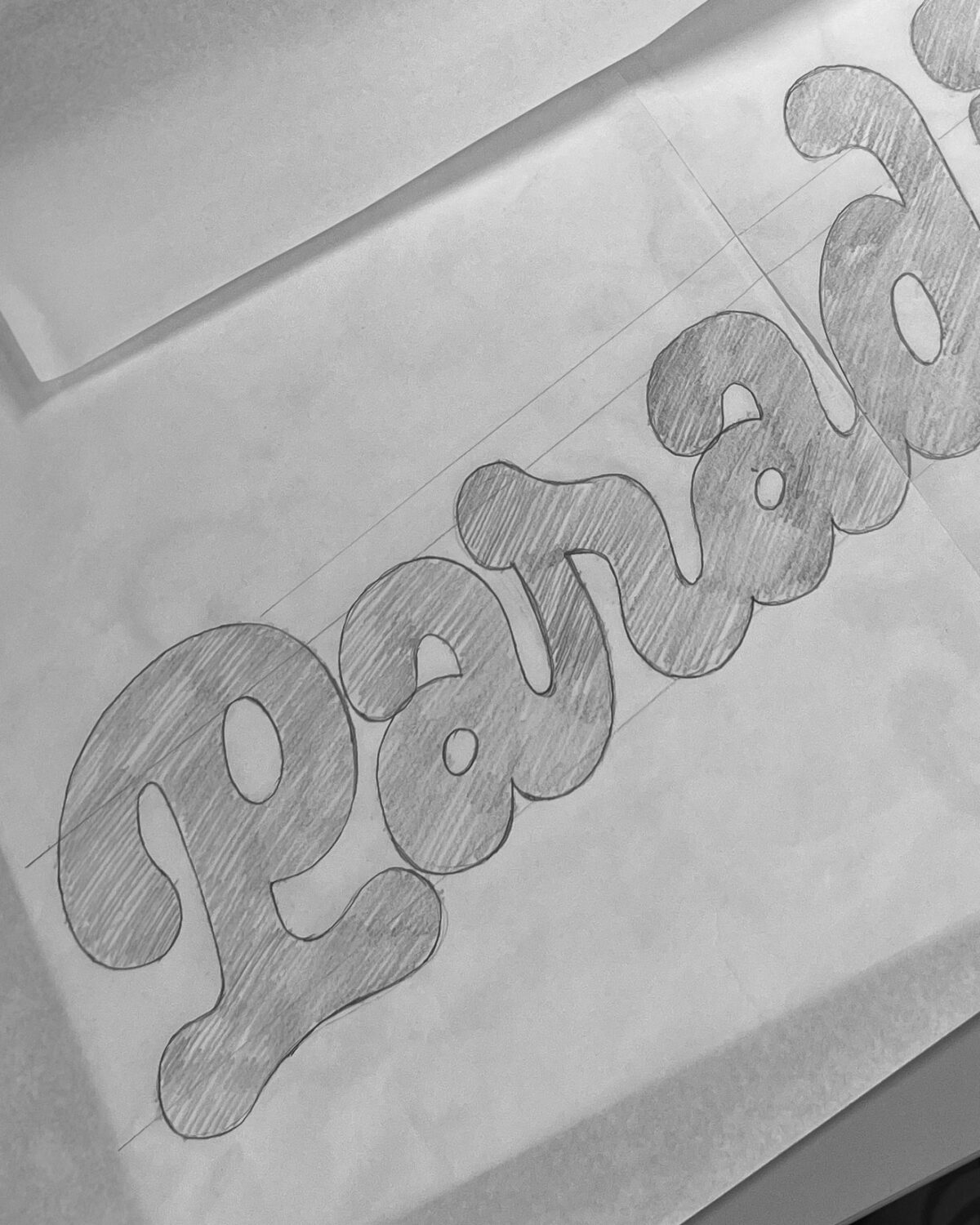
MR: T1 Glicky was born during one of the first typography workshops I attended in Barcelona. It was a time when I was moving away from Illustrator for vectorisation and starting to work with Glyphs (perhaps, unconsciously, the name came from there as well).
I could invent some elaborate conceptual origin, but the truth is that T1 Glicky began as a hand-drawn sketch, playing with TypeCooker during that workshop. It then sat in a drawer for a couple of years, until I found the motivation to refine it and finally bring it into production.
AW: Do you have any big dreams for it?
MR: This is my first typeface on the market. I am very excited about it and look forward to seeing how other designers will use it and bring it to life in their projects.
Above all, I’m interested in discovering its versatility, in seeing how its character shifts from project to project, since until now I’ve always designed custom typefaces for very specific contexts.
AW: Is there anything about yoru craft or design process that you’d like to share or think it’s important to talk more about?
MR: Having dedicated a lot of time to calligraphy, I usually like to start by drawing by hand. I believe it’s a great way to take a brief break from screens. It gives much more freedom and expressiveness, as if the letters I’m drawing had a life of their own, not born in a digital context.
It also helps me think more deeply about what I really want to communicate. Most of the time, the final digital result doesn’t exactly match the hand-drawn version — sometimes it’s completely different — but the latter certainly has a huge influence on the former.
AW: Martina, could you tell me about how you decided to approach the graphics?
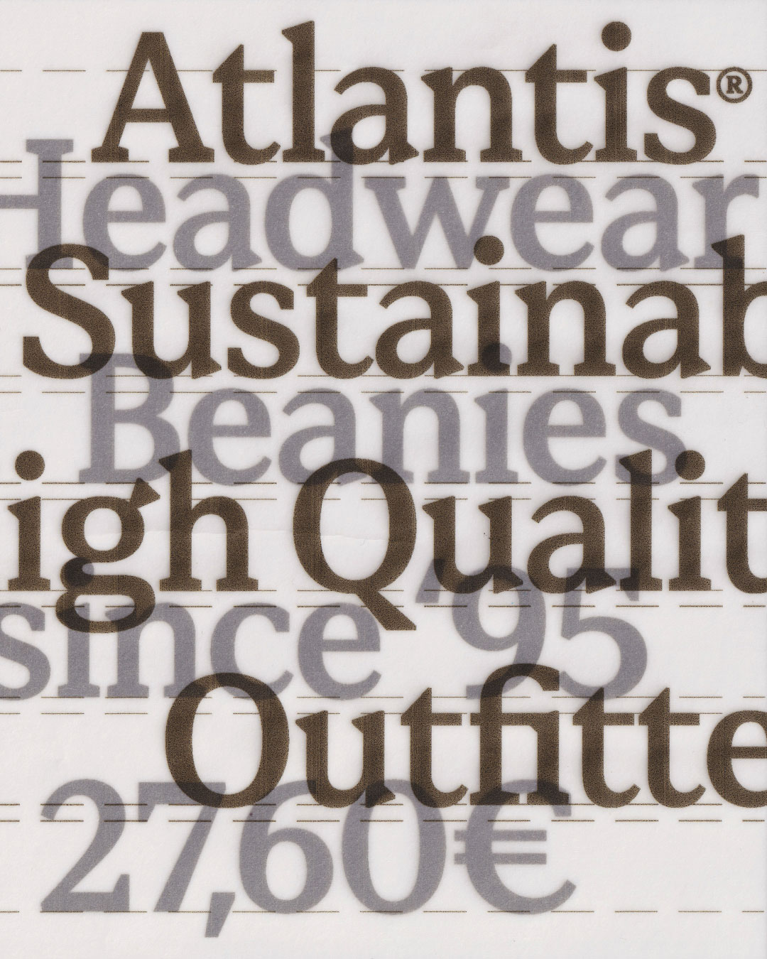
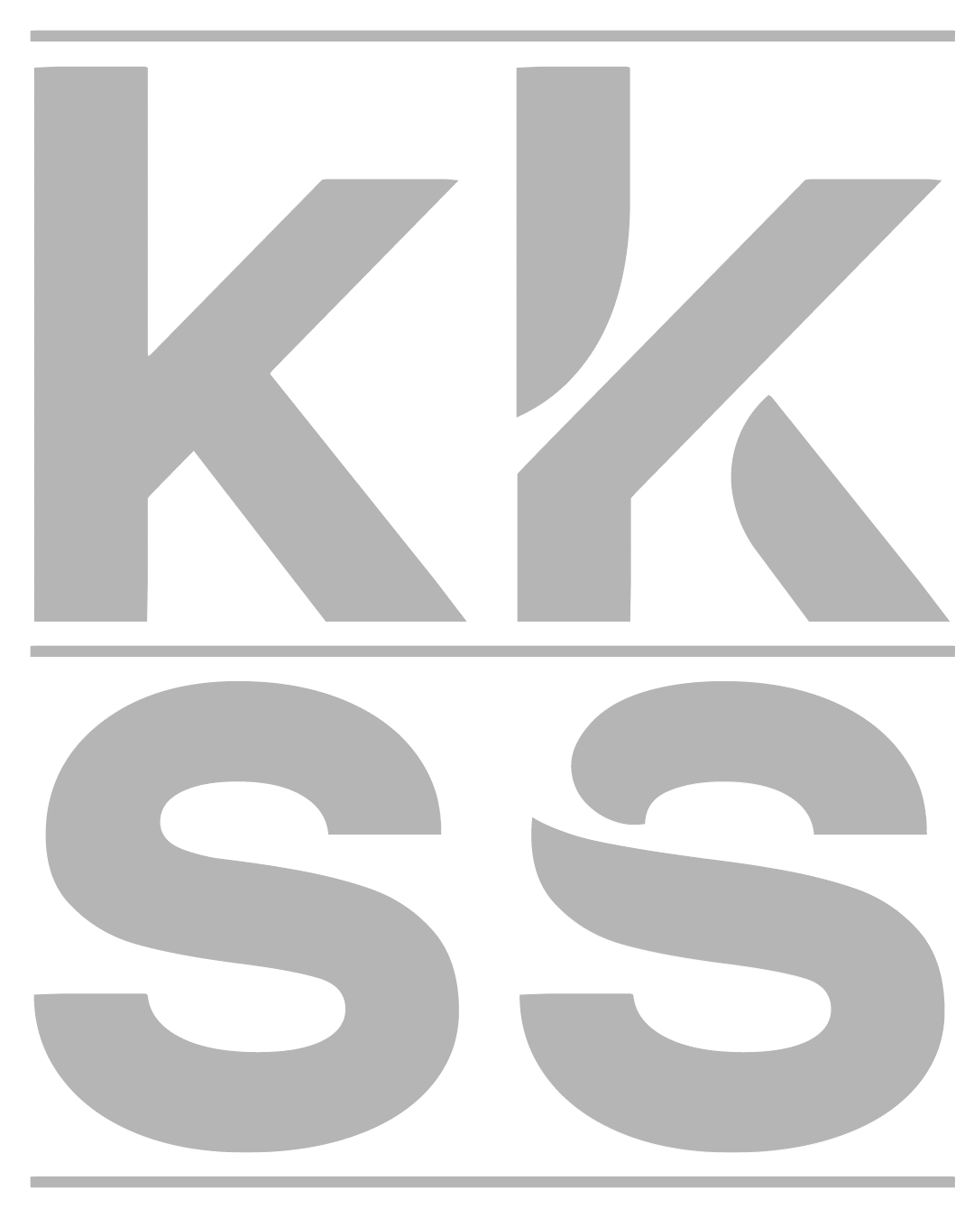
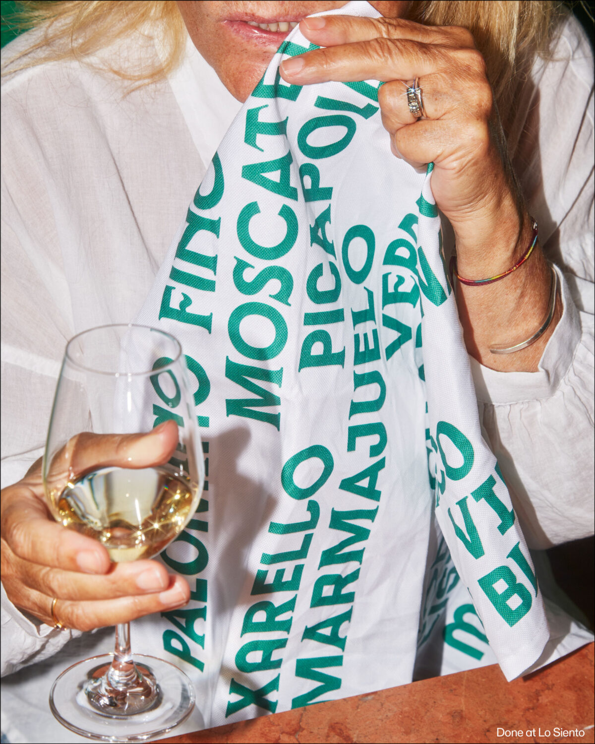
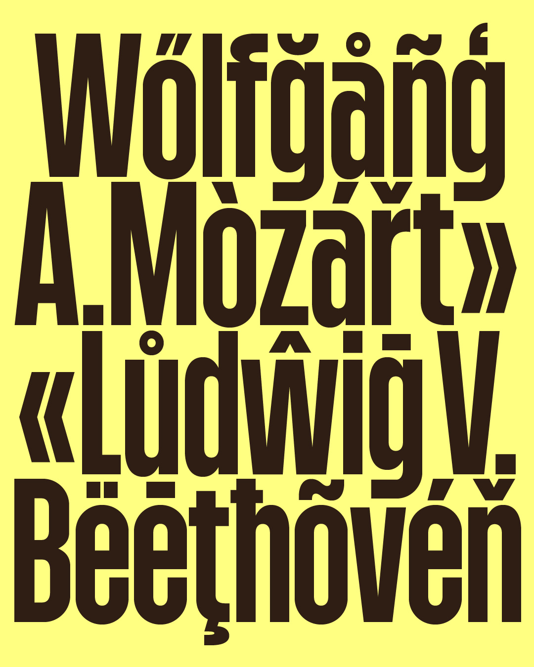
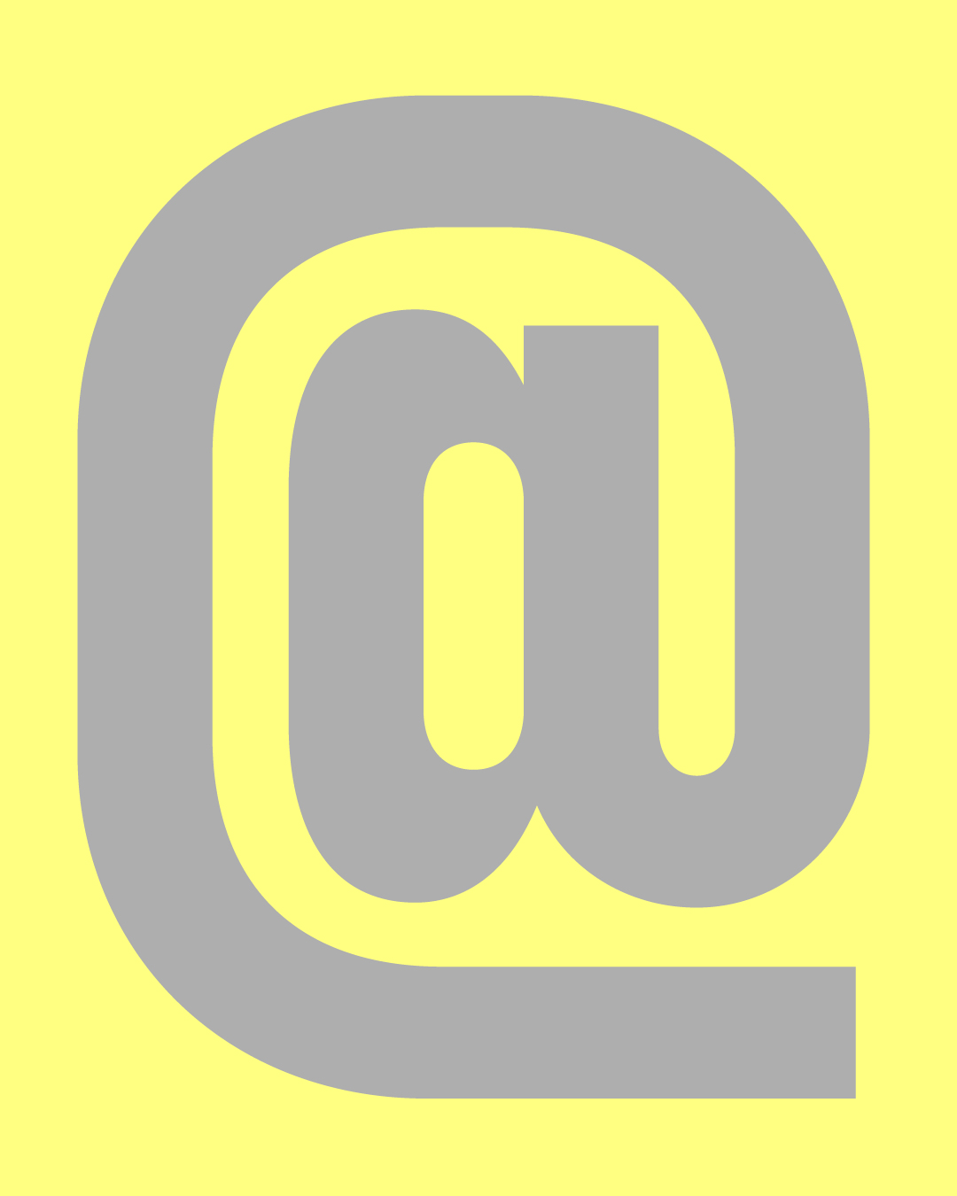
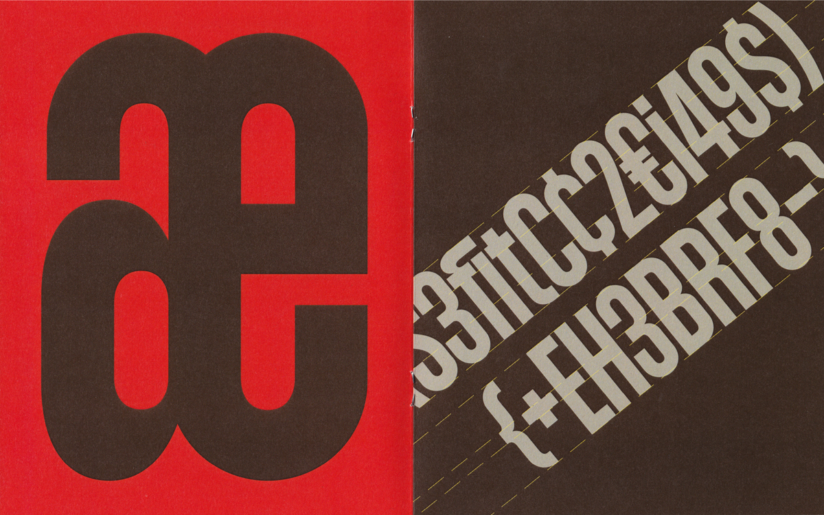
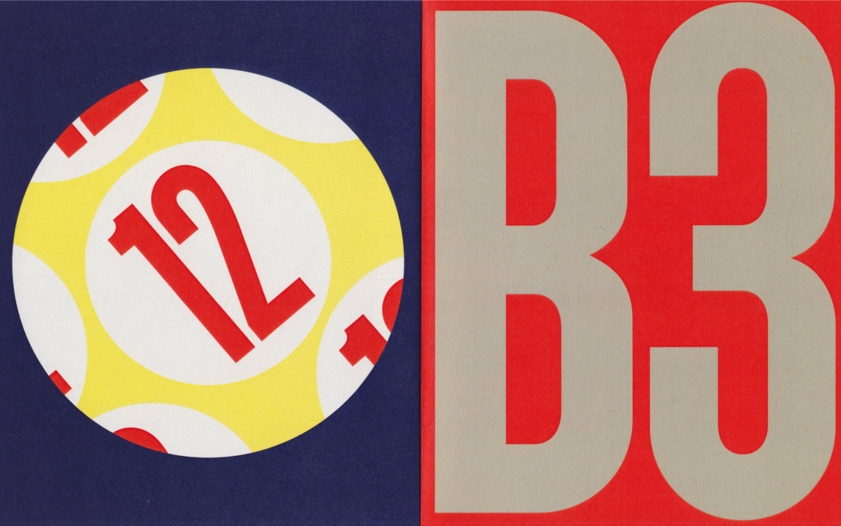
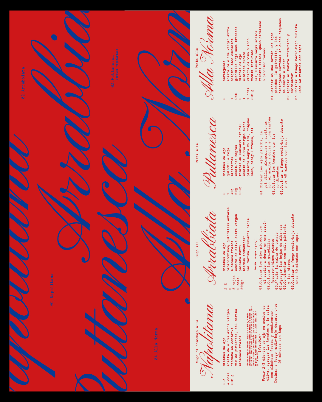
Martina Troya: The direction of the visual pieces is based on the characteristics of T1 Glicky. As a display typeface, it requires working with large-scale typography, composing headlines and statements and using a bolder visual language, with a strong focus on form and without additional graphic elements.
The colour palette is intended to create dynamic and optimistic visual pieces, incorporating a playful component that reinforces its personality. This idea is reflected in graphic elements such as a casino machine, a billiard ball, or a clock out of control.
AW: Great, and could you tell me a bit more about how you approach designing with type?
MT: In general, within my design process, the most careful and sensitive stage is the choice of typography and the definition of the intention behind its use. I consider typography to be a powerful element that must be approached with knowledge, as it holds a strong capacity for expression, language, and meaning. For this reason, typography is one of the most fundamental elements in my design work.
AW: Do you think there is an interesting relationship between the type designer and the designer using their type?
MT: I believe that bringing together two different professions or perspectives is always enriching. The exchange of knowledge, the chance to share ideas, and even to debate are especially valuable. In this case, Marco brings a more technical approach to the letterforms, while I focus on composition. The final result reflects our collaborative effort and the complementarity of our perspectives.
Enjoyed this editorial? Browse more of our typeface design editorials here.
Explore more of Marco Rollo’s work here, and Martina Troya’s here.