Typeface design has always carried a tension between tradition and experimentation – a constant push and pull between inherited forms and the urge to redraw the rules. Within this continuum, designer Emelie Gannert has carved out a space that feels both rooted in history and strikingly unfamiliar. Currently completing her master’s degree at the Bauhaus University in Weimar, Gannert has channelled her practice into a bold exploration of letterforms that resist easy categorisation.
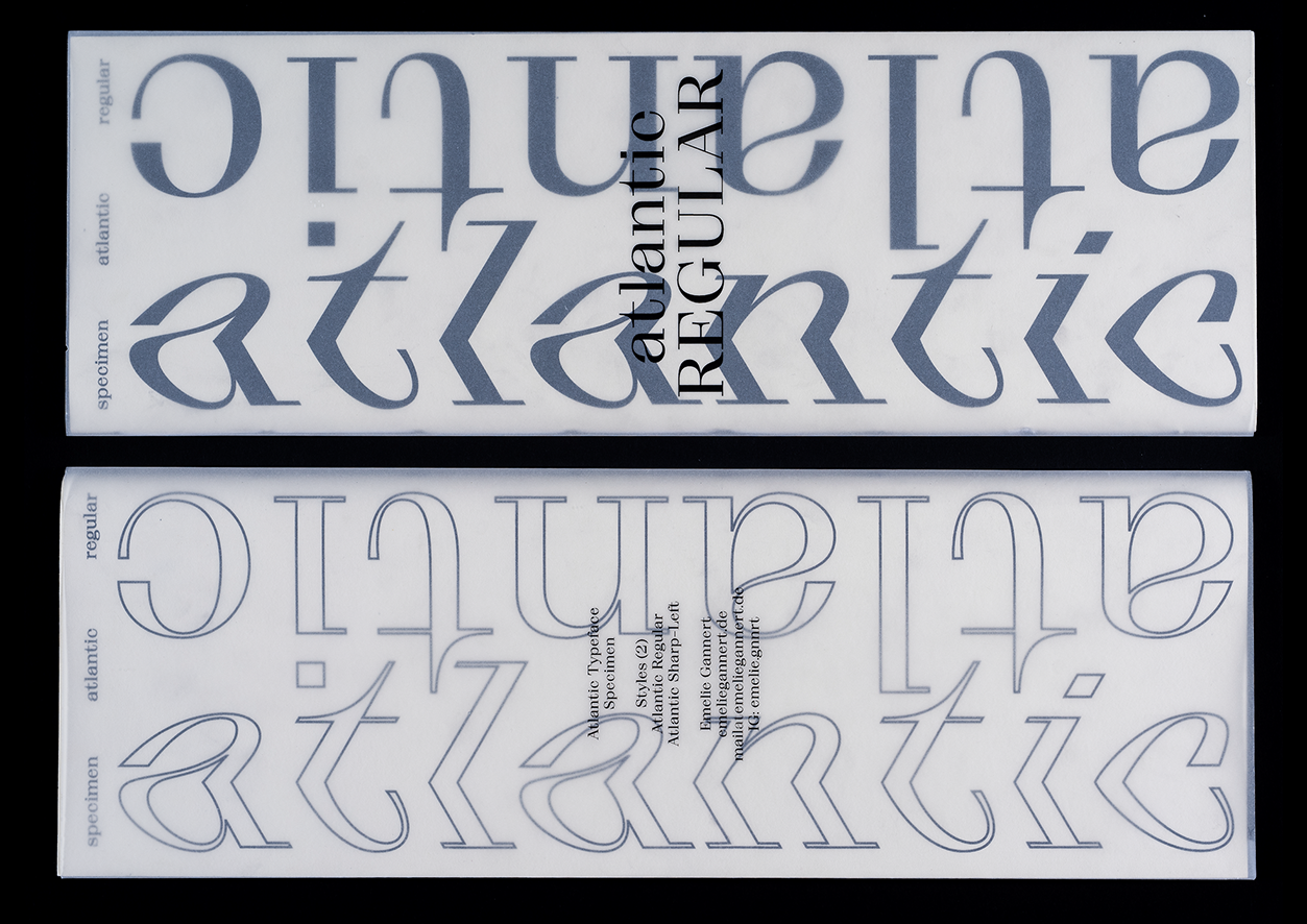
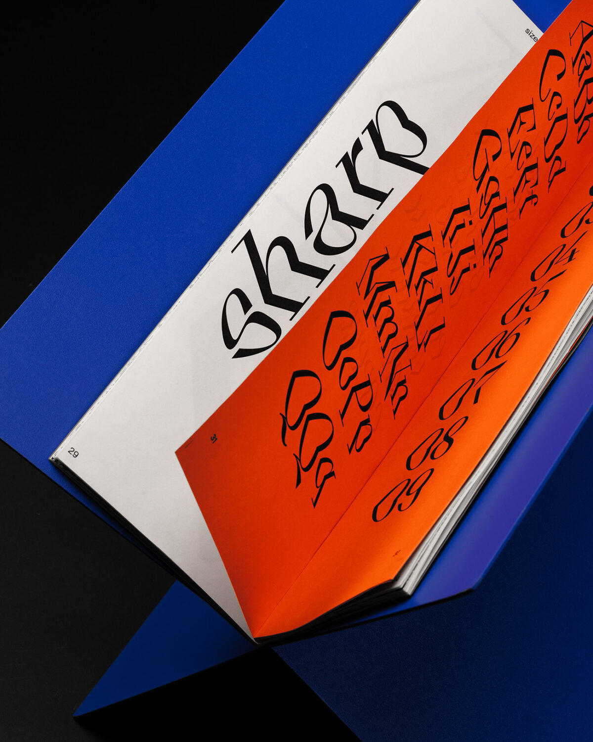
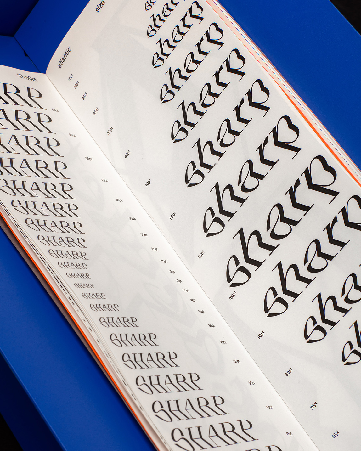
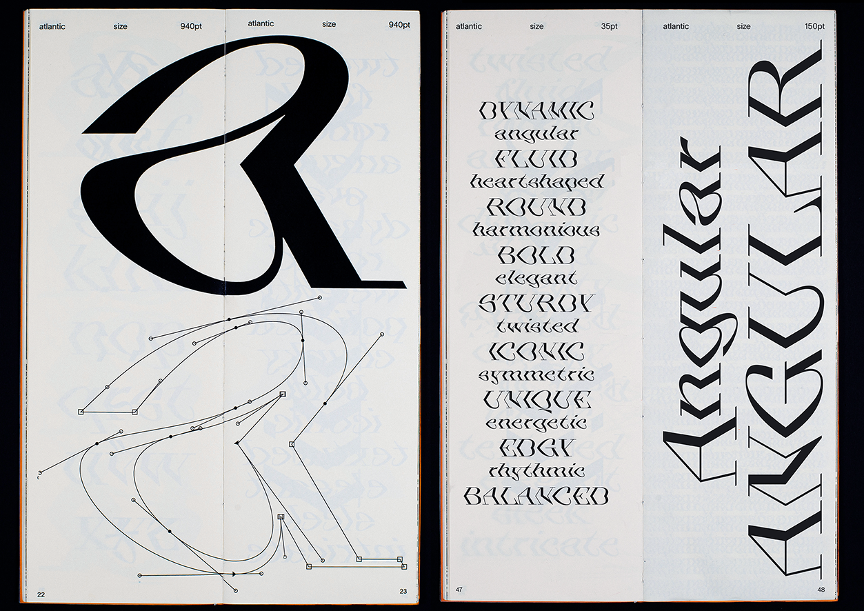
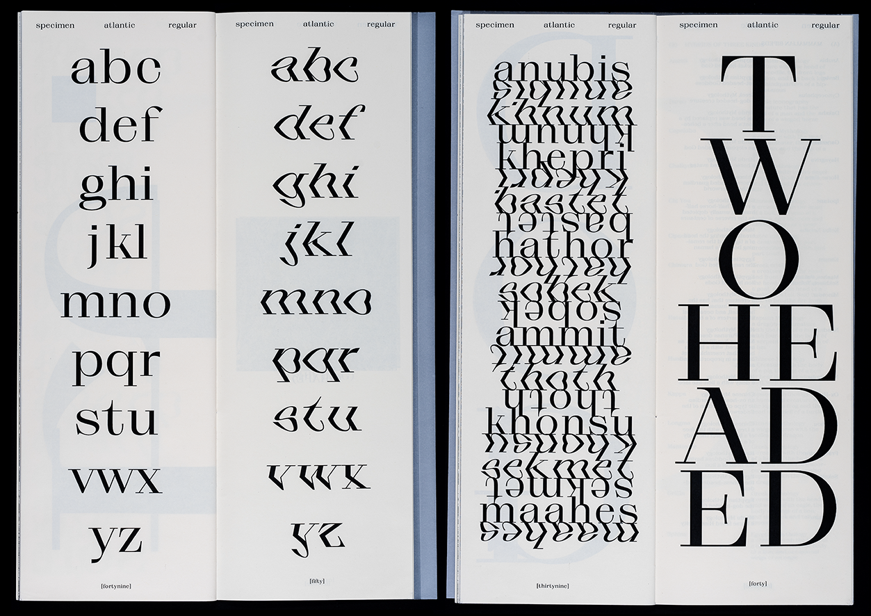
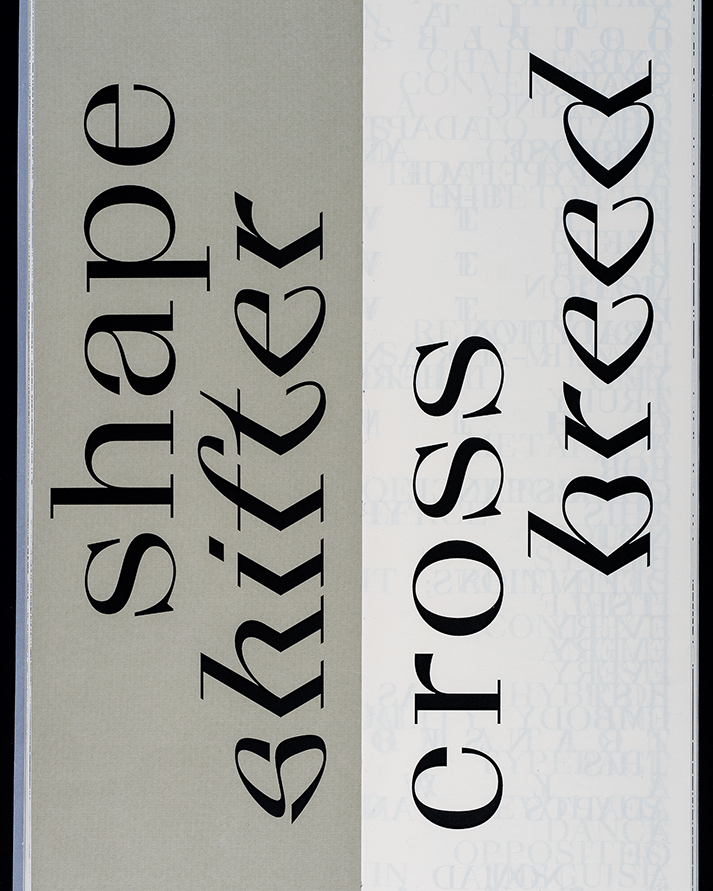
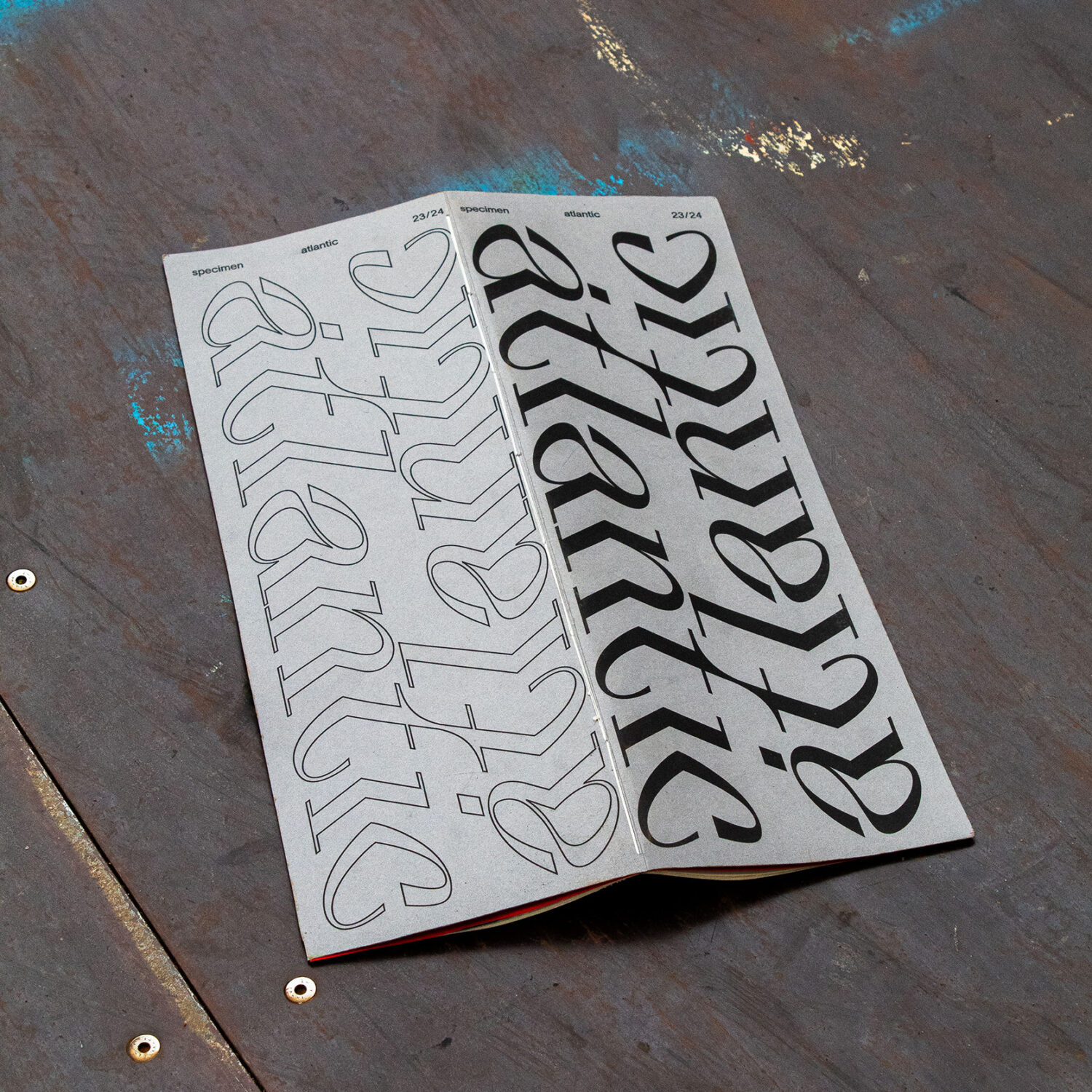
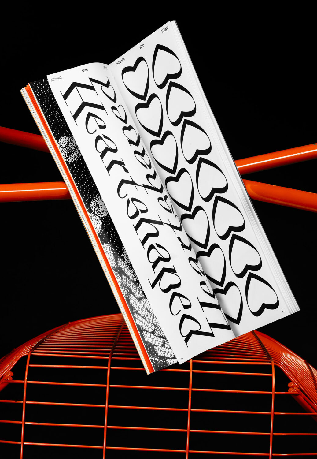
Her latest project, Atlantic, is born from this tension. Sparked by a chance encounter with a 16th-century penmanship study – a script that slanted not one way but two – Gannert discovered what she calls “Double-Slanted Italics”, an uncharted typographic territory that sits outside the boundaries of traditional italics. What began as a single “sharp-left” cut has since evolved into a variable system of three styles: sharp-left, regular, and sharp-right. Together, they propose an interestingly unique method of typographic emphasis – a counterpart to italics that both disrupts and harmonises.
It was my pleasure to interview Gannert to learn more about Atlantic’s conception.
Amber Weaver: How did you conceptualise the design for Atlantic? What inspired the design?
Emelie Gannert: As I was browsing through old type-specimens, I stumbled upon a penmanship study from the 16th century that had a bend at the midpoint. It’s what I’ve come to call the ”Double-Slanted Italics“, a category that represents a relatively unexplored territory in type design, challenging the conventional boundaries of italics. I was so fascinated by its structure and surface and the fact that it’s neither left- nor right-slanted but both. I have never encountered anything like this ever before, and that concept was so unique to me that I knew I wanted to do something similar but with a more contemporary approach to it.
That’s how Atlantic was born, or at least the sharp-left cut, which was the initial idea, the starting point for the entire project. From there, I saw the potential to develop it into a variable type system consisting of three styles: the sharp-left cut, a regular, and the sharp-right cut (the sharp-left but mirrored). As I refined the sharp-left’s underlying rules and structure, I began drawing the regular. That process, in turn, revealed new and more fitting design principles, which I integrated back into the sharp-left. It became a continuous loop of iteration and refinement.
AW: Why neoclassical?
EG: In the early stages of sketching, this was one of the questions I kept coming back to. My first drafts were entirely sans serif and highly geometric. At some point, Photoshop became my best friend: I started taking existing typefaces, slicing them in half, and distorting them in different directions just to get a feel for all the possible styles I could go with.
The more time I spent with different letterforms, the more I realised that serifs bring both the individual letters and the overall text image a certain horizontal calm – a sense of balance across the page that helps to tame the otherwise quite disruptive structure. That realisation was one of the main reasons I chose a neoclassical style. I still wanted it to have its own distinct, contemporary character, so the terminals differ significantly from those of a traditional neoclassical typeface.
AW: What’s the story with the sharp left style?
EG: As the regular’s character set grew and Atlantic developed beyond just a display typeface, I began using the sharp-left cut to emphasise certain words. Much like you’d normally use italics or a heavier weight to highlight text, I used the sharp-left – and that was the pivotal moment when I realised I might have stumbled upon a new form of typographic emphasis. I explored this idea in greater depth in the theoretical part of my thesis, looking at different methods of typographic emphasis and how they might be expanded beyond their traditional forms.
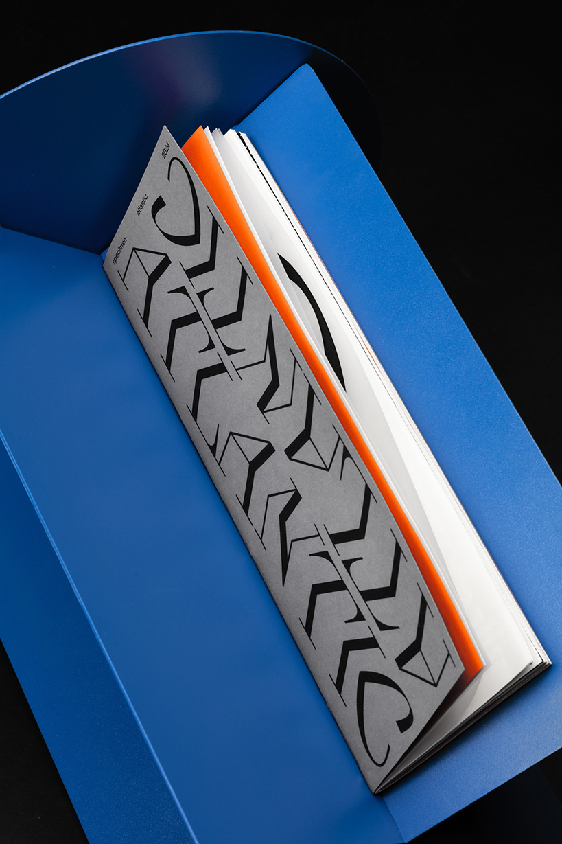
Currently, I am working on the sharp-right style, which is an even bigger challenge than the left one, as the letterforms kind of fall into each other, and the spacing gets very tight. Due to their natural form, some letterworks work better with the left cut, whilst others work better with the right cut. So it’s kind of a trial-and-error process to find a way that works and, most importantly, looks good.
AW: What did you find most enjoyable about the process?
EG: It seems that the more I work on this typeface, the more ideas I get for extending the type family even further. There’s still so much unexplored potential. Part of that comes from the fact that the workflow itself is highly experimental – I have to figure out my own methods as I go. I often say that Atlantic has its own physics you have to get used to.
AW: Equally, what did you find the most challenging?
EG: A lot, to be honest. But then again, that’s what makes it so much fun to work with – it’s quite a challenge. But I’d say the biggest difficulty is the lack of references – you kind of have to find your own way with working on this typeface, especially due to its unorthodox forms. In many cases, I have to work completely against the understanding of established letterforms, which makes me question my own abilities from time to time because it takes a lot of “ugly” sketches before I get to a shape that both follows the typeface’s structure and, most importantly, is beautiful to look at.
AW: Now that you’ve been through a font production process from start to finish, what are some of the lessons you wish you’d learnt beforehand?
EG: I wouldn’t say that I got through a whole font production (yet)… There’s still so much more that I need to learn, so much more I want to get into. Mastering, for example. Spacing has also been quite a challenge, but I’m very lucky to have a tutor who’s eager to tackle these challenges with me. And to be honest, it’s oddly reassuring to see others struggle with some of my (sometimes VERY questionable) sketches too, because it makes me feel less like I haven’t learnt anything at all.
AW: Where do you see Atlantic working in the wider commercial landscape?
EG: I’d absolutely love to see it used as a new way of typographic emphasis. It has a similar effect as an italic – a subtle way to differentiate without interrupting the natural reading flow – but I’d say it’s able to create an even stronger emphasis. I don’t want to prescribe where or how Atlantic should be used. I love seeing how different designers interpret it in their own work. Since the typeface is constantly evolving and expanding, I don’t think there will be a strict limit to where it can or cannot be applied. It’s thrilling to imagine it in contexts I haven’t even considered yet.
AW: Any plans for future fonts, or Atlantic?
EG: Sometimes I have the feeling Atlantic is a typeface that I’ll be coming back to continuously. I have so many ideas for other typefaces that I’d love to start working on sooner or later, and it’s also useful to take a step back and let Atlantic rest for a while – coming back with a fresh perspective always helps. It’s also refreshing to work on less experimental typefaces with more historical depth that can serve as a guiding line. But as I mentioned, the more I work on Atlantic, the more ideas keep coming. So I guess it’s a never-ending story?
Enjoyed this piece? Read more of our typeface design editorials here.