“Surrounded by a rich visual culture – especially the hand-painted signage found throughout my neighbourhood – I’ve developed a deep appreciation for vernacular lettering and craftsmanship,” Eunice Su tells us of living in Tainan, Southern Taiwan. In the city, she continues, it’s common to encounter artisans working in ceramics, lantern-making, and other traditional crafts. Seeing these practitioners shaped the designer’s approach to drawing and design, with an acute sensitivity to form, material, and visual texture.
A Path Shaped by Typography
After several years designing packaging, Su furthered her studies at Pratt Institute, where a typography course, introducing her to the practice of type design, “completely shifted my creative direction,” she explains. “I became fascinated by the intricacies of letterforms and the nuanced decisions involved in shaping them.”
Joining the Type@Cooper Extended Program allowed Su to refine her technical skills and collaborate with professionals in the field, where she developed typefaces Carousel, Gummi, Axis Sans, and Brucke. “[The course] provided a deep grounding not only in technical skills but also in the historical, theoretical, and philosophical aspects of type design,” she recalls. “One of the key lessons was understanding how letterforms are shaped by their original tools, whether broad-nib pens or pointed pens, and how those tools influence contrast and proportion. We developed this understanding through calligraphy, sketching, and proportion studies, which sharpened both hand and eye.”
Su’s Philosophy: On Film, Ceramics, Historical Integrity, and Modern Relevance
Over these years, a compilation of knowledge and experiences has shaped her design philosophy and continues to do so. From her appreciation for film (“Filmmakers like Roy Andersson and Andrei Tarkovsky have deeply shaped the way I think about rhythm, pacing, and structure,” she tells us) and craftsmanship of ceramics – meditative and slow processes that also connect to her past – to tools like RoboFont and Python, through which she deepened her understanding of teaching.
Perhaps the most significant aspect of Su’s philosophy is her respect for preserving cultural heritage. From her experiences at Type@Cooper – including a revival project that taught her the importance of cultural preservation – balancing historical integrity with modern relevance is, she says, a core part of her process. “Many historical typefaces were shaped by the constraints of their time: metal casting, phototypesetting, ink traps and not all details translate well to today’s contemporary needs.” As such, she aims to preserve “80–90% of a typeface’s traditional structure and spirit,” closely tracing the original printed outlines to maintain historical integrity.

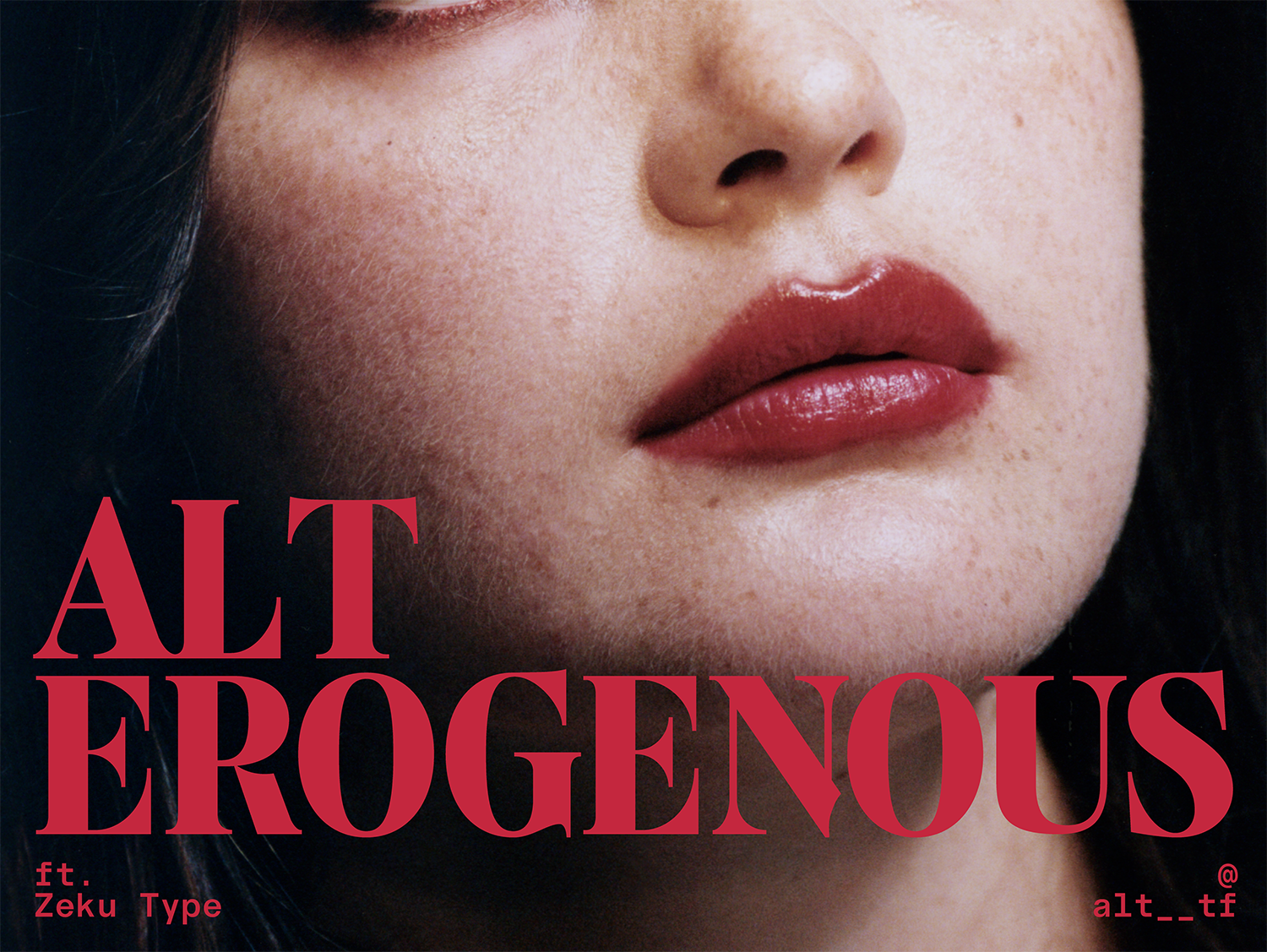
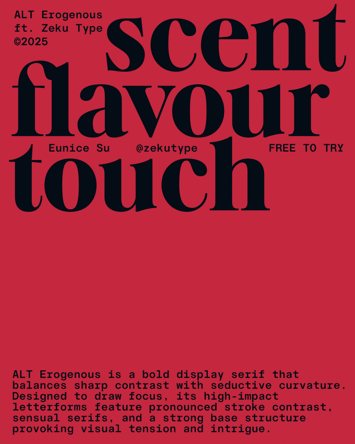
Introducing ALT Erogenous: A bold and beautiful revival
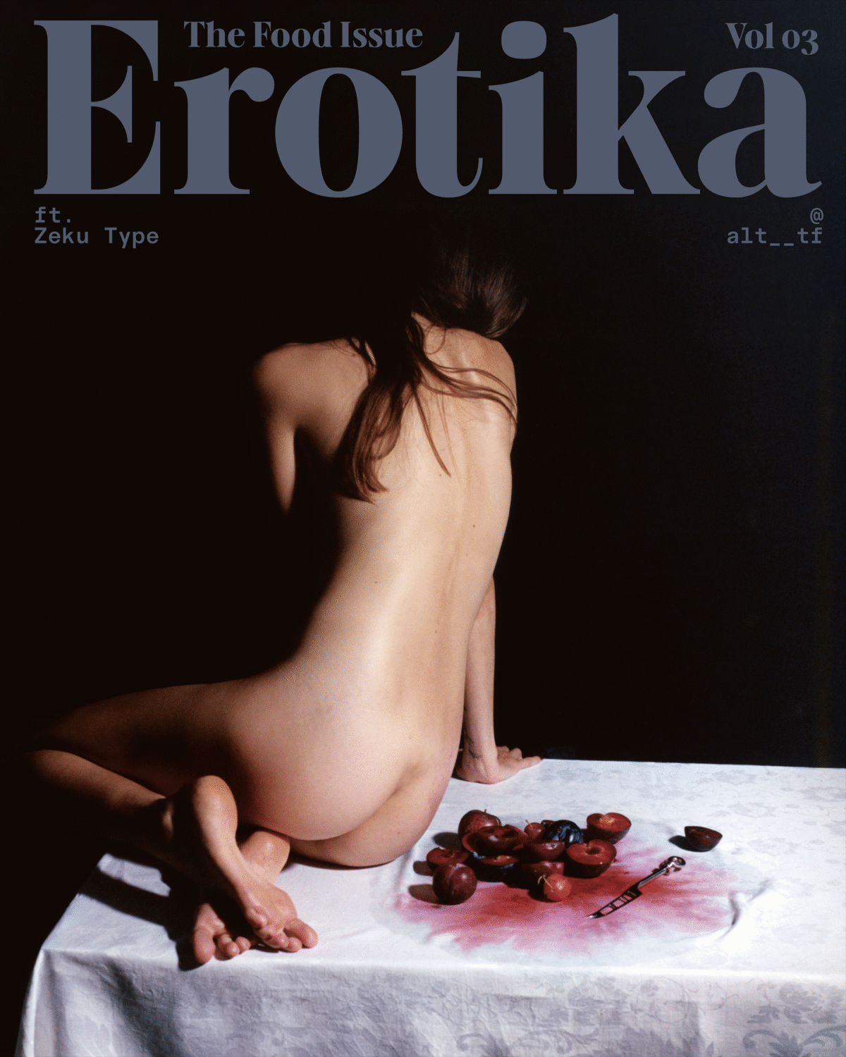
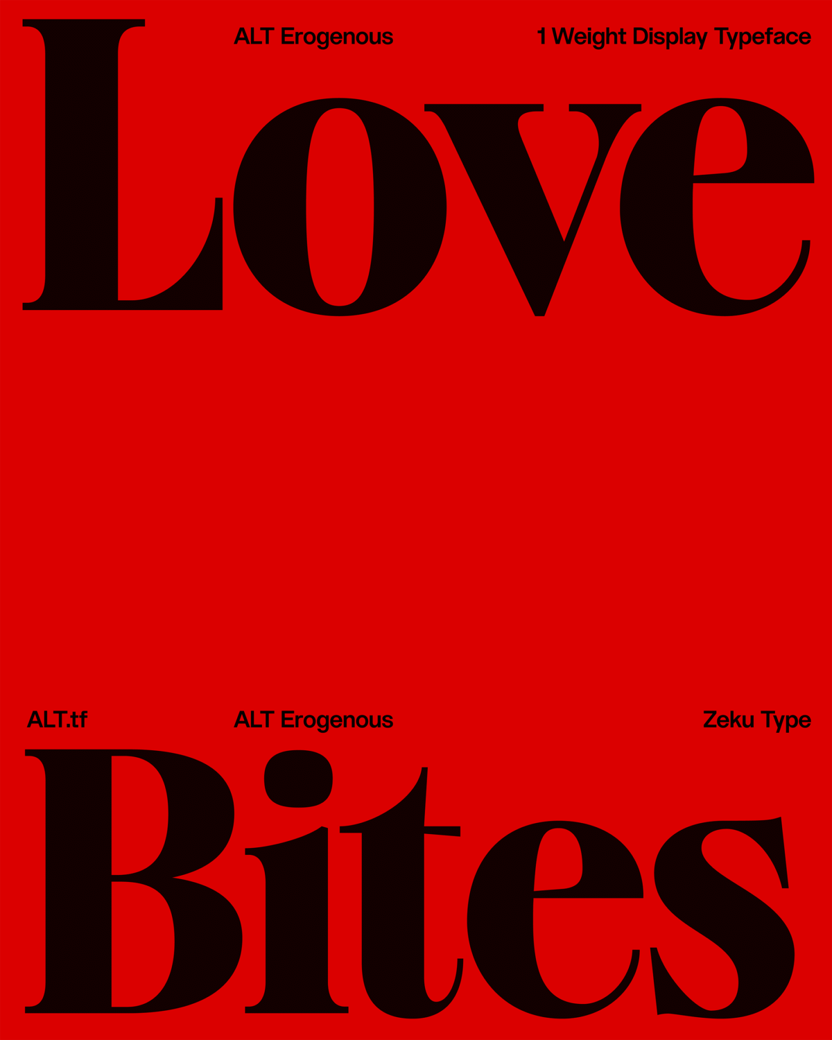
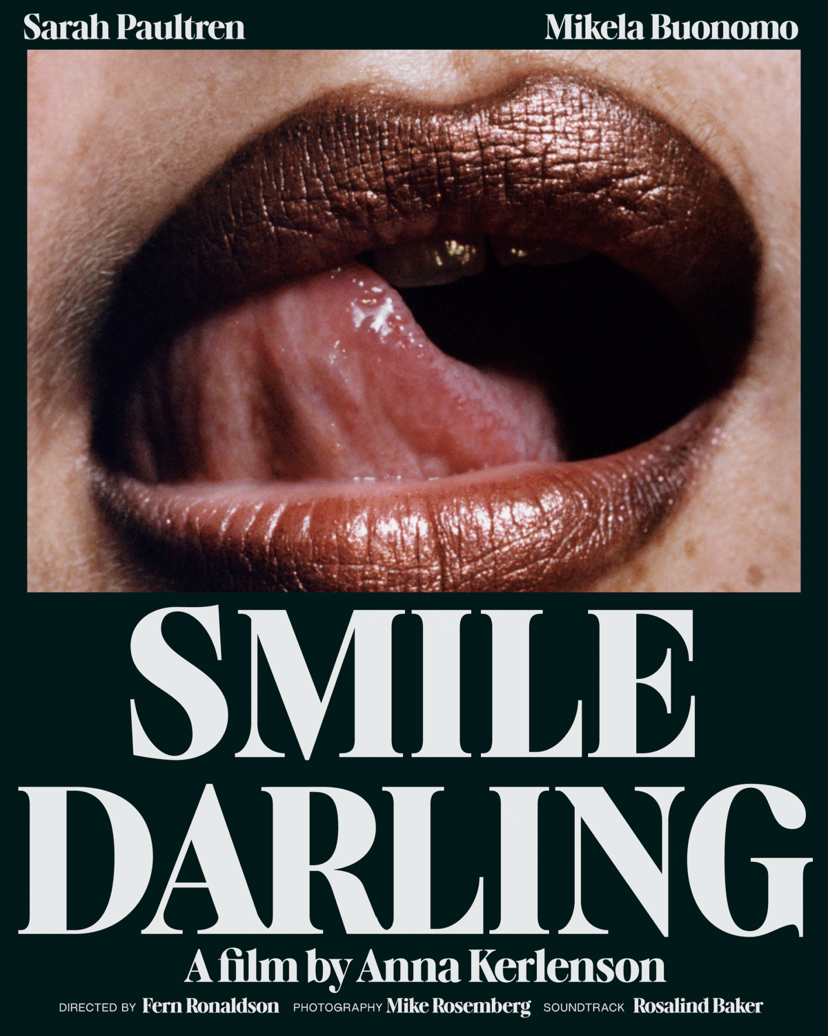
Released through ALT.tf (a foundry promoting diversity in type design), Su’s ALT Erogenous is a revival of lettering from the cover of ‘Combat in the Erogenous Zone’ by Ingrid Bengis (1972), a book exploring the complexities of female identity, freedom, and emotional duality. Erogenous, she explains, is “a typographic response to these emotional and social complexities, a way to visualise internal tension and cultural questioning through form.” Embodying a blend of emotional depth and visual strength, Erogenous as a typeface explores female identity, empowerment, and the tension between vulnerability and resilience.
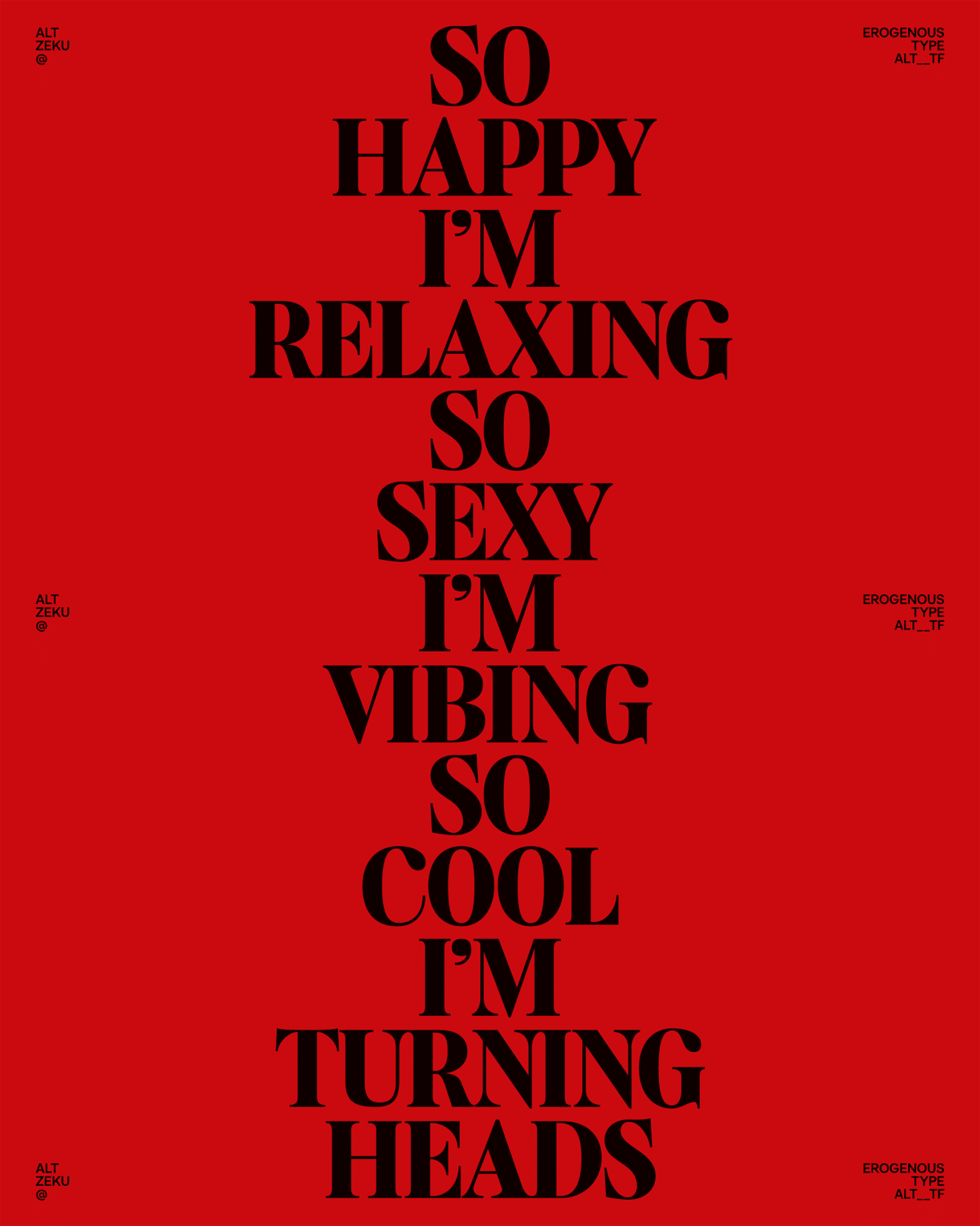
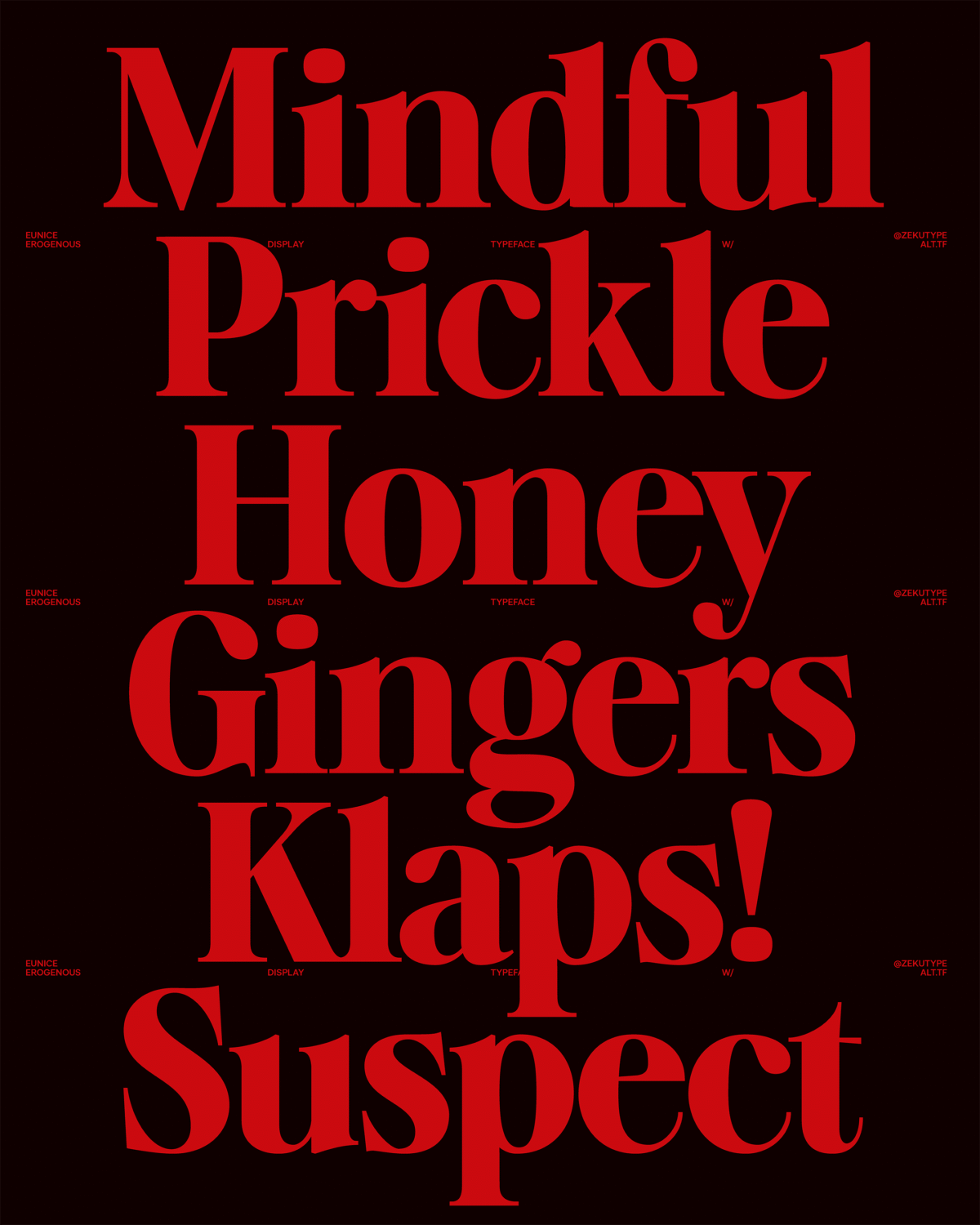
The display serif is characterised by its careful balance of sharp contrast and seductive curvature. In development, Su recalls, creating consistency among the razor-sharp serifs was critical: “Because even the slightest inconsistency became immediately noticeable.”
These striking letterforms – with their dramatic stroke contrast, stylistic sharp terminals, and a sturdy base — create a captivating visual tension. They also boast unique design elements, like alternative serif shapes, embodying the multifaceted nature of femininity: strength and softness, defence and resilience, all intertwined in a bold, layered expression.
With all of this in mind, Su proposes that Erogenous is ideal for high-impact uses such as headlines, logos, and packaging. “I envisioned it being used by brands with strong, experimental identities, where typography takes a leading role in shaping visual narrative and brand voice,” she reveals.
Technical Features
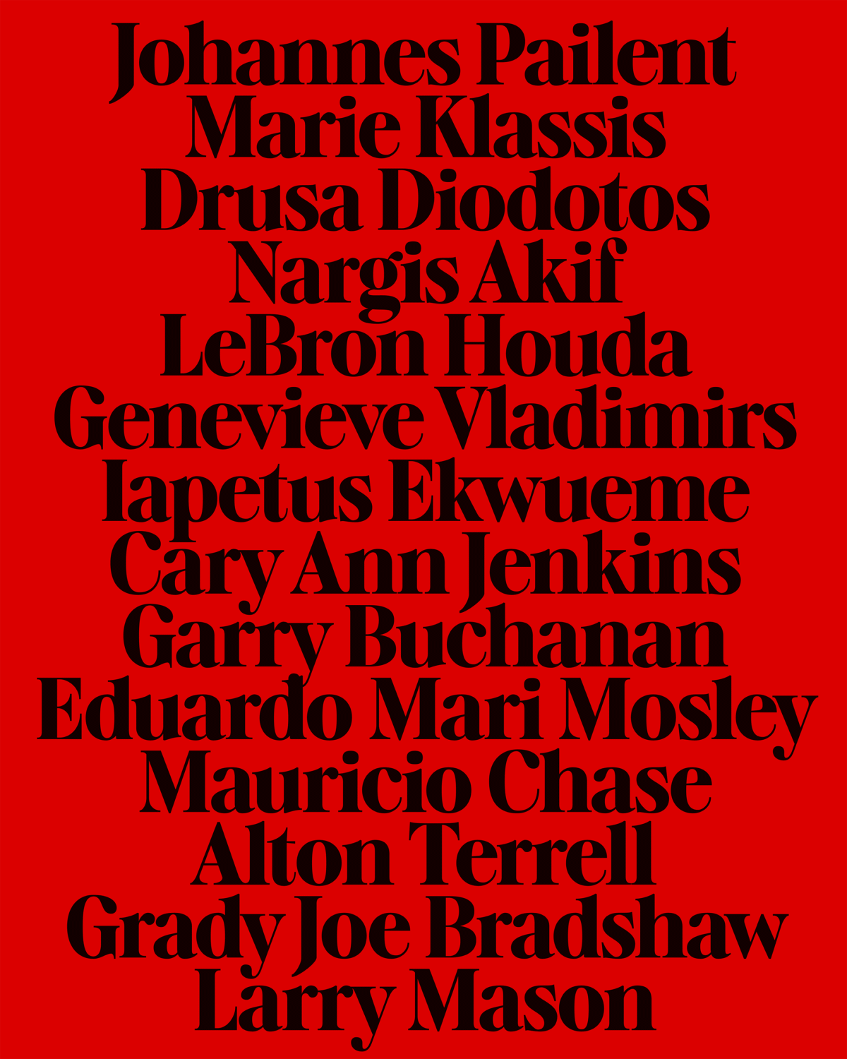
Boasting 484 glyphs and support for 219 Latin languages, as well as full Latin Extended-A and 95% Latin Plus coverage, Erogenous offers comprehensive global functionality. Version 1, Su elaborates, also includes small caps, ranging numerals, punctuation, and additional marks, which she plans to expand further. “I am in the process of developing an italic style, adding more weights (Light, Medium, Bold), and increasing the number of ligatures and symbols to enhance its usability,” she adds.
Eunice Su’s Advice for New Designers
After completing the Extended Program at Type@Cooper, Su returned as a teaching assistant, gaining a new perspective on type design—the way students approach it. For beginner typeface designers, Eunice offers tips for those eager to learn more about the craft.
First of all: “Be patient,” she says. “Type design is a slow, iterative process that relies heavily on trial, error, and refinement. It’s important to give your work time to breathe. Step away from it, print physical proofs, and revisit it with fresh eyes. Many subtle issues can go unnoticed on screen but become clear in print or real-world contexts.”
Secondly: “Be consistent. Even brief, regular practice can help build the muscle memory and visual sensitivity needed to improve. Progress might feel gradual, but over time, it adds up in meaningful ways.”
And, lastly: “Understand there will be mistakes. In my opinion, perfection isn’t the goal; clarity, intention, and growth are. Allow yourself to stay curious, remain critical, and trust the process. Type design is as much about observation and patience as it is about creativity and skill.”
Enjoyed this piece? Browse more of our typeface design editorials.
Credits
Campaign Direction: @amberweav_
Graphic Design: @bojjoe
Type Designer: @zekutype
Shoot:
Producer & Art Director: @angelxvelluto
Photographer: @lindsayellary
Lighting Director: @olivermatich
Set Design: @olivia.giles.set.design
Beauty: @gracemariaellington
Nails: @hannahbmanicures
Models: @millycope and @charlotterrobinson
Set Assistant: @r.osew
Thank you: @buttressandsnatch