For Spanish type designer Javier Unknos, type design & typography has always been more than form — it is a way to reconcile personal history, creative freedom, and technical precision. Having first encountered letters through graffiti and, at the same time, wrestling with dyslexia, written words once felt resistant, even hostile. Over time, design became both an outlet and a language of its own. Today, after refining his practice at Type@Cooper, he brings this balance of discipline and expression into projects that fuse structure with humanity.
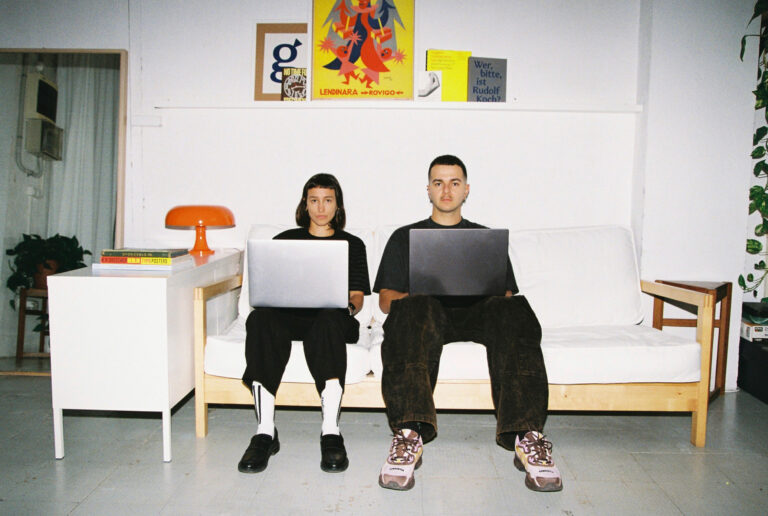
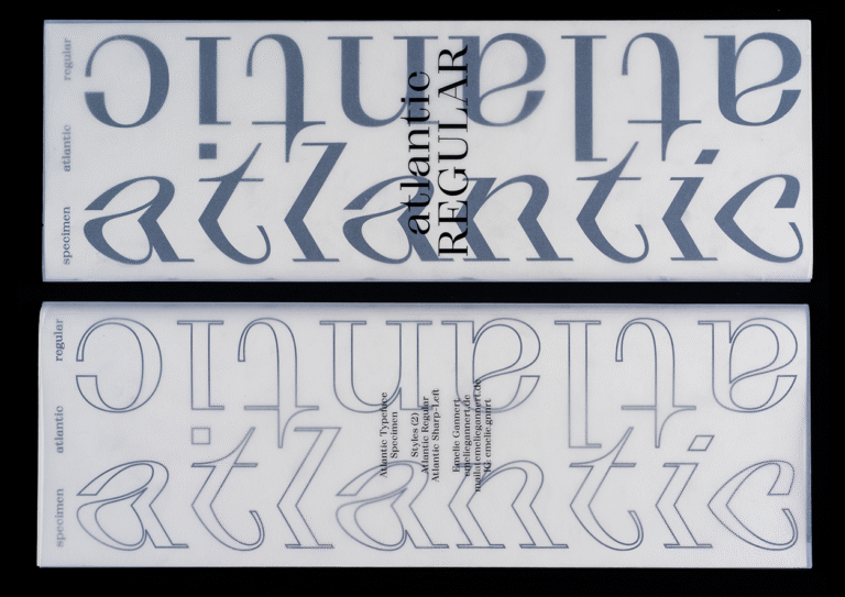
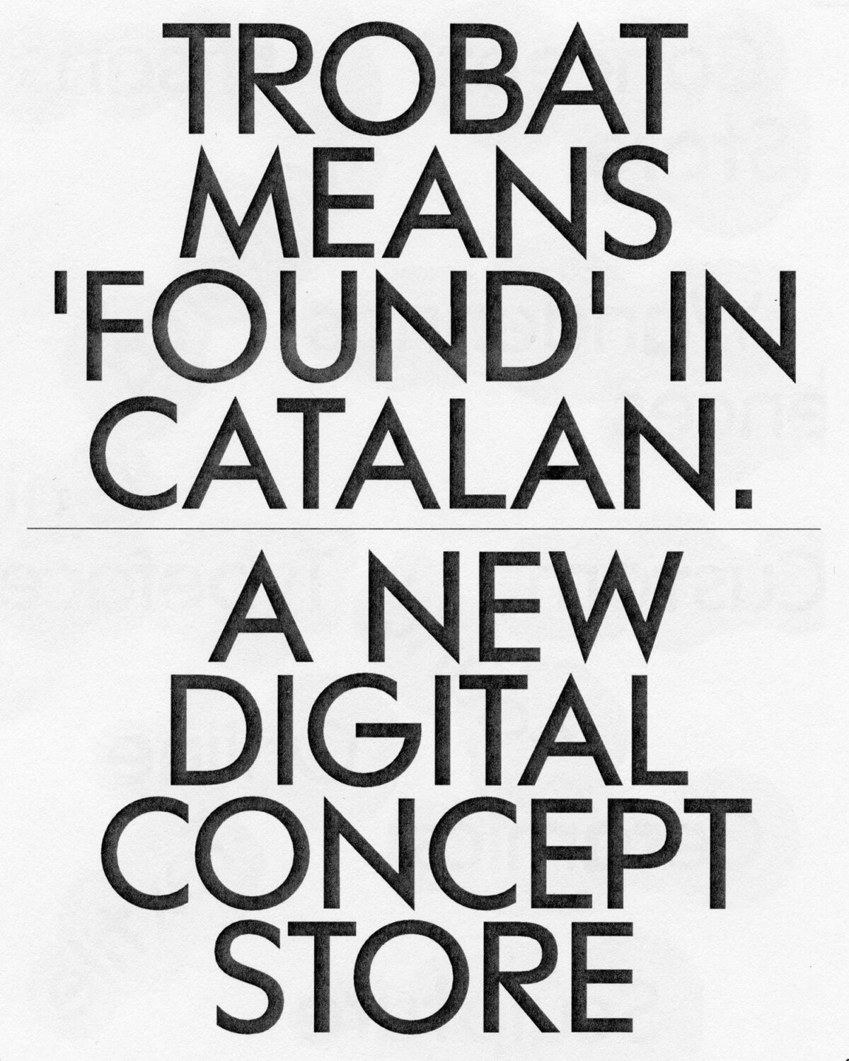
TROBAT is one such project. Conceived as the digital counterpart to the physical space TROBAR, the typeface was designed to bridge two worlds under a shared identity. But beyond its role as a branding tool, TROBAT set out to embody a deeper idea: digital craftsmanship. The result is a geometric framework softened by subtle handmade interventions—a system that is at once precise and alive—and it was my pleasure to be able to chat to Unknos to learn more about how TROBAT came to be.

AW: Hi Javier, thanks so much for sitting down with me. So let’s get to it! How did you conceptualise the design for TROBAT?
Javier Unknos: The project started with Mireia Campos in creative direction and Paula de Álvaro in art direction. They had previously worked on TROBAR from the same owner, so connecting both identities was essential. TROBAR is the physical space, and TROBAT the digital one, two worlds that had to feel part of the same story.
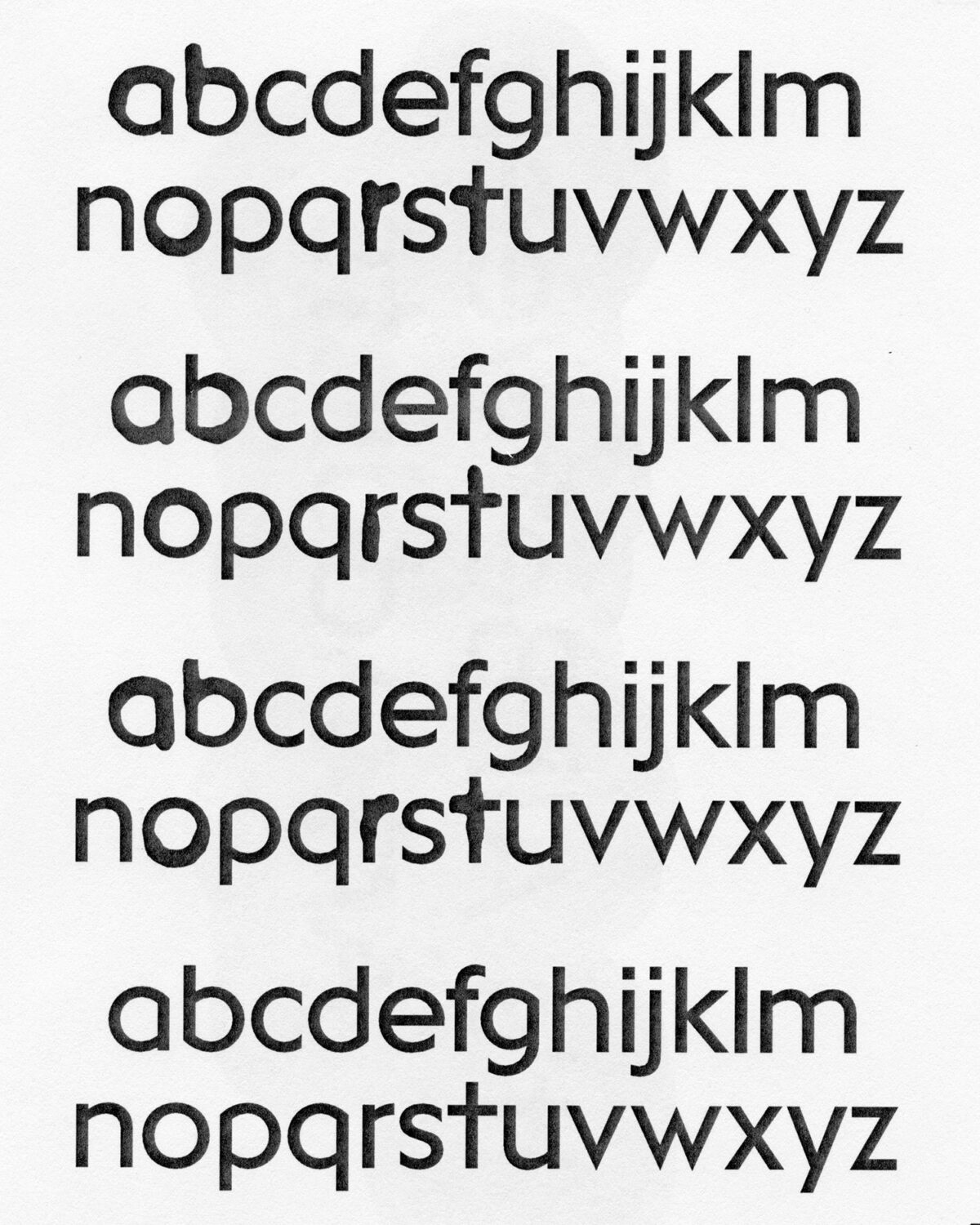
From the beginning, we wanted the typeface to be more than a graphic tool and to reflect the brand’s values. The main idea we developed and wanted to express was digital craftsmanship, combining precision with subtle handmade interventions to create a strong and flexible system.
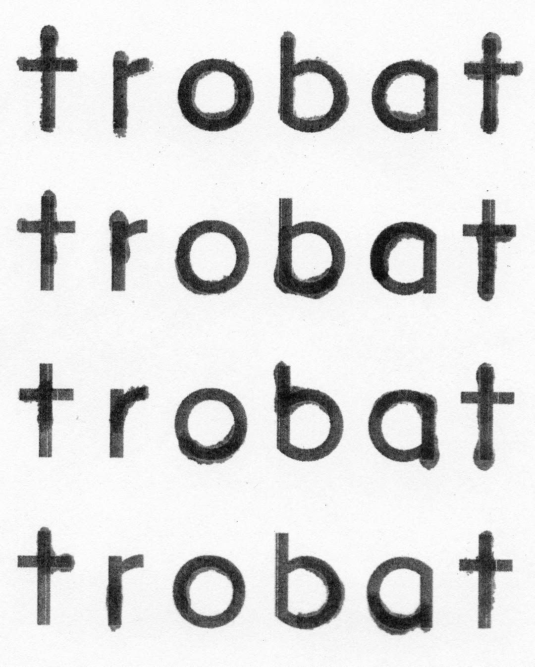
The name TROBAT means “found” in Catalan, which is why we called the typeface FOUND, connecting the concept of discovery with the design itself.
AW: What inspired the design? Are there any environmental factors that play a key role?
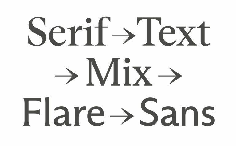
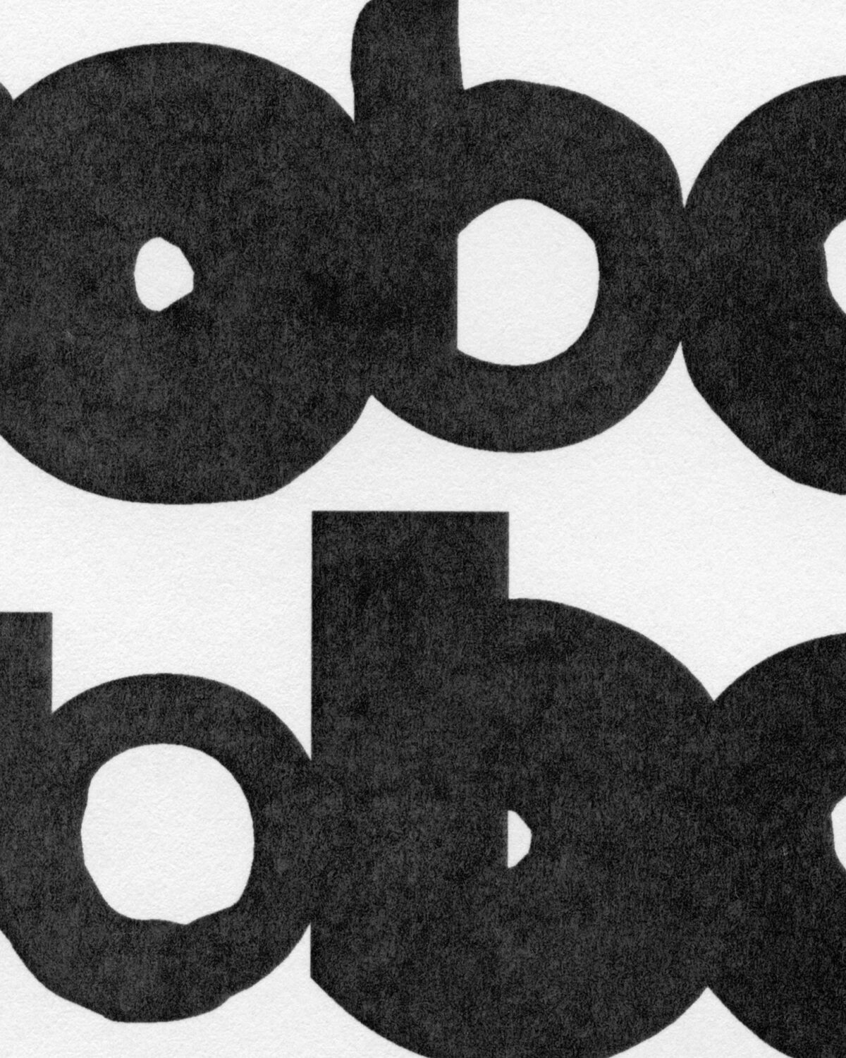
JU: We worked with the tension between geometric structure and a more handwritten energy. We looked at historical moments when geometric lettering and handwriting lived side-by-side, and we reinterpreted these references in a contemporary way.
AW: What does your process look like when drawing letters?
JU: I start with simple sketches by hand and then move to the computer, switching back and forth between both and sometimes printing and scanning as I go. That dialogue is where the best results appear, and it is a pattern I follow in all my projects to balance precision with the organic qualities of drawn forms.
AW: Why did you opt for a geometric typeface classification?
JU: It was a natural decision, linked to a historical and artistic period that served as a strong reference for the client and provided a solid base for introducing subtle handcrafted variations.
AW: What’s the story with the stylistic set?
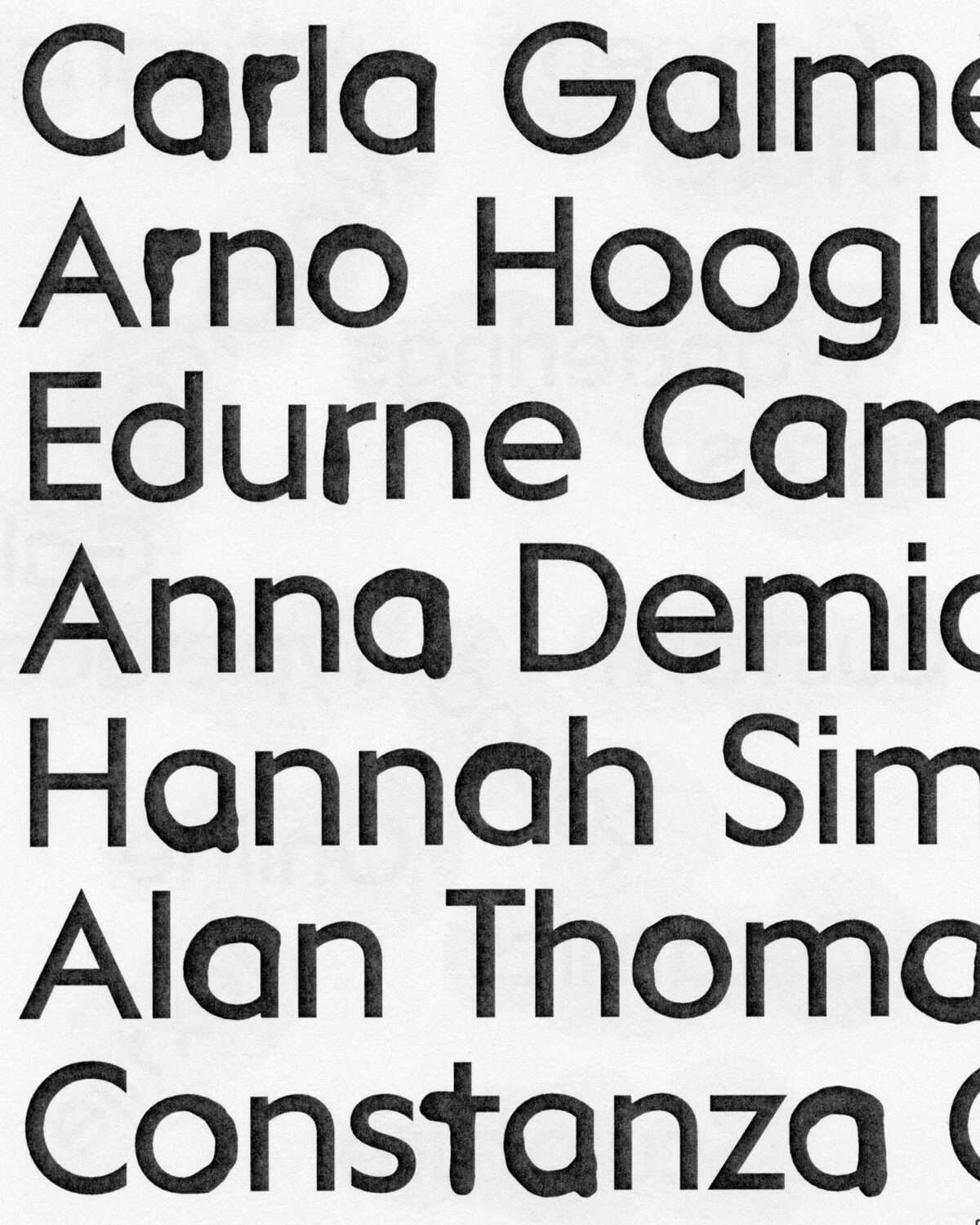
JU: During the first phase of the process, we were clear that we wanted the brand to be present in any context, not only with the brand itself, but in a more evident and visual way. Therefore, we focused on the letters of the logo [T R O B A T]. Each has alternative versions that change through contextual substitutions to create a sense of randomness. This reflects the idea of craftsmanship because no two pieces made by hand are the same. These variations bring rhythm and variety to the text and make the typeface seem alive.
AW: With your previous work coming out the Cooper Type, which included quite serious typefaces, you seem to have implemented both the essence of that seriousness and playfulness with TROBAT’s stylistic set — what was this experience like?
JU: The TROBAT project is earlier, from the beginning of 2023, while my time at Type@Cooper was in the 2024/25 course. There, I focused on reinforcing the technical aspect, which gave me a very solid base, although I have always tried to explore the balance between formal structure and expressive freedom, looking for harmony and rhythm in each project.
AW: What did you find most enjoyable about the process?
JU: Experimentation is always the best part for me. Designing type often feels meditative. There is a conceptual phase of thinking and trying things until the “eureka” moment arrives. After that, I move into a more methodical stage that feels natural and focused. In TROBAT the most rewarding part was developing the modifications. We drew many versions of each letter and then refined and selected the sets that matched the logo variations. It was meticulous work and very satisfying.
AW: Equally, what did you find the most challenging?
JU: The hardest part at that moment was building a system that truly felt random. I had tried similar ideas before, but never at this scale. It pushed me to dig deeper into how contextual features work and sparked a real interest in scripting for type design.
AW: If you had to give any advice to clients who romanticise over commissioning a custom font one day, what truths or lessons would you give?
JU: Patience is key, and it helps to see typography as the voice of the brand. A custom typeface is not only an aesthetic choice. It is a strategic tool that brings coherence, simplifies design processes and becomes part of the brand’s legacy. It takes time and reflection, but the reward is a clear identity and consistent presence that grows with the brand.
Patience is key, and it helps to see typography as the voice of the brand. A custom typeface is not only an aesthetic choice. It is a strategic tool that brings coherence, simplifies design processes and becomes part of the brand’s legacy. It takes time and reflection, but the reward is a clear identity and consistent presence that grows with the brand.
AW: Any plans for future fonts?
JU: Right now, I’m moving along two main lines of work. On one side, I’m expanding my personal projects by adding new styles and weights. On the other side, I’m developing several custom projects, some of which will be released soon. Beyond the drawing itself, I’m also handling all the technical and production aspects that will allow me to sell my typefaces through my website, from preparing specimens and licenses to unifying production and character sets. It may sound like pure organisation, but I enjoy it as much as the methodical process of designing type.
Enjoyed this editorial? Browse more of our customer typeface design articles here.