
Paper Still Matters had a vision. TYPE01 Studio gave it a voice. For Paper Still Matters (PSM), the journey from personal passion to professional platform called for a rethinking of not just visuals, but vision. With ambitions to become a full-time creative business, the brand needed a complete transformation—one that could resonate with its target audience of designers, book lovers, and visual thinkers in Quebec and beyond.
When Paper Still Matters came to us, it had the bones of a good idea—but lacked the clarity and cohesion to truly connect. With no website, an outdated logo, and an absent visual system, there was a clear gap between the quality of the books they curated and the experience they were offering to potential customers. Our job was to close that gap and build a brand that could stand up to the design-savvy community it aimed to serve.
Designing a Brand That Designers Believe In
Starting with strategy, at the core of the brand is a simple but powerful statement: people don’t just buy books, they buy into stories. This became the foundation for the brand’s positioning—one that framed Paper Still Matters not just as a seller of design books, but as a design-centred lifestyle brand. The goal wasn’t to mimic traditional publishing aesthetics, but to carve out something more dynamic and connected: a brand that feels credible, confident, and most importantly, full of creative energy.
This insight shaped every layer of the identity—from tone of voice to typography, from logotype to layout. Knowing we were speaking to a highly visual, detail-driven audience, we created a design language that could hold its own within the visual world it was entering.
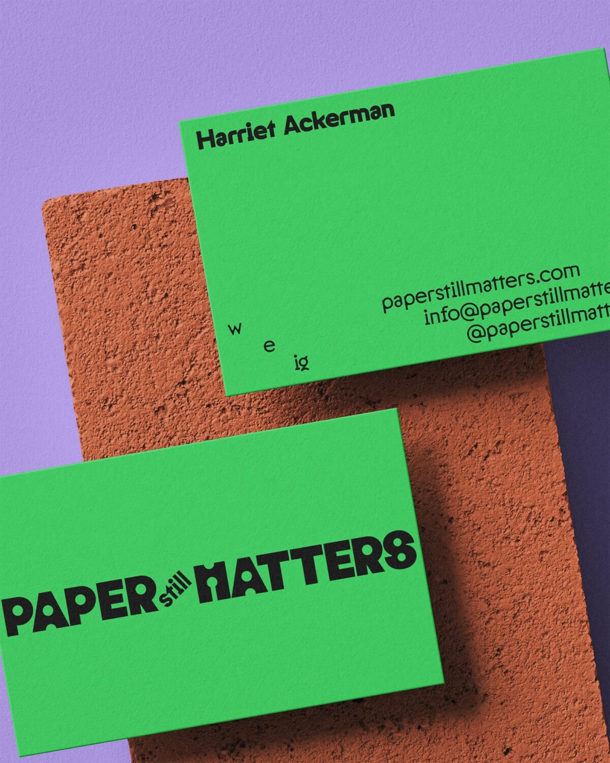
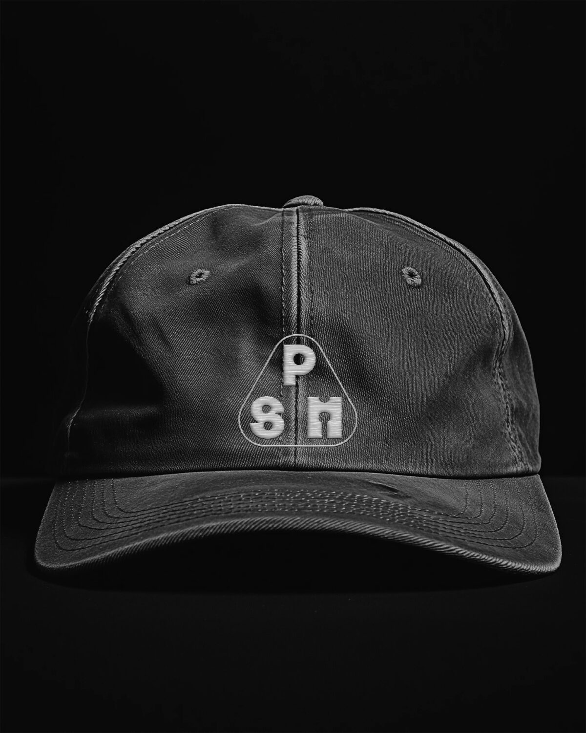
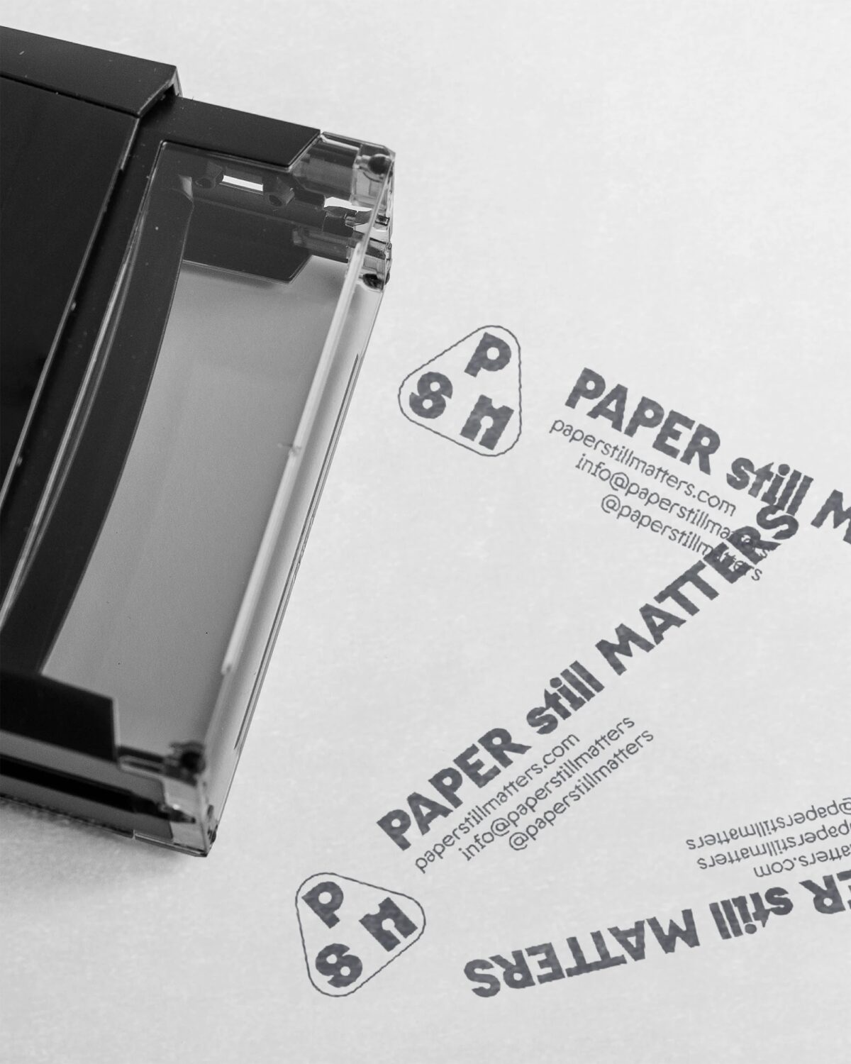
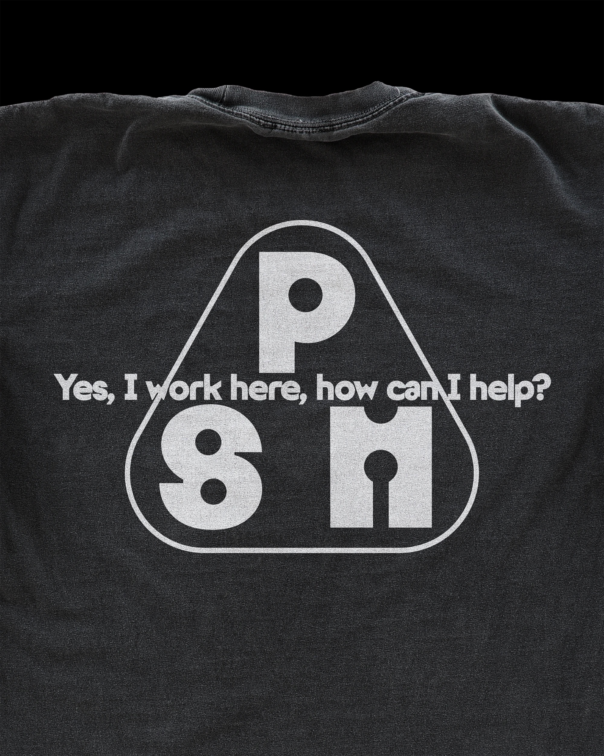
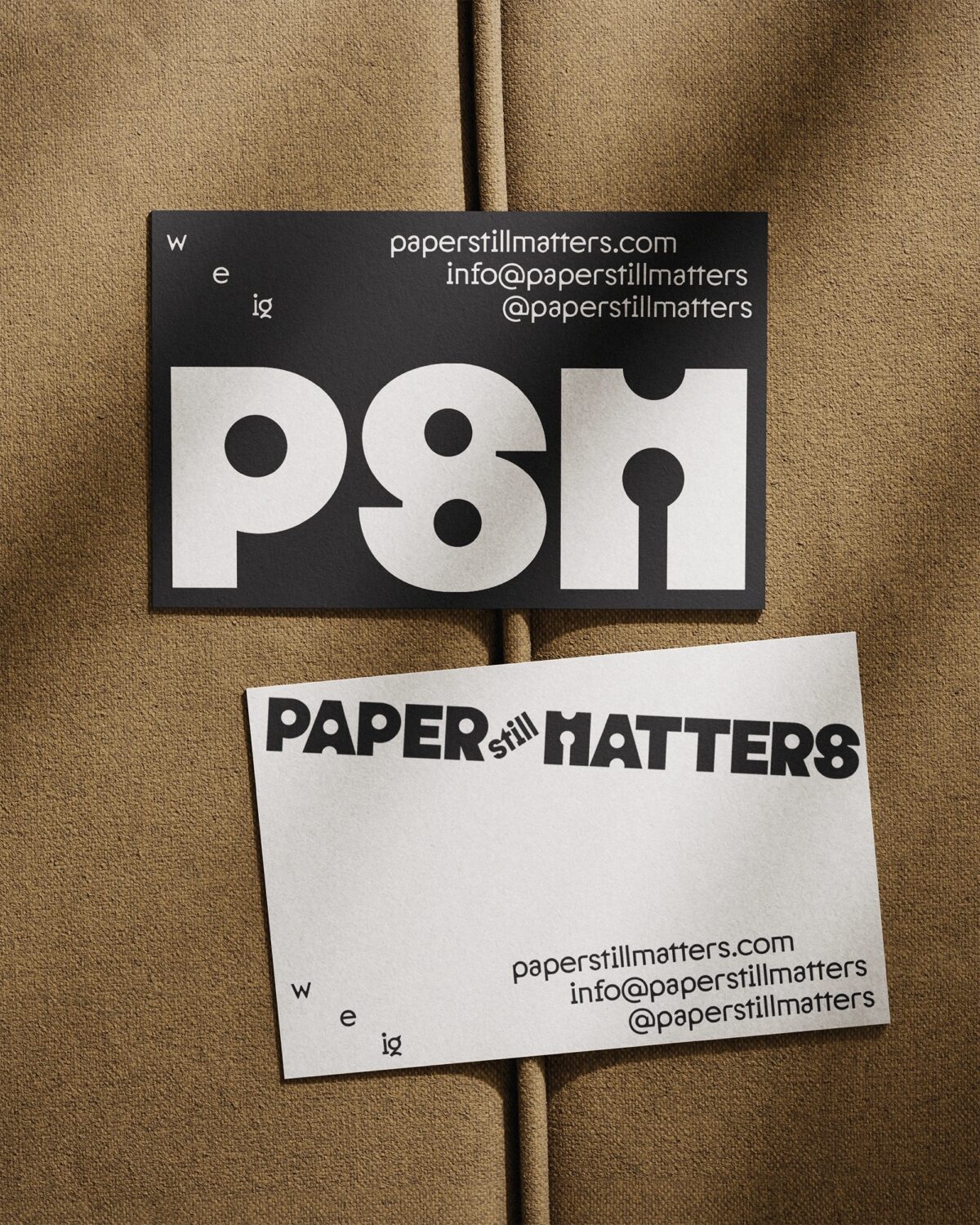
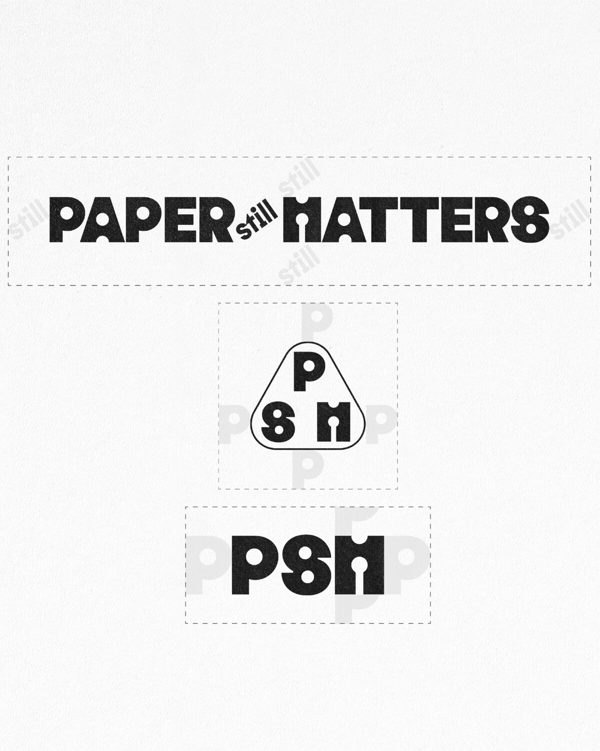
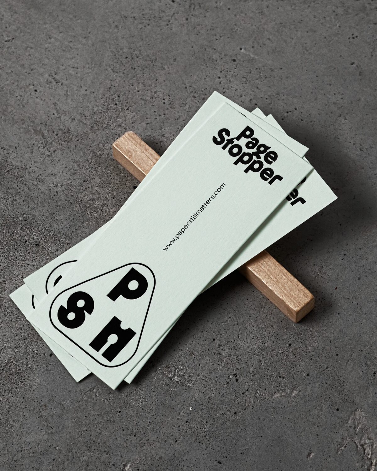
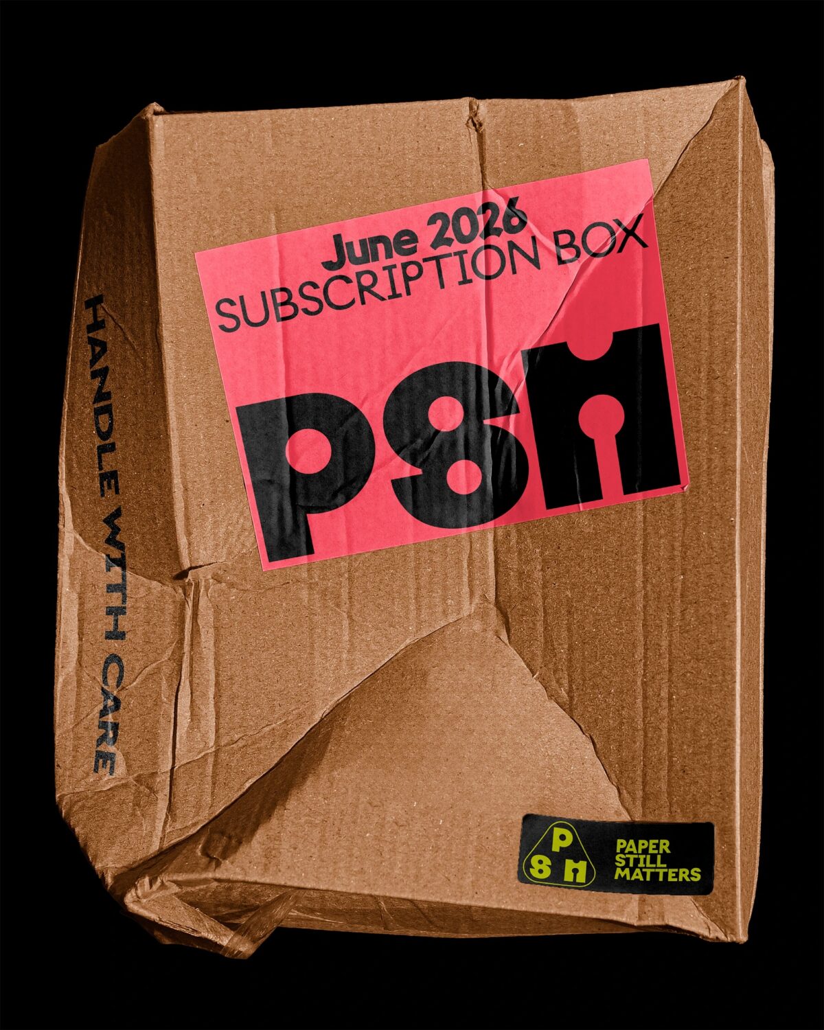
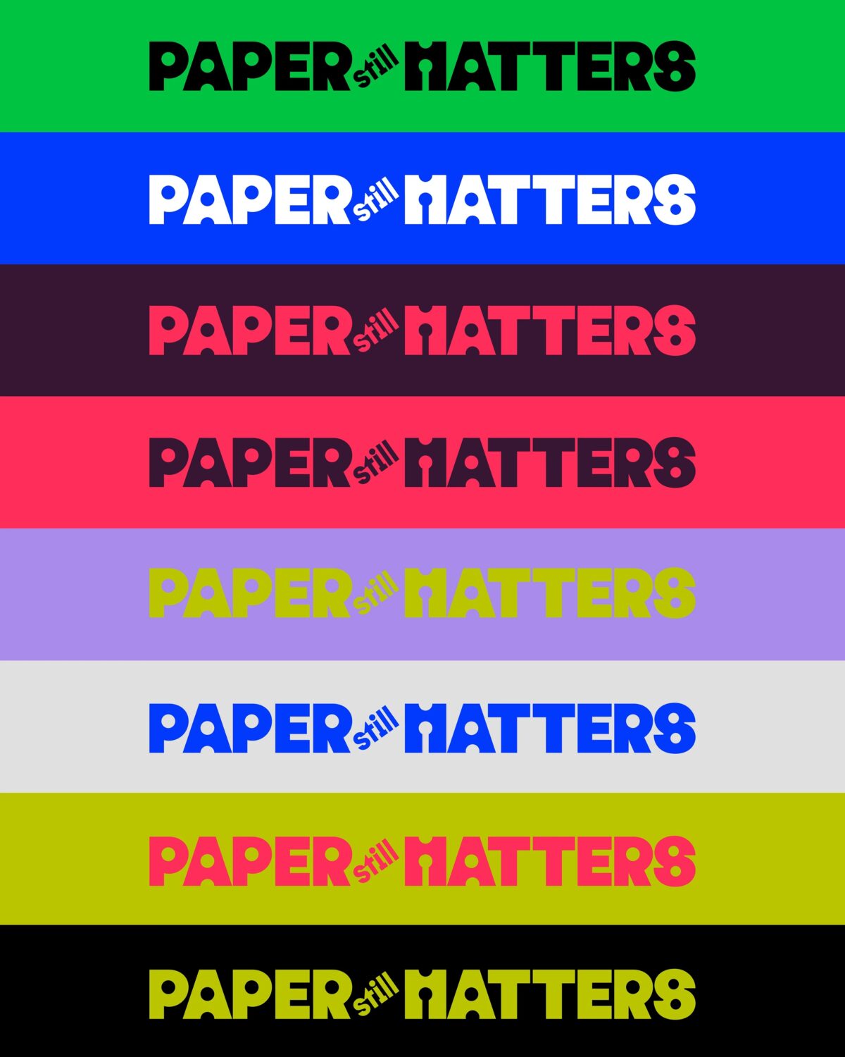
A Custom Logo Type, Built to Last
The PSM logotype was custom-built to reflect both the craft and clarity which sit at the heart of the brand. Much like the books it champions, the logo is tactile—an anchor point for the visual identity that holds weight across packaging, social, and web.
Typography played a critical role, serving not just as a functional tool but as a reflection of the brand’s underlying personality: structured, but never sterile.
For headlines and key brand statements, we chose Onlysans—a postgeometric sans that embodies both clarity and quiet rebellion. At first glance, it reads as rational and restrained, but look closer and you’ll find subtle irregularities: unexpected proportions, offbeat curves, and a duplexed system where letters maintain the same width across weights. This feature lends a unique visual stability while introducing a hint of tension—perfectly mirroring PSM’s ethos as a brand that straddles traditional craft and contemporary expression.
Supporting typography is set in ALT Riviera by ALT.tf—a warm, modern sans serif that lends a calm counterbalance to Onlysans’s eccentricity. Used across body copy, UI elements, and metadata, ALT Riviera brings humanist rhythm and softness to the brand’s digital and printed touchpoints. It ensures readability while reinforcing the brand’s tone: thoughtful, considered, and designed for those who notice the details.
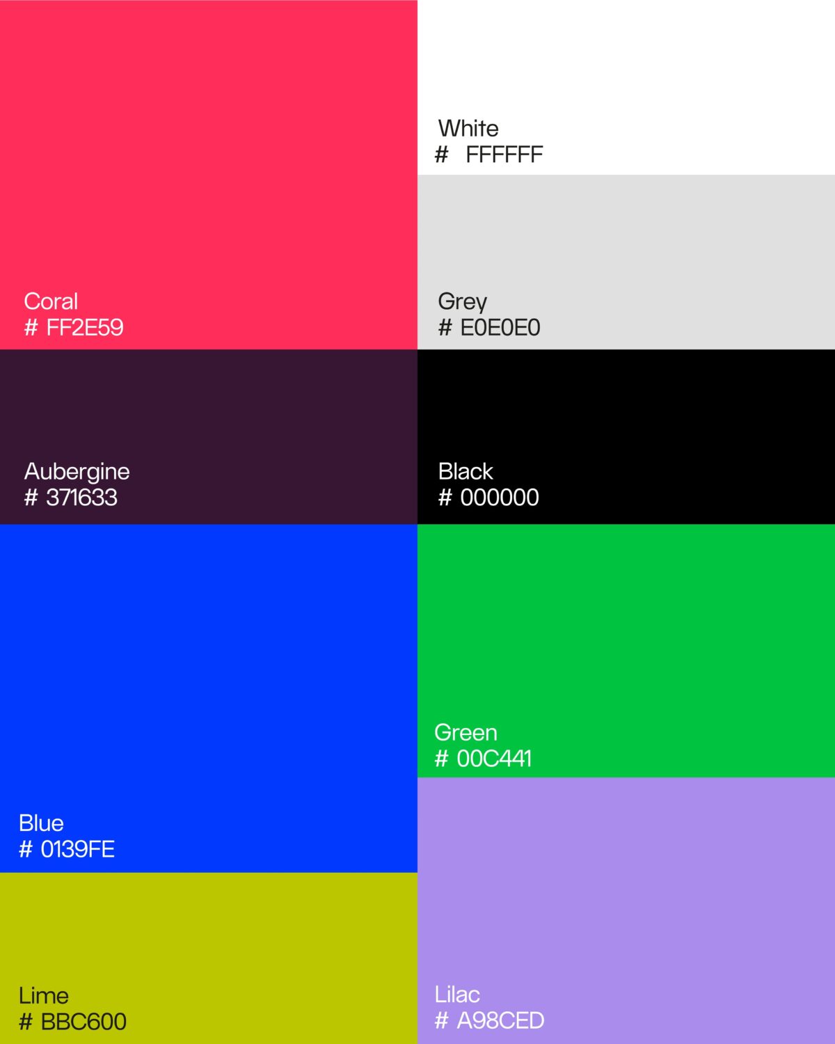
A Palette Designed for Expression, Not Restraint
In contrast to the minimalist colour palettes that have defined much of recent brand design—often limited to three or four carefully curated shades—the visual identity for Paper Still Matters embraces a broader, more expressive spectrum. We developed a 9-colour palette, intentionally crafted to offer range, depth, and adaptability across print and digital applications.
This expanded palette isn’t just about variety for its own sake. It reflects the creative, layered nature of the brand’s audience: designers, book lovers, and visual thinkers who appreciate nuance and detail. By moving beyond a strict set of primary and secondary colours, the system allows the brand to respond fluidly to different contexts—whether that’s a calm, neutral background for editorial content or a vibrant accent to bring energy to a campaign or product feature.
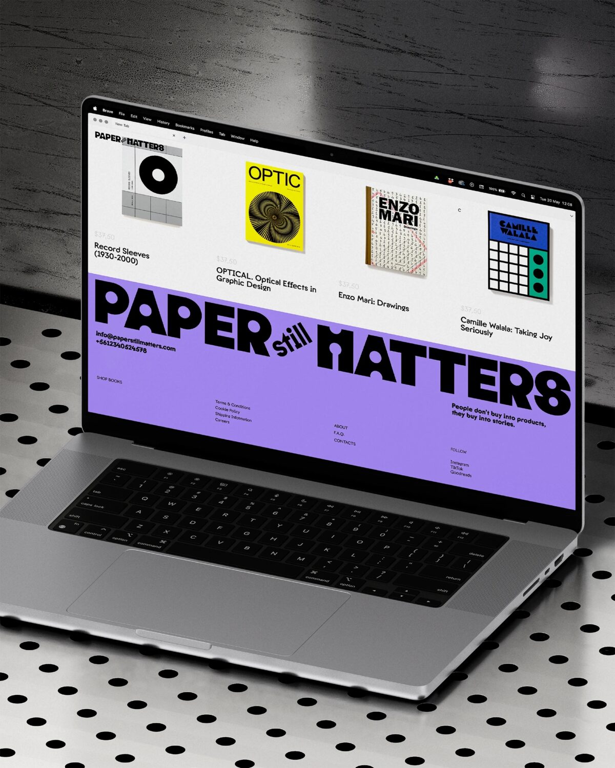
From Platform to Presence
Alongside the visual identity, we designed a clean e-commerce website that gives Paper Still Matters the digital home it was missing. Built with both form and function in mind, the site delivers a smooth experience for design-conscious buyers while reinforcing the brand’s visual and strategic clarity.
Ready to Grow
Today, Paper Still Matters is no longer just a side project—it’s a fully realised brand ready to grow with its audience. With a distinctive identity, a focused strategy, and a digital presence to match, it now has the tools to build community and carve out a meaningful place in the creative world.
For us, the project was more than just a branding exercise—it was a chance to help elevate a business that values craft, culture, and connection. From a bold new visual identity to a clean e-commerce platform, this project sets the tone for what our studio stands for: strategic, type-led design made to connect.
Brand identity and digital design by TYPE01 Studio
Creative Direction: Giulia Boggio
Learn more at type01studio.com


