This elegant serif typeface, with its gentle curves and subtle serifs, reflects the designer’s vision of love, nostalgia, self-expression, and cultural preservation.
Read the name O’Plérou and you’ll likely think of Ivorian artist, graphic designer and illustrator O’Plérou Grebet, renowned for his digital art and emojis / ‘Zouzoukwa,’ (‘image’ in his native tongue, Bété) representing elements of African cultures. A graduate of the School of Arts and Digital Images at ISTC Polytechnique in Abidjan, O’Plérou’s journey represents a natural evolution of his mission to celebrate and elevate African visual culture, which has seen him featured in Forbes Africa 30 Under 30 list.


Lately, he’s brought his creative expertise into the type design world, creating typefaces that merge his cultural heritage with contemporary design principles, bolstered by the goal “to typographically represent the spirits of the cities of my country, and make them become vessels for worldwide communication.”
His latest creation, ALT Nadrey, released through ALT.tf—a foundry (formerly known as Femme Type) focused on championing diversity in type design and fostering inclusive representation in the industry—adds to his growing portfolio of typefaces, which include OS Korhogo, “an experimental typeface that pays tribute to the city of Korhogo in Côte d’Ivoire and its Senufo Culture,” and OS Gagnoa, “a grotesque typeface inspired by the beauty of being human.” He describes each creation as “a testament to the beauty and depth of Ivorian creativity.”
ALT Nadrey is a typeface that embodies heart and heritage, aptly named ‘My Heart’ in the Bété language. “Like most of my typefaces,” he tells us, “the idea for Nadrey didn’t come from a brief but resulted from expanding on some letter sketches I had intuitively made in my digital sketchbook.” After sketching the ‘n,’ he was eager to develop a complete typeface.

Filled with warmth, ALT Nadrey features graceful, flowing strokes with varying thicknesses. To O’Plérou, Nadrey represents “both my structured side well, but also reveals a certain sensitivity to details and a desire for self-expression,” best showcased in the design of the ampersand. However, the aspect of his personality that Nadrey represents the most, he states, is his attachment to nostalgia. He often takes his friends’ photos and videos (visual memories) where, “We must invest in the half-sadness of the future,” he jokes. “The ‘Eheee’ (Ivorian equivalent of Awww) people do when they look at old pics is precious to me.”
Conceptually, ALT Nadrey’s leading source of inspiration was Apple Garamond, where O’Plérou was intrigued by a tech giant such as Apple using a serif in their campaign, Think Different. Despite not having seen the typeface as a child, he says, “seeing them online creates a kind of… digital nostalgia, which represents a large part of Nadrey’s spirit.”


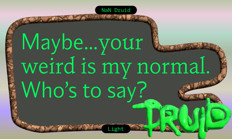
A slightly condensed typeface, ALT Nadrey’s smooth curves and graceful transitions create breezy connections between strokes and serifs, avoiding harsh angles while merging with an intentional, organic feel. This softness extends to the terminals, where subtle flaring – particularly noticeable in characters like ‘L’ and ‘T’ – adds a touch of personality. Interestingly, O’Plérou reveals that the serifs’ inspiration comes from candles, “kind of like a frozen representation of a melting candle,” with waves and folds that solidify as they descend. “The bottom serifs are also supposed to create a melted wax effect, with the hollow between their highest point and the lowest part of the letters.”
In addition to these serifs and the ‘soft-aggressive’ serifs of the capitals, some of O’Plérou’s favourite details include how the terminals of ‘c,’ ‘g,’ and ‘r’ curve inward, creating a flowing visual rhythm. “I’m also a fan of the loops in ‘b,’ ‘d,’ ‘p,’ and ‘q,’ which feel ‘natural’ to look at,” he adds. Its distinctively tilted design lends the typeface a sense of rhythm and movement, exemplified by the unique tail on the lowercase ‘g,’ – a favourite of O’Plérou’s – which showcases an elegant open loop – “tilted and quite eccentric without being disruptive.”


The typeface achieves perfect balance with its moderate x-height, ensuring optimal readability while maintaining its distinctive character. Though adorned with decorative flourishes, it demonstrates remarkable versatility, performing equally well in both display settings and body copy. And why put a limit on the possibilities?
“Honestly, I’d like to see designers adopt this typeface in fields I hadn’t thought about at all when publishing it,” he says, noting that the typeface has the potential to work well with fashion, archival work, art, and maybe restaurants. “But why not aeronautics? I don’t want to confine its use to one project category,” he continues, “but what’s important to me is that each time the typeface can ‘say’: “I was used for this project because its author held this project precious in his heart.”
ALT Nadrey is a comprehensive typeface offering 637 glyphs, featuring over 40 thoughtfully crafted ligatures, old-style figures, and extensive symbols and punctuation marks. With 100% Latin Plus Support, it provides complete coverage for Latin-based languages. Future goals include an italic version before adding other weights to make it into a family. “Otherwise, to grow the typeface’s universe, I’d like to do an exhibition in Abidjan to talk about it because since there aren’t many type designers here, the typeface remains a digital cultural artifact. I’d like it to become a source of pride for the country, so I plan to take action to make more people know about it :)”

To mark the typeface’s release, ALT.tf and O’Plérou teamed up with Obou Gbais, a contemporary Ivorian artist, to create a striking visual campaign that celebrates the intersection of typography and Ivorian artistry. His work, deeply rooted in cultural storytelling and social realities, perfectly complemented the typeface’s mission of preserving and celebrating Ivorian heritage. Through his distinctive paintings that often depict crowds and incorporate traditional Dan masks, Gbais brings an additional layer of cultural authenticity to ALT Nadrey’s visual narrative.
Available now at alt-tf.com, ALT Nadrey offers a contemporary interpretation of classical serif elements, paying homage to typographic tradition while expressing O’Plérou’s vision with plenty of love.
Read more type design editorials here.