Following its success in the English-speaking design market, Blaze Type’s book, ‘How to Design Fonts?’, has entered the Francophone world, published in French by Pyramyd Éditions under the title ‘La création typographique – Concevoir des polices de caractères.’
A reliable guide for both established and emerging typeface designers, this book outlines Founder Matthieu Salvaggio’s step-by-step method for drawing and creating letters, numbers, and symbols. “It seems that it was pretty well received, there is not a lot of documentation in French regarding type design,” he tells us on this edition’s release, “and even though there are more when it comes to English, I felt like we were still missing a very straightforward approach to type design.”


Pyramyd Editions, a publisher specialising in creativity, design, and visual art, is known for its strong commitment to education, working to make content as accessible as possible to a broad audience. For Salvaggio, who is passionate about making type design clear and accessible, this partnership was a perfect fit. “I grew up as a student with Pyramyd Editions books about graphic design, layout, etc,” he reflects, “so it was clear to me that they were the best choice when it came to à publication. They are such an amazing team to work with; their insights helped to take the book even further.”


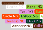
With a typographic system built entirely from Blaze Type’s catalogue, the book’s design was handled by Paris-based studio Hic et Nunc, who prioritised typographic hierarchy and efficiency throughout the publication. Modern neo-grotesque Rules was chosen for body text, while Norse-inspired Surt was selected for titles and section markers. Balette, featuring twisting, root-like terminals, is used for navigational elements and annotations.
While the book has undergone a few minor tweaks, Salvaggio assures us that it still holds the same valuable information as the English version, now in a beautifully printed edition available for purchase on Pyramyd’s site. [Link]


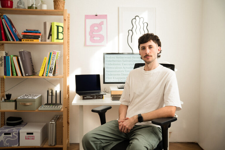
Another venture in the realm of the printed page, Blaze Type was invited to contribute its expertise to the GF Smith rebrand. Rejecting the uniformity of the heritage paper industry, the new look, developed by Templo, speaks to the creative sector of today. Led by a generous burst of colour (inspired by GF Smith’s paper collection) and a bold new voice, the new identity is cemented with a smiley, omnidirectional typographic logo. The choice for the logo, and primary brand typeface (supported by Dinamo’s ABC Social for body copy) was Blaze Type’s Homie, a warm modern sans-serif typeface that blends humanist and geometric elements.
Focusing on legibility and consistency, Blaze Type began by redesigning the logo’s glyphs to address the legibility issues from spherical distortion. They used this as a starting point to make specific corrections to the typeface while maintaining consistency with the logo, including lowering crossbars, hollowing out the dots of the ‘i’s, and altering the arrow elements. All of these adjustments culminated in a British touch for the GF Homie typeface, aligning it with the company’s heritage.

Regarding the broader business with the foundry, the founder is pleased with the progress this year: “Everything is going super well, we are very busy!” For example, Blaze Type has also revealed their work in collaboration with Desperados — a customised typeface representing Desperados’ brand identity, which, according to the type designer, embodies the duality of the drink’s modernity and the Latin beer’s history. “We met with a representative of Publicis during a talk, a type specialist, mind you, and we bonded over our shared love of font engineering,” he notes. “He introduced us to the team working on the brand development and voilà!”

As requested by the client, Blaze Type began with an existing, royalty-free typeface (Anton, Vernon Adams, 2020) and developed their own damaged counterpart (Anton Desperados), incorporating details found in old typesetting and intentionally adding wear, flaws, and textural imperfections for a vintage, expressive look. Textural effects were manually edited on each glyph to preserve legibility while preventing the font from appearing overly artificial or digital. Blaze Type created two font variants: a lightly textured version and a much rougher, heavily textured one. “The font was a real challenge as it is made out of graphic accidents from scratched and torn type on paper sheets,” says Salvaggio. “A real tech struggle, but it was so much fun to do.”

Regarding future developments, we are excited to share that Blaze Type is expanding its font collection and beginning work on Japanese versions of its fonts.
To follow the foundry’s further news and releases, follow them on their official website and social media channels for the latest updates and announcements.
Enjoyed this piece? Read more of our typeface design features here.