Few brands hold as much nostalgic weight as Donuts®. With a presence stretching back more than half a century, it has been a beloved part of childhoods, snack breaks, and supermarket shelves for generations. But like many heritage brands, Donuts® had gradually lost some of the visual charm that once defined it. Over the last decade, its identity had faded — becoming less memorable, less cohesive, and less in touch with the bold character it once projected.
The challenge was clear: revive the soul of Donuts® without turning it into a pastiche of its former self. Instead of leaning into empty nostalgia, Barcelona-based graphic designer and type designer Bogidar Mascareñas approached the project with precision, depth, and typographic respect. The goal wasn’t just to make the brand look good — it was to make it feel right.
From Childhood Charm to Confident Character
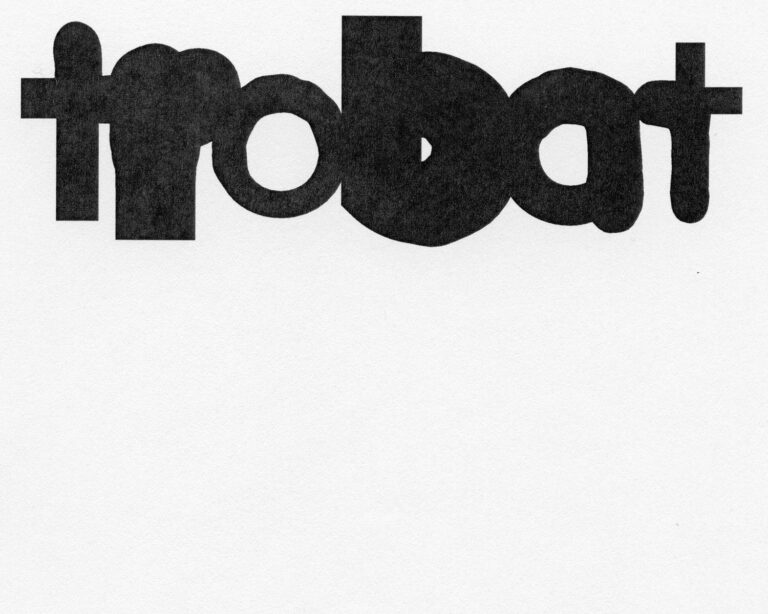
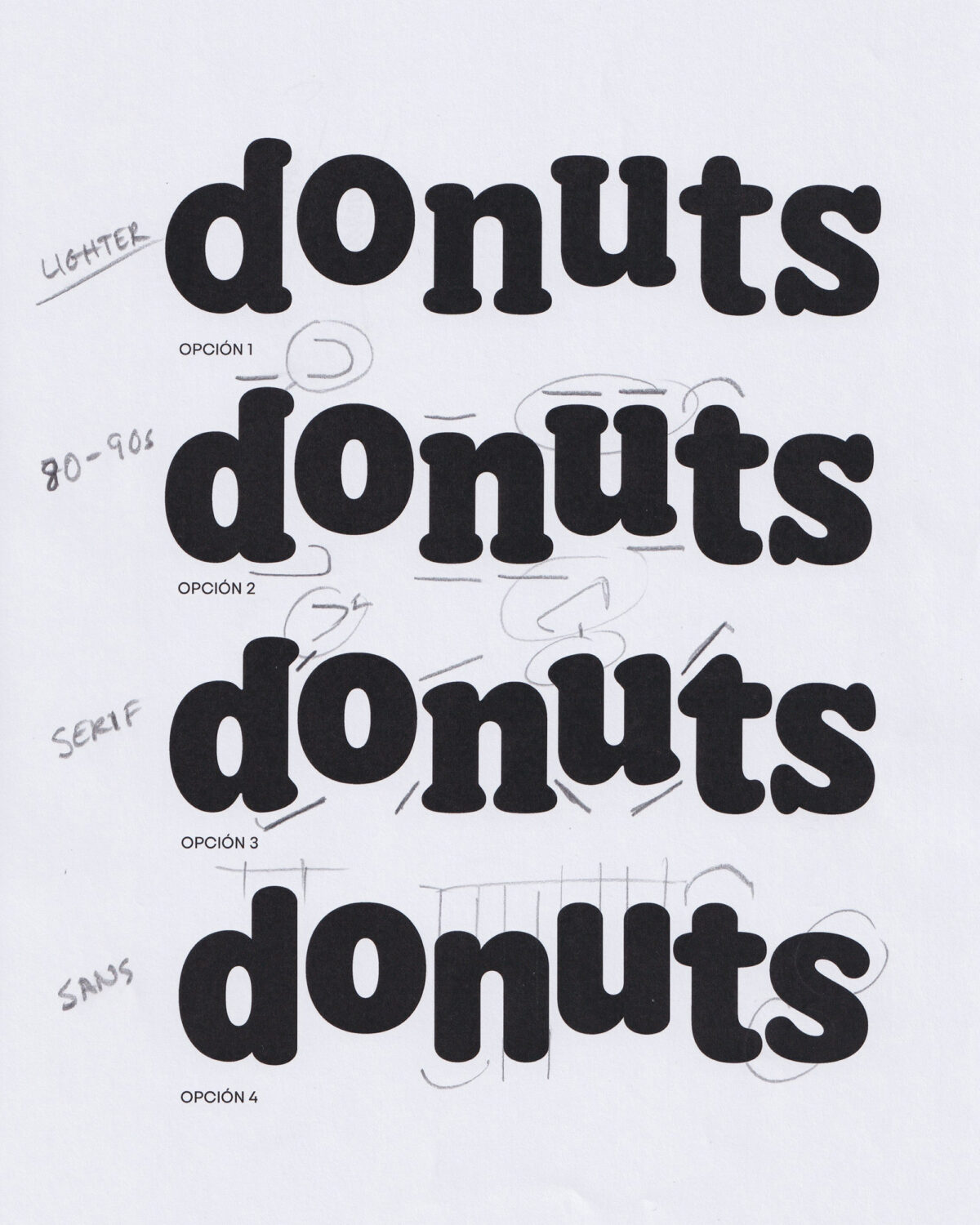
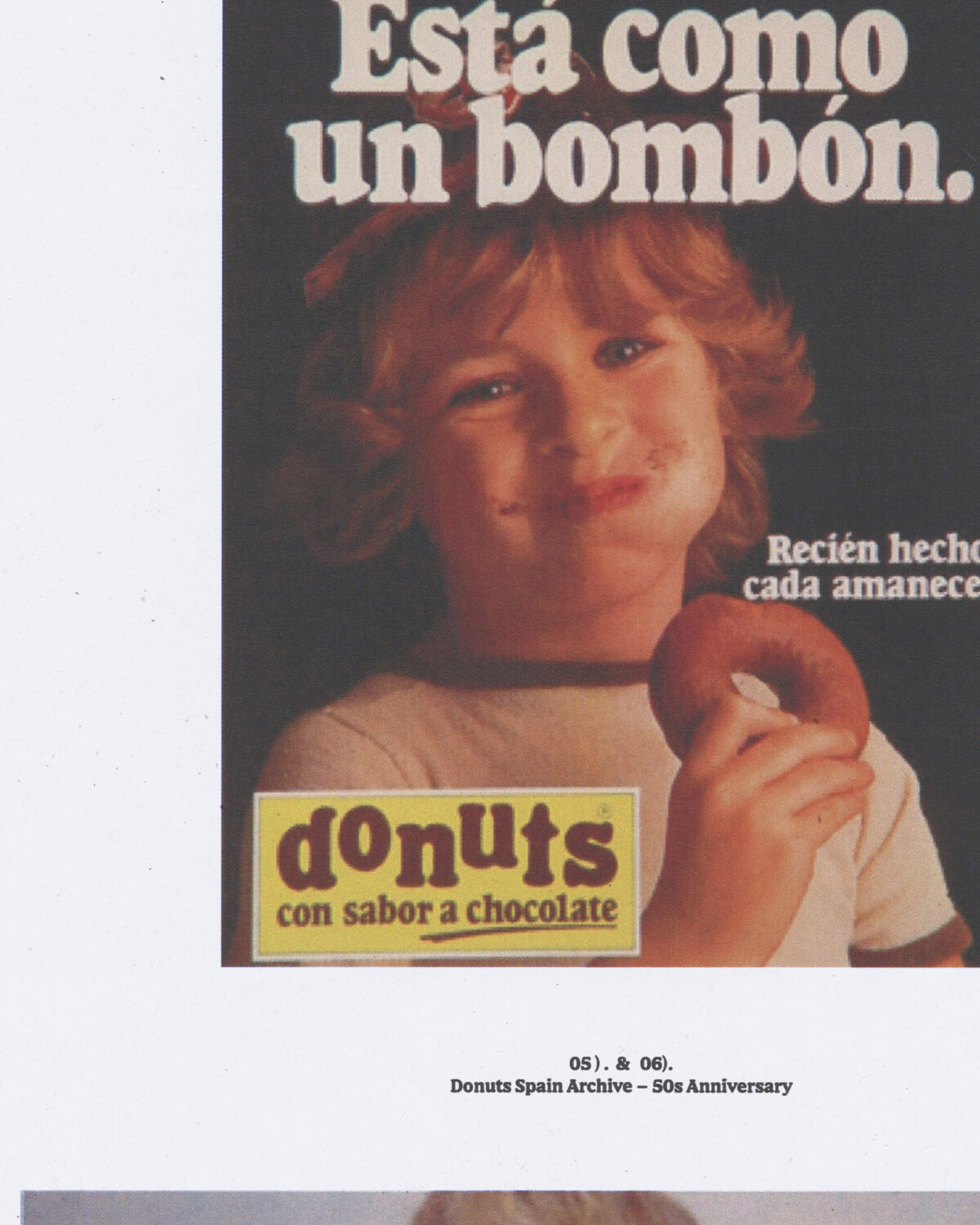
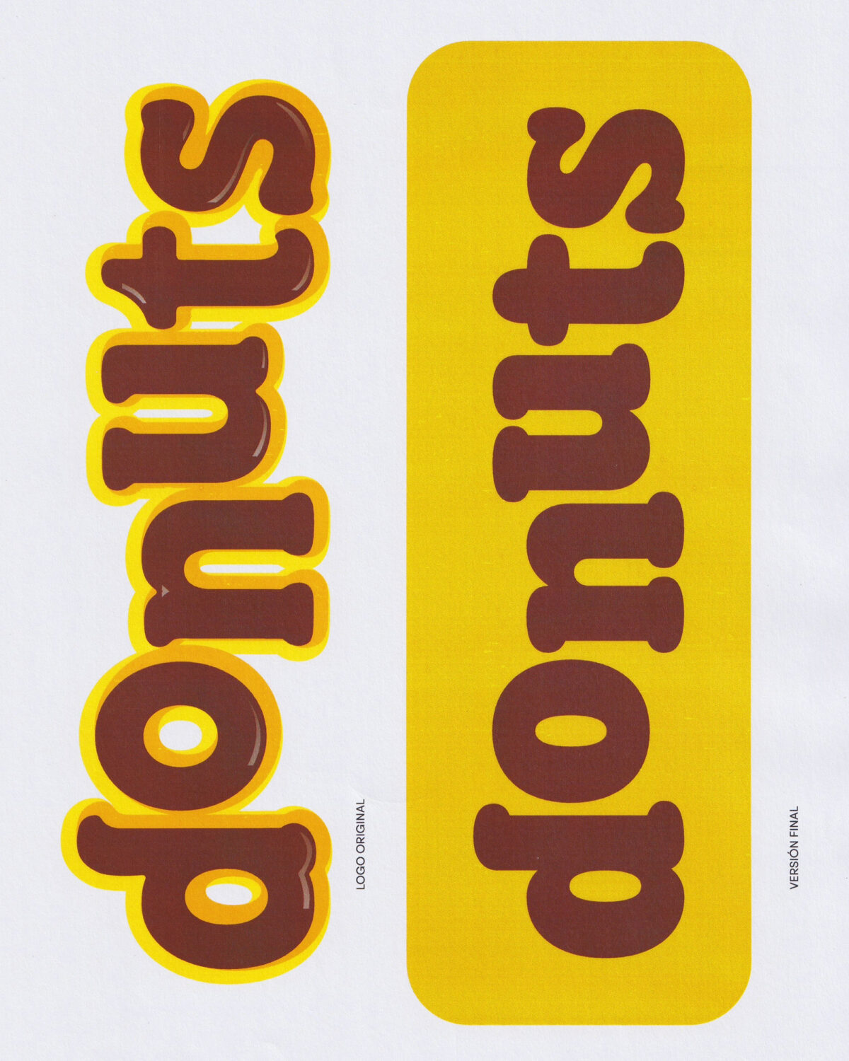
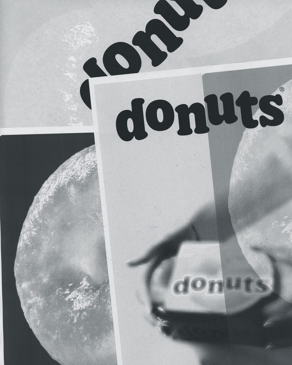
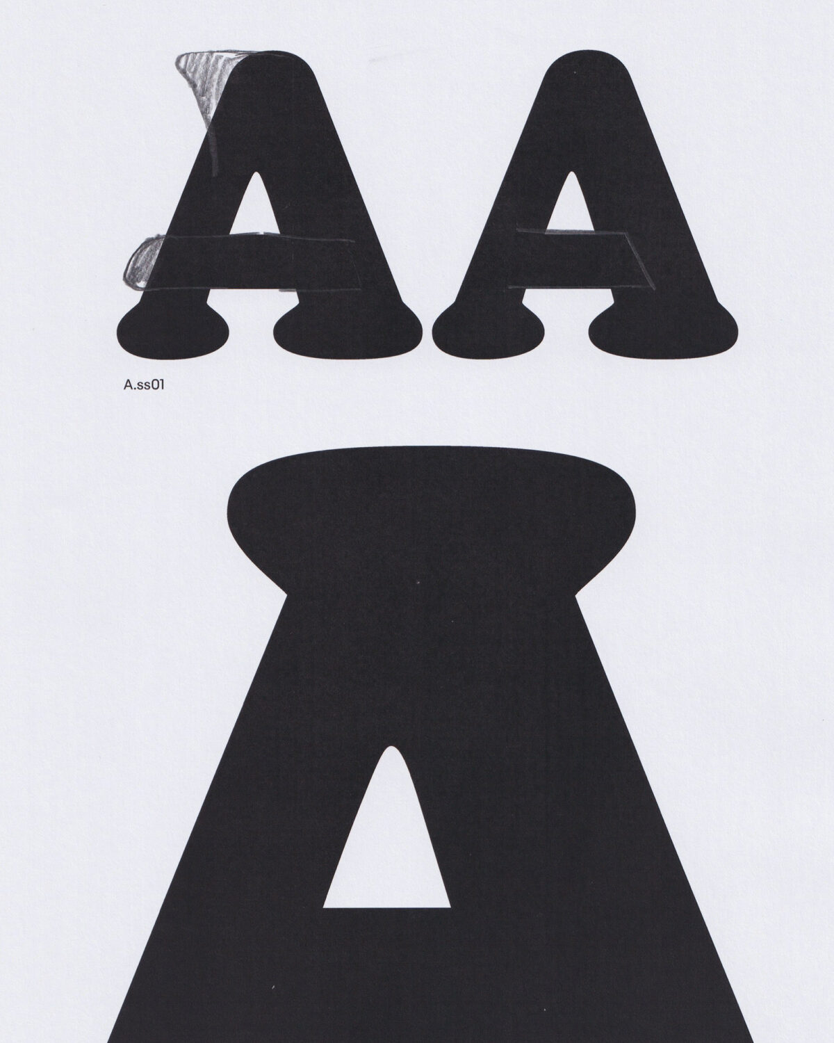
The cornerstone of the rebrand was the redesign of the Donuts® logo, a move that carefully walked the line between evolution and preservation. Drawing inspiration from the brand’s most iconic logos of the 1980s and 1990s, the new design moves away from a more playful, juvenile aesthetic and embraces a bolder, more mature expression.
The refreshed logotype features a subtle yet robust serif, with adjusted counter shapes and enhanced overall weight. The letterforms strike a balance between softness and structure — a nod to the product itself — and convey a newfound sense of confidence while maintaining the warmth that made the original logo so enduring. It’s a logo built not just to be seen, but to be remembered.
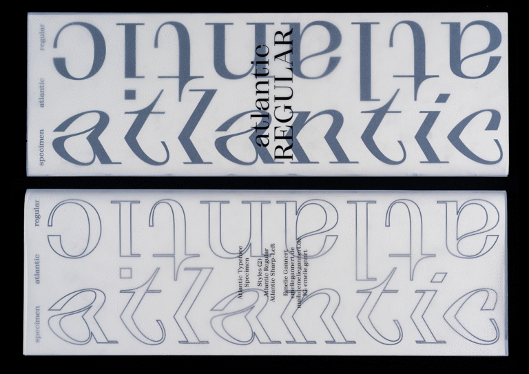
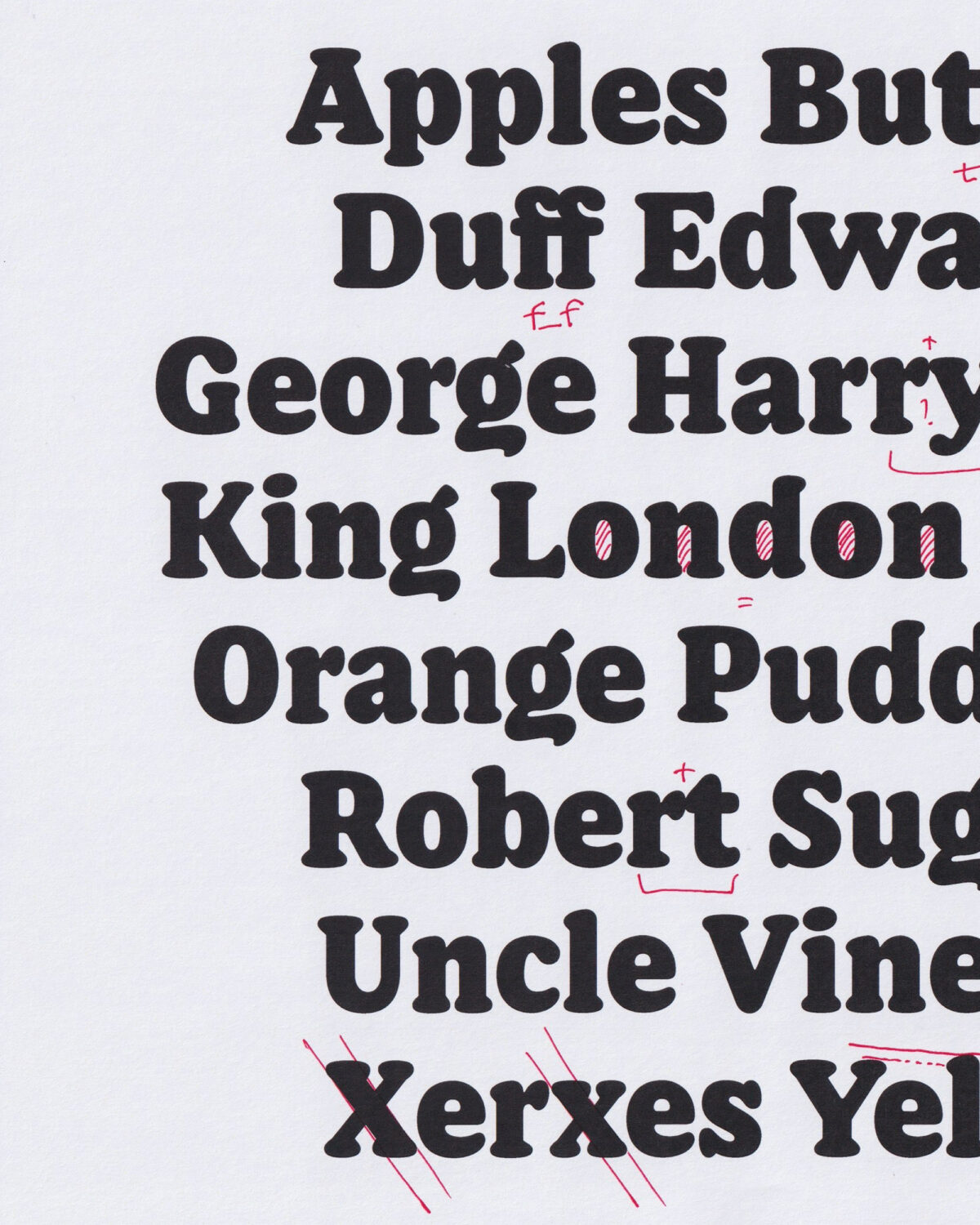
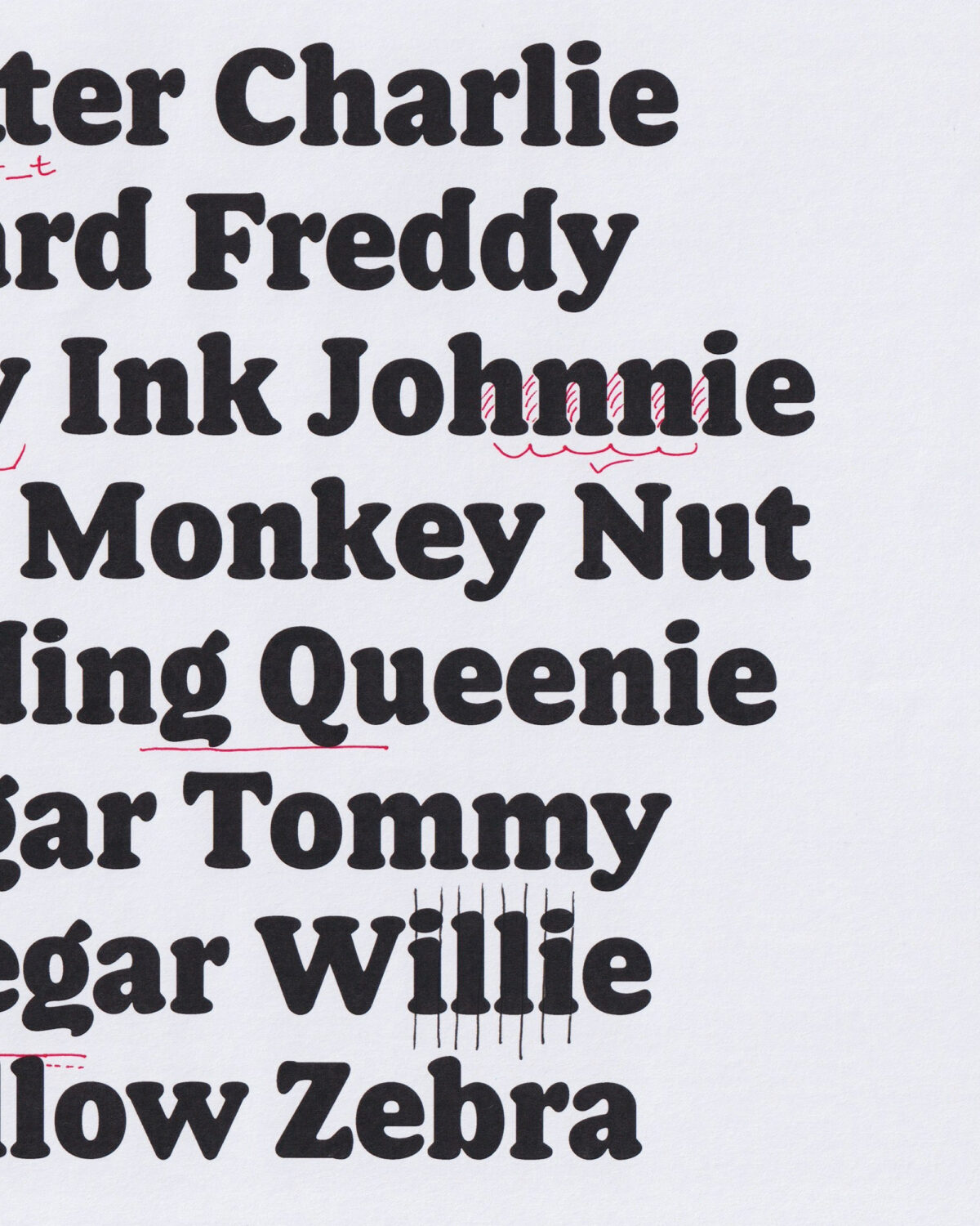
A Custom Typeface That Extends the Brand
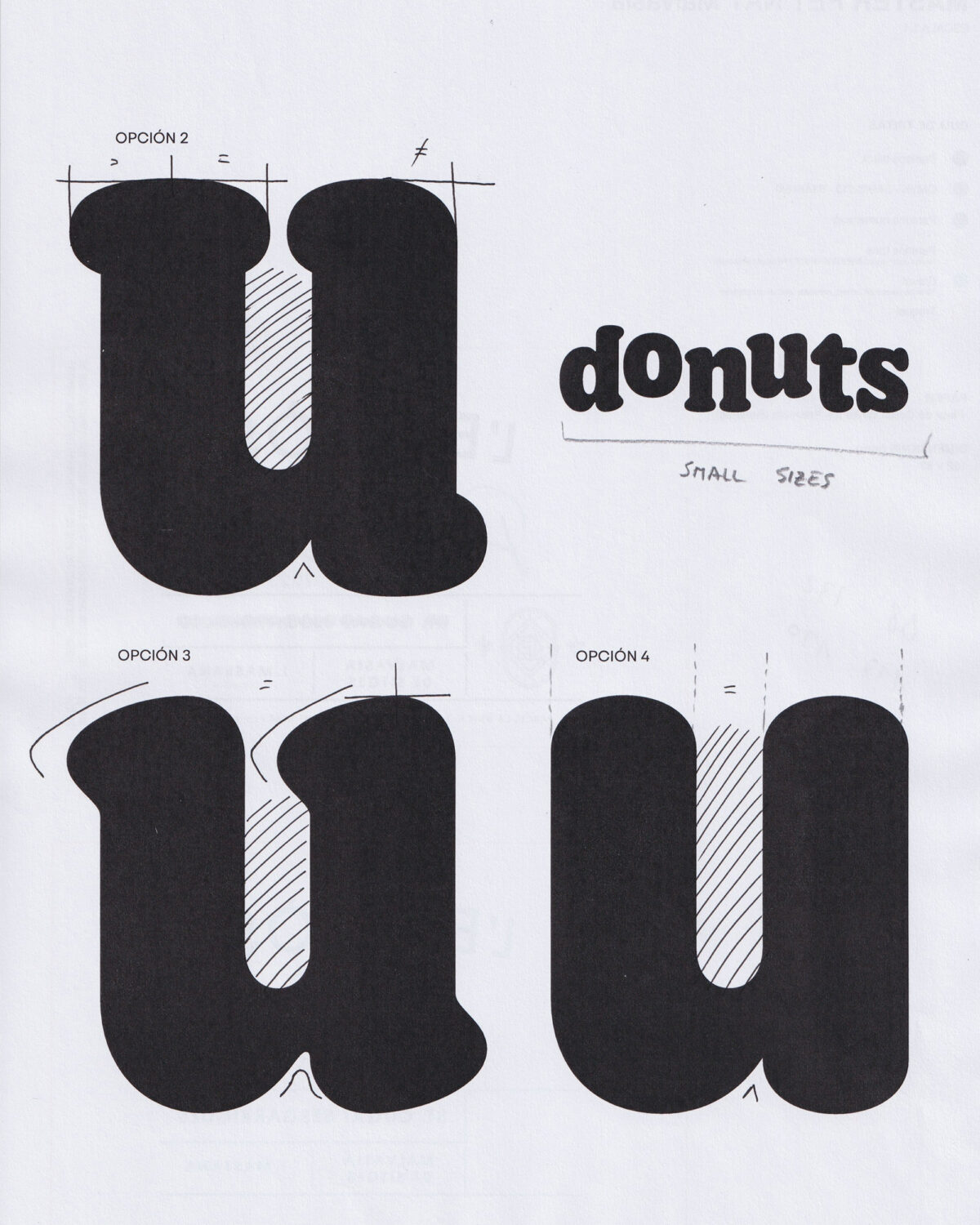
Integral to this revival was the creation of a custom Donuts® font, expanding the visual language beyond the logo and into every touchpoint. Rather than simply creating a display face to echo the logotype, the team developed a full type system with five carefully calibrated weights, from Light to Bold.
The typeface builds directly on the logo’s DNA, preserving its distinctive features and transforming them into a versatile typographic toolkit. Every glyph, diacritic, and alternate character contributes to a cohesive identity — one that feels unmistakably Donuts® whether it’s applied to packaging, posters, or digital content.
This wasn’t just a redesign — it was the construction of a new, ownable language for the brand.
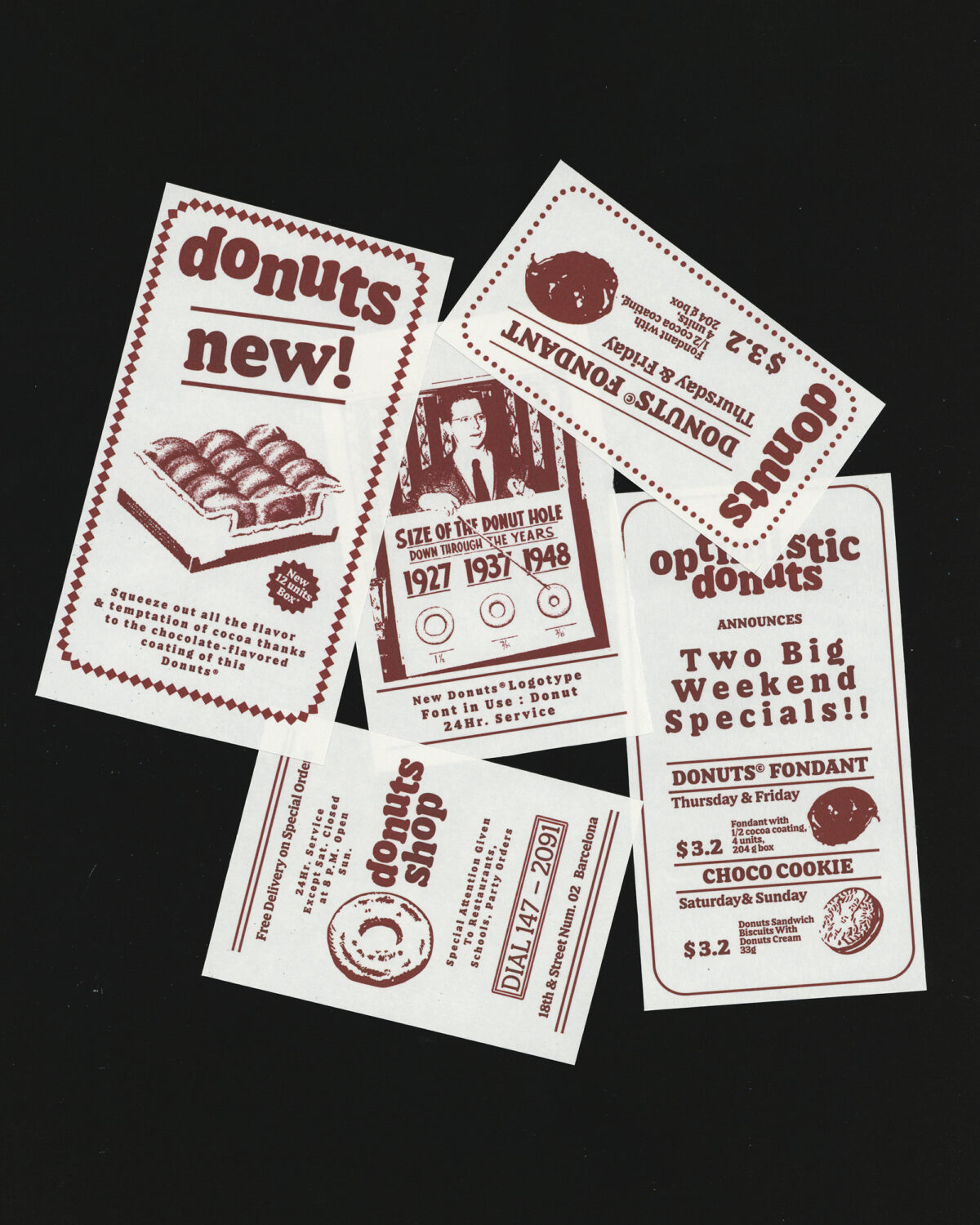
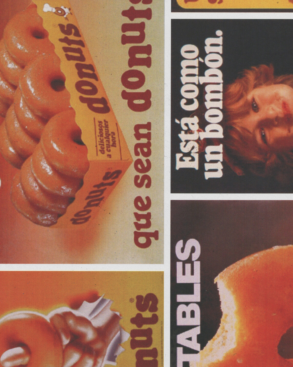
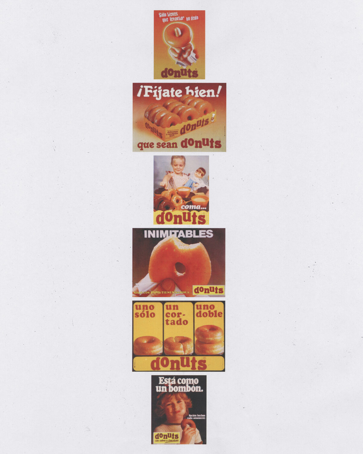
Visuals That Echo the Past, Speak to the Present
While the foundation of the brand is built on strong typography, the visual system takes things further by embracing a vintage look, infusing campaigns and packaging with a timeless sensibility. From the colour palette to the textures, the visual language deliberately evokes the feel of a bygone era, all while sitting comfortably within a modern context.
This blend of old and new creates an emotional bridge between past and present — preserving the memory of Donuts® while ensuring its relevance in a contemporary marketplace. The design doesn’t shy away from its heritage — it celebrates it, reinvents it, and makes it visible again.
A Cohesive, Confident Brand for the Future
Across every medium — from shelf to screen — the new Donuts® identity signals a brand that knows where it came from and where it’s going. The custom typeface anchors the visual system with clarity and consistency, while the refined logo and classic visuals reinforce a narrative of maturity, quality, and familiarity.
What emerges is a brand that feels both refreshed and rooted. Not a reinvention, but a return to form — with added strength, structure, and sophistication. With this redesign, Donuts® reclaims its voice — not just as a product, but as a cultural symbol that continues to evolve with each new generation.
Additional Credits
Visuals by @juliablbda
Design Team @bimboesp , David Noriega, Ana García, Marta Zabala
Regular weight designed in collaboration with @carlosmartos.design
Browse more typeface design editorials here.