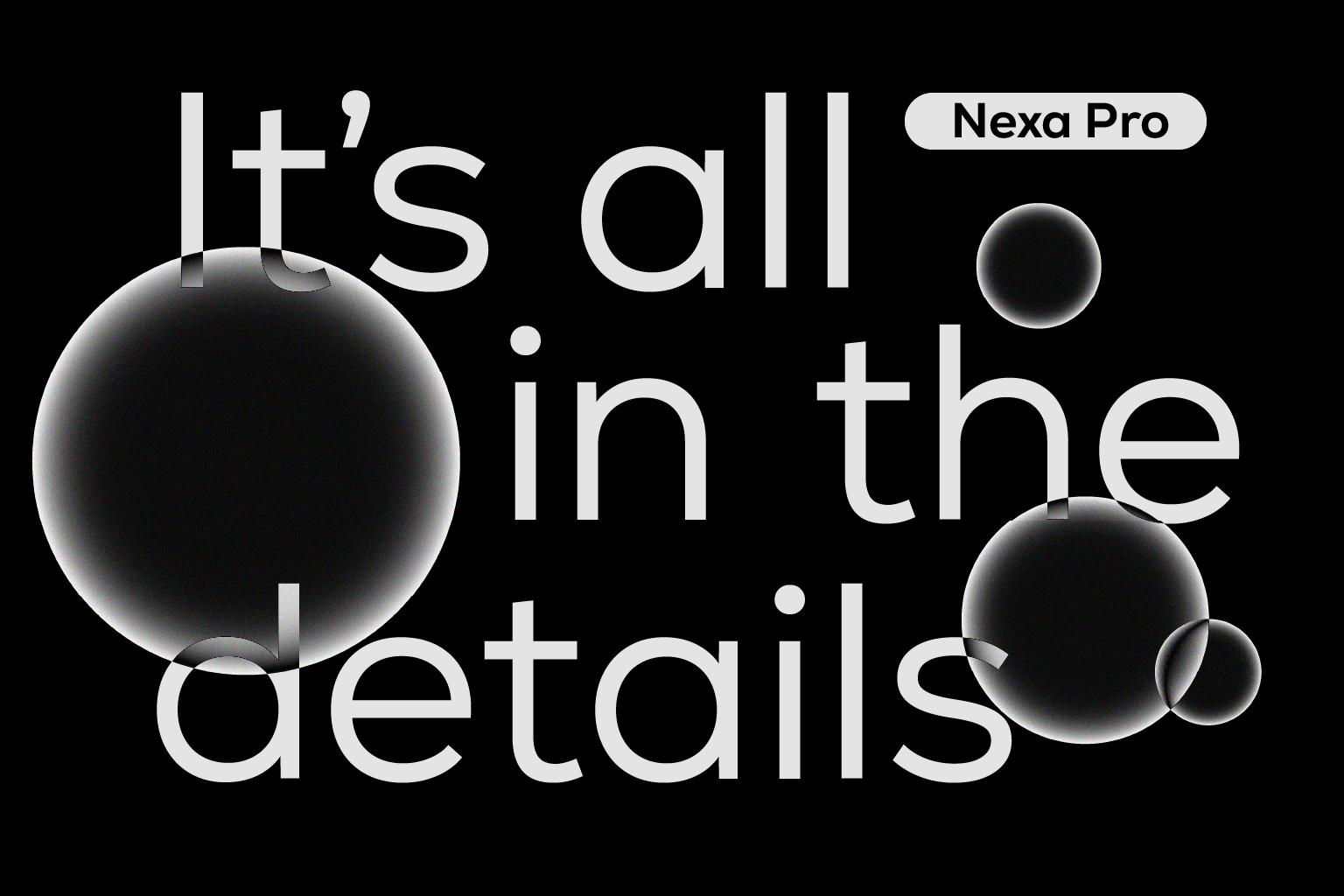
Some sans-serifs lean too far towards a crisp, clinical coldness, while others may be too playful and decorative, making them less versatile. Nexa Pro? It sits perfectly in the middle.
Crafted by the team at Bulgaria-based type foundry Fontfabric, Nexa Pro is a practical, balanced geometric sans-serif with a rhythmic, evergreen style and unique character traits.
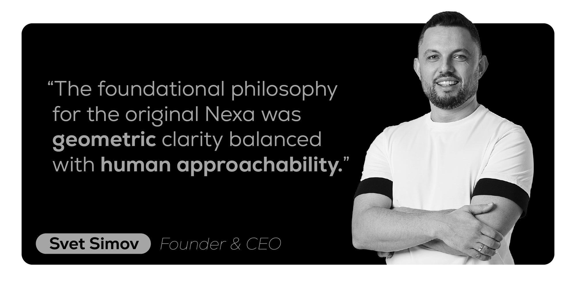
As its original designer, Fontfabric Founder and CEO Svet Simov explains, the typeface’s core philosophy is a balance between geometric clarity and human approachability. “We didn’t just chase the cold, strict geometry of the early modernists,” he states in an interview with Fontfabric. “We deliberately introduced elements like the subtle adjustments to the curves and the iconic character of the lowercase ‘g’ to give it a warmer rhythm.” For designers, it became an appealing choice, not only for its “clean and professional” qualities but, as Simov points out, because it “felt distinct and had a soul.”
These days, typefaces have to work harder than ever, as designers face the reality that fonts are used across print and screens of all sizes, from handheld smartphones to LED digital walls – there’s a wealth of touchpoints and interfaces to consider. They also have to think globally, as design – working with companies across continents – must consider cultural differences and reading habits to ensure effective communication and visual impact.
Fontfabric, recognising this, decided to evolve the best-selling geometric sans-serif to meet the demands of today’s multi-platform, multinational design world, while maintaining its signature clean, modern style and approachable feel. More scripts, greater creative control, and optimised for legibility.
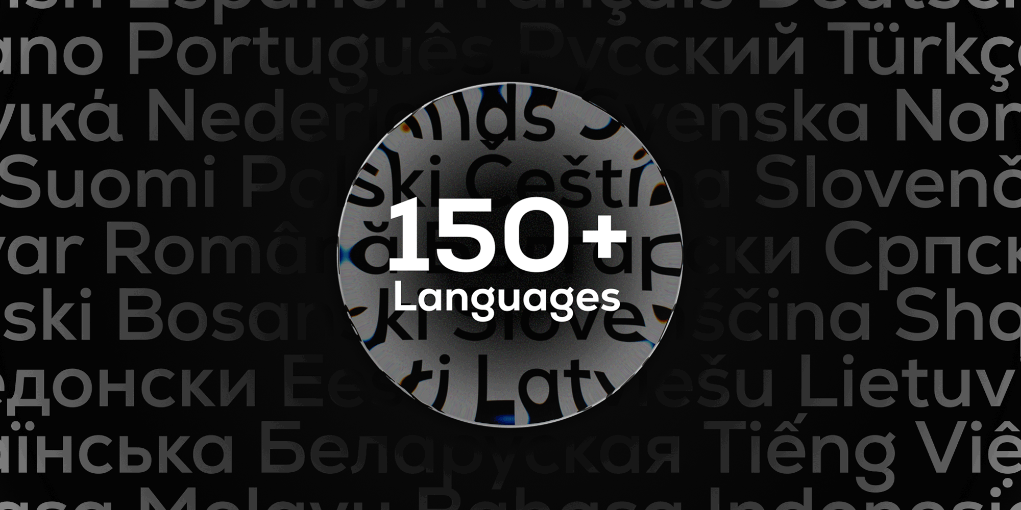
Global Reach & Language
Following waves of demand from the design community, Nexa has expanded into Nexa Pro, with improved language support. Greek, expanded Cyrillic, Latin, and Vietnamese are all now available. As a result, brand designers working across multinational identity projects will no longer need to scour the web for new, secondary fonts. It saves time while ensuring consistency across designs, enhancing brand recognition in diverse markets.
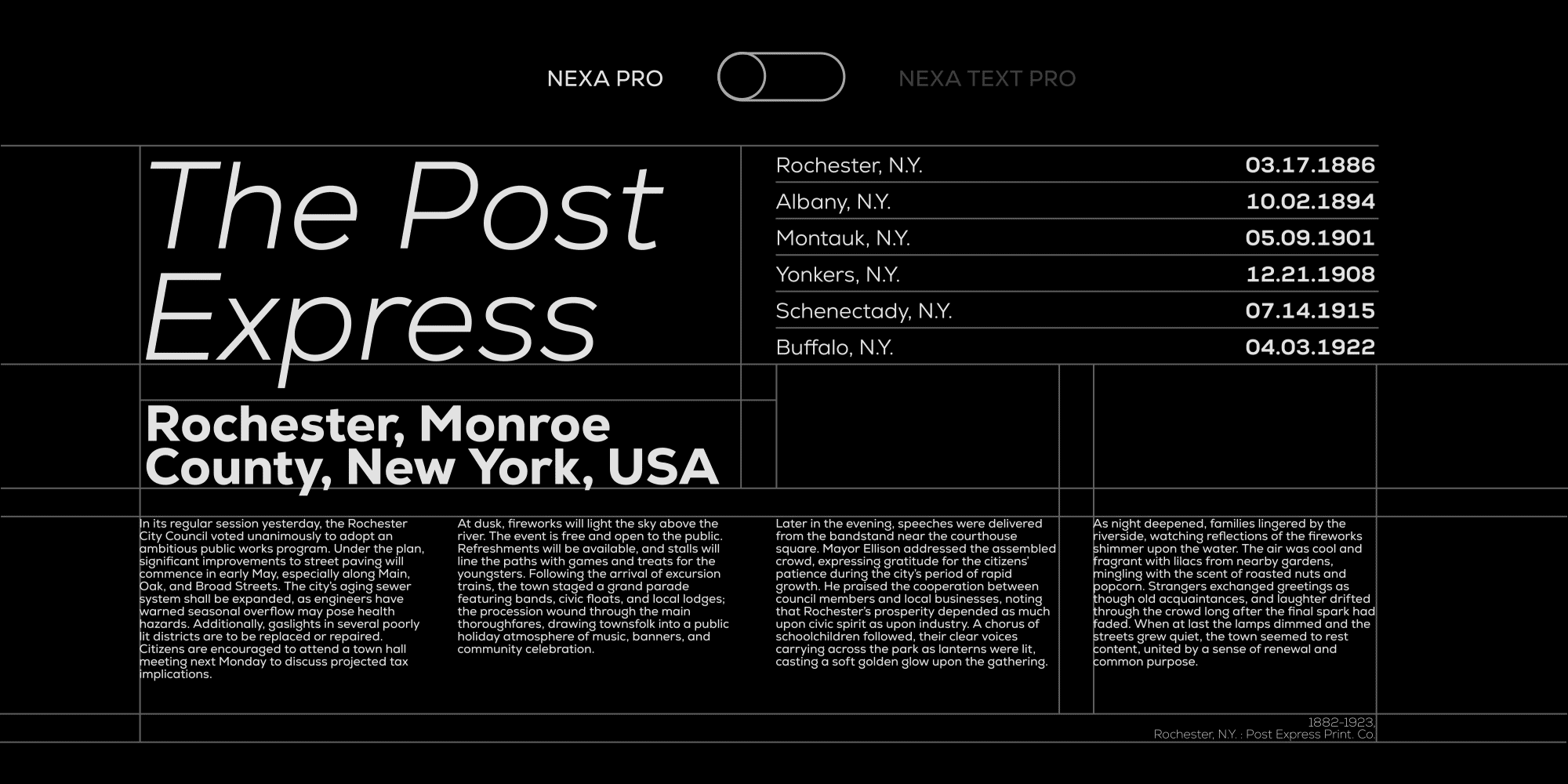
Engineered for Legibility: Introducing Nexa Pro Text
While expanding Nexa Pro’s script selection, the team defined two key styles: ‘Display’ and ‘Text.’ The former brings expressive flair. The latter, they explain, isn’t just a scaled-down version. Rather, it’s specifically optimised for legibility in long-form content, body copy, and user interface (UI) design. To achieve this, Fontfabric made subtle adjustments – from slightly looser tracking and optimised counter shapes to balanced proportions – all to improve reading comfort and minimise eye fatigue.
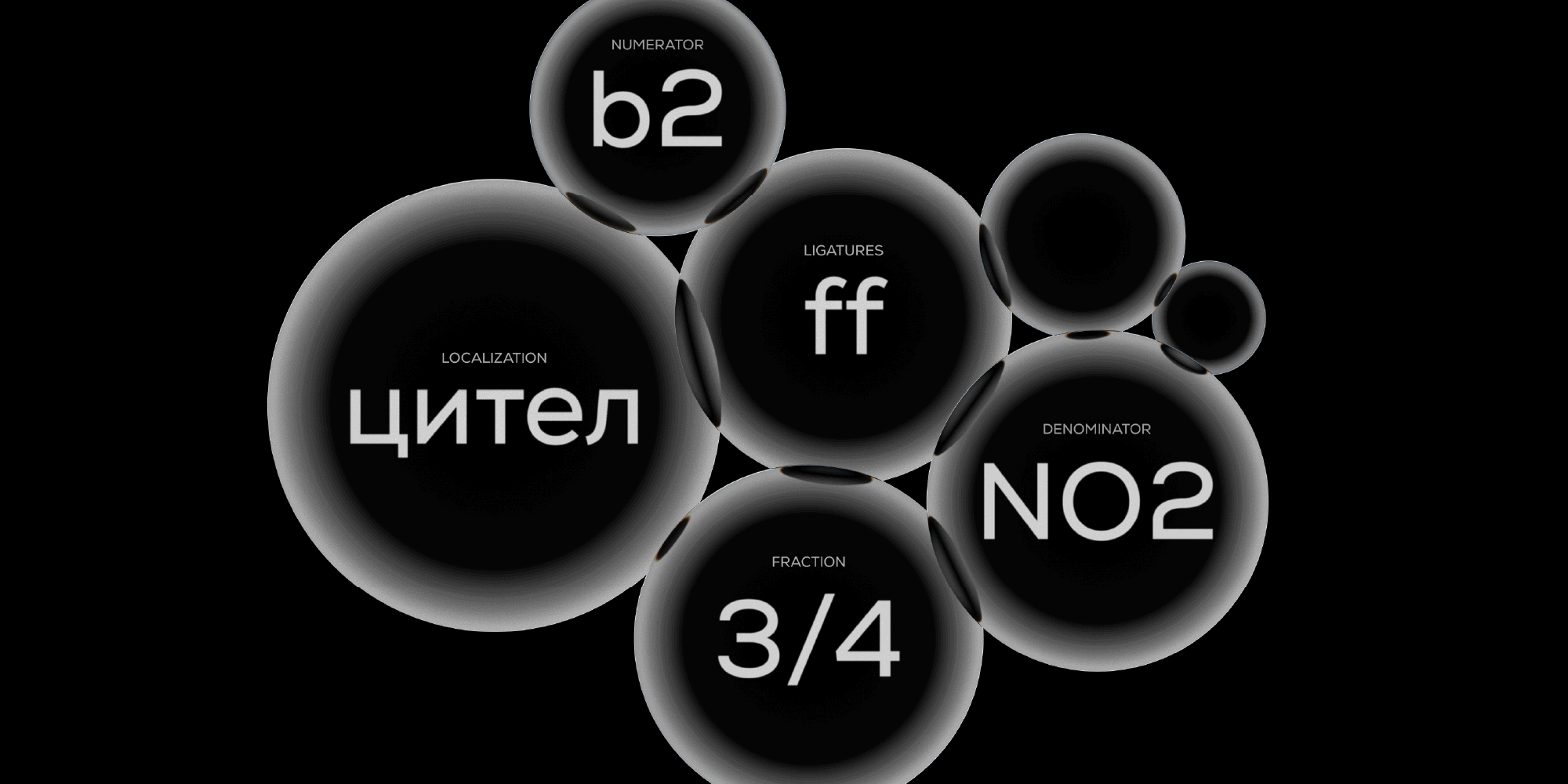
OpenType Features
For designers looking for more customisation, NexaPro also boasts a full set of OpenType functions, including stylistic alternates, localised forms, ligatures, small caps, tabular and proportional figures, case-sensitive forms, and more. Beyond the array of weights/styles available (including variable), these add a wealth of customisation options, allowing you to create unique and visually appealing typography tailored to specific projects.
The development ensures that Nexa Pro is a comprehensive ecosystem of fonts — fulfilling all brand identity requirements, from striking headlines to subtle copy moments. It is a global-scale workhorse, offering greater flexibility and more features while maintaining the clean, modern style that people loved about the original. Now, it is even more powerful and ready to meet today’s design needs.
Across the entire system, there’s a seamless harmony, thanks to the consistency of the weights — Simov’s most gratifying detail. “Maintaining that core Nexa feeling from the thinnest Extra Light to the heaviest Black across all those new styles and scripts is the most demanding and, ultimately, the most gratifying technical feat. It’s a testament to the meticulous work of Ani, Iva, and Vika.”
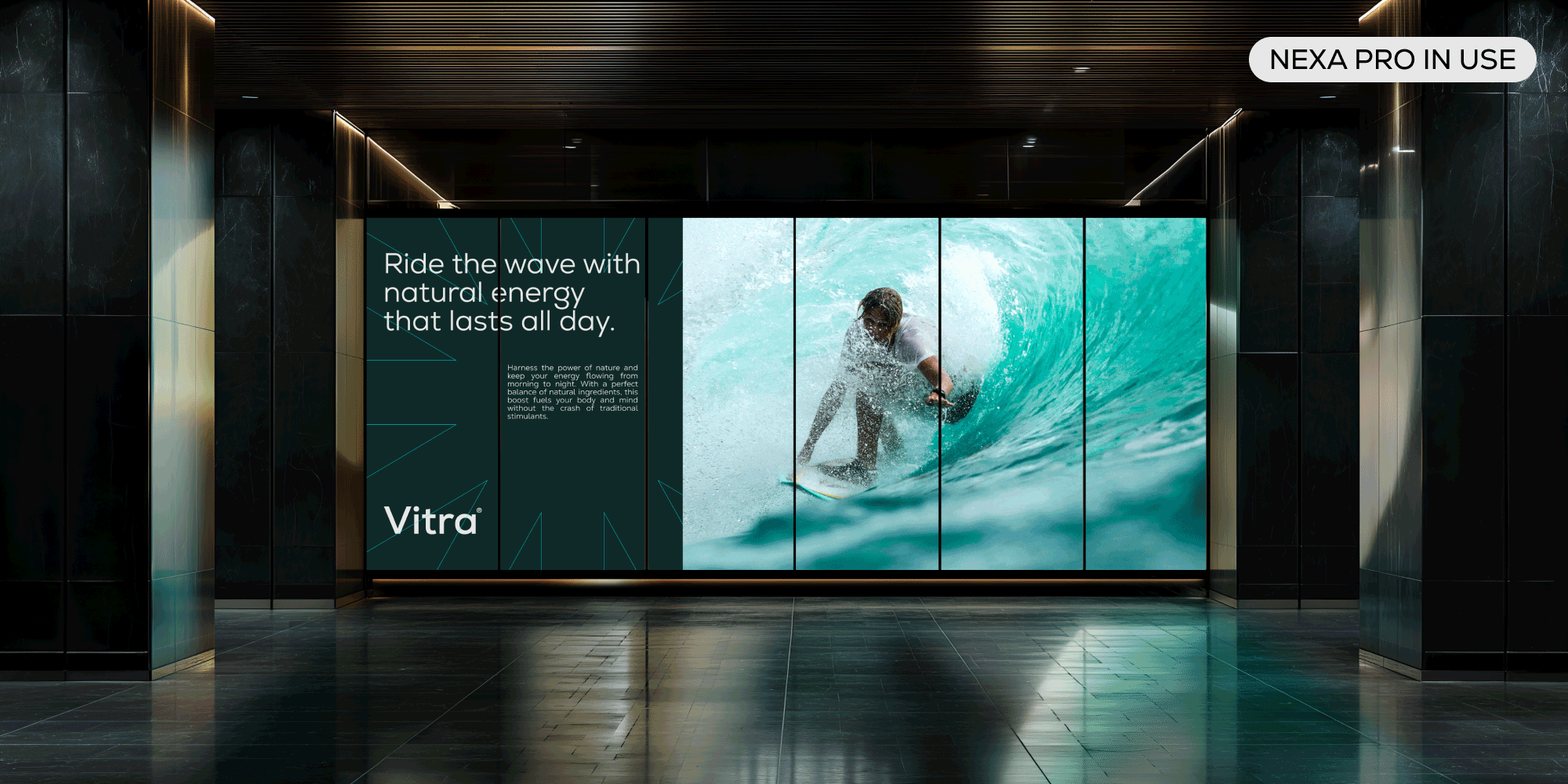
Nexa Pro In Use
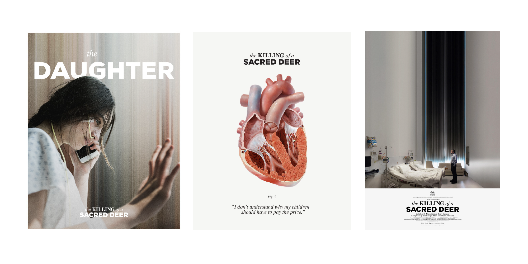
Nexa Pro’s versatility is proven in its use-cases, where on one hand it shines as a statement font in Vasilis Marmatakis‘ posters for Yorgos Lanthimos’ The Killing of a Sacred Deer. Set in capital letters, its bold, clear, smooth geometric forms contrast Linotype’s Times, contributing to the poster’s clinical perfection and subsequent feeling of unease.
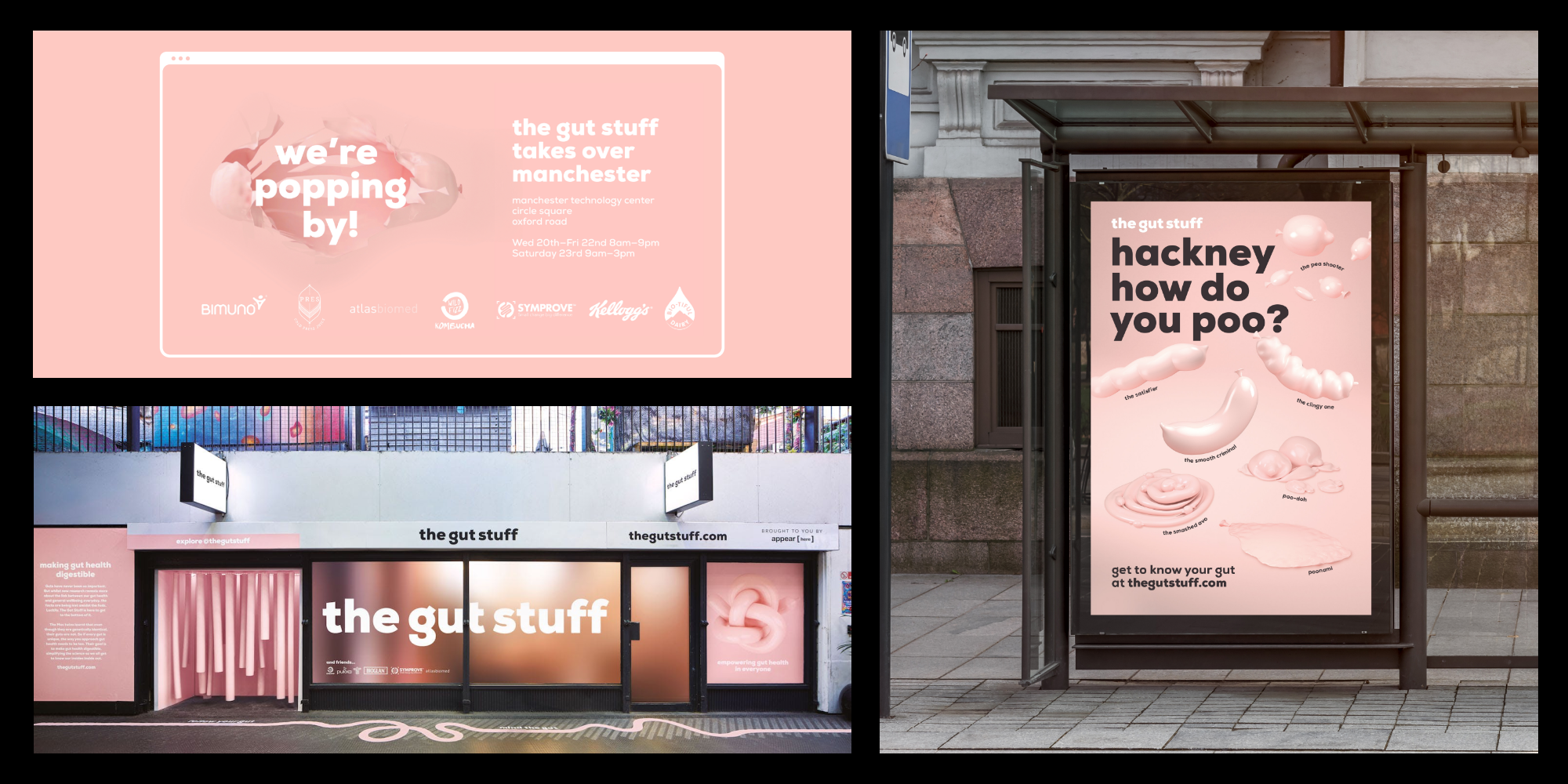
In JKR and Revolt’s identity for the gut stuff, it’s an entirely different story. Working with a soft pink palette and engaging 3D graphics, Nexa’s friendly nature fits right in with the humorous, lighthearted and engaging identity.
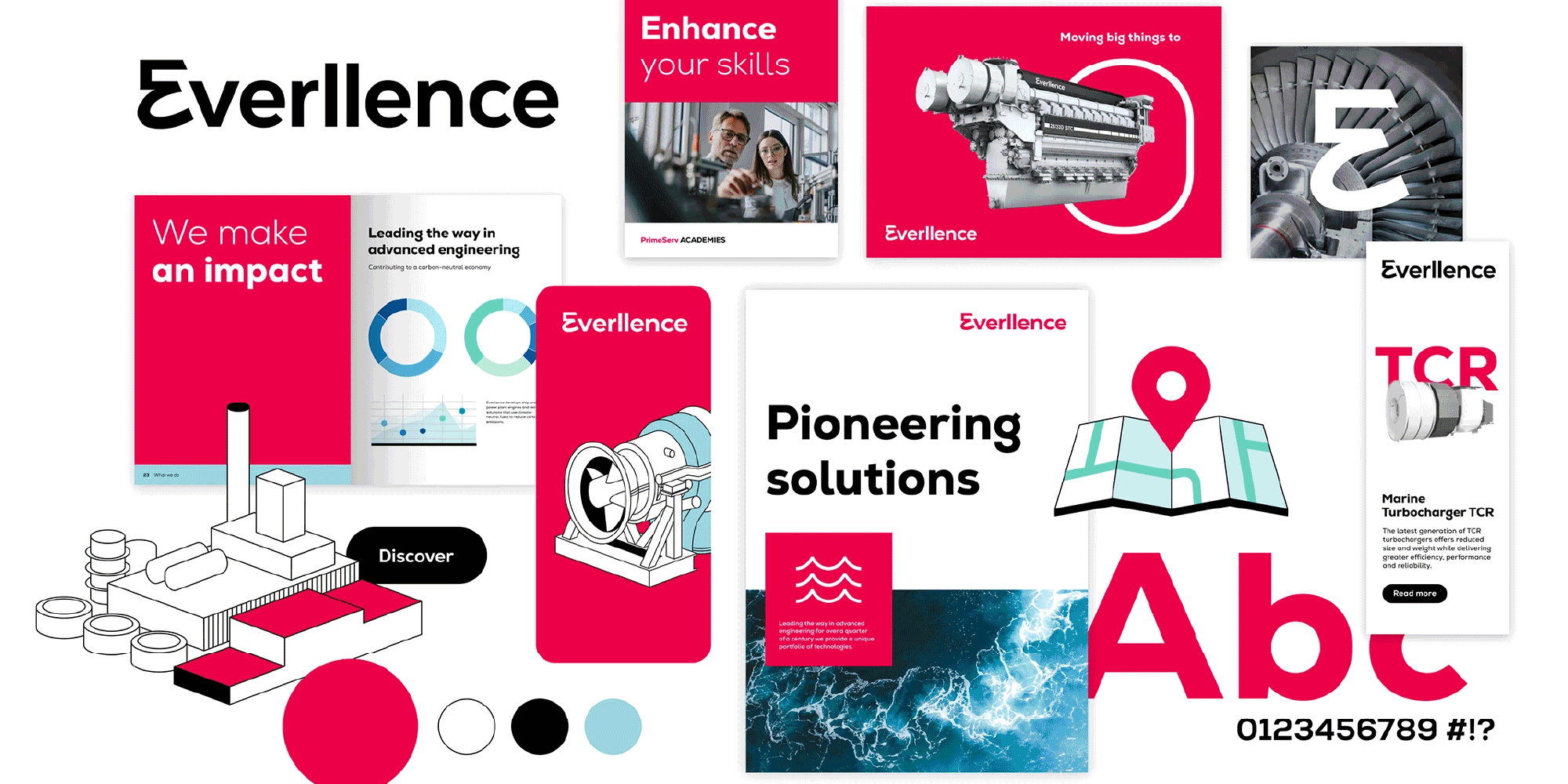
When used in the identity system of German engineering company Everllence, the effect is immediate trustworthiness, with the brand signalling its expertise through a personable and straightforward approach. Here, Nexa Pro’s design is perfect for solidifying audience confidence.
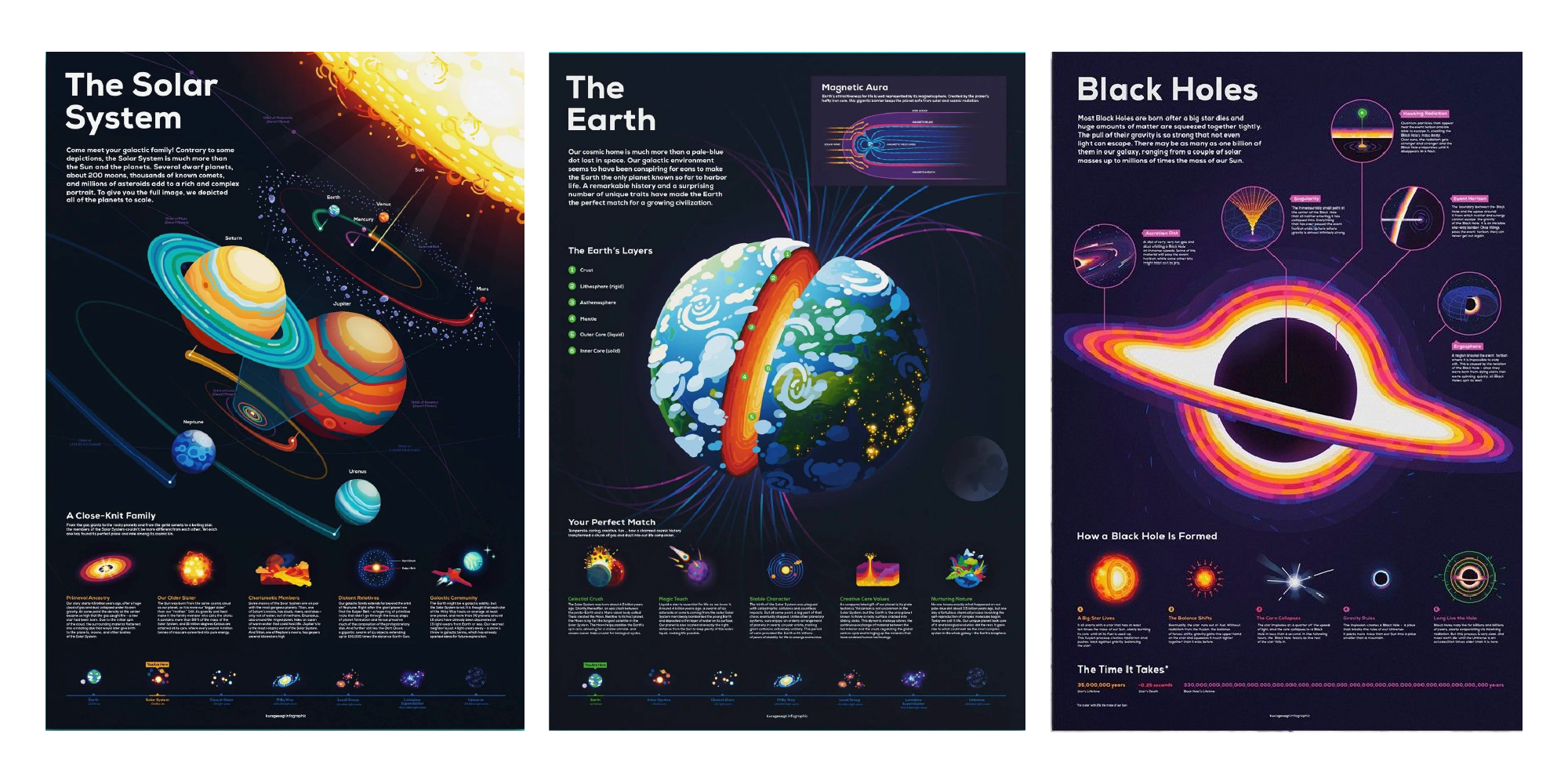
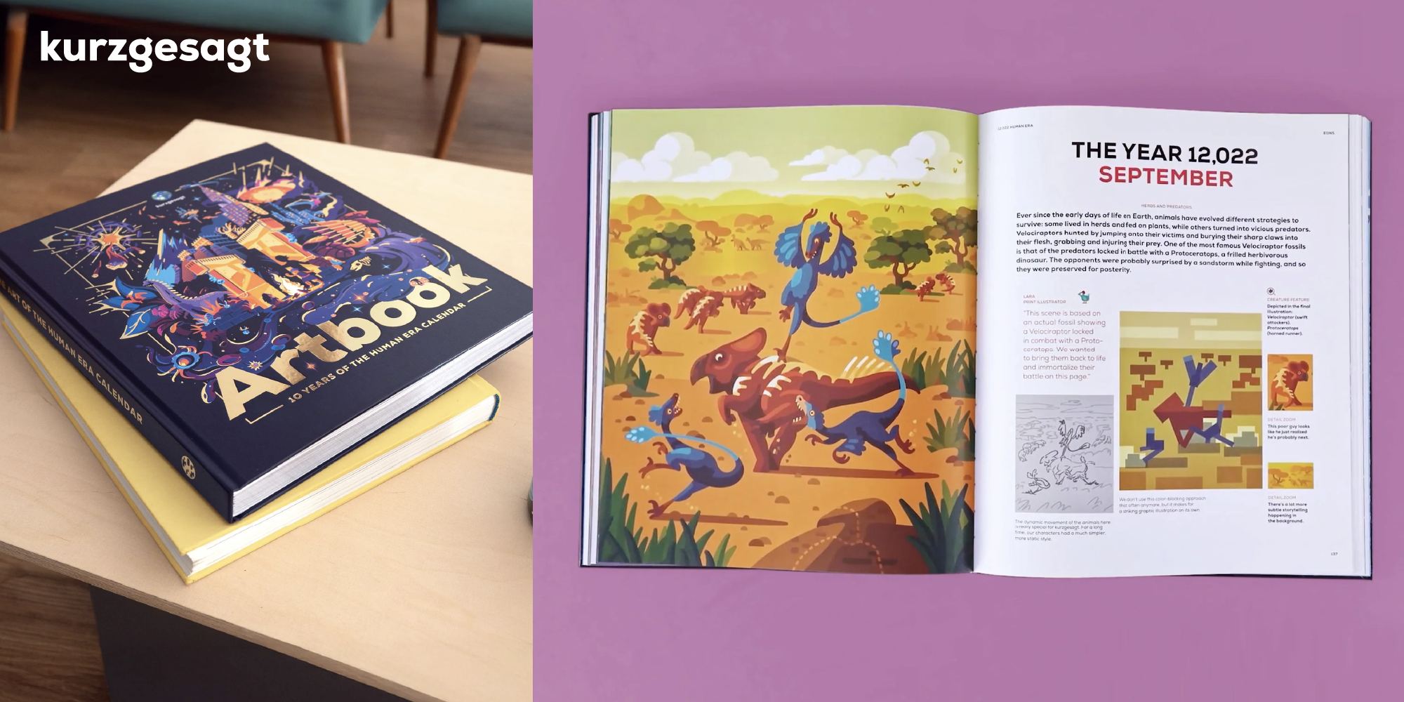
And when you’ve got an audience as big and devoted as Kursgesagt, you need a typeface that reflects both clarity and credibility — which is why the animation and design studio, and leading YouTube channel for science, humanity, and the future of the planet, chose Nexa Pro as their signature font, ensuring their message is as bold and engaging as the ideas (and animated educational content) they present.

Inspired to bring Nexa Pro into your latest project? Further information and licensing options can be found on the Fontfabric website.
Browse more of our editorials around type foundries and typefaces here.