For Fabian Dornhecker, a German communication designer, typeface designer, and founder of La Bolde Vita, the perfect font formula can be found in the world around him.
“I try to be attentive to my environment and see the systems in everything,” he tells us. While on holiday, for example, he spotted a large number on an aeroplane wing. It had been partially displaced by an underlying flap, resulting in an unusually distorted shape. “And I wondered whether this could be derived as a system for other numbers or letters,” he continues, believing that any arrangement, method, or inconsistency in any context can be inspiring.
By engaging with the world this way, Dornhecker finds plenty of doors to potential typefaces. Rather than rushing in, he reflects on the idea, trying out a quick sketch before deciding whether it is feasible to develop into a typeface or if it is “too boring or too absurd.”

Once something looks promising, “it quickly goes into a digital sketch phase,” Dornhecker notes, where initial concepts are developed through rapid prototyping – trying out a few glyphs or some styles. “And when a few sample words look good, I design the font in a basic character set.” A crucial testing ground, this is typically where potential challenges in production, from master variations to kerning peculiarities, become apparent.
The final phase, production, takes place over a longer period, sometimes punctuated by months-long breaks, which he finds a welcome respite. “A fresh and unbiased view of the project quickly reveals problems you were previously blind to.”
In addition to the usual methods and tools of proofing, a trusty project diary aids his work – a hub of decisions, problems, and solutions; it’s a practice that proves invaluable when working on designs that span months or even years. “But it’s also a great way of retracing roadblocks from old projects,” he adds.
Once everything has shaped up nicely, Dornhecker guarantees that his typefaces meet his list of criteria before release, no doubt ensuring that they’re not only technically mature and extensively tested but also align with their documented conceptual principles and, most importantly, evoke a sense of euphoria when viewed with fresh eyes after a few weeks’ distance. Emotional resonance is as crucial as technical perfection.

In his practice, he is careful to maintain a balance between experimentation and practical usability, ensuring that conceptual curiosity is not compromised. It’s a question that has occupied his thoughts for some time. “Many of the concepts that I like a lot would lead to very experimental and unusable results,” Dornhecker admits. Reflecting on his evolution as a typeface designer, “I now definitely take more time when developing ideas and in the design phase,” he says. And while his process is a lot more standardised now, he asserts that a decision based on gut feeling can lead to better or at least more interesting results: “I try to preserve this as much as possible and not approach everything rationally.”
It’s reflected in the foundry’s catalogue, which offers a diverse range of typefaces that balance functionality with flair and flavour, each with a unique origin story.
Zukunft, for example, resulted from merging elegant Didone shapes with a brutalist influence, resulting in a contemporary interpretation of the Didone style with distinctive decorative elements. Swono, meanwhile, has roots in hurried handwriting. A collection of various handwriting styles from solved crosswords are brought together in the classic crossword (mono) grid, with the possibility to change nuances for several key glyphs.

Residenz Grotesk, born from the idea of combining urban graffiti with constructed grotesque forms, perfectly exemplifies his philosophy. “First, I created a visual average for each letter from several sources,” he explains, “in the interplay with all the other letters, the distribution of several characteristics, such as the complexity of the structure or round versus sharp transitions, had to be harmonised.” In the end, however, the outcome was a somewhat vague compromise that failed to capture the essence of either reference. “After a bit of back and forth, abandoning and restarting, I came to the conclusion to offer both extremes in one font.”
It is a neutral and versatile workhorse at one end, leaning into the familiar standard forms of grotesque Swiss-style typography. At the other, it adopts the more expressive loops and angles of handwritten shapes and graffiti. A fully functional neo-grotesque, it can be transformed into the expressive display font, either selectively or completely, using the OpenType features. “This also corresponds much more to the inspiration in real life,” he points out, “where tags can often be seen in urban spaces alongside printed letters or signs with sans serif fonts.
Initially, these alternatives were integrated into an extra style – but in real-life use, it has been shown that you can achieve beautiful font mixes much more quickly if everything is available in one style via OpenType.”

However, a typeface occasionally calls for a more segmented and definite approach. Dornhecker separates his expansive serif Timez into the more traditional ‘normal’ and ‘display’ styles. The three sub-families, ‘Readable,’ ‘Casual,’ and ‘Strange,’ encompass the spectrum of usability – from bookishly robust to eye-catchingingly sharp and dramatic, all while sharing the same skeleton and technical parameters.
BHV also stands out as a pivotal project which shaped his philosophy on typeface creation. A family of oddities, BHV features unusual angular cuts and striking contrast between mechanical corners and flowing curves. What began as a simple (yet visually complex) modular font design flourished into something far more comprehensive: a complete family with multiple weights, accompanied by a serif variant, and a new text style for far easier reading. The process evolved significantly, with curiosity continuously propelling him forward. “The creation of BHV has shown me most clearly that it is important for me to see ideas and concepts through to the end.”
Since founding La Bolde Vita in 2019, he has carved out a unique space in the typography landscape. “I think there are enough commercial typefaces out there that follow the latest trends and don’t make a major contribution,” he notes. “On the other hand, there are more and more students and autodidacts with exciting approaches and a fresh spirit.” His foundry operates in what he describes as the “sparsely populated gap” between the two.
“I also work as a communication designer on the side,” he adds, allowing him to zoom out from the typographer lens and place fonts in projects himself or with his team. “Using your own font for real projects and in layout programs and not just in the font editor is incredibly valuable and can’t happen often enough.”

In addition to the feedback from designers to whom he’s sent sample versions of his fonts, he takes note of how other designers implement the typeface in real-world projects, aiding him in overcoming “design blindness.” It’s something he takes great delight in – seeing how his typefaces have been thoughtfully and creatively interpreted and applied in various contexts. However, three scenarios particularly stand out to him:
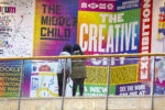
- When designers fully utilise a font’s capabilities – exemplified by the identity for Falmouth University’s MA Communication Design 2022 degree show, designed by Harry Boyd, which utilises Residenz Grotesk. A far cry from the often-subdued and conservative approach of other educational institutions, Boyd harnesses the typeface’s complete range of alternatives to deliver a playful and daring look, reflecting the course’s exploratory and provocative nature. “When the full “potential” of a font is used,” Dornhecker notes, “it’s a good feeling.”
- When the typeface becomes so integral to the design that all elements appear custom-made for each other – “I was particularly impressed by the branding for Amphico with the Zimula InkSpot,” he tells us. “Regarding feedback from the design community, this typeface surprised me the most,” Dornhecker reflects. “A geometric grotesque with the possibility of changing the size of ink traps and even reversing them into so-called InkSpots seemed almost too simple and obvious to me. But it was probably the right sweet spot between practical usability and something unusual in the right dosage.”
- When his fonts are used in projects related to topics or products he personally enjoys – like seeing Airo used as the logo font for German rapper OG Keemo, discovered while Dornhecker was listening to their new album.

Embracing opportunities to develop unique concepts and typefaces sustains his practice. After all, no one wants to be limited to offering crowd-pleasing fonts; exploring freely is vital: “I keep it that way,” he says, “one release for users, one for me.” And designing beyond marketable fonts is essential to creation. He tries not to take the marketing side of things too seriously, either. Like other designers, he creates standard promotional materials but also makes plenty of memes to poke fun at both his fonts and the industry.
His Black Friday newsletter, for instance, urged, “Stop buying all that useless stuff.” instead of sending out another promo code. Balancing time in this way – between commercially successful fonts, creative exploration, and having a bit of fun – keeps the motivation high.
While Dornhecker acknowledges his perfectionist tendencies – a trait often beneficial in type design – he’s learned to balance this with pragmatism. “You can very quickly get lost in the smallest details or less relevant things,” he admits. This realisation led him to embrace the motto “better done than perfect.” As he points out, publishing a typeface doesn’t mean the end of its development, “No one prevents you from correcting, improving or expanding an already published typeface.” But an unreleased one can’t benefit from real-world usage, designer feedback, or provide the motivation needed to keep improving.
“And, of course,” he adds, “‘perfect’ is also an extremely subjective attribute.
Thank you, Fabian, for your answers! Check out his foundry La Bolde Vita here.
Browse more type design and foundry editorials here.


