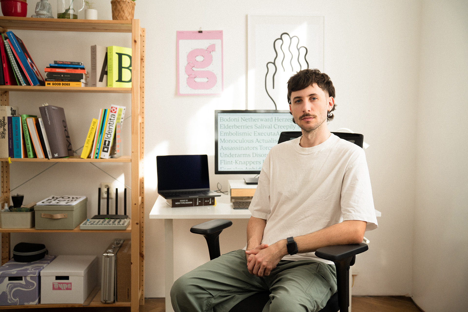
After a busy month filled with the hustle and bustle of Andrej Ševčík’s everyday life — “Starting new client work, finishing our new home, and handling tons of emails” — the founder of Narrow Type took a moment to talk with us about recent foundry updates.
Andrej Ševčík: A Creative Life
Czech type foundry Narrow Type may only be a few years old, but with over 37k followers and client collaborators such as Frontify, it’s been an immediate success – a reflection of Ševčík’s expertise, rooted in a lifetime of creative visual exploration. While typography wasn’t his first career goal, “I’ve loved type since I was a kid,” he tells us. “I remember doodling weird signs, entire alphabets, and later, graffiti sketches.”
Ševčík initially pursued his love of painting, studying art at the Faculty of Fine Arts while also studying at the Faculty of Education in Brno, Czech Republic. Here, a renewed passion for graphic design led him to start taking on a few gigs at uni. After graduation, Andrej wore many hats – artist, art teacher, and designer. He co-founded a graphic design studio, collaborating on diverse projects that often pulled him back toward the magic of typography. A side project selling graphic assets marked the next phase. It was here, after immersing himself in online tutorials and design books, that Andrej tackled what seemed impossible: designing his own typeface.
The process was challenging — “sometimes painful, sometimes fun” — but he cherished every moment. “Creating your own alphabet and typing your first words with it felt magical (and still does),” he recalls. “That first serif took me ages to finish, but I did it, and to my surprise, it became a bestseller.” He admits that while now, “I kind of hate that font and it’s not available any more,” people at the time loved it, “which was extremely motivating. It kickstarted my type design journey.”
As one typeface design led to another, the designer realised he was hooked. Around that time, he founded the foundry and launched the Instagram account. Andrej gradually focused more on type design, eventually launching his own shop and newsletter while collaborating with an international array of creatives. “What began as a fun side project slowly became a serious foundry.”
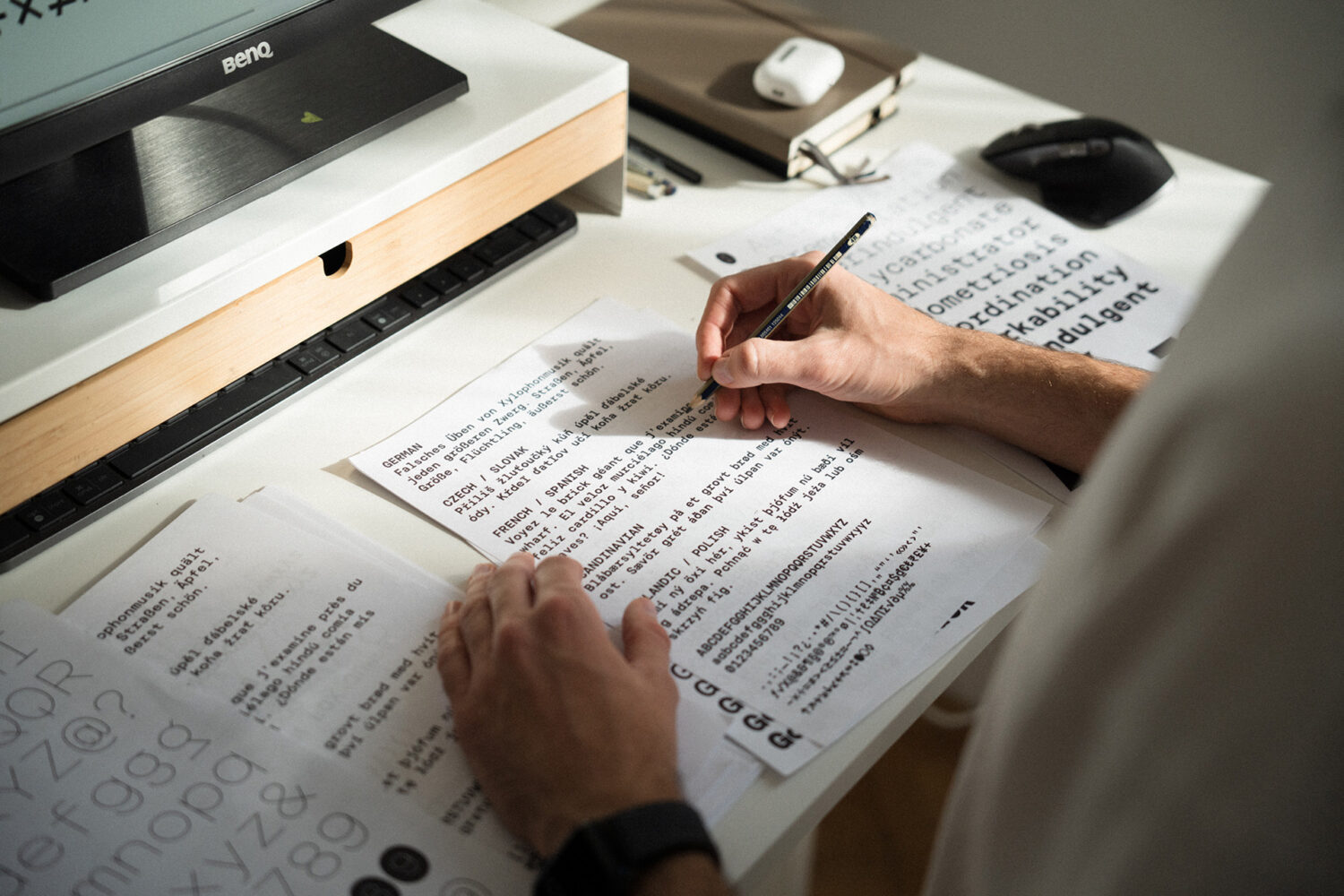
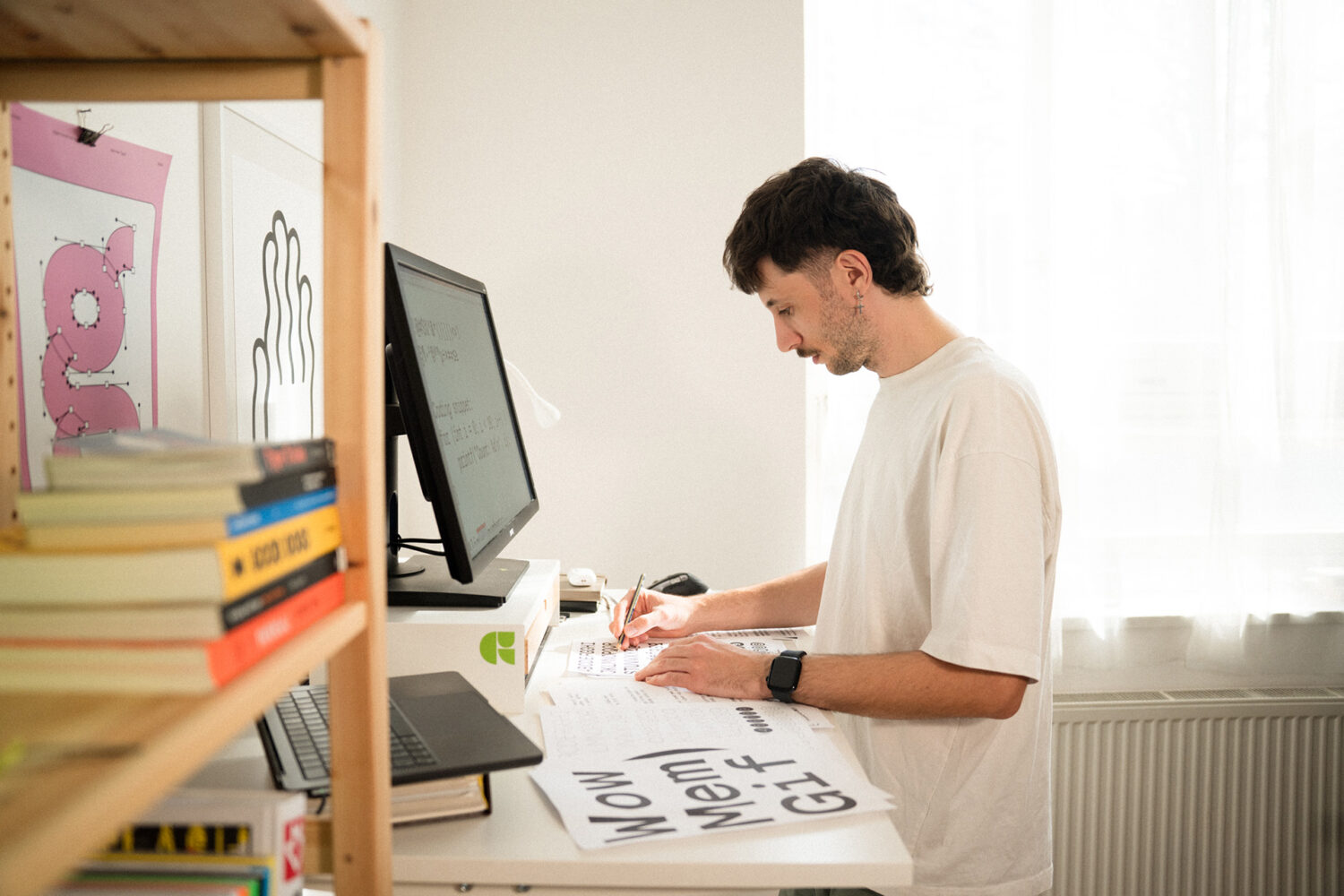
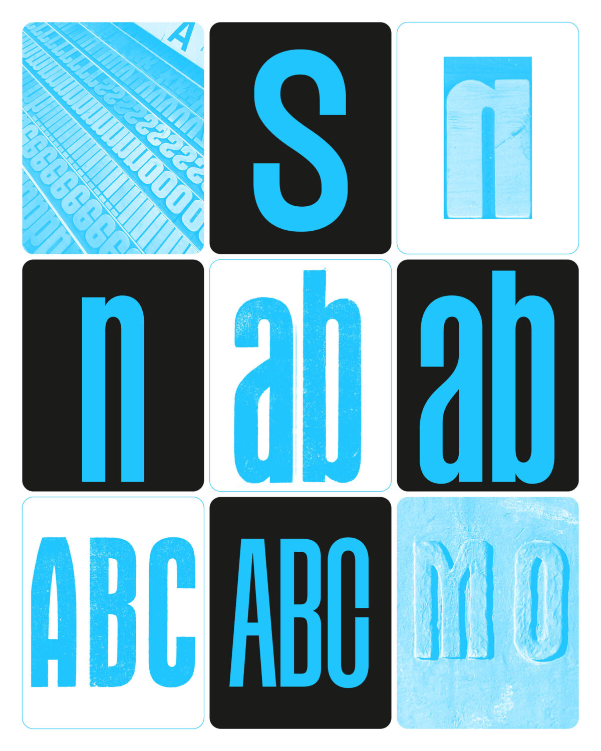
Ševčík’s background as an artist undoubtedly influences his process — from using his drawing skills, as he notes, “sketching ideas on paper is still an important part of my process,” to his understanding of each glyph. “For me, the visual aspect of type is very important,” he says. “I think about each letter as an object; every glyph has to be balanced and beautiful on its own. But of course, the entire set also has to work together as one consistent system, and that’s probably the toughest part of type design.”
He also enjoys considering typefaces as having individual personalities and characters, so each font is presented in colour and context, showcasing their unique qualities and encouraging designers to explore their expressive possibilities. After all, it’s what makes Narrow Type, Narrow Type; “Contemporary Fonts with Personality.”
Goga Mono and Magnete Sans
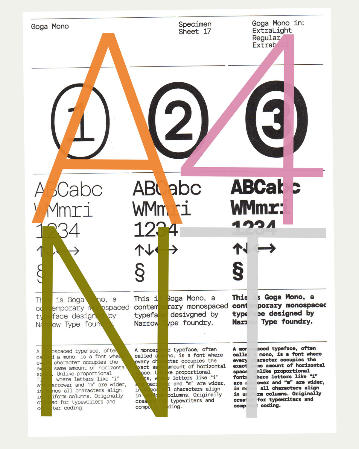
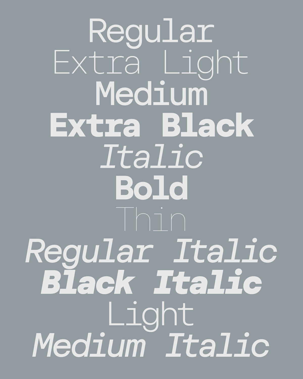
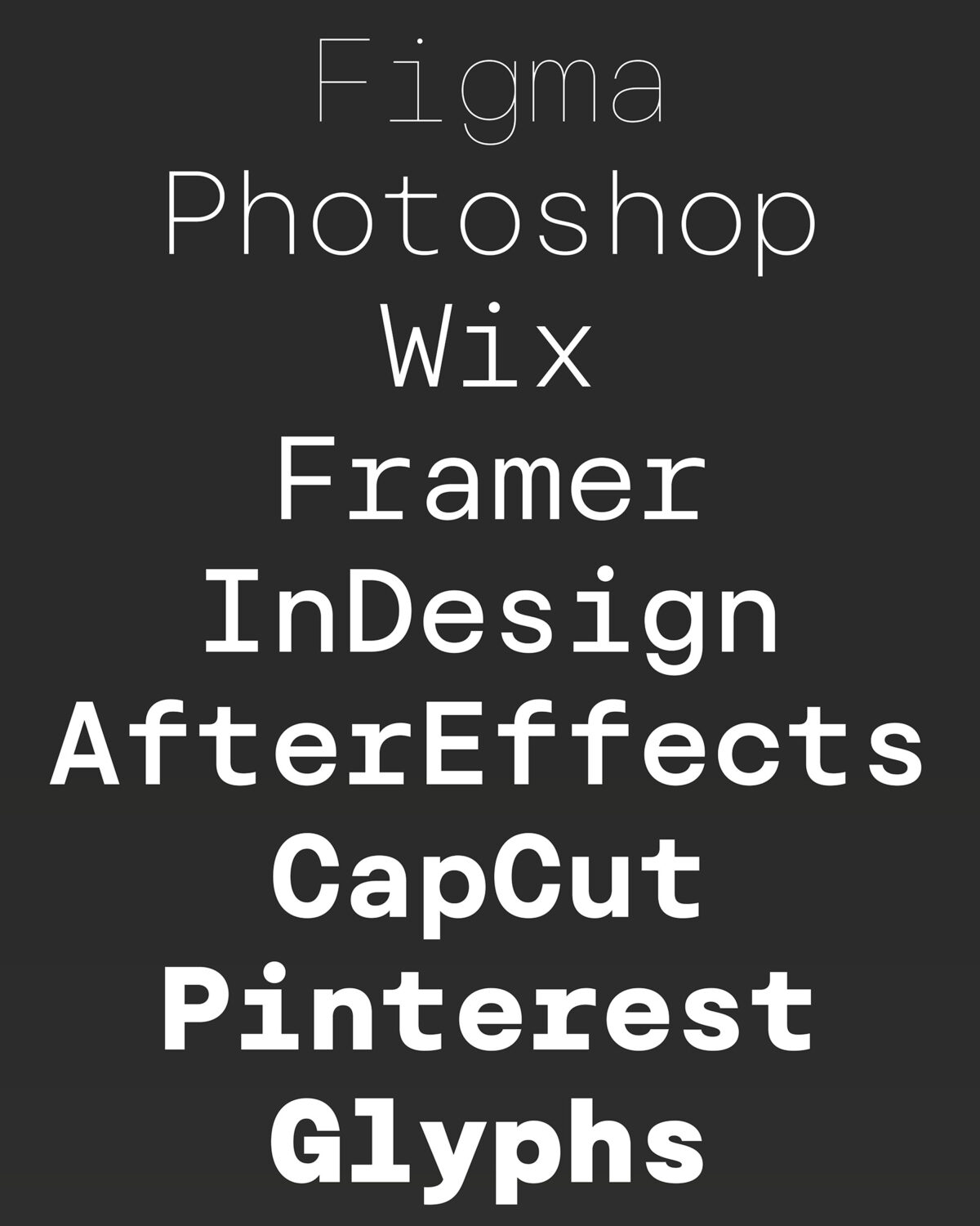
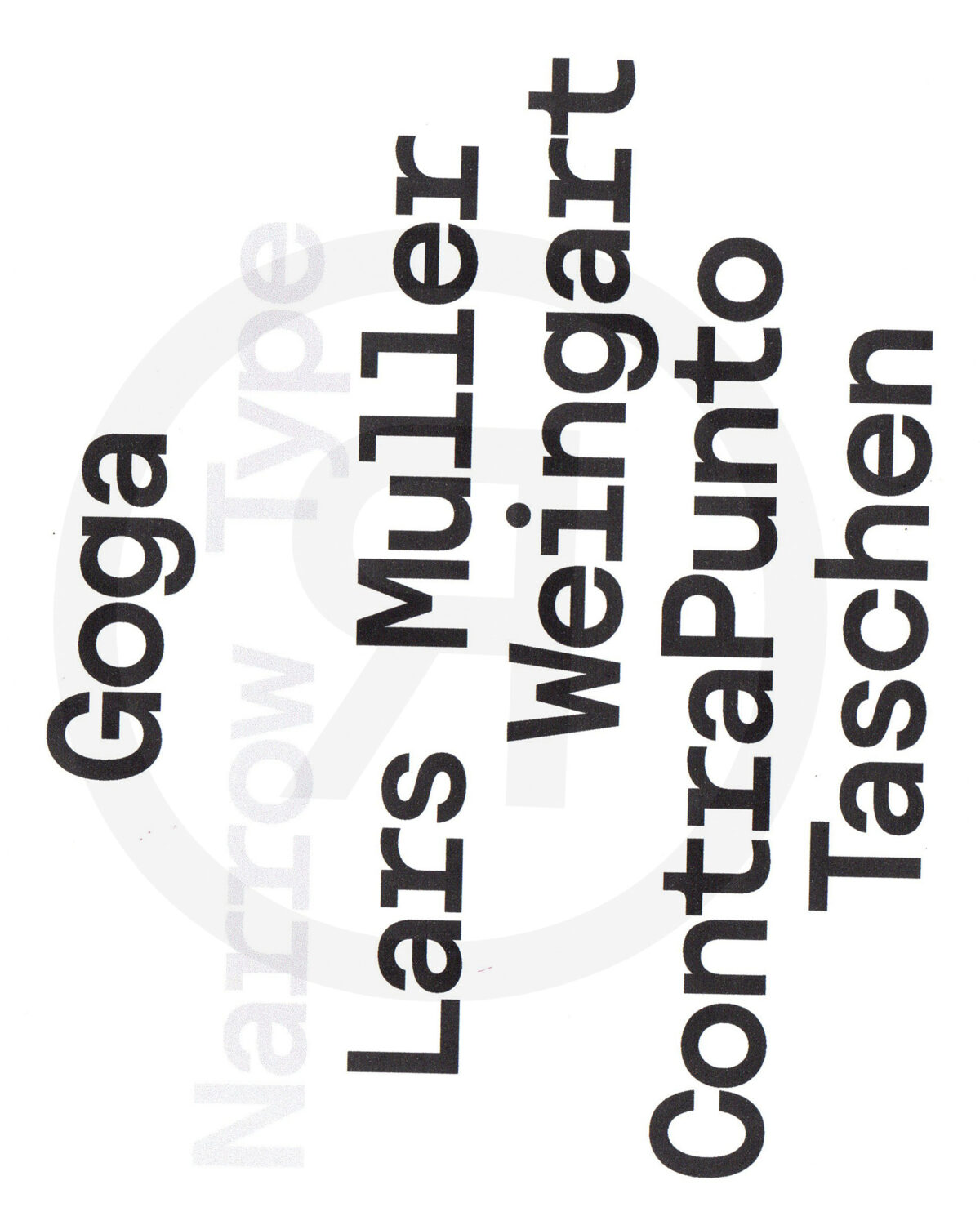
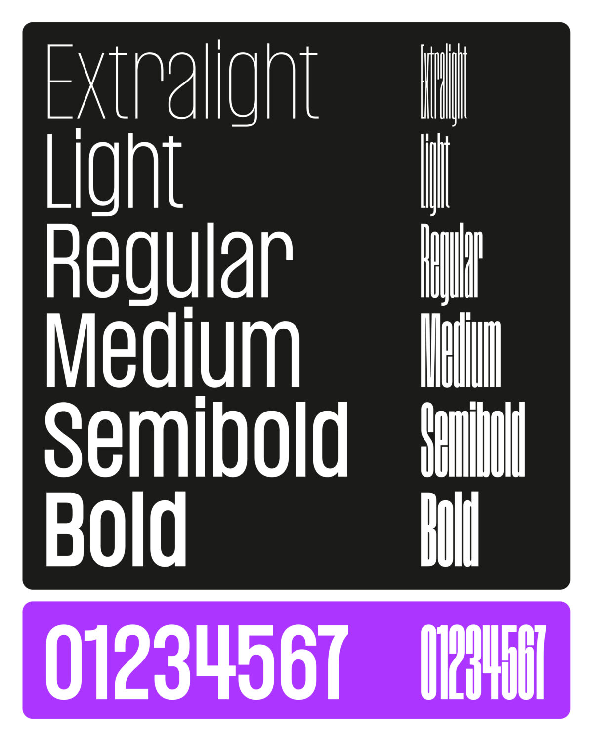
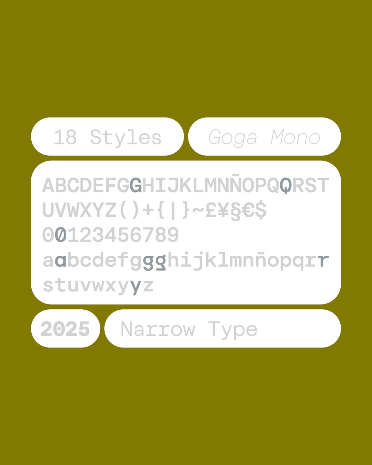
This year, one of Narrow Type’s standout releases is Goga Mono, the foundry’s debut monospaced typeface. As Ševčík’s first mono, it required him to learn many new things — “and that’s something I love about trying new challenges,” he tells us. “The hardest challenge was balancing dense letters like M and W so they wouldn’t look too heavy, and finding the right overall width so Goga Mono feels balanced across all weights. In the end, 630 units turned out to be the sweet spot.”
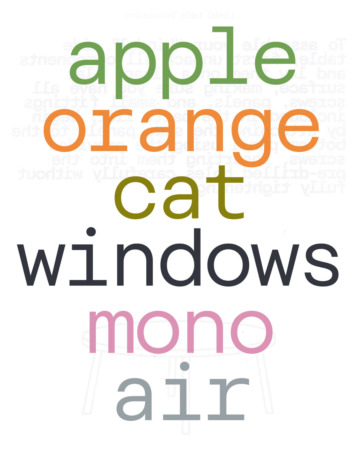
The mono shares the warm personality of the Goga family – characterised by its blend of geometric and neo-grotesque styles – making it a more versatile choice than other monos which lean into techy aesthetics.
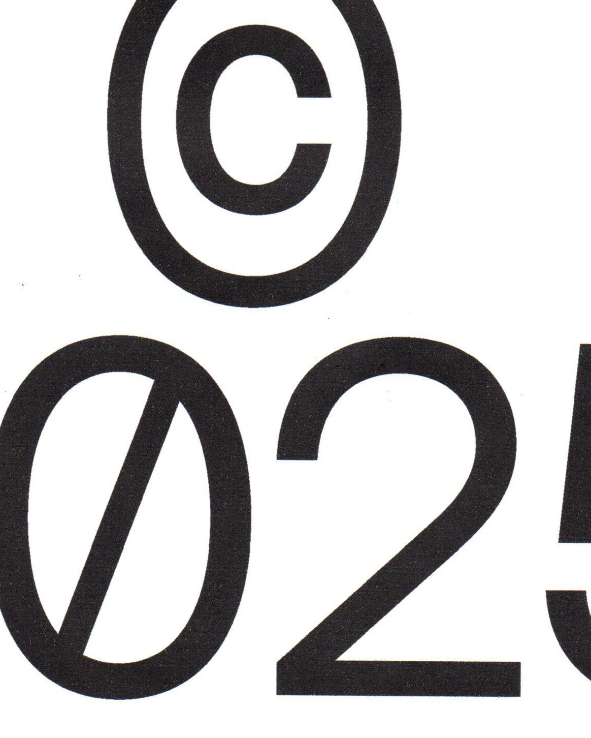
Ševčík’s favourite details include typical mono glyphs such as the condensed W or m and the wide barred i or r. “I also like the two options for the zero,” he adds, referring to both the dotted and a slashed version. As a family, Goga Mono comes in 18 styles from thin to black plus italics, which, Ševčík notes, gives designers a great range of options.
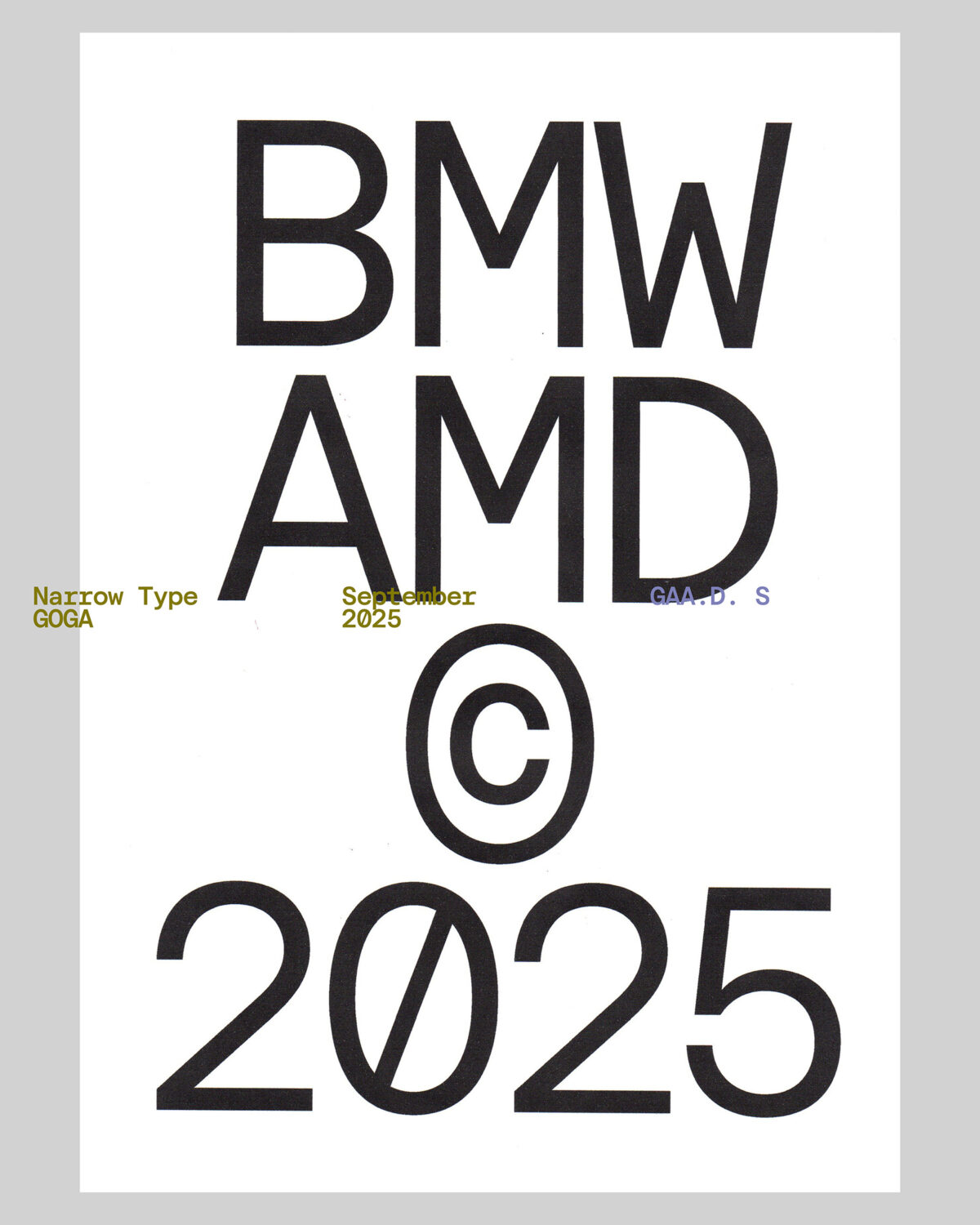
“What I love most is how Goga Mono feels natural in both code and design-driven contexts. We collaborated with Jaime Garcia from GAA Design Studio on the visual campaign, which turned out beautifully.”
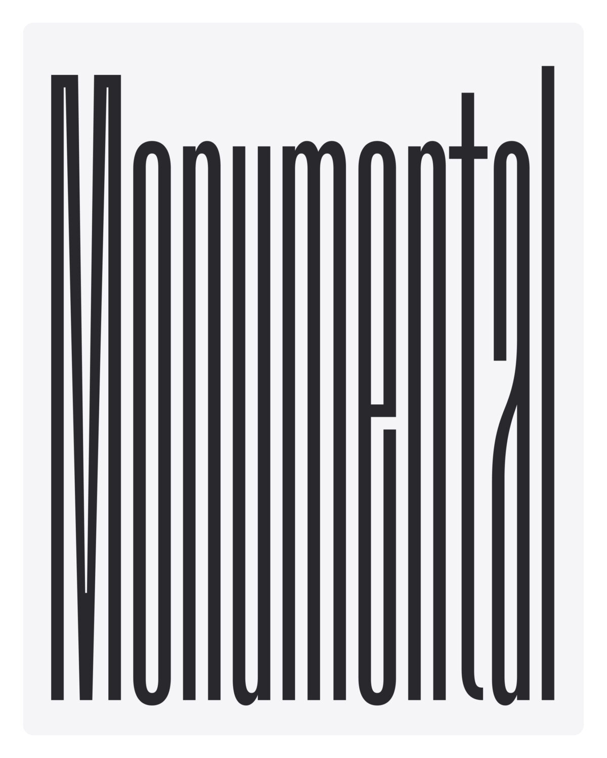
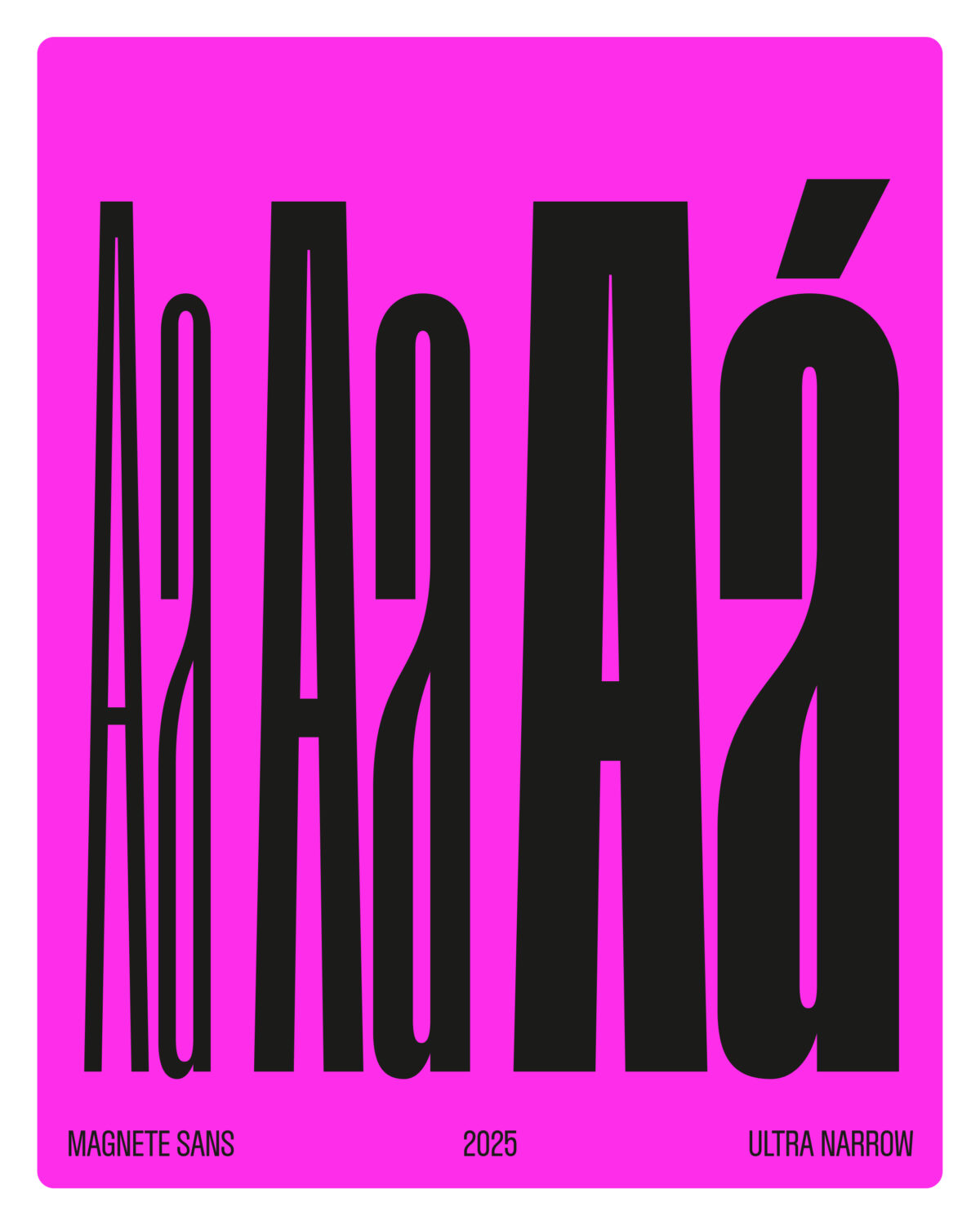
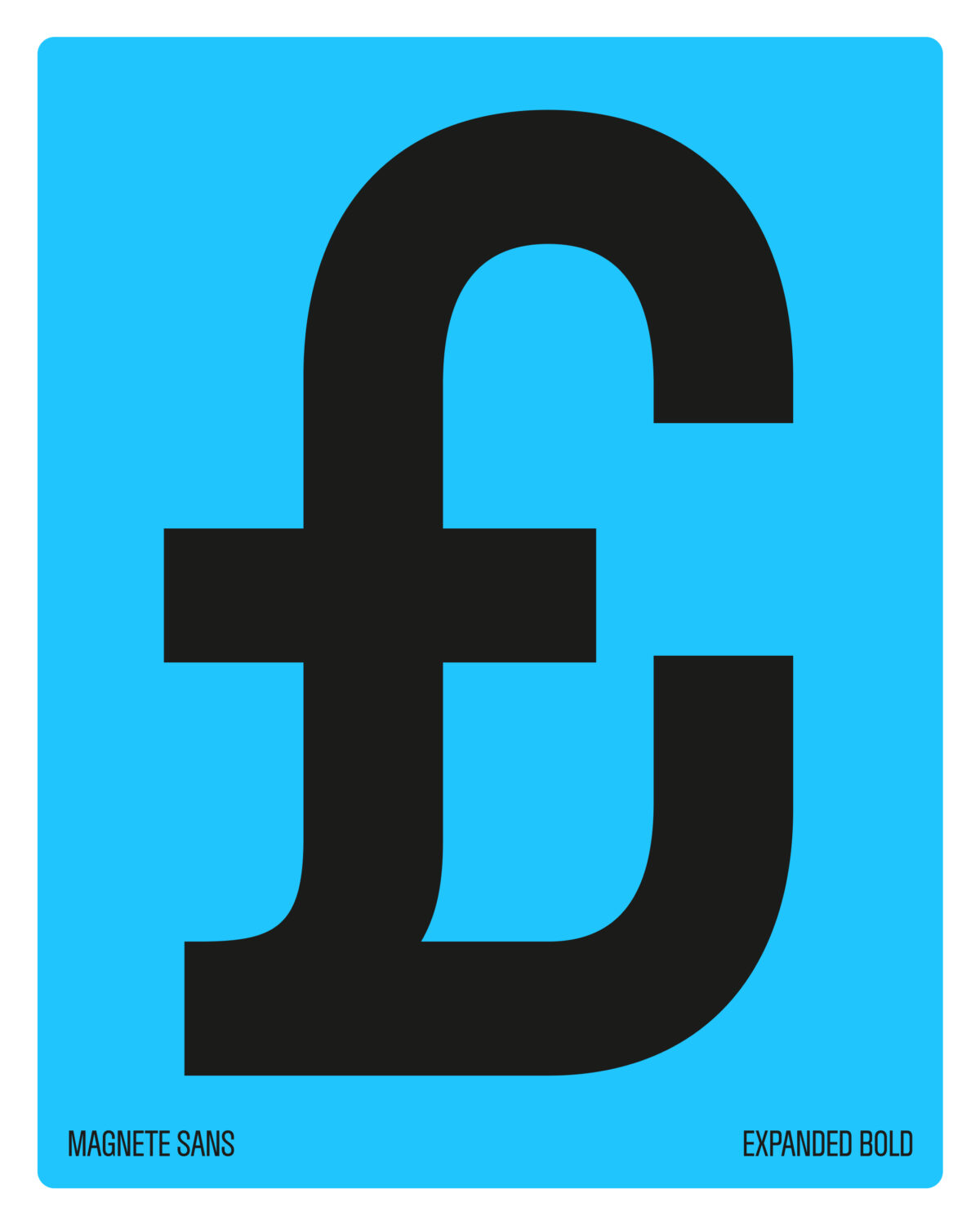
Other new additions to Narrow Type’s lineup include Magnete Sans, a condensed grotesque designed by Fabrizio Falcone, “a talented Italian type designer.” The pair began collaborating about a year ago, with Ševčík providing support with the final stages and mastering. “The process was quite long because of the complexity of condensed typefaces,” he recalls. “We also added new masters for smoother interpolation — instead of four, we ended up with six. There was a lot of work on this one!”
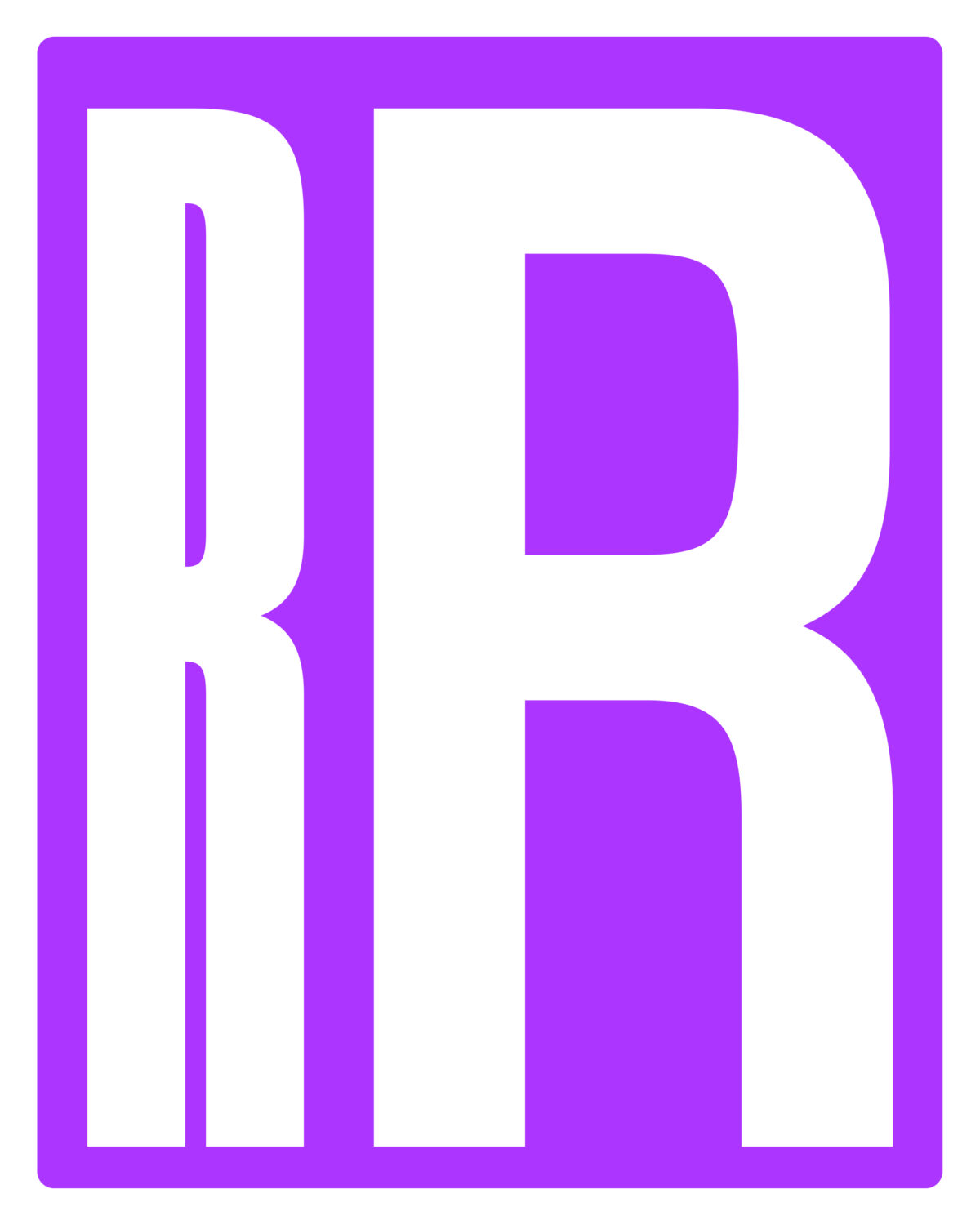
Magnete Sans draws inspiration from 20th-century display, condensed grotesques such as Aurora or Inserat Grotesk. “Over the decades,” Ševčík explains, “these grotesques evolved — some had curved diagonals (in letters like k, v, w, x, y, A, K, M, N, V, W, X, Y), others had straight ones. Some used vertical legs on the R, others angled.” Magnete Sans captures all the quirks and variations that make historical grotesques so distinctive “The result is a contemporary condensed grotesque featuring 24 styles in four different widths, plus a bunch of stylistic alternates.”
Community, Process, and Balance
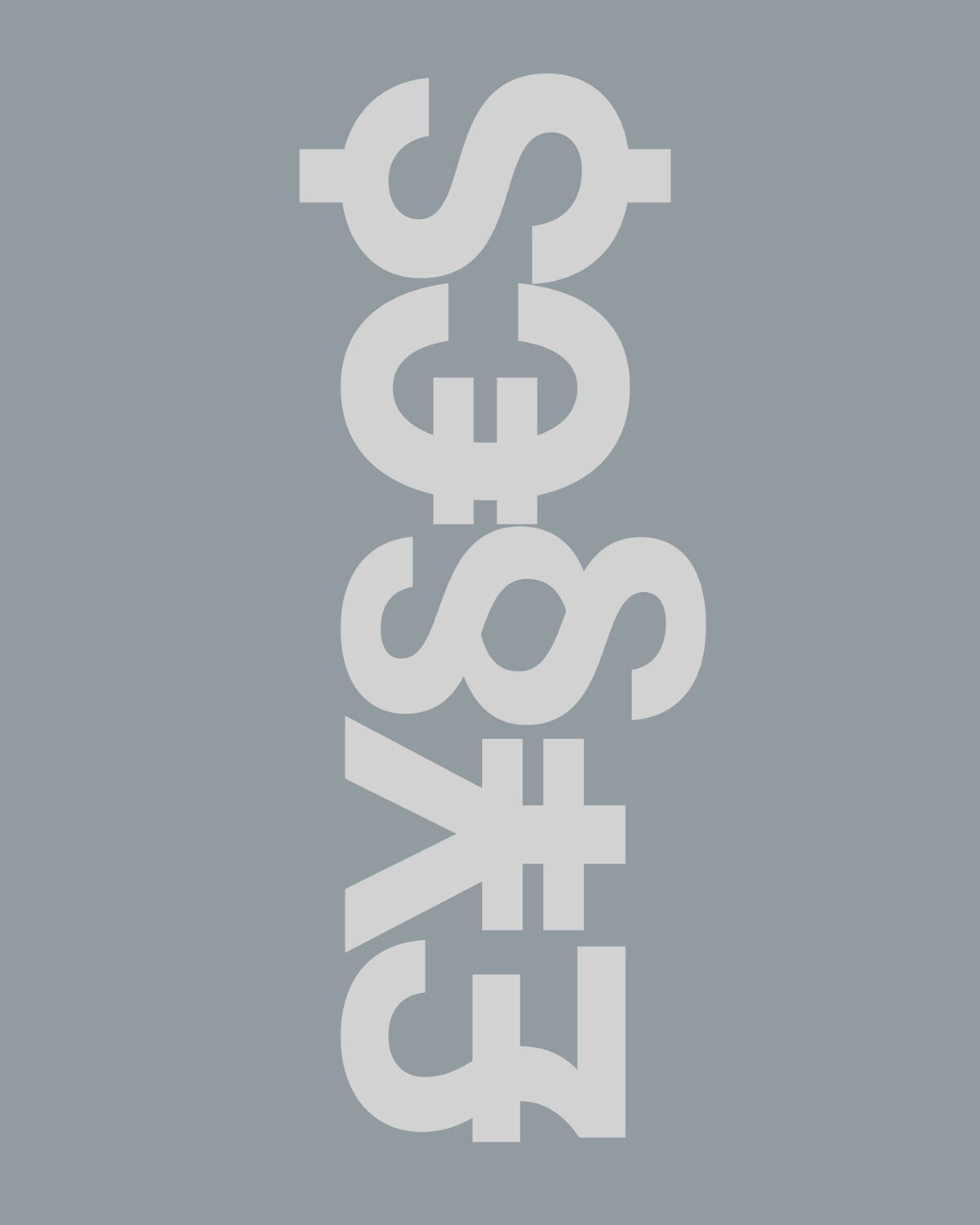
Beyond typefaces, Narrow Type is renowned for its behind-the-scenes content, sharing video reels of his design and sketching process on Instagram – from day-in-the-life summaries of Ševčík’s day to the all-too-relatable woes of getting the curves of an ‘S’ just right. Sharing this insight to his craft, he says, happened very naturally. “When I started our Instagram account about four years ago, static posts were already losing reach and Reels were being pushed a lot,” he notes. “I began making short videos of myself designing or sketching letters because I thought people who don’t know how typefaces are made might find it interesting. And they did – those reels performed really well and brought in a lot of new followers.”
Balancing creativity and life is a central theme in Ševčík’s videos, as for many multi-faceted creatives. Early in his career, he grappled with overwork and disorder until burnout forced him to reassess his priorities. “When I started freelancing after graduation, it was pure chaos,” he says. “I worked all day, didn’t move much, and had no structure at all. I was working a lot, but far from effectively. Then I discovered a book called The End of Procrastination, and that’s when I started thinking about to-do lists, time blocking, and the importance of breaks.”
This gradual journey from chaos to order is ongoing. As he explains, balance is crucial:
“Even though I love my work, I don’t want to spend my whole life working. I want to be with my family, have time for hobbies, and spend time in nature – I really need that. And I definitely don’t want to go through another burnout, haha.”
To find a good balance between retail font design, client work, content creation, and family time, planning remains fluid – a few days reserved for retail fonts, some for client work, and at least one for content creation, augmented by the use of Notion for long-term project tracking. Ševčík’s personal workflow is not rigid, but adaptive, shaped by the cycles of inspiration and ongoing projects.
A Year of Growth: Looking Back and Ahead
Approaching the end of the year, we asked Ševčík which Narrow Type project he’s been particularly proud of. “Probably the customisation of our typeface Azurio for Frontify’s rebranding,” he responds. “They were looking for a typeface that merges technological precision with human warmth, which we achieved by softening some letters and punctuation while keeping Azurio’s sharp, precise character. I love the result.”
As for current progress, Ševčík teases a particularly exciting project for an “amazing” client. “I can’t share details yet, but it’s going to be great,” he notes. “We’re also working on an ambitious new release – a complementary sans and serif family. Both typefaces share similar details and features, so they’ll pair perfectly together. It’ll be a versatile workhorse duo. There’s still a lot to do, but we aim to release it in the second quarter of next year. And, as always, there are plenty of other works in progress, we’ll see which one comes out first!”
Returning to the theme of balance, Ševčík admits that he sometimes misses the tactile joys of painting and working with physical mediums – an experience he’s eager to embrace once again. “I’m also really excited about our new home,” he shares, “where we’ll have a shared studio – my partner will make pottery there, and I’ll finally get back to painting.” As 2026 approaches, there is an exciting shift in Narrow Type and Ševčík’s development. Ultimately, it’s this interplay of art, collaboration, and passion that drives him and shapes the exciting projects on the horizon.
Enjoyed this piece? Read more of our type foundry editorials here.