

Cheng Peng (@frpengcheng) is a Graphic Designer and Illustrator based in Paris. Draw in by the designer’s vibrant use of colour and bold, dynamic compositions, we got in touch to chat about the recent typographic poster series, <Everywhere There Are Kids>.
Hello! Can you introduce yourself as a creative in your own words, explaining your outlook/ethos as a designer, what it is you do/focus on, and what is going on for you currently?
As a creative person or graphic designer, I solve problems by visual methods. Besides visual attraction, I also hope to show my own attitude in my works. Recently I joined a new design team which has some public service projects that I am very interested in, and now my work is focusing on exploring how to use aesthetics to make people think about social welfare.
Can you run me over how the <Everywhere there are kids> project came about? Where did it begin? What were your aims and hopes for it?
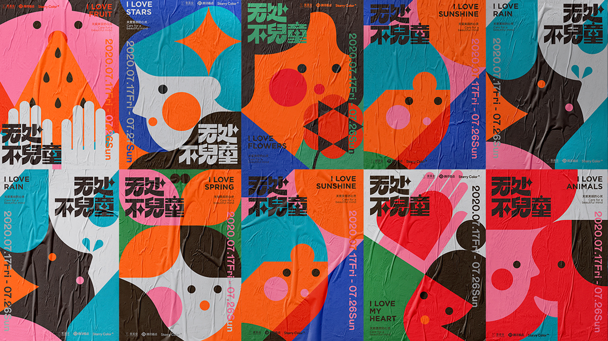
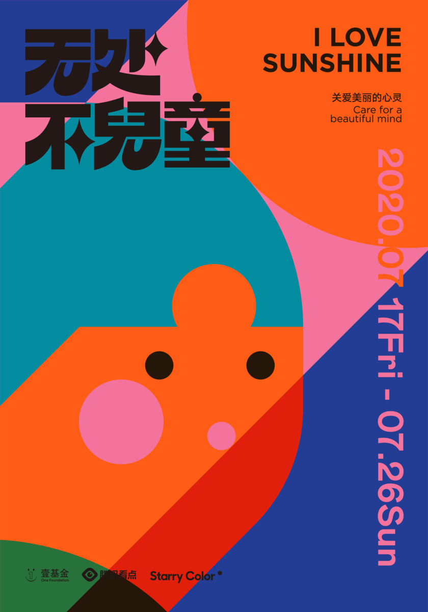
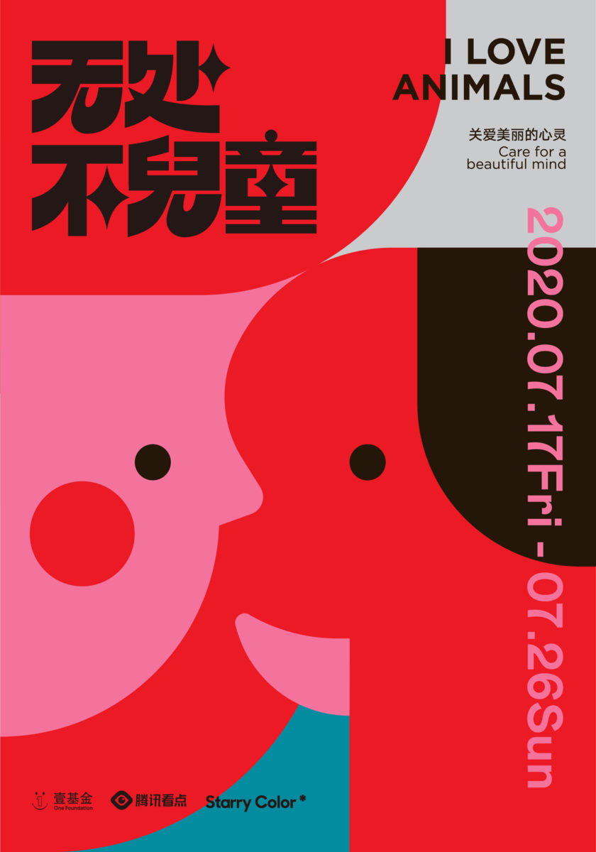
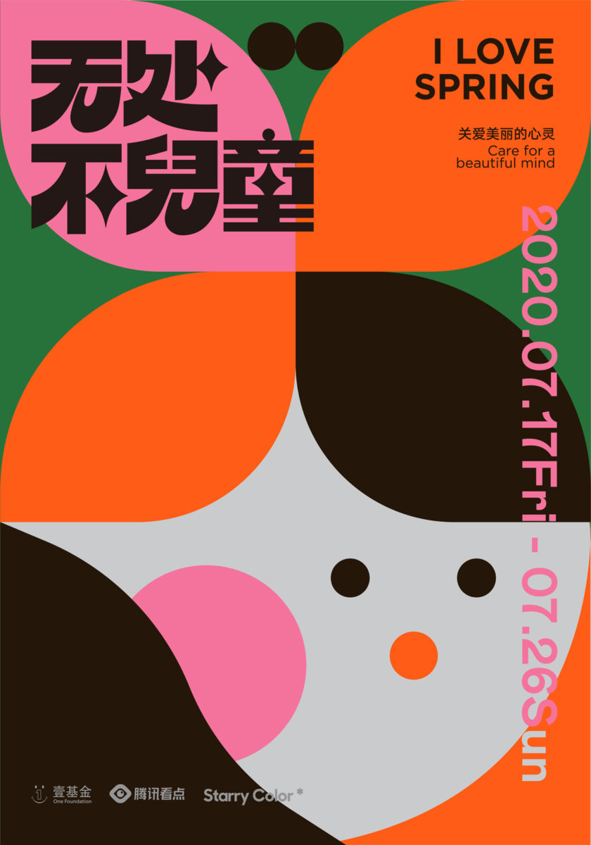
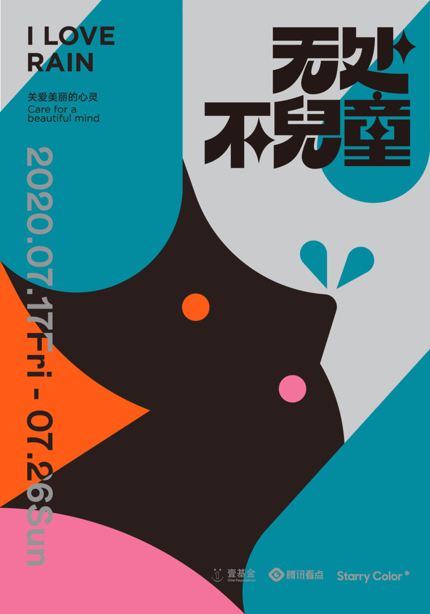
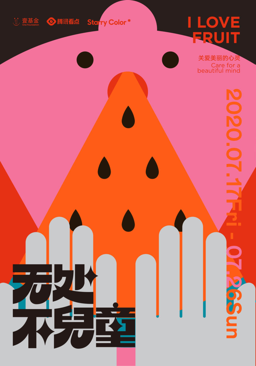
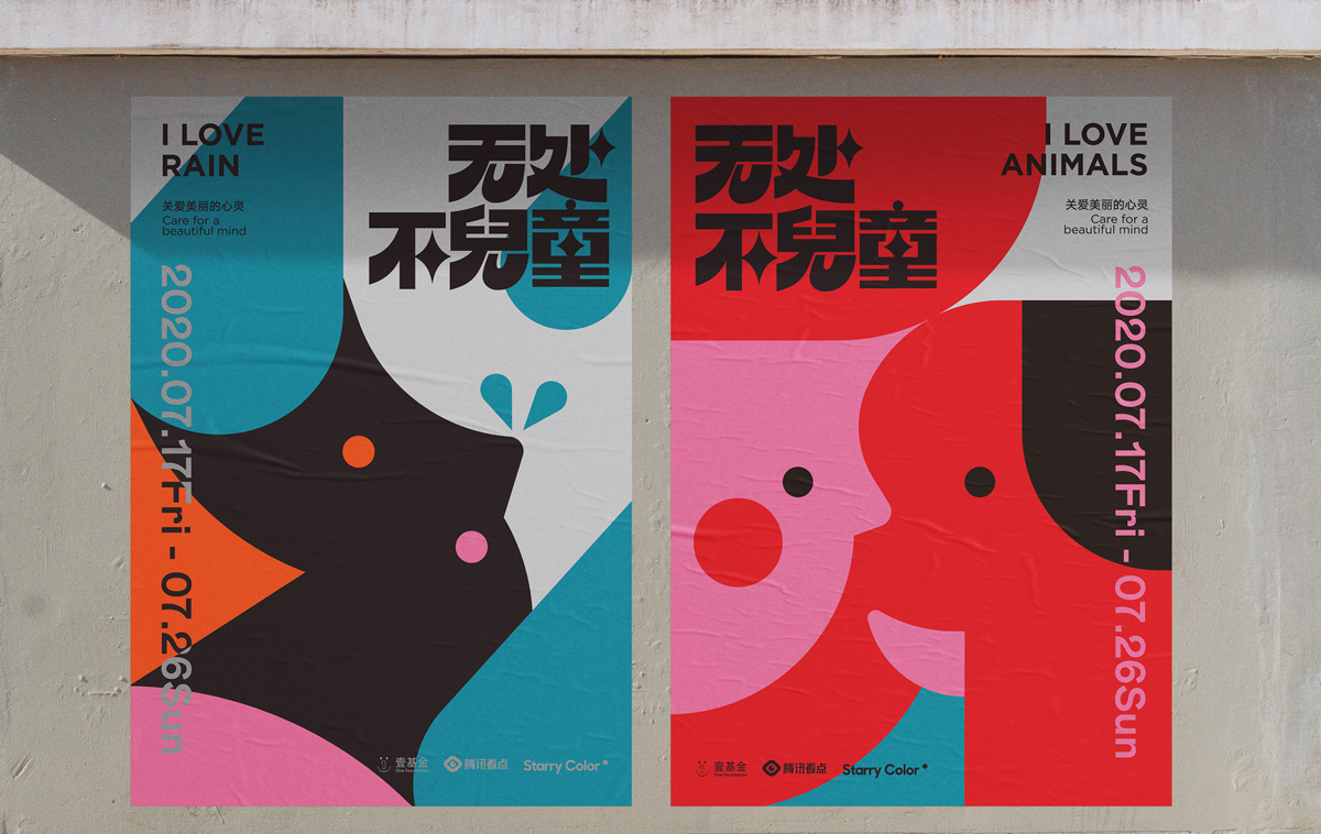
I created these posters as part of an event for autistic children organised by Tencent Viewpoint and One Foundation. More than 70 artists were invited to participate in the exhibition, and 27 shops were invited to put posters welcoming autistic children in their shop windows. This campaign is to encourage more people and stores in our city to accept and welcome children with autism.
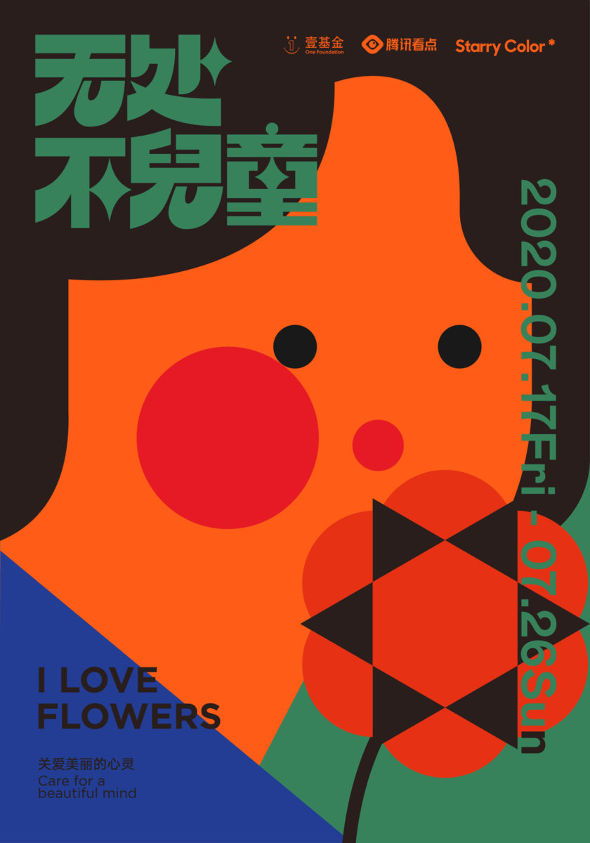
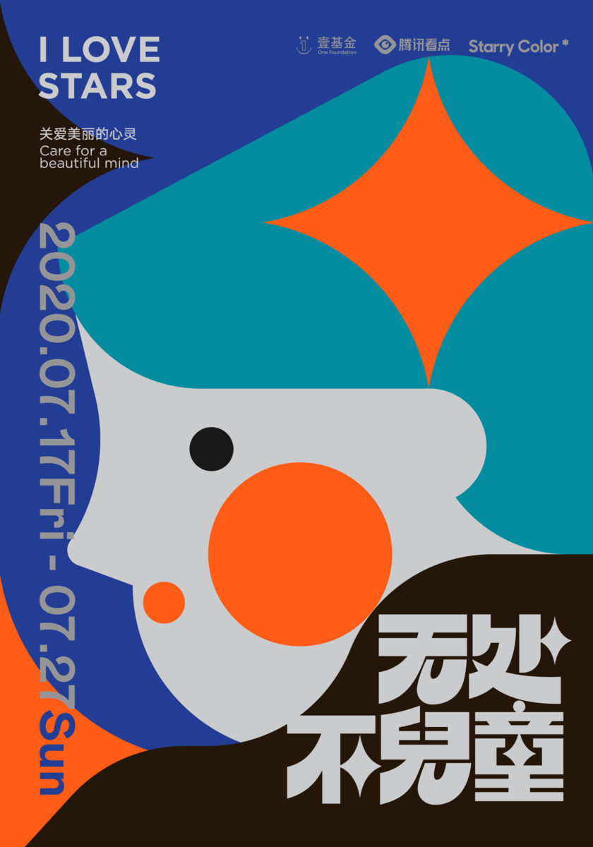
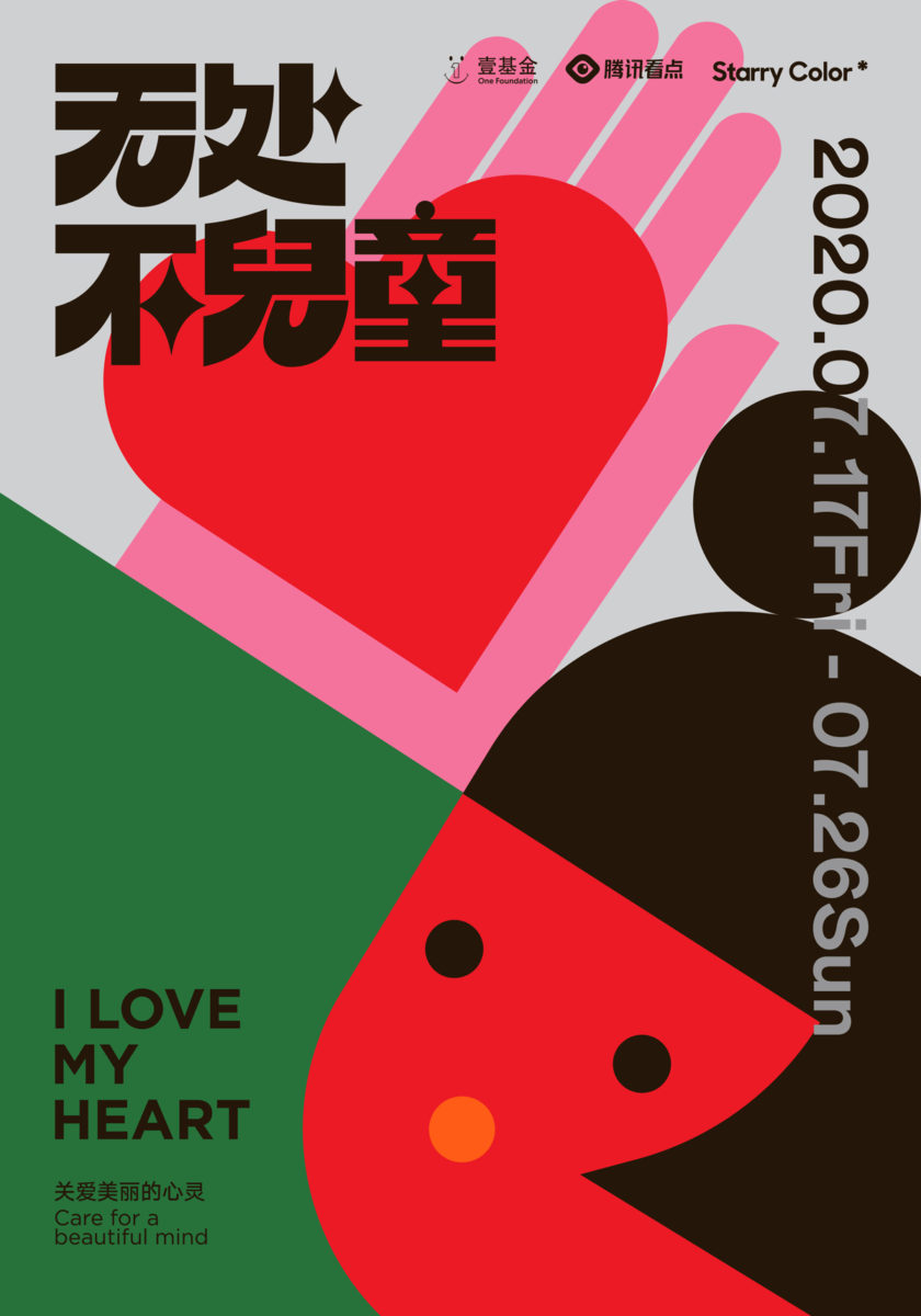
I made a series of posters on the theme “Caring for Beautiful Minds.” Autistic children are just as curious about the world as any other children, they love animals and plants, sunshine and rain. I hope these posters will call on society to understand their beautiful minds without labels.
What was your experience of developing the concept for the work and translating this concept visually?
Before doing this project, I watched some documentaries about autistic children, and after getting to know them, my first impression was that they are just like any other children; curious about the world, full of kindness, kindness, and kindness. So I wanted to emphasise in this series that “autistic children are full of curiosity and love for the world” with the words “I like…” as the slogan for the series of posters, and then I’ll visualise them.
I used simple geometric shapes to represent sunlight, flowers, rainwater, animals, fruits and children. I hope that these simple shapes can represent the pure essence of children, and that society can also see the pure essence of autistic children and their beautiful minds.
How was the technical process of designing the posters? What materials/software/processes did you use? Did any particular moments stand out as the most exciting or the most challenging?
I used Adobe Illustrator to draw these vector graphics, I was personally very interested in dividing up the graphics, working with the colours, and exploring the balance and harmony of the graphics and colours together — this was the most exciting and challenging part of the project.
Can you give me some details on the posters/typography?
First of all I emphasised the contrast between the thickness of the strokes in the font because it’s more dynamic. I replaced some of the strokes with star elements without interfering with the reading, and since we call autistic children “children from the stars”, I wanted to emphasise this concept in the type design.
How do you personally view type as part of your graphic design practice? How important is it to you + what inspires you about type/typography?
I think types are a part of graphic design; they convey mood and character and they’re a very important. I love Chinese typography from the 60’s – 80’s and I wanted to incorporate some new styles to bring those beautiful fonts back to the public. I hope people will have fresh feelings about Chinese old type through my works.
What are your future ambitions in design?
I will continue to explore graphic forms, including typography of course, I want to see more graphic possibilities and whether my personal style can serve as a link between my work and the public, provoking them to think about social issues.
Thanks, Cheng! To see more, check out Cheng’s Instagram and Behance.


