Have you ever dreamed of a typeface inspired by a pine tree? Or imagined a typographic system with the magic ability to gender-neutralize Romance languages such as French or German despite their timeworn masculine/feminine grammatical structures? Dream no more—your typeface has arrived.
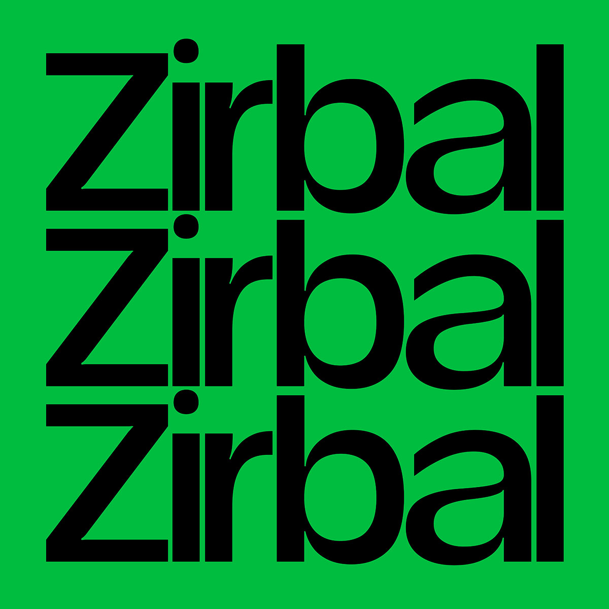
T1 Zirbal, a new sans serif display and headline font from T1 Foundry by TYPE01, takes its name from the Zirbel, or Swiss stone pine, a white pine found at high altitudes in Central Europe’s Alps and the Carpathian Mountains. These hardy trees can endure temperatures of -50℉, live up to 1000 years, and their overall sturdiness made them suitable as a symbol for the Roman legion in 15 BC (whose military field insignia featured the Swiss pine cone). They provide useful resources too, providing pine nuts, flavouring for the alcoholic beverage Zirbenschnaps, and wood for decorative Tyrolean carvings ever since the 17th century.
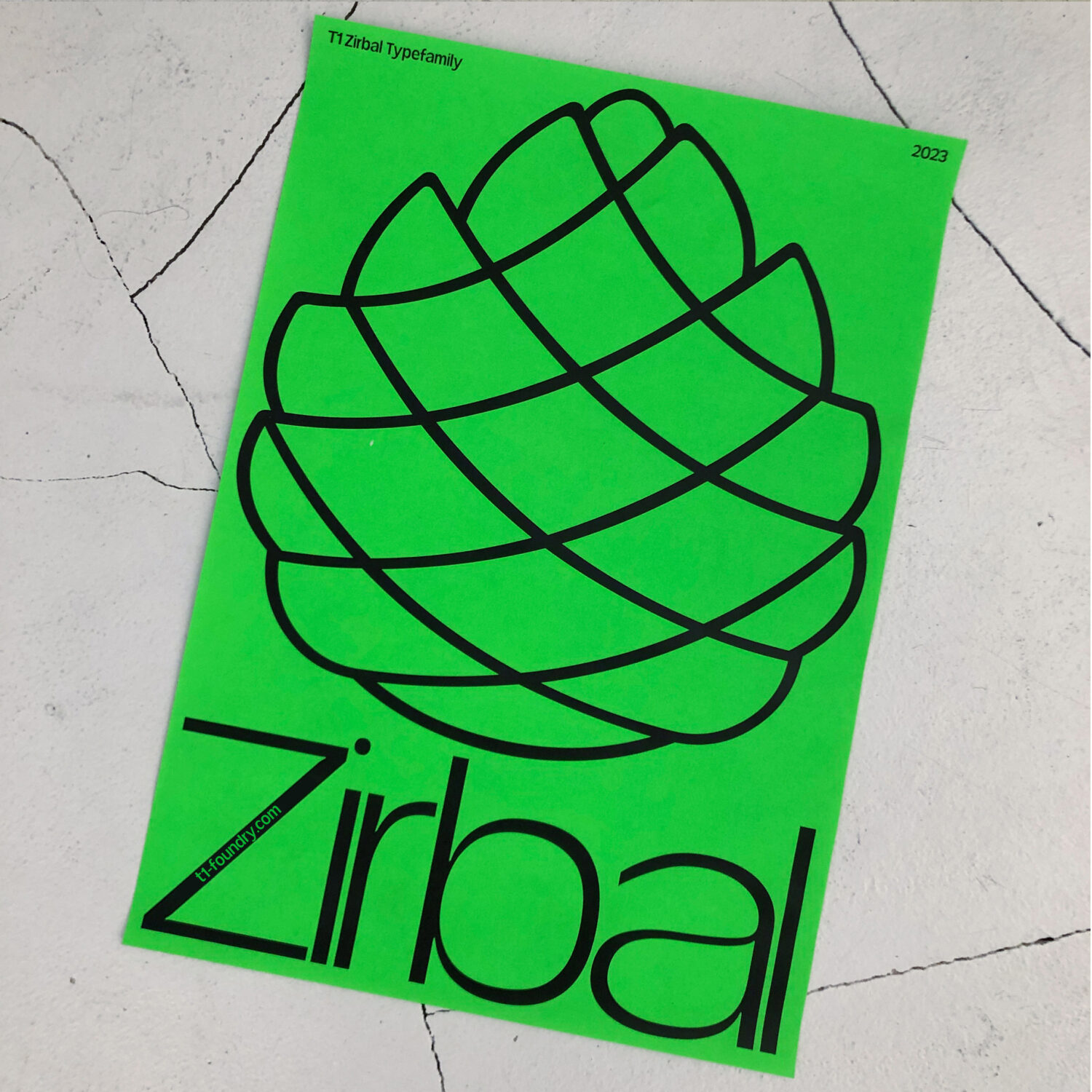
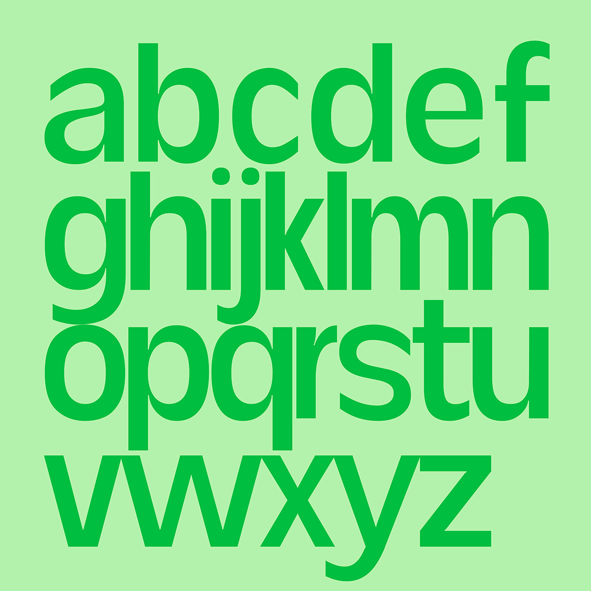
T1 Zirbal’s creator Daniel Stuhlpfarrer (@daniel_stuhlpfarrer) is an Austrian-born typeface designer who grew up in Styria, also known as Zirbenland (“the land of the Swiss stone pine”). During a recent trip home from Berlin where he now resides, Stuhlpfarrer began sketching out a typeface inspired by the trees he knows so well. “I was traveling home during the spring, excited to be going back to the mountains,” he says. “To pass the time on the train I started sketching out letters, and quickly had the idea of a chunky round typeface that was also somewhat sharp, like the Zirbel pine cone’s notches.”
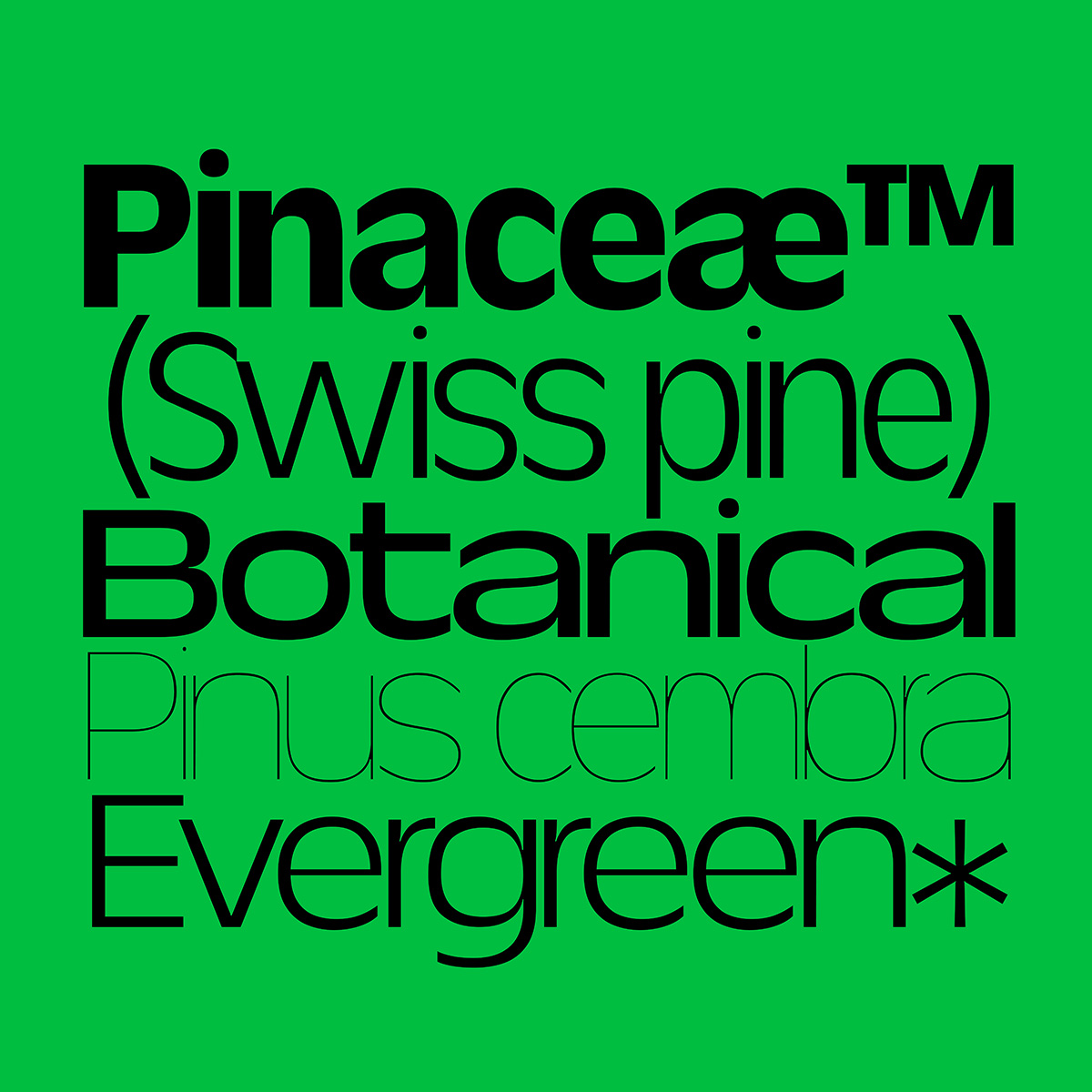
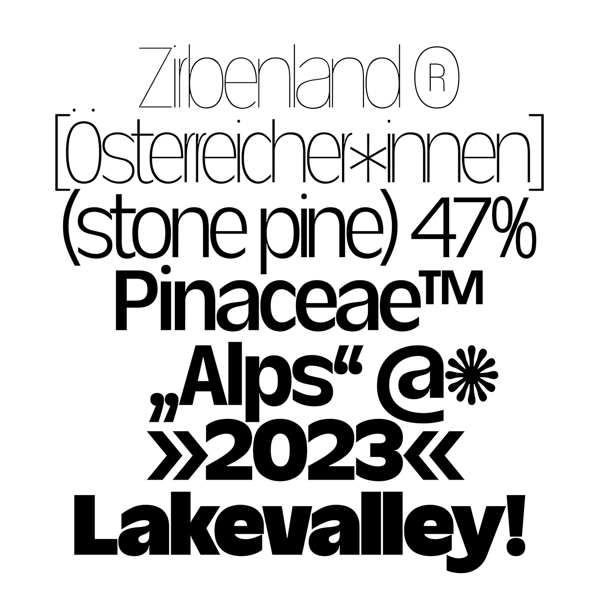
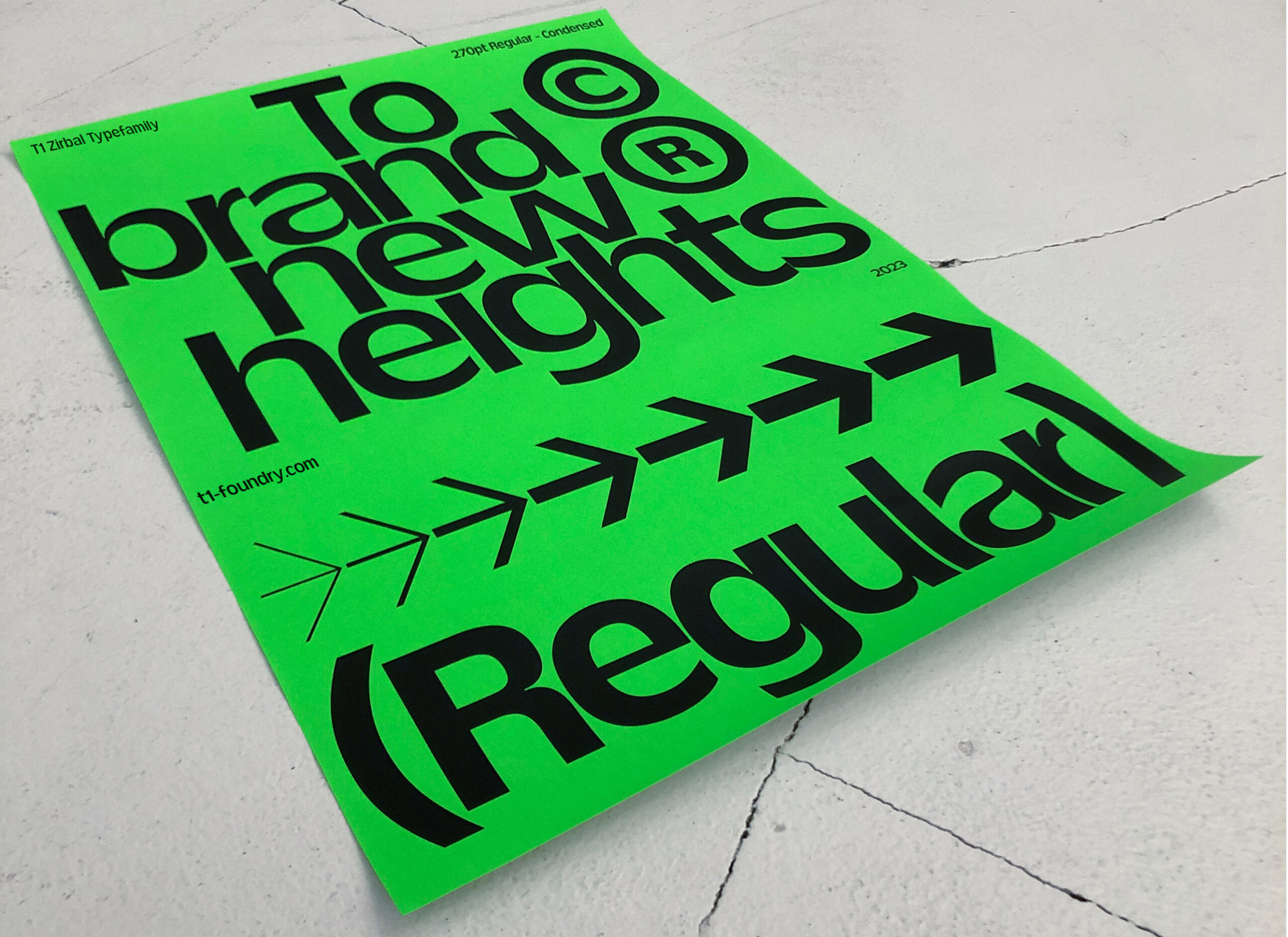
By developing the lowercase alphabet first, Stuhlpfarrer uses narrow letter spacing that allows a line of typeset words to resemble a dense grove of stone pines. The foundry’s type specimens for T1 Zirbal, play up this visual connection to landscape, using a colour palette of bright sharp green and solid black that evokes dense forests. A playful asterisk even resembles a pine cone seen in the cross-section.
In addition to its organic roots, the typeface design tackles the dilemma of tilting a language that relies heavily on masculine and feminine forms into more neutral territory. “In German, generic masculine is the norm but it’s outdated; to evolve language into more gender-neutral forms, we need appropriate typefaces,” Stuhlpfarrer says. His solution lay in repurposing the familiar asterisk, a direct challenge to the accustomed usage of the character as a superscript indicating a footnote.
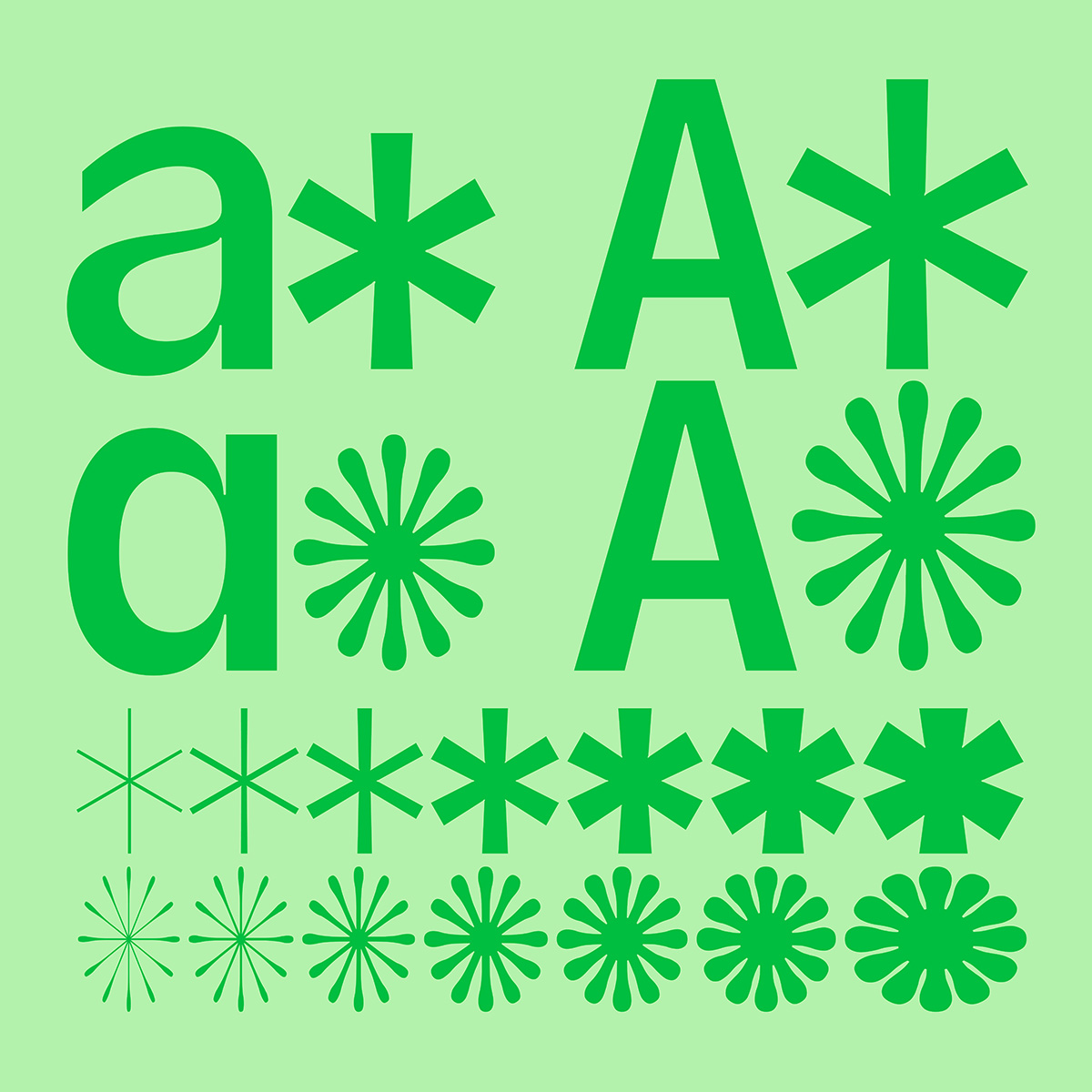
The designer built a variety of predictive text asterisks into T1 Zirbal’s code: a normal superscript version, a lowercase version that fits the x-height and baseline, and an all-caps/uppercase version. “We use an asterisk level with the x-height to interrupt a gendered word, followed by the suffix -innen which means all,” he explains. “A recent scientific study found the use of asterisks like this did not interfere with reading behaviour—so we were not introducing a new problem while solving another.” As an example, ‘typographer’ becomes ‘typograf*innen’, not male or female, just a typographer. Students in his class at Berlin School of Design and Communication (BSDC), are starting to speak in this way, referring to their craft as typograph-(pause)-innen. And (are you surprised?) this innovation also has its inspiration in the Swiss stone pine: The tree’s flower cones can self-fertilize since they are both male and female.
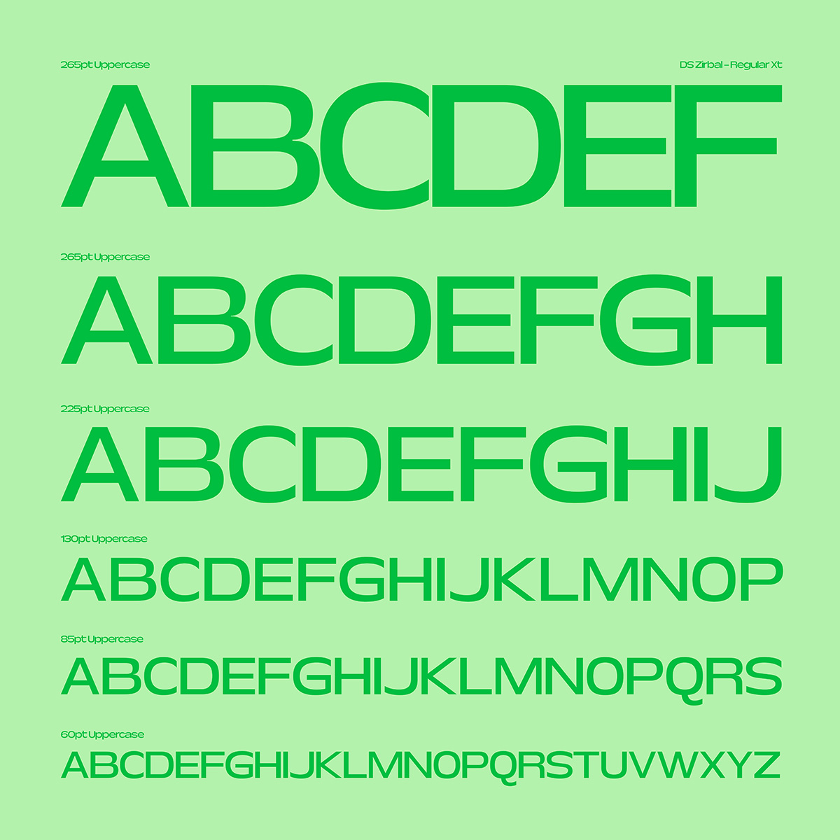
T1 Zirbal has just enough quirkiness to distinguish it from older tried and true sans-serif typefaces. While some features such as sharp joins between bowls and stem and abrupt stroke cuts are reminiscent of Antique Olive, the 1962 sans-serif typeface by the great French type designer Roger Excoffon, T1 Zirbal is very much its own beast. Many other characteristics of the forms, including the slumping spine on the lowercase s and the Helvetica-like teardrop counter of the lowercase a, are T1 Zirbal’s own.
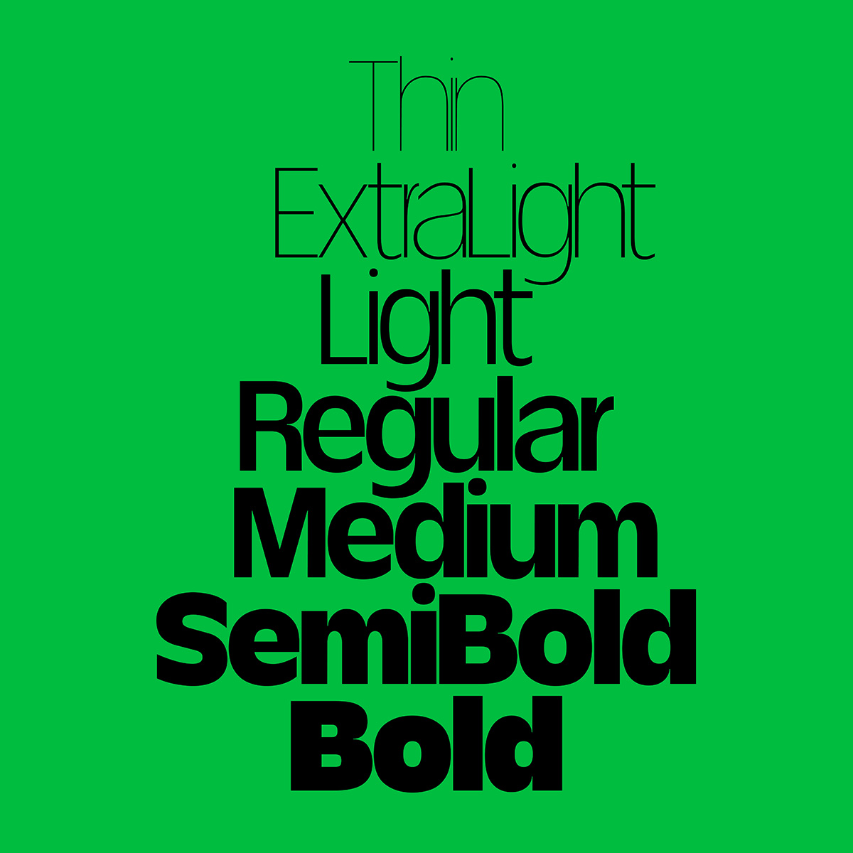
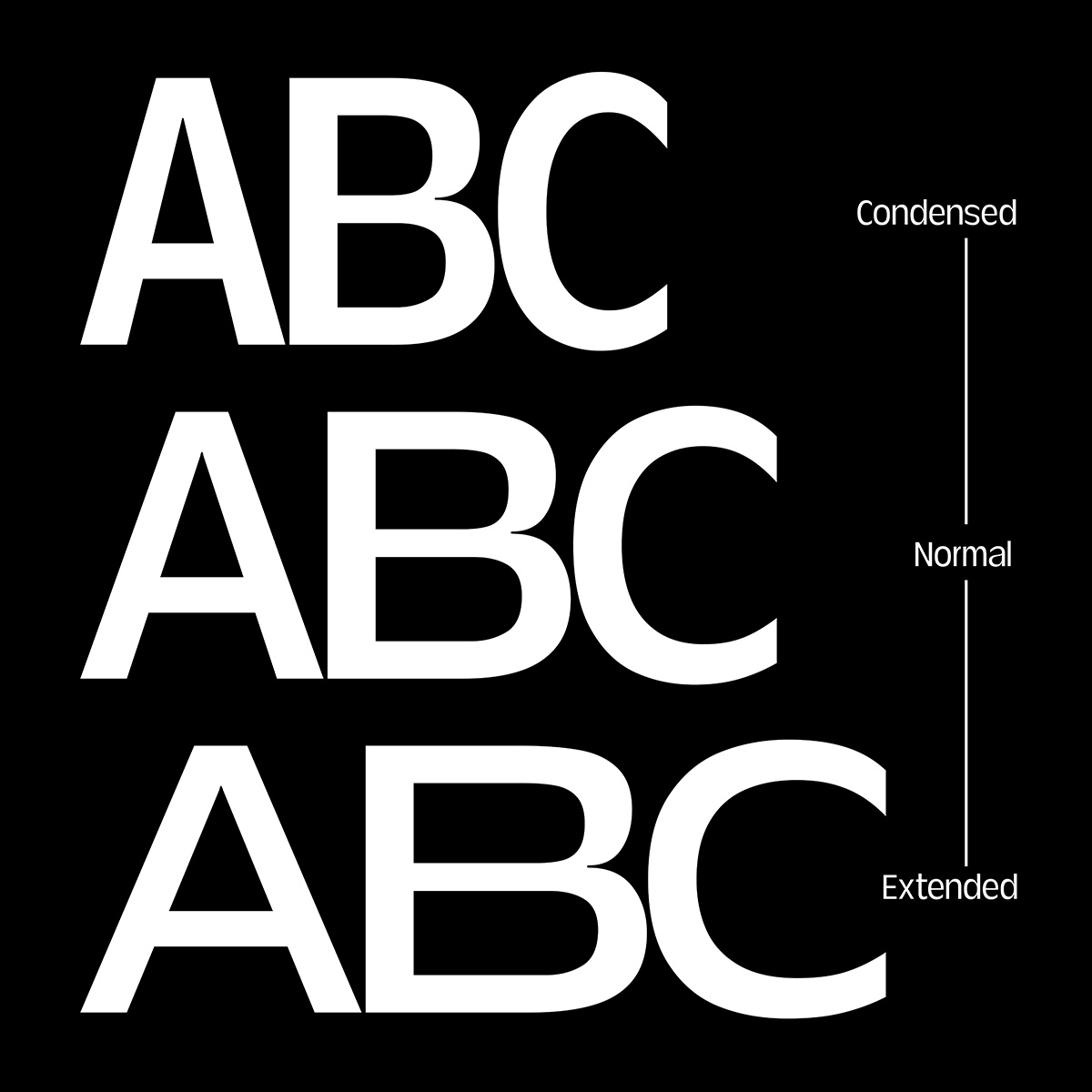
The family of 21 fonts comes in 7 weights, from Thin to Bold, and 3 widths: Condensed, Normal and Extended, supporting 35 languages. T1 Zirbal is also equipped with a 2-axis variable font, giving its user a wide range of movement to play around with.
The typeface features a nicely varied approach to its letterforms within the family: the uniformly thin stroke weight on the lightest version diverges from the varied contrast seen on others. Not strictly a reverse contrast font, with strokes that are heavier on the top and bottom and lighter on the sides, T1 Zirbal does have some letters (particularly the lowercase d and o) that lean in this direction.

The Bold weight features tiny little ink/light traps on some characters, a nod to both type’s role in historical print technologies and its use on screens and immersive media today. Together with the sharp cuts where bowls meet stems, they open up the solid blackness of the strokes just enough, adding little hits of light and delicacy to the sturdy letterforms.
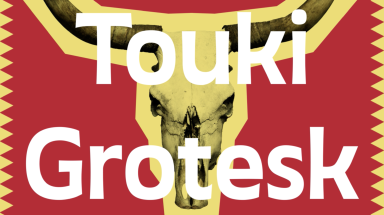
T1 Zirbal’s flexible range of weights and variable options is adaptable to type systems for a wide range of editorial publications, posters, labels, logos, and entire brand identities. As a display font, its slight quirkiness allows it to pair well with a more subdued sans-serif grotesque for text (try Lay Grotesk, Non-Natural Grotesk, or Autaut Grotesk). For those whose motto is Go Big or Go Home, experimenting with T1 Zirbal alongside a thorny serif such as Slack Light could prove effective. Or, to play it a bit safer, a serif text font whose letterforms hew more toward the traditional, like LD Family, might do the trick.
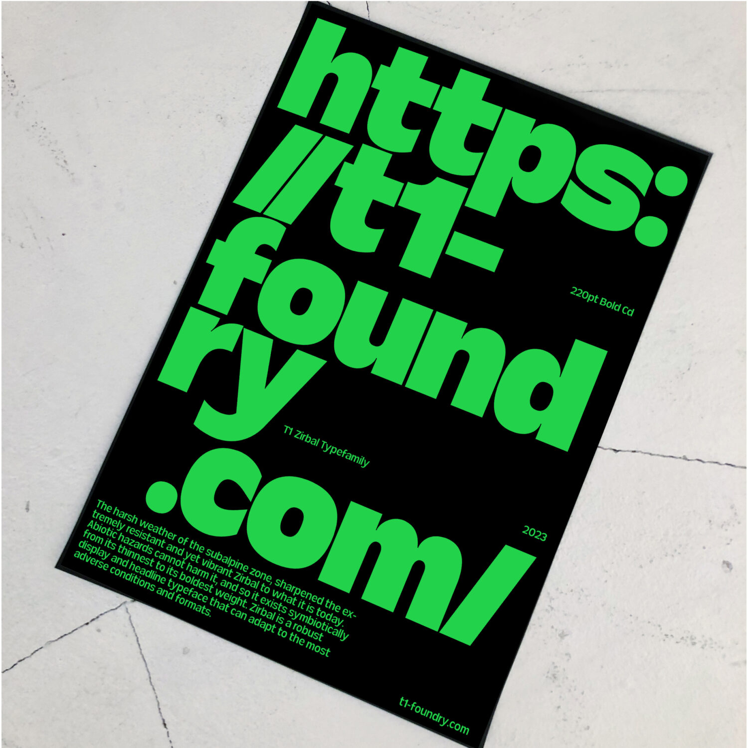
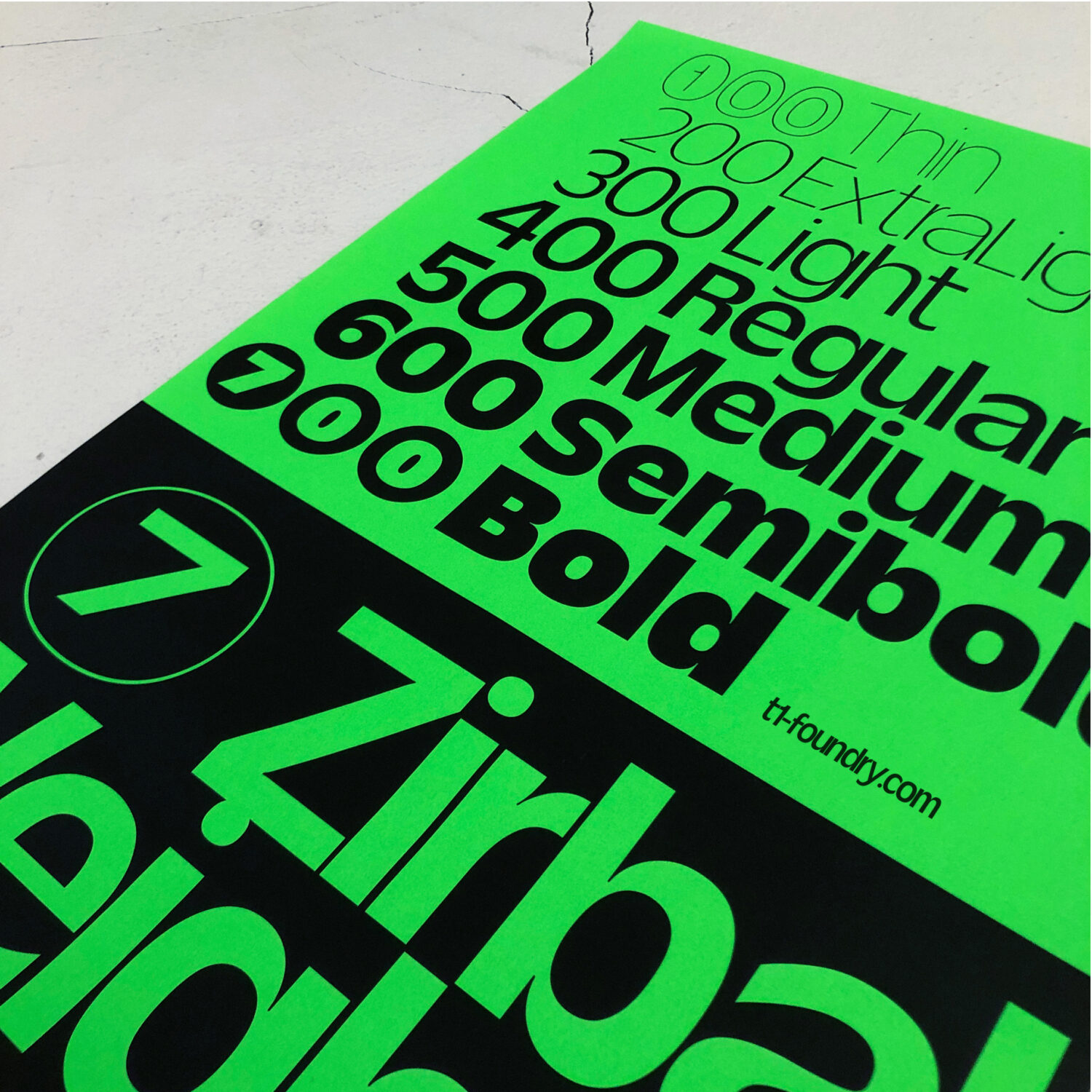
In the subalpine zone where they grow, the Zirbel pines have to withstand extreme weather conditions and harsh climates; Stuhlpfarrer envisioned his typeface as a similarly hearty creation suitable for all design environments.
Download free trials over on T1 Foundry. The first 50 licenses get 50% off!

