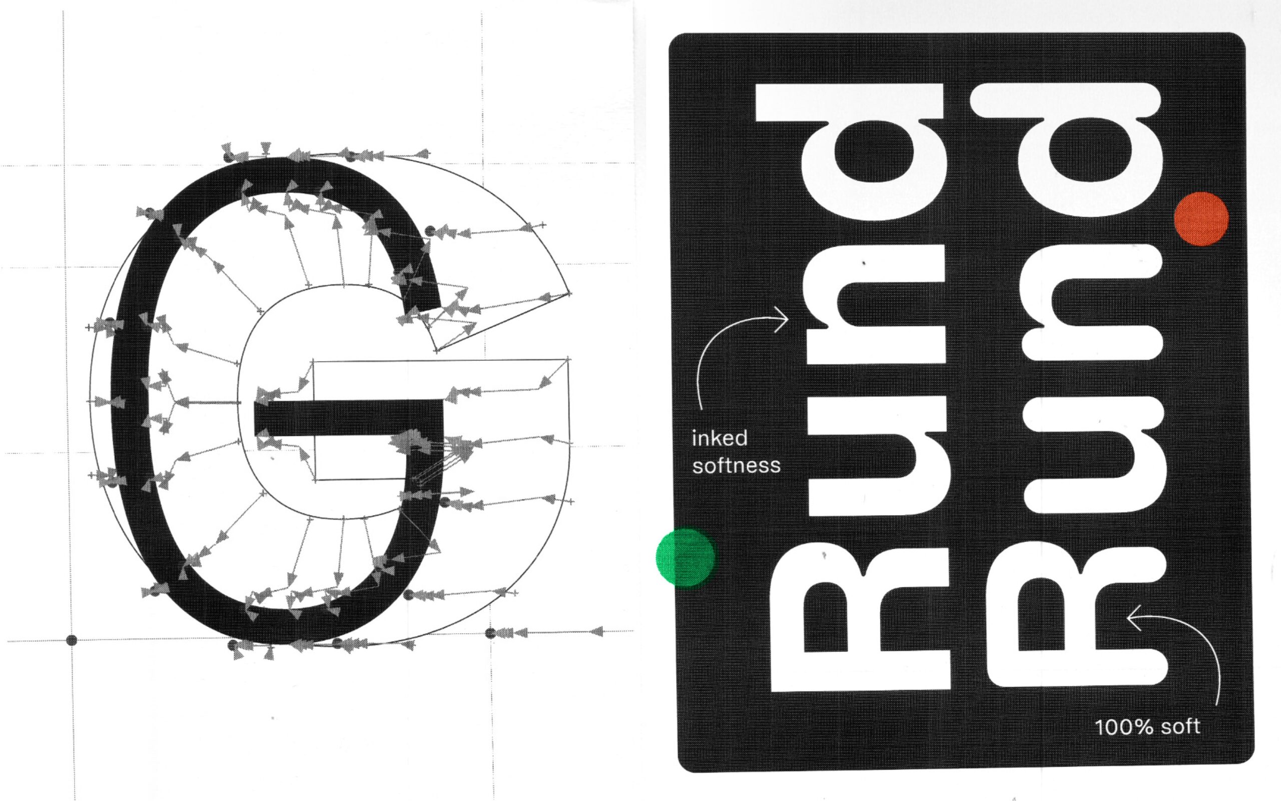

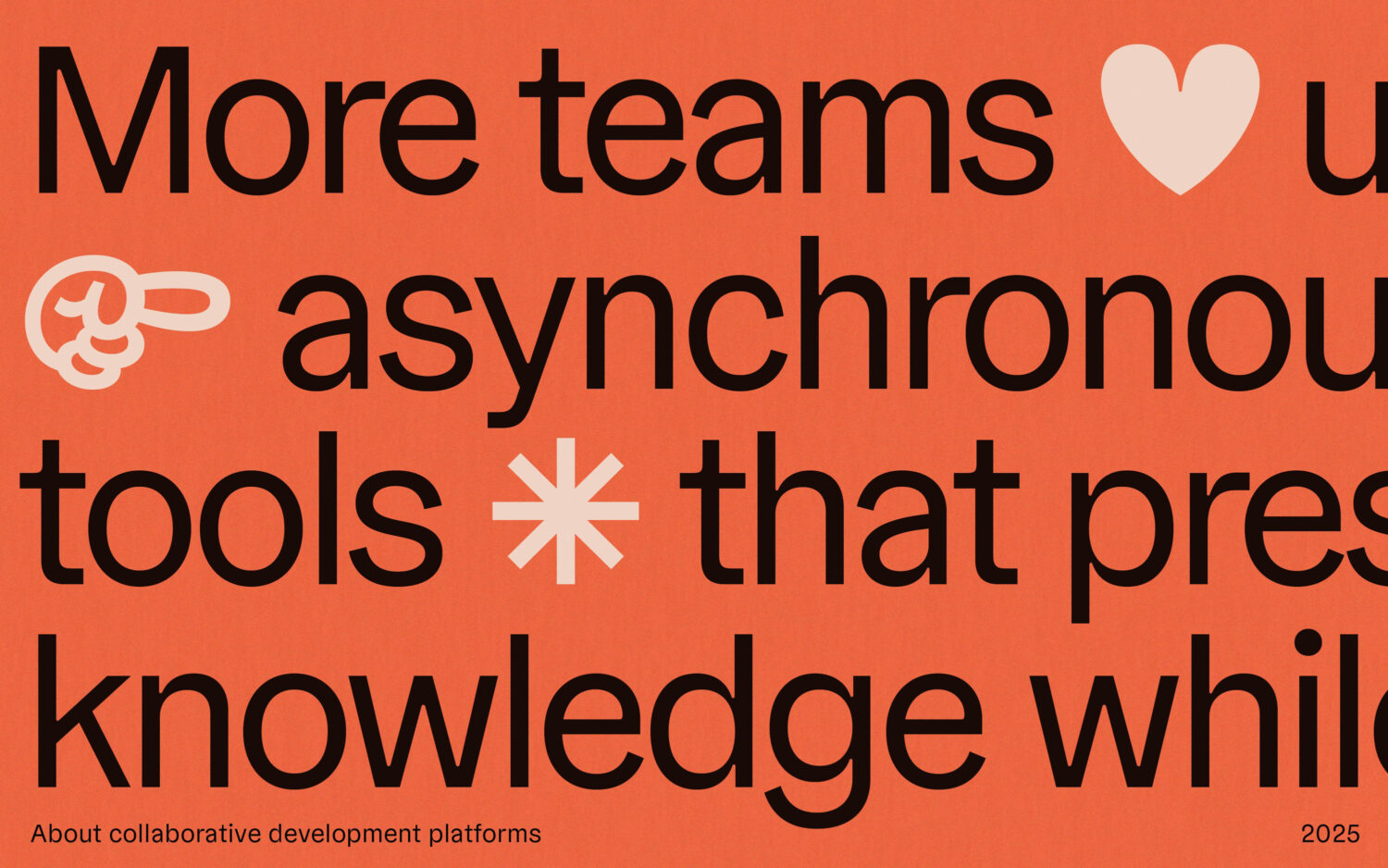
For many designers, procrastination hinders creativity. However, for Germany-based foundry TypeMates, this kind of work paralysis sparked something new. Faced with the overwhelming workload of developing the Gregory serif families, designer Jakob Runge recalls feeling like a rabbit caught in headlights. “In the meantime,” he tells us, “it was time to get my hands on how this might look in a sans serif.” And so Gregory Grotesk was born — a charming sans-serif that carries the ‘soft anti-ink trap’ features of its serif family.

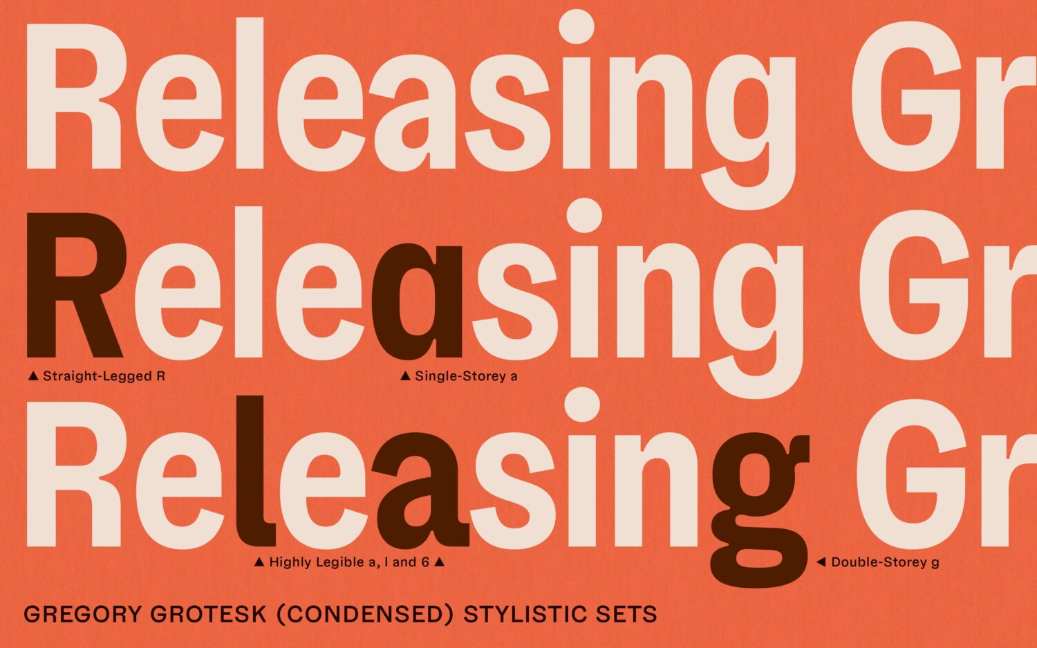
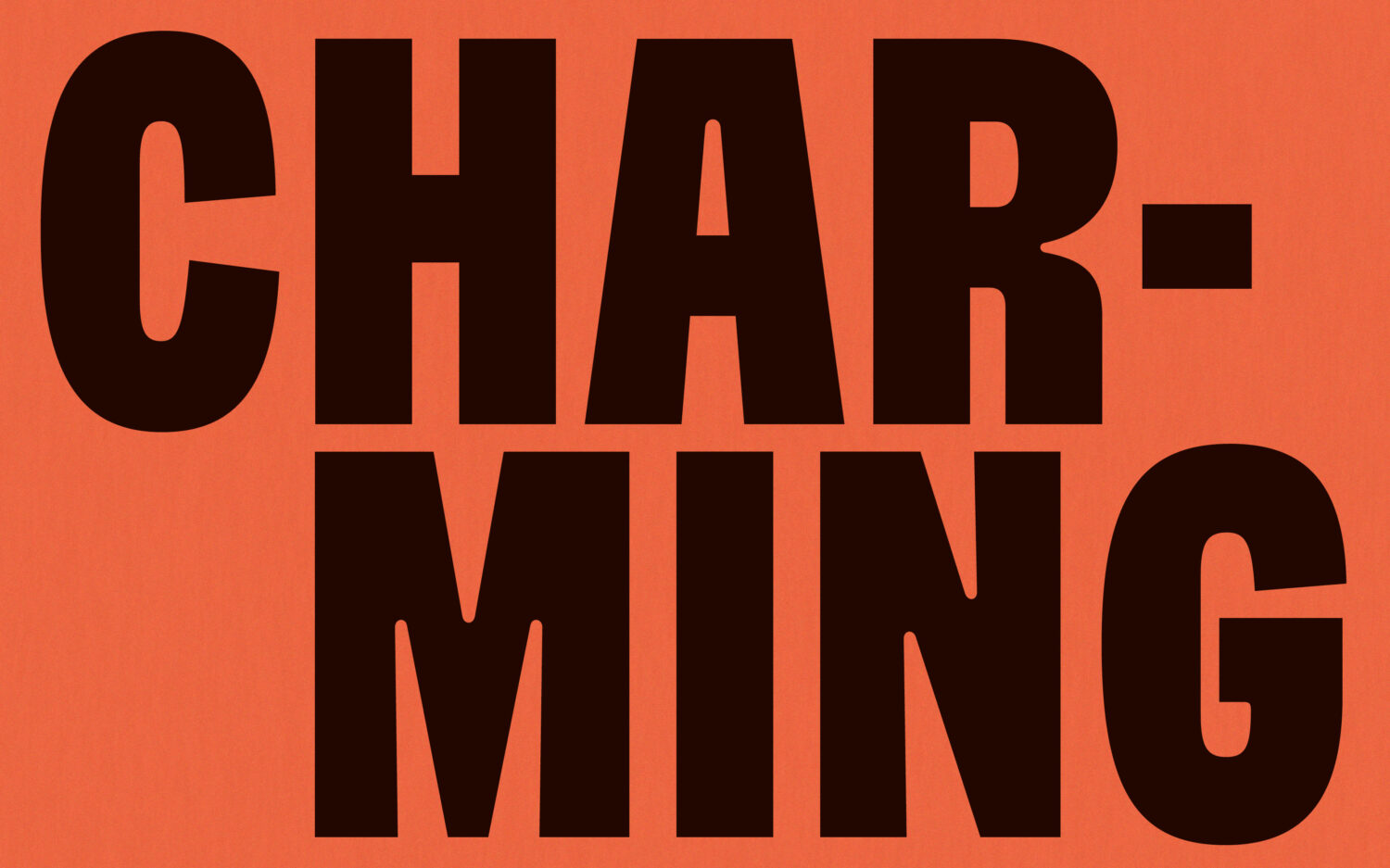
In addition to “some extravagant, top-heavy letter shapes,” the grotesque’s defining traits are its rounded inner corners at angular junctions. Here, instead of opting for ink traps, Runge turned to larger-scale wood type printing for inspiration, bringing a more handmade flair to “sterile digital environments.” This lack of ink traps causes strokes at joints to thin, creating a tapering effect like 19th-century grotesque fonts. “Eye-catching moments of contrast and character, they celebrate small type displayed big.”
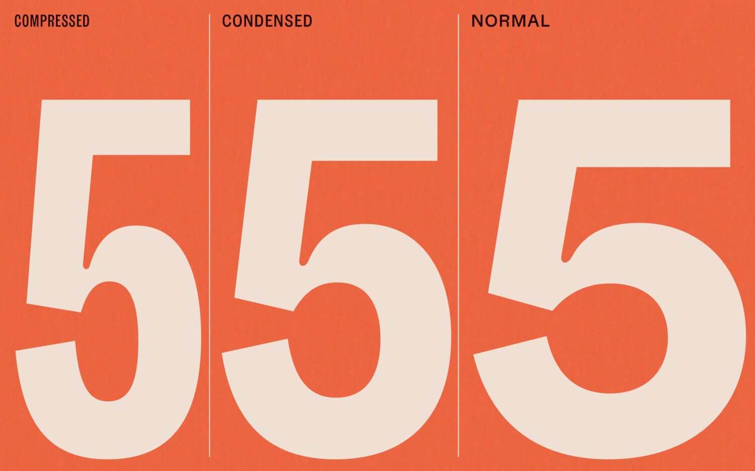
A friendly, positive personality blends with a hardworking, highly functional design and geometric structure that carries through all 24 styles — 8 weights and 3 widths — including Condensed and Compressed versions.
“The compressed styles were developed after the regular version of Gregory Grotesk was almost set in design,” Runge explains. “Sometimes I find it difficult to develop condensed widths because white space plays a significant role and the individual personality of the typeface tends to fade – to exaggerate: ultimately, they all appear just condensed and sans serif.” Fortunately, Runge could count on a “hidden gem in modern typography,” the inked style. “That really helped to keep the Gregory-specific flair, even in narrow widths. At times, I almost prefer the pithiness of the compressed to the original,” he notes.

With extensive experience creating superfamilies, TypeMates thrive at developing large font families – ones that feature a variety of styles, languages, and typefaces, including sans and serif siblings, as Runge describes. “When things get complex, we are on fire,” he adds.
Within the wider catalogue, the Gregory Collection provides a softer serif option, with Gregory Grotesk contrasting with their other geometric typefaces. “For me personally, it’s a circle of type,” says Runge. “After graduating with the characterful Franziska, Cera followed with super clean shapes. Then came Urby, which turned up the volume on special shapes, followed by Grato and Gratimo, which went back to geometry. Now it’s Gregory, with the idea of ‘not much rationale but matching shapes.’ I’ve come full circle now to a design with lots of personality.” As a family, Gregory’s fonts share the same spirit but differ in details. “It is a superfamily that is somewhat contrary, connecting rather than matching.”
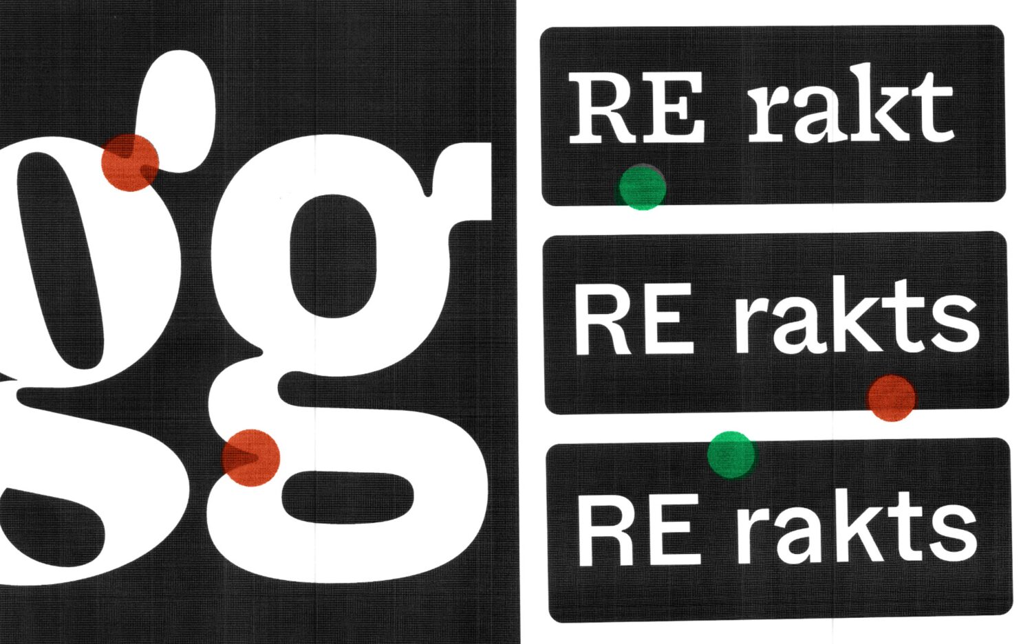
At large sizes, the Grotesk maintains a distinctive, recognisable appearance, while also providing functional typography for interfaces and texts at smaller scales. And its flexibility allows it to pair well with many other typefaces, whether for body text or headlines.
“In a current project showcasing our one-time licences without subscription, we are using Gregory Grotesk Condensed for headlines combined with Marc’s Weymann Serif for subtext.
In another case, Gregory Grotesk is a good partner for Philipp Neumeyer’s Nobert in body text, because Nobert is particularly strong in headlines and does not —on purpose— provide any styles for usual weight and widths in text sizes.”
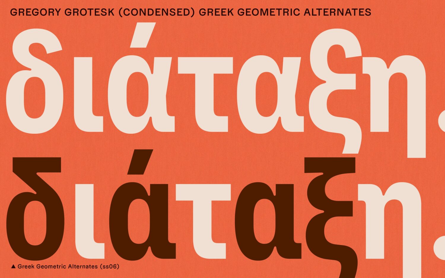
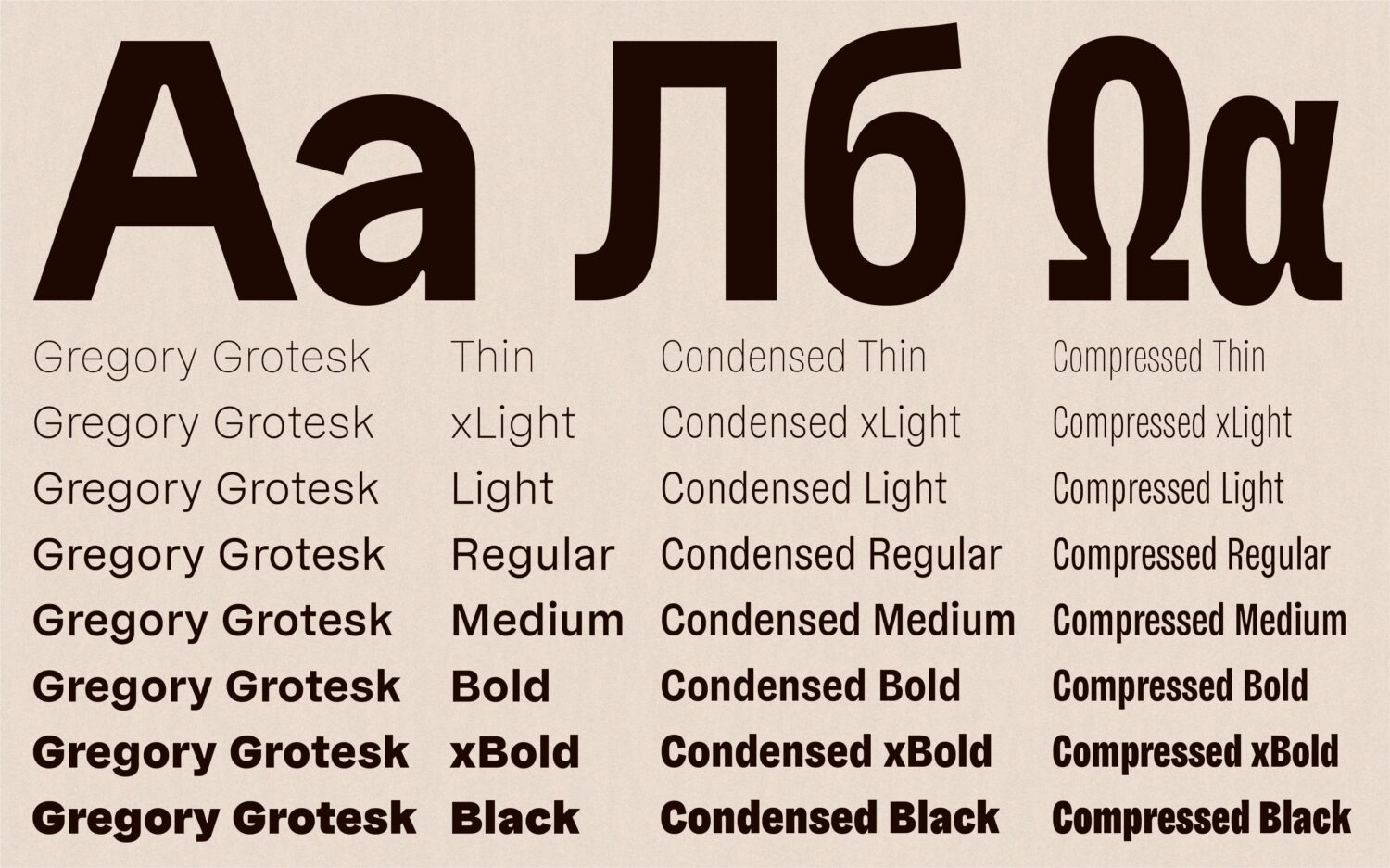
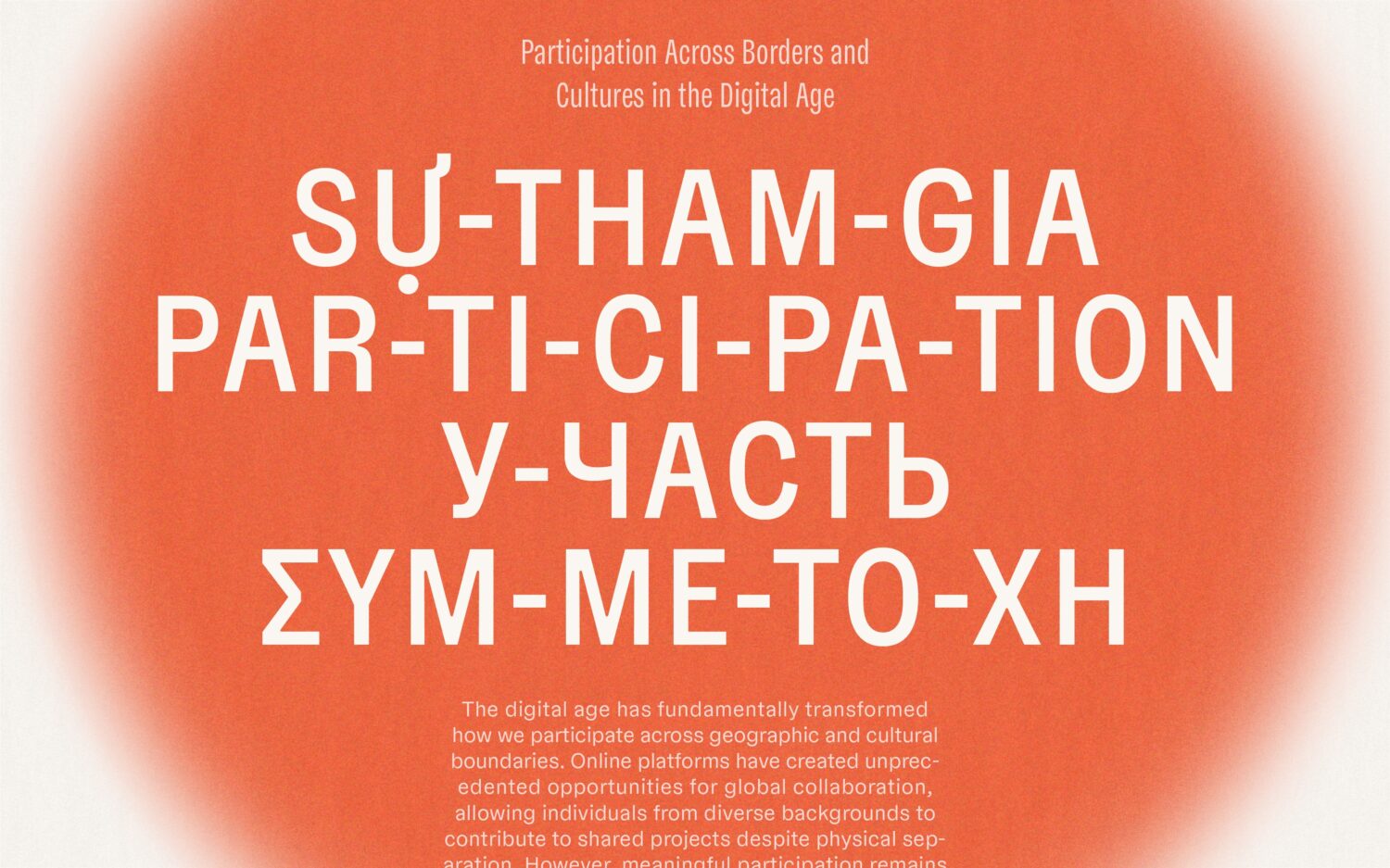
Regarding language support, the typeface currently supports over 270 languages, and beyond Latin, it includes Greek and Cyrillic support for a full pan-European approach. “Shout-out to Antonia Cornelius for joining the team, becoming a publishing partner and adding Greek and Cyrillic letters. Also props to Irene Vlachou and Maria Doreuli for taking care of the cultural validity in these scripts.”
In terms of development, Gregory’s momentum continues, building on its Grotesk and Poster styles with a text-focused serif in the works, soon to complete the trilogy. Runge promises “soft-curved serifs, generous countershapes, and a cosy vibe that makes complex text a pleasure to read.”
As for the rest of the year, the type designer has a few ideas and projects brewing, including an Arabic and Hebrew version of Runge’s bestseller Cera Pro, which is in the works. “The idea of the soft anti-ink trap has infiltrated my mind to see how this might look in a totally rounded design,” he adds. “It matches very nicely, but it’s another day’s task for now.”
Likewise, he imagines a monospace version will likely follow, helping to bridge people-based branding and the value generated from code and data.
“There are many possibilities,” he concludes. “For now, I will see how Gregory performs and whether future plans become relevant. In the meantime, you can test the font to see if it matches your projects. Free demo fonts are available for all weights plus variable fonts, already waiting for you over at TypeMates.com.”
Browse more of our typeface editorials here.