Since its launch in 1999, Typotheque has defined itself by a continued commitment to language, designing for world scripts, from the dominant writing systems of Latin, Chinese, and Arabic to the lesser-known – such as Canadian Syllabics, Cherokee, and Ol Chiki – that are often overlooked. As Founder Peter Bilak explains, “This is a massive undertaking,” involving extensive research that is often documented and shared in books, academic journals, magazines, and on the Typotheque website.
“We tend to think of our practice as publishing,” he says, “sometimes we publish typefaces, and other times our work takes the form of a printed publication.” Backed by their research-led approach, the foundry also works with clients on custom typefaces for airports, transport orientation systems, global car brands, and more.
A Sans-Serif for Scale, Size and Legibility
Zed marks another significant milestone for the foundry – at face value, it’s a colossal project, with over 500 styles and was initially sparked by Bilak’s curiosity about whether it was possible to design a sans-serif that excelled in both text sizes and display. But the project’s journey and discoveries have had even greater ramifications.
“The starting observation was simple,” he recalls: “Fonts behave very differently depending on the size at which you use them. Take a font designed for large sizes and set it small, and readers have to strain to follow the text.”
He lists Helvetica as an example – impactful at large sizes, tightly spaced with closed counter shapes creating rhythmic headlines – but these same qualities hinder readability at small sizes. “Many people criticise Helvetica without realising that the version bundled with most computers was designed for display use only, not for continuous text.”
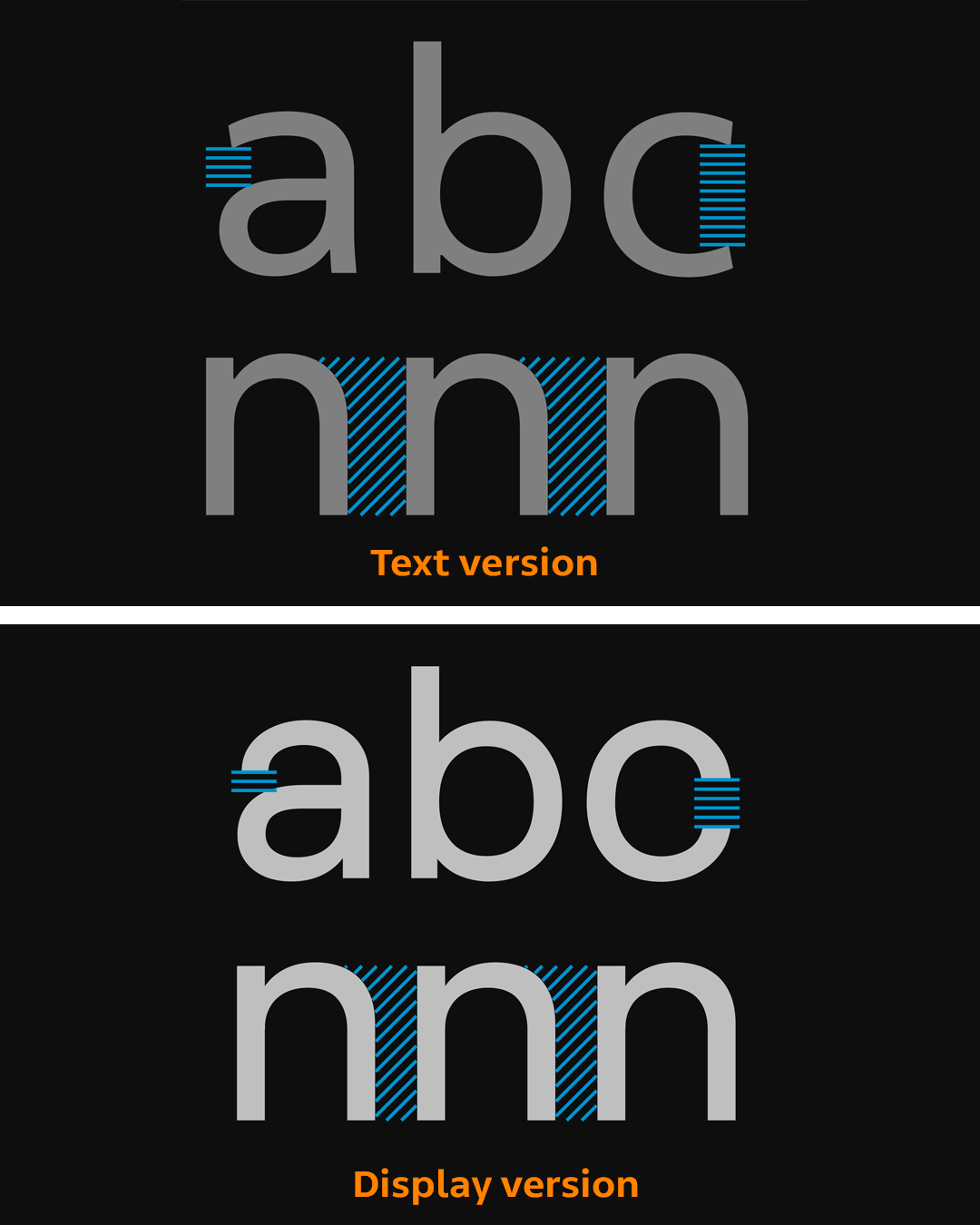
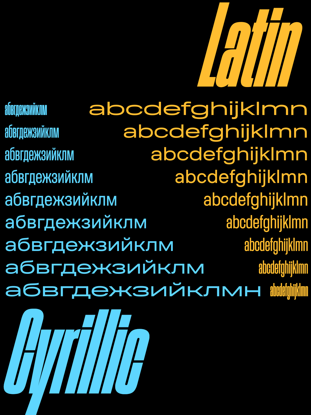
With Zed, Typotheque concluded that there was no way to compromise by “splitting the difference.” Instead, they created two distinct optical versions. Zed Display follows the model of geometric neo-grotesques, which work well at large sizes. But Zed Text’s construction instead draws inspiration from humanist letterforms, which better support reading at small sizes.
Partway into development, an inquiry from Integral Designers for a new font for the signage system at Quinze-Vingts National Hospital – a specialist public hospital in Paris dedicated entirely to ophthalmology and eye health – led the project to expand and evolve, resulting in a typeface optimised for low-vision readers.

What Low‑Vision Research Revealed
The team drew on existing ophthalmologic and legibility research, while also conducting their own trials, to refine details that are often invisible in standard usage but crucial for low-vision readers.
Bilak explains that the team identified three design areas with clear evidence behind them:
First, open internal spaces. “Closed letter counters have been shown to impair letter recognition,” he tells us.
Second, generous letter spacing, because wider spacing between characters has clear and measurable benefits for reading at small sizes and at a distance.
Third, familiar and distinct letter forms are essential. Readers depend on recognisable letter shapes, so each letter must be clearly differentiated while avoiding unnecessary complexity. The key lies in striking the right balance between structural simplicity and clarity of distinction.
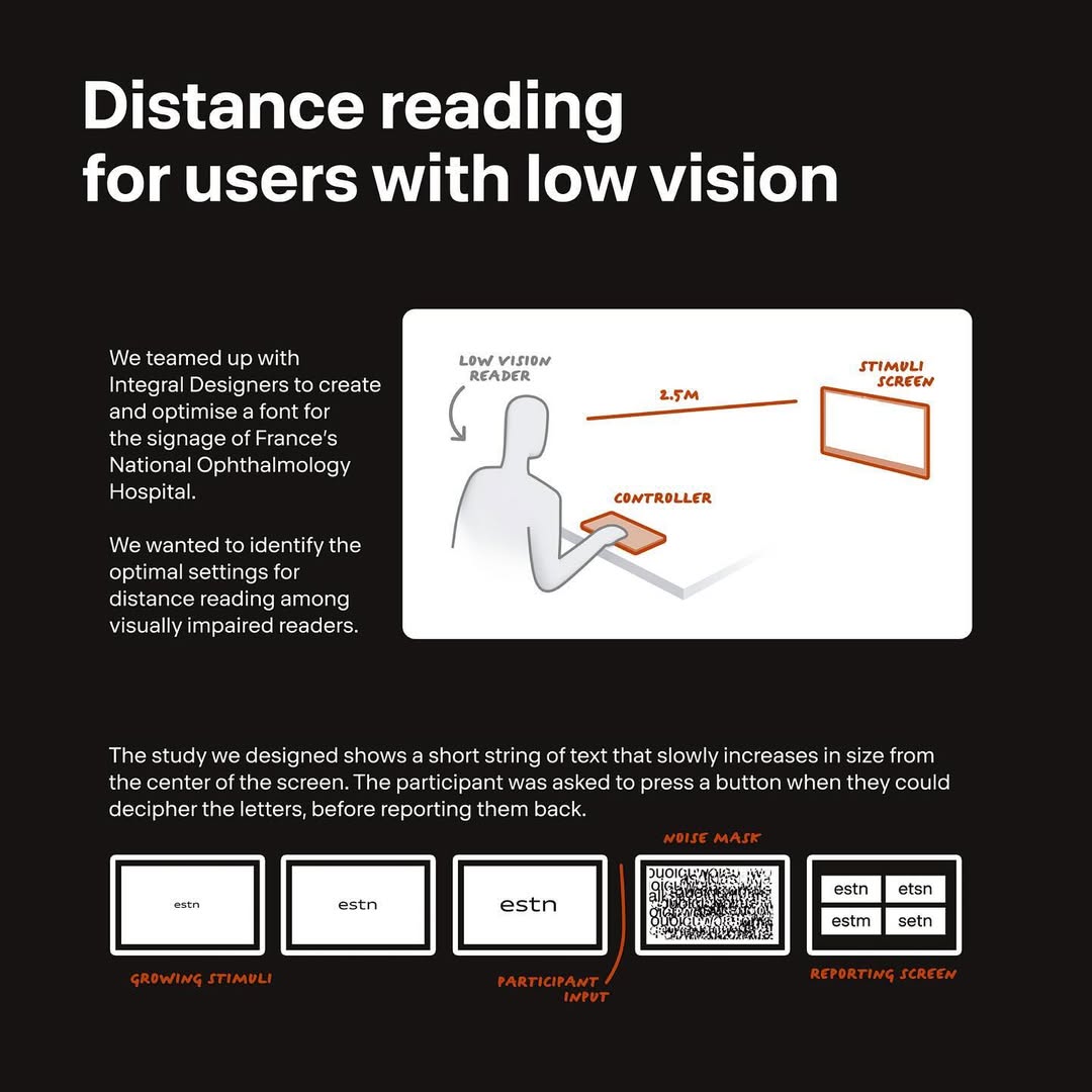
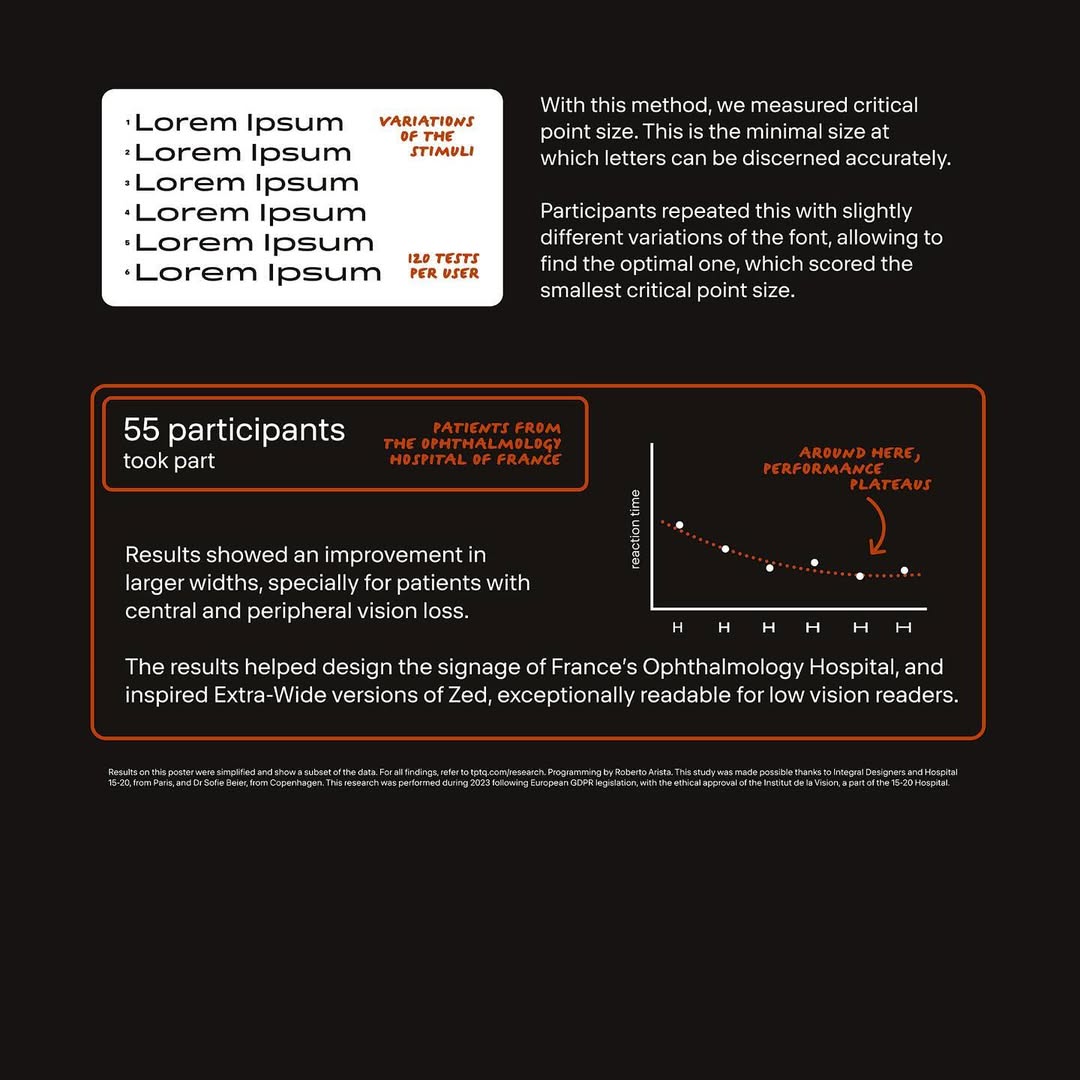
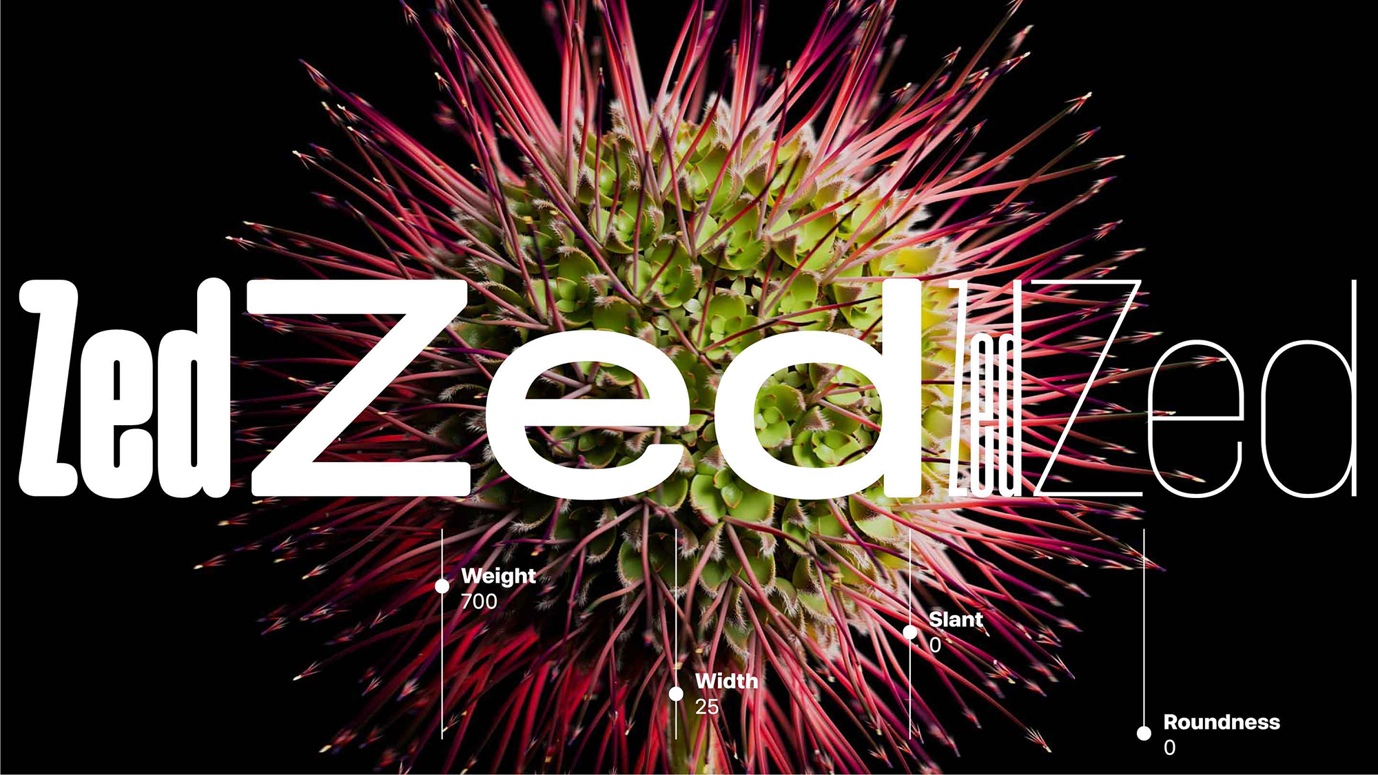
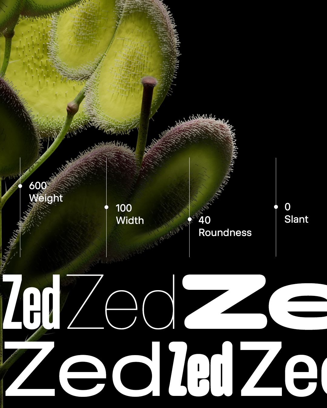
“The most important thing we learned is that legibility is not universal,” reveals Bilak, pointing out that reading performance depends heavily on the specific nature of a person’s visual impairment. “A reader with tunnel vision benefits from narrower letterforms,” he continues, “while a reader with only peripheral vision benefits from wider ones. This led us to develop several width variants of Zed Text and test which proportions helped which groups of patients most.”
The most surprising insight of the project, however, has broad implications well beyond the original accessibility brief – that wide letterforms not only benefit readers with visual impairments, but are also read faster by healthy readers than text of normal proportions. “The reason appears to be reduced crowding,” says Bilak. “Wider letters create more separation from surrounding characters, which improves individual letter recognition.”
Language Support: From Code Points to Communities
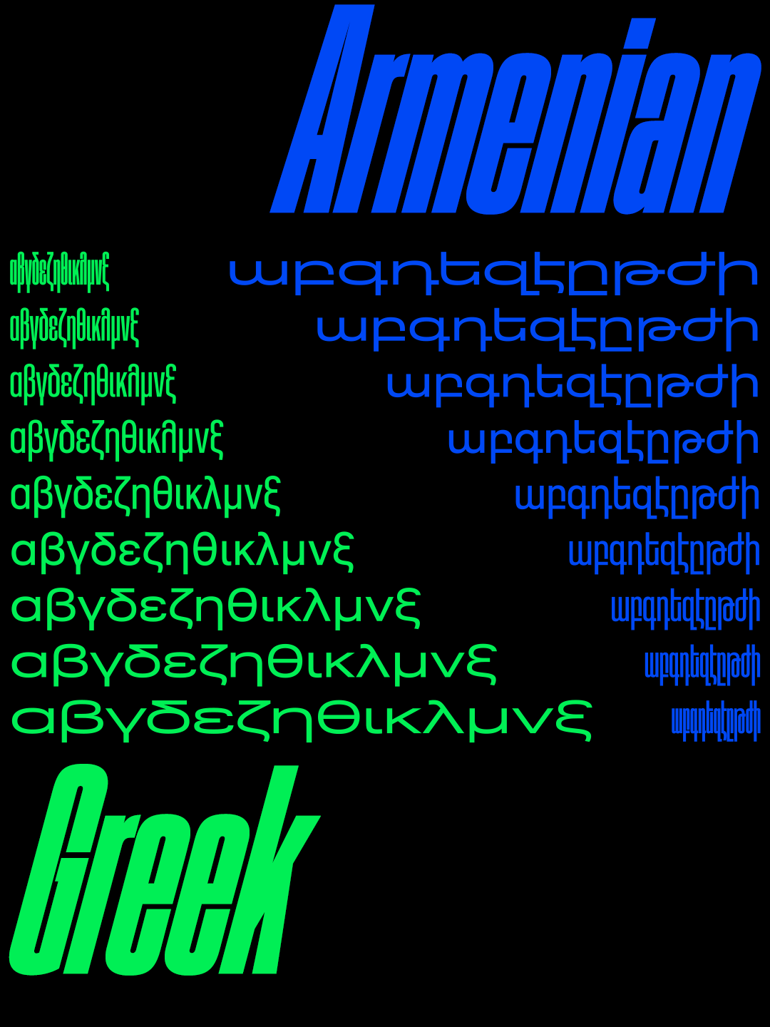
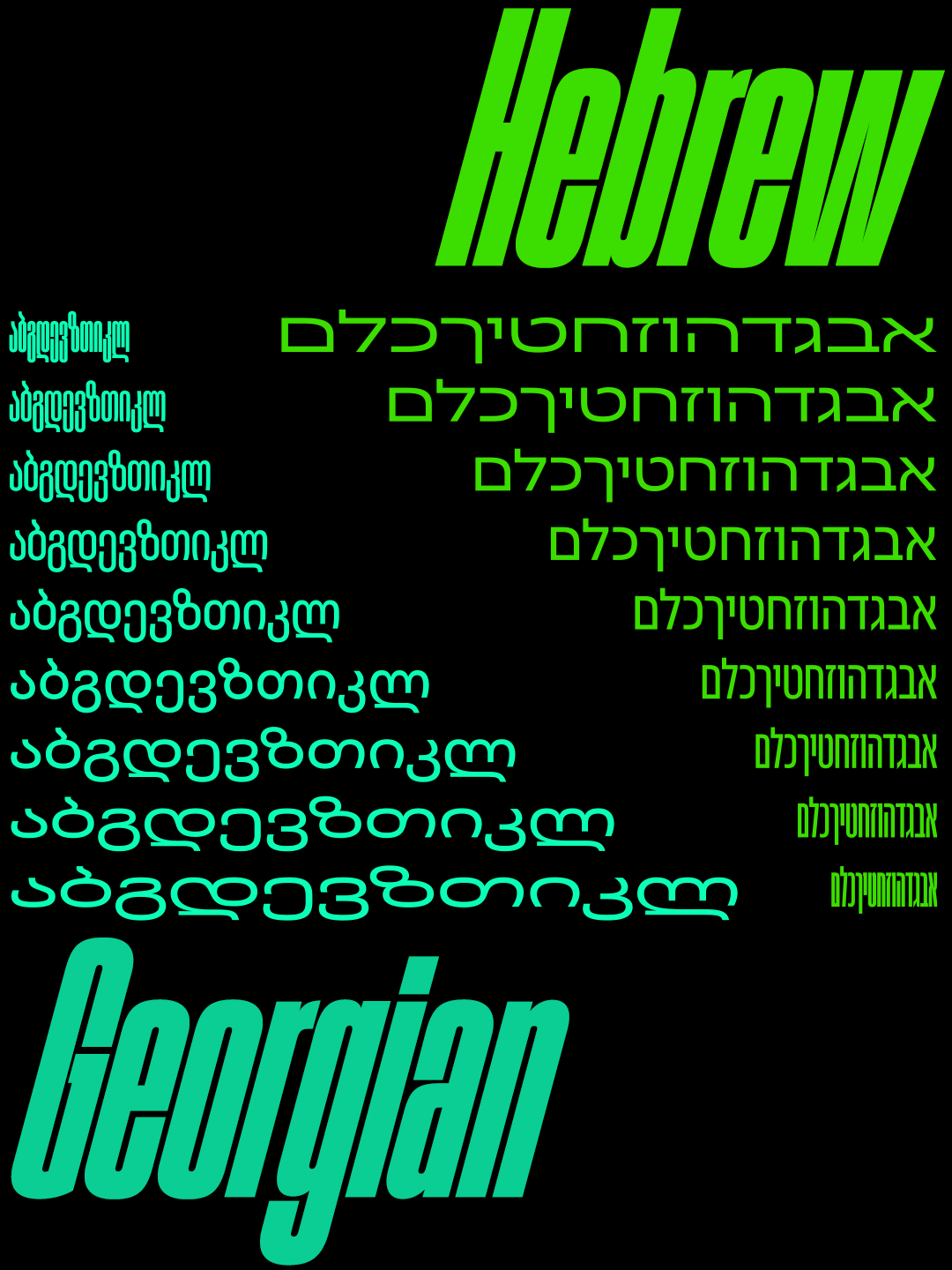
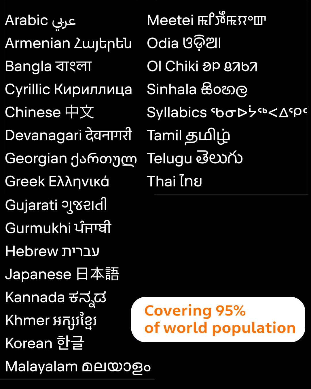
From two optical versions, the project quickly expanded in scope. As Bilak explains, “The idea gets pushed quite far.” Ultimately, this development led to the creation of over 500 styles that support major global writing systems as well as smaller and marginalised languages, many of which have historically lacked strong typographic representation.
Working closely with the evolving Unicode Standard (an international standard that assigns a unique, stable numeric value (code point) to every character, symbol, and emoji across all written languages), Typotheque ensures that scripts, symbols, and minority languages are not only technically encoded but also meaningfully supported in everyday typography.
“We can’t design a font for a script that isn’t fully encoded,” Bilak tells us, “so when gaps exist in the Unicode standard, they block everything downstream. We work directly with indigenous communities to do on-the-ground research, and what we find consistently is that when any single piece of the digital infrastructure is missing – a font, a keyboard layout, software support, or incomplete encoding – it can make a language effectively unusable in digital contexts. Often this pushes native speakers toward a dominant language simply because the tools exist for it.”
With the help of foundries like Typotheque, that balance can begin to shift, as designers and communities collaborate to push for better encoding, tools, and standards. “Many people assume they can only adapt to technology, not change it,” Bilak continues. “The Unicode Consortium is a good example of how largely volunteer-based work can shape the technological infrastructure that underpins how billions of people write.”
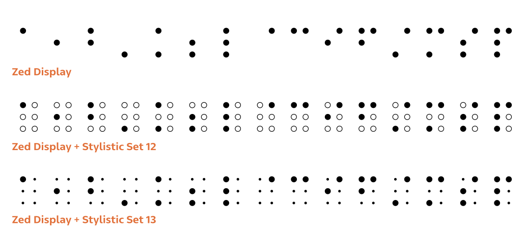
Typotheque’s Braille work extends this logic beyond sighted reading altogether, recognising that “Braille is simply another writing script, and it fits naturally into the same research framework. During development, we noticed that the output method affects Braille readability in ways that aren’t always accounted for — small adjustments to dot spacing can meaningfully improve the reading experience depending on how the Braille is produced.”
Likewise, the inclusion of icons and symbols in the Zed family serves a different but related purpose: to remove linguistic barriers to communication.
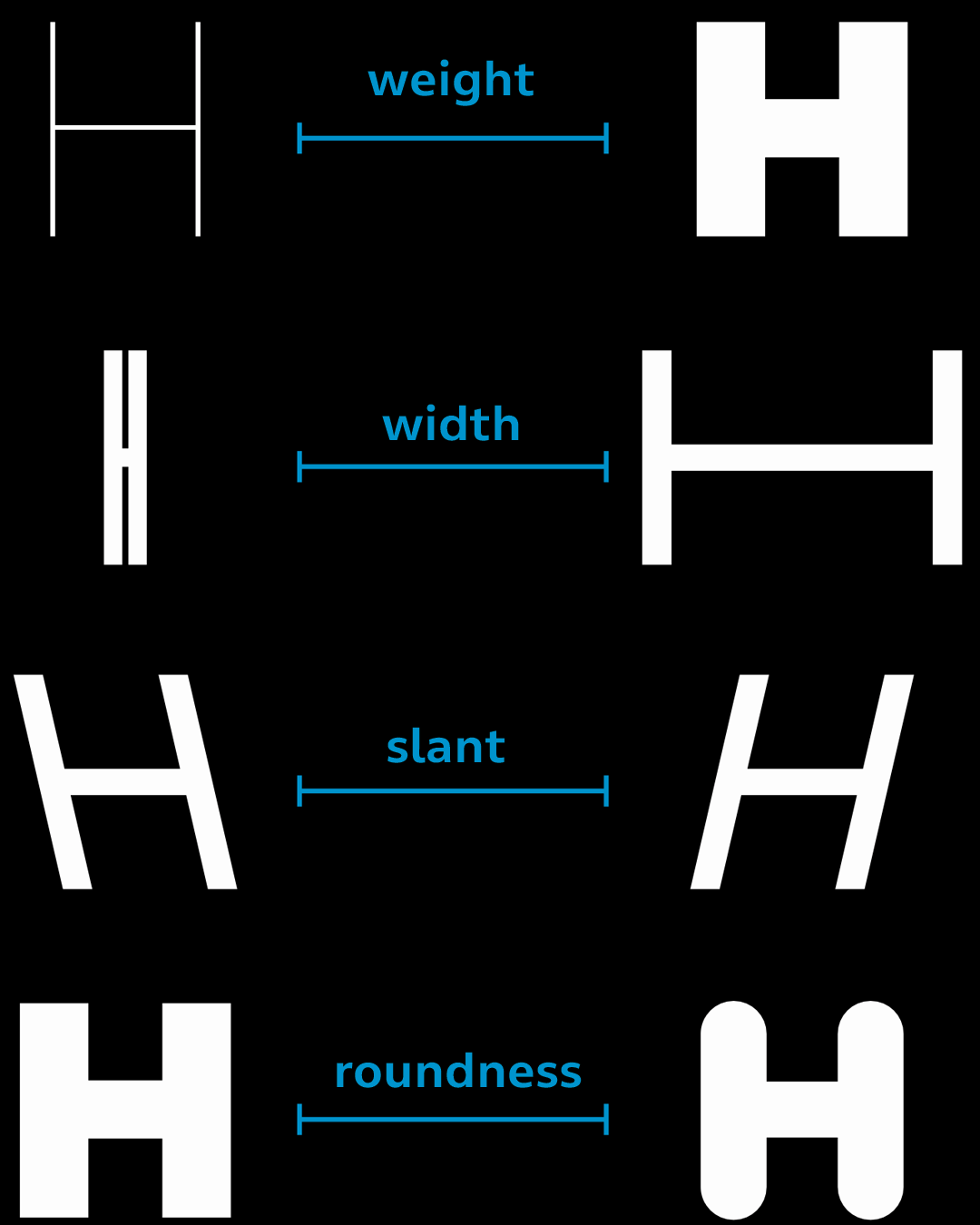
“They’re highly context-dependent,” says Bilak, “and when used well, they help people navigate unfamiliar environments without relying on a specific language. Just as text fonts can be styled to fit a design context, we wanted icons to be adjustable too – so Zed Icons are variable, allowing users to shift weight, roundness, and optical size to suit a specific environment or output size.”
Dismantling Language Barriers
And throughout it all, the project continues Typotheque’s prerogative: “We design fonts for people.”
For Bilak, this holds personal importance, having struggled to find fonts that properly supported his own language, Slovak. This experience during his design student days taught him a lot about how companies and markets function, and how much space there is for individuals and small studios to make a difference in ways that corporations don’t.
“There is real value in supporting languages that face technical barriers, where careful work can have a disproportionate effect,” he says. “We have designed fonts where, for the first time, people could write their own names correctly in a published typeface. As a designer, I care about the impact of work, and there is no greater satisfaction than seeing how improving language support – whether that means fonts, keyboard input, or better documentation – can strengthen a language that is already under considerable pressure.
This is why Zed supports all writing systems, large and small, even when marginalised languages require a disproportionate amount of time and research. Zed already covers most of the living writing scripts of the world, but there are still significant gaps to fill, and those gaps affect real people.”
Zed in Design Contexts
Originally released in 2024, Zed has seen a comprehensive update in 2026, along with the addition of language support for Armenian, Cyrillic, Chinese, Georgian, Greek, Hebrew, Japanese and Korean. There are another 20 writing scripts we are currently working on, focusing on the languages of South and South East Asia.
Typotheque also partnered with designer and programmer Just van Rossum on an interactive online tool that lets users explore the four‑dimensional Zed space, turning what could have been a static catalogue of 558 styles into a navigable landscape that quietly teaches how the family works.
For Bilak, what matters is that Zed meets people where they are.
“A home user who needs a single reliable font may find what they need immediately. An experienced designer can use the variable axes to push into territory that wasn’t really possible before. An indigenous designer working in their own language might find, for the first time, that their script is supported properly. A wayfinding studio combining multiple languages and symbols in a single system can work with consistent visual logic across all of them.”
His advice is to start with the system overview or printed specimen, get a feel for the scope, then pick one style and see how far you can adapt it to a specific context.
“Variable fonts are often discussed in technical terms, but at the user level, it is simply about shaping how language looks – and that is something most designers have strong intuitions about, even if they’ve never worked at that level of control before.”
For those ready to experiment with it in their own work, Zed is available from Typotheque’s website, where you can explore the family, test scripts and styles, and use the interactive tool to understand how its axes behave in real projects.
Enjoyed this piece? Browse more of our typeface design editorials here.