In recent years, conversations around type design have intensified— geographically, culturally, and conceptually. Yet much of the industry’s foundation still leans on inherited systems, often disconnected from the contexts in which they’re used. It’s within this gap that designers like Chisaokwu Joboson are not only contributing new work, but rethinking what typographic practice can represent.
Working from Nigeria as the founder of Udi Foundry, Joboson approaches type design as both a formal discipline and a cultural act. His work is shaped by a sensitivity to visual memory — one that draws from local lettering traditions, post-colonial histories, and the realities of designing within underrepresented language systems. Rather than treating type as a neutral tool, he positions it as a carrier of context: something that can preserve, adapt, and extend cultural narratives.
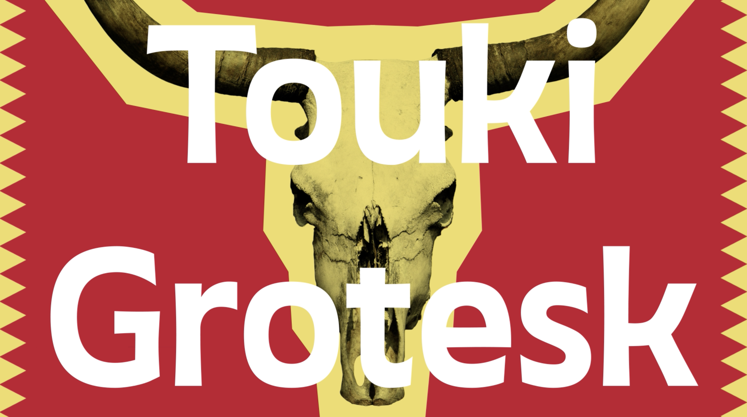
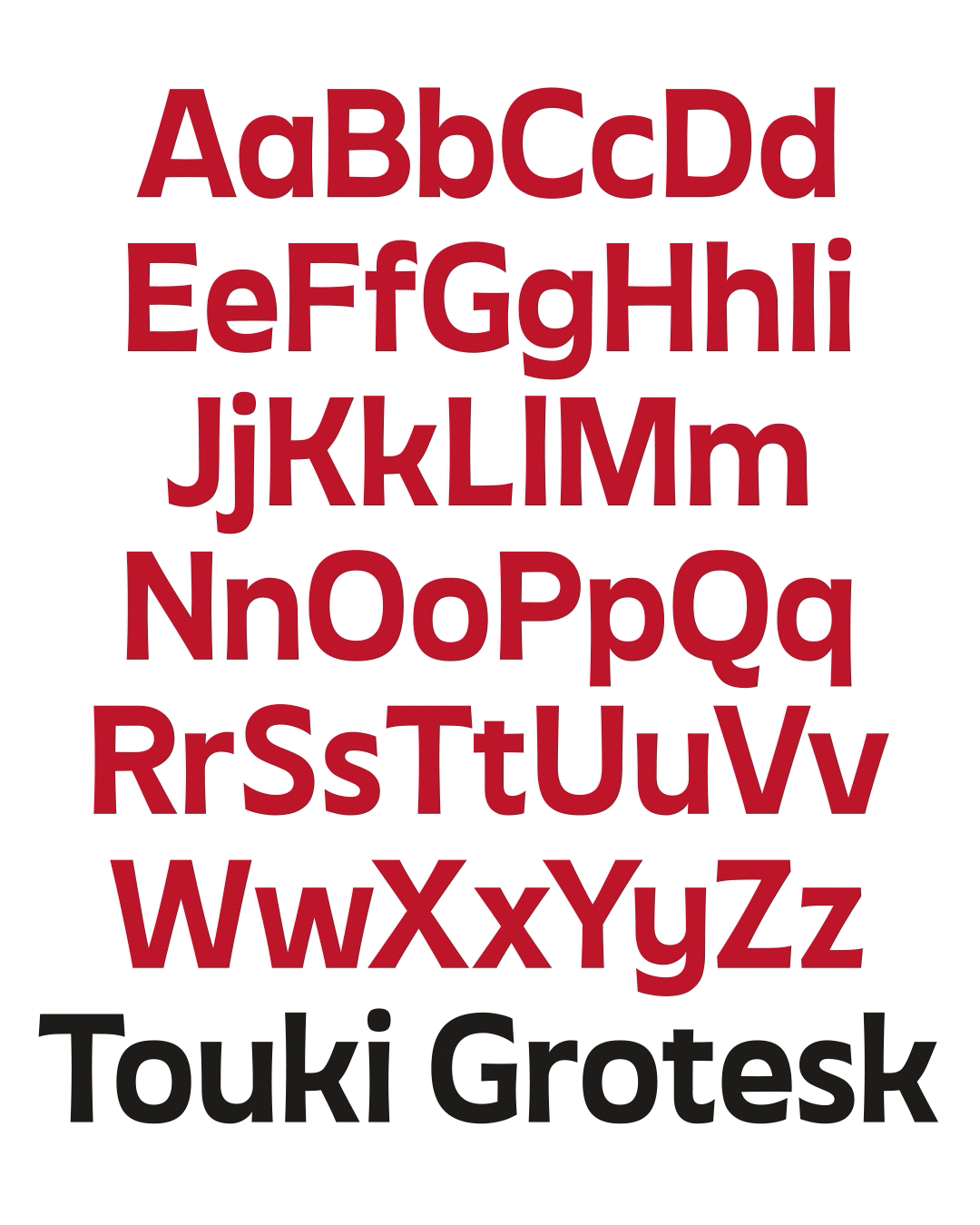
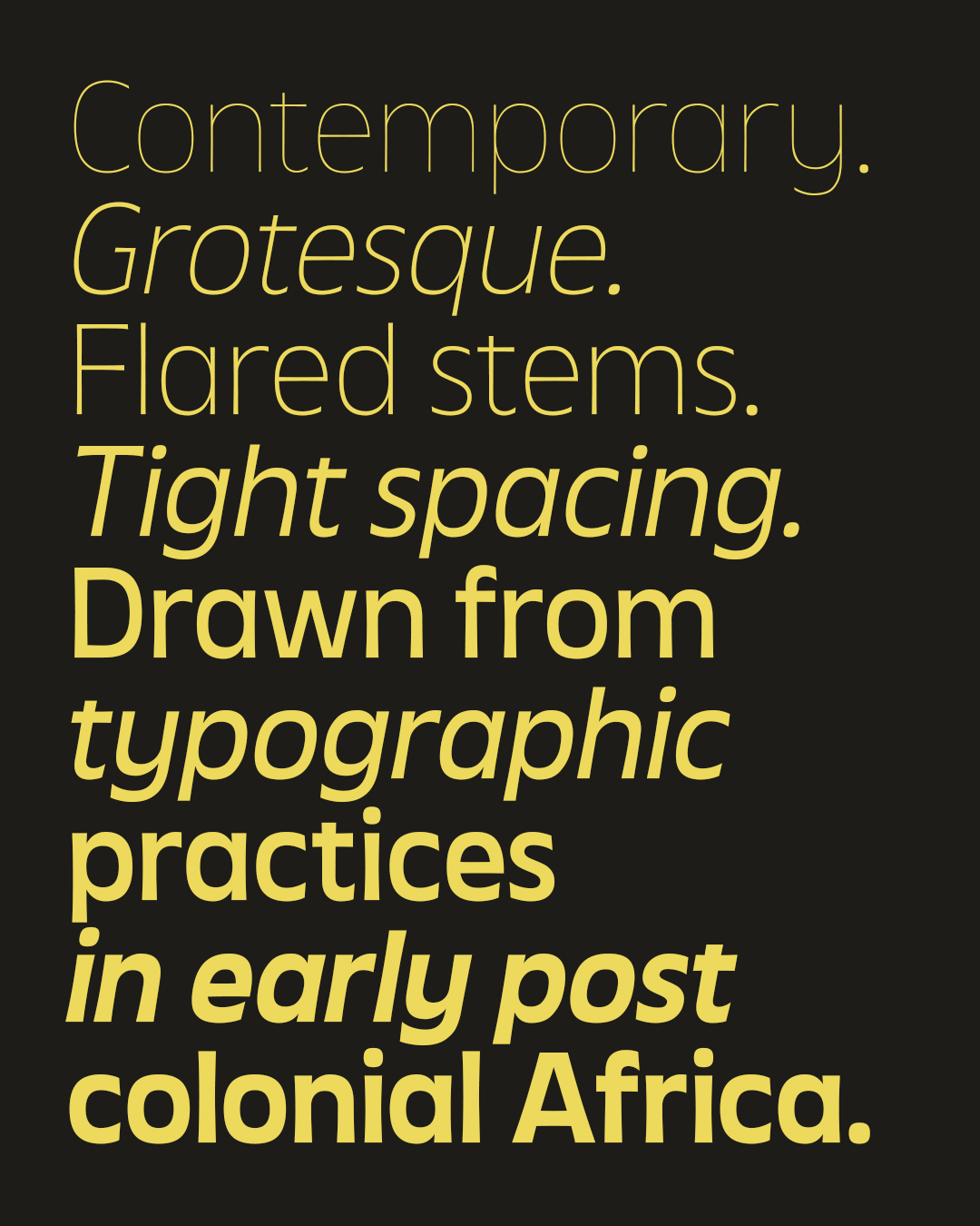
His typeface Touki Grotesk takes this approach as a starting point. Influenced in part by the visual language surrounding the 1973 film Touki Bouki, the project explores how imported typographic structures were reinterpreted across African visual culture in the decades following independence — and what it might mean to continue that evolution today.
In this conversation, Joboson reflects on his path into type design, the current state of Nigeria’s typographic landscape, and the broader questions of representation, access, and authorship that continue to shape the field.
Amber Weaver: Hi Chisaokwu, thank you for taking the time to answer my questions here. What is it that excites you the most about type design?
Chisaokwu Joboson: What excites me most about type design is that type is both invisible and powerful. We encounter it every day, yet rarely stop to consider how deeply it shapes perception. It influences how language is received, how authority is constructed, and how culture is archived. A typeface can subtly shift tone, expression, history, and even memory.
I’m especially interested in how type can reflect culture when it’s grounded in context. For me, it becomes a bridge between past visual systems that may have been overlooked or undocumented and future forms that are still undefined. Type design allows those histories to evolve rather than disappear.
AW: And what about Nigeria’s typographic scene? Could you educate us more on that?
CJ: Sure. Nigeria does not yet have a large formalised type industry in the way some Western countries do, but it has an incredibly rich lettering culture. From hand-painted signage and film posters to album covers and political graphics, typography has long been embedded in public life and visual expression.
What’s emerging now is a new generation of designers moving into structured type design. Access to tools and education is improving, but there is still a need for stronger local infrastructure, particularly in formal education, archiving, and distribution. The scene is largely self-taught, collaborative, and community-driven. It’s still early, but it’s energetic and evolving. That momentum makes me optimistic — not just about Nigeria, but about the broader future of African type design.

AW: So, Touki Grotesk, what inspired you to create it? And what informed the design?
CJ: Touki Grotesk emerged from research into post-colonial African typography, particularly the custom lettering found on African-themed film posters and record sleeves in the decades following independence. I was interested in how the Latin script, introduced through colonial systems, was reinterpreted, adapted, and reshaped within local visual cultures.
One key reference point was the poster design for the 1973 Senegalese film “Touki Bouki”. I was drawn to its expressive yet structured lettering — a balance between hand-drawn immediacy and emerging modernist influence. That tension became central to my thinking. Rather than replicate specific historical forms, I focused on structural qualities: subtle tapering, moderated proportions, and a slightly humanised rhythm within a grotesque framework. Touki Grotesk imagines what a contemporary African-inflected grotesque might look like if those post-independence visual experiments had evolved into formalised type systems.
AW: Do you have a specific approach in the way you start designing type?
CJ: I usually begin with research and exploratory drawing. The research might involve archival material, signage, film graphics, or broader historical context. From there, I move into sketching— sometimes loosely at first — allowing unexpected forms to surface before refining them structurally.
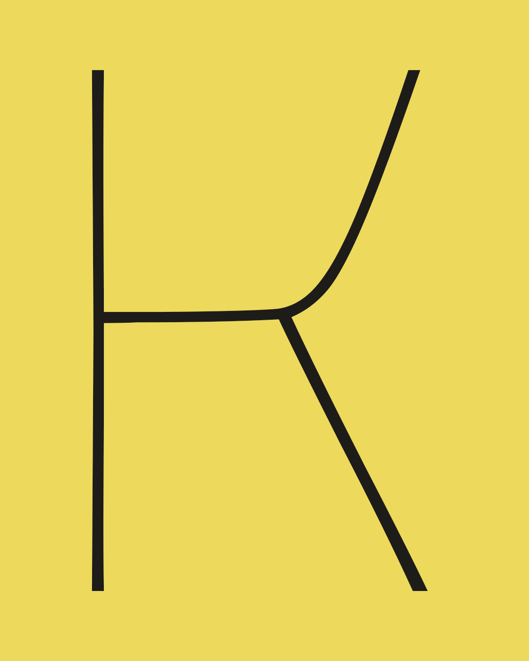
Very early on, I analyse the system: counters, terminals, stress, proportions, and rhythm. Once the core character is established, I develop the typeface methodically, typically starting with key uppercase and lowercase letters, then expanding to numerals, punctuation, symbols, and eventually extended language support.
I try to balance intuition with systems thinking. The initial exploration allows personality to emerge, while the structural phase ensures coherence and functionality across the typeface.
AW: Are there any distinct features of the fonts you release? Is there a purpose behind that?
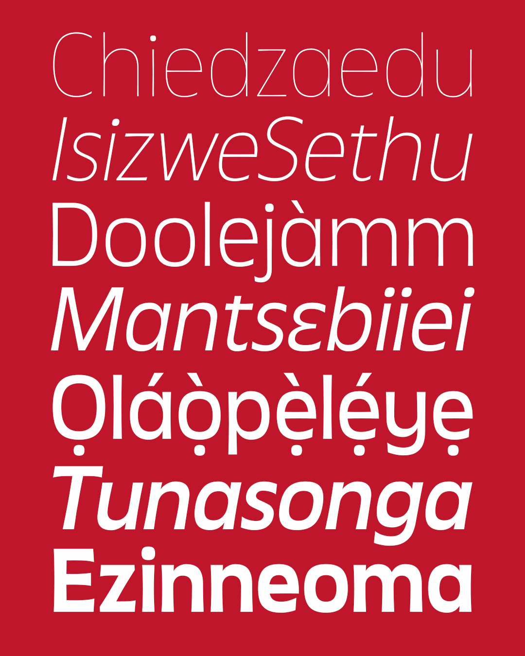
CJ: Across my typefaces, there are two consistent considerations: context and representation. In some projects, that translates into Afrocentrism; not as surface styling, but as a sensitivity to proportion, rhythm, and visual memory shaped by African environments. It’s more about perspective for me. I’m interested in how contemporary African identity can be expressed structurally within a type system. In other projects, the distinction lies in language support.
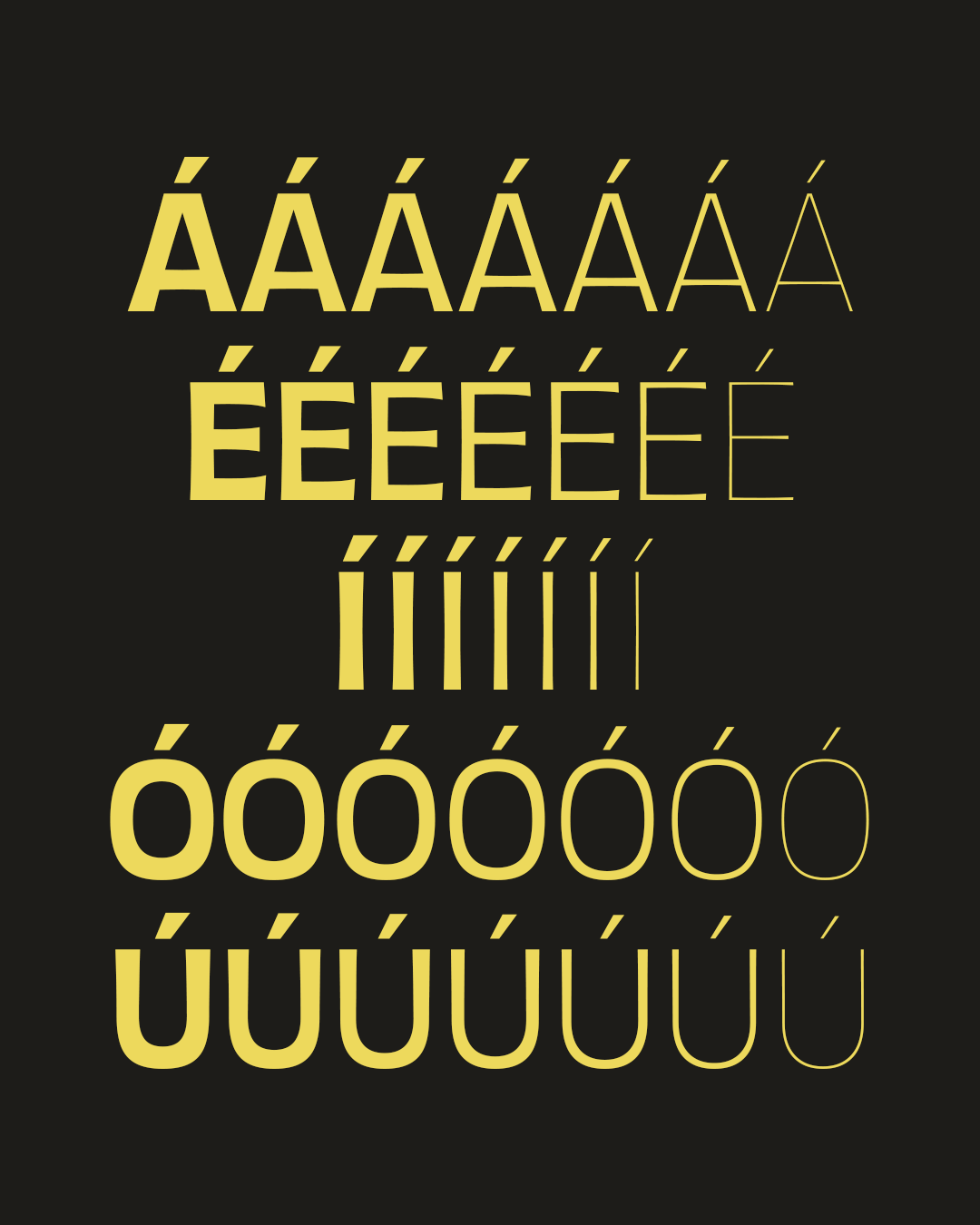
Expanding coverage for African languages is really important to me, particularly in digital spaces where typographic infrastructure has historically been limited.
AW: I see that you have several initiatives in your bio, like Ụdị Foundry and Type Afrika. Could you tell me more about those?
CJ: I appreciate you noticing that, Amber. Udi Foundry is my independent type practice, focused on developing contemporary typefaces that engage African history and culture while also supporting African languages. It operates as both a commercial and cultural project: a space for experimentation, research, and contribution to typographic discourse from within Africa.
Type Afrika is a community initiative aimed at encouraging more Africans to explore type design. It’s informal but intentional: providing access to affordable learning programmes, sharing resources, and offering guidance to designers who may not have clear pathways into the field.
Much of type education remains concentrated in Western institutions, so Type Afrika exists to help bridge that access gap in a way that empowers designers locally.
AW: And what are some of your ambitions when it comes to the foundry and Type Afrika?
CJ: For Udi Foundry, the ambition is to build a sustainable, globally respected type practice operating from Africa — not as a niche, but as a serious contributor to the field. I want the work to stand on its own formally and conceptually, while also expanding the geographic narratives that shape contemporary type design. For Type Afrika, the goal is long-term ecosystem growth: increased access to education, more African type designers entering the field, and stronger contribution of African typographic work. Eventually, I’d love to see structured education and archives emerge locally.
AW: If you had to advise someone who is just starting their journey into type design. What advice would that be?
CJ: Be patient: with yourself, with your journey, and with the process. Type design requires time, dedication, and a genuine love for the craft. It’s not a fast path to success, so if profit is the only motivation, it can quickly become discouraging. Having a deeper purpose — curiosity, contribution, growth — makes the process sustainable.
At the same time, don’t wait for perfection. Release your work. Share what you’re building. Talk about your process. It’s easy to fall into a cycle of endless refinement, trying to get everything right the first time. Resist that instinct. Typefaces evolve. Many of the fonts we admire today are the result of years of iteration and updates. Growth happens in public as much as in private.
AW: Anything exciting on the horizon in 2026?
CJ: Yes. I’m continuing to expand the Udi Foundry catalogue, including updates to existing families and another font release before the end of the year. I’m also developing more structured programming for Type Afrika and exploring ways to contribute to African typographic history more intentionally.
Trial Joboson’s fonts on Udi Foundry here.
Enjoyed this piece? Browse more of our typeface foundry editorials here.