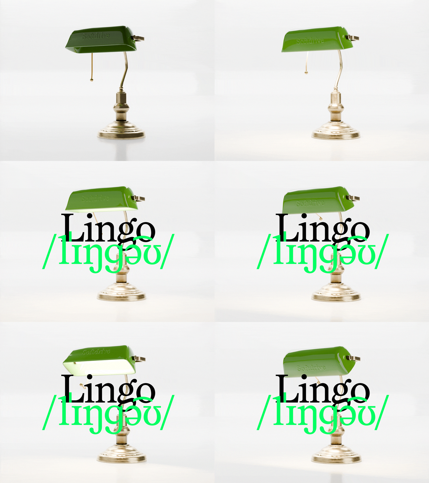

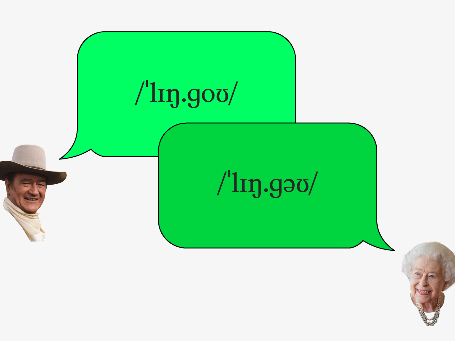
You might remember learning phonics as a child: linking letters to sounds. In the UK, for example, you’d say: cuh-ah-tuh, cat. Phonetic characters, the International Phonetic Alphabet, are a universal system for writing these sounds down without spelling confusion. For Mark Julien Hahn, founder of Berlin-based Softdrive Foundry, the connection is personal. “I come from an area in the Black Forest in the south of Germany where people – my family too – have a really strong accent,” he explains. Germans from further north struggled to understand them, so, like many of his friends, he dropped it. “That made me quite sensitive to phonetics and how to pronounce things properly.”
Lingo, Softdrive’s first retail release, is a serif typeface with a full IPA character set built in. It’s the kind of concept that only makes sense once you know where it came from.
From Skate Stickers to Serifs
Instead of entering type through a specialist programme, Hahn’s journey was gradual and organic.
His older brother, a graphic designer, sparked an early fascination with graphic design, while skateboard graphics, stickers and logos filled in the rest of his teenage years. As a kid, he drew obsessively, not so much comics and cartoons, but preferring realistic drawings. “In hindsight, that was kind of a good practice for working with curves and proportions in type design,” he says.
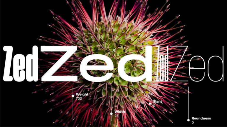
At the Art Academy in Stuttgart, where he was studying communication design, he started drawing custom fonts for his own projects and kept developing them long after the projects were done. Protest Grotesk, begun as a custom font for the architecture initiative Stadtlücken in 2016, wasn’t finished until 2023 – seven years, on and off, with Solenn Bordeau handling production and mastering.
The turning point was a custom typeface commission for software company ServiceNow, developed with type engineers Christoph Koeberlin and Igino Marini. “I loved going really deep into the process,” Hahn says. “That was when I realised this is the kind of work that is the most satisfying to me – so I decided to do it properly and started Softdrive.”
Why now, in a landscape where more foundries are publishing more typefaces than ever? Hahn is candid that “the question of which products are actually justified and needed is a relevant one.” His answer is twofold: working directly with graphic designers, ideally on custom work, and offering retail typefaces that don’t “just make another version of something that has been there before.” Each typeface needs a function and a story – and a campaign/brand building that “emphasises, humanises and sometimes mystifies” it, in the spirit of the 90s and 2000s skate brands he grew up on.
Lingo: The Concept
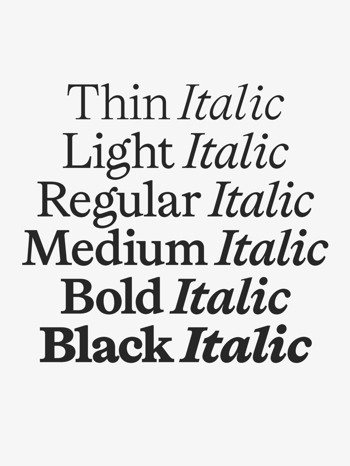
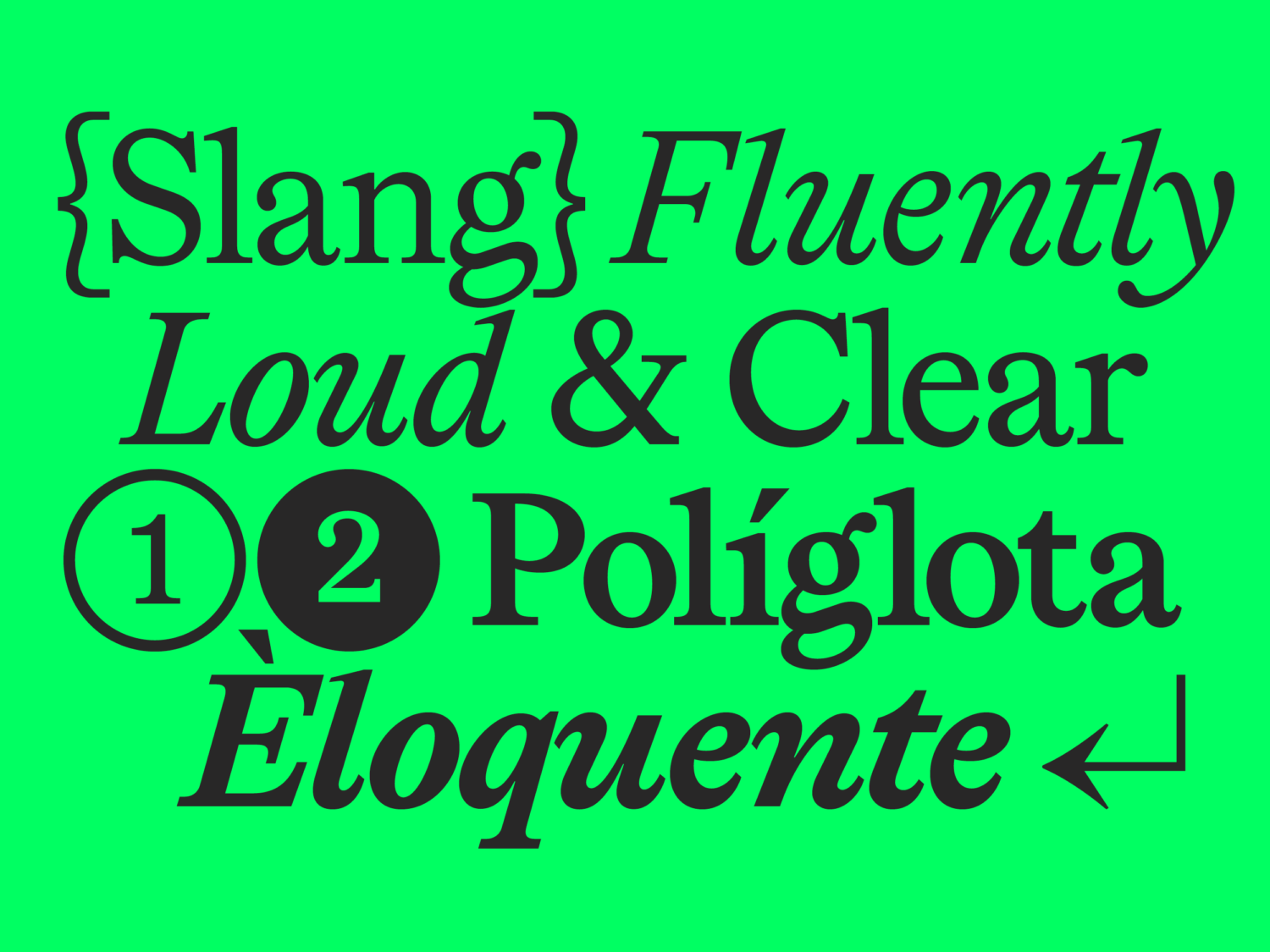
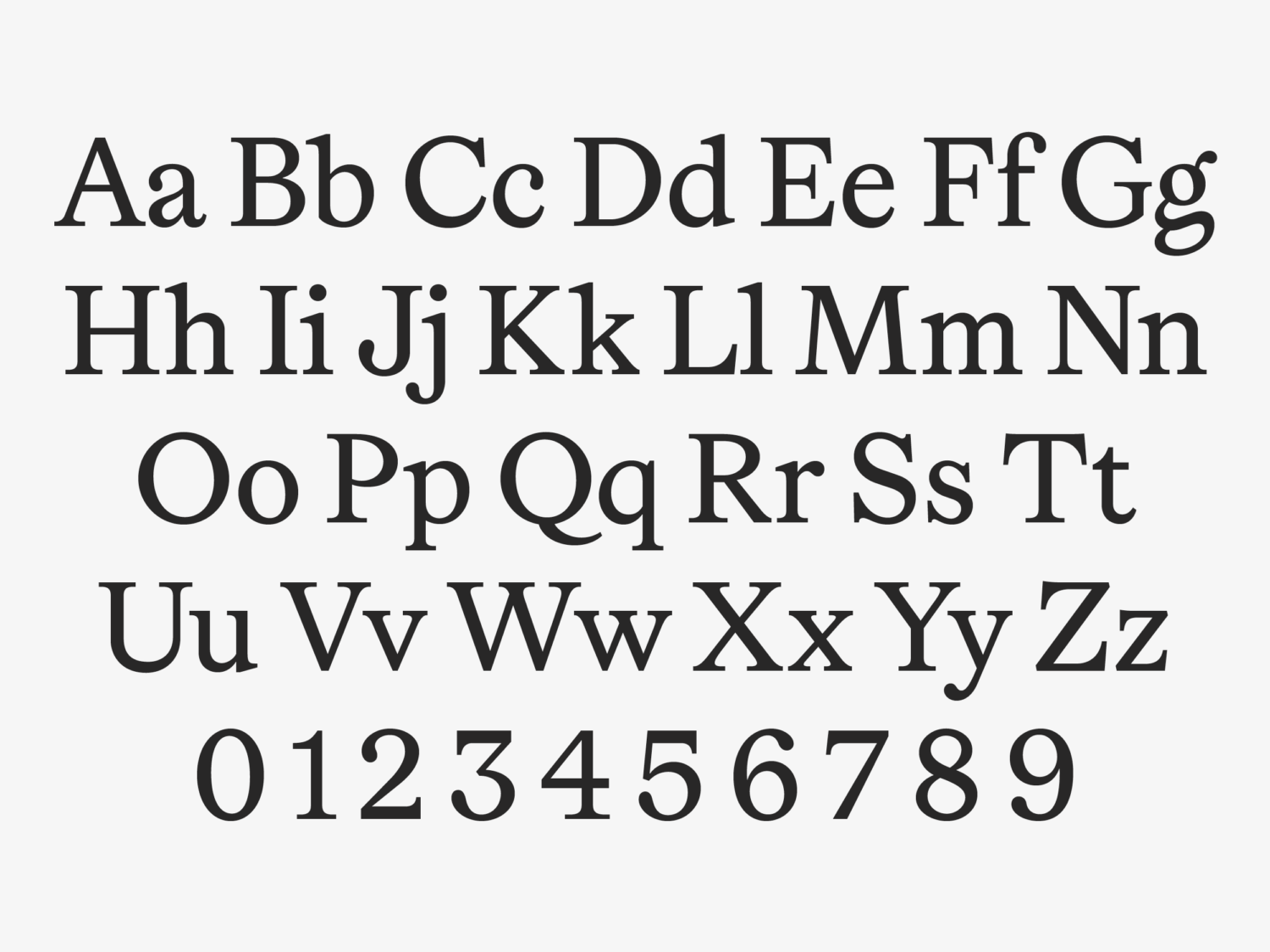
Lingo is a transitional roman serif in six weights with true italics, extended with a full set of IPA phonetic characters. Surprisingly, the two halves didn’t arrive together. The roman came first as a body-text font; the IPA idea came later. “That combination is what turned it into an actual concept,” Hahn says – it also opened the typeface up to display sizes and logo work.
The roman draws on three 18th-century sources, each bringing something different. The Romain du Roi, commissioned by the French state and cut by Philippe Grandjean, is widely considered the first typeface constructed on a grid rather than drawn from calligraphic habit. Hahn used it as the model for the lowercase construction: “It gives you a constructed underpinning inside what is otherwise a warm Roman serif.”
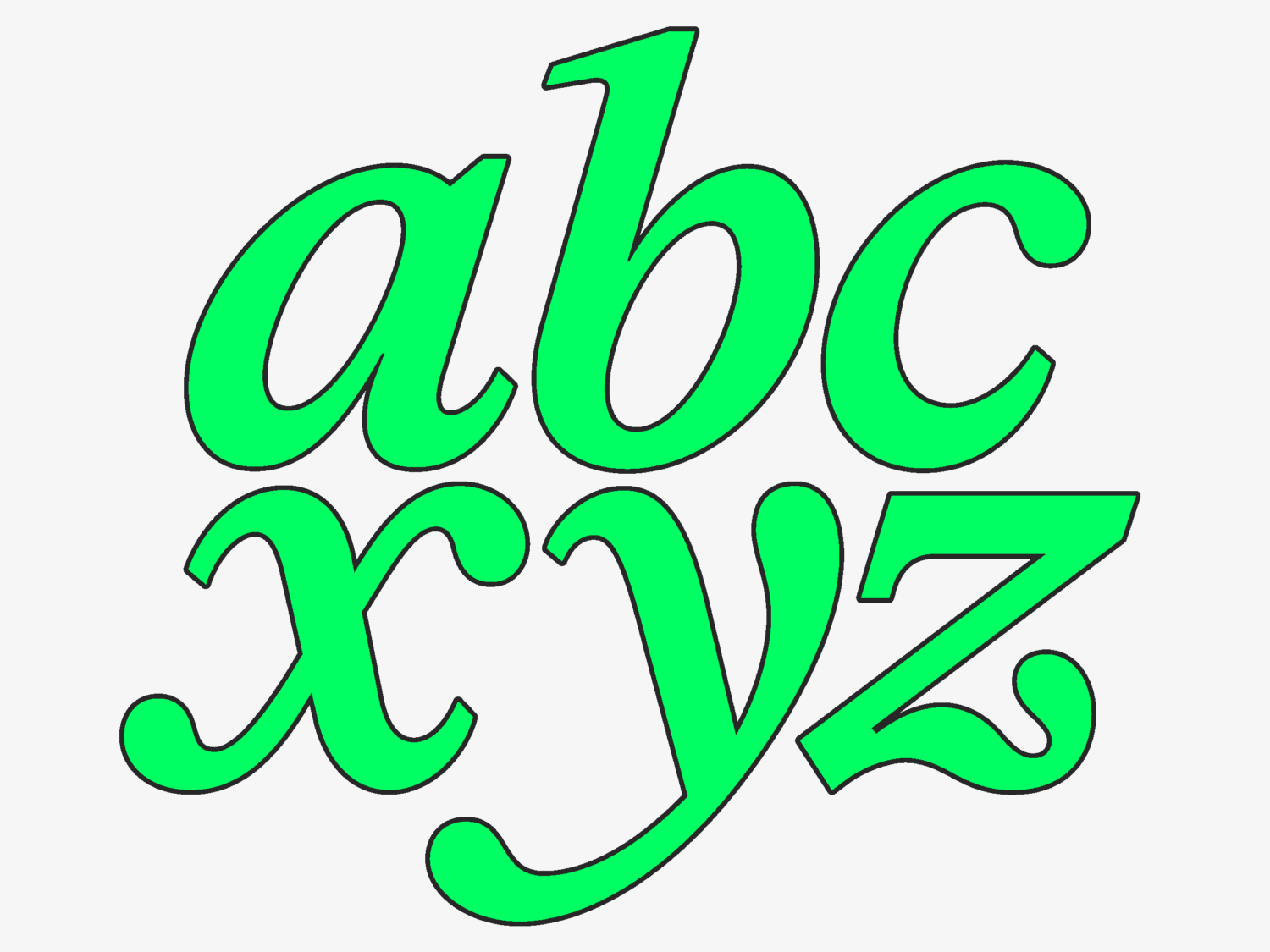
The warmth comes from elsewhere. “The drops of the a and the ear of the g are much closer to Baskerville – that is where the softer, more calligraphic details come from. The lowercase italics are shaped a lot by the Caslon italics, while the italic capitals drift towards Baskerville, because they are steadier and less calligraphic, which keeps them from getting too busy next to the roman.”
Plenty of serifs cite the 18th century. What makes Lingo interesting is the tension Hahn is engineering: a rational skeleton dressed in humanist detail. It’s historical “paired with something contemporary”, and, fittingly, a mirror of the IPA itself: a constructed system laid over messy human speech.
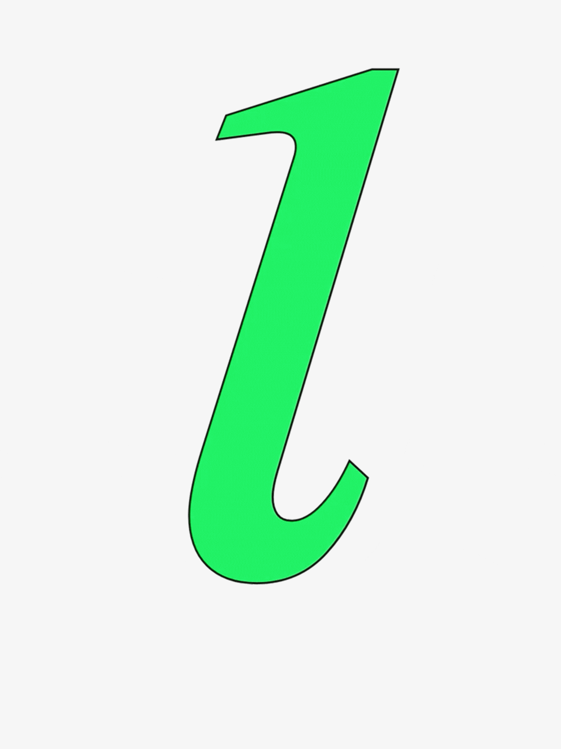
That logic extends to the italic phonetics, where there was no precedent. “The IPA has no italic tradition – phonetic characters are always set upright, so there is nothing to copy.” Some follow their Latin relatives; others had to be invented. His favourite is the gamma-like alternate y: “I just asked myself how the hand would end that stroke – and it ends in a little swirl, the descender curving back up into a closed loop, the same way you would write it.”
Workhorse vs Show Pony
Created entirely by Hahn, “from design to production and mastering, through to designing the campaign and coding the website,” Lingo took about four years, with first drafts in 2022. The Regular and Bold, he says, came first and were far more display-like: bigger drops and a much more pronounced ear on the g. Bringing them into body text meant tuning those features back without losing the character, “many, many versions until it felt right.”
The biggest challenge across the weights came from the drops; heavy ones gave character, but at the bold end they closed up the counters “and then it stops reading.” So Hahn redrew them smaller, weight by weight. His principle: exaggerate the idea first, then fine-tune it back.
Early Trials turned that process into a feedback loop. The biggest response was about the g. “People came back and told me the ear makes it hard to read at small sizes… and that I should just change it. I did not want to, because that g is a lot of the character of the typeface.”
His solution was a Body g in Stylistic Set 3 (SS03): keep the expressive one for display, switch to the quieter one for long text. The far-reaching f, which collided when tracked tight, produced a run of extra ligatures.
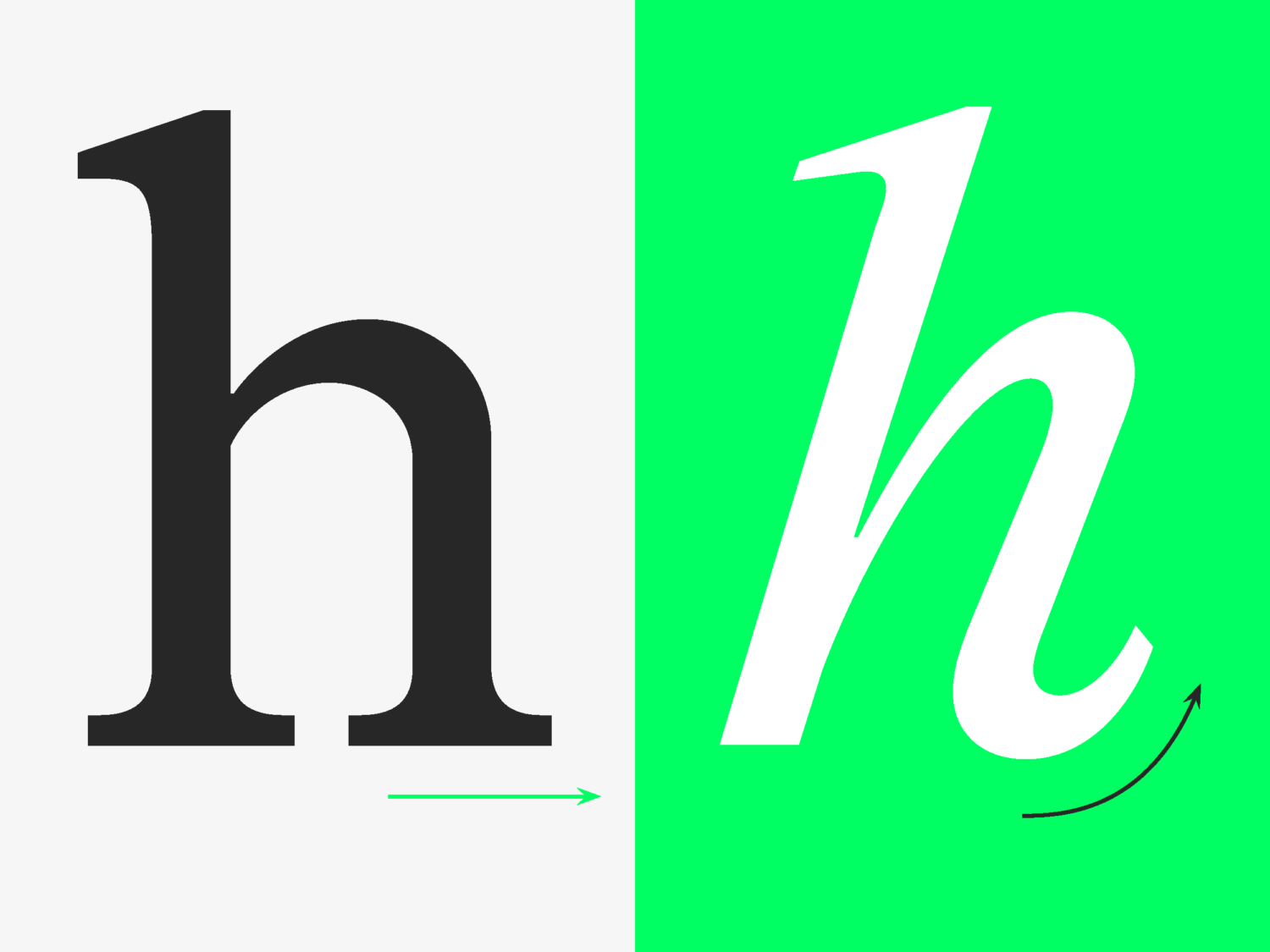
Then there are the details Hahn loves for their own sake:
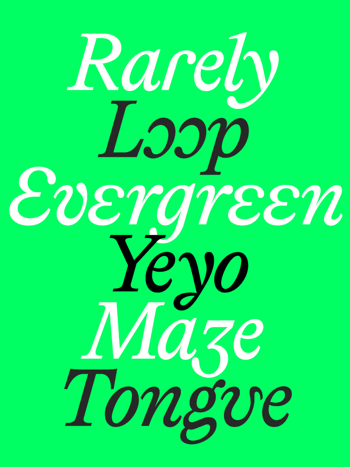
The open o (based on the c, just turned) that “changes the texture of a whole setting.” And, his favourite, a hidden one: when two g’s follow each other, a contextual alternate flips the second ear so they don’t just repeat, but “answer each other.” Most readers will never notice. “But to me, that is what makes it fun. If someone does notice, they stop for a second, and that is the moment they remember the typeface.”
If you buy the entire Lingo family, you also receive two variable font files; weight axes for upright and italic, rather than one with a slant axis. Since the italic is a true italic, “so the letterforms are genuinely different shapes, not the roman at an angle. There is nothing sensible to interpolate between.”
Where does he want to see it? Posters and logos that “go crazy with the stylistic sets.” But the thing that hasn’t happened yet: “someone using it in a completely sincere context. Setting a paper on new linguistic research, for example. That would close the loop on the whole idea.”
Care over Clout
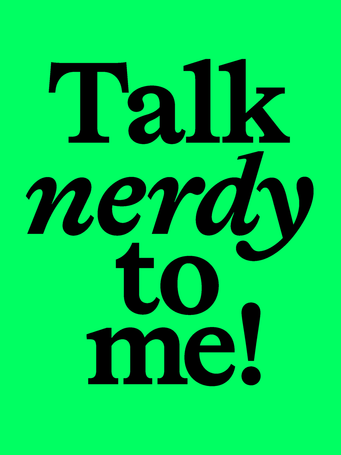
The best place to meet Lingo is its thoughtfully crafted website, showing off all aspects of the typeface. The specimen is “the technical, sincere one: all the details and the nerdy type-design stuff,” running entirely on the variable font so you can push the weight across the whole page. The Release Note, by contrast, tells the story. The copy, by Brooke Cheney, isn’t lorem ipsum but language itself: vowel shifts, dialects, spelling as “a fossil record of sounds that no living mouth makes.”
That tone, conversational, witty, and warm, is deliberate. “Being casual doesn’t mean being less precise. The nerdy details are all still there; they just don’t need to be wrapped in formality to be taken seriously.”
It extends to how the foundry runs. Every release comes with free trial fonts – and unlike most foundries’ trials, they aren’t stripped down: complete character set, all OpenType features, kerning included. The frustration behind it is a designer’s one: “I can’t judge a font that has no kerning or diacritics,” Hahn says.
Underneath it all is a quiet point about who gets to make type. For a long time the answer was a closed circle – “mostly white Central European men who got to shape what type design looked like.” Hahn is glad that’s changing, and clear that it doesn’t mean binning the history. “I love the old references, but they shouldn’t be the entry ticket.”
What’s Next
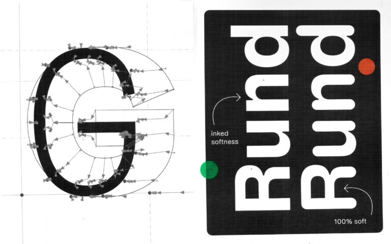
Lingo sets the template: concept and storytelling first, in whatever style the typeface demands. Coming up are a rounded extension of Protest Grotesk – “somewhat ironically, the first typeface in the Softdrive catalogue that is actually soft,” with a campaign that will “literally be about driving” – a refresh turning Cidade from a one-weight unicase font into a full display system, and an expanded 365 Grotesk built to be “the ultimate sans serif for every day of the year, no matter the weather.”
Lingo is out now.
Download the full trial at softdrivefoundry.com – and if you set a linguistics paper in it, let him know!
Read more of our type design editorials here.