
18 Years of Type Design from Latin America.
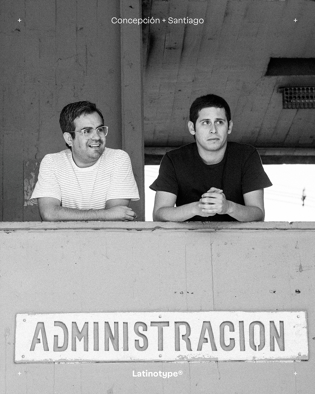
Eighteen years on, the Latinotype catalogue reads less like a collection of fonts and more like an archive – a record of how type design in Latin America has changed. It began in 2008 as a one-person project in Concepción, a cold, rainy university city in southern Chile, at a time when Chilean typography lived mostly in classrooms and had little commercial tradition to draw on. From there it grew into one of the most recognised foundries to come out of the region.
Today the foundry has more than three hundred families in circulation and has drawn type for brands on several continents. But what defines it isn’t a house style. It’s a way of working: collaborative rather than single-author – spread across global distribution platforms and extended into scripts far beyond Latin.
So rather than a linear chronology, what follows opens a handful of folders from that archive and pauses at the moments when Latinotype changed how it worked – and where it sat in the market.

Archive 01 – Shared Learning as a Starting Point
The early typefaces – Los Lana, Pincoya and Muralista – were as much exercises in graphic exploration as spaces for collective learning. Nobody involved had much technical training, so a good idea counted for more than clean outlines, and the group existed to turn the one into the other. That meant designers of very different backgrounds and skill levels could take part, and teaching became part of what Latinotype was from the start.
It worked like a small, informal co-operative: designers, friends, relatives and collaborators helping one another finish typefaces. Daniel Hernández, for example, would eventually teach his own father to design type. Years later, a Mexican designer would describe Latinotype as his “personal trainer in typography.”

Archive 02 – From the Periphery to the World
Concepción is a provincial city, a long way from Santiago, where Chile’s design scene actually lives. And in the early years, that distance showed. Travel changed things; events and meetings with type designers elsewhere in Latin America showed the founders a bigger, more ambitious version of what they’d been doing at home. A loose group of beginners teaching each other became something with real methods and real ambition: making type that could exist outside Chile, not just locally.
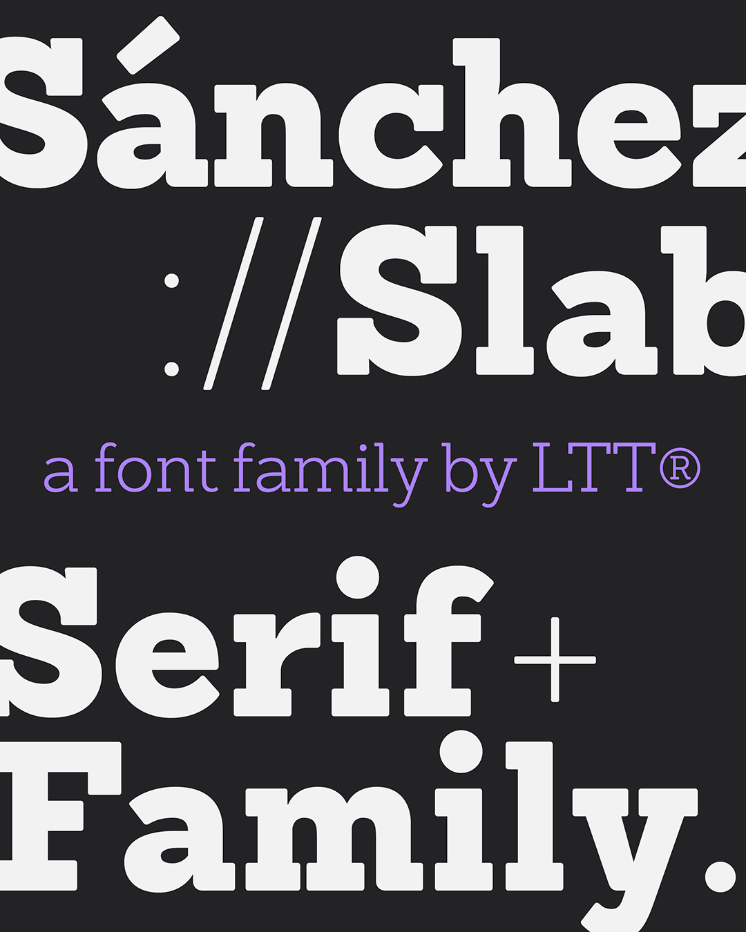
The real shift came when Daniel Hernández joined from Buenos Aires, where he’d been working with Ale Paul. With him, Latinotype started designing typefaces to sell, and to sell internationally. Families such as Antártida, Sánchez and Isidora reflect this transition. Around the same time, the circle of collaborators stretched beyond Chile, across Latin America and into Europe.
Archive 03 – Shaping a New Image
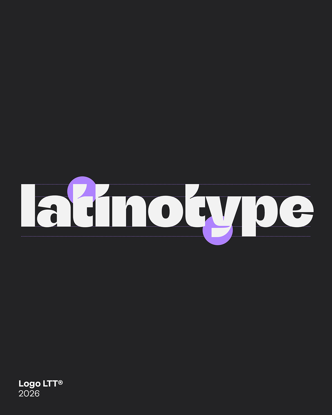
Once Latinotype was working for clients outside Chile, its own identity started to look out of date. The original logo was hand-lettered, rooted in Latin American vernacular graphics – which had fit the experimental early years. As the catalogue grew and new commissions arrived, the foundry needed a different way of presenting itself to the world.
A new logotype, based on typography rather than lettering, introduced a more precise and professional tone. The point wasn’t to disown where the foundry came from, but to scale it up, so Latinotype could sit across the table from international brands as an equal without losing its character.
Archive 04 – Building a Foundry
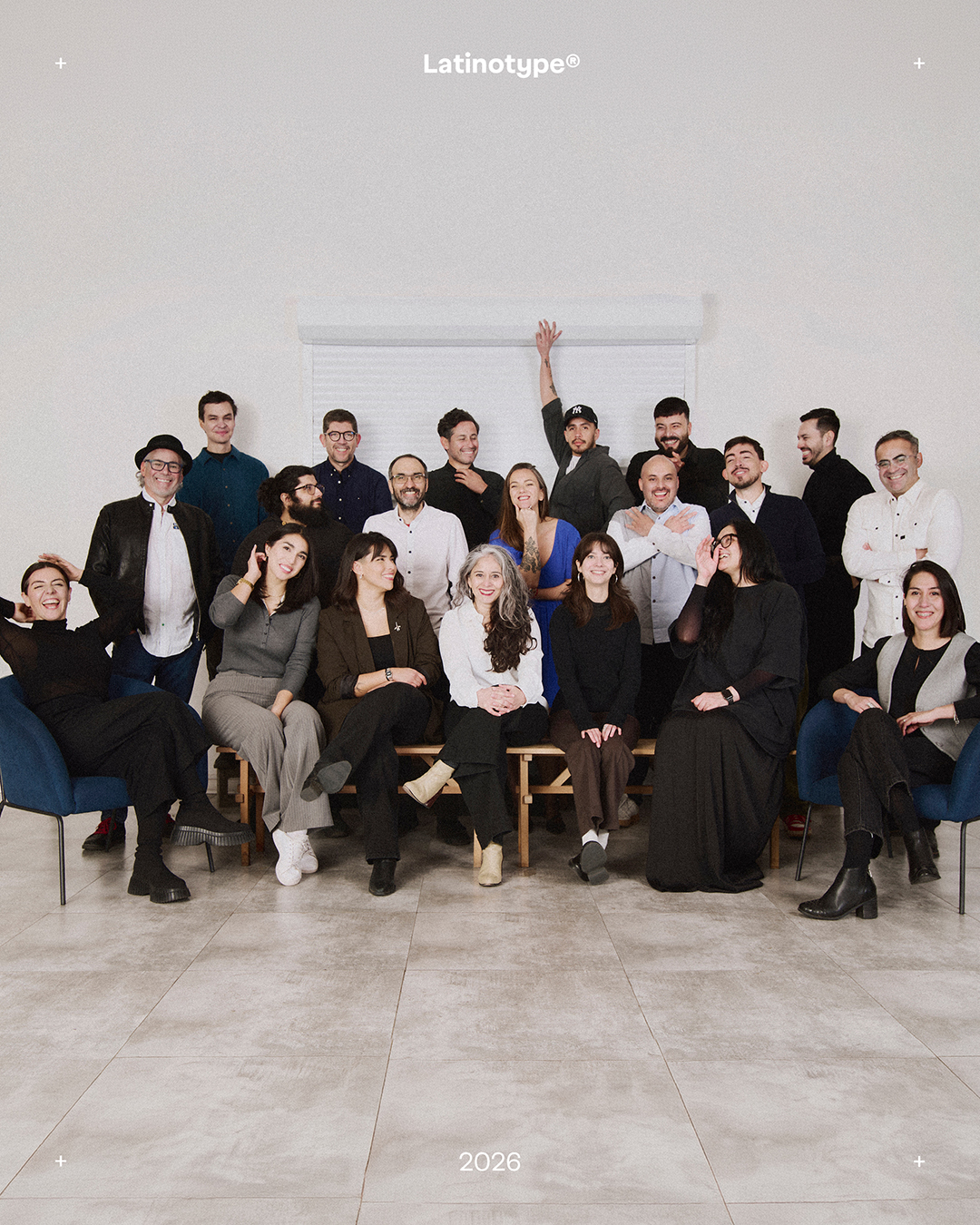
Because Latinotype grew by bringing in people from very different backgrounds and levels of experience, it also became something rare in the field: a foundry with more women designers than almost anywhere else in the Latin American type scene. Several of the catalogue’s best-known families were drawn by women working within this model – Paula Nazal Selaive’s Trend and Trenda, Sofia Mohr’s Moranga, Guisela “Coto” Mendoza’s Dans Le Cuisine and Bon Appétit, among others – and the way the foundry worked is a large part of why.
Technological evolution played a key role in consolidating this structure, making it possible to systematise processes, build complex families from a small number of masters and organise production across different stages and roles. Beyond a traditional studio, Latinotype gradually became a platform: a place where a new generation of Latin American type designers could learn, publish, and get paid.

Archive 05 – From a Local Catalogue to Global Circulation
Getting onto MyFonts changed Latinotype’s international trajectory. As the catalogue grew, some families became genuine bestsellers and found markets the foundry had never sold into. When Jan Middendorp featured Trend in the MyFonts newsletter in 2012 and 2013, it was an early sign that the international type world had noticed.
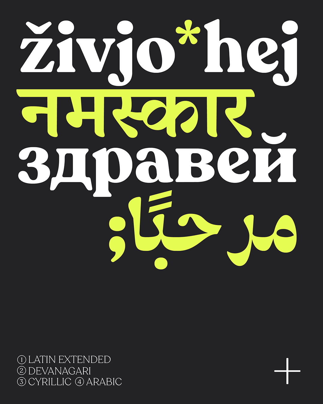
From there, being used by brands abroad changed the work itself. Typefaces that had only ever needed Latin now needed Cyrillic, Arabic, Devanagari. Latinotype brought in specialists – Tarek Atrissi for Arabic, among others – and learned to design for scripts and cultures a long way from Concepción.
Trial Latinotype’s fonts out for free here.
Enjoyed this piece? Browse more of our type foundry editorials here.