
Custom font production for brands is undergoing a quiet shift where the days of buying a generic off-the-shelf font are disappearing. Today, cutting-edge global brands view custom typography as their digital handwriting, a core strategic asset that needs both functional precision and emotional range.
Recently, I sat down with Jowey Roden, founder of Koto, to discuss the launch of CCType, their new in-house type foundry. We talked about why one of the world’s leading branding agencies decided to enter retail type, how to strip the nightmare out of font licensing, and where technology is taking type design next.

Here are 5 key takeaways from our conversation:
1. Scaling In-House to Drive Commercial Value
For years, Koto built bespoke typefaces for tech giants like Amazon and Google. Launching CCType was about channeling over a decade of high-stakes learning into a dedicated retail foundry, delivering custom-level craft directly to the wider market while enhancing their full-service agency offerings.
Jowey: “The more facets of creativity we can own and deliver internally, the better the services we can ultimately deliver to our clients… Something specific to typography is that if we can offer it at a more affordable cost, it’s much more likely to happen within a project. And generally, the product quality in the project becomes much better.”
Amber: “Bringing things in-house reduces the external resources you need to pitch to the client. It’s actually really good to hear that clients have that appetite, because font choice is a vital part of brand language. If you sleep on it, it can completely dilute the message.”
2. The Rise of the Sophisticated Type Buyer & Licensing Fatigue
Clients are far more educated on typography than they were five or ten years ago. They recognise that a headline font isn’t enough; type must work across apps, out-of-home, and motion. At the same time, enterprise clients are suffering from severe licensing fatigue around traditional pay-per-view metrics.
Jowey: “We’ve been noticing an appetite from clients for bespoke typefaces or things unique to them, along with licensing fatigue. Particularly at large scales—app downloads, page views, etc.—people start asking, ‘Why am I paying such a large amount for this when maybe we could do something bespoke?.”
Amber: “I’ve been having similar conversations with clients daily for about 5 years now. Licensing can get so complicated when dealing with a third party—it becomes a complex triangle. The client more often than not has to muster the energy to care about the complex process; what they really want is to get work done in a way that works for them.”
3. Killing Friction: “One Licence to Rule Them All”
Traditional font licensing is unlike buying almost anything else in business, often causing friction that turns buyers away at checkout. CC Type’s approach strips out the complicated math in favour of a clean, company-size model with unlimited usage parameters.
Jowey: “We were looking for simplicity. Essentially: size of company equals cost, and it doesn’t matter where you use it—web, app, or out-of-home. It’s one licence to rule them all. You should be able to explain it to your CMO in one sentence: ‘We’re buying this thing forever for X number of people.'”
Amber: “With licensing, there’s so much friction you can accidentally create by trying to offer every option imaginable. The more options clients have, the more confused they get, which turns them off buying altogether. Selecting a font should feel as easy as buying a piece of clothing.”
4. Quality Over Quantity: Building Transparently
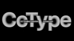
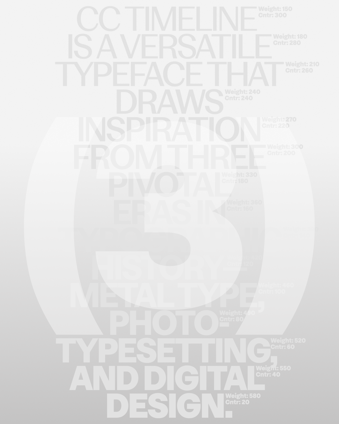
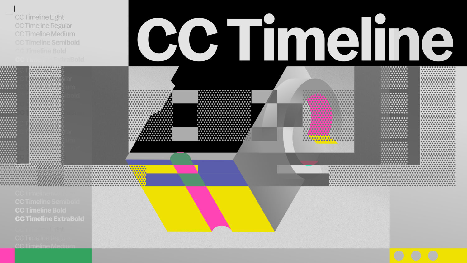
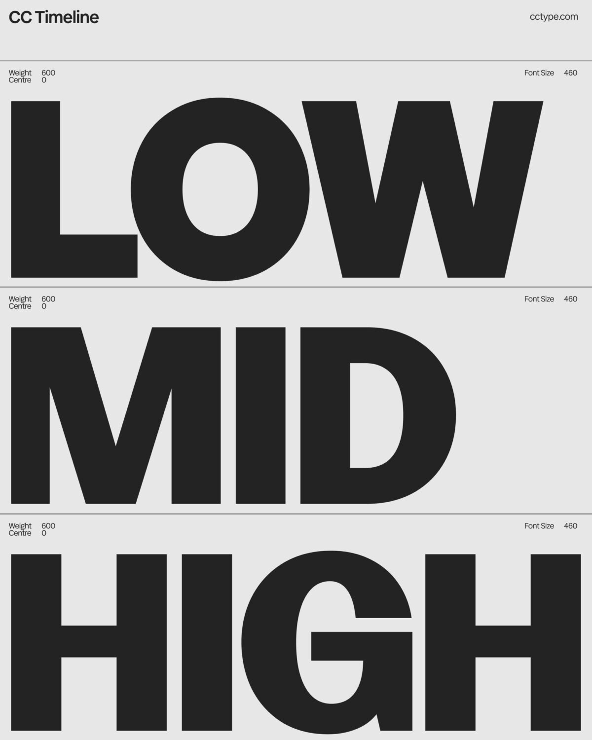
Rather than launching with a massive catalog, CC Type debuted with a single, highly refined variable typeface—CCTimeline. By launching intentionally with one workhorse family, the studio can gather real-time market data, learn from early adopters, and build transparently in public.
Jowey: “We’ve got five or six families as works in progress, but we wanted to ask: what could we do exceptionally well with lots of variability and high craft? Part of responding to the market was wanting to build transparently, see purchasing patterns, and respond to feedback. With that said, whatever we do next will be weirder.”
Amber: “Focusing on one high-craft workhorse allows you to test the waters without overwhelming the market. It shifts the focus back to the end user and the experience you’re taking them through.”
5. The Frontier: Creative Code, Dynamic Decay, and Unlocking Character
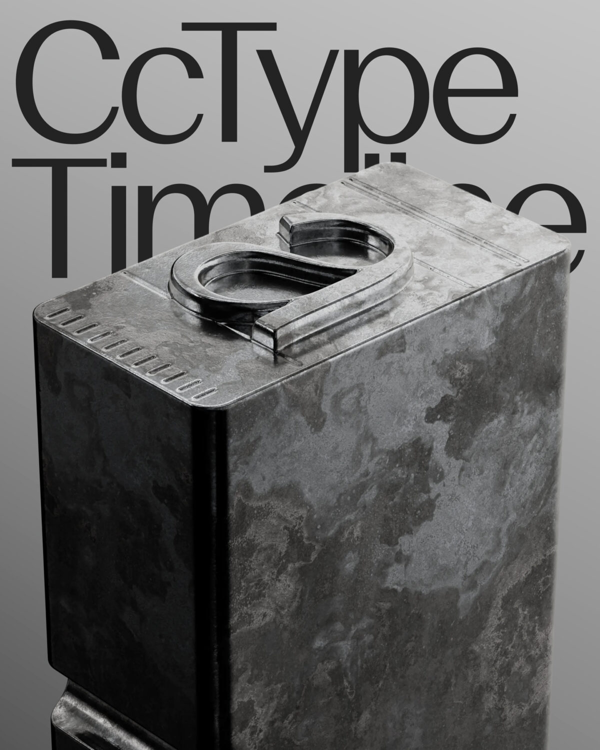
The future of type lies at the intersection of craft, emerging technology, and authentic personality. From open-sourcing type for students to experimenting with algorithmic fonts that respond to keystrokes or decay over time, type is becoming an active artistic medium too.
Jowey: “We’re interested in novel uses of type. Could a typeface decay over time the more you use it? Could it adjust based on how many people use it, or respond to keystroke inputs? We want to strike a balance between weird and usable—striking headline styles with extreme character that scale down into very functional body styles.”
Amber: “What’s exciting is that agencies like Koto are driving type culture. We’re all drivers of design culture in our own way, and by documenting these shifts now, we can look back and see what truly influenced where typography went.”
Check out CC Type’s Timeline typeface here.
Explore Koto
Enjoy more editorials about the goings-on of type foundries here.