Alen Kapetanovic of Silverstag Type Foundry spent five years studying civil engineering before drawing a single letter, and this can be felt in his type catalogue: strict proportions, with serifs engineered to hold their shape from hairline to black. Yet his favourite is called Arcilla, Spanish for clay. “It’s easy to mould,” he tells us; it’s not concrete, it’s not a block of stone.” That tension runs throughout SilverStag, the one-person Madrid foundry he has run since 2018: an engineer’s discipline applied to letters, followed, every so often, by a decision to let go. We spoke to him about kerning 3,000 characters by hand, why his italics keep turning into scripts, and the fantasy book cover he’s still waiting for.

From Watercolour to Working Foundry
SilverStag arrived without a plan. Kapetanovic had been designing since 2009 – websites, branding, “everything” – and built a studio with clients and employees. But his first typeface, in 2018, was painted in watercolour, scanned and rebuilt in Illustrator: “an SVG font that was really popular back at the time.”
“I didn’t even have a vision at that moment about what I want to make,” he tells us. “I’d been just experimenting for the first year, seeing what I can do, learning a lot about type because everything I’ve learned, I learned on my own and through some courses online.” Direction came as script gave way to serif and sans, and experiments became a catalogue.
What hasn’tchanged is who does the work: Kapetanovic alone designs, kerns, masters and engineers every SilverStag typeface, start to finish – and only ever one at a time. “I like to have control over those things,” he says, “to actually make my idea and the final product how I really want.” He’s candid about the cost: “It’s true that I don’t publish as many typefaces as I did three or four years ago, but I do everything on my own, and I’m really trying to make these typefaces as best as possible.”
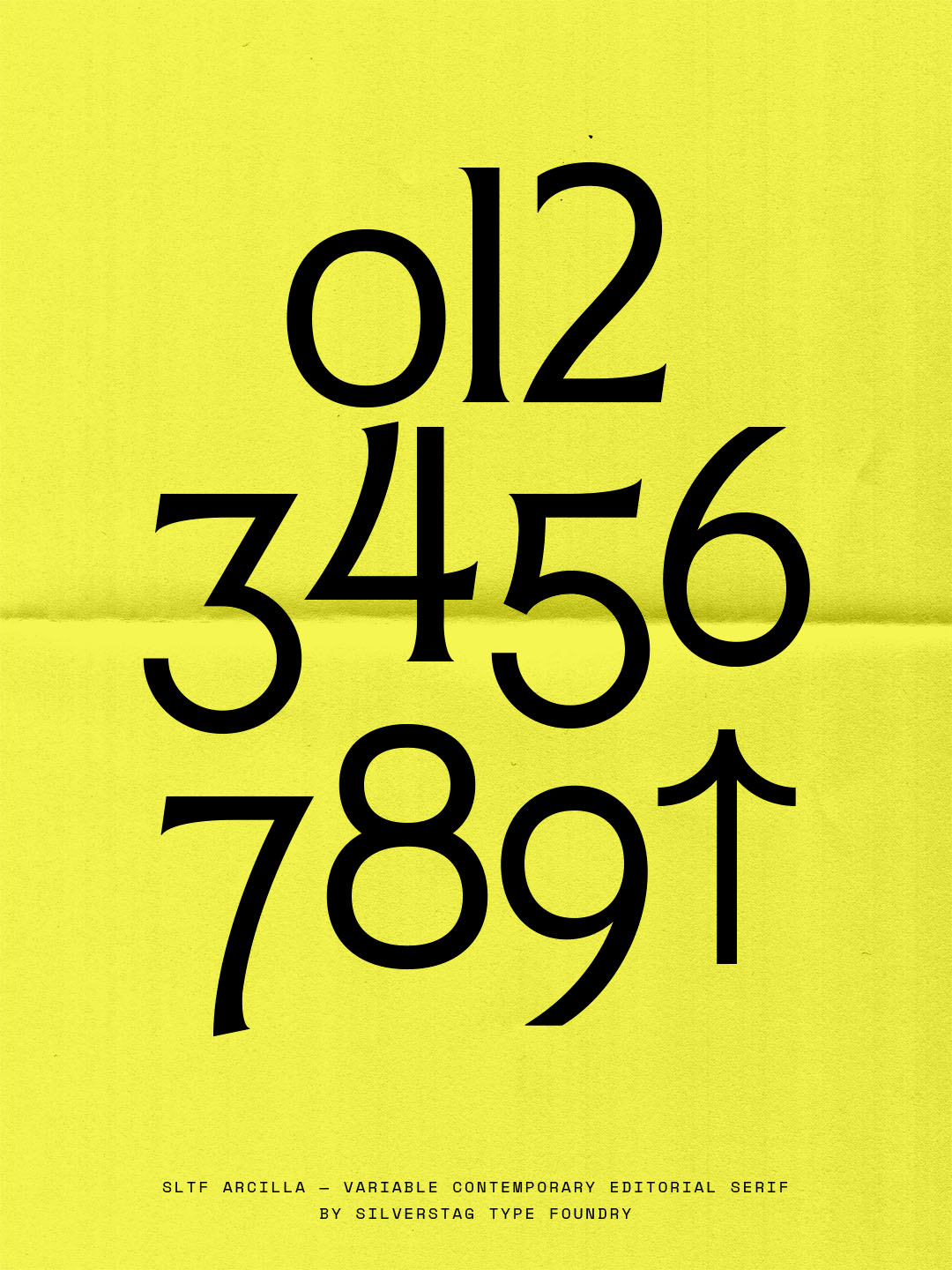
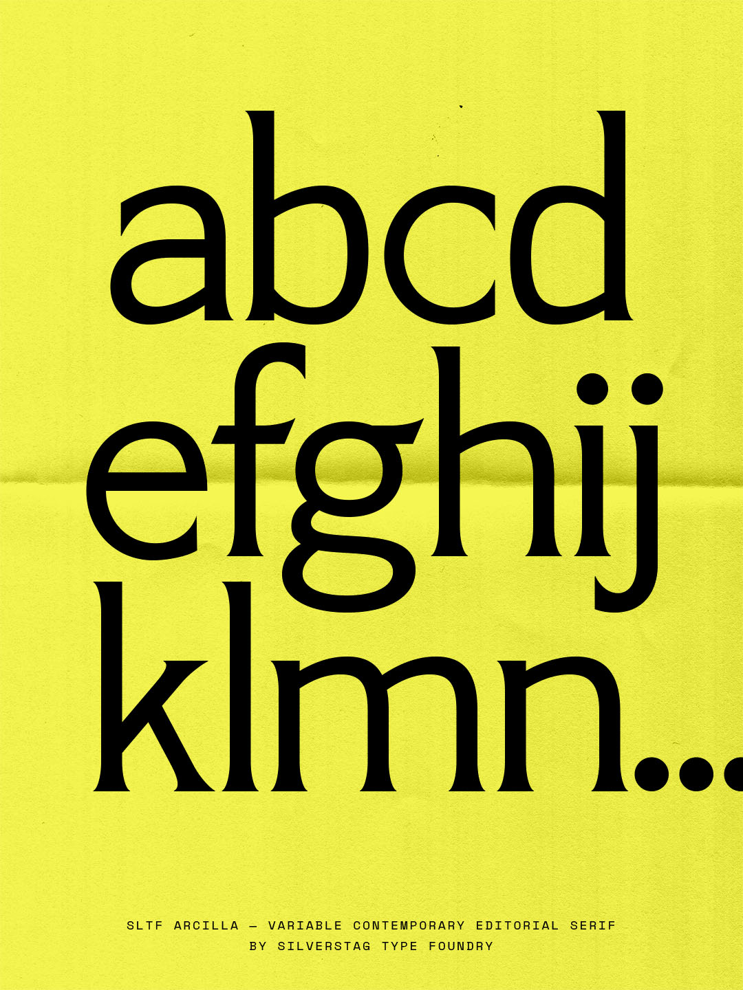
Arcilla: Clay in the Hands of an Engineer
Ask for a favourite, and he doesn’t hesitate. “Arcilla has that architectural and technical aspect to it, and it probably comes from my education. All these technical drawings, I think it’s incorporated in all my typefaces, but especially in Arcilla.”
The capitals are where the engineering shows: sharp wedge serifs that, set in all caps, turn a word into a single carved shape. The lowercase is softer – open, rounded, with a small flare into the serifs – which keeps it readable at small sizes. The references are Madrid’s architecture, not type specimens, and the name signals the attitude: “With clay, you can make whatever shape you want. So I gave myself the freedom to make letters really interesting.”
That freedom shows in the alternates, and in his favourite glyph (if he REALLY had to pick): the alternate uppercase As. “One leans left, one leans right, but they also have this extension at the top that isn’t really what you see in a letter A.” The harder part was the variable version – serifs that work “on a thin version and on a really, really heavy version” – “quite a challenge, but something I really enjoyed.” Kerning, by contrast, barely troubled him. Structure is the easy part. The chaos comes later.

Old Money, Wild Italics
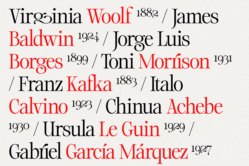
Where Arcilla brings structure, The Silver Editorial and Netsera, the foundry’s two bestsellers, bring contrast and curve: one with slow, nostalgic glamour, the other with the full sweep of the calligrapher’s hand.
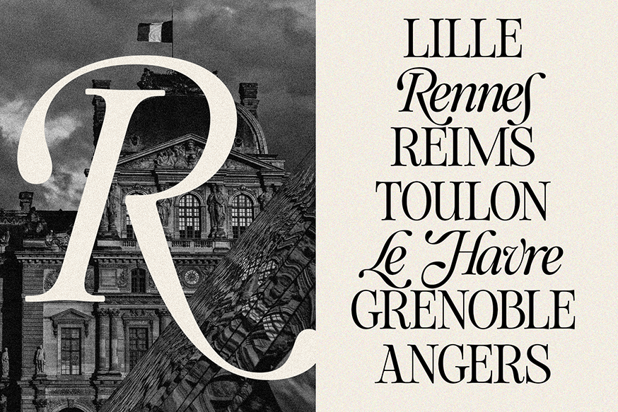
The Silver Editorial – a sharp, high-contrast editorial serif inspired by 1980s fashion magazines – began life three or four years ago as a simple regular and italic. “Then I saw that people really loved it,” Kapetanovic recalls, “and I believed they loved the nostalgic vibe it brings, but also something modern.” Deliberately light on ligatures and alternates, it’s a face that “brings that rich and old money style to the table.” Two years ago it grew into a full family of 18 weights plus variable fonts; it remains one of the foundry’s best sellers, and “one of the typefaces I’m really, really proud of.”
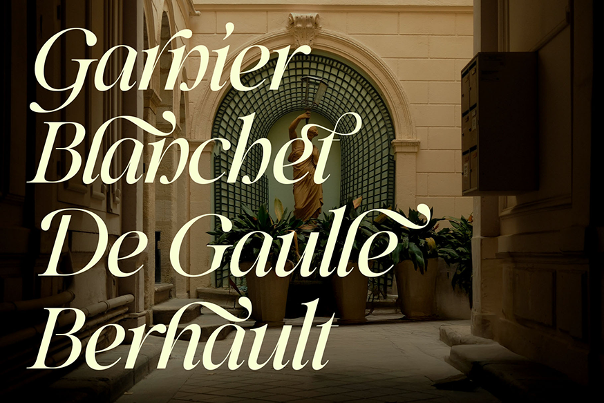
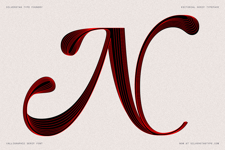
While it shares an undeniable elegant essence, Netsera goes in the opposite direction. Its roman is “quite classical – if you think of Bodoni or the Didone fonts.” Still, the italic is built as a calligraphic serif, dense with swashes, ligatures and alternates like an ‘s’ that dives well below the baseline. It was “probably the hardest typeface to do kerning on. You can imagine one scenario, but there are five or ten more where they’ll use a certain letter in the middle of a word, even though it’s meant to be an ending letter. It’s really a nightmare. But I like doing those things.”
Balance, he admits, isn’t always the goal: “Sometimes I just go and hit it hard with all these swashes.” Recent releases The Loneta Editorial and Hazel Shore push further – serifs whose italics are closer to calligraphic script, “but you still look at it, and it’s still a serif.” Of Loneta: “It’s one of the coolest things I’ve made.”
Looking Everywhere But at Type
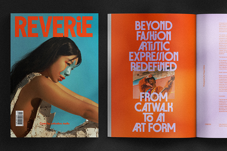
Kapetanovic’s process starts by refusing the obvious reference. “When I try to find inspiration for my typefaces, I never look at other typefaces or fonts, because if you look only at typefaces, you are missing so much. There is so much inspiration in art, in music, in architecture, in shapes, and how they combine.” His Pinterest boards are “full of different kinds of things and not letters.”
The same instinct extends to tools. “When they pushed ChatGPT and then Claude and all these LLMs, I decided that my typefaces will still be designed by me. Kerning is done by hand, by visual recognition. I want my typefaces to be 100% human-made.” That can mean “five or six hours just looking at letters,” followed by two days of not opening Glyphs at all.
Likewise, the human-made principle doesn’t stop at the letters; it extends to the business, too. “I am a one-man band, and I cannot pretend that I have a huge team.” Having left branding to escape two hundred emails a day, he now answers every message himself – on his own terms: “I like to be in a direct conversation with my customers.”
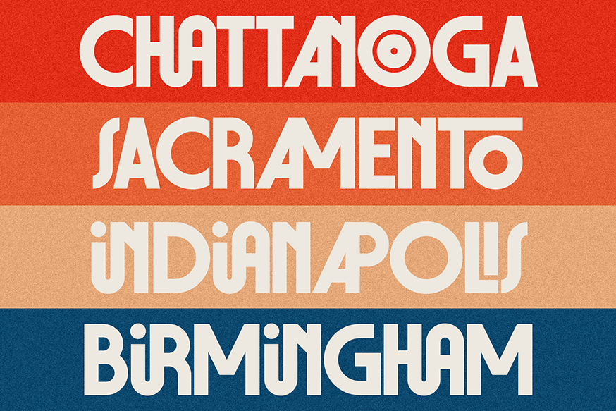
And it hasn’t made him precious. Subscribe to the SilverStag newsletter, and you’ll receive a font pairing guide and more than 20 typefaces, free for personal and commercial use, including full nine-weight families like Bergamot Grotesk and LaRuja. Trials for everything else are available on request.
The reasoning is practical before it’s philosophical. “Sometimes designers are just not able to afford a typeface,” he notes, “especially if they are freelancers, but they are still great designers, and they want to be able to create great designs.” And then: “I do believe that we all have to contribute in some way to the design scene, because not everyone can use Poppins or Helvetica. As a type designer, I do believe that there is so much more we can give.”
What’s Next
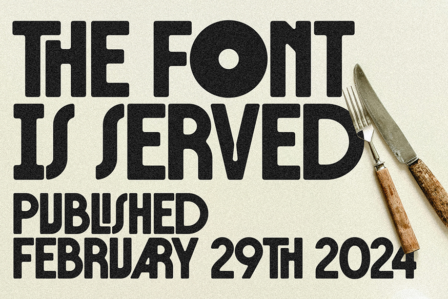
With The Roman Edition, the engineer takes over again – “really strict proportions, like you see on old European buildings, especially in Italy” – expanding into full weights, italics and, engineering permitting, a variable version. What follows will be its opposite; it always is. “I am never creating two similar typefaces one after another.”
Fitting for a foundry named after an animal that sheds and regrows its antlers every year. Beyond the foundry, Kapetanovic hosts Creative Figures, a video interview series that has already welcomed Jessica Hische and illustrator Murugiah, with a Grammy-winning album cover designer among upcoming guests. “I like to surround myself with creativity,” he says, “and that’s what I’m doing right now.”
As for any ideal or aspirational uses of his typefaces, he looks to fantasy novels: “I am a huge fan – The Wheel of Time, Lord of the Rings. Arcilla is a match made in heaven for those titles.”
While he hasn’t got his paperback yet, he’s got something close: Wicker, Black Bear’s fairytale romance starring Olivia Colman and Alexander Skarsgård, in cinemas this month, is set entirely in Arcilla – title, billing, tagline, pull quotes. For a typeface built to evoke an otherworldly presence, a man woven from willow isn’t a bad place to start.
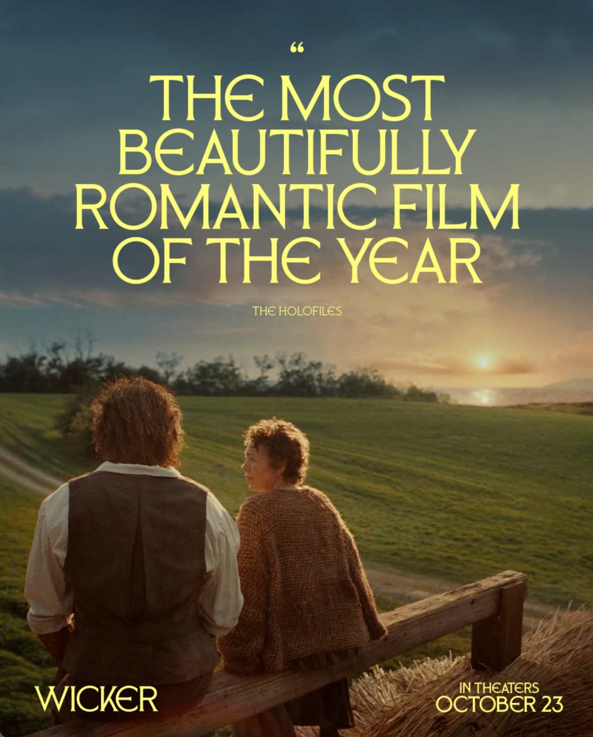
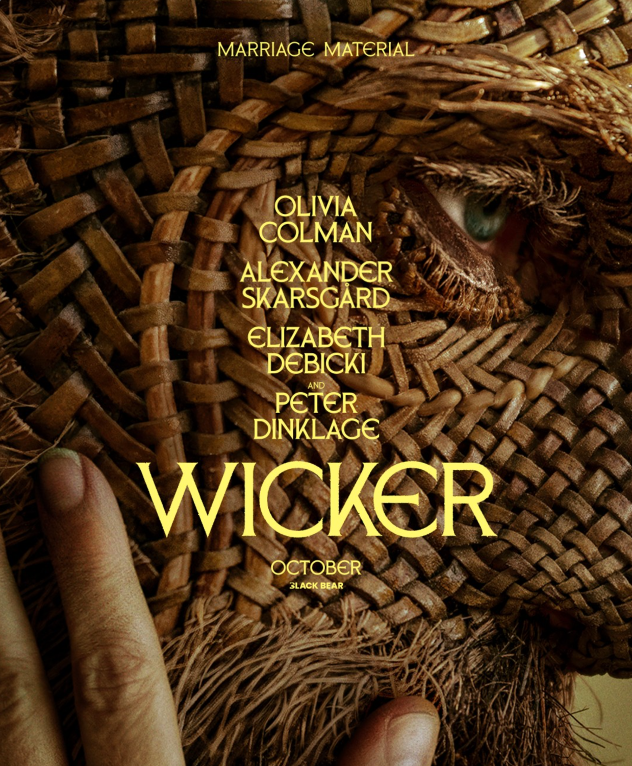
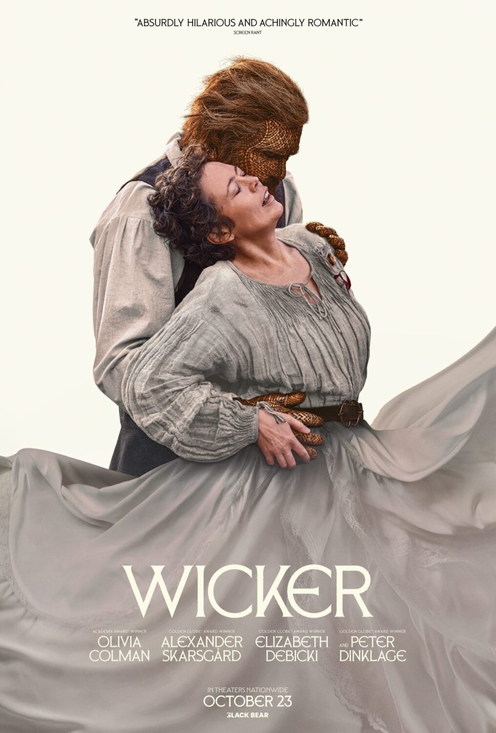
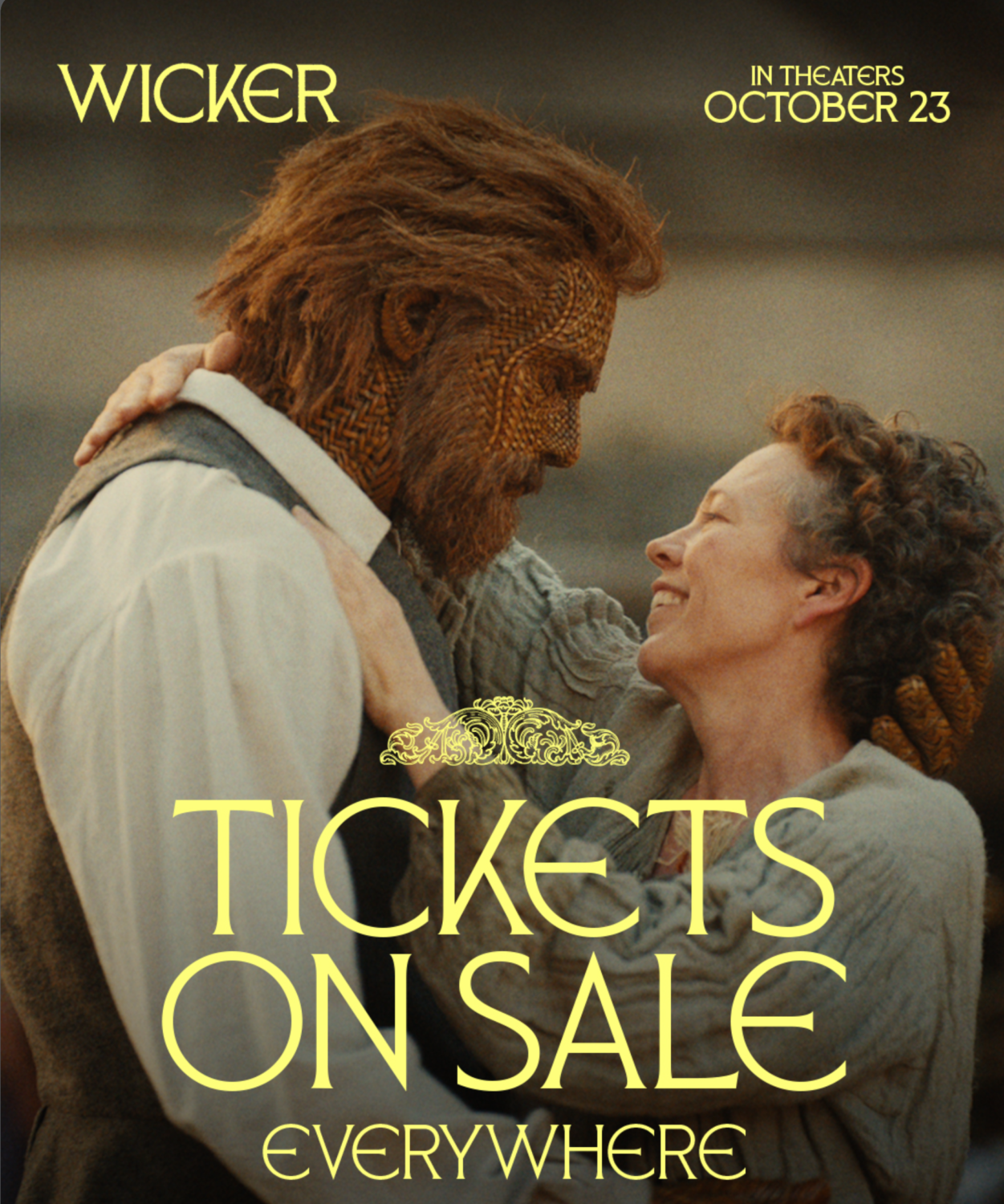
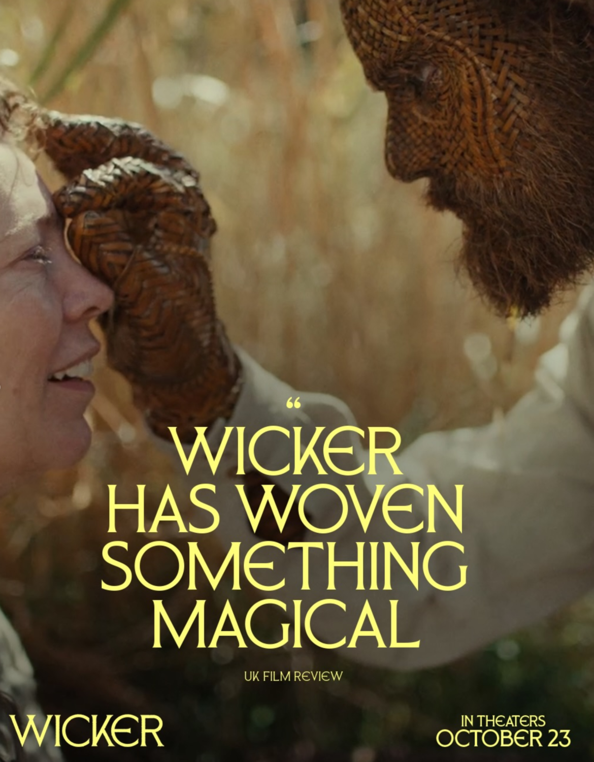
Wicker campaign artwork courtesy of Black Bear. Typeface: Arcilla by SilverStag. Design and art direction by the Wicker marketing team. [link to @wickermovie]
Enjoyed this piece? Browse more of our type foundry editorials here.