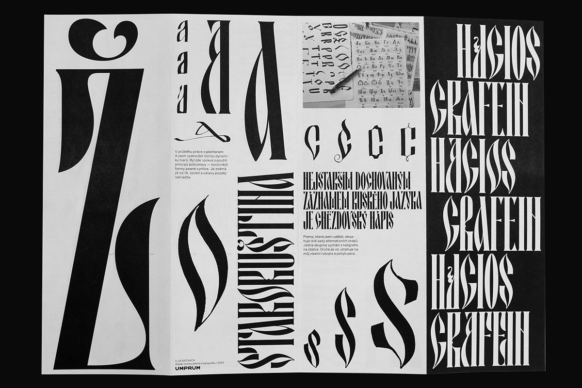
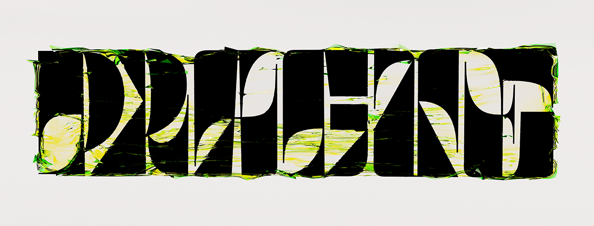
Ilya Bazhanov (@staticolors) is an artist, graphic designer and member of Umprum Type (@umprumtype). His work is heavily influenced by old Slavonic typefaces and specimens as well as industrial Slavic cityscapes, history and culture. FUD Grotesk is constructed with a nod to brutalist architecture in the Czech Republic, whilst the incredible Thaw (WIP) refers to Khrushchev’s Thaw period of the ‘60s; a time during which censorship in the Soviet Union began to relax, marking great historical change with the implementation of De-Stalinization policies.
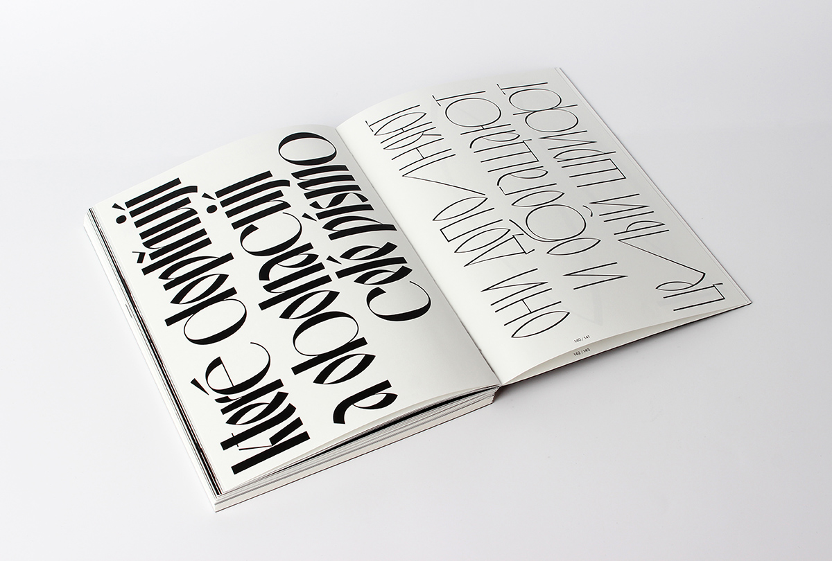
On his journey with FUD Grotesk, Ilya tells us ‘in the city where I studied and lived a while ago – Ústí nad Labem in Czech Republic – there are buildings constructed in such a brutalist style; the city having been destroyed during the Second World War and rebuilt in socialist times. I think this font was also influenced by my hometown where I was born, Chelyabinsk in Russia, which is a very industrial city with a lot of different manufacturer buildings. The massiveness and brutality of the giant structures have made a strong impression on me. I wanted to reflect this in the font by creating unusual shapes, such as many peculiar ligatures and unusual letter serifs, which are really small’.
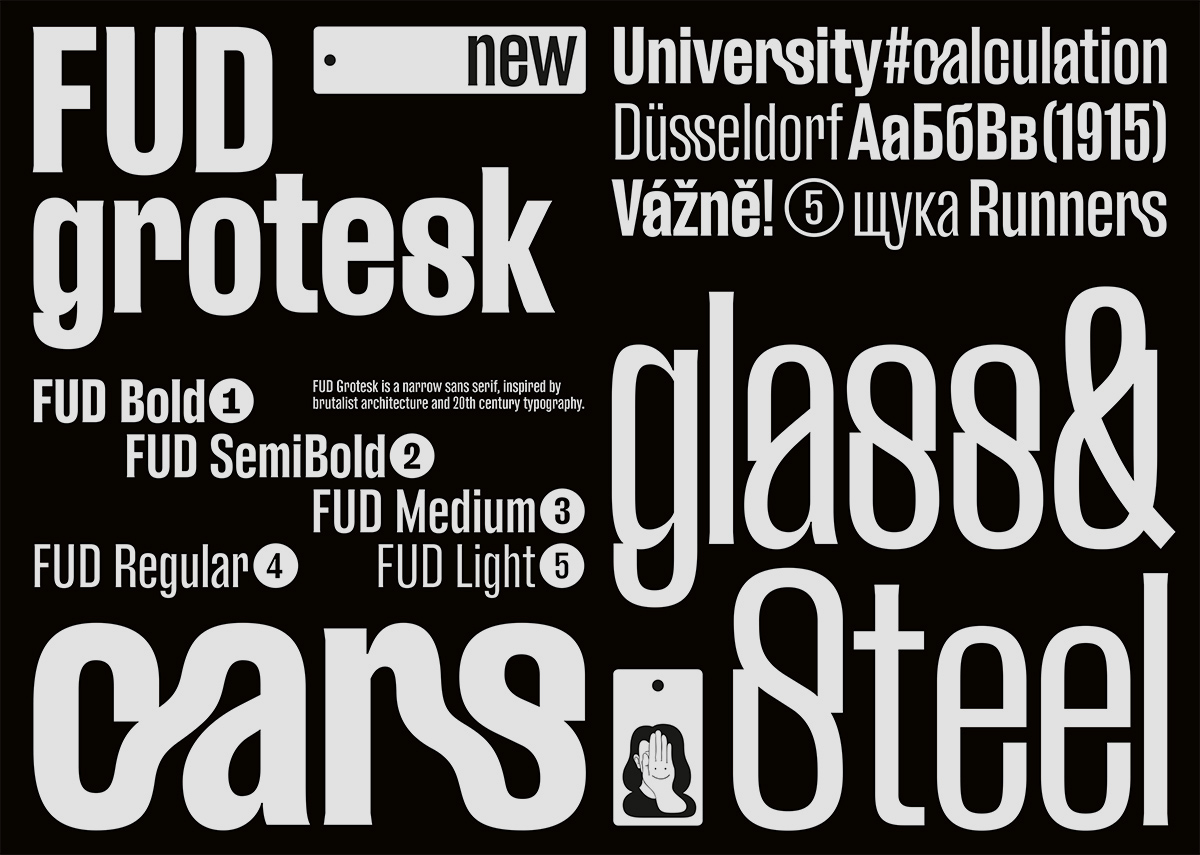
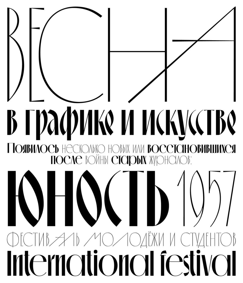
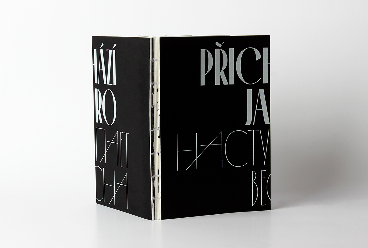
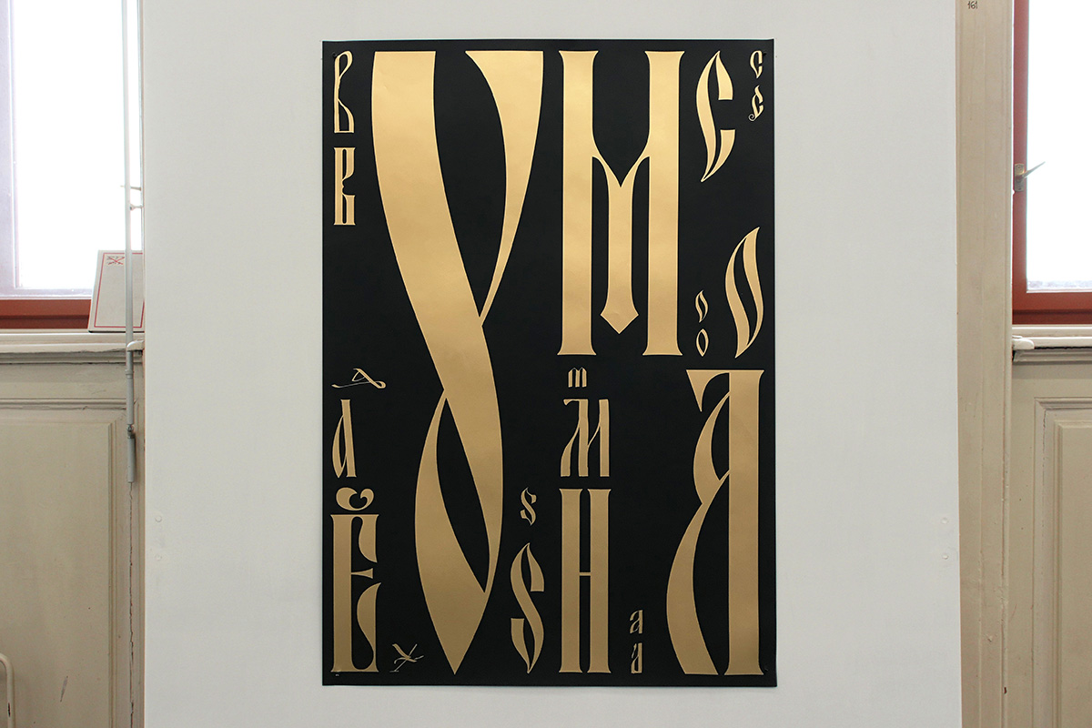
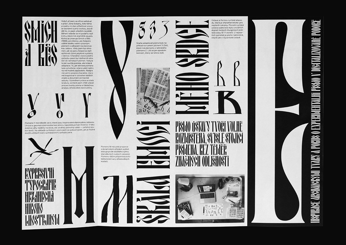
On the other hand, Thaw is more directly linked to old Slavonic type specimens, printed matter and historical visual narratives. Forming part of Ilya’s bachelor thesis, the designer explains he ‘was always attracted by old Russian books covers and figuring out how fonts worked back then, and why they don’t work that way now’. Closely examining Khrushchev’s Thaw period, Ilya felt the shifting times were interesting to excavate, from both graphics and cultural/historical perspectives. ‘The result is a book that consists of two parts’ Ilya expands, ‘a little research on the typefaces that emerged at the time, followed by my own typeface; which was inspired by typefaces from the book covers.’ We were so interested by this investigation and besotted with Ilya’s typographic output, so we invited him to delve a little deeper with us…
Hi Ilya. First off, can you expand a bit about the process of digitising old Slavonic type and how you got into this kind of work?
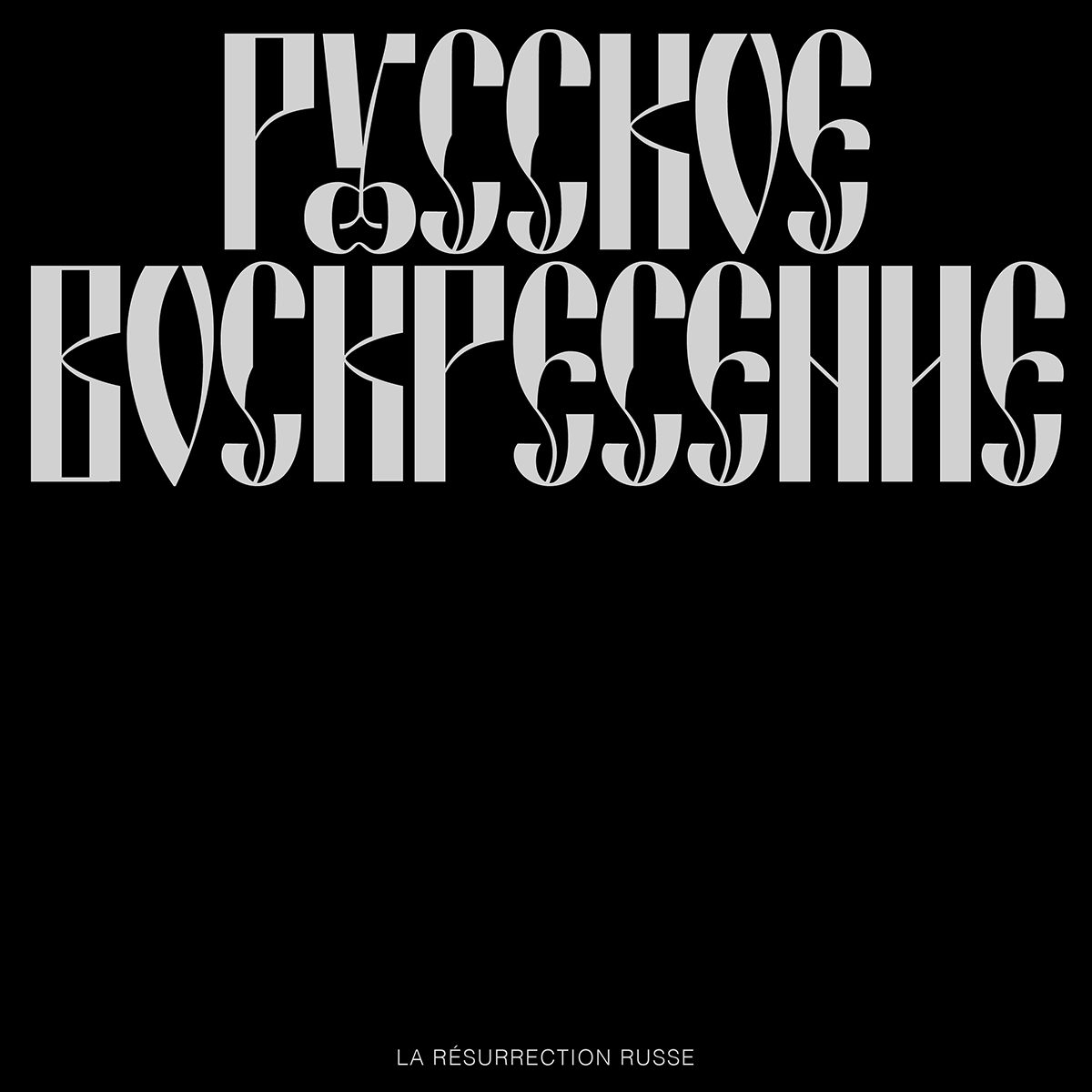
For me, the topic of time has always been very important – especially in typography, in which contact with the past is more obvious. Speaking of this project, a friend of mine sent me a few images of the French emigrant newspapers of the early twentieth century. I was surprised by the headlines in these newspapers in a good way, and that made me interested in seeing how something like this could work today in display letters. I tried to digitalise the logo of a newspaper called ‘Russian Sunday’; I really like how the old fashioned Slavic font in its header works and it was interesting to try redrawing it a little according to my vision.
I’m also really interested in digitalising some of display parts of the letters and thinking about how to make them all work in a modern typeface. Calligraphy plays a very important role in the creation of old Russian fonts, because historically all of this is intertwined. I am interested in trying different approaches in calligraphy in order to understand how certain forms work.
What are some of your favourite old Slavonic fonts/typefaces? Where do you go for inspiration?
It might be useless to highlight one specific font, I’d rather say I like the writing itself and how its historic roots shape its form. Old Slavic fonts are heavily associated with religious texts and Orthodox church paintings. At the same time, I really like looking at various archives and old books in search of interesting forms.
Can you tell us a bit about your thesis examining Russian typography? What have you learned and explored through it?
My bachelor thesis is devoted to Russian fonts of the ‘60s and the period of the ‘Khrushchev Thaw’. I was interested to know how such vibrant and original fonts appeared in those years. For example, I was really inspired by works of Lev Zbarsky, one of the famous and important graphic artists of that time. I really like that authors of that time had a very artistic and novel view of their own on creating letters. It’s very similar to illustration and painting. Sometimes the shape of letters is a whole artistic statement, which is very close to me.
That’s so interesting. So how do you think studying older type can connect us to historical, technological or social narratives? What can we learn from looking at the history and culture of type?
I think that history plays a very important role in type design, just like in everything. Looking back, you can notice many important details and try to understand the essence of why it was done this particular way and not any other. At the same time, typography is closely related to the historical events and technologies of each time period. In my opinion, typography is also related to art, which reflects in its own way the spirit of the times. For example, in the ‘60s an exhibition of Picasso, Matisse and other artists was held in Moscow, which in turn greatly inspired painting, graphics and type. Today we have new technologies and new contexts within which it is possible to rethink historical models in a new way.
We really love your custom type for the Czech poetry book, ‘Srdce v mrakodrapu’ as well as your work for The Washington Post. Can you tell us a bit more about these projects?
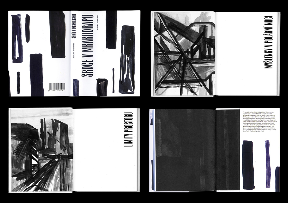
This custom typeface I created for the book of the Czech poet Bohumil Ždichynec. I also did illustrations for cover and chapters. It was important for me that the font corresponds with the illustration and the meaning of poetry – to make everything work as one. I searched of the shapes for the font with a wide-ended brush, the same tool that I used to draw illustrations, in order to achieve identity in the shapes.
These sketches are for an illustration I did for the Washington Post project, By The Way. It is a new travel site with insight from local journalists and photographers covering everything from places to eat to favorite their neighborhoods. The finished product that is present on the site is much more calm, but in these sketches I wanted to make a more expressive lettering with unusual shapes.
Lastly, what can we look out for from you in the future?
I am currently actively working on finalising Thaw typeface, and hopefully I can release it soon. At the same time with creating fonts I do a lot of painting, and illustration occupies a very important part of my life; sometimes I also draw murals in the streets. Next year I am finishing my Master’s degree at the The Academy of Arts, Architecture & Design in Prague (UMPRUM) so right now I’m making plans for my diploma.
Thank you, Ilya! If you want to keep up with Ilya’s future work, check out his Instagram and be sure take a look at Uprum Type’s upcoming projects.

