
The Extraset team (@extraset.ch) is formed of a group of Geneva-based graphic designers with 4 different studios. Working mainly on cultural commissioned projects, the team made up of Alex Dujet (Futur Neue), Xavier Erni (Neo Neo), Roger Gaillard (Cécile + Roger) and David Mamie (Todeschini Mamie) is passionate about typography. ‘We do typefaces because we are fascinated by letters, and most of the time we tend to work with them through our projects. This allows us to put a certain shadow/authenticity in our work’, Alex tells us.
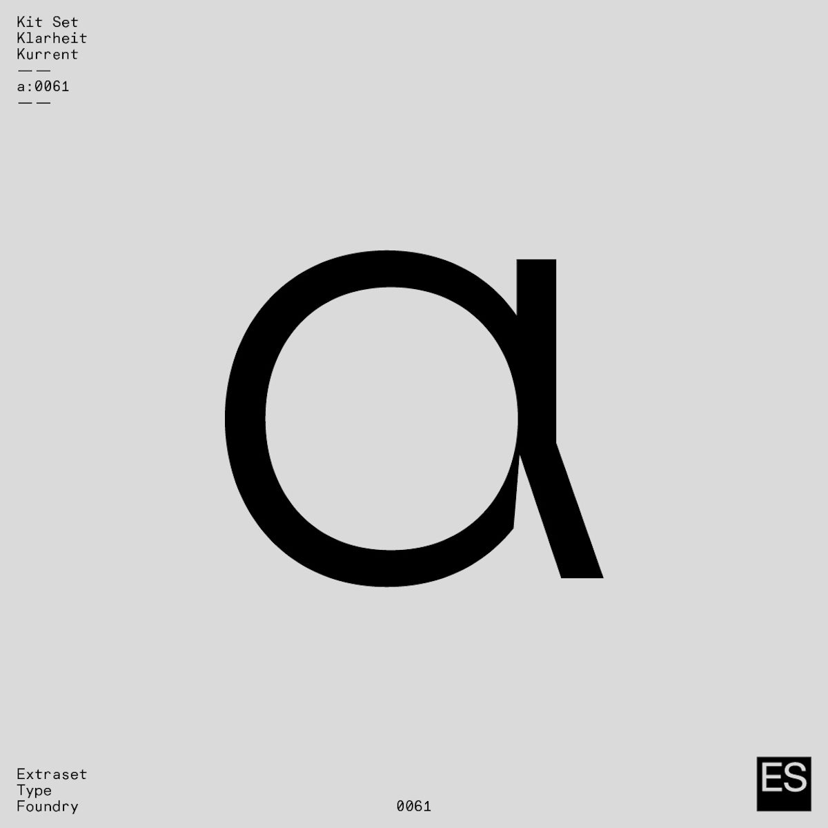
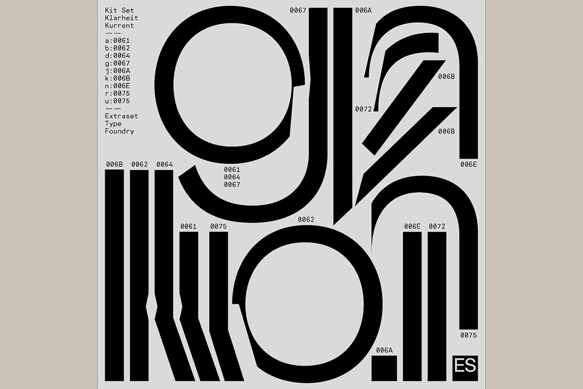
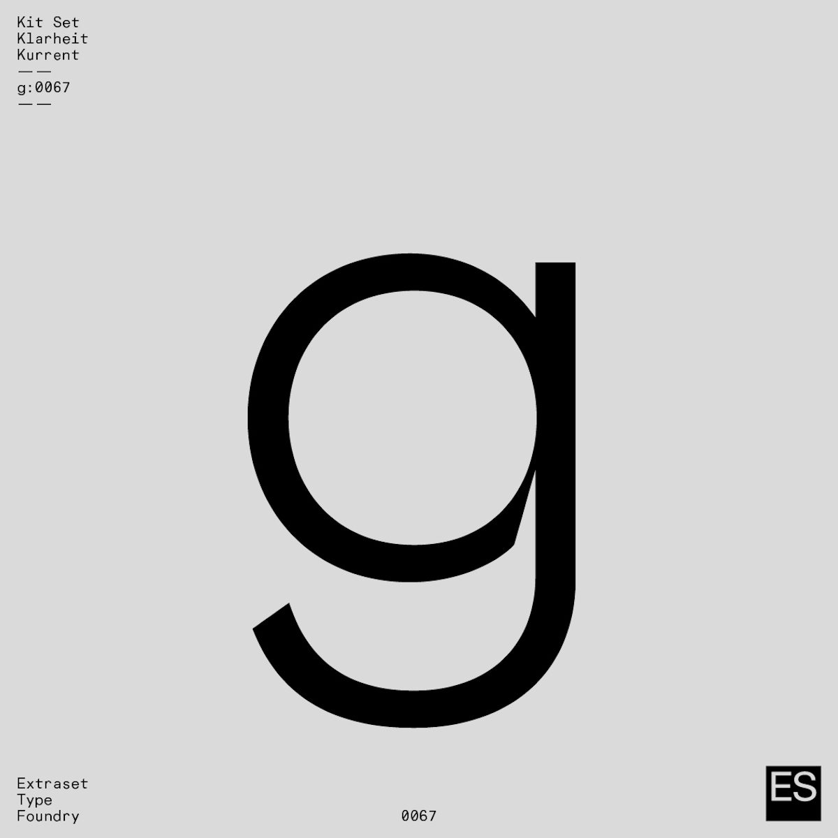
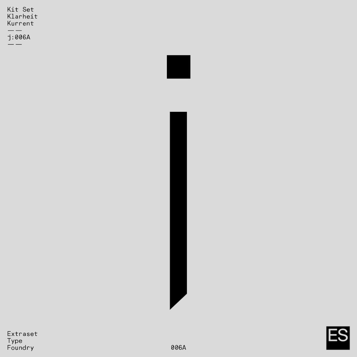
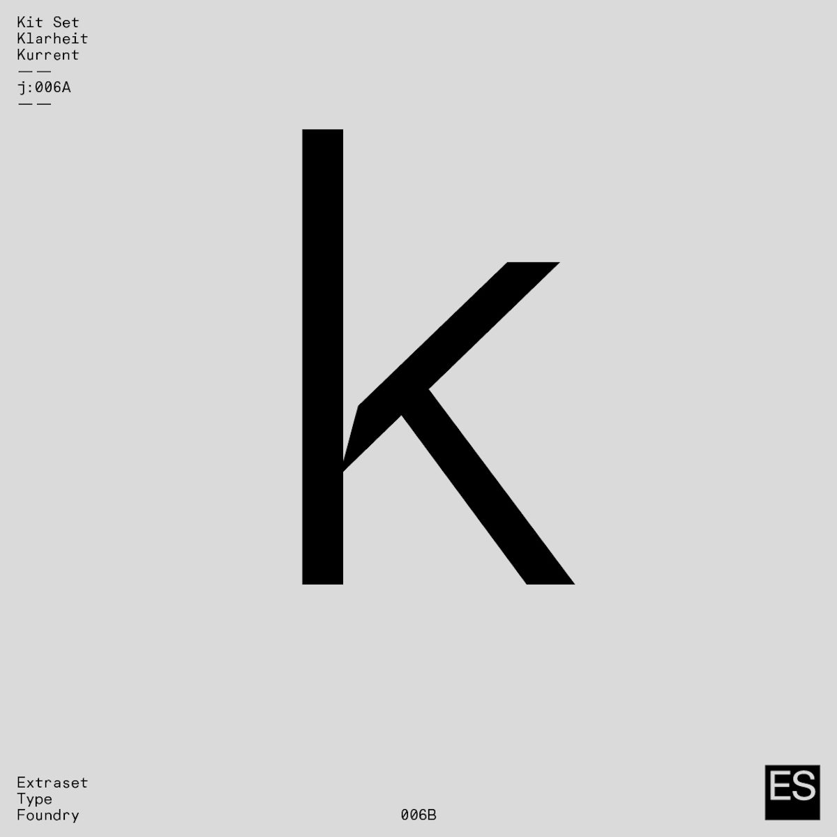
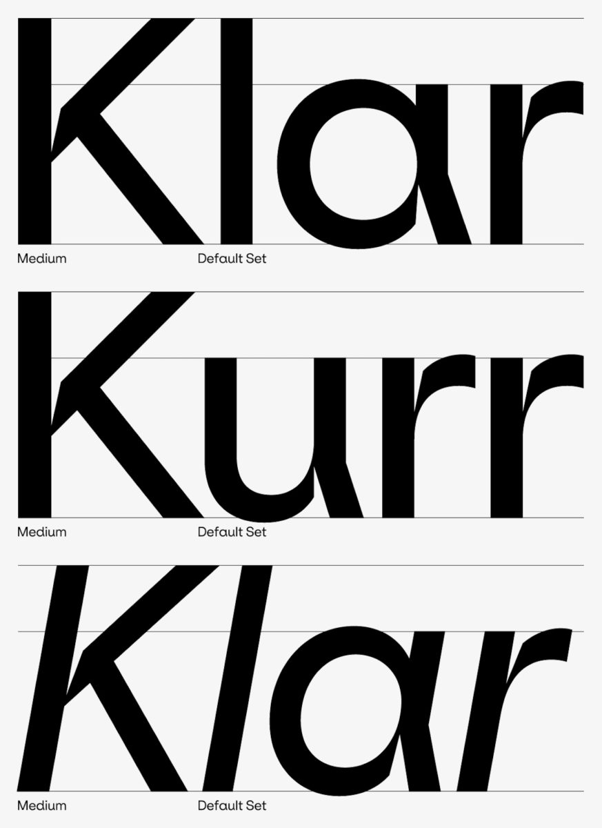
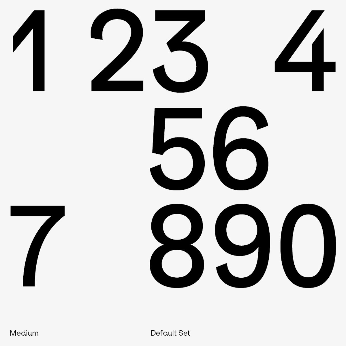
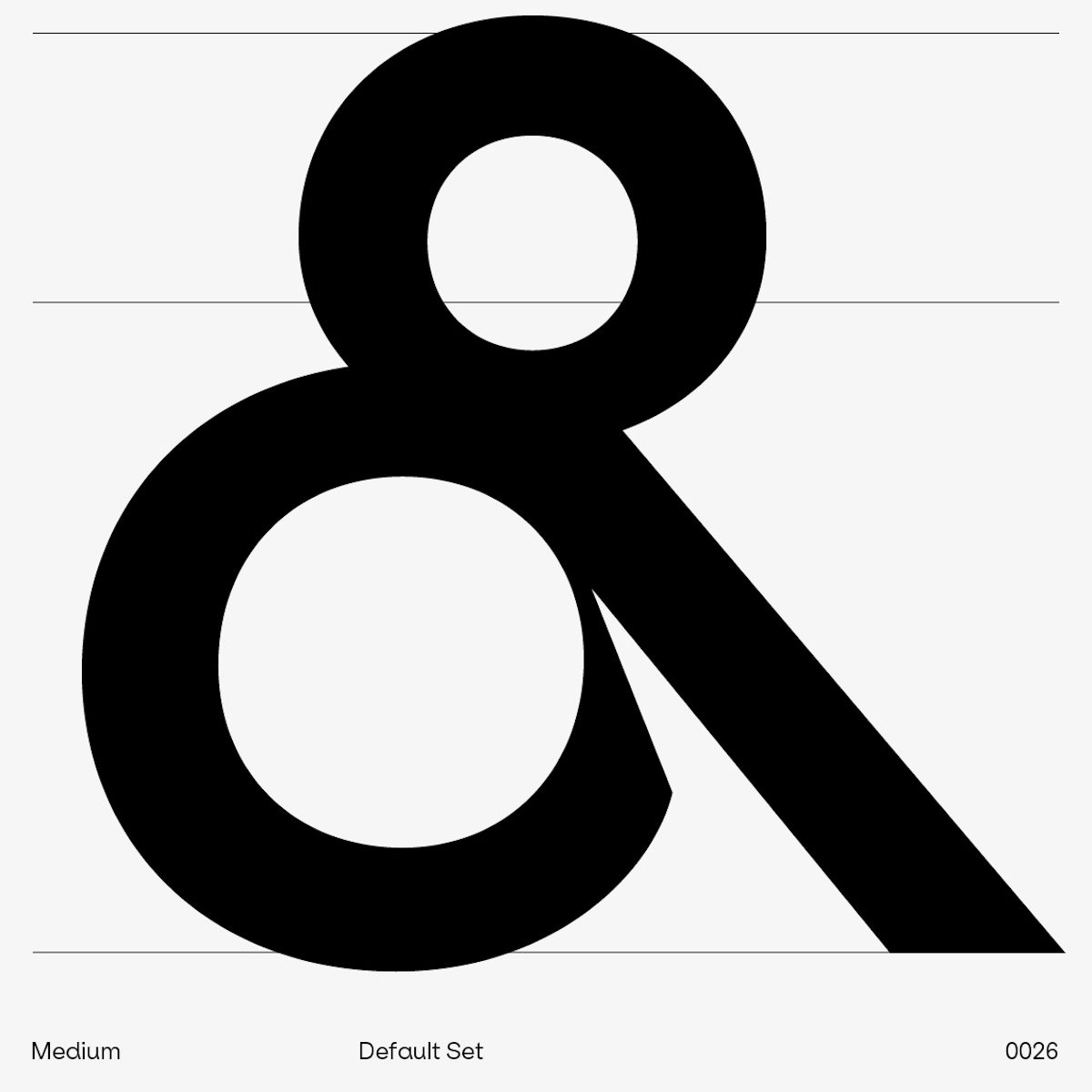
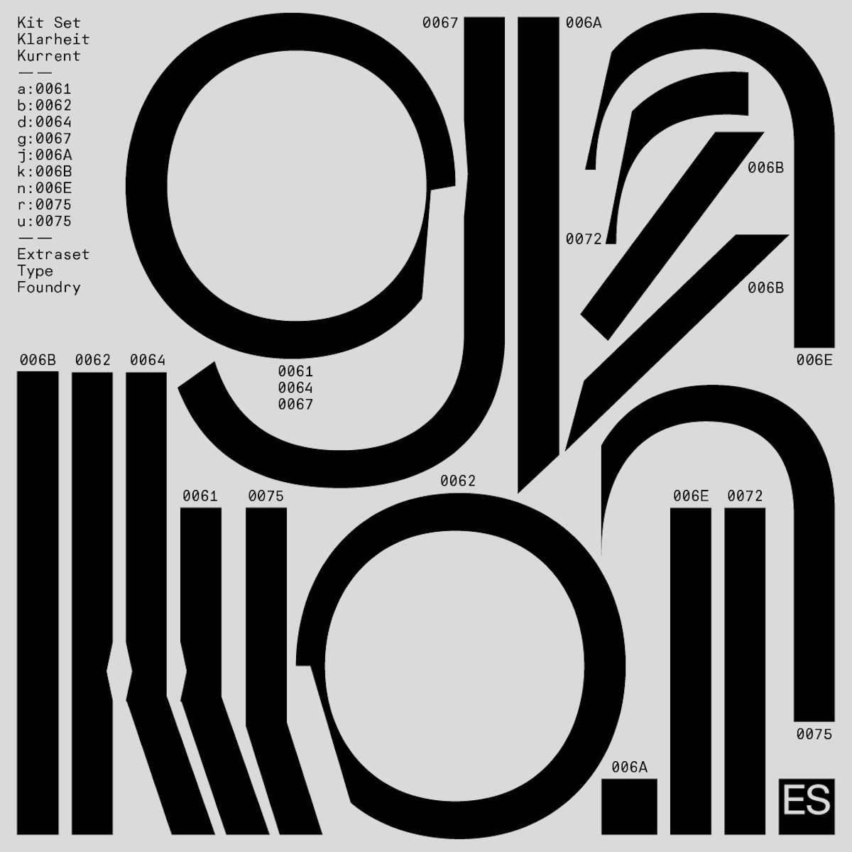
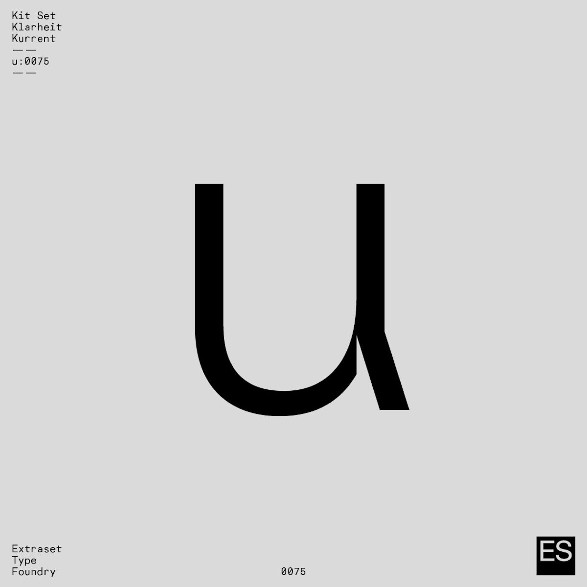
We first saw Extraset’s incredible typeface Klarheit Kurrent in their Instagram post, Thx IKEA for the IDEA, and we’ve been obsessed ever since. The post was made as a fun way of promoting the typeface online and plays on the idea of a kind of flatpack typeface – hence the IKEA reference – only Klarheit Kurrent is much more considered than that. As Alex explains, Klarheit Kurrent is ‘a geometrical typeface that uses several recurrent components to build it’.
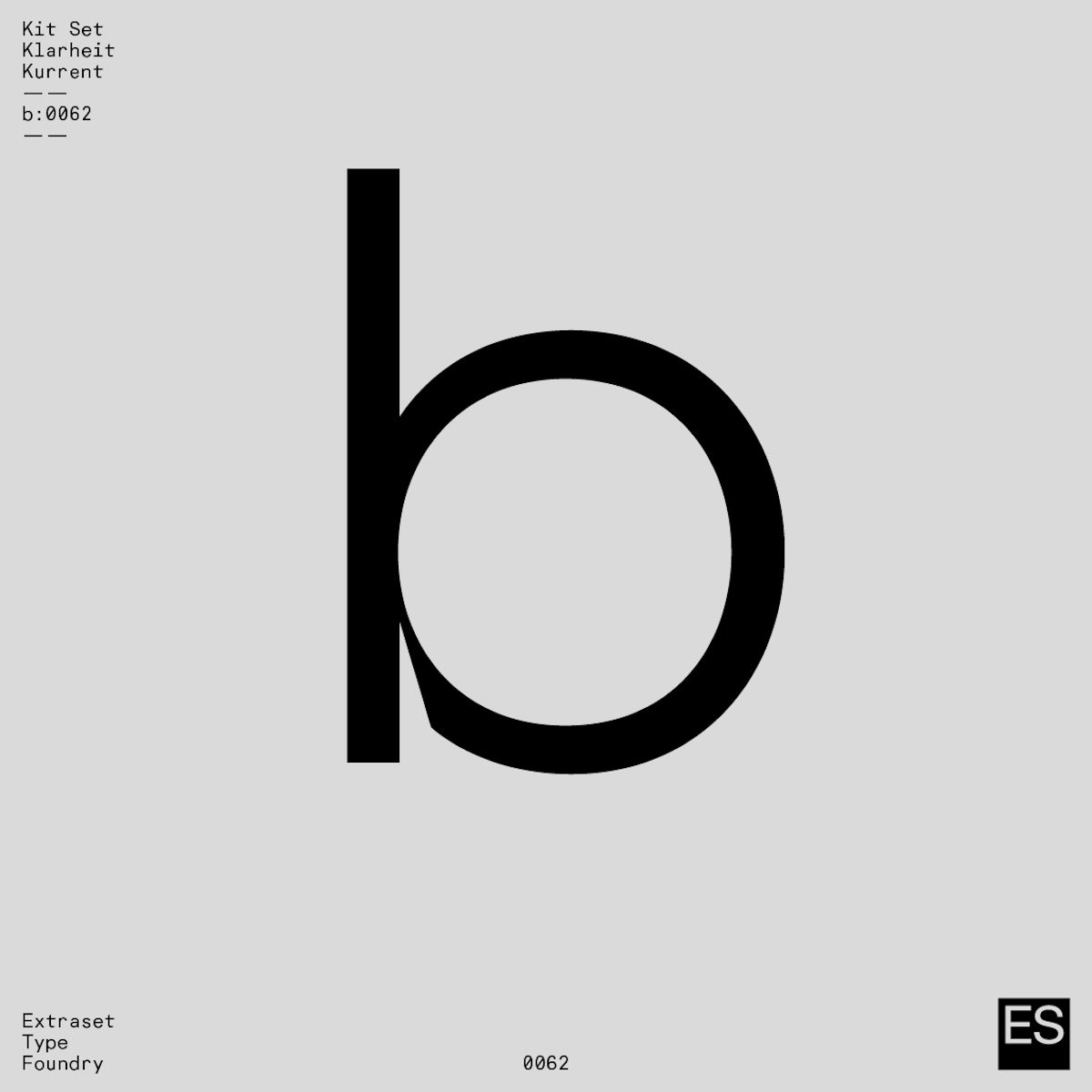
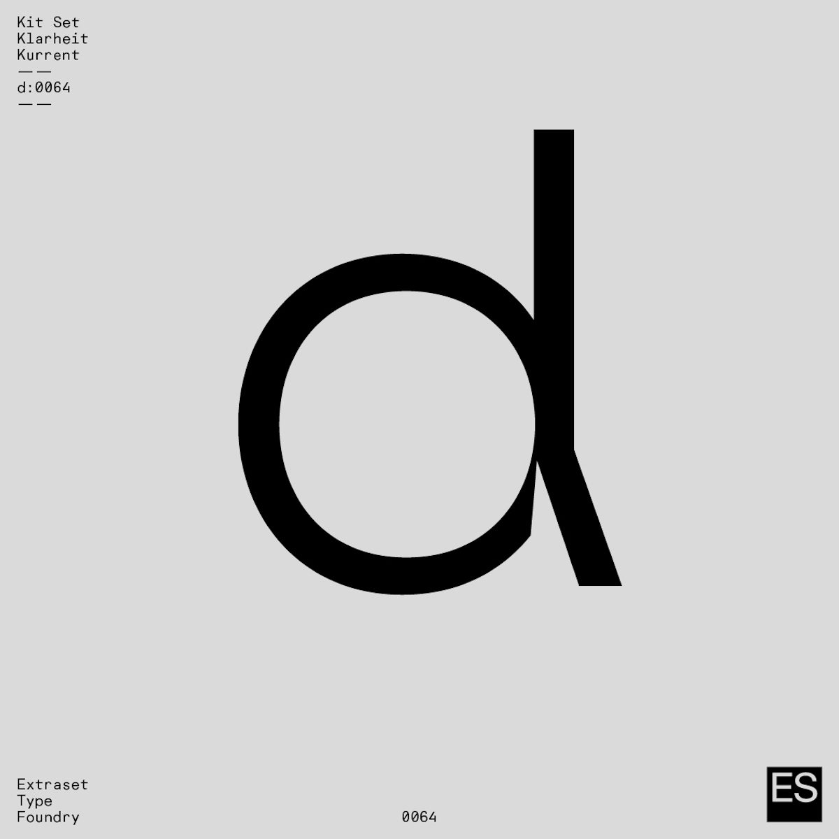
‘Klarheit Kurrent is a variation issued from the flagship Klarheit Grotesk project’, Alex elaborates. Whereas Klarheit Grotesk offers endless possibilities and extensive OpenType features, Alex continues that ‘Klarheit Kurrent proposes a radical design choice with a unique finish, rather than the multiple OpenType possibilities that Klarheit Grotesk offers‘. Whilst designed to echo modernism and geometrical standards, this approach means Klarheit Kurrent’s radical personality includes moves such as slashing the stylistic set, and setting a focus on singular decisions.
Klarheit Kurrent’s parent typeface, Klarheit Grotesk includes some of Klarheit Kurrent’s characters as alternates, but overall has a more accommodating and flexible personality. ‘Oscillating between two major standards, Klarheit Grotesk seeks to meet the requirements of a more contemporary form of modernism. The project features a formula that revisits geometrical solutions drawn from the Bauhaus movement as well as key typographic standards used in 1960s Swiss modernism. After five years of work and various experiments with this tool, Alex Dujet has come up with several finishing touches revolving around the global structure of its basic design’, Extraset explain.
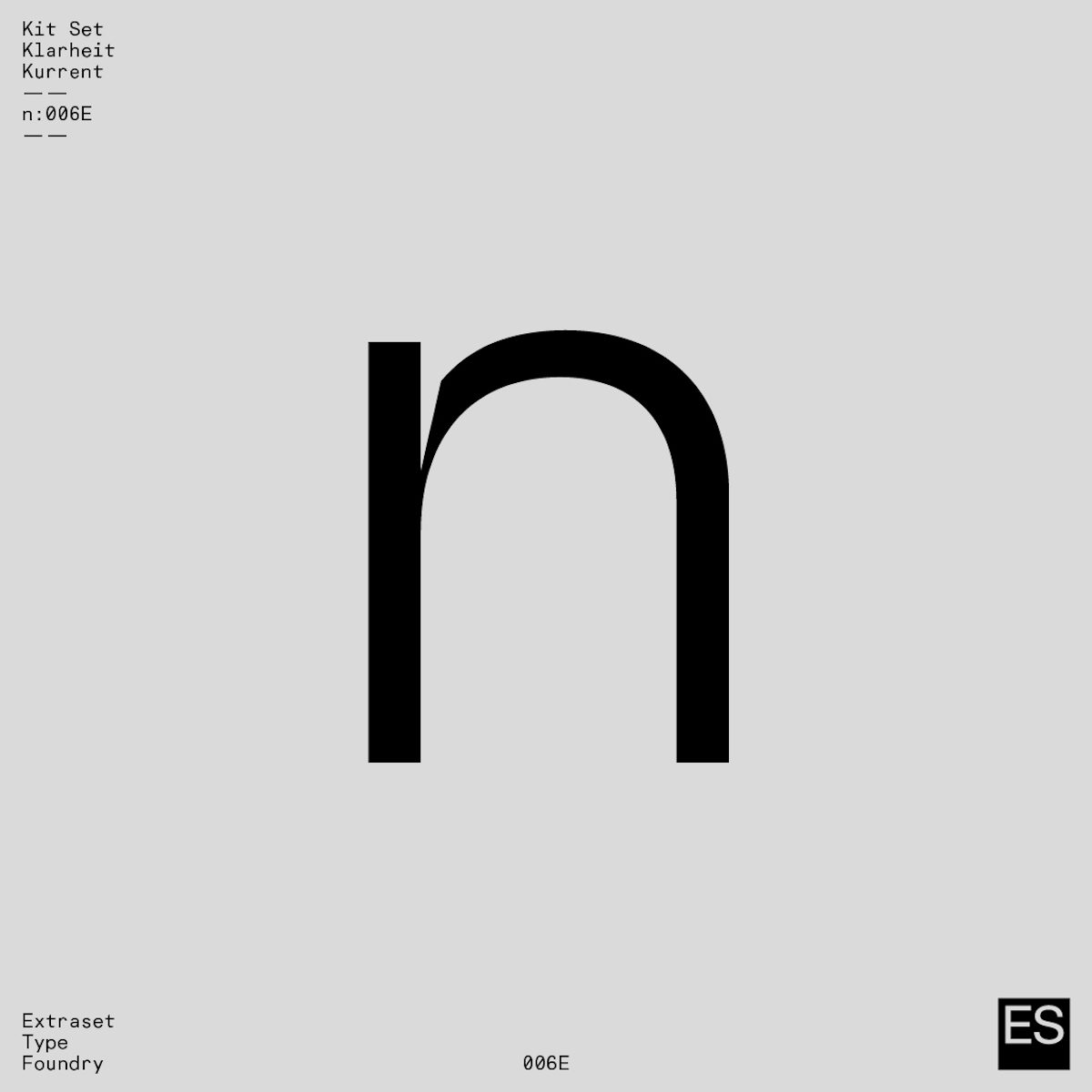
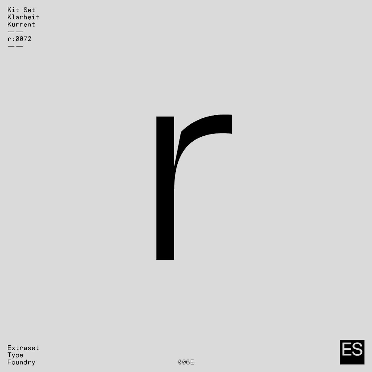
Klarheit Kurrent thus emerged as an intuitive development from Alex’s work on Klarheit Grotesk. ‘Developed based on the structures of its parent Klarheit Grotesk, this variant seeks to meet the necessary demands of a powerful and original tool. The aim of the project enhances the authenticity of headlines and provides an atypical atmosphere when using this font for work tasks’, the team note. ‘The project only focuses on a single decision in opposition to the manifold possibilities of the flagship Klarheit Grotesk project, a radical choice that features extreme cuts in the finishes of some of the components of the basic alphabet, in order to outline an authentic approach when developing communication projects of all types.’

Whilst less extensive and accommodating than Klarheit Grotesk, you’ve got to love Klarheit Kurrent’s stunning conviction. To follow Extraset wherever they’re going next, be sure to check out their website and Instagram to keep an eye on their upcoming endeavours.


