
Bruno Café is a designer and art director at R/GA by Design, New York City. We fell in love with Bruno’s visual identity design for Pulsante; a short film written and directed by Matheus Ávilla. Featuring Violaine & Jérémy’s Voyage typeface, the visual identity uses type and 3D illustration to explore the narrative themes of the film and creates a stunning marriage between stories, type and visual language. We got in touch with Bruno to hear more about his type selections and the journey of producing this gorgeous visual identity.
Hi Bruno! Can you introduce the film you designed the visual identity for and what it was about?
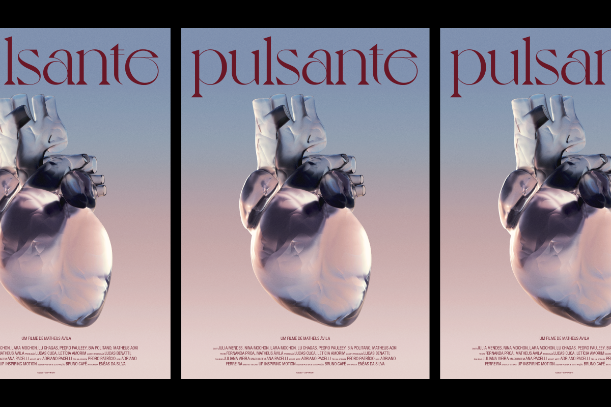
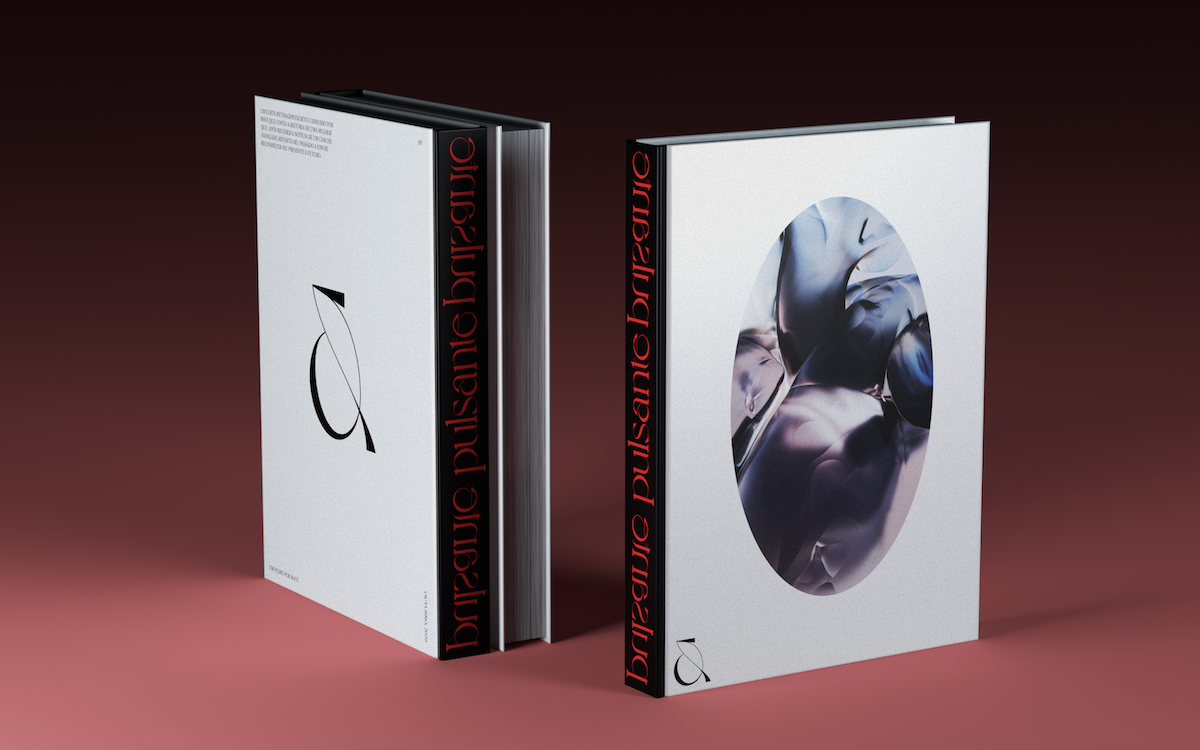
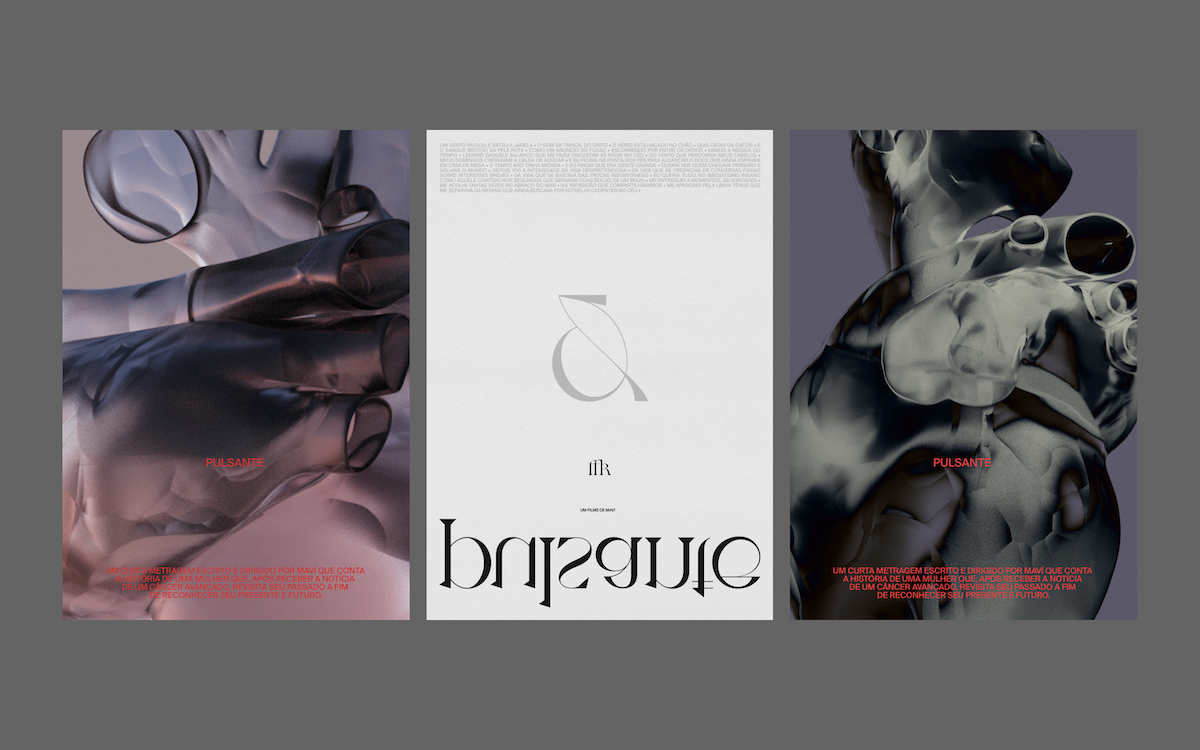
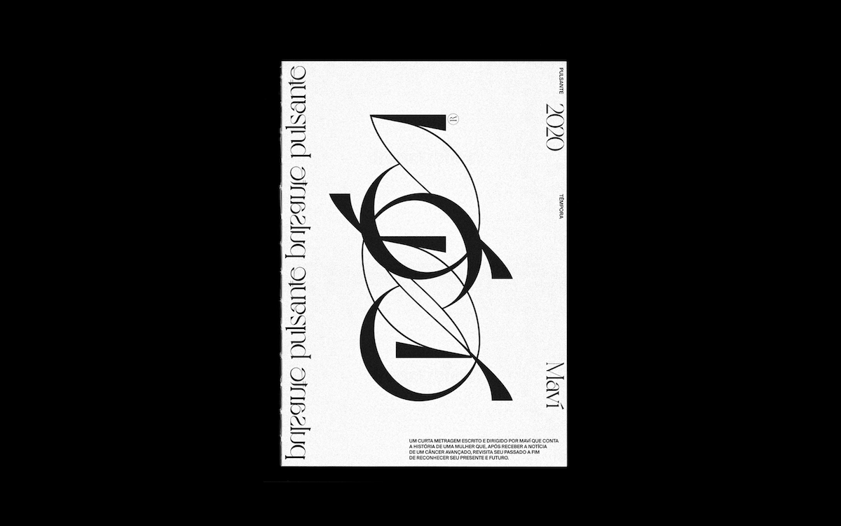
Pulsante is a short film that was written and directed by Maví (Matheus Ávilla), a wonderful Brazilian friend. I had the honour of being invited to make the project’s visual identity. The film tells the story of a woman who, after receiving news of advanced cancer, begins to revisit the past and then starts thinking about looking towards the future with optimism. The idea of the film is precisely to look at life, not just to the hospital life that the disease brings.
How did you interact with the narrative of the film and the stylistic elements of the production when thinking about the visual identity?
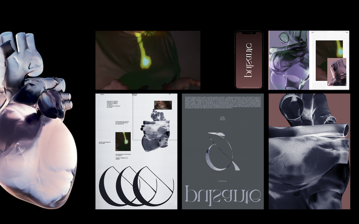
I first watched the short before I started exploring some paths. I started the process thinking about creating a visual system that was close to the elements that are very present in the movie – kind of like windows, glass, shards, reflections, light, about recovering, dawn, discovering a new life, and so on.
How much creative freedom were you given in the process and how did you go about finding the right path?
So, I separated these ingredients and started looking at some photographic references – things with reflections, glass, refractions. But I still didn’t know what I wanted. I was lucky because Matheus – Director and screenwriter of Pulsante – is a very talented guy, and I was able to share with him everything I imagined during the process. Yes, I changed my mind a few times in the middle of the road until I matured and arrived at a result where we were both happy.
In the beginning, I looked at a lot of references with photographic compositions, natural light, and that led me to the final result.
How did you want the 3D illustration and the typographic elements to relate to one another? How did one inform the other?
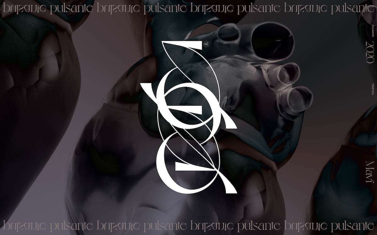
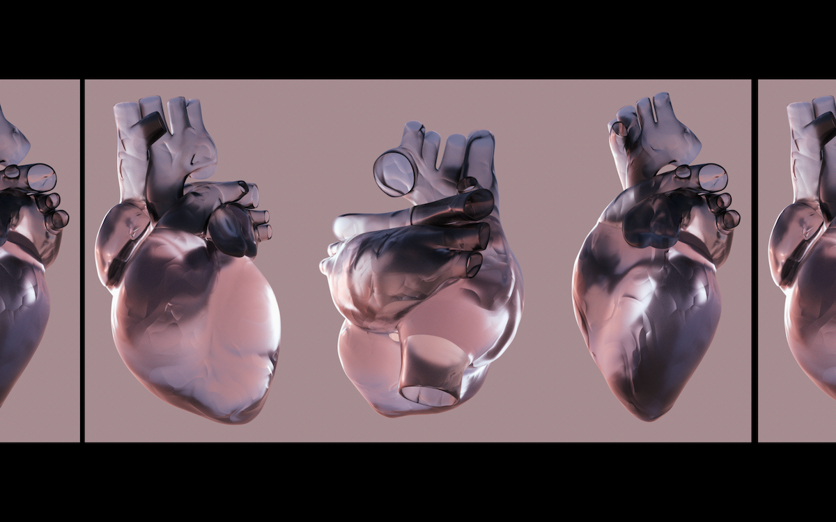
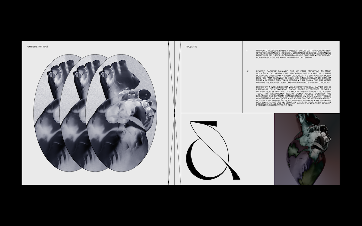
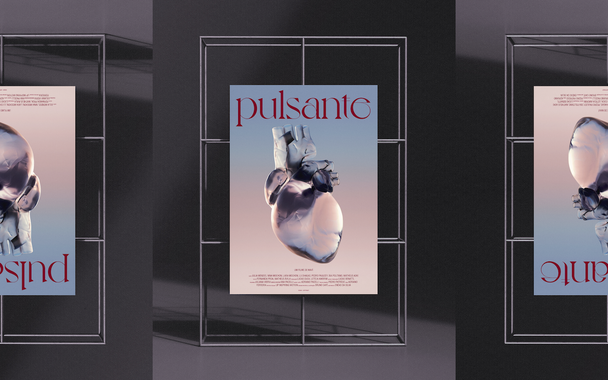
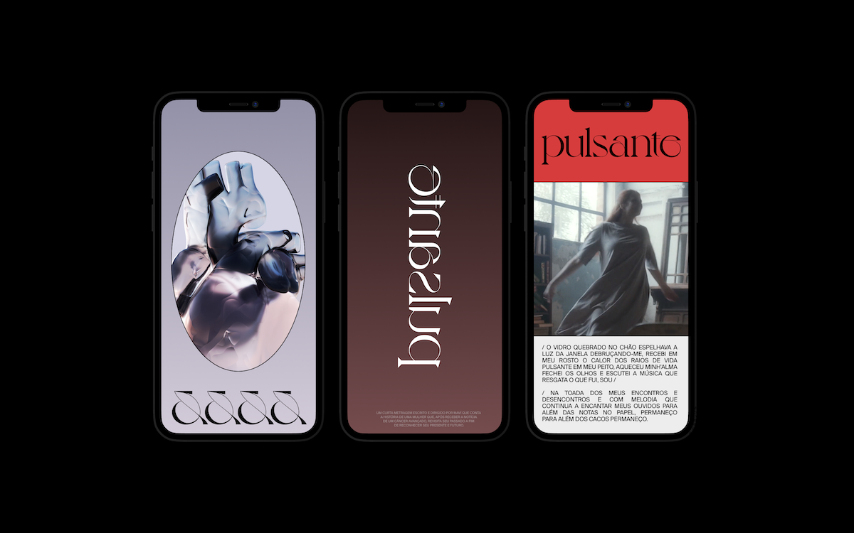
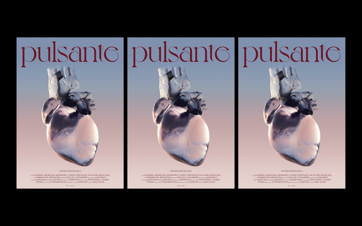
First, I was thinking of an illustration that had a strong visual impact like the narrative the film has. Having little knowledge of 3D – it was never the first idea, on the contrary, it was the last – I knew it would take time to arrive at a good result. But it was still an experiment; it was long nights, help from friends who work with 3D, lots of tests until I reached a glass heart. I didn’t want anything ultra-realistic. The glass heart was the closest representation of the window that is present in the film – full of reflections, colours, texture. The idea was to have a reconstructed heart, with a sort of romantic and poetic heart at the same time with the lightness that the film has.
Can you tell us about your typographic selection and treatment for the visual identity?
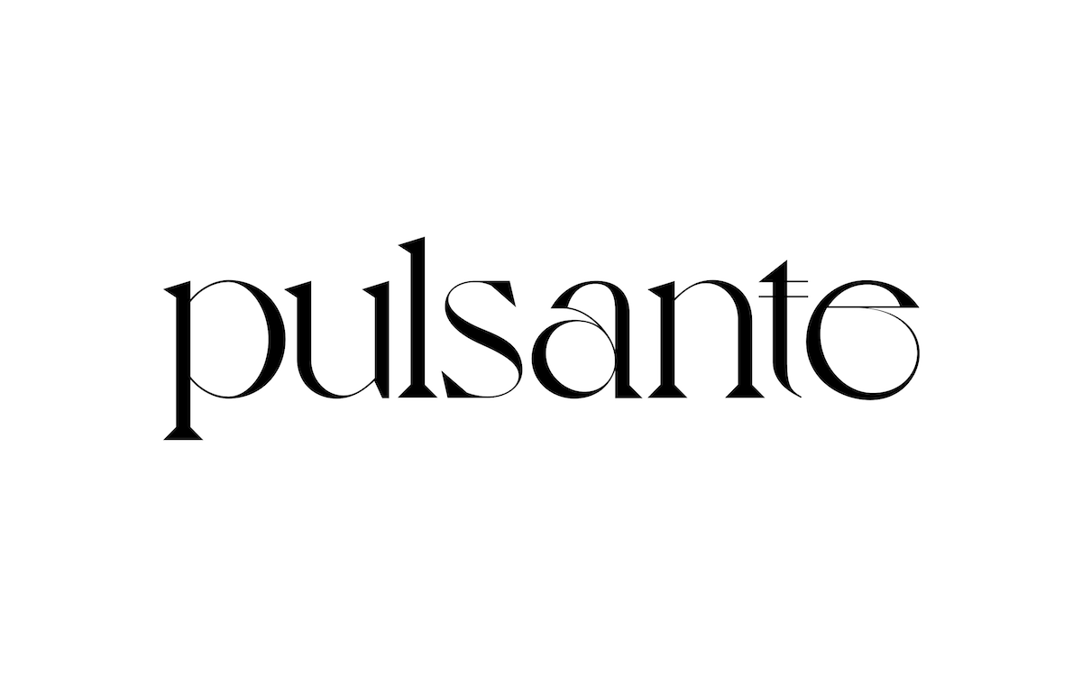
Typography was a super important element in this project where I wanted something to bring something more romantic with an elegant, curvy serif; the middle ground between delicate and strong. I tried several different types until I was satisfied with the result that Voyage brought.
Did you encounter any specific challenges or pivotal moments in the creative process?
I don’t have a well established process in my head when I start work. I have ADHD – so this is the first challenge, right? When I start a project I see several possibilities, a lot of information happens at the same time and I need to know how to direct it to a path that I believe in. But I believe that the biggest challenge was to achieve the result of the illustration and that it was literally ‘pulsating’ in the eyes. I wanted something really specific and that was proprietary for the film which would maintain the consistency and the language I was envisioning.
How important of an element do you think type is when it comes to creating a visual identity for a film?
I believe that typography says a lot about how people will see your work. The way it is positioned, colour, spacing – it’s about how people will read you, your language – it’s like our body expression. It’s a very important part of work.
What were your influences/inspiration?
My inspirations go beyond design books or things like that. New York is a manic city, even in times of a pandemic. I really like to observe the way people talk, express themselves, walk and react to things. Sometimes I stand for a while just looking at how light reacts on the wall. A walk with my dog always brings me new stories. But I confess that I’m a lucky guy because my influences also end up being the people I have close; my wife, friends, people who worked with me, or who I still work with.
What should we look out for from you in the future?
I don’t know. Honestly, I don’t have a plan for the future. I want to remain this curious guy, learn from friends, and listen to a lot of loud music on my old record player… I grew up in an extremely simple family in Brazil, so I didn’t expect to participate in a design interview one day! True life is: have fun, learn from others, be yourself, and do what you love!
Check out more form Bruno at @brunocafe and @rgabydesign.


